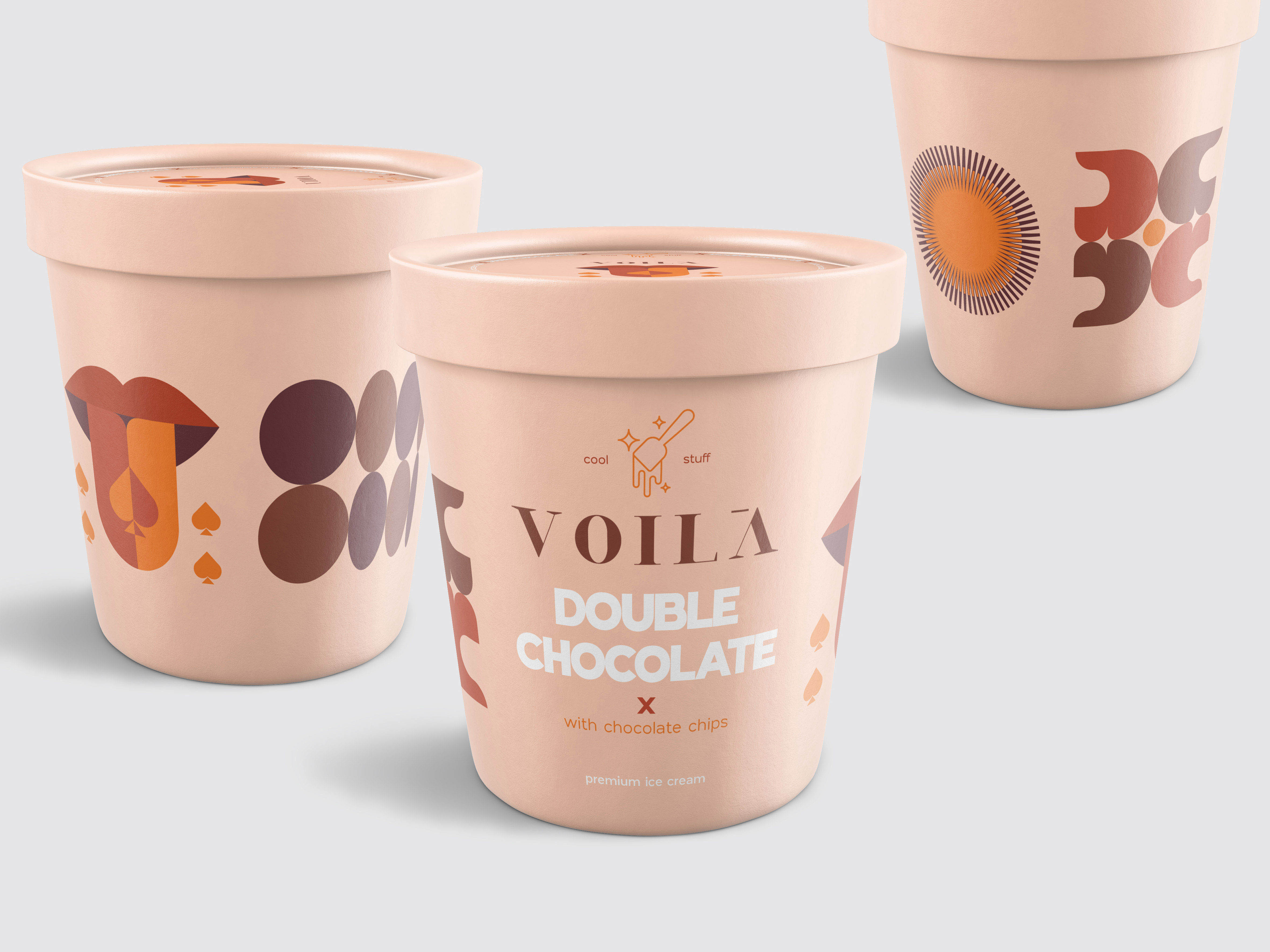
Voilà Cool Stuff – by Bold Branding Our client is a well-known desserts shop in the Egyptian market; known for its high quality, unique products with sophisticated designs and distinctive brand image. We wanted to create a sub-brand for the new pre-packed ice cream range that will match Voilà’s innovative identity, remarkable packaging, with the unique design philosophy that will stand out among competitors.
Main Icon: We fashioned a unique icon for the product range to be treated as the main emblem that will be used in all the ice cream current and future range.
Voilà is known for always delivering out of the box desserts, there are no boring products. The same thing with their new ice cream range. So we named the range “cool stuff” indicating the cool additions to the traditional flavours that created the Voilà twist.
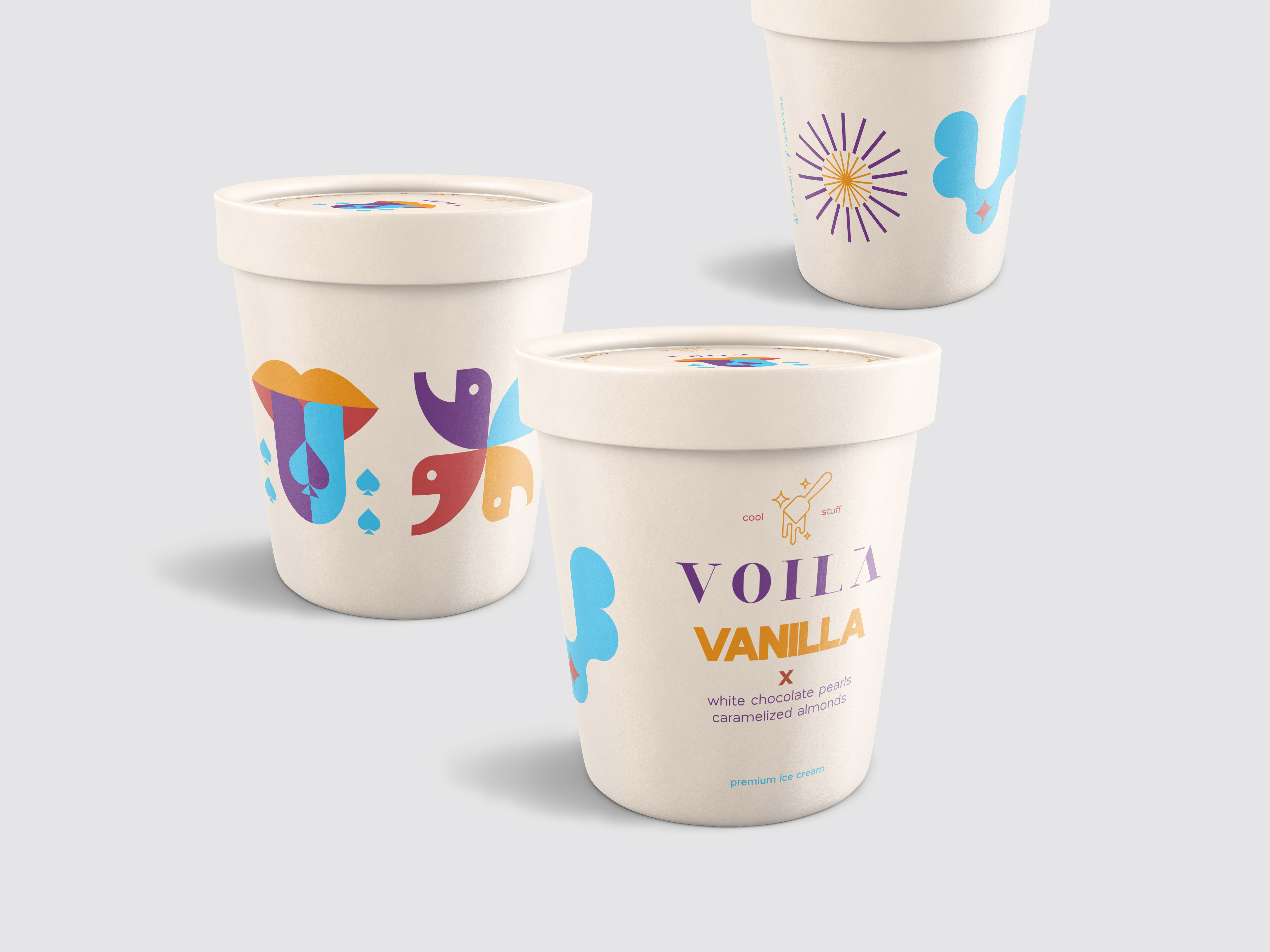
“Cool stuff” is hugging a nice ice cream spoon with some delicious drizzles.. surrounded by some sparks, that represents the surprising cool flavours in the range.
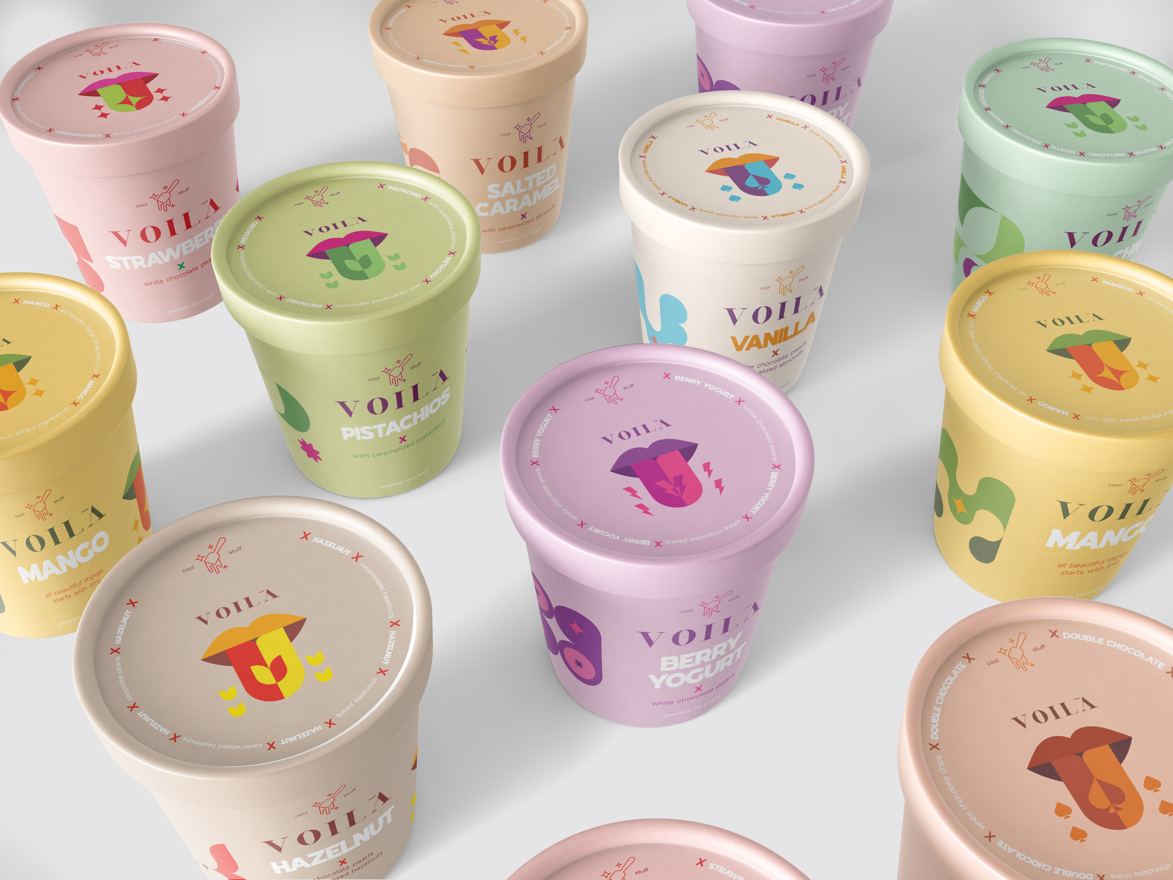
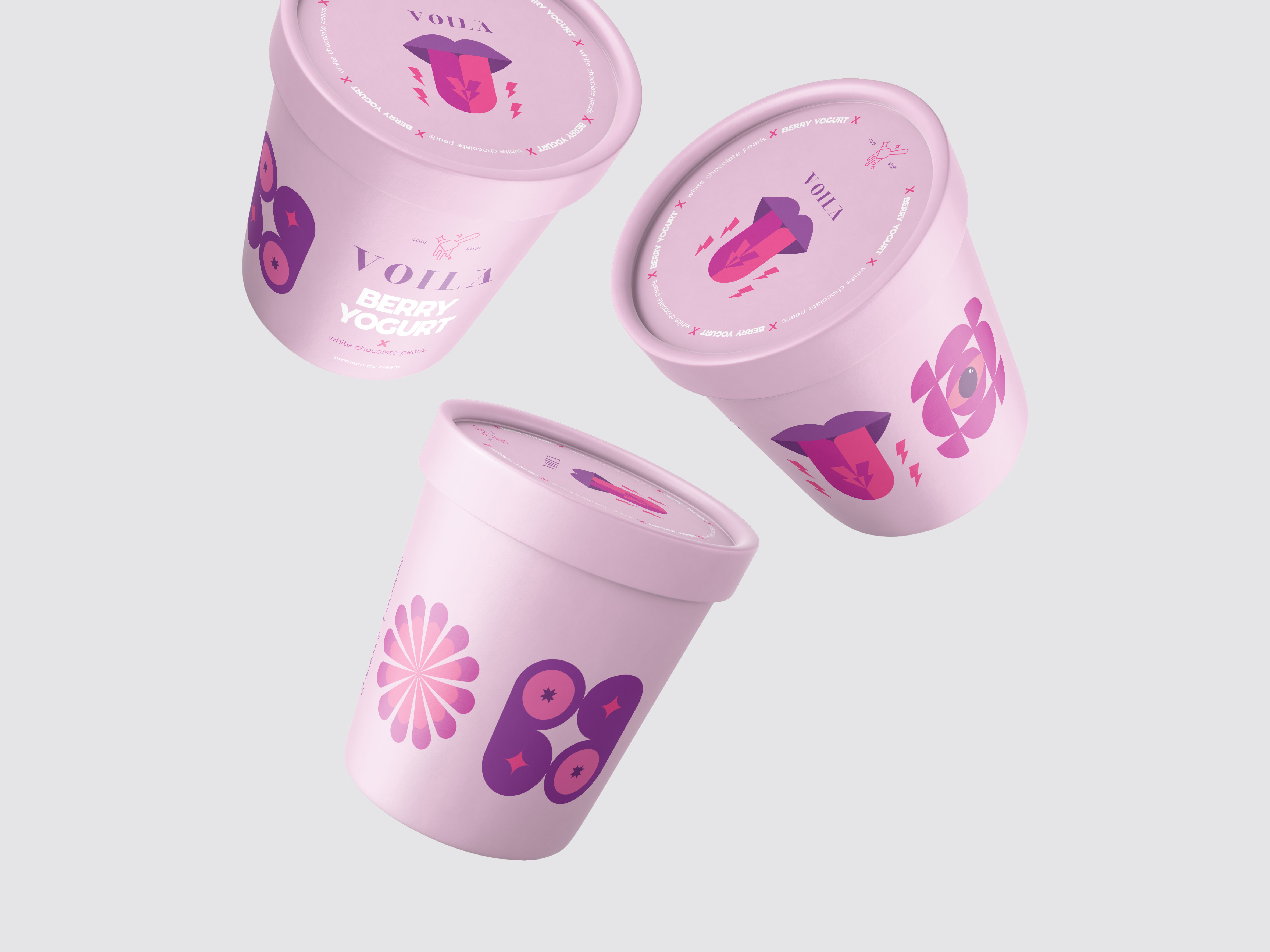
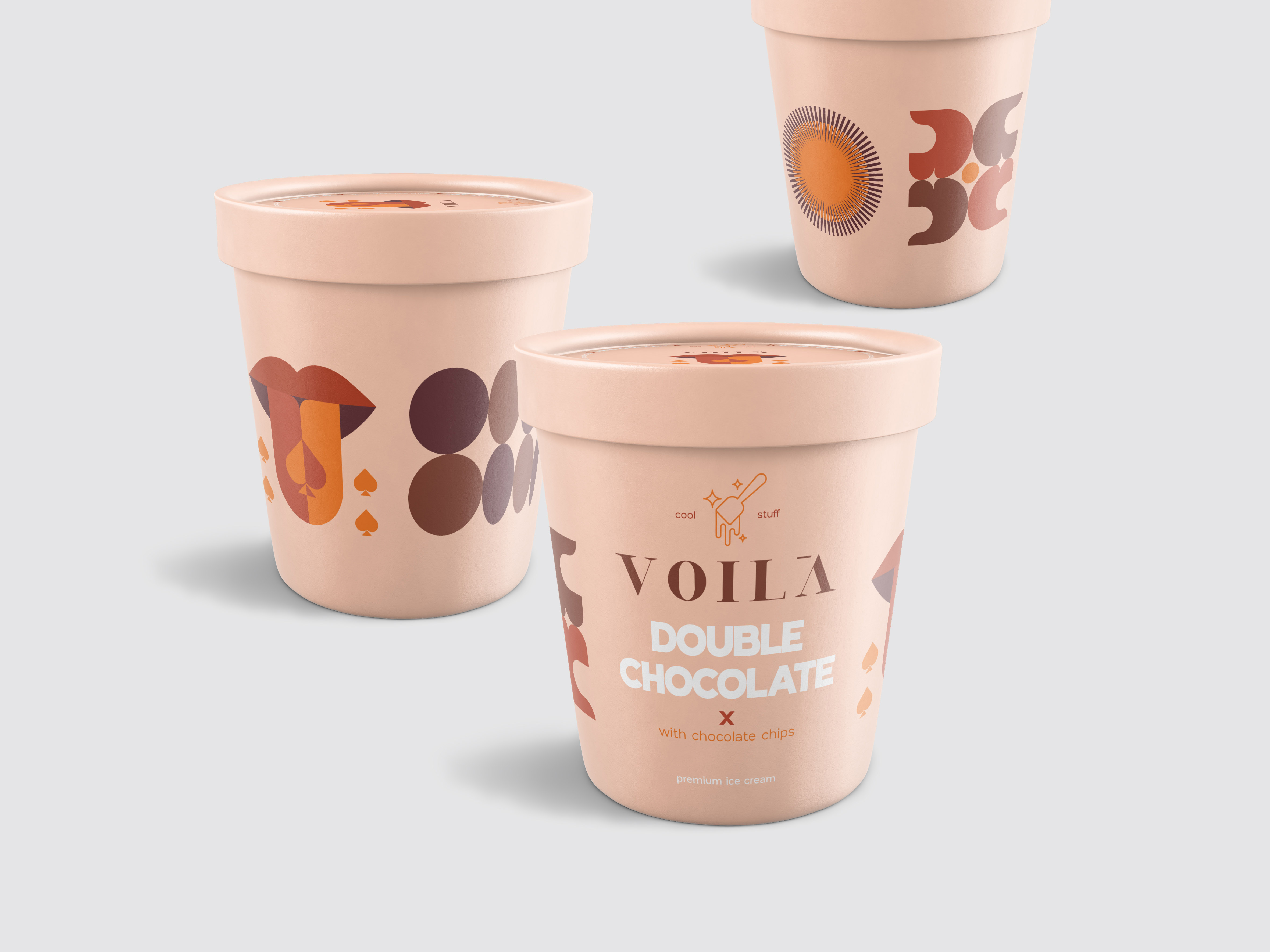
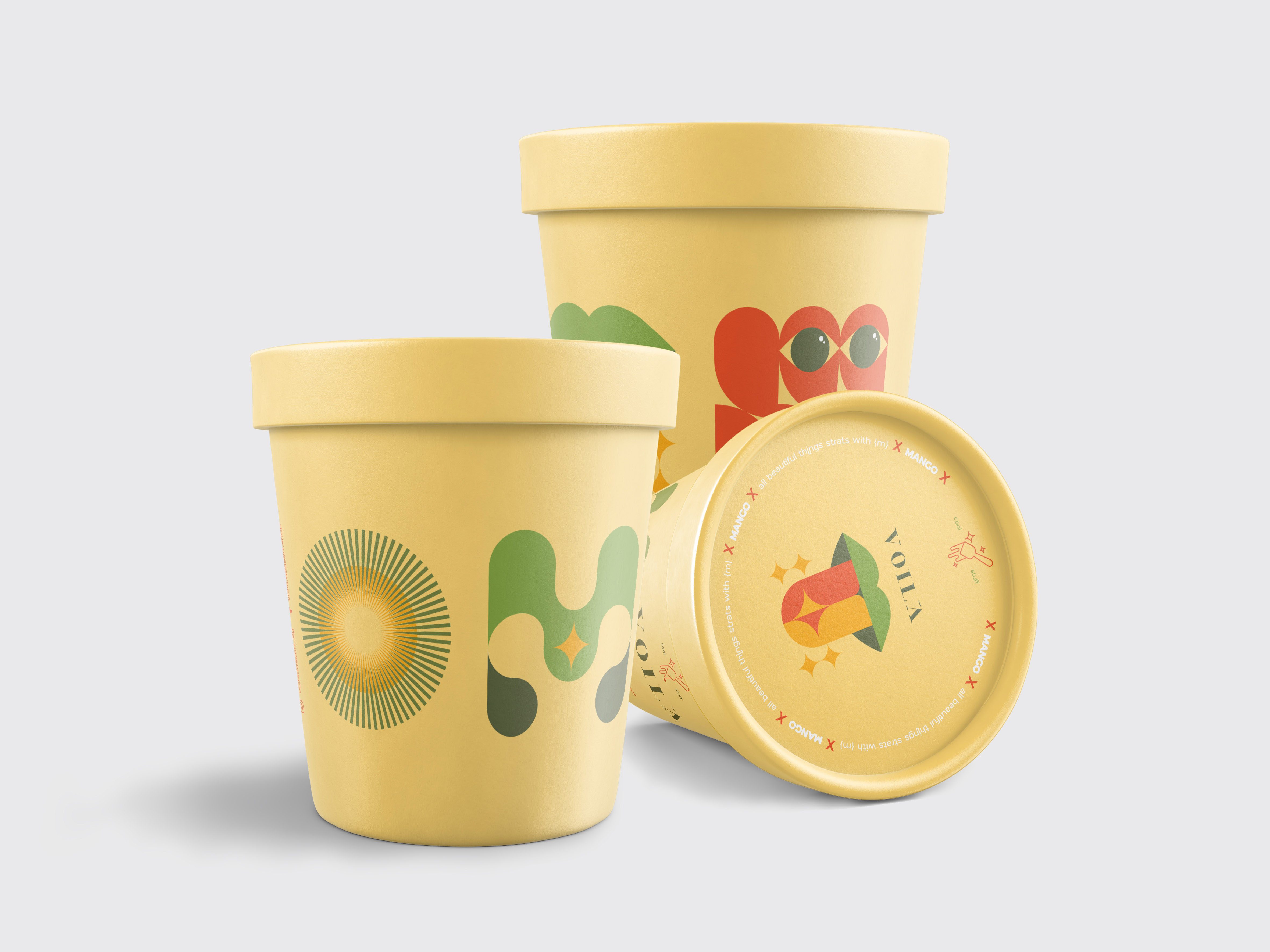
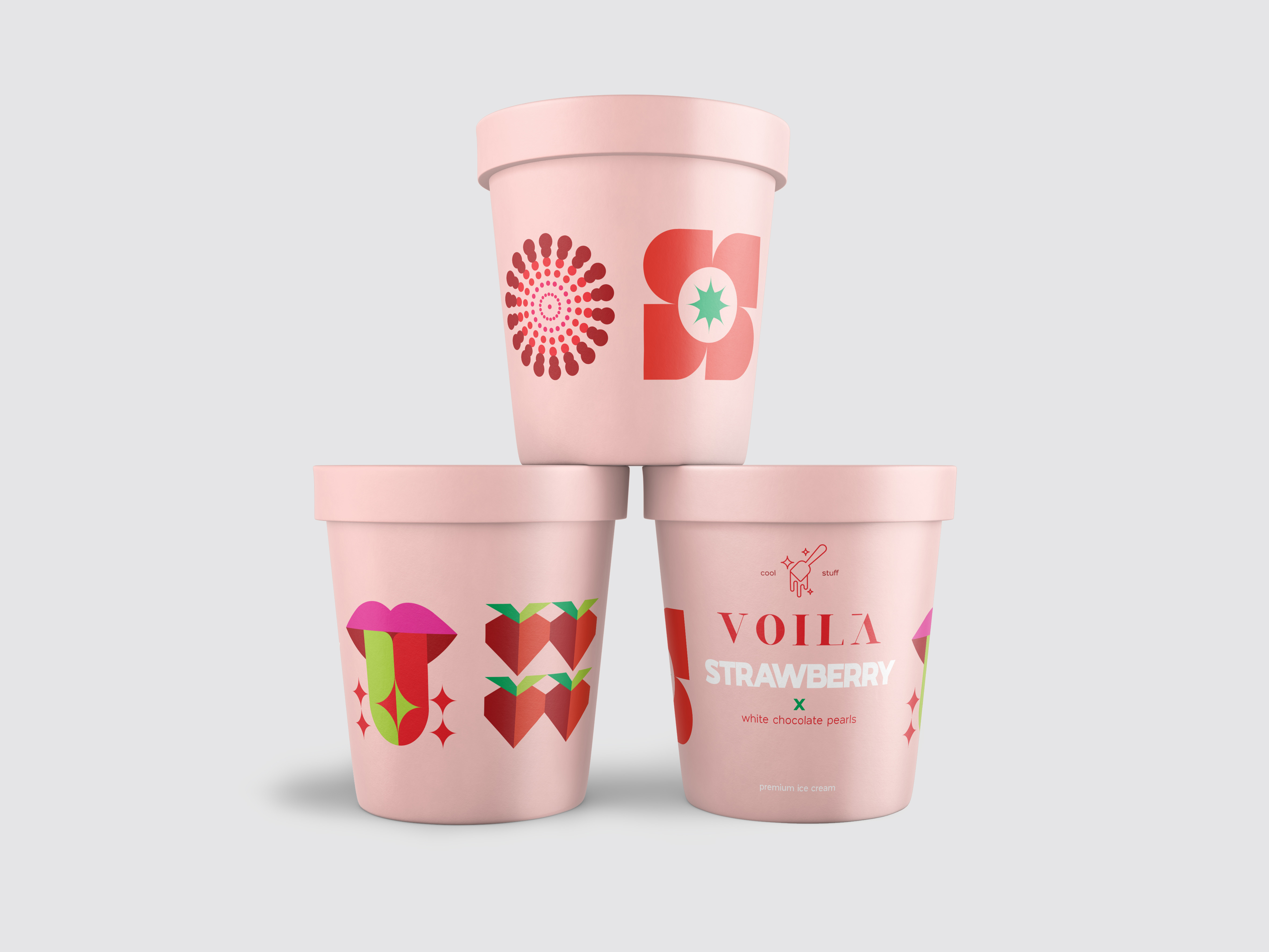
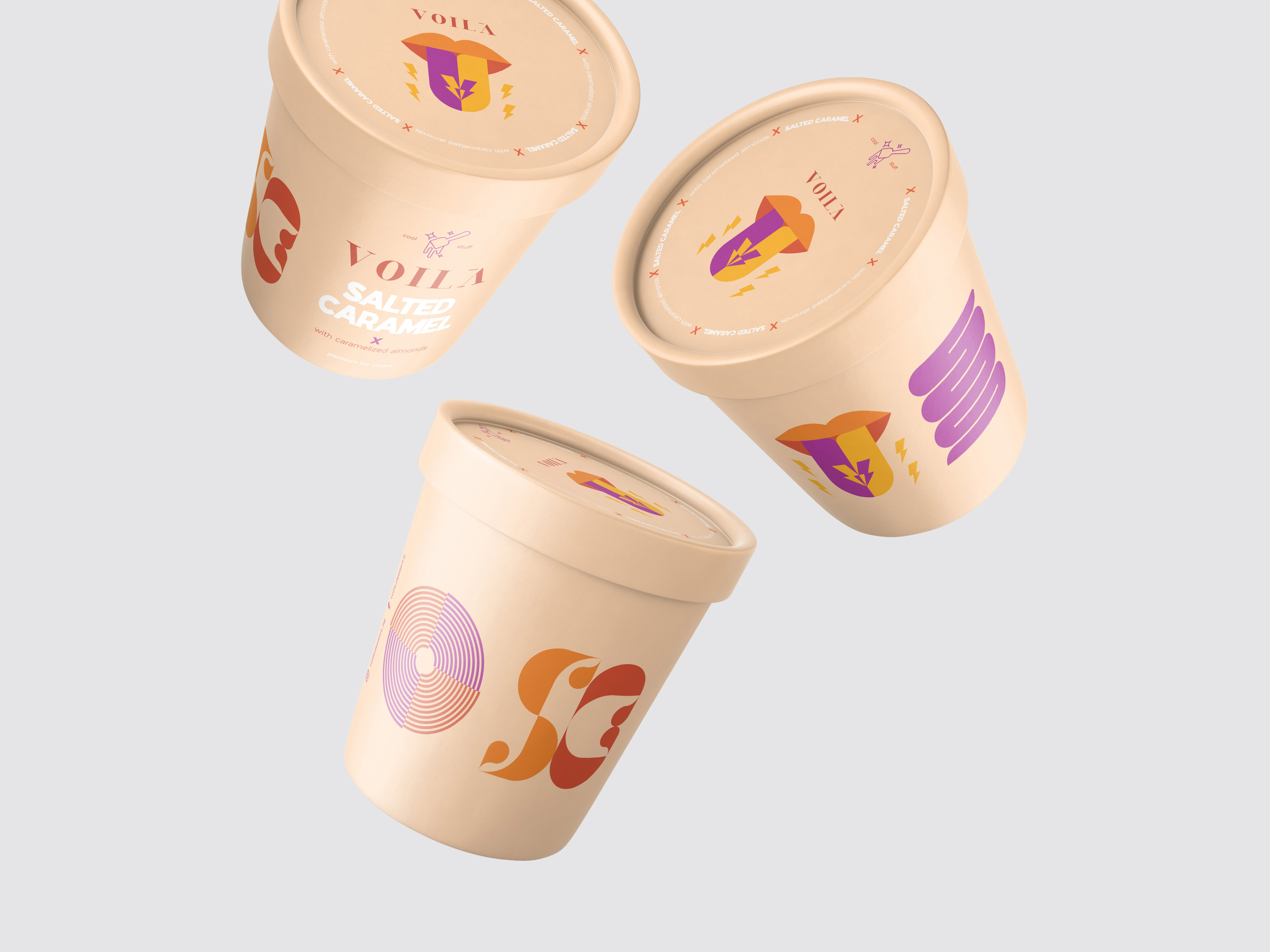
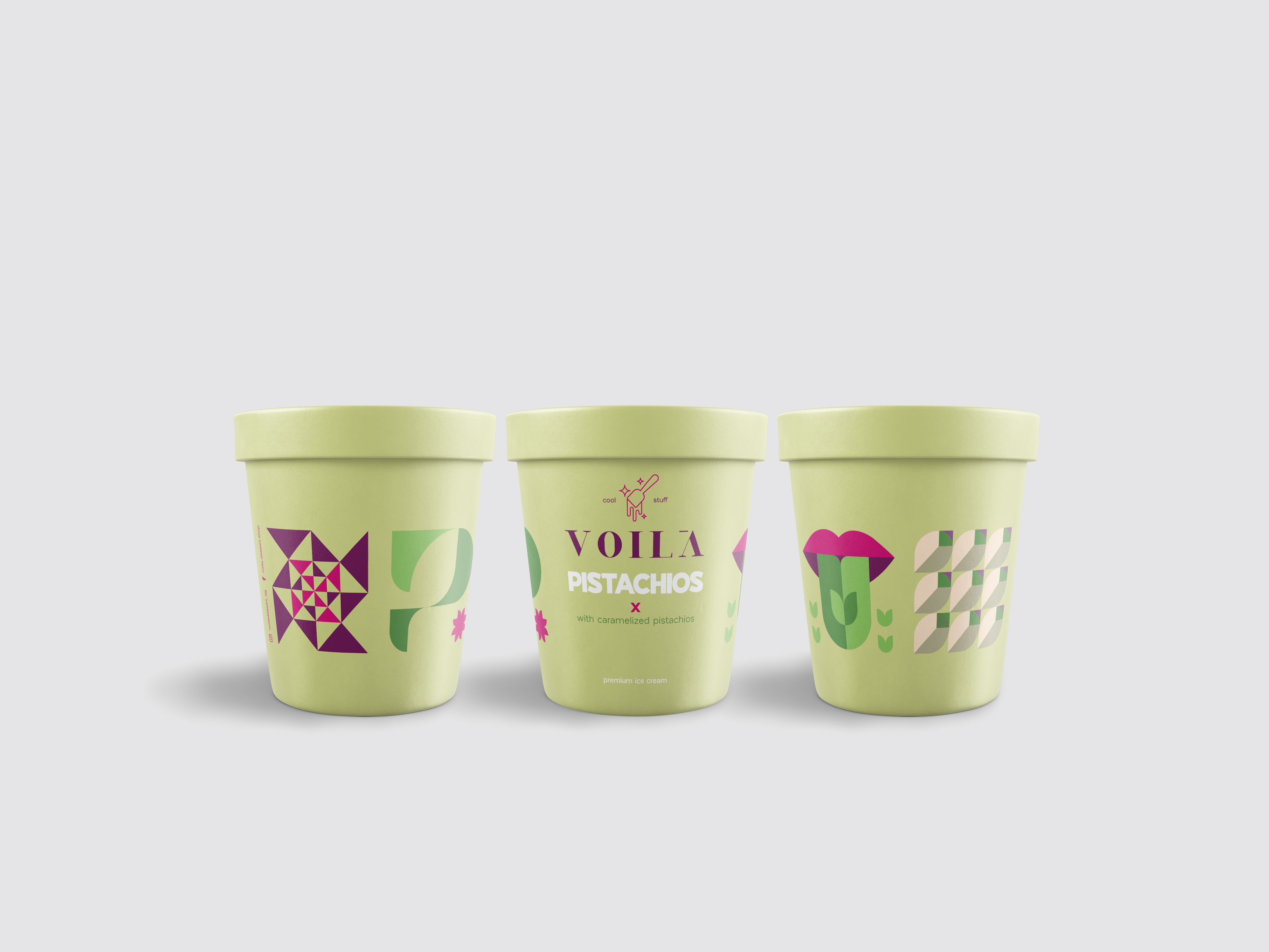
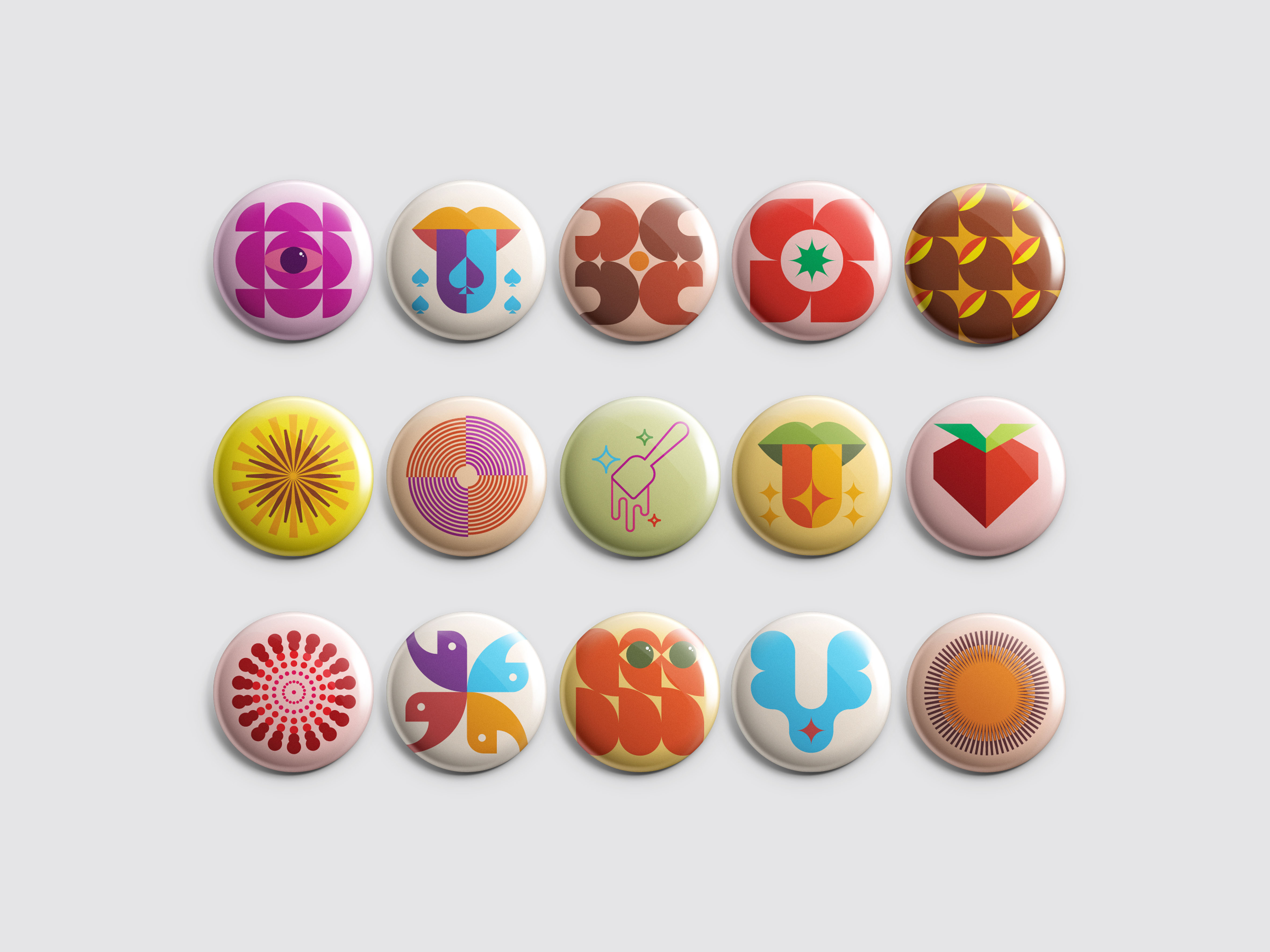
Design Philosophy: The challenge was to create an ice cream packaging that shows the flavours subtly without having to include the traditional fruits or ice cream images… But instead, we wanted to create an illustration language that beautifully translates the flavour as well as communicate the brand’s image and the high product’s quality standards. Each label has a differentiating colour combination that is relatable to the flavour; with a bold readable title in the middle, and each label includes 4 main icons; the flavour pattern, the tasting tongue, the flavour typo, and the exciting optical illusion icon
The Flavor Pattern: moving away from the traditional images and direct flavour illustration; inspired by the flavours’ elements and lines; we created a distinctive geometric pattern assigned for each label; communicated the dominant flavour of the pack harmoniously with the rest of the icons and the unique colour palette assigned.
The Tasting Tongue: Ice cream is meant to be licked, and enjoyed with all the taste buds in the tongue… each group of flavours has a unique impact on our taste buds, thus we grouped the flavours by their taste effect into 4 main categories. (Spade) the loved classics like the all-time favourite chocolate ice cream. (Spark) the spark of the fresh taste like that of the fruity flavours (Electric bolt) the clash of flavours that creates unforgettable experiences like yoghurt berry or salted caramel. (Flower) represents all the nutty rich flavours that elevate any ice cream taste
The Flavor Typo: Inspired by the flavour lines and elements we created a unique initials typo for each flavour.. connecting it with the colour palette, and flavour pattern, you will be able to easily differentiate each flavour on the shelve and quickly grab your favourite bucket!
The Exciting Optical Illusion: We all experience ice cream differently but we can all agree that ice cream brings happiness and feelings of joy. The different experiences are presented in fun optical illusion elements whether it is a dazzling, explosive, loud, oriental, soft, or fun effect.
Colour Combinations: As we were creating a new direction for the ice cream packaging we wanted the flavours to be easily differentiated in an elegant way… and choosing each flavour’s colour palette was as essential as the illustrations themselves. We chose soft baby colours as the main background with more striking icons to grab the attention. Colour coding the labels was vital to differentiate the flavours and tie all the elements together to the flavour of the pack; creating an appealing ice cream package that is easily spotted on any shelf.
Cool Stuff! Working on this cool project was very exciting for our team in Bold Branding, and to create a design language that works with 9 different flavours – so far and ready for expansion – was a challenge that we enjoyed creating and executing!
CREDIT
- Agency/Creative: Bold Branding
- Article Title: Bold Branding Creates Identity and Packaging Design for Egyptian Voilà Dessert Retail Brand
- Organisation/Entity: Agency
- Project Type: Packaging
- Project Status: Published
- Agency/Creative Country: Egypt
- Agency/Creative City: Cairo
- Market Region: Middle East
- Project Deliverables: 2D Design, Art Direction, Brand Creation, Brand Design, Brand Experience, Brand Identity, Brand Naming, Brand Tone of Voice, Creative Direction, Design, Packaging Design, Packaging Guidelines, Typography
- Format: Bucket
- Substrate: Plastic, Pulp Carton
- Industry: Food/Beverage
- Keywords: Ice Cream, Branding, Illustration, Packaging, Identity, Creative, Typography
-
Credits:
Designer: Kamal Rizk
Project Manager: Sarah El Kasaby


