Lemon Paper Scissors – A Real Story
Ever seen a transparent tree? In 2016, Swedish Tonic disrupted the tonic shelves with the introduction of real cinchona bark, making their tonic stand out as un-filtered, non-transparent, hand-brewed, and organic. Their fan base was thirsty for more, and so were they. As they’ve grown, they’ve expanded their horizon to approach the whole soda game differently – the REAL way. Real passion. Real craftmanship. Real taste. Their relentless pursuit of elevating beverages has transformed them from a modest start-up to a full-fledged, albeit small-scale, soda company.
The first time we met up with the Swedish Tonic team was in a tiny garage brewery, where they gently pressed fruits by hand. All day and all night. It was seven years ago. We’ve been their agency since. Today, they hold that same genuine will to make better sodas. Never concerned of what people might think of them doing things differently, because there’s always a good reason why they do it. So, when they decided to revamp the traditional lemonade through their real-deal-filter, their attitude and new beverage once again inspired us.
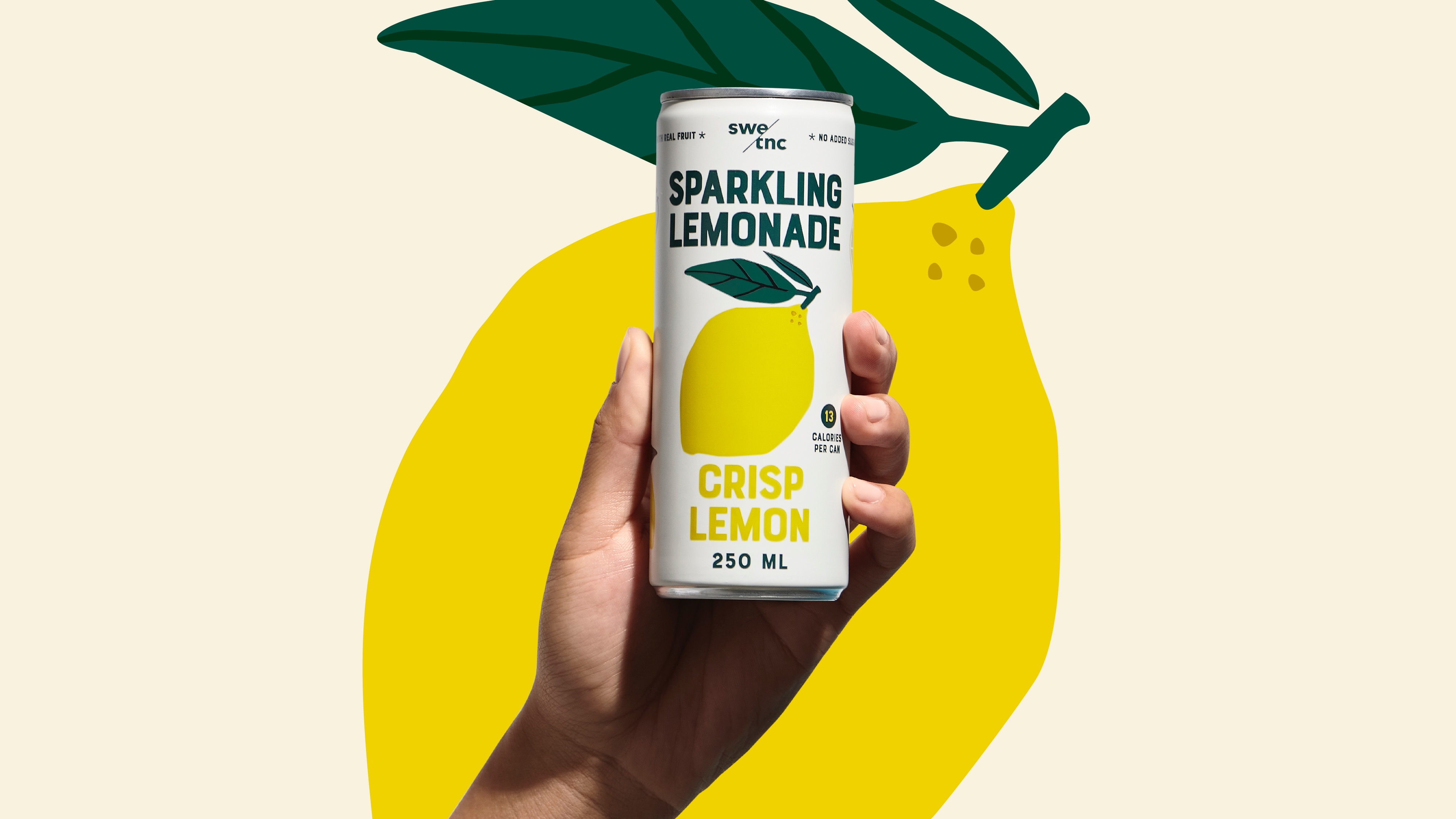
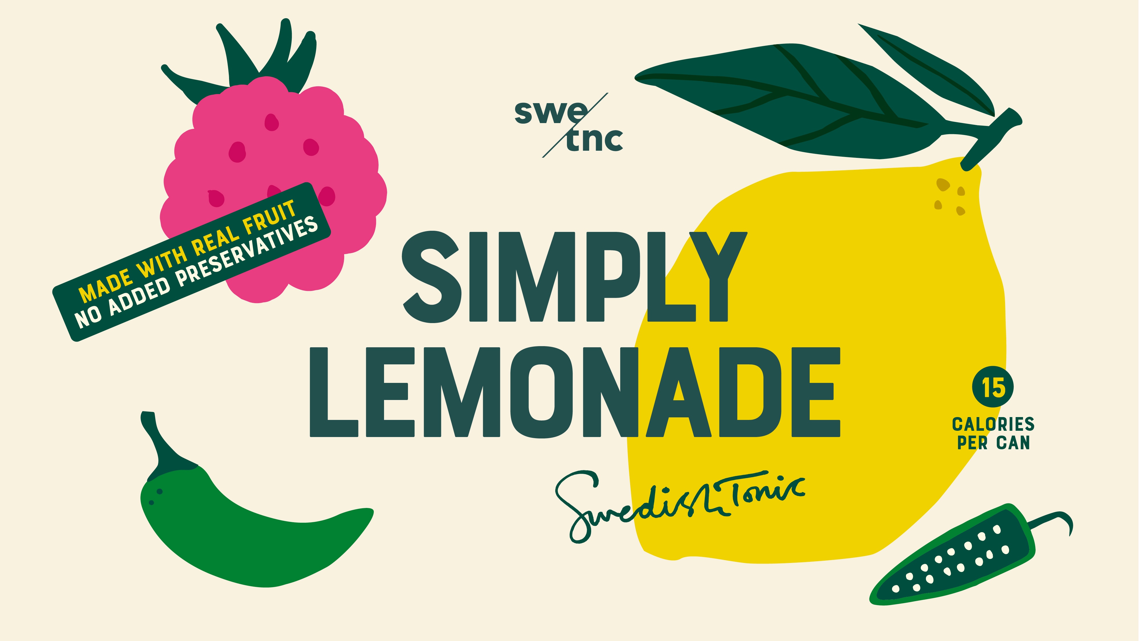
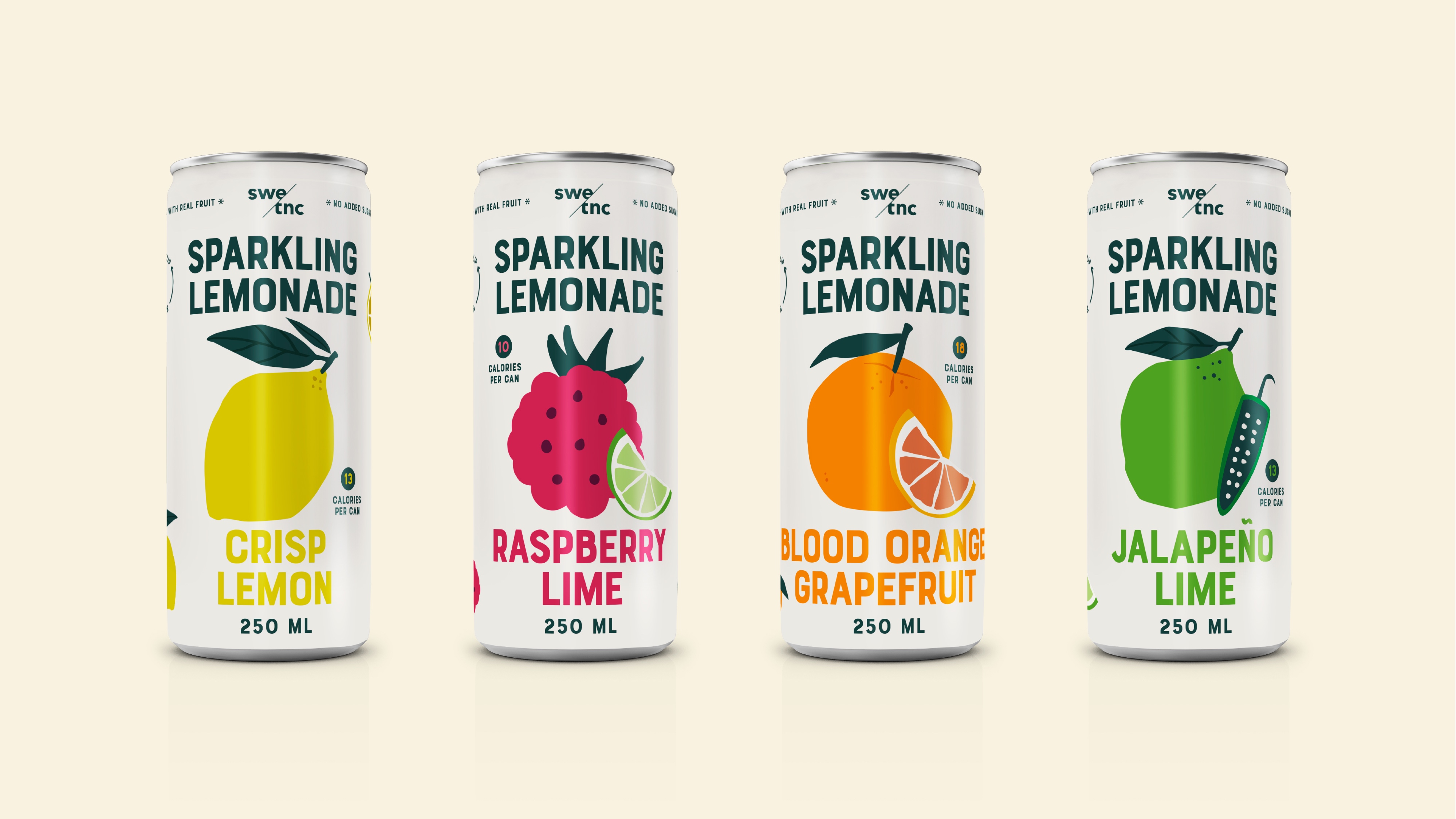
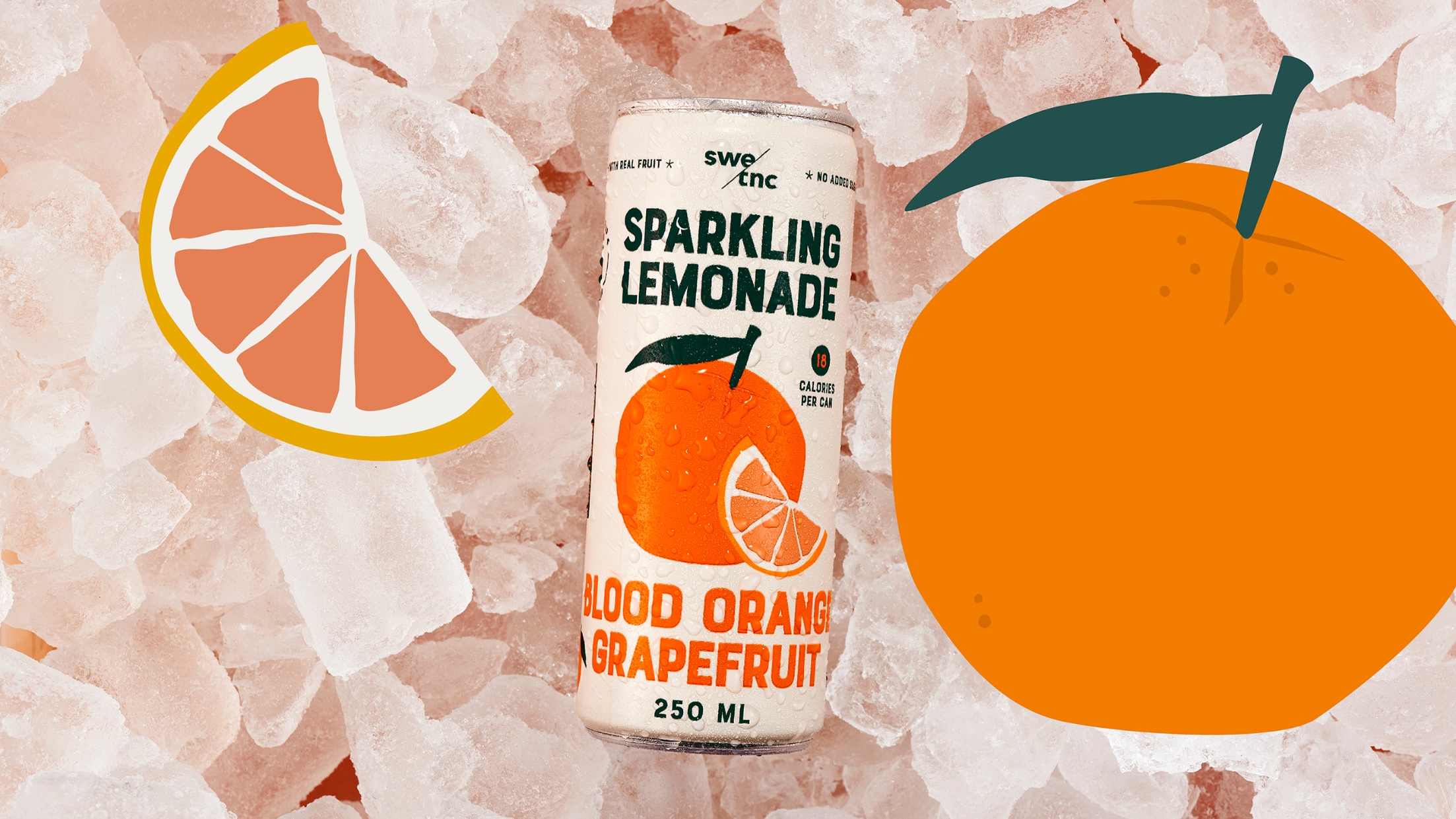
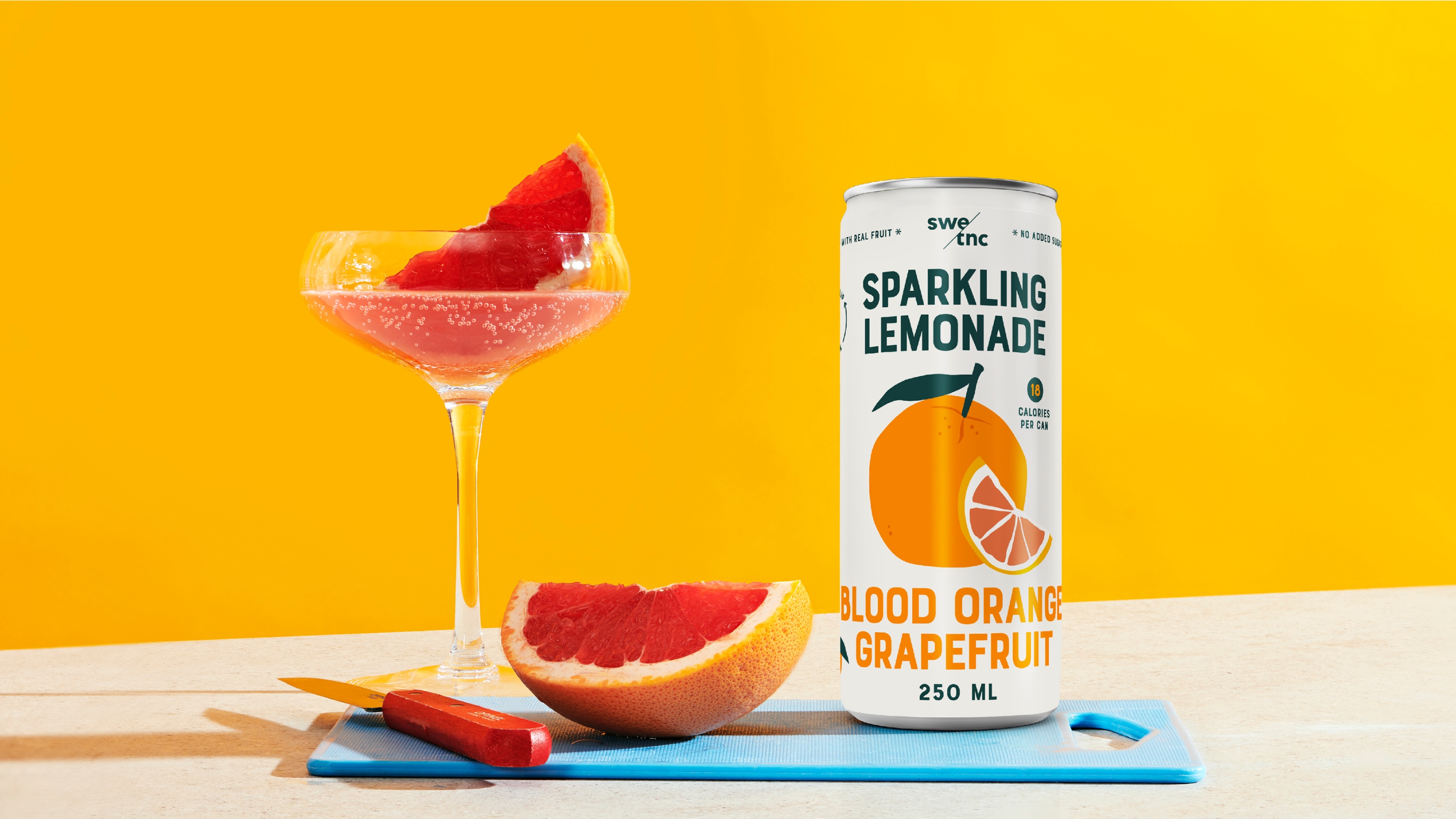
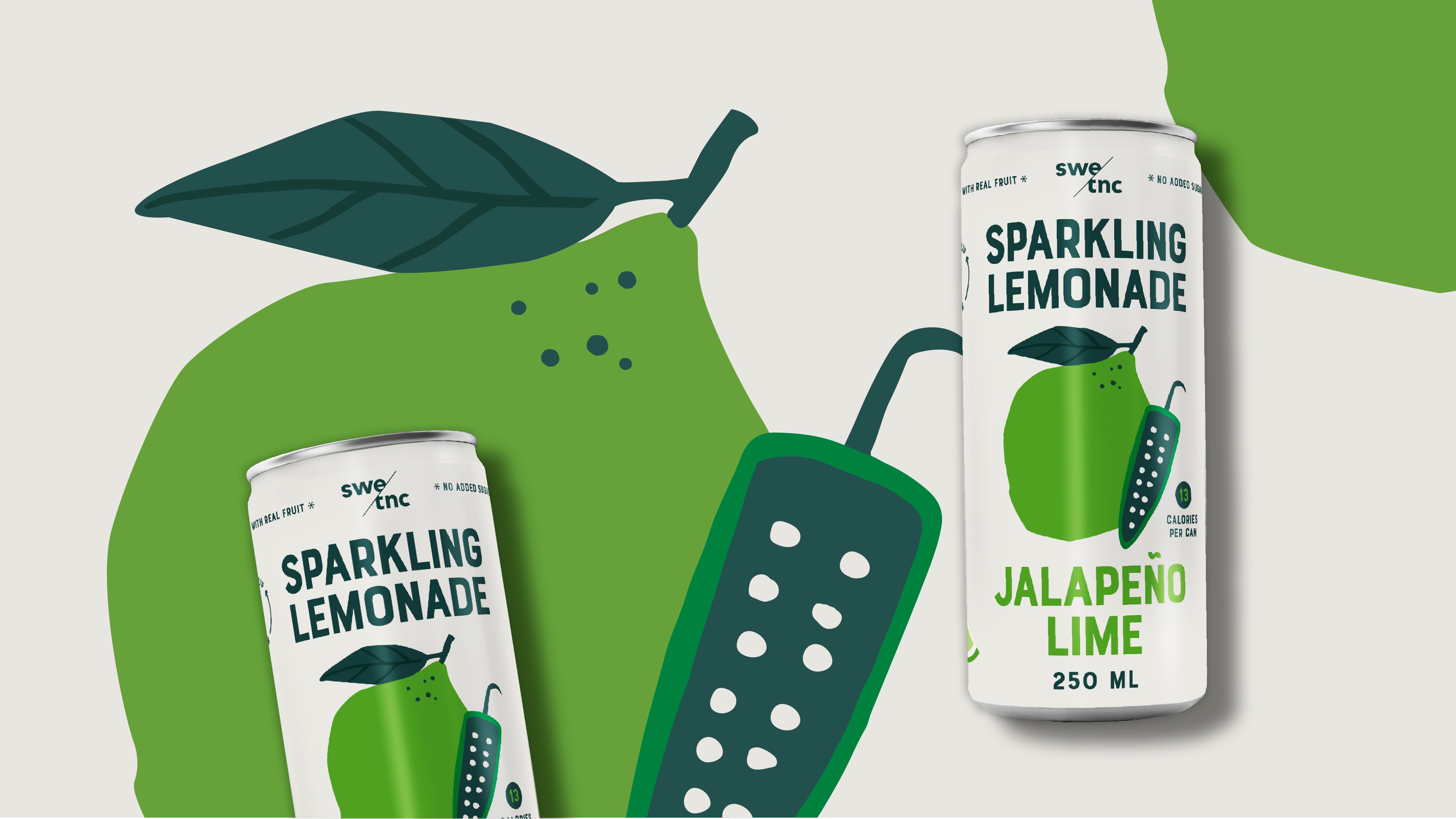
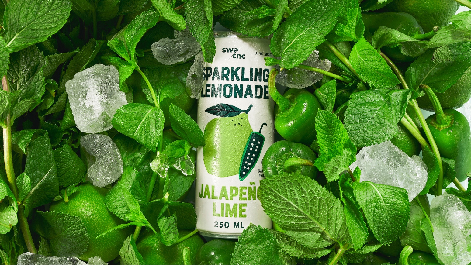
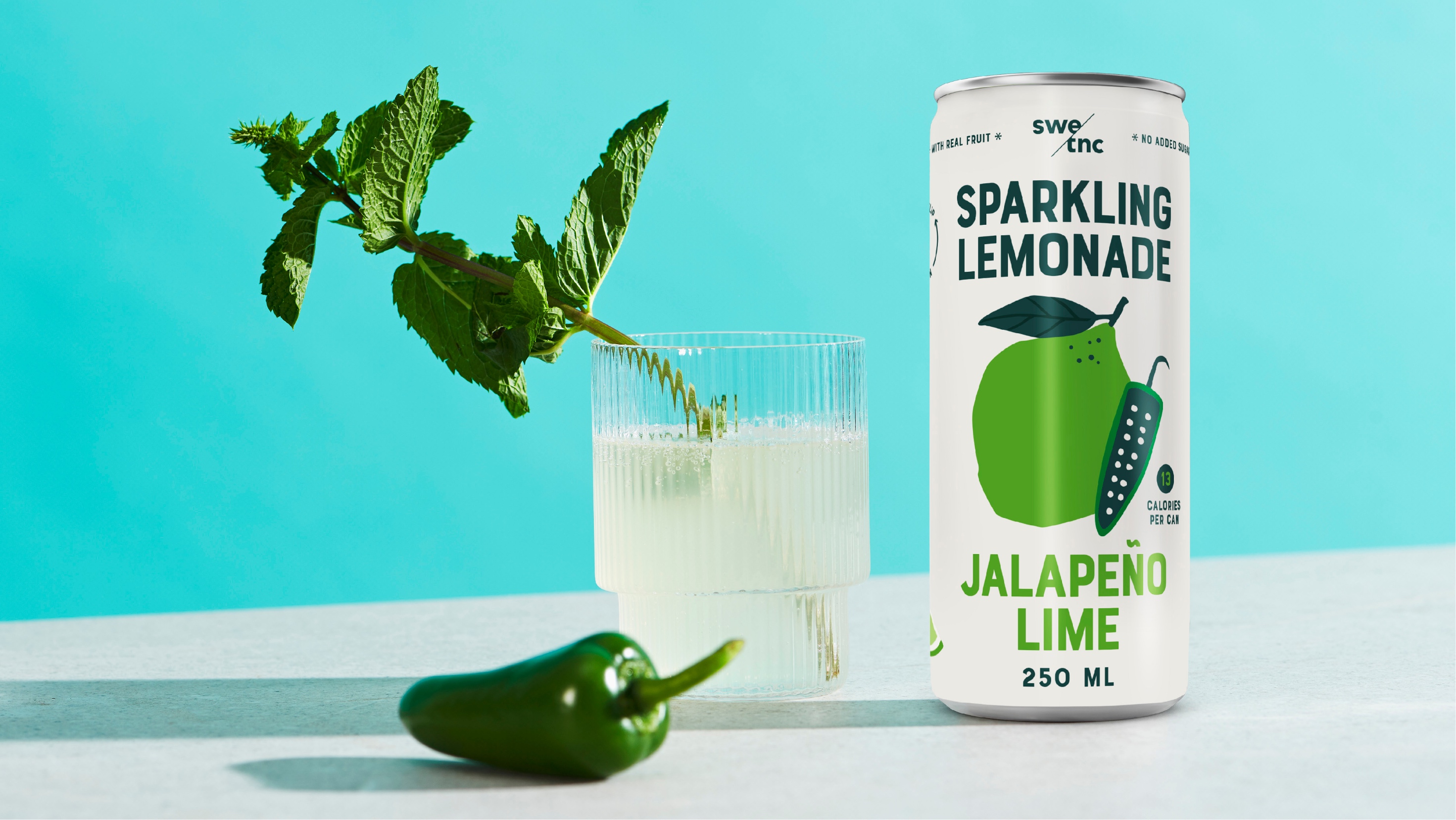
To capture this lemonade updated for the modern world, we returned to Swedish Tonic’s roots and embraced the fundamentals – lemons, papers, and scissors. The design is all about the craft and the fruits. Unadulterated and daring. The different flavours of jalapeño, lime, lemon, and raspberry take center stage with handmade illustrations in cut-out style. Raw. With freckles. Bold in a naïve manner. Rebellious in its kindness. Vibrant colours against a natural backdrop convey organic and dopamine filled fruits, all at once. The brand’s signature real-deal attitude and natural edge shine through the design.
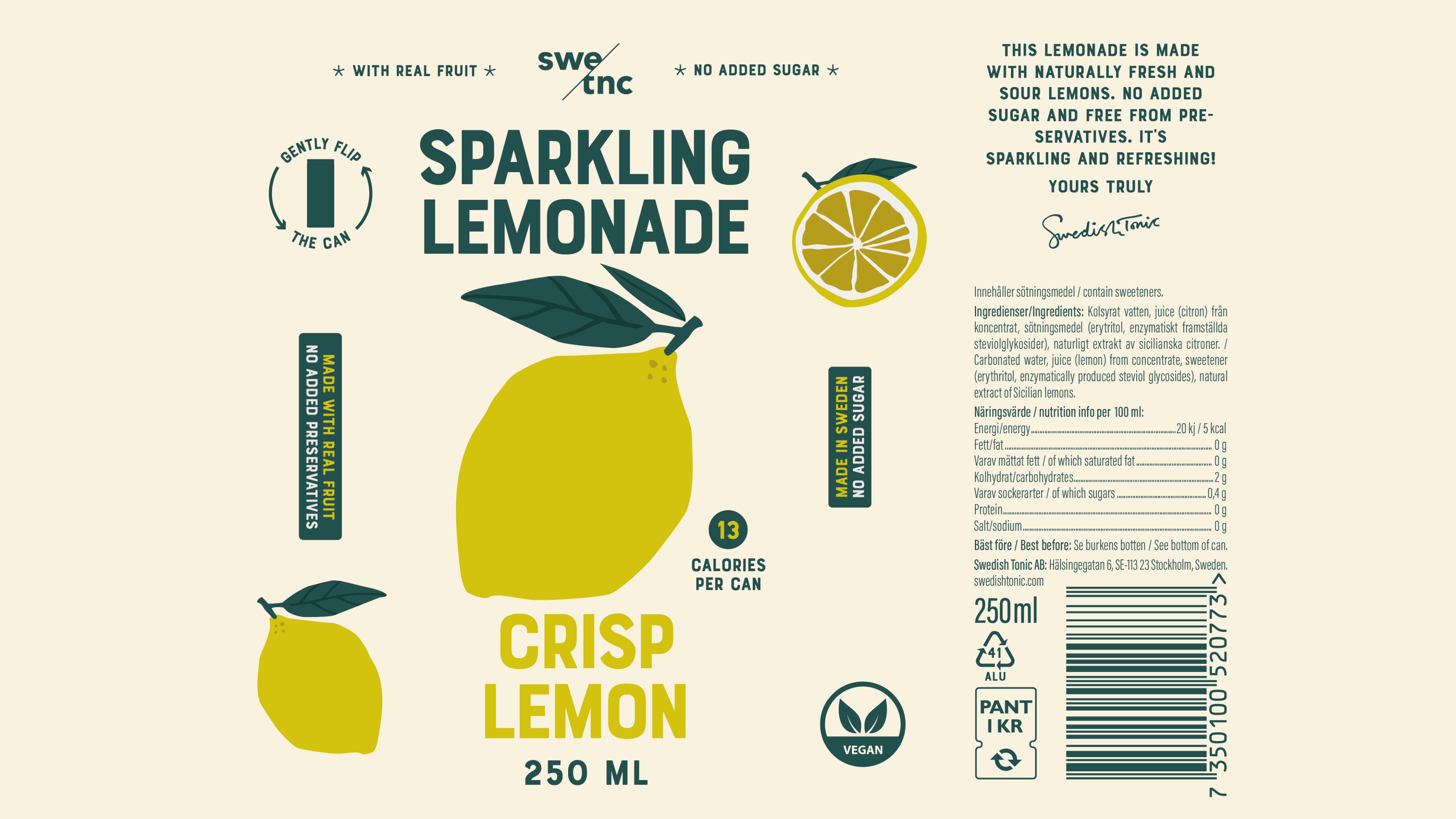
To enhance the taste experience and help consumers navigate, we added clear descriptors. With their characteristic Bourton Base typeface, we seamlessly merge the top and bottom elements to create a visually striking drink that’s irresistible while still keeping brand recognition. Together with the real-deal claims – no added sugar, low in calories, and REAL juice – the result is a label design that mirrors the lemonade’s sparkling, fruity, and fresh character.
And it’s a success! Swedish Tonic has broadened its reach and captured the attention of a younger audience with this modernized lemonade. The distribution has also widened into design-led retailers and art fairs. It’s no longer just a competitor in the world of lemonades; it’s become a naturally fresh alternative to sugar-laden sodas and energy drinks.
CREDIT
- Agency/Creative: Pond Design
- Article Title: Bold and Fresh Packaging Design for Swedish Tonic’s Lemon Paper Scissors
- Organisation/Entity: Agency
- Project Type: Packaging
- Project Status: Published
- Agency/Creative Country: Sweden
- Agency/Creative City: Stockholm
- Market Region: Europe
- Project Deliverables: Packaging Design
- Format: Can
- Industry: Food/Beverage
- Keywords: WBDS Agency Design Awards 2023/24
- Keywords: Packaging Design, Product Creation
-
Credits:
Managing Partner: Johanna Augustin
Production Manager: Niclas Hemlin
Creative Partner / Graphic & Interior Designer: Viktoria Hamberger
Junior Designer: Måns Rydh
Copywriter: Emma Hagberg
Production Designer: Anna Johansson


