Design Dimensions – White Rhino Brewing Co. – Brand Identity
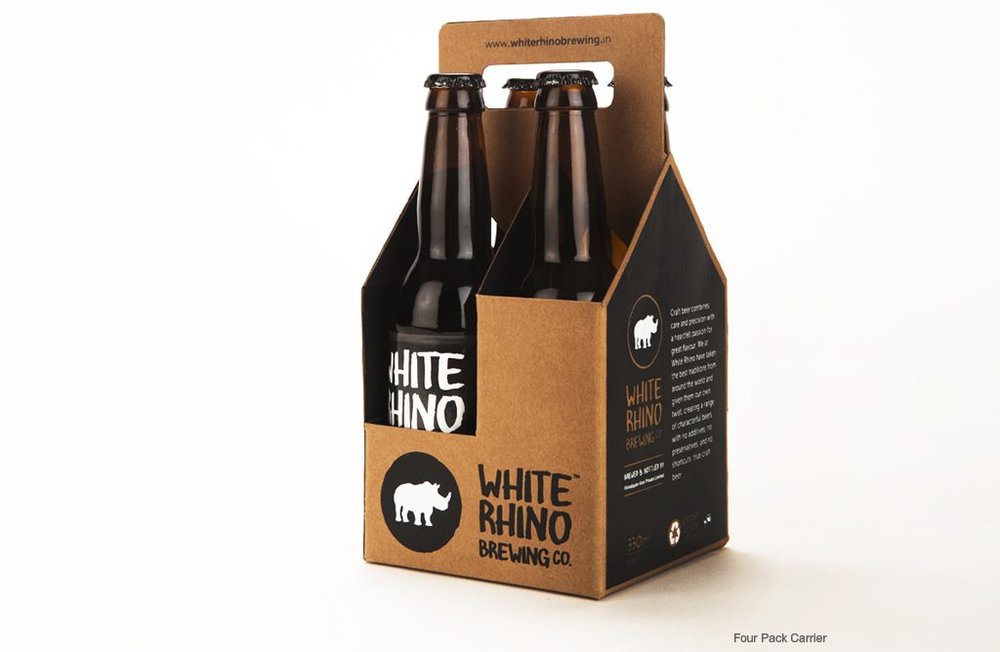
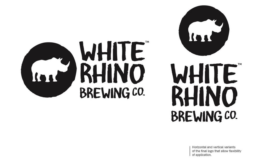
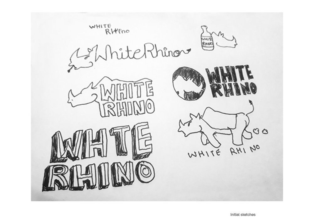
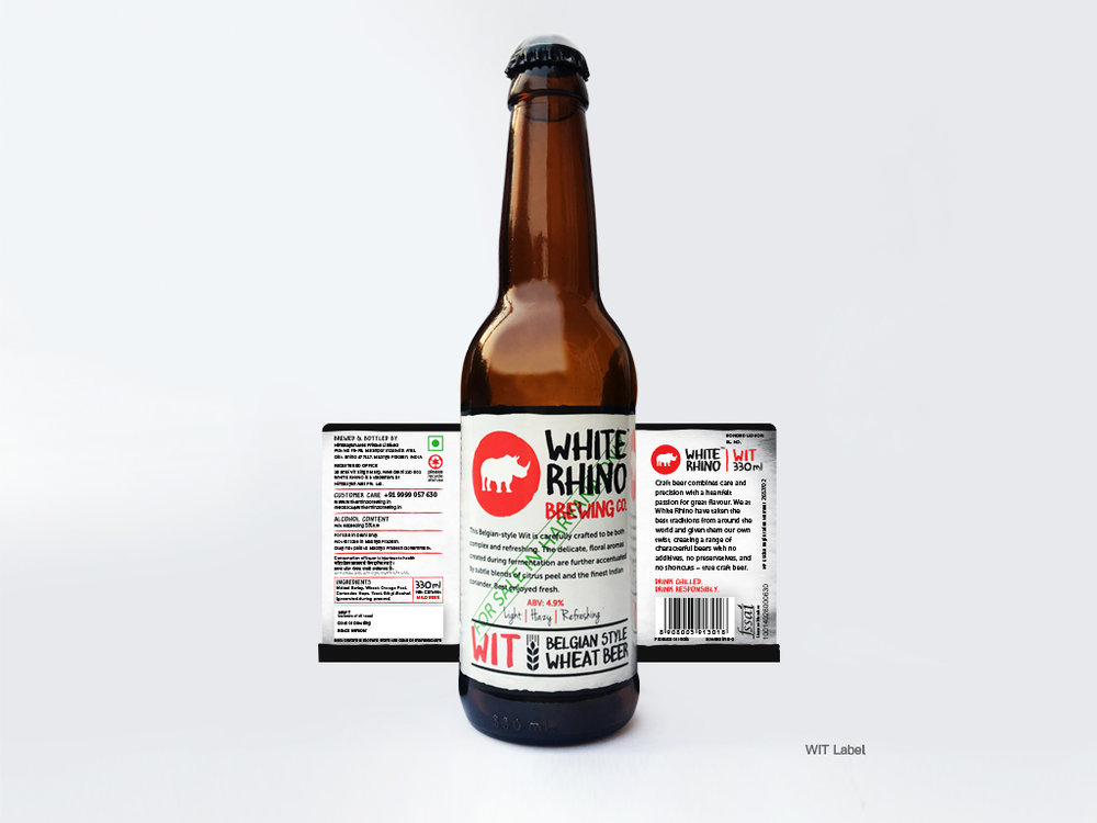
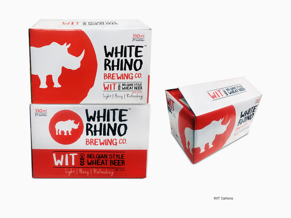
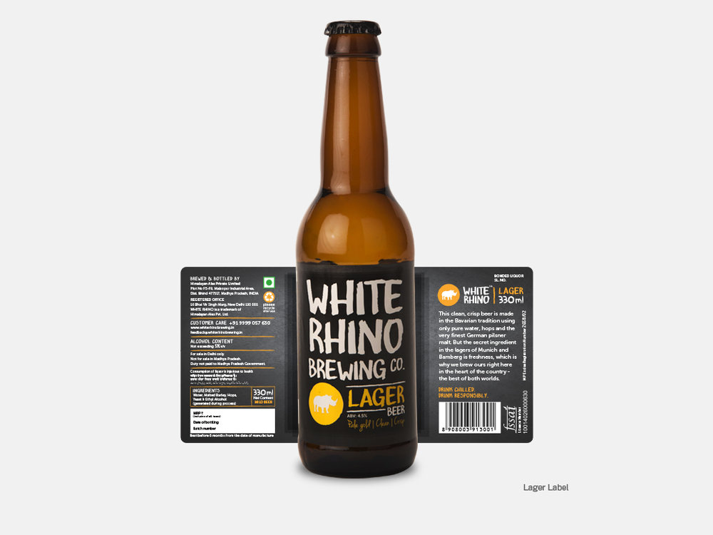
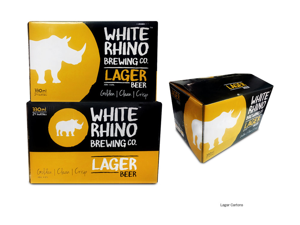
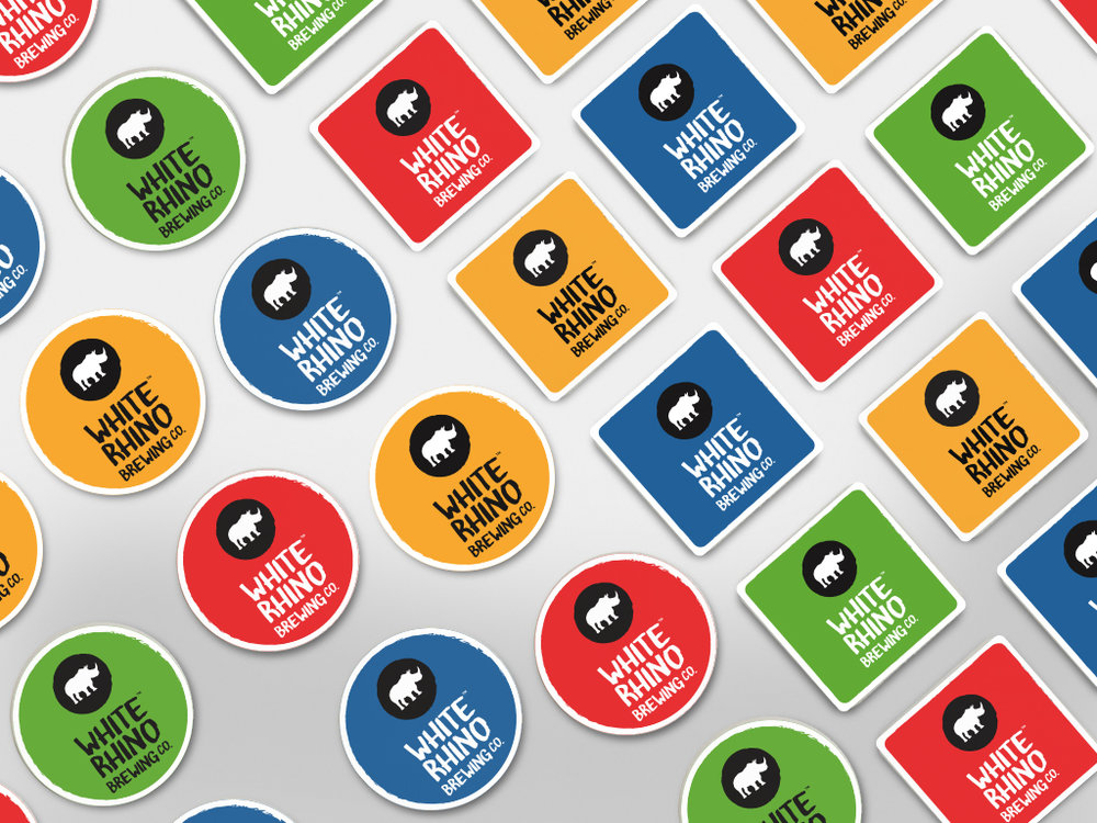
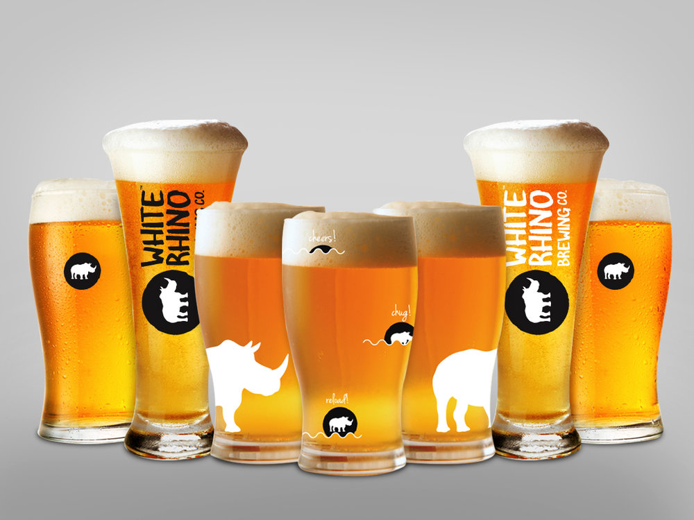
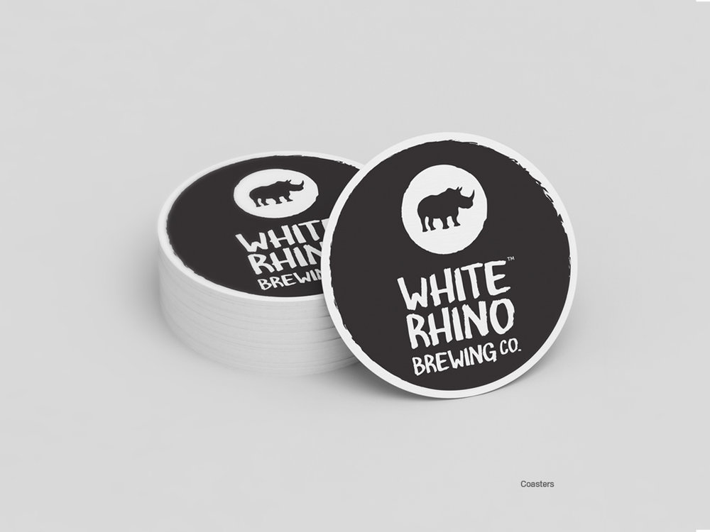
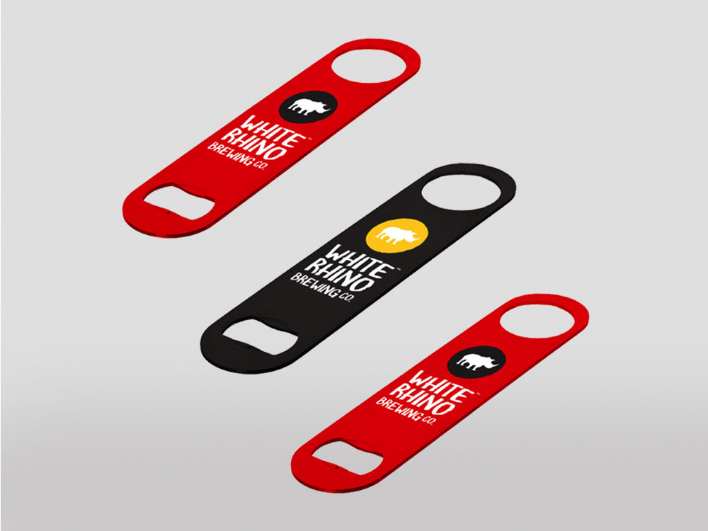
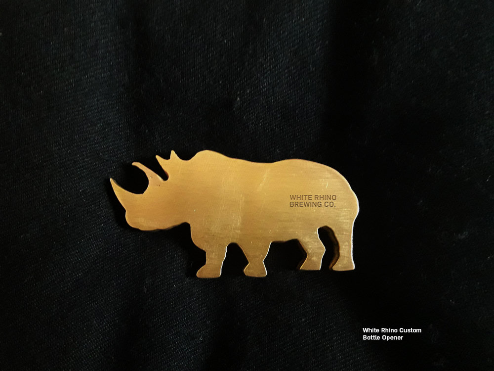
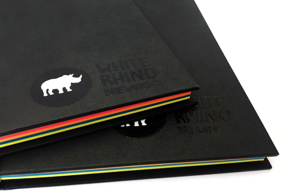
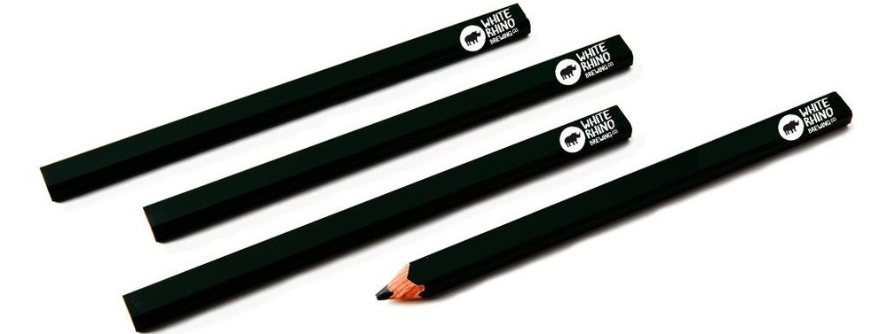
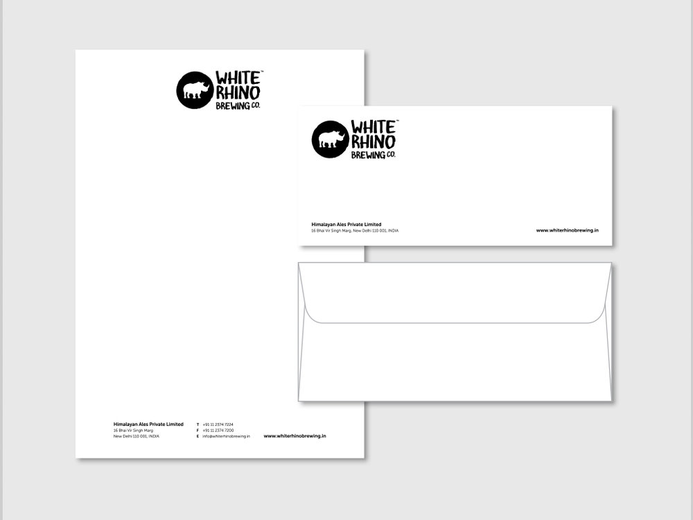
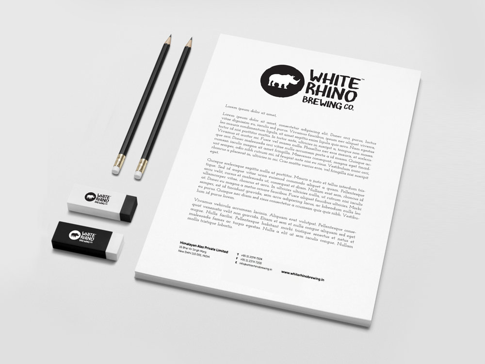
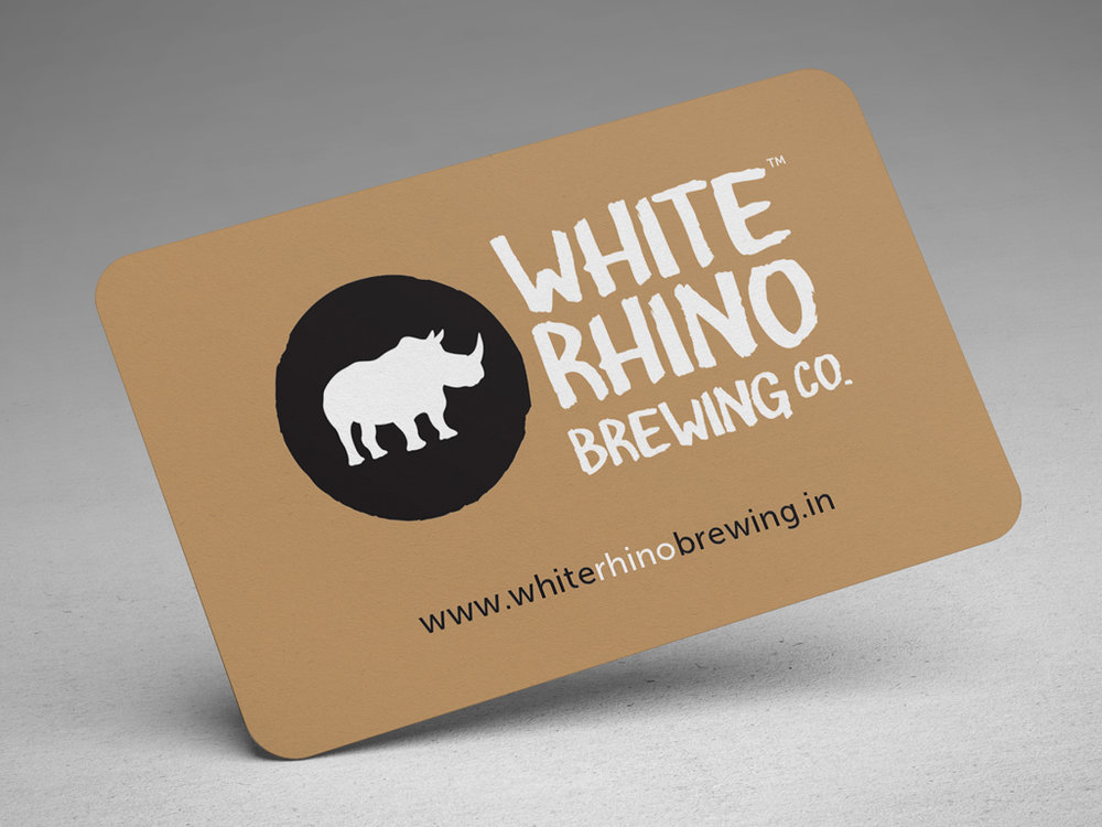
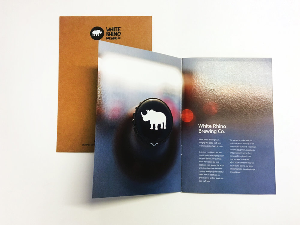
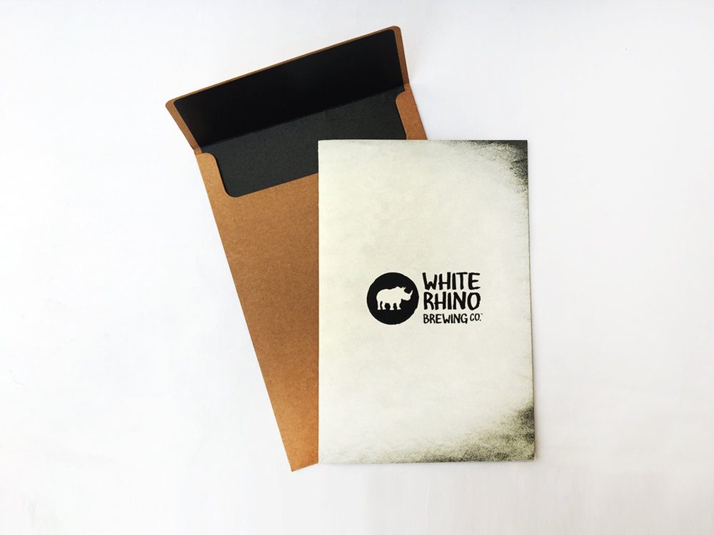
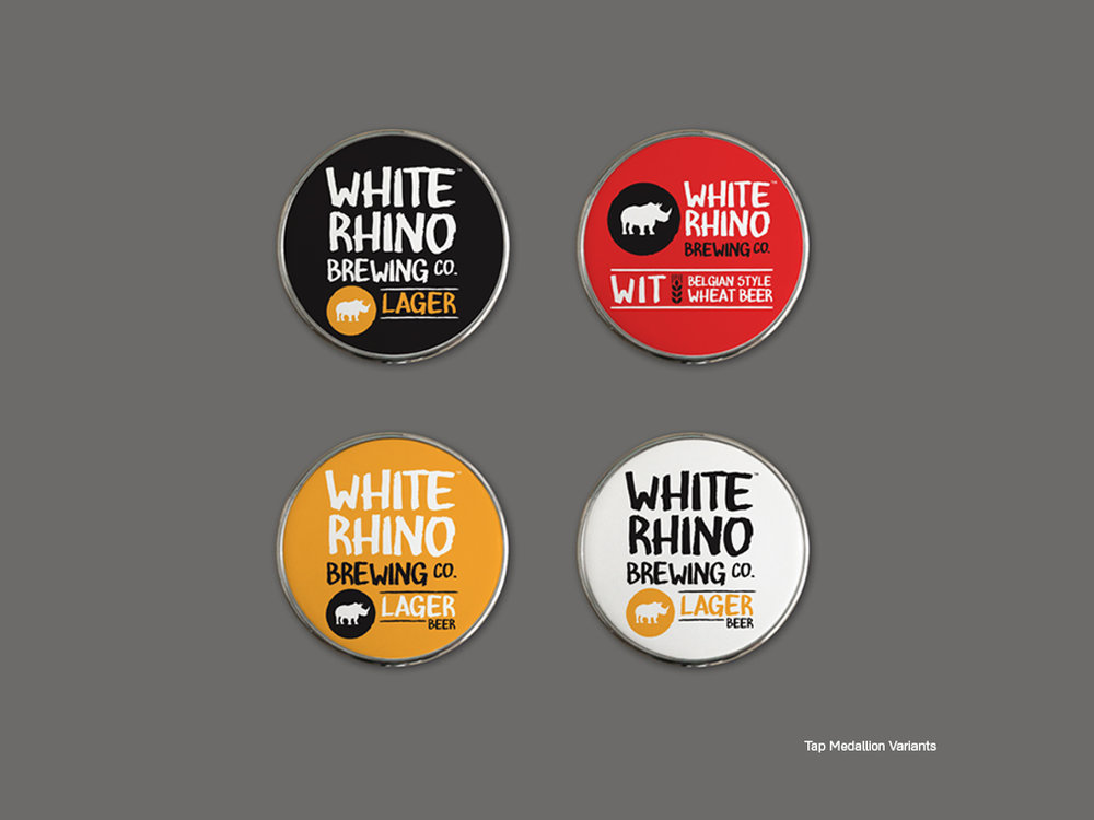
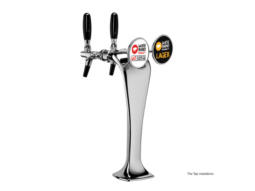
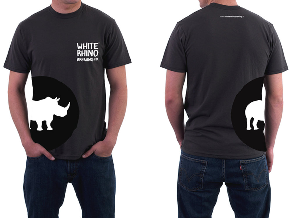
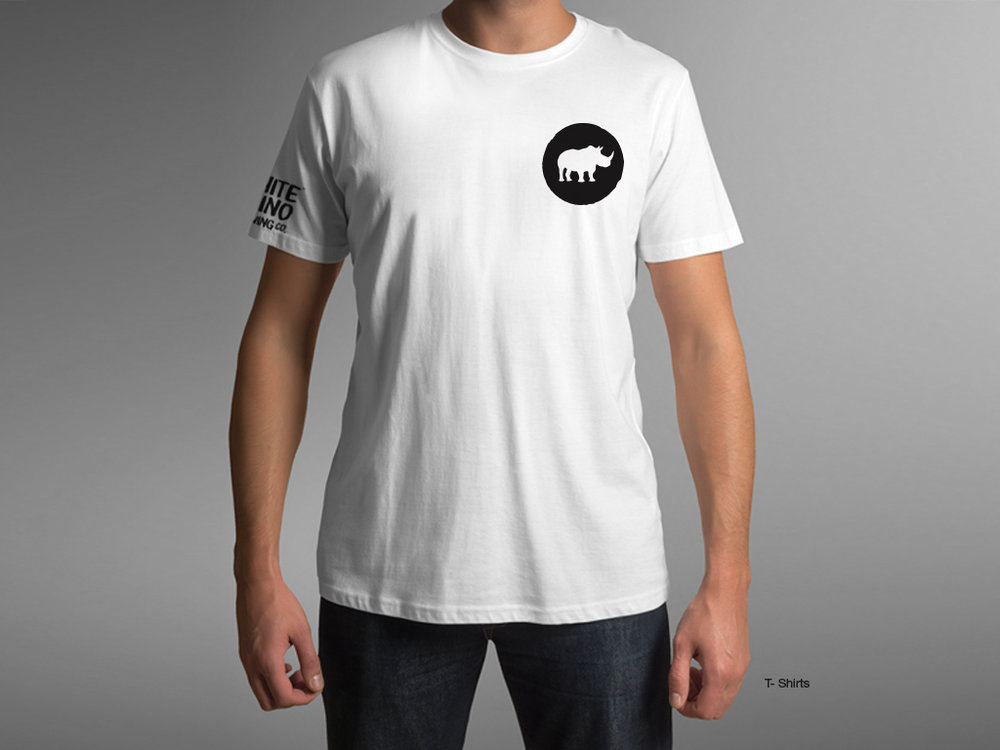
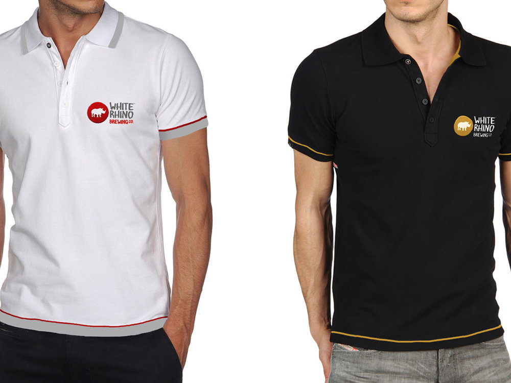
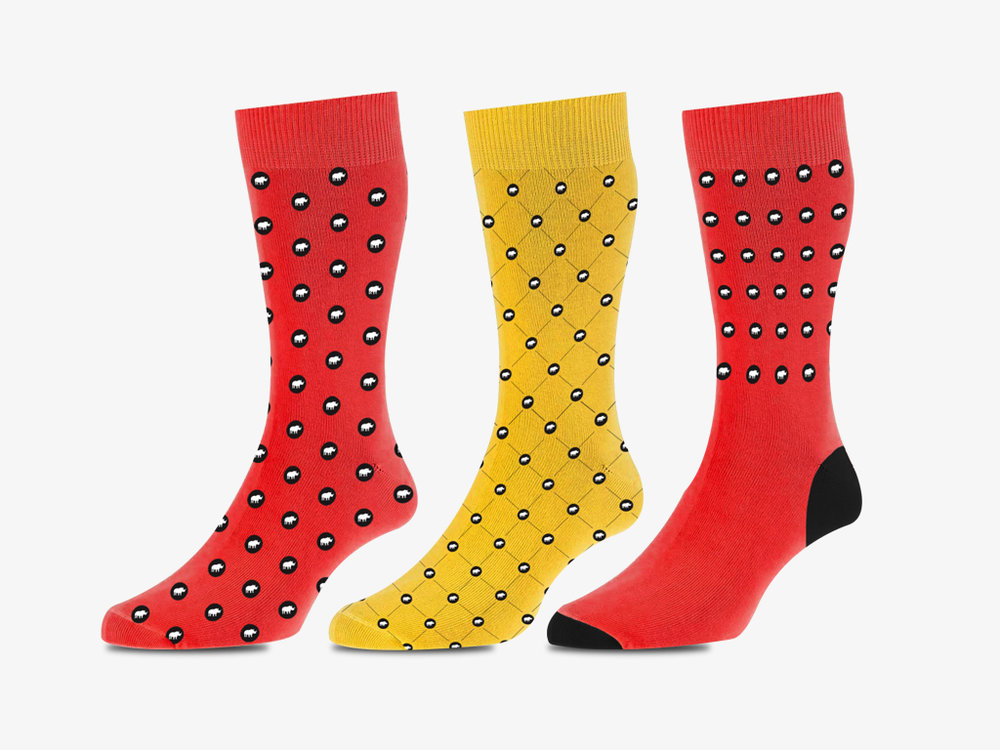
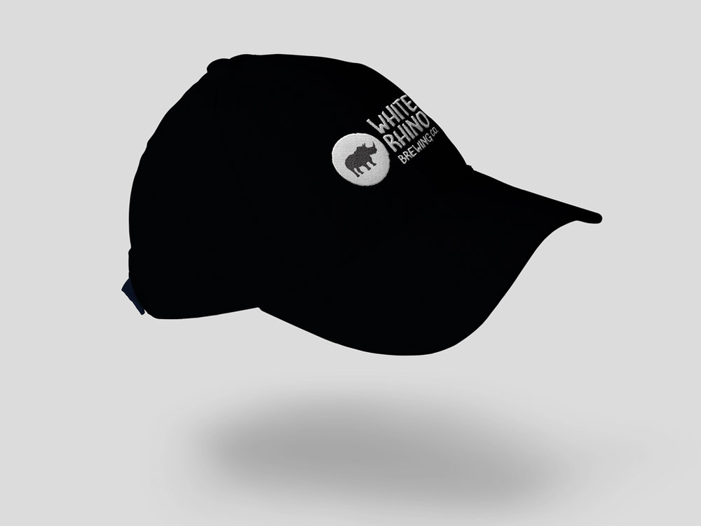
” Here’s what excites us about the latest in Indian craft beers – White Rhino Brewing Co. Three years ago, we became a part of their story. The client shared with us, their intentions of crafting a wide range of eclectic brews. A rare taste that’s hard to find anywhere else, just like its namesake. They asked us to communicate their vision to reality and we instantly agreed!Until now, existing breweries have either been too small to distribute or too large to focus on flavour, leaving beer fanatics with the only alternative of opting for imported beers that are often stale. White Rhino Brewing Co. was conceived with the objective of bringing together the best ingredients, equipment and people to brew world-class craft beer right here in the heart of the country delivering kegs and bottled ales to pubs and retail outlets across geographies. We drafted a logo that is rustic but fresh and minimal, bold, iconic and confident. The brand has an open identity. Each beer comes with it’s own colour palette with a base of the classic black and white. The logo was made in two variants – horizontal and vertical to make the usage flexible for all shapes and sizes of packaging and promotional collateral. BRAND IDENTITYCraft Beer is basically beer made by educated and experienced brewers who are inspired and passionate about consistently making beer that is unique, great tasting and worth your time and money. Understanding this was important for us and we have dedicated a lot of time and creative effort into building the brand identity to reflect the ideal that this beer is unique, tastes great and is definitely worth your time and money.STATIONERYKeeping the rustic yet refined theme in mind, we opted for gloss black and matte white screen-printed business cards on brown kraft paper and minimalist black and white letterheads and envelopes.PACKAGINGFor one of the very few types of alcoholic beverages that is socially acceptable to drink straight out of its container, designing beer labels require a particular uniqueness that makes them stand out of the otherwise design bling off the shelves or at the bar.WIT is essentially wheat beer, brewed in the Belgian tradition and is designed to be complex, refreshing and eminently drinkable. Its flavour profile is almost entirely defined by its low bitterness, aromatic spice blends and the distinctive yeast strain. Best enjoyed fresh! The white background is to depict the lightness of the beer and it’s pale, hazy nature.LAGER, often deemed “brewing naked” in Germany is a clean and deceptively simple beer where it is very difficult to hide one’s faults. It is a beer that focuses on the pure flavour of malt and water in perfect harmony with just the right amount of “noble” hops. For this design we fused a charcoal grey and ochre yellow palette depicting the crisp, golden beer that Lager is.We designed the White Rhino labels amalgamating bold typography and simplistic design that highlight the characteristic elements of the beer. These labels are placed on dark amber coloured glass bottles. The tap medallions are equally important and were designed to be easily recognizable at bars and pubs.We know a good carton not just from its strength to hold all the beer together but also from it’s inevitable pull of great graphic design. The White Rhino packaging is further extended to corrugated cartons for individual labels with bold typography and clear messaging. Days and weeks were spent in materializing the utmost perfect design and strength, working with carton makers at every stage to ensure sound quality.MARKETING COLLATERALTo take the collateral further, we also designed T-shirts, socks, caps, key chains, diaries, pencils, coasters, bottle openers, beer mats, glow signage along with 4 pack carriers for their marketing team to use at business meetings, promotional events and to create a strong recall value at bars and pubs.Overall the White Rhino journey has been a creatively challenging and fulfilling one for us. We can’t wait for you to see it on the shelves at pubs and bars across the country, stocked at retail stores and in the hands of beer aficionados. We hope you enjoy every sip as much as we have enjoyed creating the brand language for this beer”
CREDIT
- Agency/Creative: Design Dimensions
- Article Title: Bold and Confident Brand Identity for the First Indian Craft Beer
- Organisation/Entity: Agency Commercial / Published
- Project Type: Packaging
- Agency/Creative Country: India
- Market Region: Multiple Regions
- Format: Bottle, Box
- Substrate: Glass, Metal, Pulp Carton, Pulp Paper


