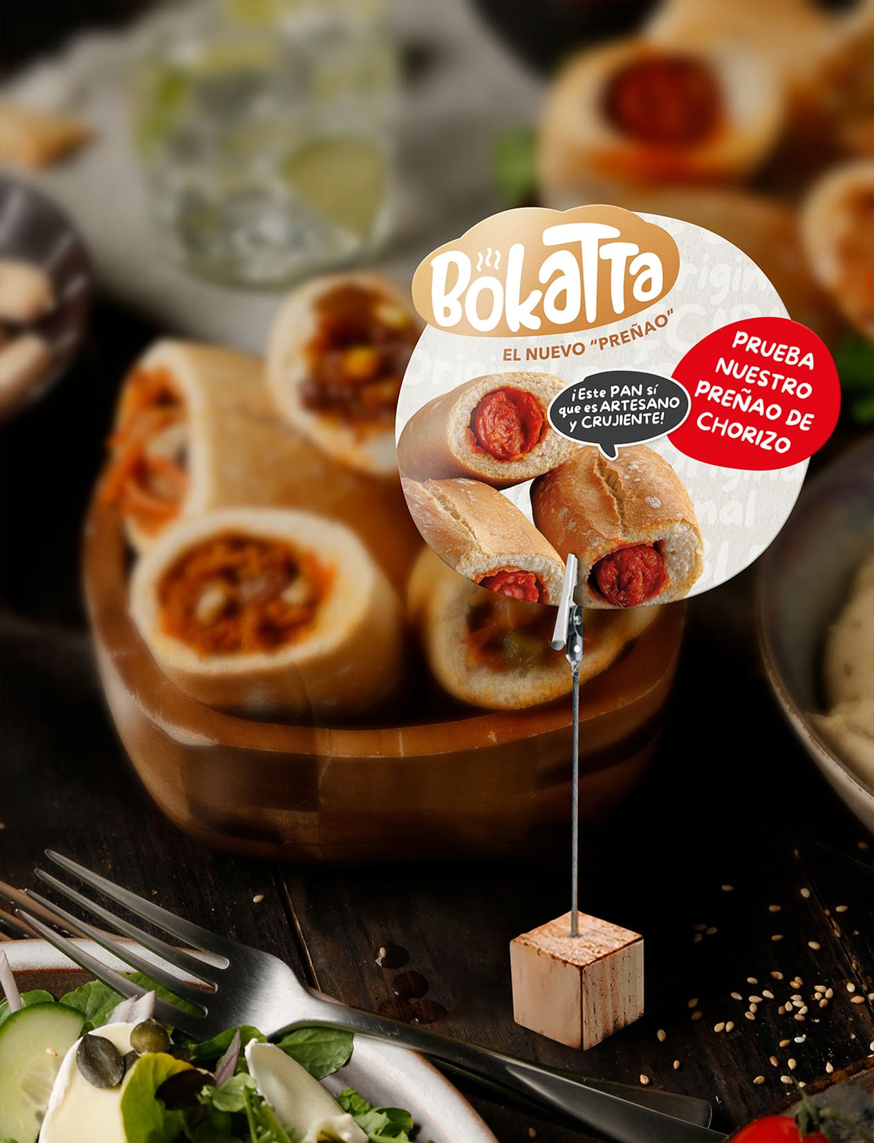
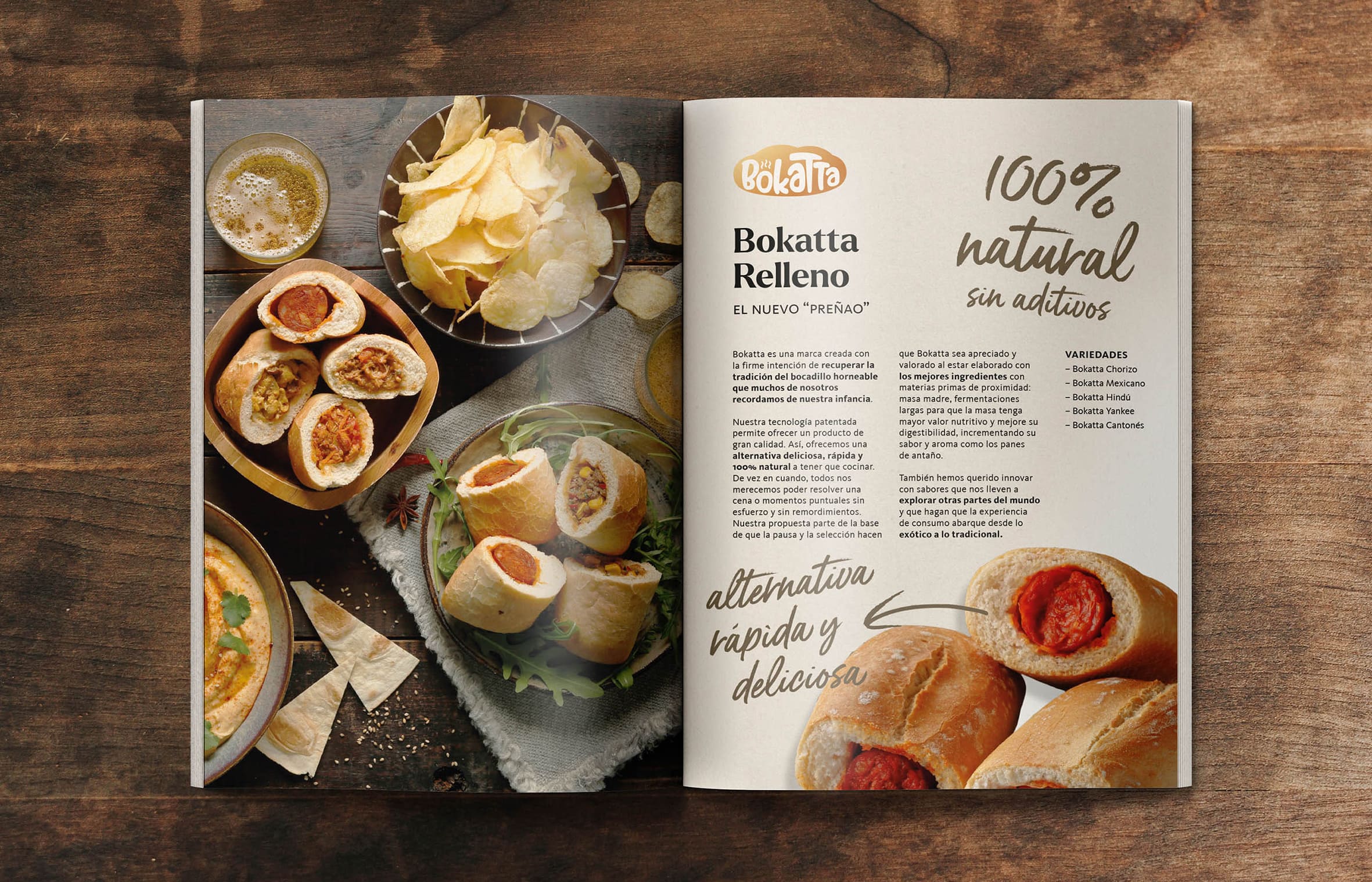
A proposal which aims to revolutionise food and snacks as we know them. A reinterpretation of the chorizo sandwich, or “preñao” as it is popularly known. A twist on an option that is trying to establish itself as a permanent fixture on the snacking scene. This modern version of a Spanish gastronomic classic needed its own space on the retail shelves, the point of contact with the consumer.
Inspired by the neologism created by the inimitable Forges: Bokatta transports us, via their stuffed roll, to different, iconic recipes from around the world; a gastronomic journey full of flavour and meaning.
This naming synthesises the benefits of this product and brings it closer to new generations.
The presentation aims to encourage us to try this tasty roll, which competes with pizzas, paninis, and sandwiches – to make an impact at times of consumption when convenience, simplicity and, why not say it, a whim, are in play…
Objectives
To achieve a naming, platform and image which work together to deliver an agile retail entry, especially in a category which does not currently exist.
To position the product as a convenience food for snack times and mealtimes.
To convey an appetising and attractive appeal to stimulate impulse buying, while at the same time summarising the attributes and features of the product.
To create a range which allows for easy incorporation of new flavours and varieties.
Proposal
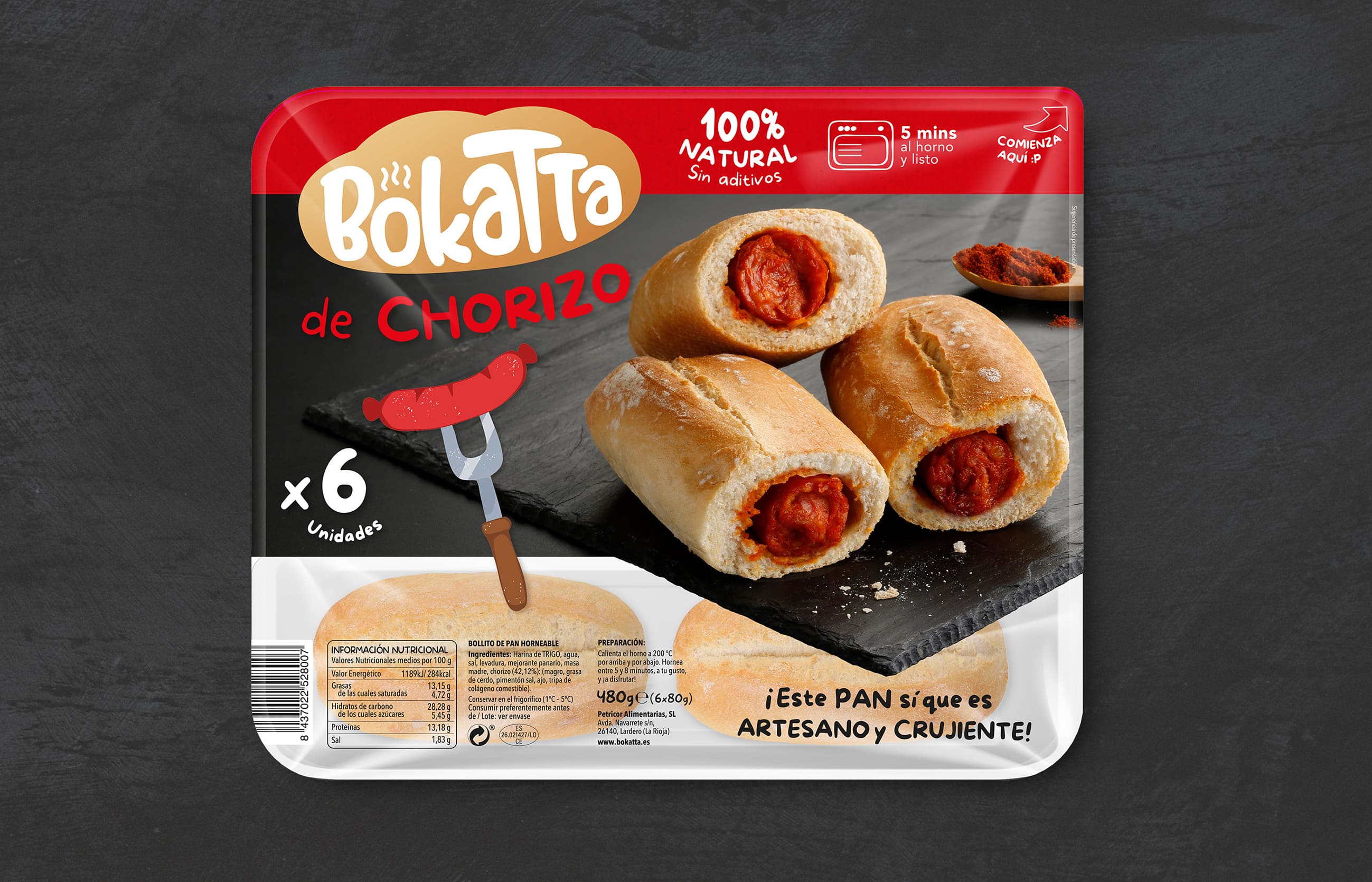
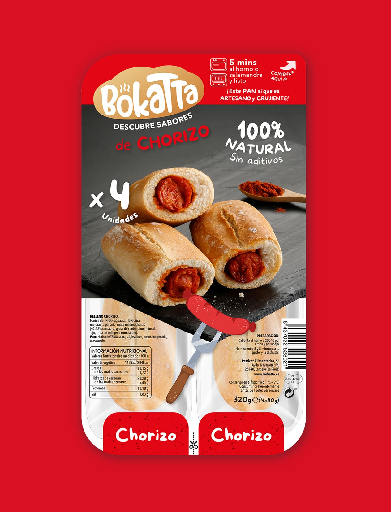
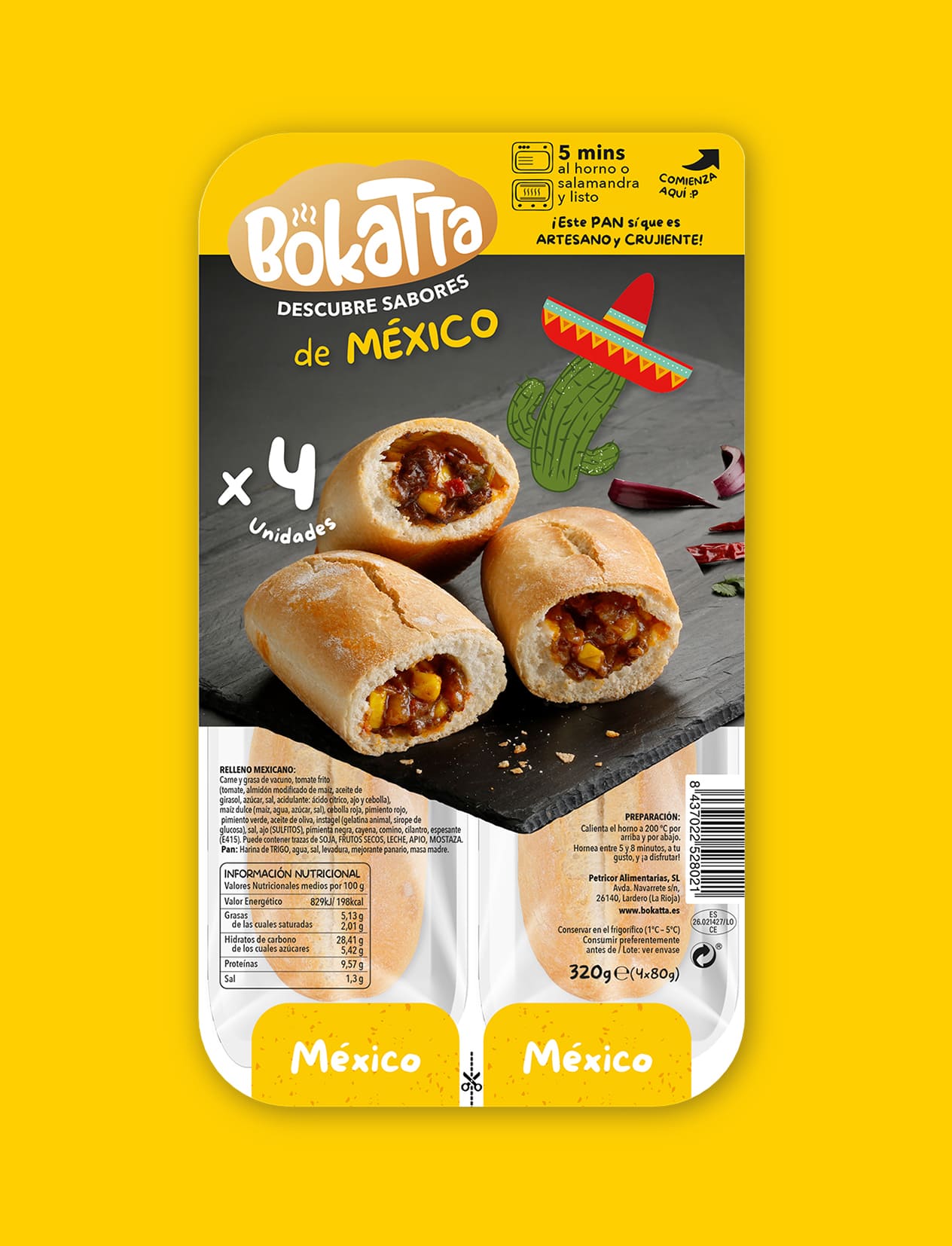
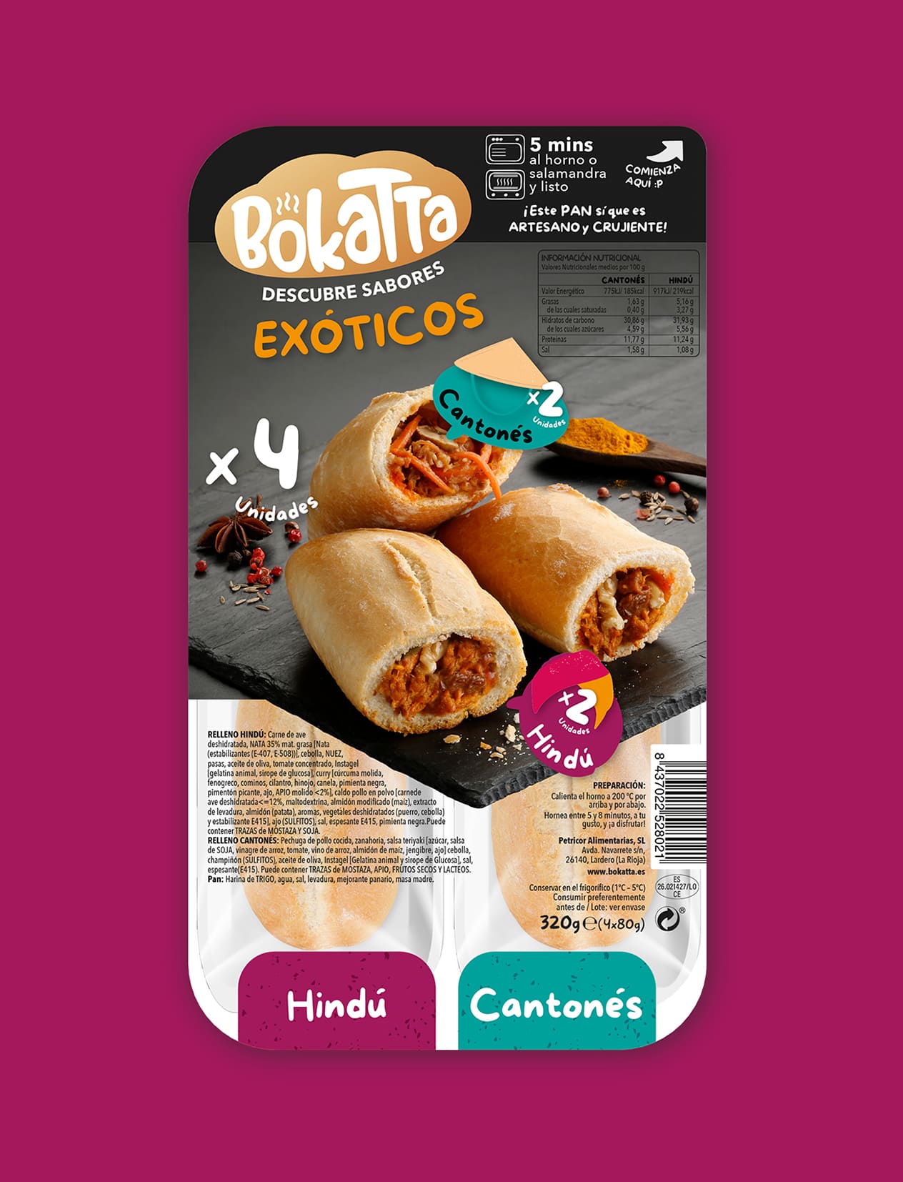
With a clear focus on the convenience of millennial consumption, we propose a simple, almost naïve aesthetic which serves to showcase the characteristics of the product and synthetically summarise the flavours, ingredients, and the gastronomic inspiration from which it derives.
The term ‘bokatta’ is used to describe this stuffed roll – the classic northern ‘preñao’ – which may be difficult to find in other geographical areas.
We create a recognisable aesthetic which serves as a common thread for all the products that make up the range and also works for the potential incorporation of new references as it establishes a layout and a poignantly striking, differential and distinctive iconography.
Graphic Solution
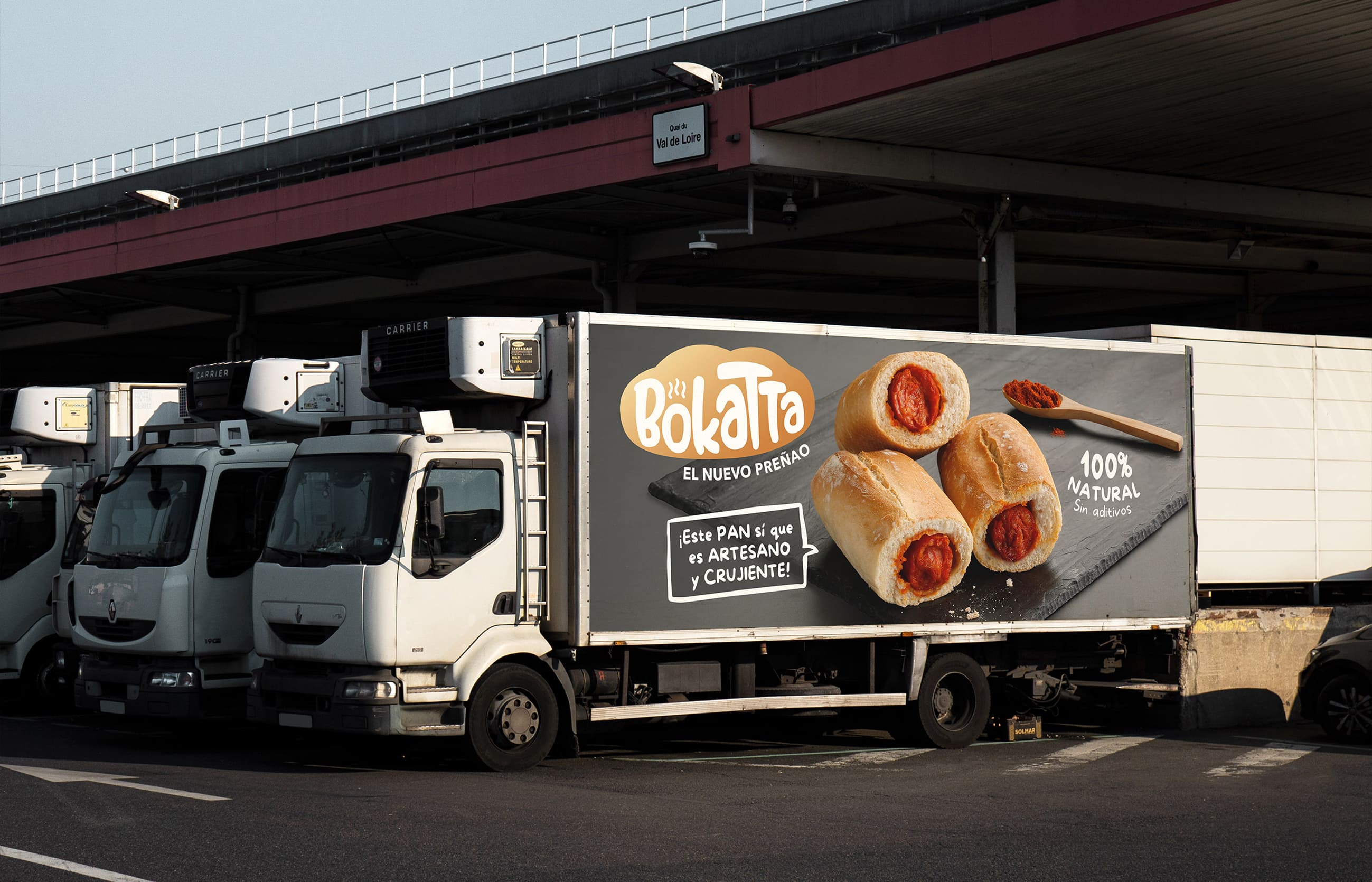
The Bokatta itself is a sandwich filled with a cartoon-style logo typography which reinforces the simplicity of its preparation.
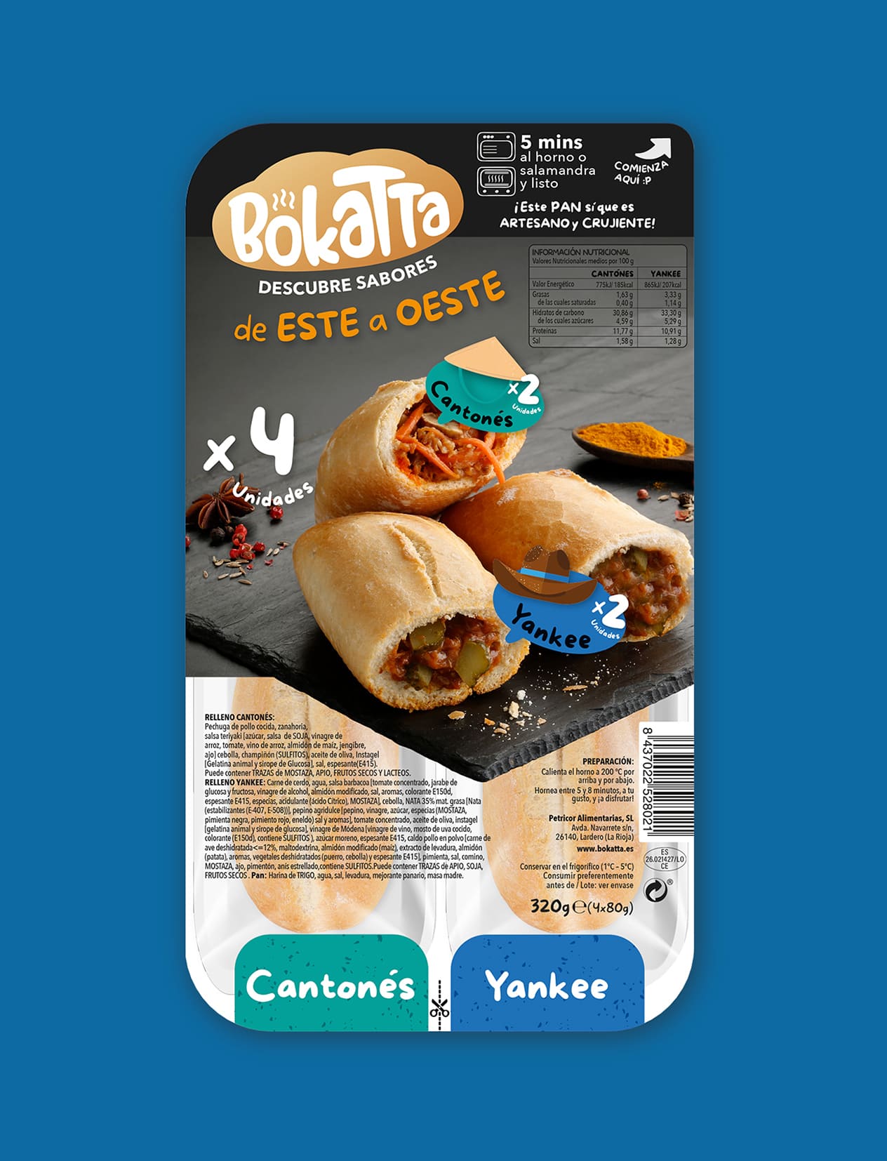
The brand pillars: convenience, nostalgia, simplicity, flavour, and quality, are all present and evident in every graphic manifestation, especially on the packaging: well-researched verbal branding ensures the messages, origin of ingredients and their combination are perceived as a tasty, healthy, product.
We must also be didactic and show the consumer what the perfect preparation experience requires in order to achieve optimal flavour. The iconic nature of the elements, together with the friendly, playful aesthetic tone, means it is perceived as very simple and attractive.
The hierarchy of messages and the iconic nature have also been the subject of research, with a view to the incorporation of new references at a later date.
The saturated colour palette makes it vibrant and allows it to stand out on the shelf, helping consumers to categorise the range.
The claim “the new preñao” is a declaration of intent.
Production
The blister pack has been designed to offer an easy consumer experience, both for groups and individuals. With materials sourced from the re-use of plastics, we have endeavoured at all times to minimise and limit the use of plastics as much as possible.
It was important to create the visual universe and the system which would serve to mark and codify how this new product would be positioned in the market in all the elements that were created.
Social Media
Branding and packaging design for @bokatta.es, a brand dedicated to recovering the tradition of the baked sandwich we all remember from our childhood. From the classic chorizo “preñao” sandwich to new flavours which lead us to discover the world. A fun proposal which promotes quick and easy ready-to-eat meals, without compromising on the quality of the ingredients.

CREDIT
- Agency/Creative: TSMGO
- Article Title: Bokatta – Re-Inventing The “Preñao”
- Organisation/Entity: Agency
- Project Type: Packaging
- Project Status: Published
- Agency/Creative Country: Spain
- Agency/Creative City: Logroño
- Market Region: Europe
- Project Deliverables: Brand Design, Brand Identity, Product Naming
- Format: Box
- Substrate: Plastic
- Industry: Food/Beverage
- Keywords: Food, Span, Chorizo, Preñado, Branding, Packaging, Logo Design, Brand
- Keywords: #branding ,#brand ,#graphicdesign ,#logo ,#design ,#marketing ,#designer ,#logotype ,#meal ,#business ,#illustrator ,#creative #graphicdesigner ,#logos ,#entrepreneur ,#logodesigner, #typography ,#brandidentity ,#fashion ,#art ,#brand ,#logoinspirations ,#smallbusiness ,#logodesign ,#behance, #graphic ,#bocadillo ,#marca ,#etiqueta, #naming, #branding
-
Credits:
Agency: TSMGO


