BNA/ Dzik. From the Underground to the Mainstream – Fire
DZIK is a brand founded by four friends who documented their fitness journey, shared jokes, created challenges, and taught others how to eat well. Over time, their channel evolved into a business: drinks, snacks, and supplements became sales hits. But the brand had a problem – apart from its name, it lacked distinctive assets, and its design was amateurish. The communication style – full of profanity and inside jokes – limited its potential for mass distribution. A strategic shift was needed: DZIK had to retain its identity while becoming more professional, accessible, and visually striking.
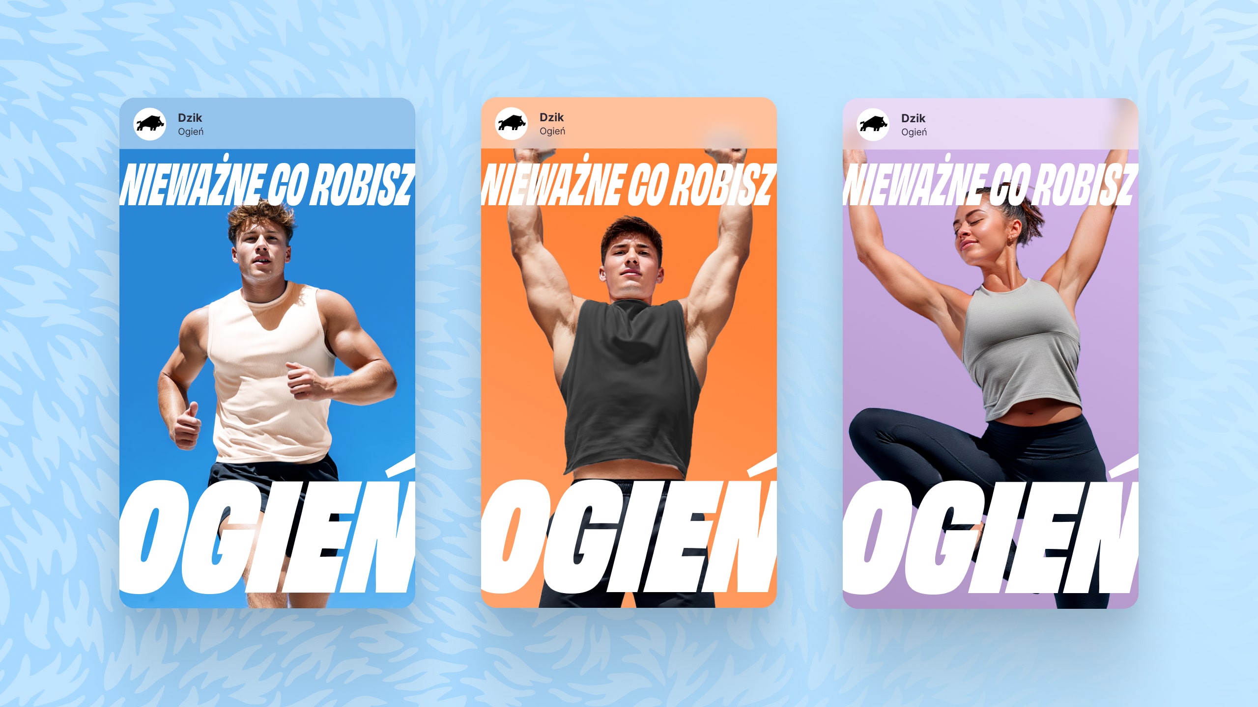
We reinterpreted DZIK’s identity as a brand combining sport and entertainment, rooted in internet culture but ready for the mainstream. We dropped the basement gym vibe and crude language, focusing on empowerment, sport, and fun. The slogan OGIEŃ! (“FIRE!”) became the expression of the new brand strategy. We highlighted the food products through flavor, ingredients, and benefit-led messaging. We built a set of distinctive visual and tonal brand assets that allow DZIK to grow without losing its edge.
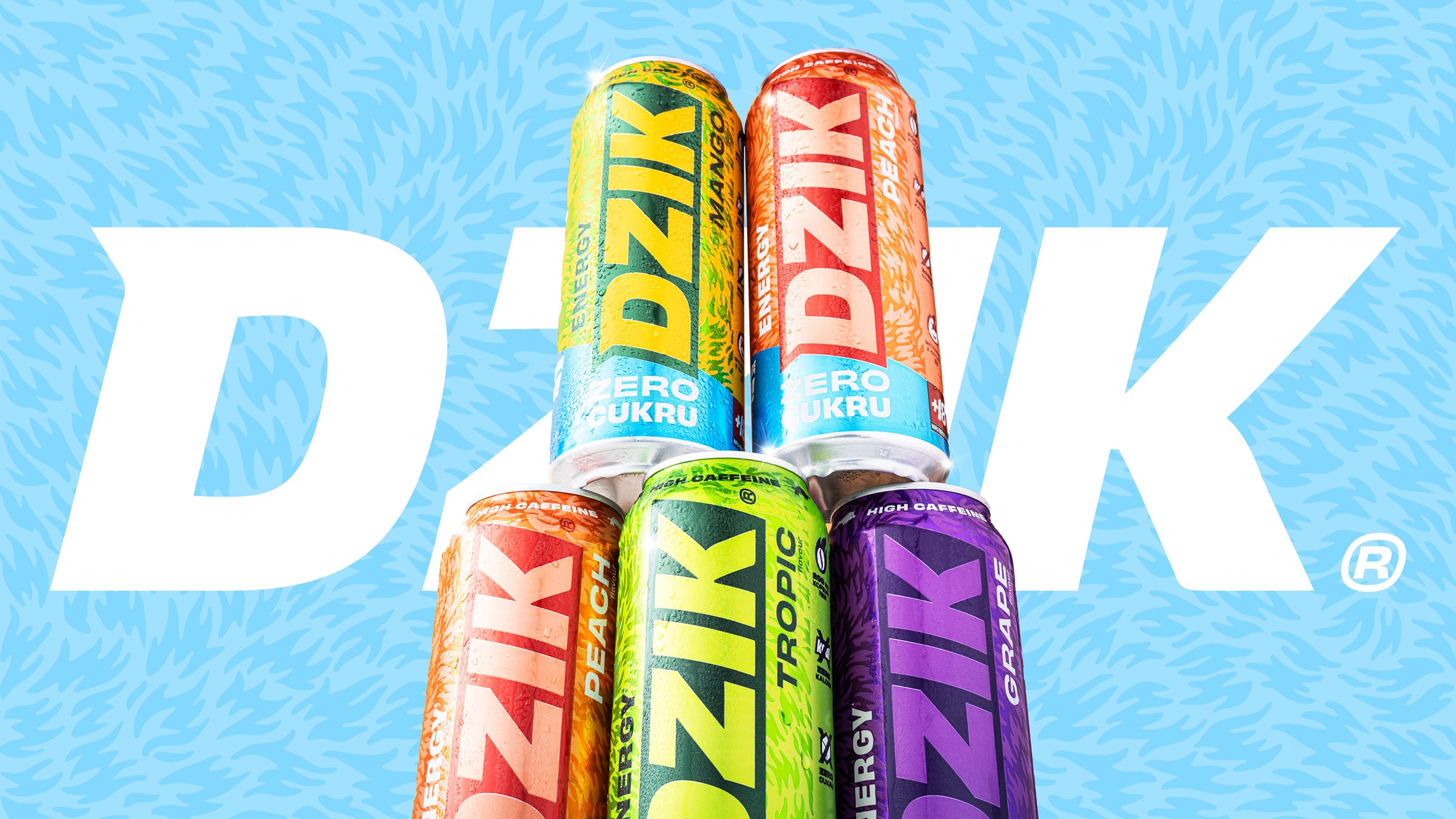
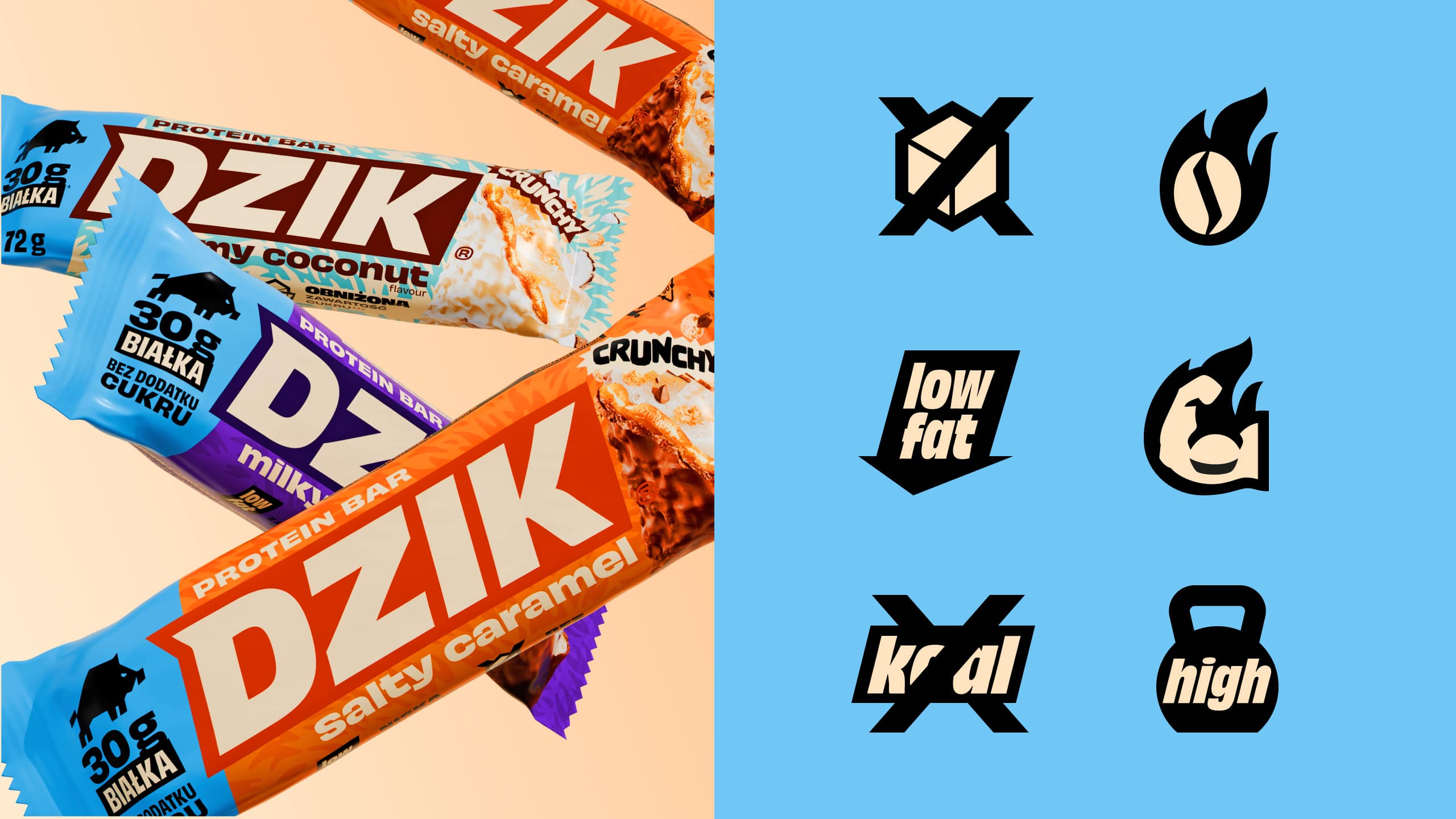
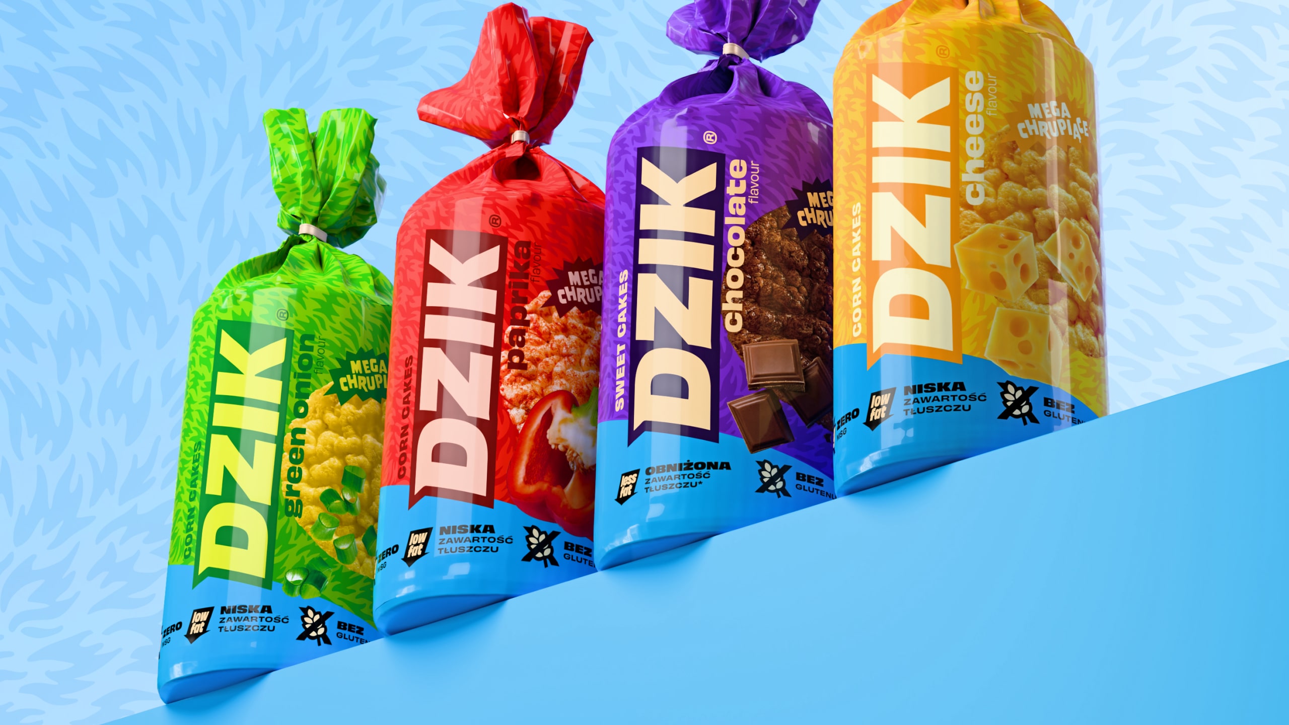
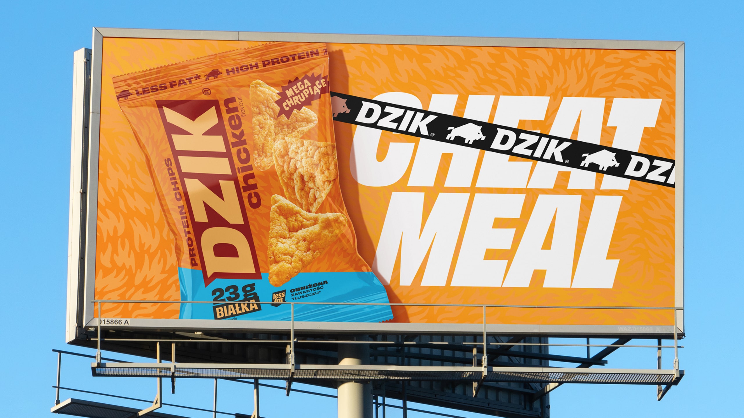
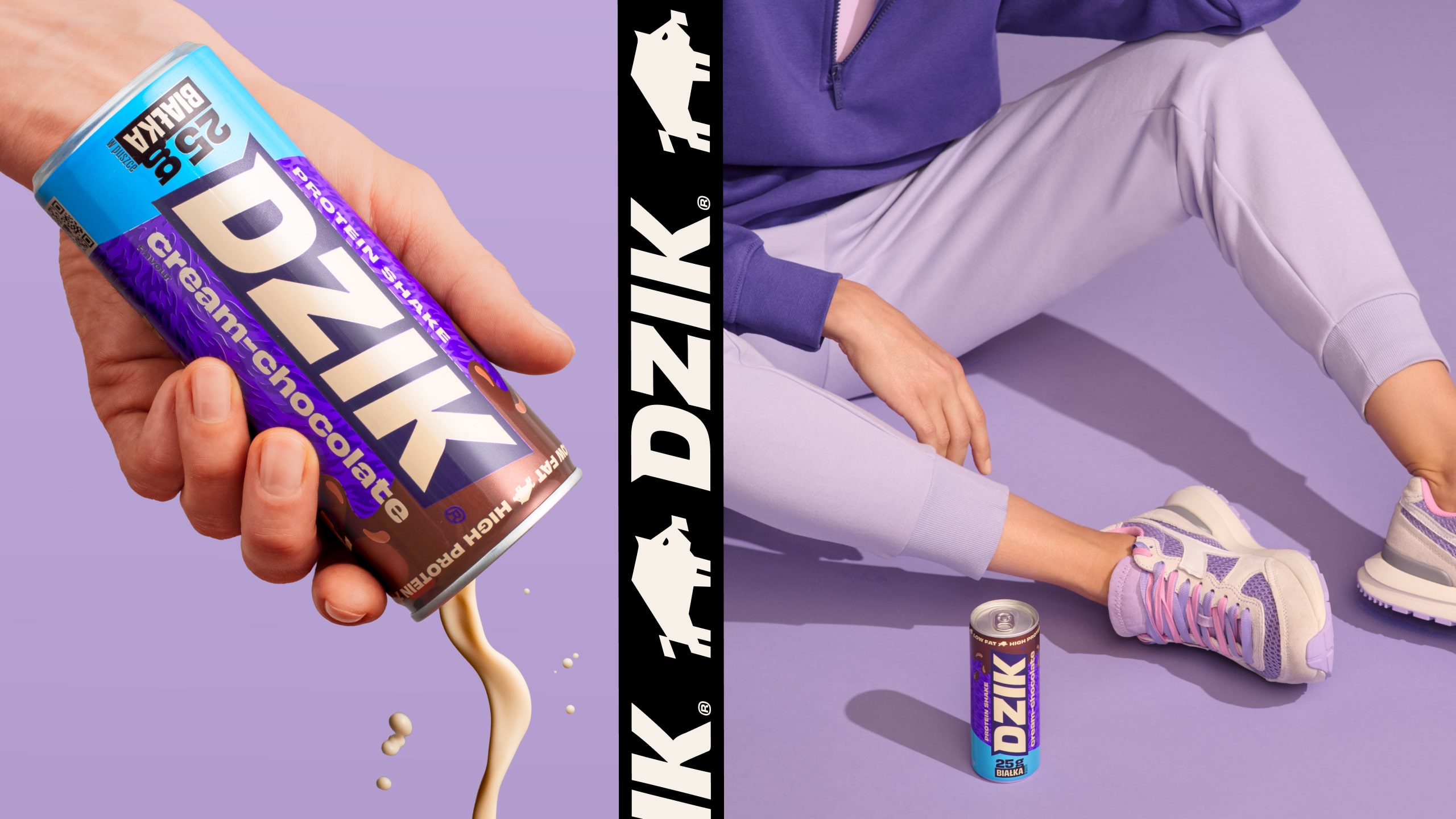
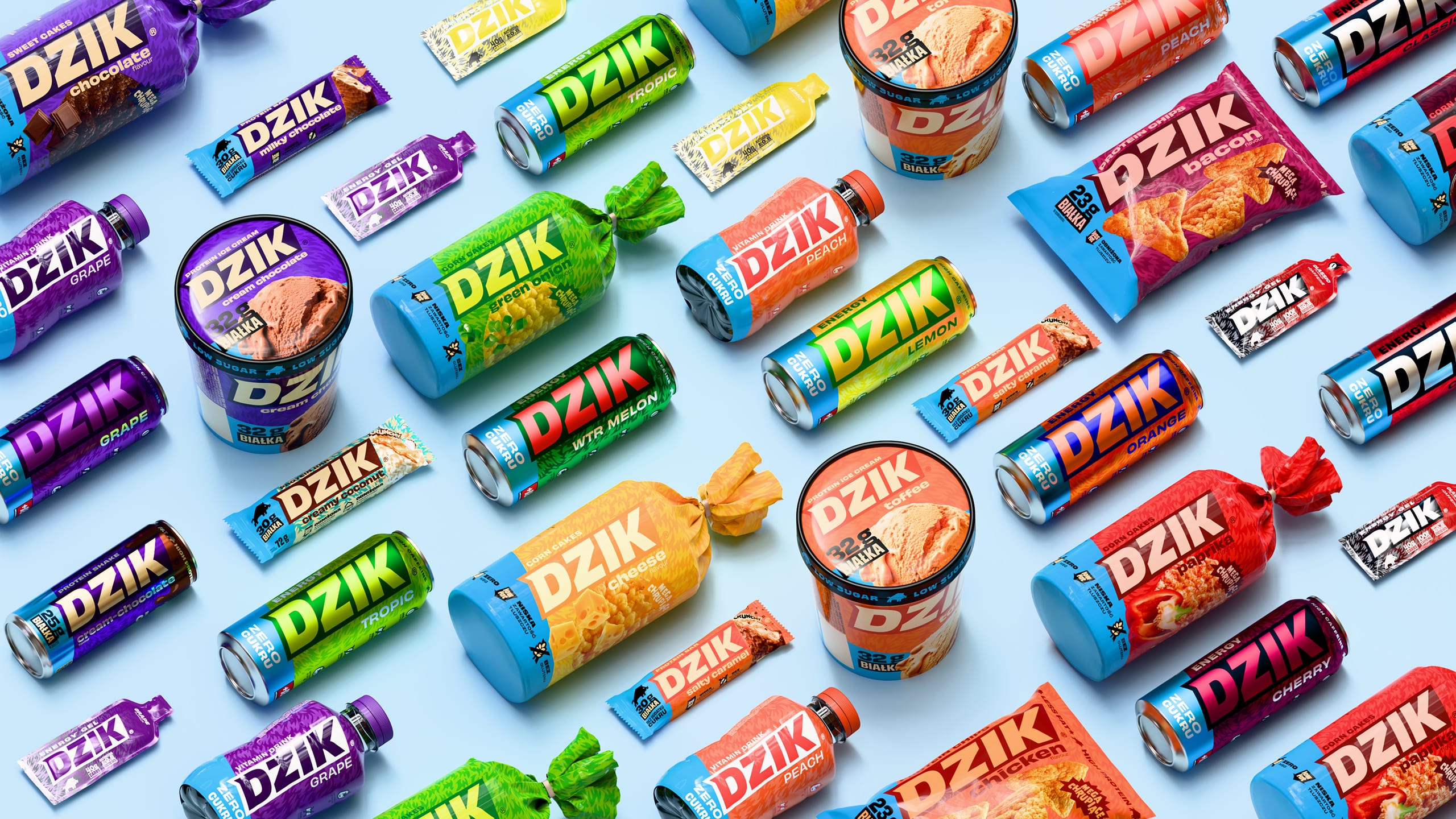
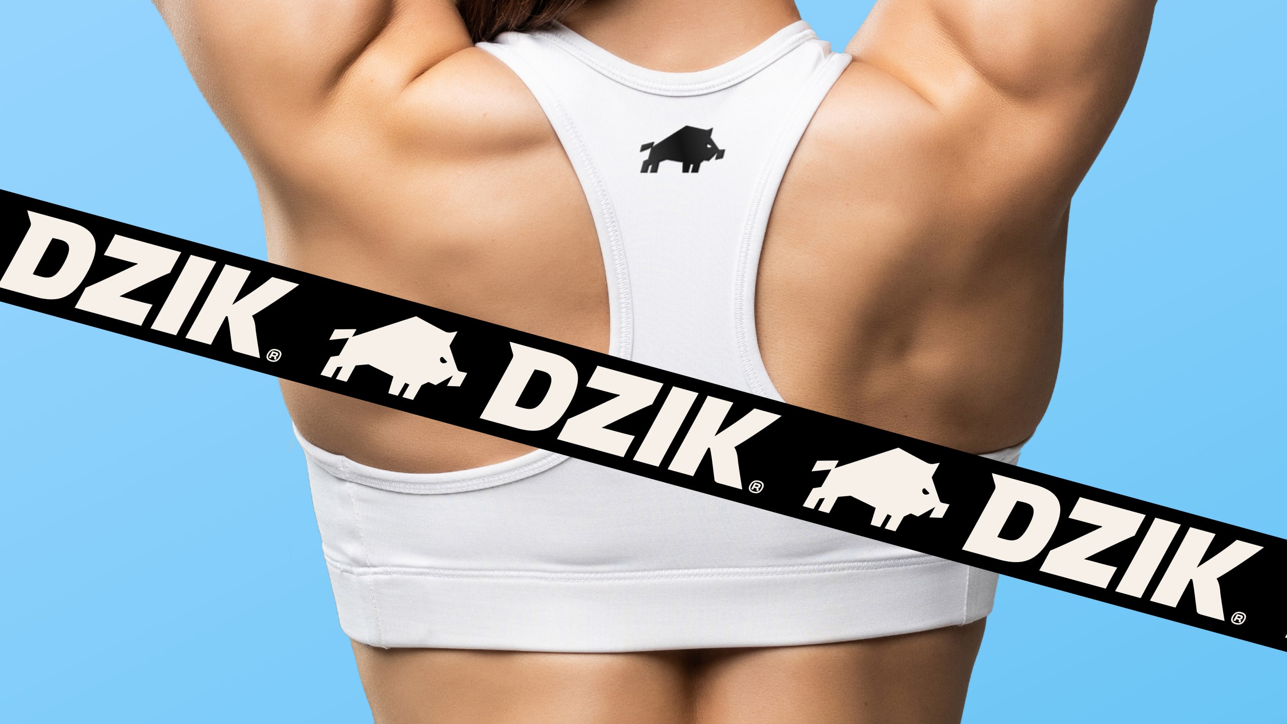
We started with a new logo – a forward-leaning boar bursting with energy and dynamism. It’s finally worthy of becoming a symbol on sports apparel. We introduced a pattern reminiscent of boar bristles and flames (OGIEŃ!). The typography gained character, and the color palette was chosen to amplify taste and fun (e.g., vibrant, high-contrast combinations). A cohesive packaging system emerged, featuring a distinctive diagonal that communicates product benefits (e.g., icons for caffeine, protein, ingredients). The rebrand extended to the entire food product portfolio – the brand’s main touchpoint and frequent hero in communication. We also developed new photography guidelines, showcasing that the brand is for anyone who wants to move. DZIK stepped out of the niche and hit the shelves with new energy and character.
DZIK is now a brand blending the world of sportswear with functional food. It’s ready to scale further with a refreshed identity, cohesive visual system, and a unique tone and aesthetic. Thanks to the rebrand, DZIK gained distinctive assets, a bold tone, and a consistent portfolio that resonates with loyal fans and new customers in mass distribution. The brand is still feisty and youthful, but now it’s also clear, tasty, approachable, and impossible to miss – on the shelf and beyond. Fire.
CREDIT
- Agency/Creative: BNA/ Brand New Attitude
- Article Title: BNA Transforms DZIK into a Mainstream Powerhouse Fueled by Sport and Flavor
- Organisation/Entity: Agency
- Project Type: Identity
- Project Status: Published
- Agency/Creative Country: Poland
- Agency/Creative City: Warsaw
- Market Region: Europe
- Project Deliverables: Brand Architecture, Brand Design, Brand Identity, Logo Design, Packaging Design
- Industry: Food/Beverage
- Keywords: brand identity, rebranding, packaging, logo design,food&bevarage, functional food, suplements, sportswear
-
Credits:
Strategic Director: Andrzej Rozen
Strategic Director: Katarzyna Stąpór
Creative Direction: Martyna Synkiewicz
Art Direction & Brand Design & Packaging: Bogusław Gelba
Brand Design & Logo Design: Jarosław Jurga
Brand Design & Packaging: Tanya Roslyak


