


Authenticity Boldly Told
The Challenge
Hopleaf Pale Ale, one of Malta’s most cherished beer brands, had over time diminished its clarity, relevance, and visual impact. A once-proud emblem of 1920’s Maltese brewing heritage, its distinctive red leaf – long a symbol of craftsmanship and trust – had lost its uniqueness that had resulted in it disappearing into a sea of sameness of generic beer design codes. Despite a loyal following, Hopleaf was struggling to connect with a new generation of beer drinkers increasingly drawn to design-driven craft beers and the influx of modern-looking global powerbrands.
The Opportunity
To make Hopleaf boldly iconic and rightfully proud of its rich heritage with a retro-modern presence, sparking a renewed connection with both loyal fans and new, younger drinkers.
We needed to revive this respected brand not through reinvention, but by rediscovering its authentic truth and framing it with a renewed sense of purpose and confidence, so that Hopleaf could once again stand proud in an increasingly competitive local beer landscape.
The Insight
Research revealed that while Hopleaf still carried emotional weight among older generations, younger drinkers perceived it as staid and traditional; something drunk by their grandparents. Yet, they also expressed a growing appreciation for authenticity, provenance, and genuine local stories – values deeply embedded in the brand’s DNA.
We learnt that younger drinkers responded to badge value; a less is more approach of visual bold simplicity captured in a single powerful symbol. This behaviour manifested itself repeatedly in their fashion choices, where highly recognisable icons clearly denote their contemporary lifestyles.
The Idea
Turning over a new leaf
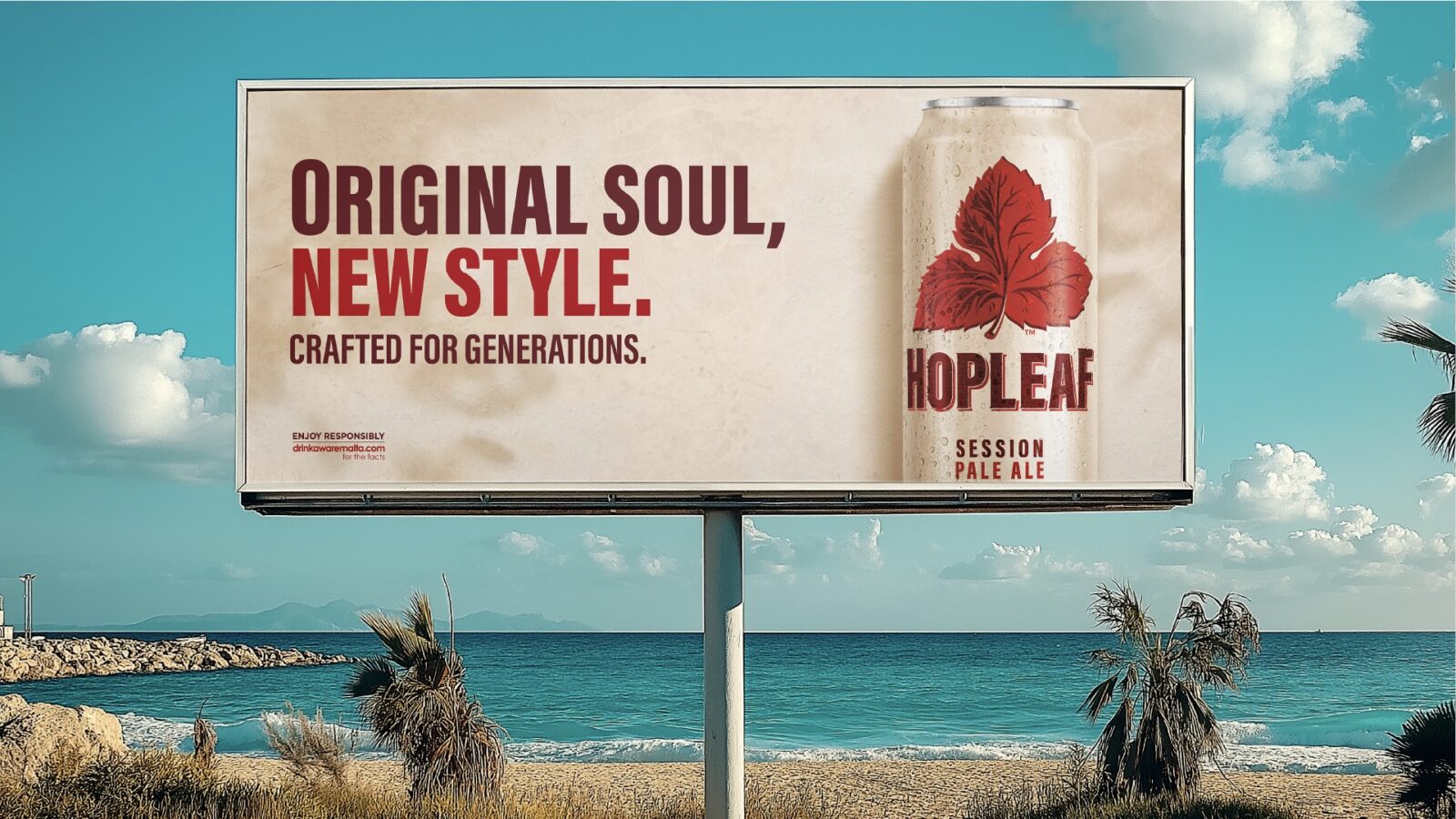
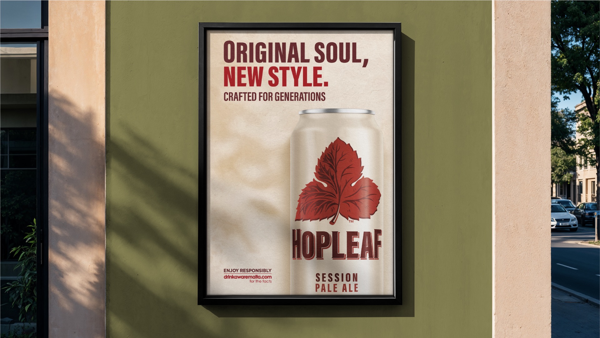
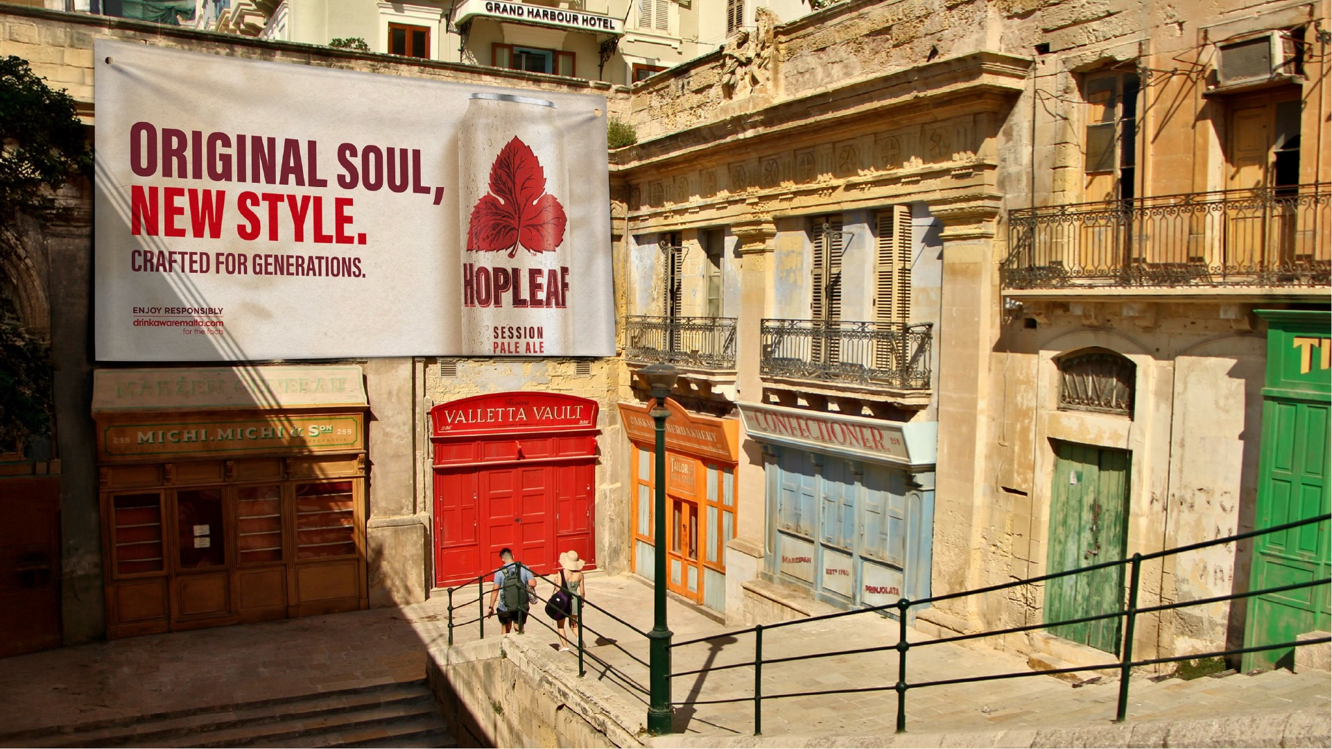
We repositioned Hopleaf as a soul-filled classic reborn by celebrating the craftsmanship and warmth that made it beloved for generations, while giving it the fresh, bold simplicity to appeal to the modern sensibilities of today’s younger audience. Armed with the creative idea of ‘Original Soul, New Style’ that was rooted in authentic rejuvenation, it liberated the enduring red leaf icon by confidently making it the hero of the brand.
Design expression
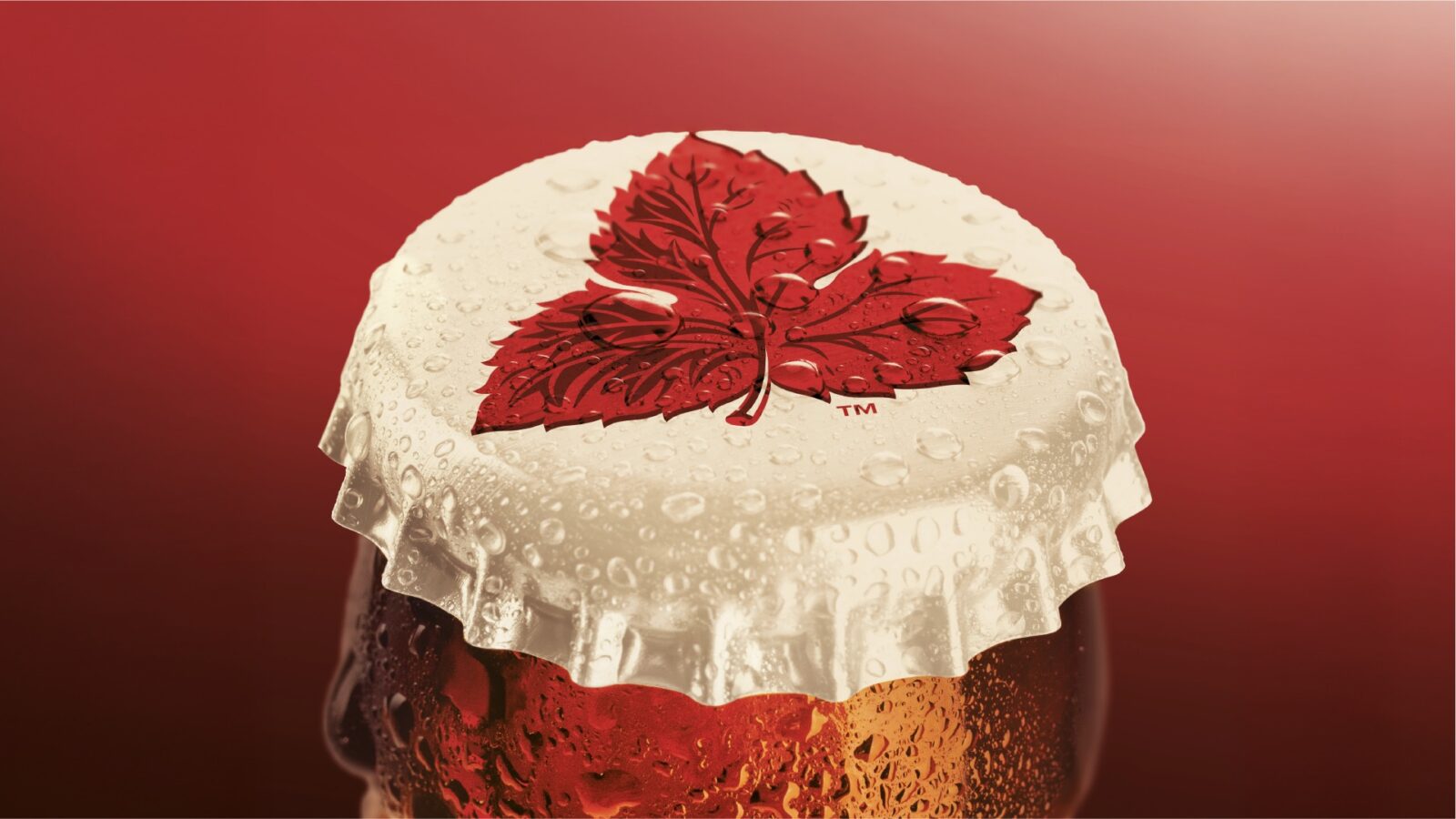
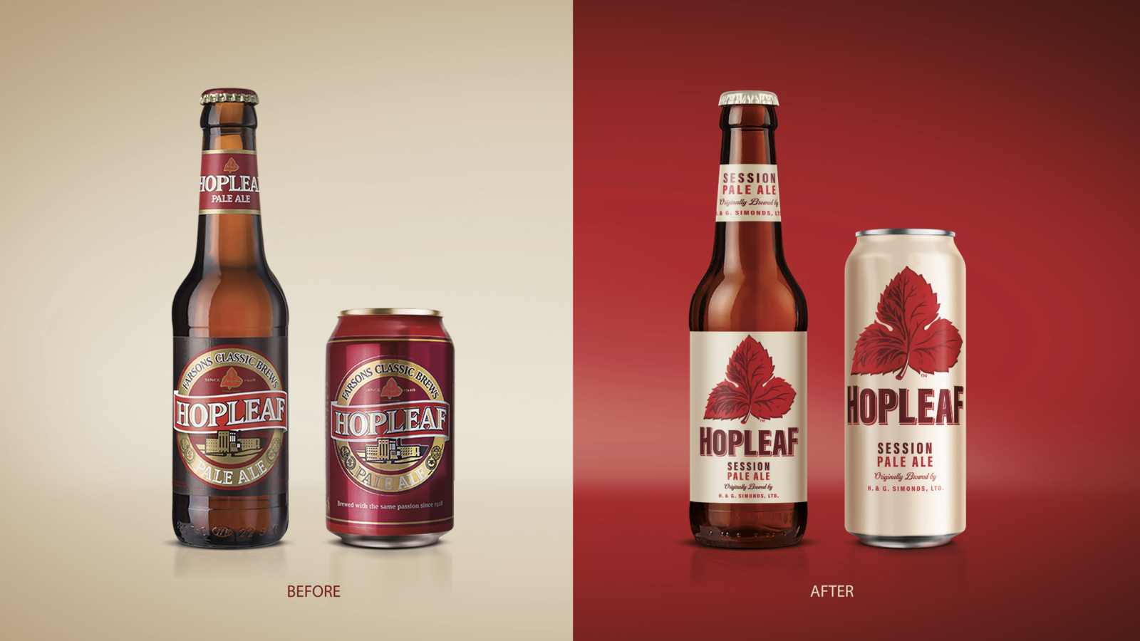
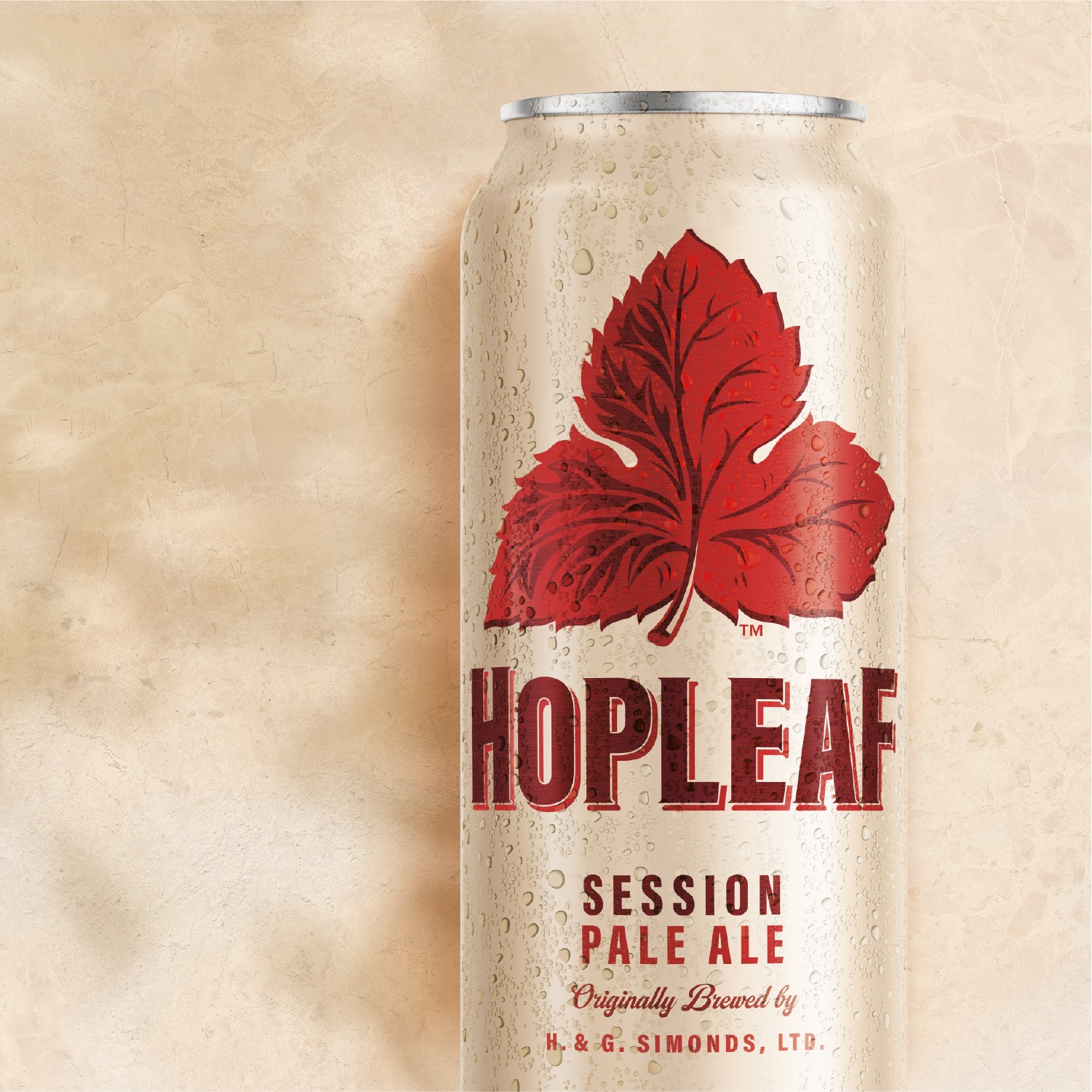
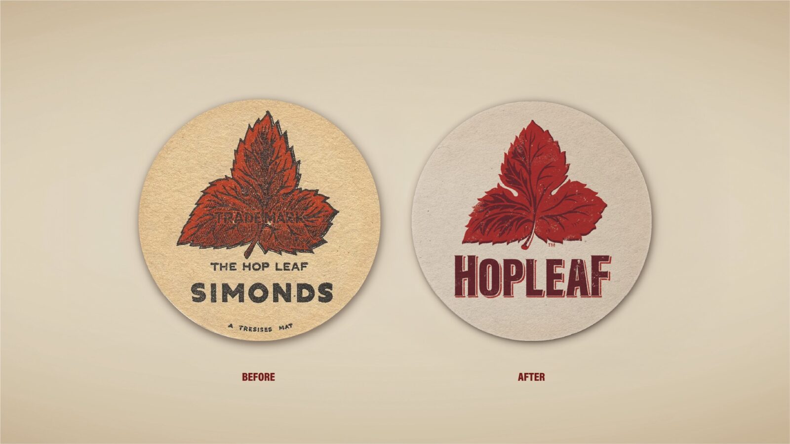
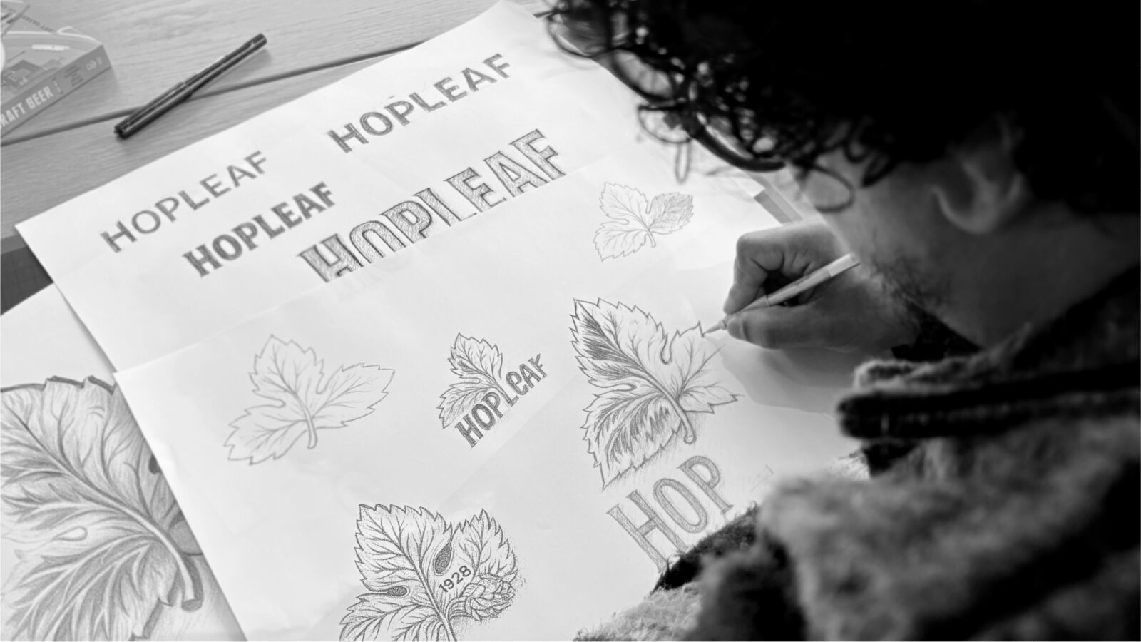
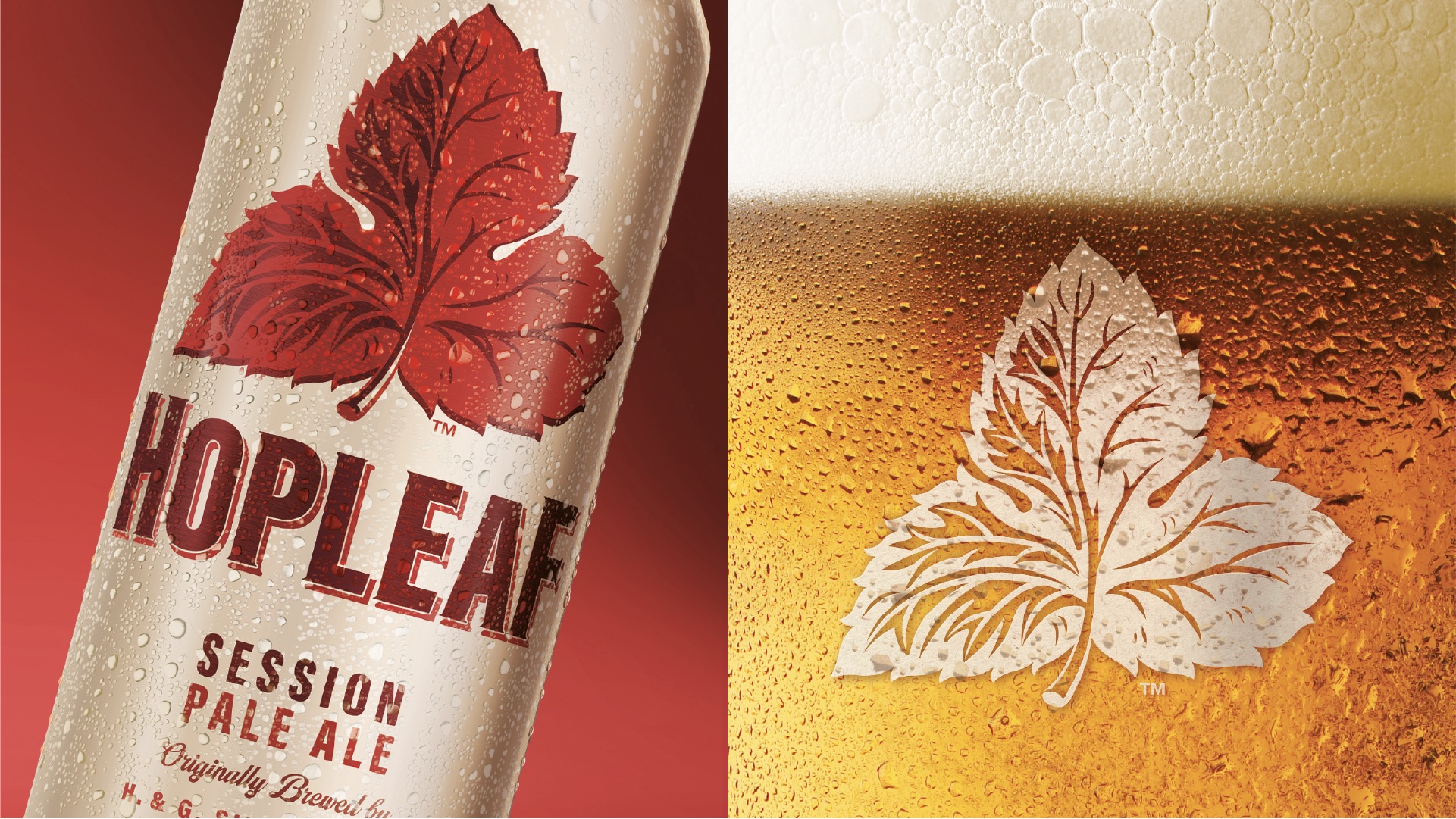
The red leaf was redrawn by hand with cleaner venation, bolder, truer silhouette and impactful two‑tone depth. This returned it to the unequivocal hero of the piece. It sits large, proud and liberated on a warm cream that nods to both ubiquitous Maltese limestone, and its fresh, sessionable taste profile.
The wordmark is crafted yet personable: condensed proportions for strength, open counters for clarity, and a shadowed inline to add authority and credibility without heaviness.
Heritage cues and subtle homages to the past are woven in with considered restraint – “Originally brewed by H. & G. Simonds, Ltd.” – and sessionable style signalling provenance while keeping the design clutter free.
On pack, restrained colour does the heavy lifting: confident deep maroon, leaf reds and quiet neutrals replace the previous ostentatious golds and accumulated design clutter, creating immediate on-shelf impact through modern authority.
Finishes are tuned for tactility and impact: matte cream cans and labels for a fresh pop. In communications, scale and simplicity do the talking – big leaf, few words – anchored by the new world mantra: ‘Original soul, new style. Crafted for generations.’
The whole design system was created to feel restored rather than redesigned for a bold new generation; confident on cluttered shelves, characterful in the hand, and unmistakably Hopleaf from ten metres to ten pixels.
Tone of voice
Confident, grounded, and proudly Maltese. The new messaging celebrates Hopleaf with a contemporary voice: ‘Original soul, new style. Crafted for generations.’ It expresses confidence, bridging the emotional connection between the brand’s storied past and its new, bright future.
Impact
Since its relaunch and following a communication campaign, Hopleaf has re-established itself as a leading local favourite, with renewed cultural relevance. The refreshed design has reawakened pride among loyal drinkers and captured the imagination of a younger audience discovering it for the first time. In trade and consumer feedback alike, Hopleaf is once again seen as a bold icon of Maltese brewing – timely authentic, and ready for the future.
“We rediscovered what made Hopleaf so loved in the first place. The redesign honours its history, restores its confidence, and ensures it continues to thrive in a changing market.” – Gareth Roberts Associate Creative Director.

CREDIT
- Agency/Creative: Bluemarlin brand design Ltd.
- Article Title: Bluemarlin Brand Design Restores Iconic Heritage for Hopleaf Pale Ale
- Organisation/Entity: Agency
- Project Status: Published
- Agency/Creative Country: United Kingdom
- Agency/Creative City: London
- Market Region: Europe, Malta
- Project Deliverables: 2D Design, Art, Art Direction, Brand Architecture, Brand Creation, Brand Design, Brand Experience, Brand Guidelines, Brand Identity, Brand Mark, Brand Redesign, Brand Refinement, Brand Rejuvenation, Brand Strategy, Brand Tone of Voice, Brand World, Branding, Copywriting, Craft, Creative Direction, Design, Drawing, Graphic Design, Icon Design, Illustration, Label Design, Lettering, Logo Design, Packaging Design, Packaging Guidelines, Research, Retouching, Tone of Voice, Type Design, Typography, Visualisation
- Industry: Food/Beverage
- Keywords: WBDS Agency Design Awards 2025/26 , Heritage beer identity, Hopleaf brand, illustrative hop icon, craft beer visual system, modernised heritage mark, pack identity refresh, label design, premium beer, iconic emblem, scalable brand assets, historic brand revitalisation
-
Credits:
Executive Creative Director: Samantha Dumont
Associate Creative Director: Gareth Roberts
Account Director: Charlie Spiers
Illustrator: Lyndon Povey
Visualiser: Simon Thomas
Simonds Farsons Cisk (commisioning client) : Head of Marketing: Karl Bondin
Simonds Farsons Cisk (commisioning client) : Head of Sales and Marketing (Retired): Susan Weenink Camilleri


