


Aimed at attracting new Gen Z audiences, the newly modernised look pulls the iconic non-alcoholic drink firmly into the social landscape of today.
London-based brand design agency Bloom has created a dynamic new visual identity for J2O, using the lens of modern socialising to redefine the iconic brand for a new generation while still appealing to loyal fans.
The redesign reflects today’s rapidly changing codes of socialising, where consumer needs are increasingly shaped by digital trends and diverse lifestyle shifts, such as moves towards low- and no-alcohol choices.
From iconic legacy to commercial success
“Like all brands in its sector, J2O – which launched in the late 90s positioned as an alternative to beer in pubs and clubs – had to evolve to remain relevant to consumers,” says Carly Sims, socialising brand director at Britvic Carlsberg
“From its previous work on Robinson’s and Tango, we knew Bloom’s ability to take much-loved icons and reinvigorate them for commercial success today. That’s the task we set them on J2O; and this uplifting rebrand ensures J2O continues to thrive with both new and existing audiences.”
Generational shifts
To inform the new design strategy, Bloom first looked to decode and understand modern socialising by analysing a range of cultural trends from how people are using dating apps to the landscape of competing drink brands.
“The generational shift from millennials to the growing dominance of Gen Z means design and cultural expressions are changing at an accelerating pace,” says Bloom senior strategist Nathan Frisch.
“We felt the former branding was too tied to J2O’s beer-like origins—it reflected that late-’90s beer and bar culture, lads and ladettes wearing labels to style bars. That aesthetic no longer resonates, but we couldn’t ignore those roots. In fact we wanted to amplify the current passion for all things 90s – it’s an era famous for being more fun”
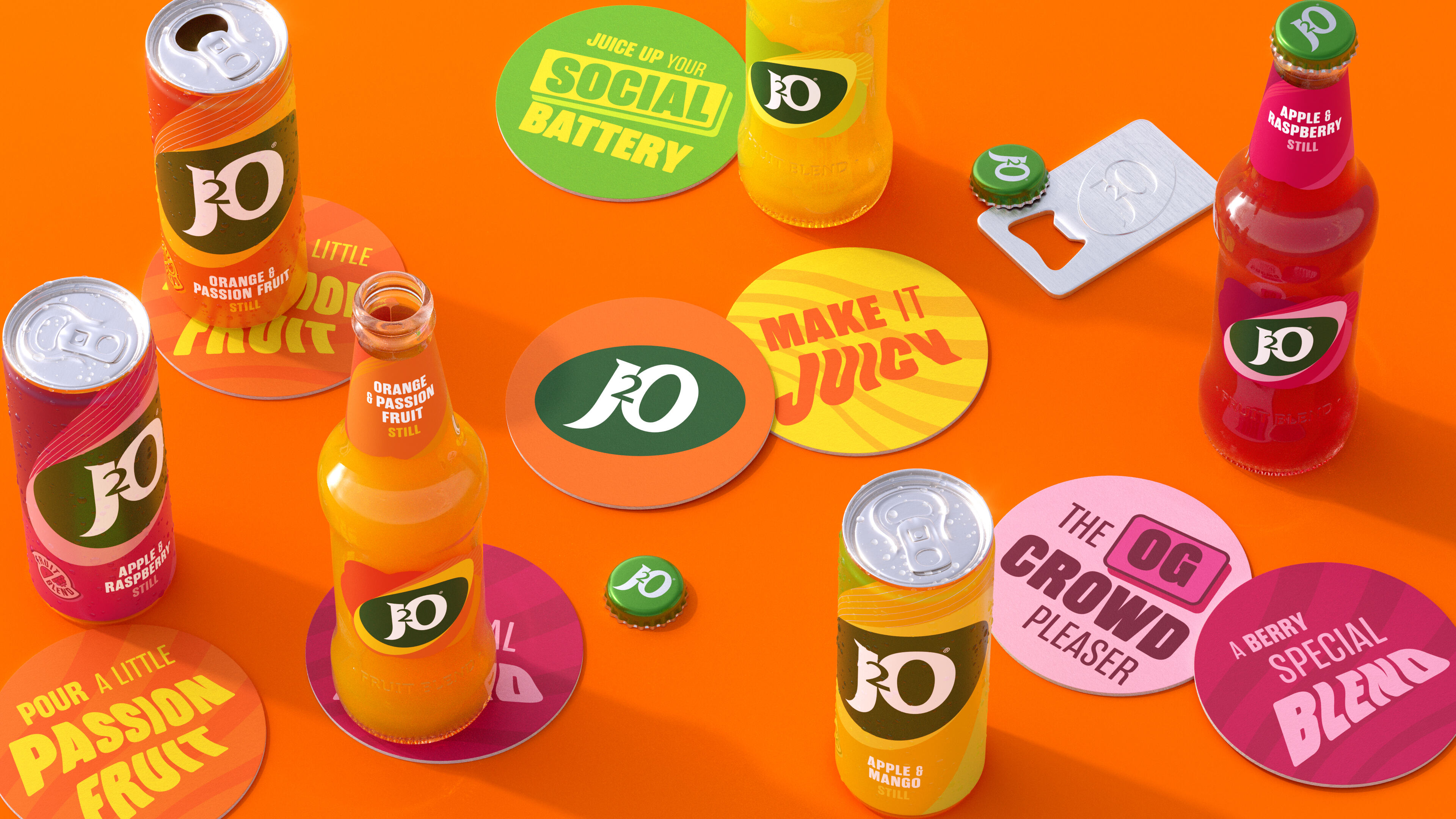
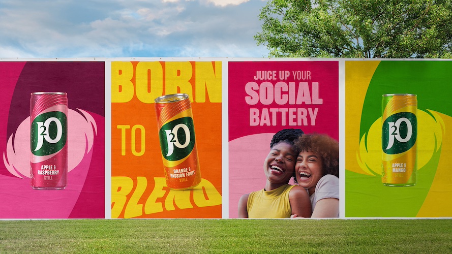
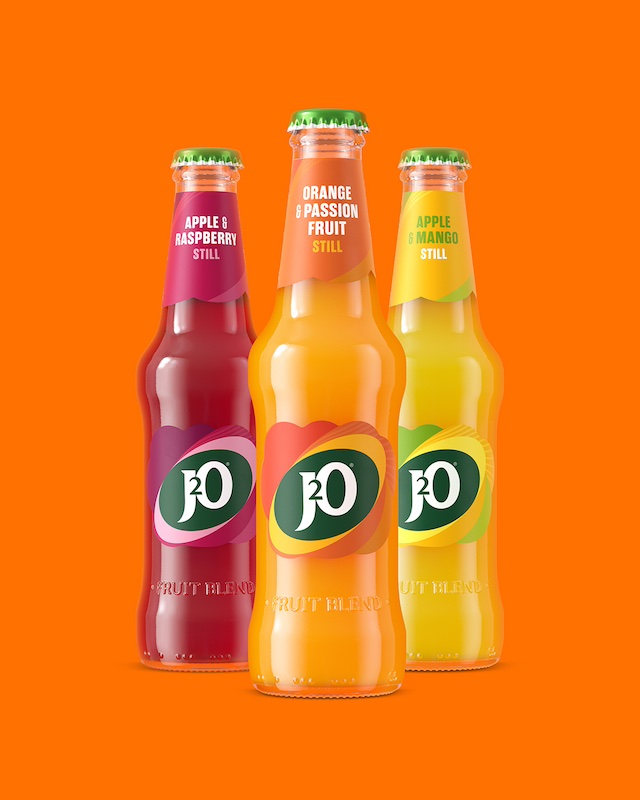
Elevating the ellipse
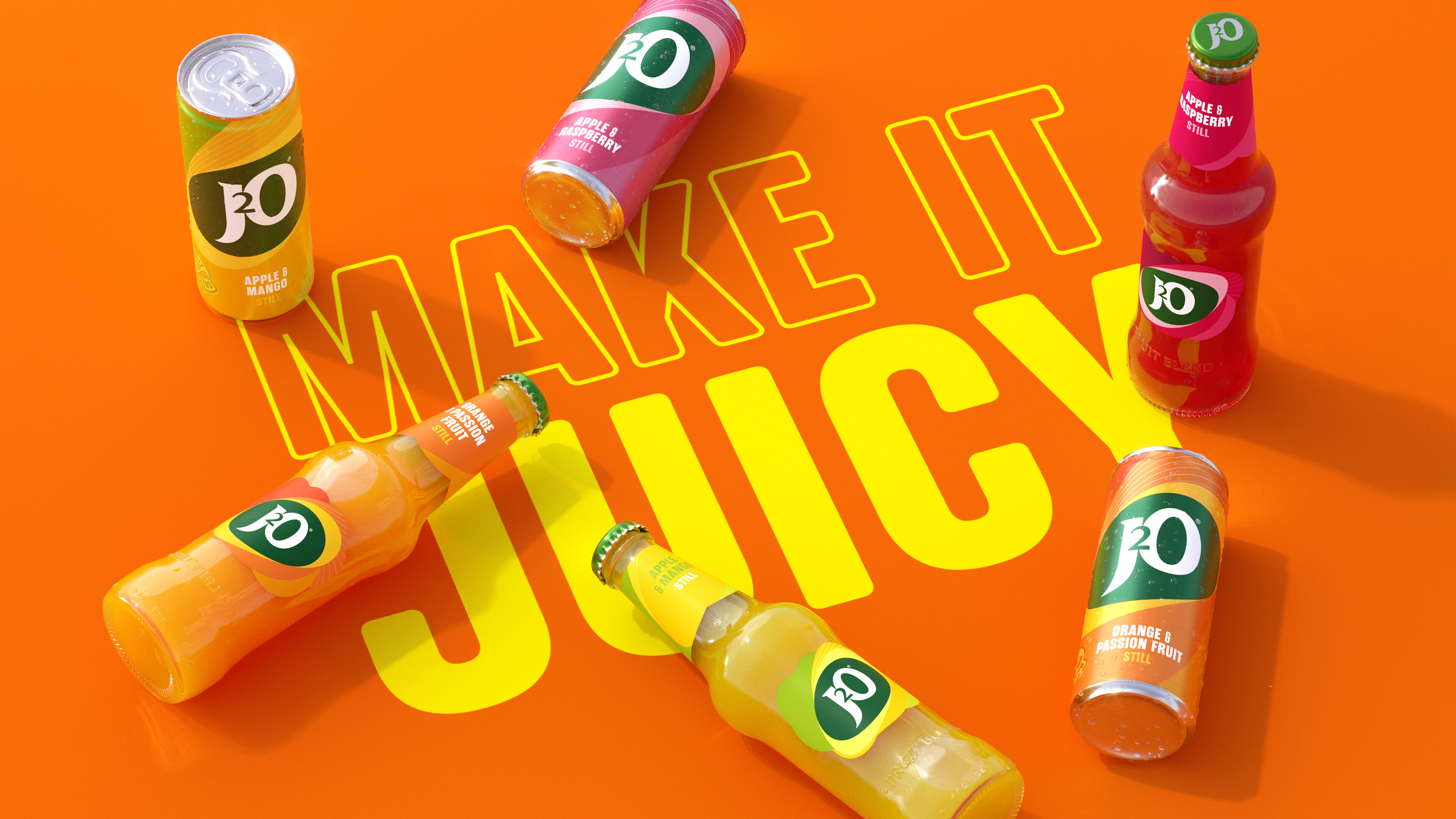
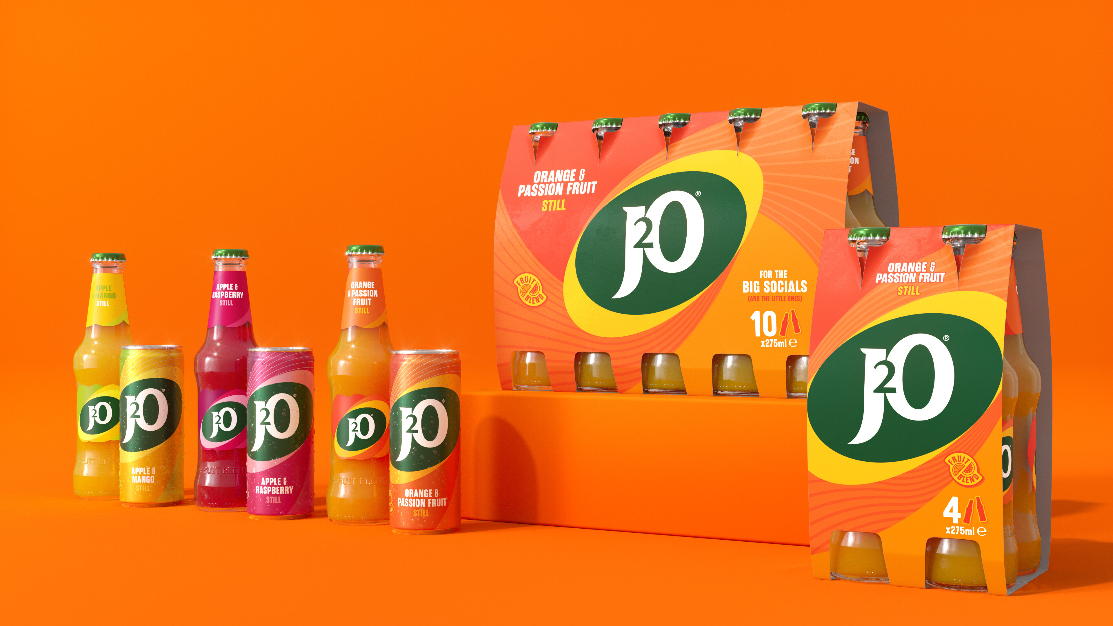
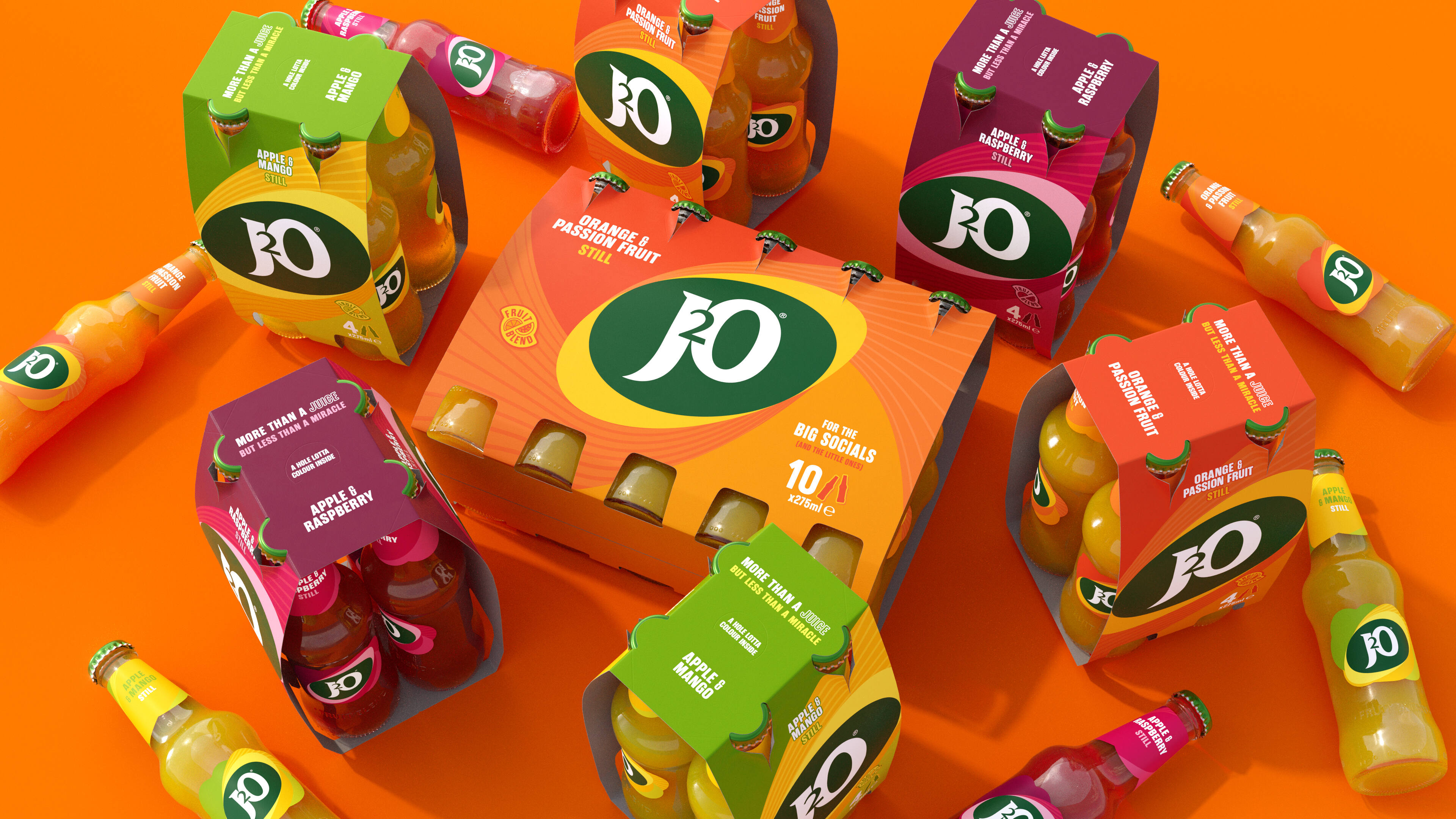
At the heart of the redesign is a high-contrast, dramatic approach that ensures on-shelf standout. Bloom introduced a new ellipse graphic inspired by J2O’s original logo, serving as a flexible framing device while maintaining the brand’s heritage and drawing on familiar category codes.
The typography takes a bold, unapologetic stance, with a single typeface used across the brand in varying weights. A wavy typographic style adds playfulness, reflecting J2O’s vibrant fruit blends, creating consistency while allowing creative expression.
The logotype’s lettering was modernised by refining the interaction between the ‘J’, ‘’2’, and ‘O’; adjusting serifs; and thickening certain elements to improve readability while preserving the brand’s personality.
A vibrant green background is used to nod to the J2O’s fruity flavours, but in a shade that avoids taking the designs into more health-drink territory.
Timeless authenticity
“Research showed that younger consumers dislike overt marketing tactics—they find them inauthentic,” says Craig Barnes, Bloom Creative Director. “Rather than mimicking competitors, we looked to resonate with people by leaning into J2O’s identity with subtle, meaningful design elements like the ellipse and wave patterns. Every design decision was rooted in J2O’s product truth and brand story.”
The new brand assets are built to be dynamic and versatile, specifically tailored for different platforms such as pop-ups, activations, or digital channels. Bloom opted for a bold, logo-forward approach for physical retail environments; while digital channels focus on lifestyle imagery, playful typography and iconography to create engagement.
J2O’s new identity taps into contemporary tastes, using warm and confident visuals to resonate with younger audiences, while avoiding fleeting trends or overt marketing gimmicks and maintaining enough heritage to retain loyal consumers.
“This rebrand reinforces J2O’s place as an iconic, modern brand ready to inspire new social occasions while celebrating its heritage,” says Barnes. “As consumer preferences evolve, it’s vital for brands to stay fresh and relatable for each generation. We’ve evolved J2O into a bolder, more versatile brand, without losing its original heart and soul.”
The refreshed visual identity is rolling out across on and off trade touchpoints from May 2025.
CREDIT
- Agency/Creative: Bloom
- Article Title: Bloom’s New Designs for J2O Reflect the Rapid Shifts in Modern Socialising
- Organisation/Entity: Agency
- Project Type: Identity
- Project Status: Published
- Agency/Creative Country: United Kingdom
- Agency/Creative City: London
- Market Region: Europe
- Project Deliverables: Brand Identity
- Industry: Food/Beverage
- Keywords: Soft drink, non-alcoholic, Gen Z audiences, le
-
Credits:
Creative Director: Craig Barnes


