


Bloom, the London-based brand design agency known for reinvigorating and refreshing some of Britain’s most-loved food and drink brands, today unveils a new visual identity and packaging design for the food pioneer Higgidy.
Reaching a New Generation
Launched in 2003, Higgidy reinvented how we in the UK enjoy pies and quiches and in the last 5 years built an incredible snacking business. Higgidy was part of a wave of early-2000s post-digital, challenger brands like Innocent and Yeo Valley. As Higgidy grows packaging continues to be at the forefront of their thinking and sought the opportunity this year to refresh the identity of this much-loved brand to further connect with a new generation of consumers.
Higgidy’s Marketing Director, Sarah Jackson, says: “We were looking for a design agency to partner with that understood the Higgidy brand and so could help us evolve our visual identity and create a design solution that was instantly recognisable as Higgidy, but distinctive and disruptive. The Bloom team’s creativity, passion and partnership was clear from the outset and they were a great choice for the project.”
Bursting with Abundance
“There’s opportunity in this market,” says Ed Hayes, Chief Strategy Officer at Bloom. “Today’s consumers love to snack – deli foods and picky bits are a high growth space. They also value quality ingredients and love to share new favourites”.
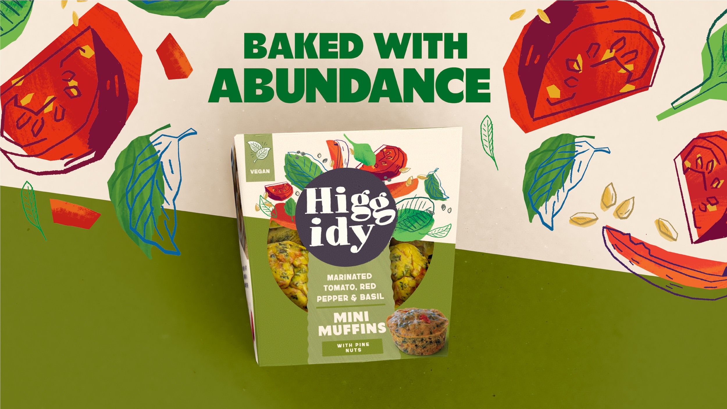
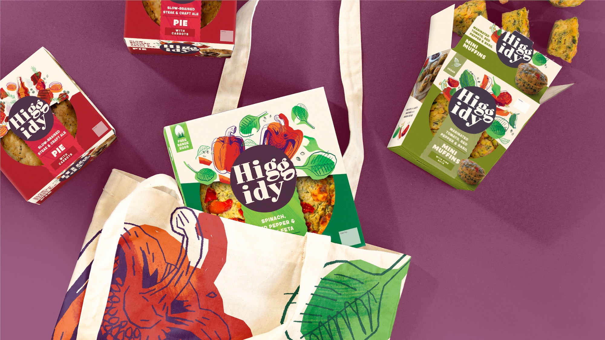
So, the new identity, built around the idea of “Bursting with Abundance”, transforms everyday food moments into something sociable, generous, and crafted. Whether it’s an impromptu grazing board, a social catch up with friends and family or enjoying a comfy pie night in, the new Higgidy design celebrates the imperfect, joyful, real-life ways that people eat today.
“It needed to feel authentic to Higgidy,” adds Hayes. “So, we spent time at the bakery, meeting the team, seeing the quality of ingredients and the care that goes into the product. It gave us what we needed so that we could do more than refresh the pack design – we could continue to bring the magic of Higgidy alive by continuing to drive irresistible taste“.
Illustration as a Competitive Advantage
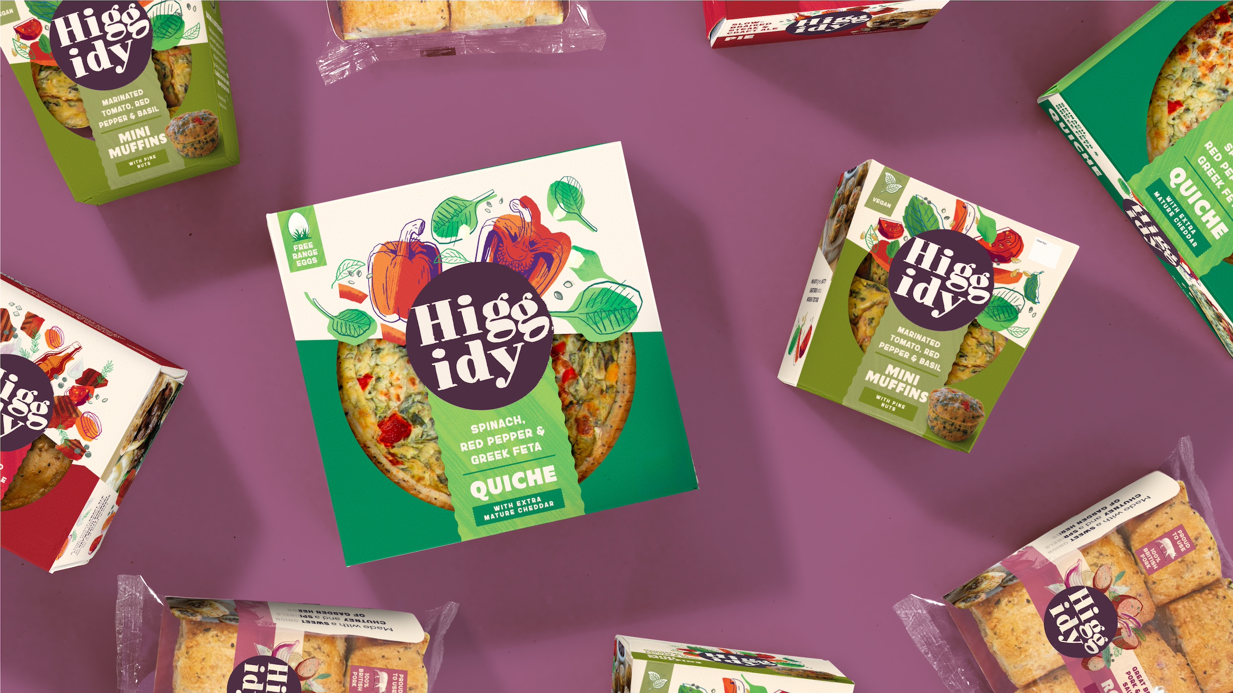
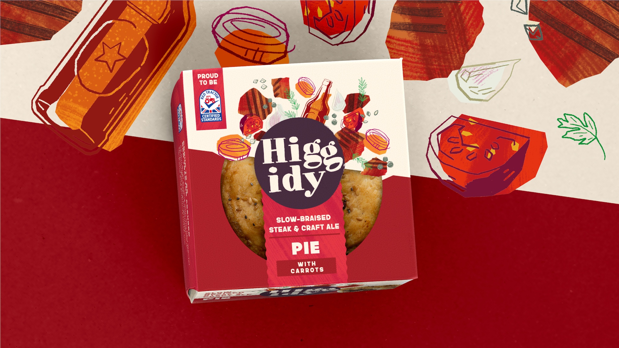
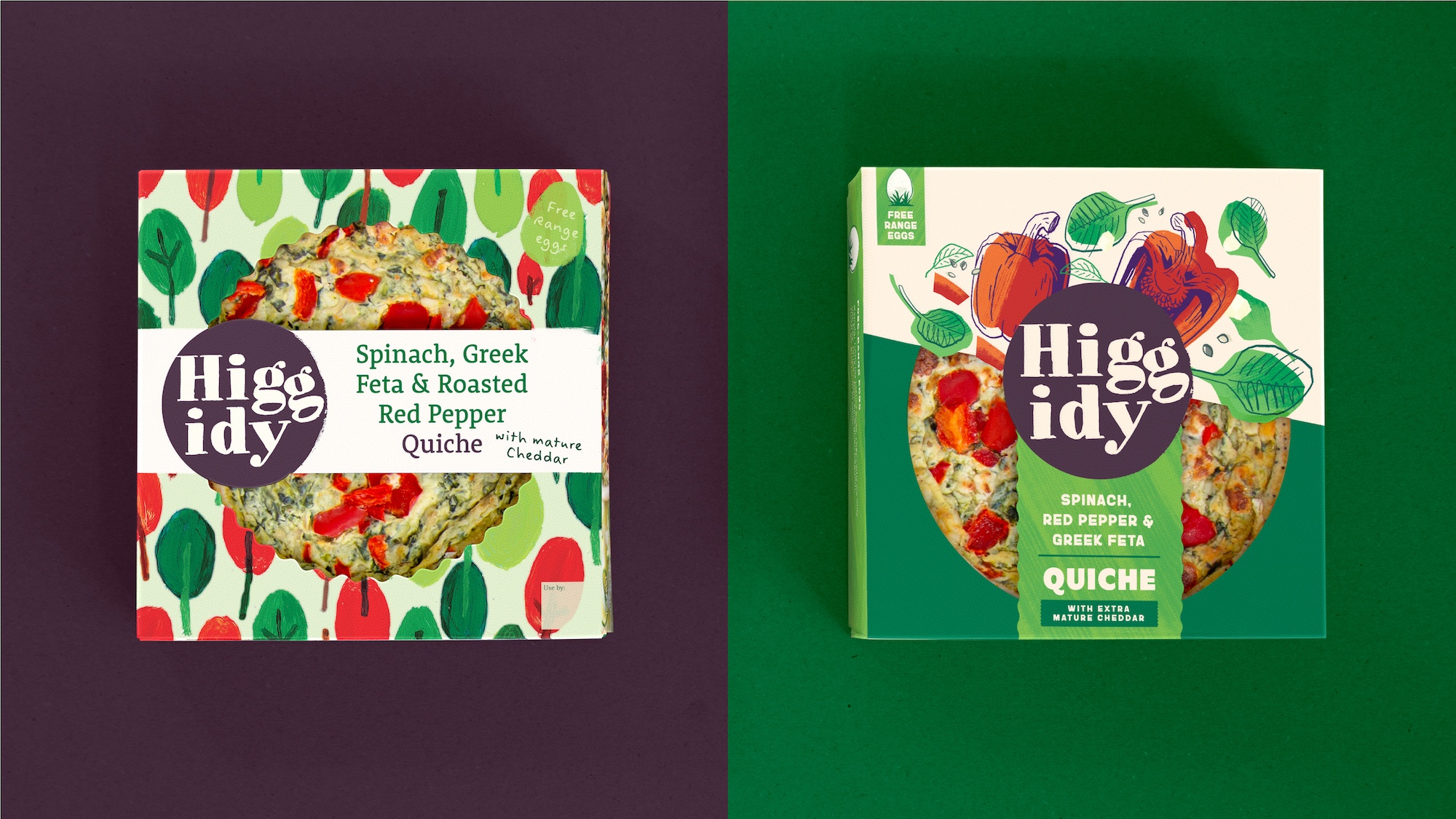
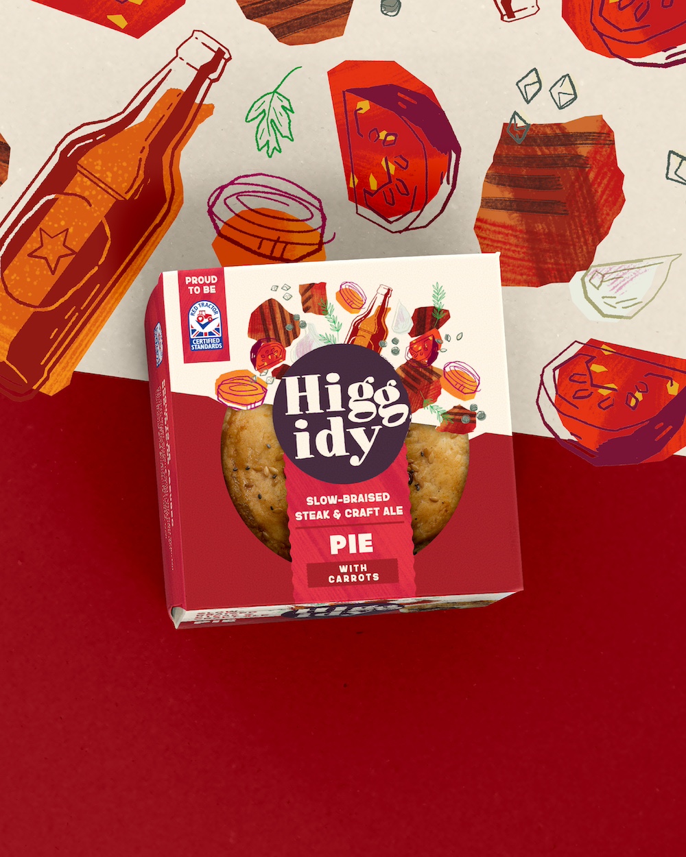
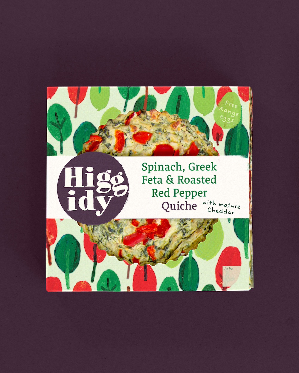
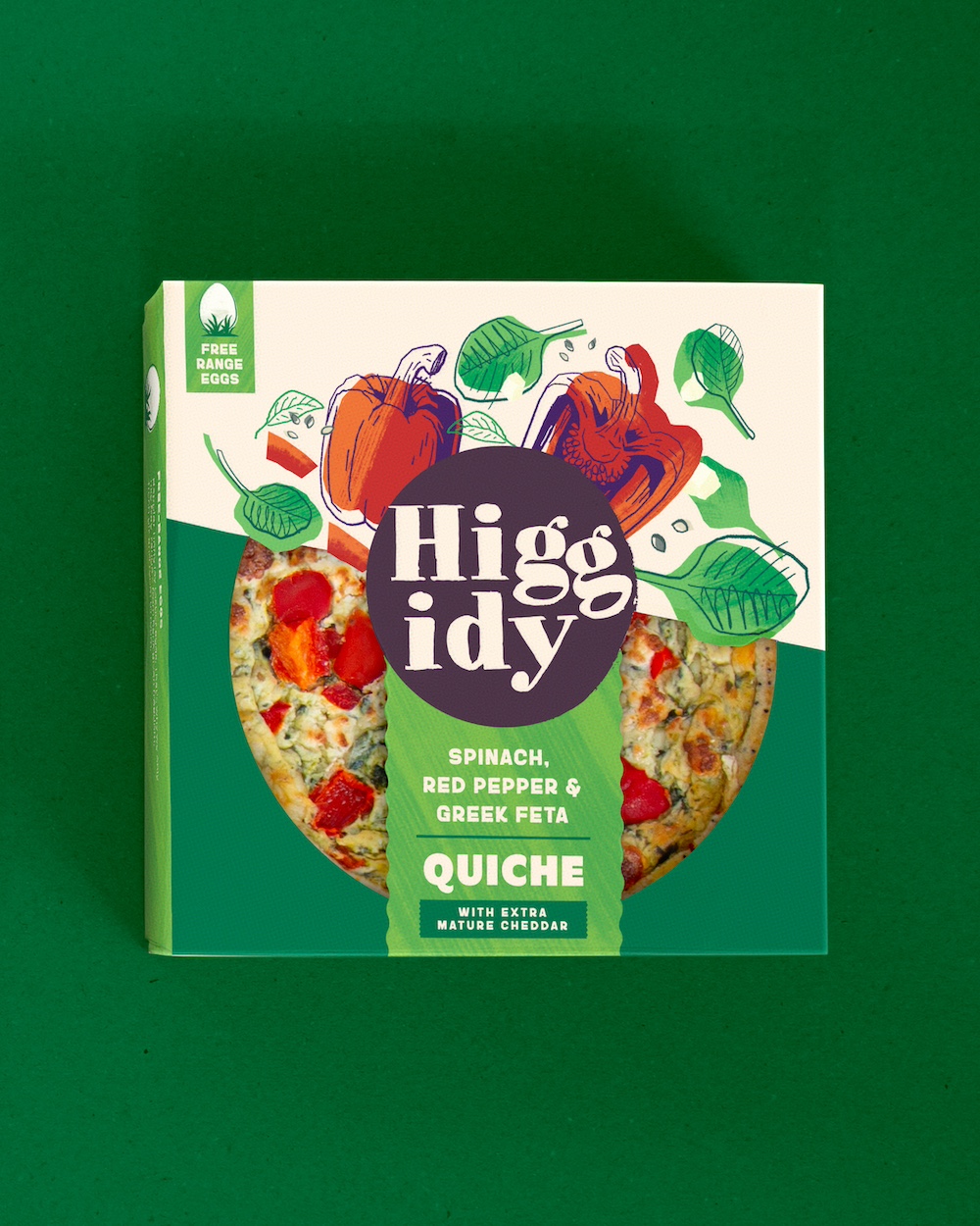
Once its key differentiator, Higgidy’s illustration style had been widely mimicked. Rather than accept this, Higgidy continue to pioneer, working with Bloom to highlight the brand’s taste, ingredients and sense of occasion with new, unique illustrations that build on the brand’s delightful distinctiveness.
“Own-label packaging can be heavily reliant on photography to drive taste. Higgidy had the chance to do something different to drive taste – warm, generous, quality products with a human touch,” says Lottie Petersen, Design Director at Bloom. “We treated every product like a recipe: building the ingredient story layer by layer.”
Clearer Message on all claims
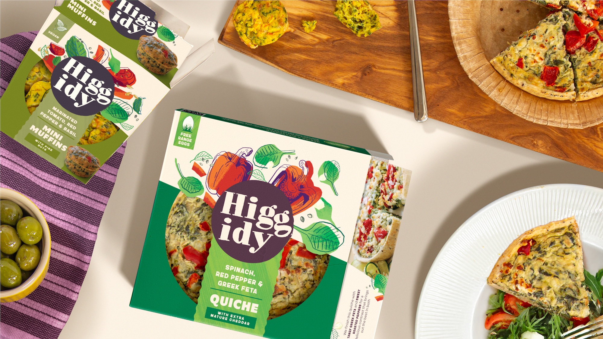
Considered claim messaging, including British-sourced ingredients and free-range eggs, is brought to the forefront via a tab system that complements the burst of illustration, ensuring the packs deliver key messages clearly and confidently.
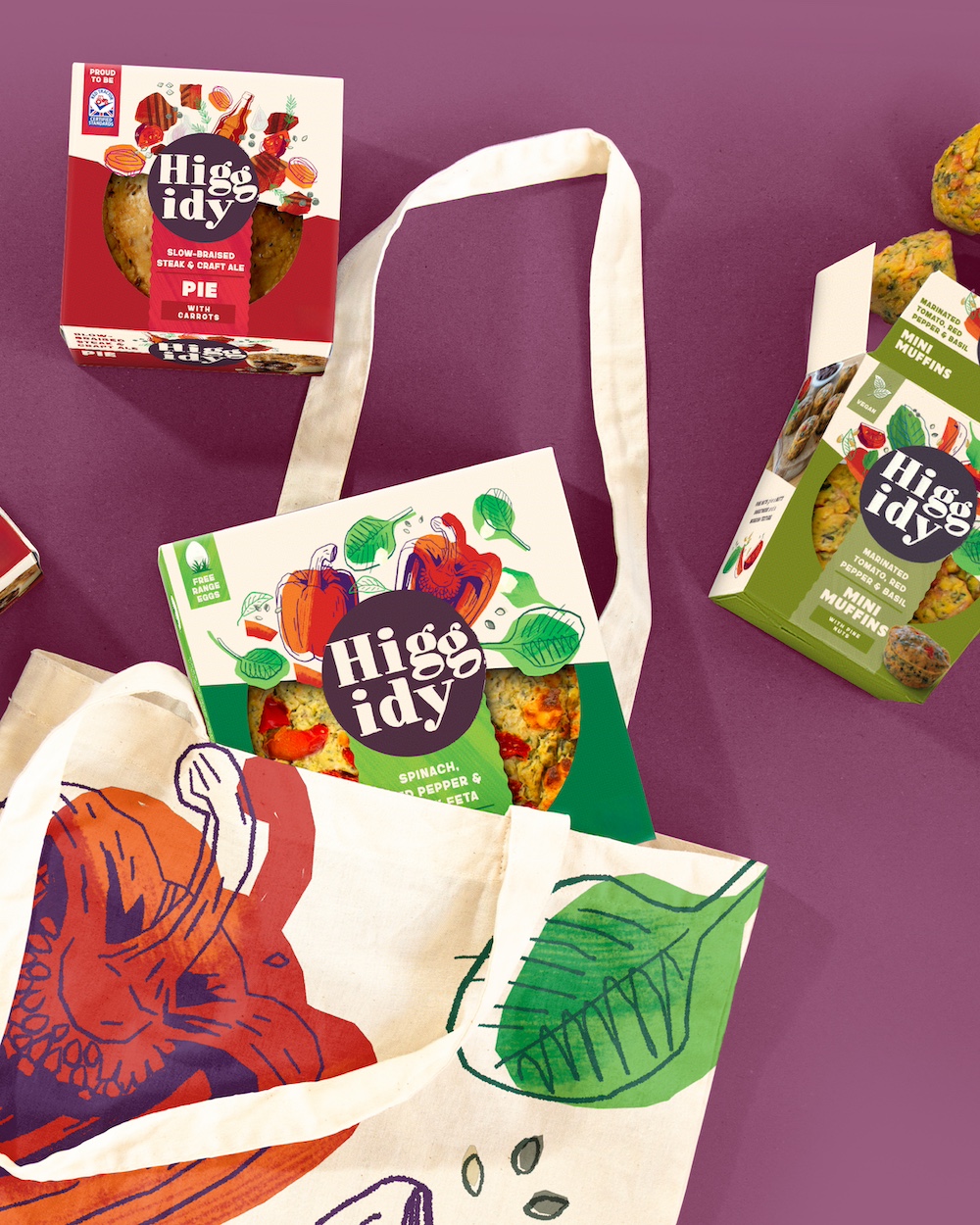
A clear window on-pack continues to hero the food itself, which through rigorous consumer research was continuously asked for, while a unified architecture creates cohesion across the range, vital for a brand that lives in many different parts of a supermarket. This coherent design system will allow shoppers to find Higgidy whichever aisle they’re in.
A Recipe Built on Trust
At the heart of the work was collaboration. Bloom and Higgidy worked hand-in-hand across the strategic and creative process, with the Higgidy Team deeply involved, right down to ingredient depictions and typeface character.
“We created a design that both we and the Higgidy team feel truly captures the spirit of Higgidyness — warm, generous, informal and full of joy,” adds Petersen.
Relevance, Modernity and Coherence
The refreshed design goes on shelf from July, with quiches appearing first in chiller cabinets across the UK, followed by the full range in August and September. Future innovation will be supported by Bloom’s work , working with a playbook that guides the brand into the future.
“We asked Bloom to build on the success of Higgidy, showing its relevance for all generations and adding coherence to an expanded product portfolio,” concludes Jackson. “They’ve delivered this and more and I can’t
CREDIT
- Agency/Creative: Bloom
- Article Title: Bloom Refreshes Higgidy Brand for All Food Lovers
- Organisation/Entity: Agency
- Project Type: Packaging
- Project Status: Published
- Agency/Creative Country: United Kingdom
- Agency/Creative City: London
- Market Region: Europe
- Project Deliverables: Brand Design, Illustration, Packaging Design
- Format: Box
- Industry: Food/Beverage
- Keywords: Higgidy, Illustration, Visual Identity, Pies and Quiches, Refresh, Food,
-
Credits:
Chief Strategy Officer: Ed Hayes


