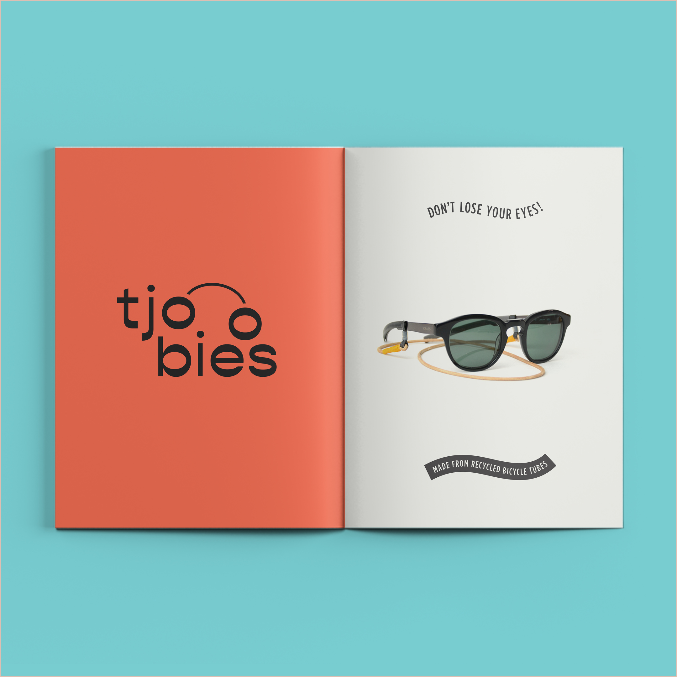
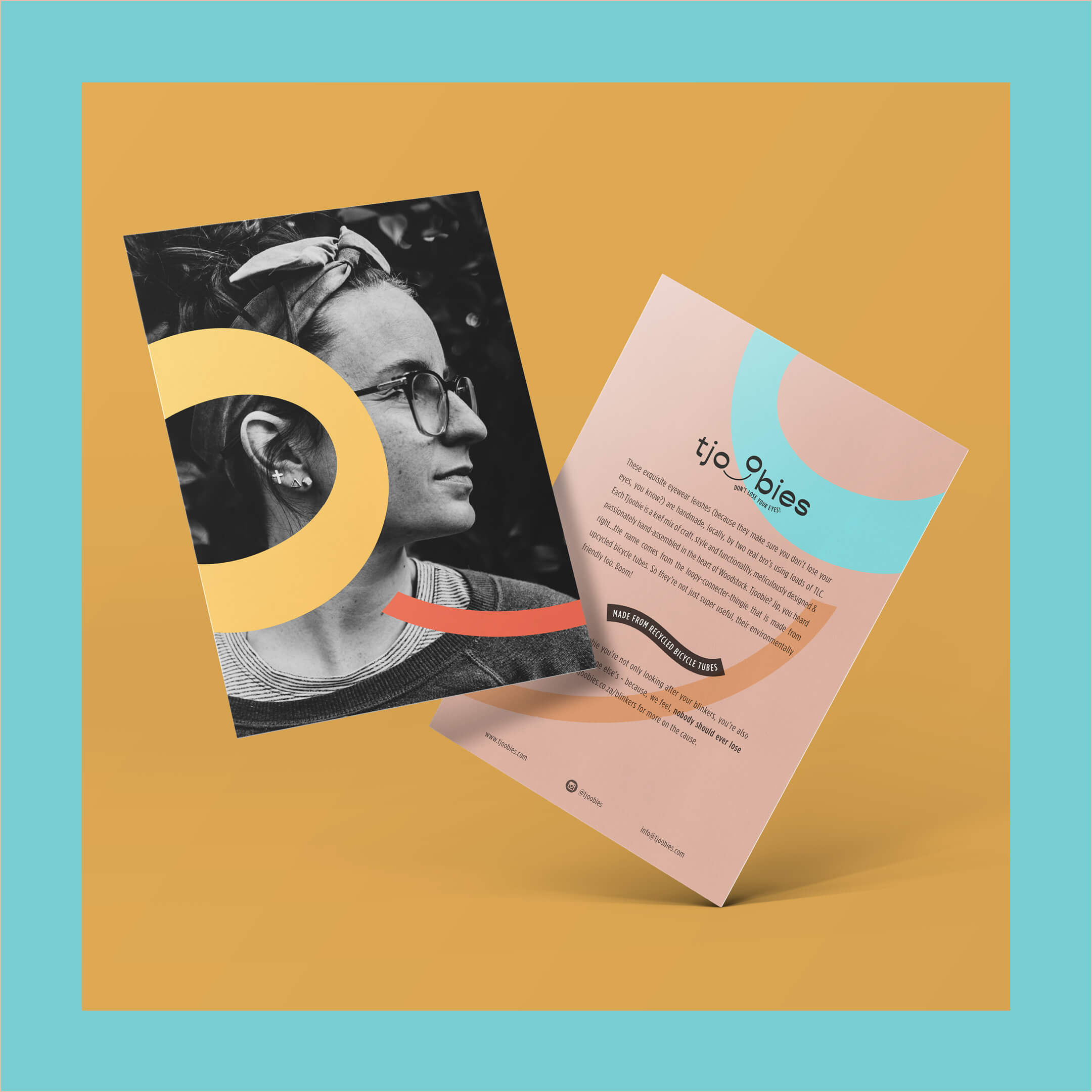
Logo and Identity created for the amazingly talented brother-duo at Stockton Goods a.k.a the founding fathers of Tjoobies . Tjoobies? It’s a stylish eyewear leash which repurposes upcycled bicycle tubes (now you get the name, right).
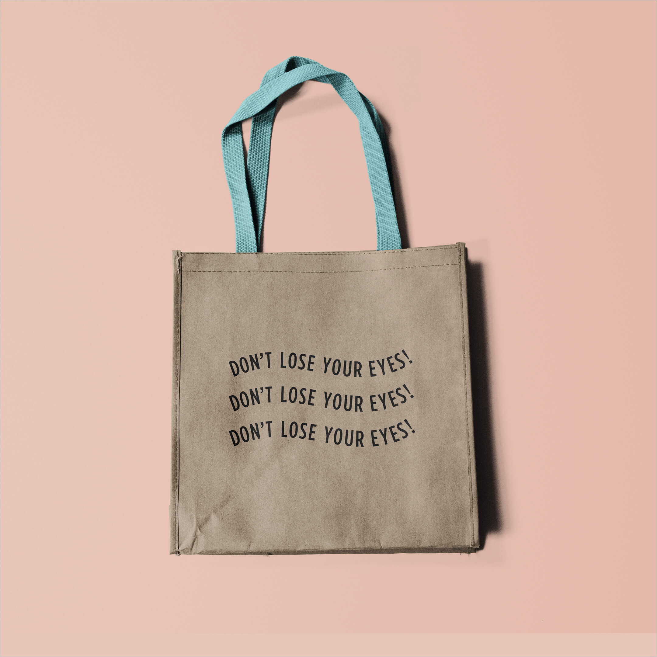
Marketed to young, stylish and environmentally-friendly individuals, these fancily handcrafted strings ensure that you don’t lose your glasses (reading, sun, whatever the case may be) – which for most of us are like our figurative ‘eyes’ – hence the pay-off line we generated = “Don’t Lose Your Eyes”.
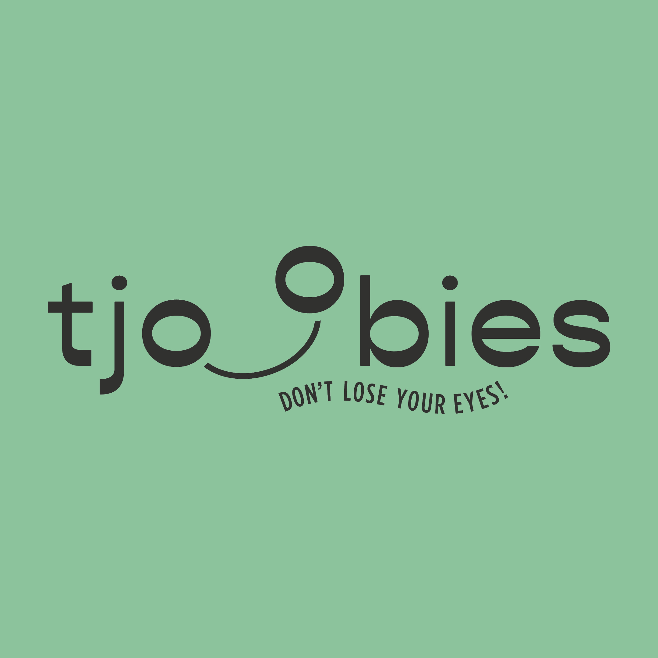
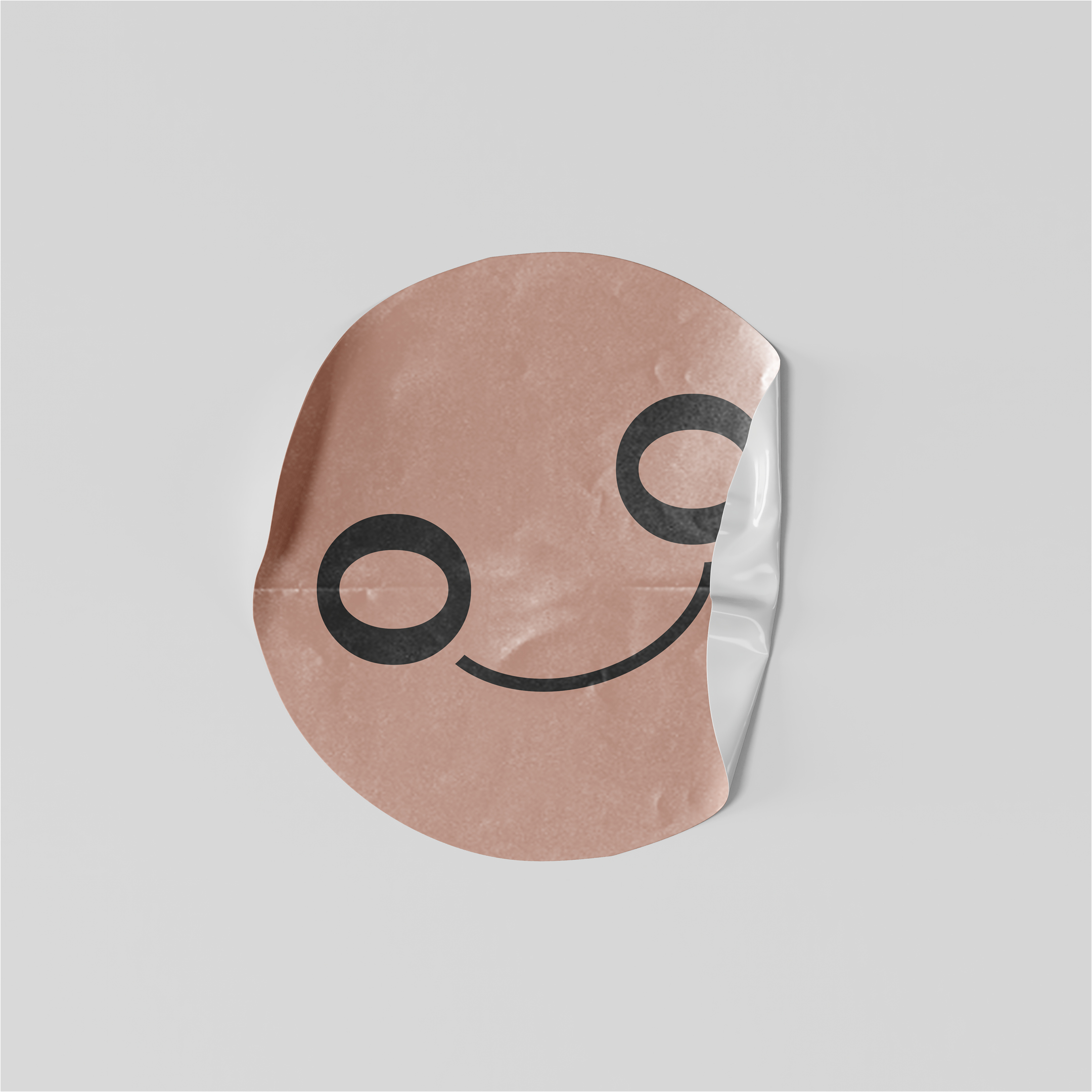
The thought with the logo is to connect the two ‘eyes/glasses’ in the Logo Wordmark (the o’s), using a simple, graphic line – which represents the Tjoobie eg. the eyewear leash. The pay-off line further supports this idea. The end result is is clear representation of the function of the product but with a fun, playful and heartfelt twist.
Tjoobies help you hold onto your eyewear, yes, but there’s a bigger purpose behind those words.
To support the identity thought further the Tjoobies founders decided that when you purchase a Tjoobie they donate a portion of the sale to Onesight – an independent, non-profit providing access to quality vision care and glasses in underserved communities in South Africa.
They share Onesights mission to #helptheworldsee because clear sight helps individuals perform better in school, earn more and connect more deeply with one another.
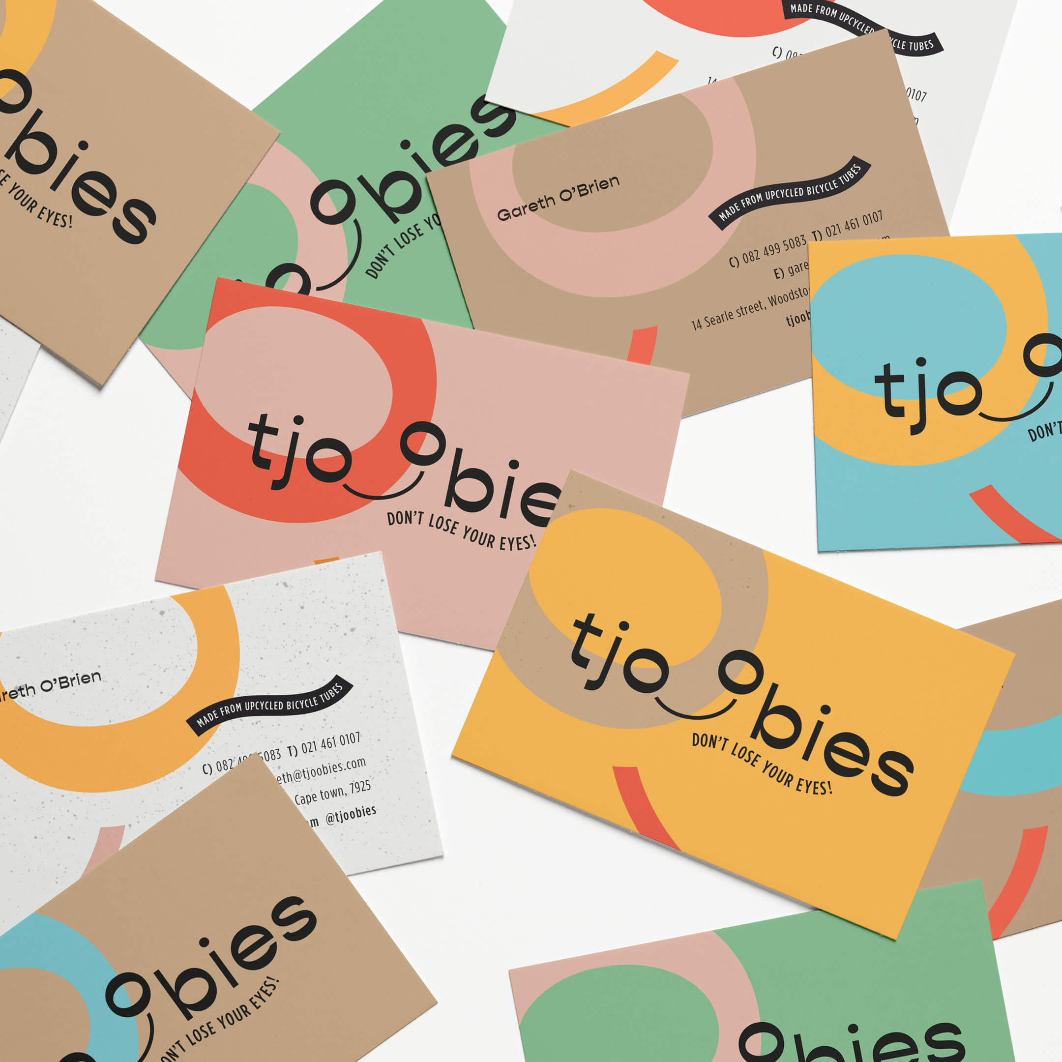
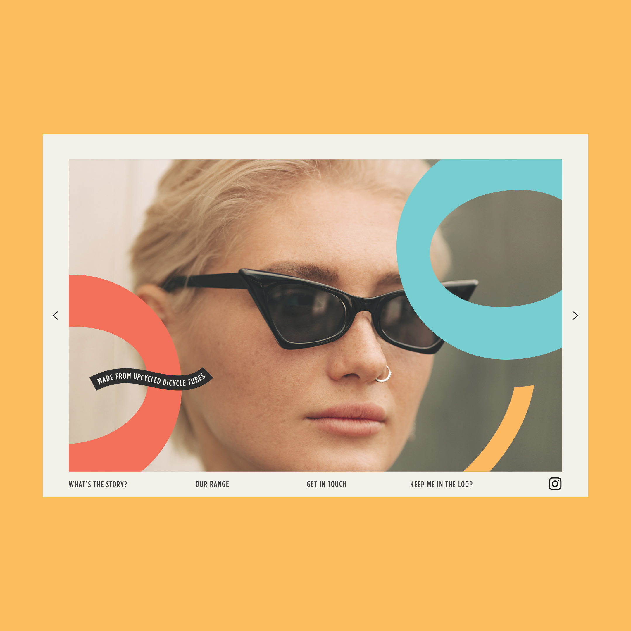
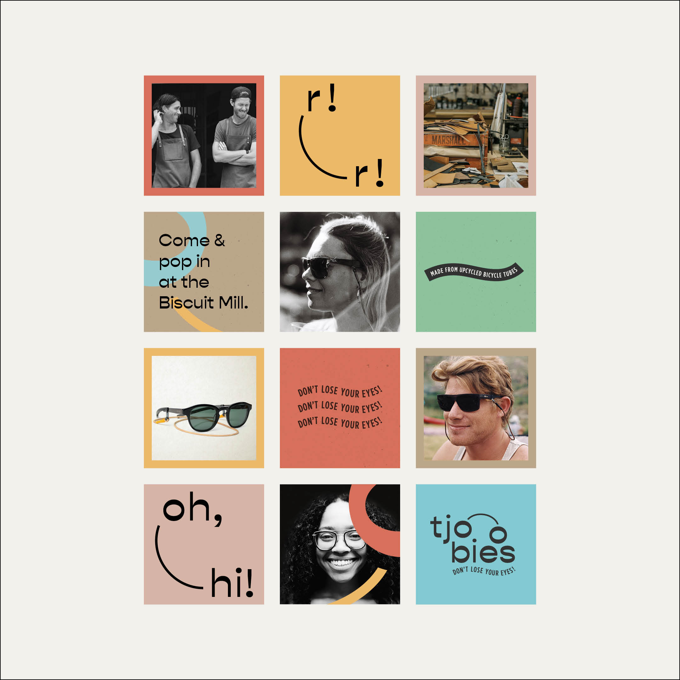
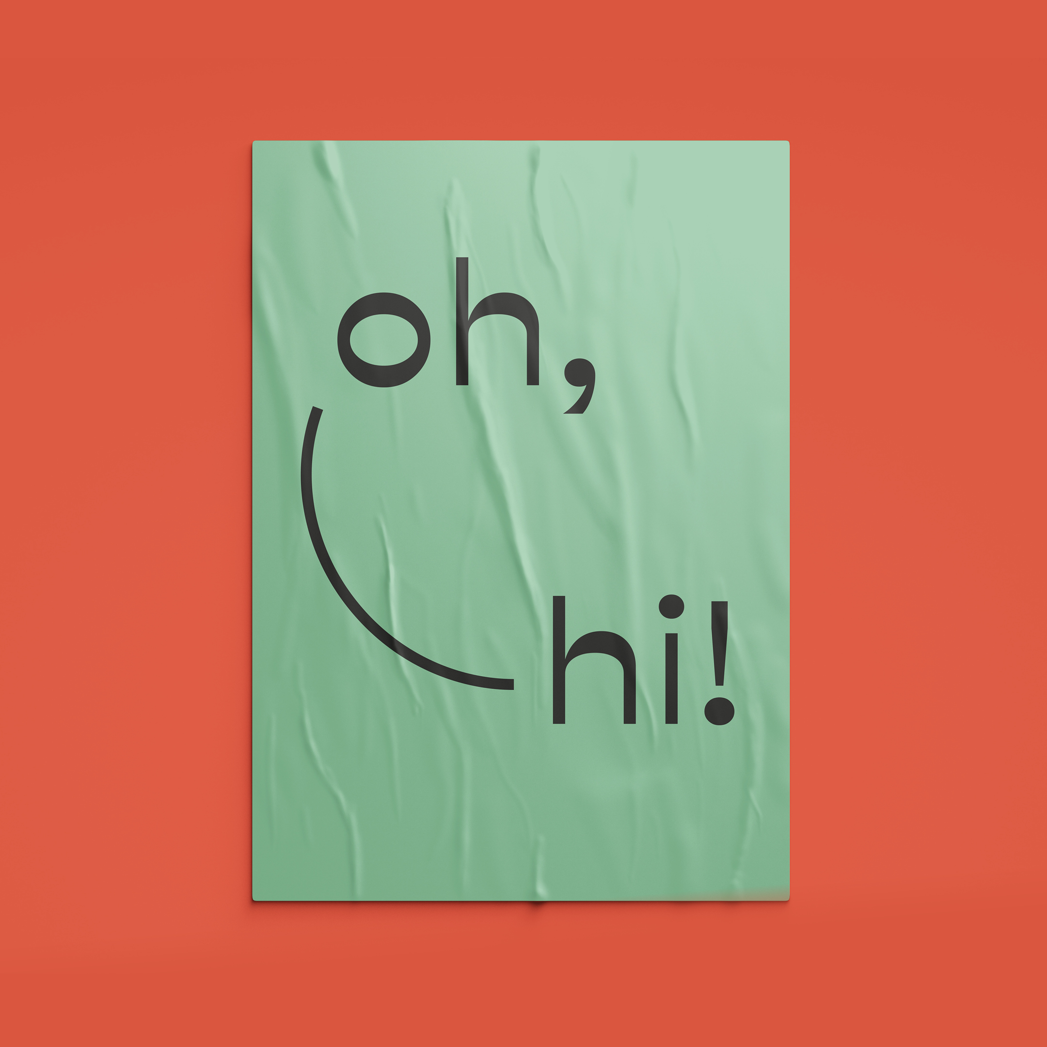
We wanted to create a personable and contemporary Logo & Identity that really captures the essence of the product and its purpose -using a mix of craft (as it the product is handmade with loads of TLC) and modern style. How: Using a traditional-looking logo typeface which is crafted to give it a modern/unique edge (the set type on path pay-offline also adds a bit of playfulness), a mix of natural craft paper colours and approachable/bold colours and a ‘real’ photography approach, mixed with a bold, graphic application.
So remember, buy a Tjoobie to ensure that you Don’t Lose Your Eyes. Because when we see better, we live better.
CREDIT
- Agency/Creative: Blood, Sweat and Polony
- Article Title: Blood, Sweat and Polony Create Identity Design for Eyewear Leashes
- Organisation/Entity: Agency, Published Commercial Design
- Project Type: Identity
- Agency/Creative Country: South Africa
- Market Region: Global
- Project Deliverables: Brand Advertising, Brand Creation, Brand Identity, Branding, Graphic Design, Identity System, Packaging Design, Research, Retail Brand Design, Tone of Voice
- Industry: Fashion
- Keywords: Eyewear Leashes. Reading Glasses. Sunglasses. Logo Design. Identity Design. Don't lose your eyes. Branding. Fun. Playful. Contemporary.


