The brand: A trendy and modern Amsterdam bakery for quality-conscious young adults and professionals. With a modern, minimalist design, it highlights the beauty of its high-quality baked goods. Ideal for those who appreciate premium treats on the go.
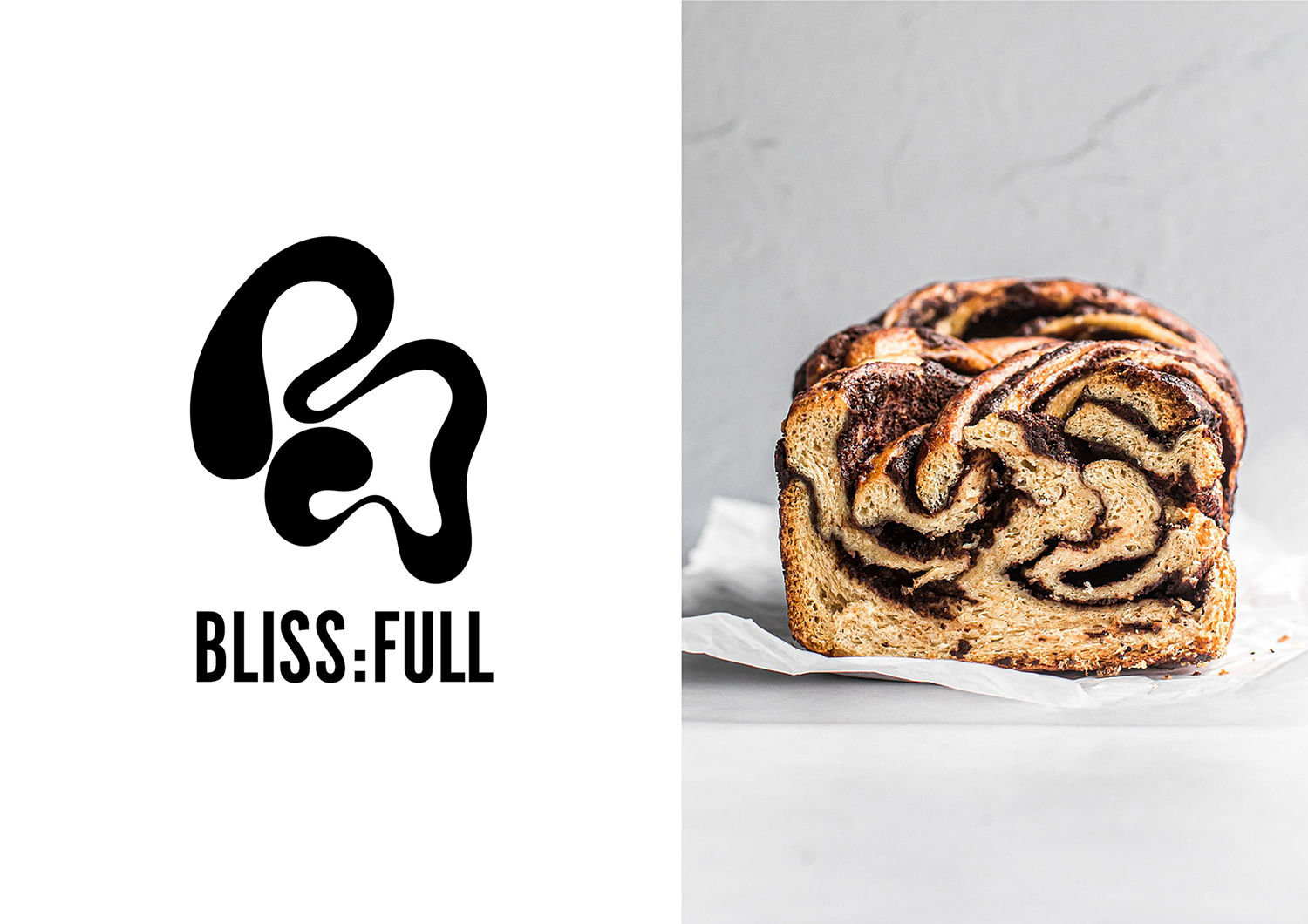
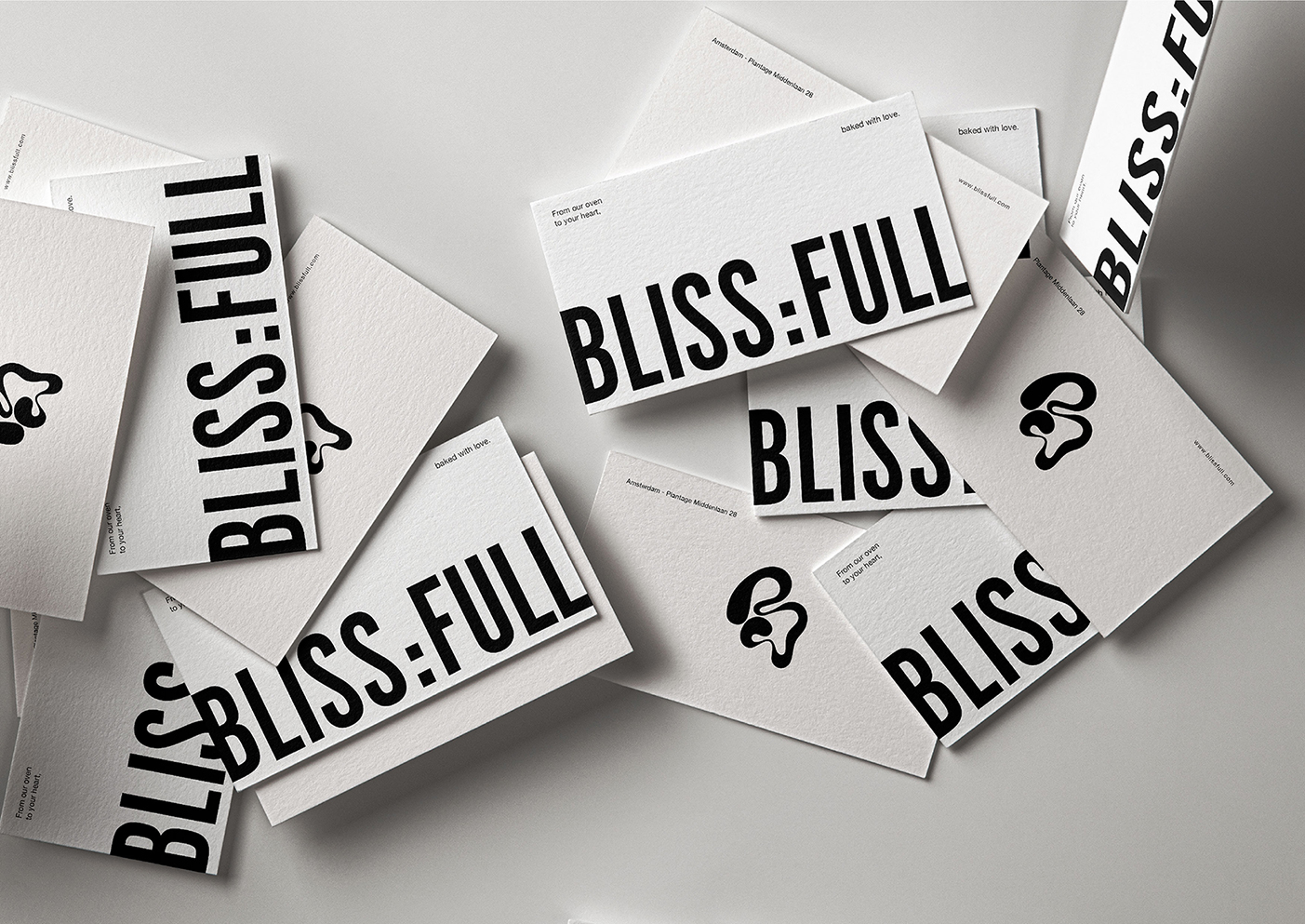
The design: The name ‘Bliss:full’ is a playful combination of feeling ‘blissful’ with the promise of feeling ‘full’ after indulging in their delectable treats. The name is split into two parts to highlight the play on words, adding an element of cleverness and humor to the brand.
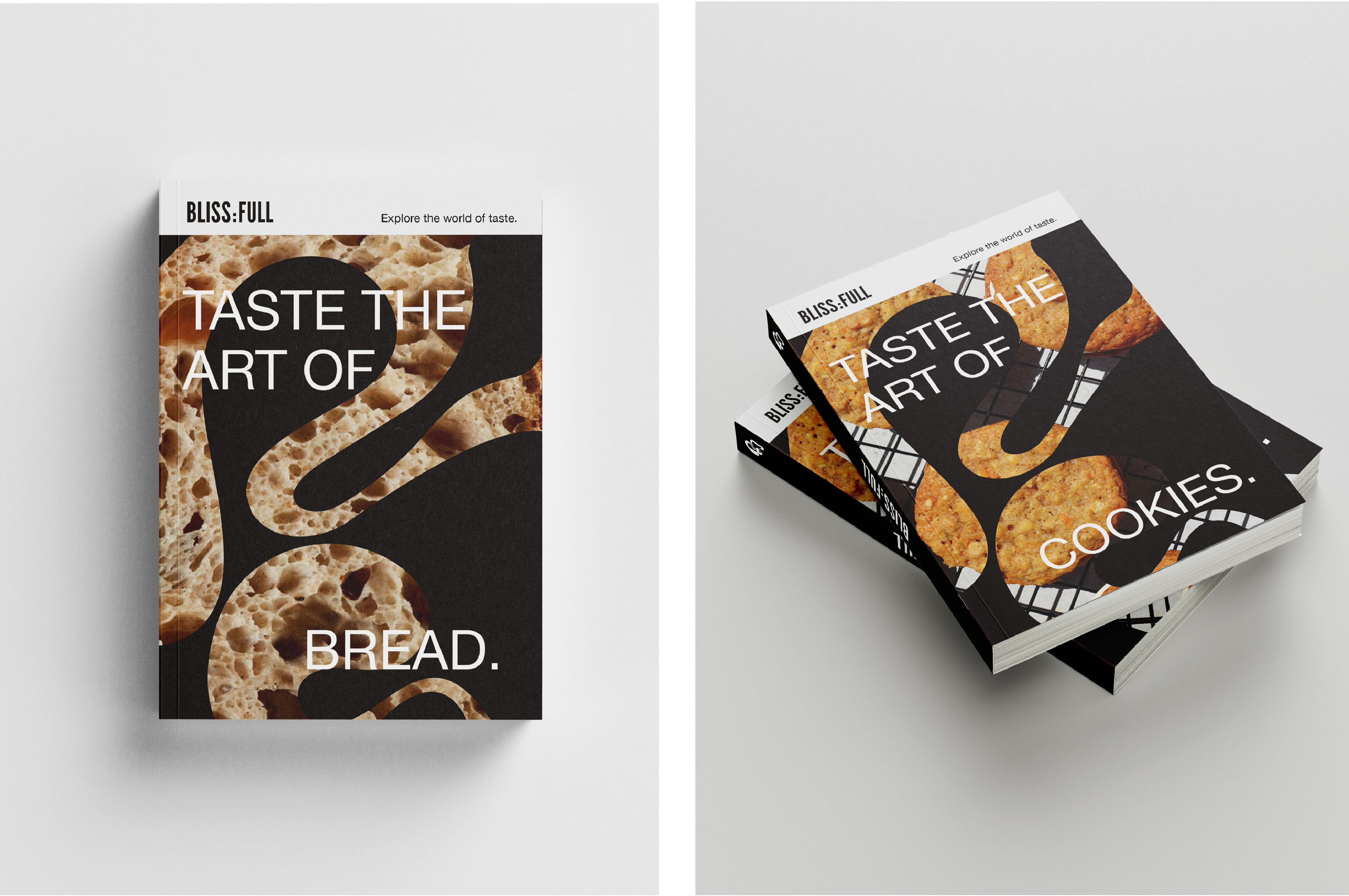
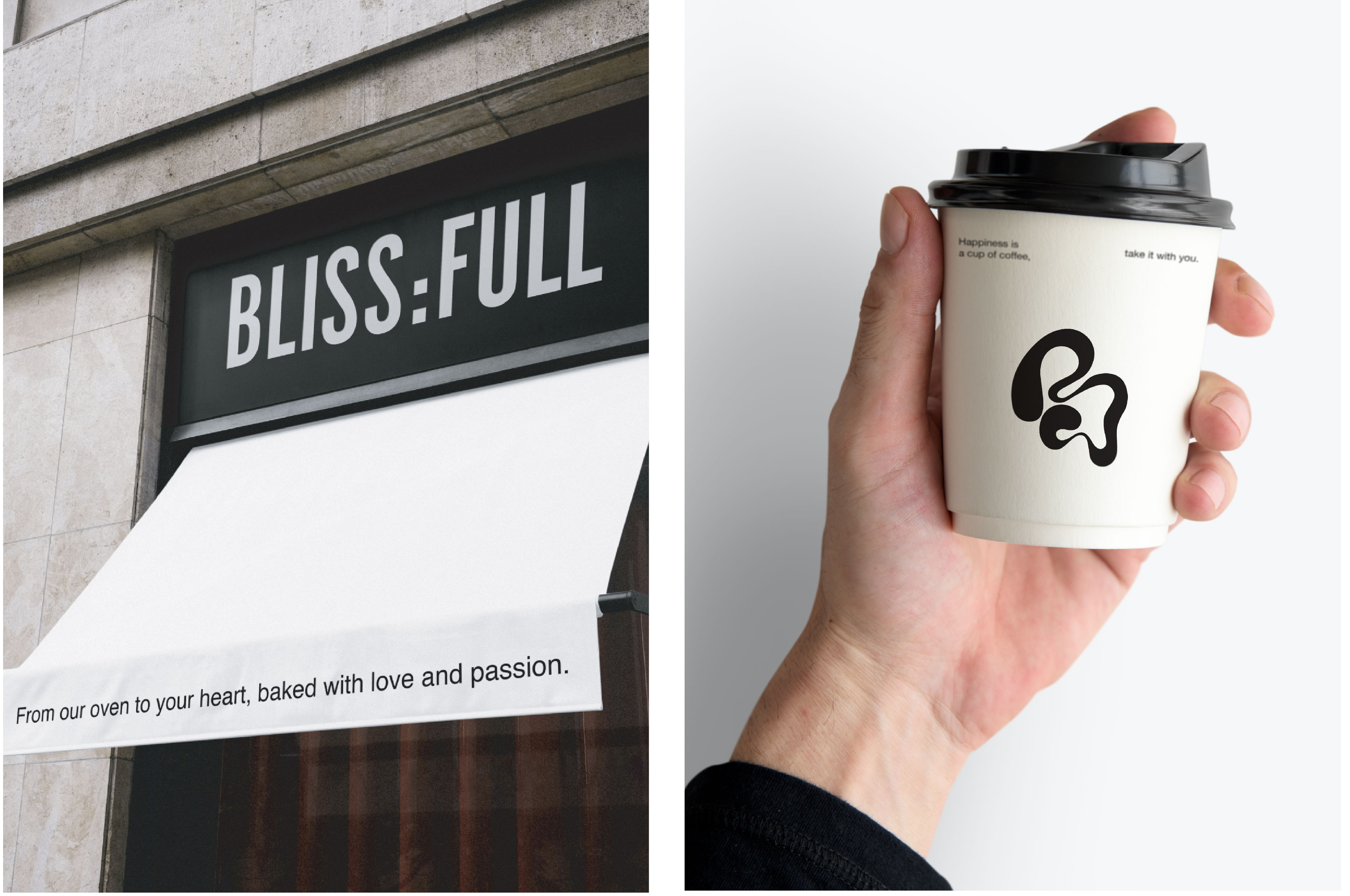
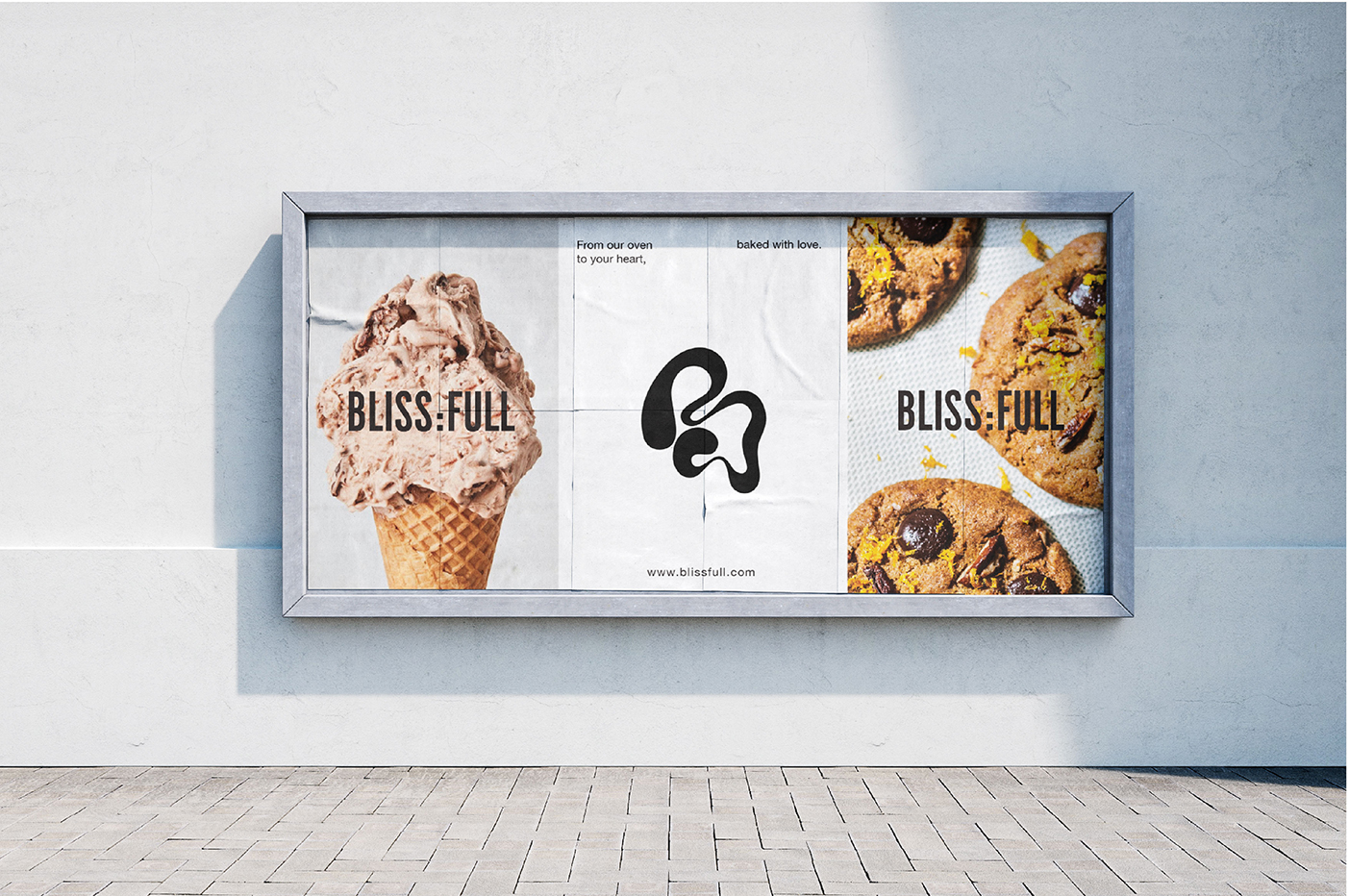
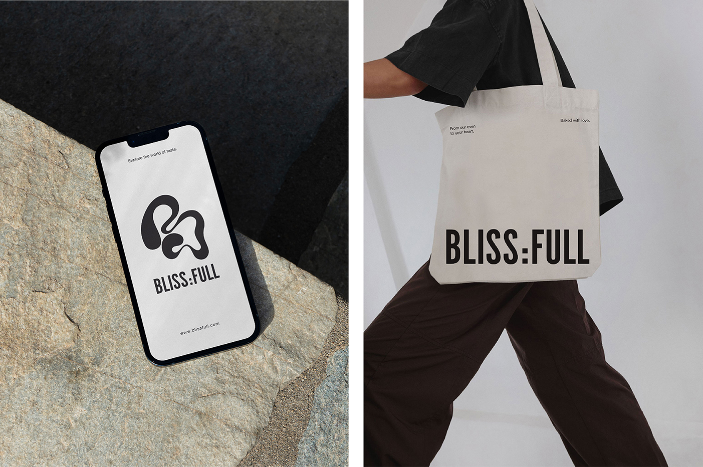
The symbol was designed with the goal of creating a bold, trendy, yet clean design. It is an artistic representation of the abstract shapes that two ingredients can create when mixed, much like the patterns that chocolate makes in a cake. The letter ‘B’ in the logo is a nod to the bakery’s name, which makes it easily recognizable and memorable.
The symbol’s curves reflect the movement of liquid ingredients mixing, symbolizing the artistry and creativity that goes into bakin.The bold and modern shape represents the bakery’s confidence in its products, promising a delicious and memorable experience.
The chosen typeface is dynamic and modern, reflecting the bakery’s identity. Stable, bold, and confident, it complements the abstract fluid symbol.
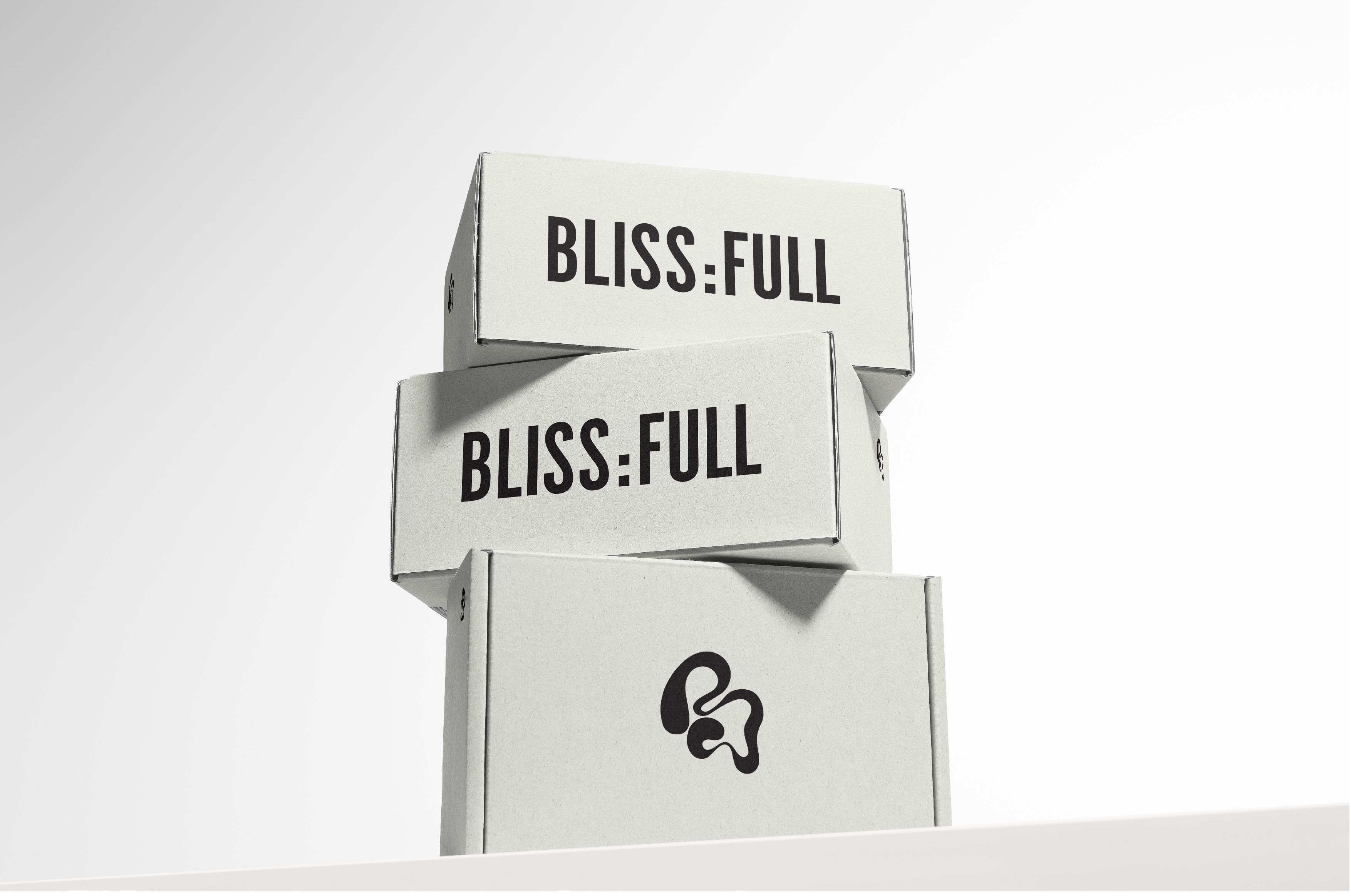
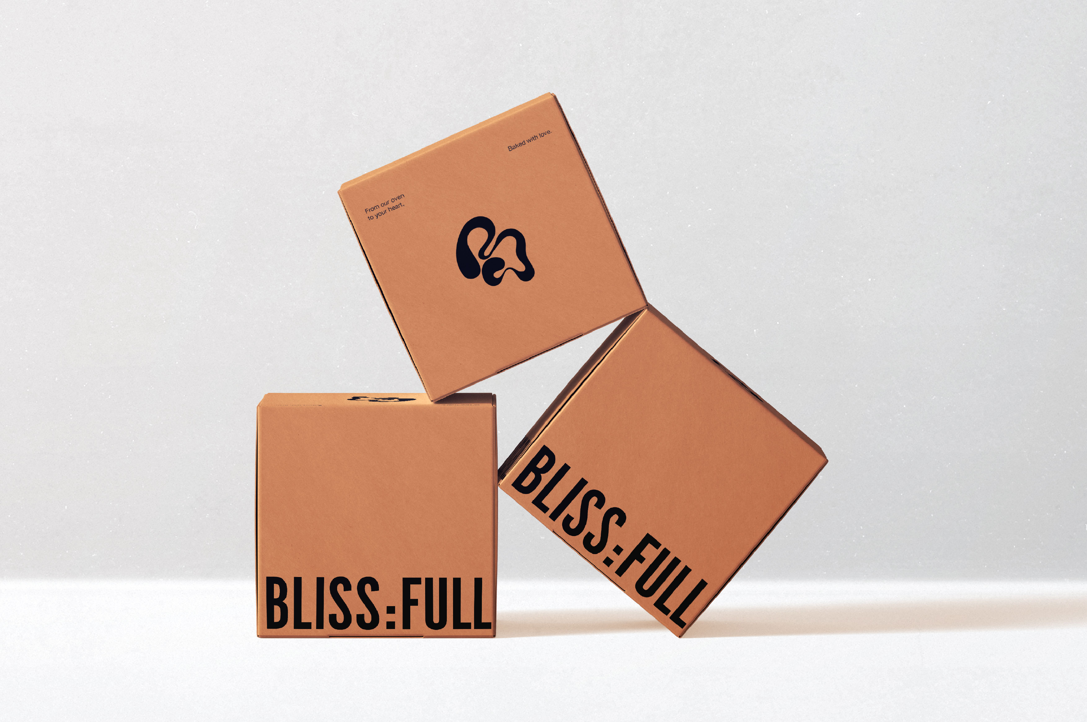
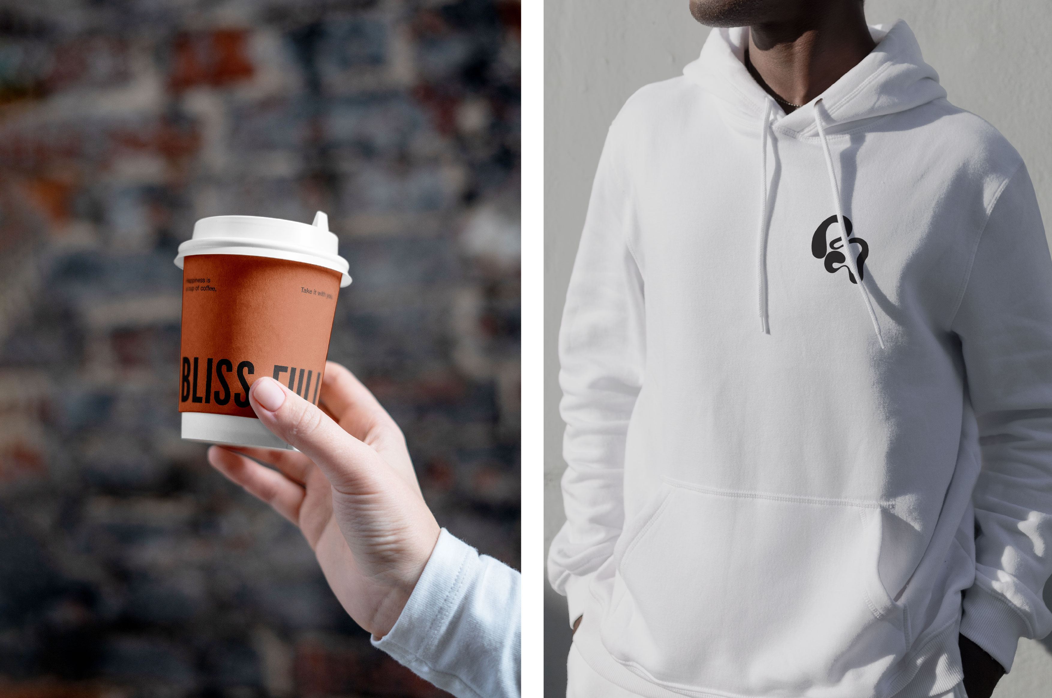
The main colors used for Blissfull’s branding are black and white, with small pops of color used for details such as the inside of the packaging boxes, coffee cups, and boxes for individual cupcakes. The reasoning behind the chosen color palette was to avoid taking attention away from the real hero of the brand – the Blissfull products. The black color used in the logo represents stability, modernity, and confidence all at once.
The small touches of color were inspired by the natural colors of baked goods like bread and croissants, adding warmth and a touch of playfulness to the brand. By using a minimalist color palette, the focus is kept on the quality of the baked goods, which is the main focus of the brand.
CREDIT
- Agency/Creative: Vassiliki
- Article Title: Bliss:full Bakery Unveils Modern Packaging – Where Minimalism Meets Delectable Treats
- Organisation/Entity: Freelance
- Project Type: Identity
- Project Status: Published
- Agency/Creative Country: Sweden
- Agency/Creative City: Stockholm
- Market Region: Europe
- Project Deliverables: Brand Design
- Industry: Food/Beverage
- Keywords: branding, brand identity, packaging, food, bakery, graphic design, identity
-
Credits:
Designer: vassiliki fi


