


Blank Street, the cult favourite brand aiming to become the defining food and beverage brand of our generation, has launched a major rebrand to signal the next phase of its growth- from a beloved coffee and matcha chain to global lifestyle brand.
Since launching from a coffee cart in Brooklyn during the early days of the pandemic, Blank Street has grown across New York, Boston, DC, London, Manchester, Birmingham, Glasgow and Edinburgh. This growth sparked the opportunity to bring greater cohesion and clarity to the brand’s identity.
Developed by global brand consultancy Wolff Olins, the new identity is rooted in Blank Street’s purpose to “add a spark to the ordinary.” It captures the brand’s spirit that customers know and love, while laying the foundation for its future.
Mohammad Rabaa, Global Creative Director, Blank Street said: “This transformation was not about doing a 180, it was about becoming more ourselves. Our brand is built on tensions: function and form, utility and indulgence, sophistication and playfulness, and you’ll see these explored more critically through this new brand identity. This evolution takes the best parts of Blank Street and doubles down, creating a more cohesive brand experience that feels both exciting and familiar.”
A unified identity
This new chapter for Blank Street includes a comprehensive design system built to flex across signage, packaging, digital, and campaigns:
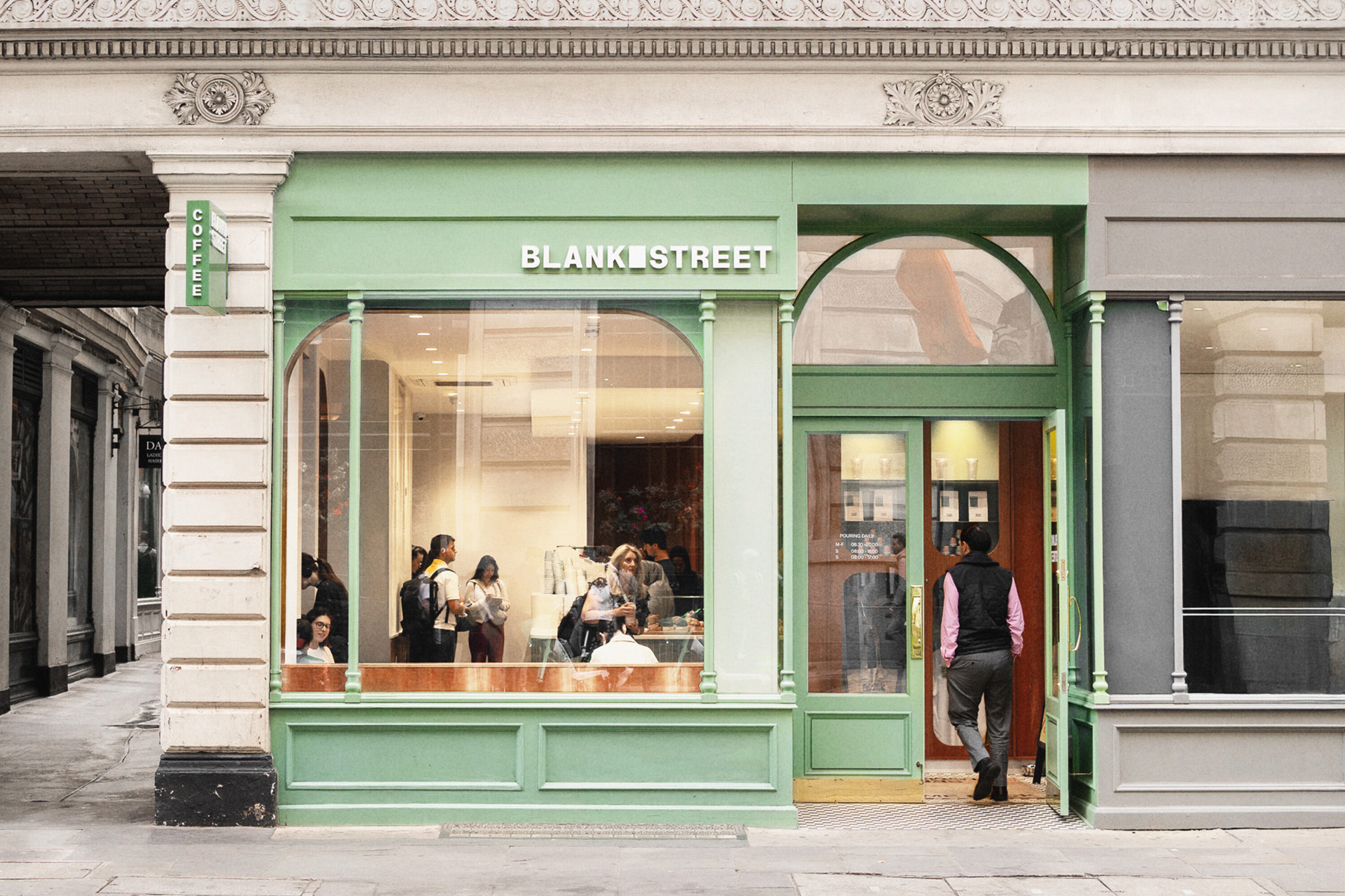
An updated logo and symbol that carves out a literal blank space, or “window” as a visual cue for imagination and possibility.
A refined “Blank Street Green” – a lush, unmistakable green hue and is now accompanied by an extensive, secondary palette of greens aptly named after times of day, a nod to the different colours a Blank Street cup takes on in morning, afternoon, and evening light.
Custom typography, developed in partnership with Due Studio, that balances clean utility with expressive charm across two typefaces. Regular Sans serves as the primary typeface, used boldly for headlines, while Remarkable Sans is the secondary, playful typeface to use for special moments.
The updated identity will begin rolling out after Labor Day. (September 1st). Customers can expect to see the new identity come to life in its Autumn 2025 campaign, with in-store updates rolling out over the following months.
Wolff Olins Creative Director, George Lavender, said: “During the creative process, we set out to elevate the essence of Blank Street – transforming regular moments into something remarkable. Every detail draws inspiration from their unique story: from the shape of the window on their first coffee cart to the signature drinks that are beloved by their regulars.”
CREDIT
- Agency/Creative: Wolff Olins
- Article Title: Blank Street Unveils New Brand Identity, Signalling The Next Era Of Growth
- Organisation/Entity: Agency
- Project Type: Identity
- Project Status: Published
- Agency/Creative Country: United Kingdom
- Agency/Creative City: NEW YORK
- Market Region: Europe, North America
- Project Deliverables: Brand Architecture, Brand Design, Brand Experience, Brand Guidelines, Brand Identity, Brand Mark, Brand Redesign, Brand Refinement, Brand Rejuvenation, Brand Strategy, Brand Tone of Voice, Branding, Creative Direction, Design, Graphic Design, Identity System, Rebranding, Tone of Voice, Type Design, Typography, User Experience
- Industry: Food/Beverage
- Keywords: Wolff Olins, Blank Street
-
Credits:
PR: Alie Griffiths


