Blanco, a family dedicated to agriculture since 1867, approached us for a new visual identity that would represent a graphic redefinition of their extra virgin olive oils.
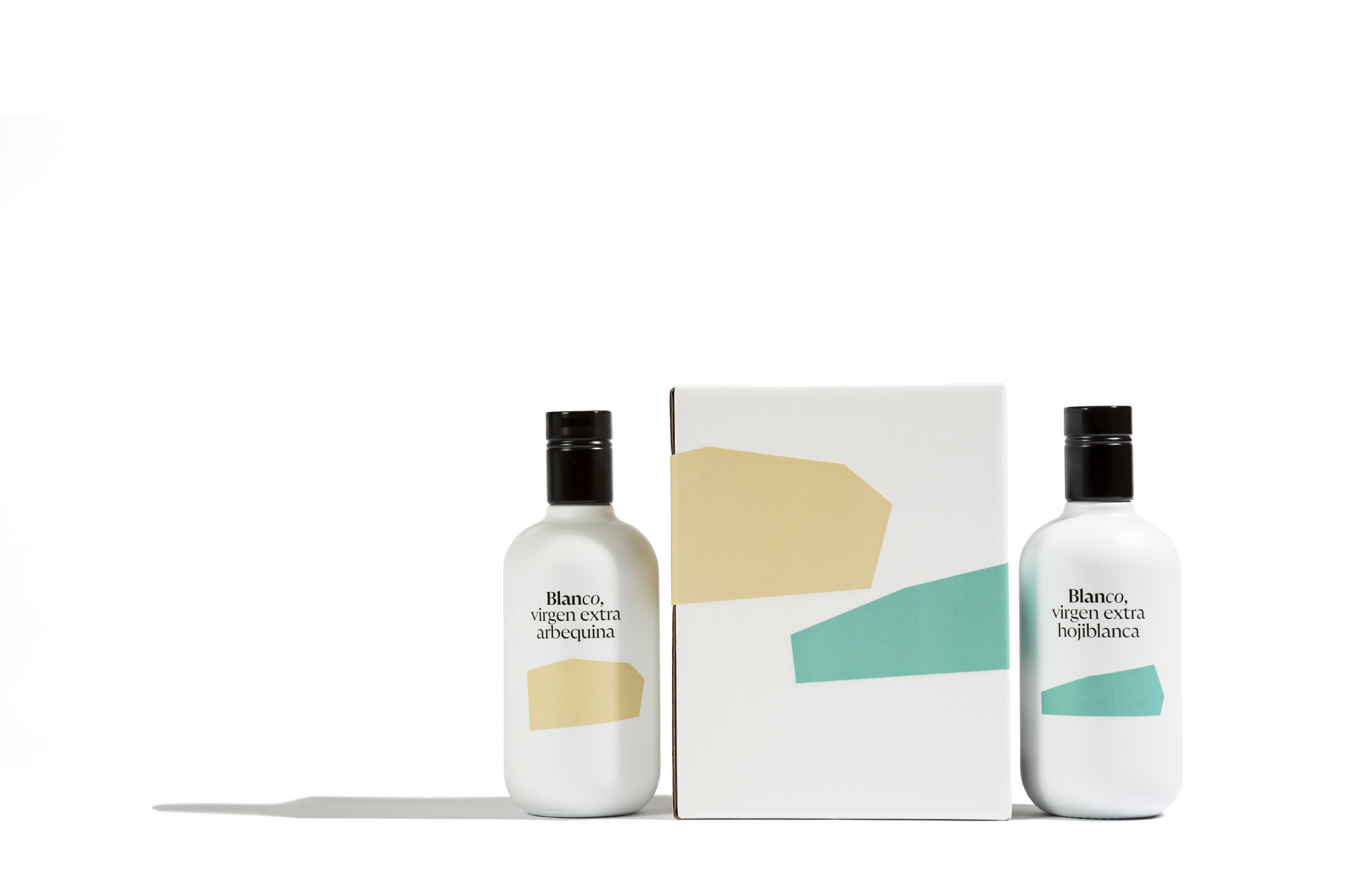
We proposed a comprehensive image overhaul to the Blanco family, aiming to reflect the quality of their extra virgin and the exclusive selection of their fruits in each harvest.
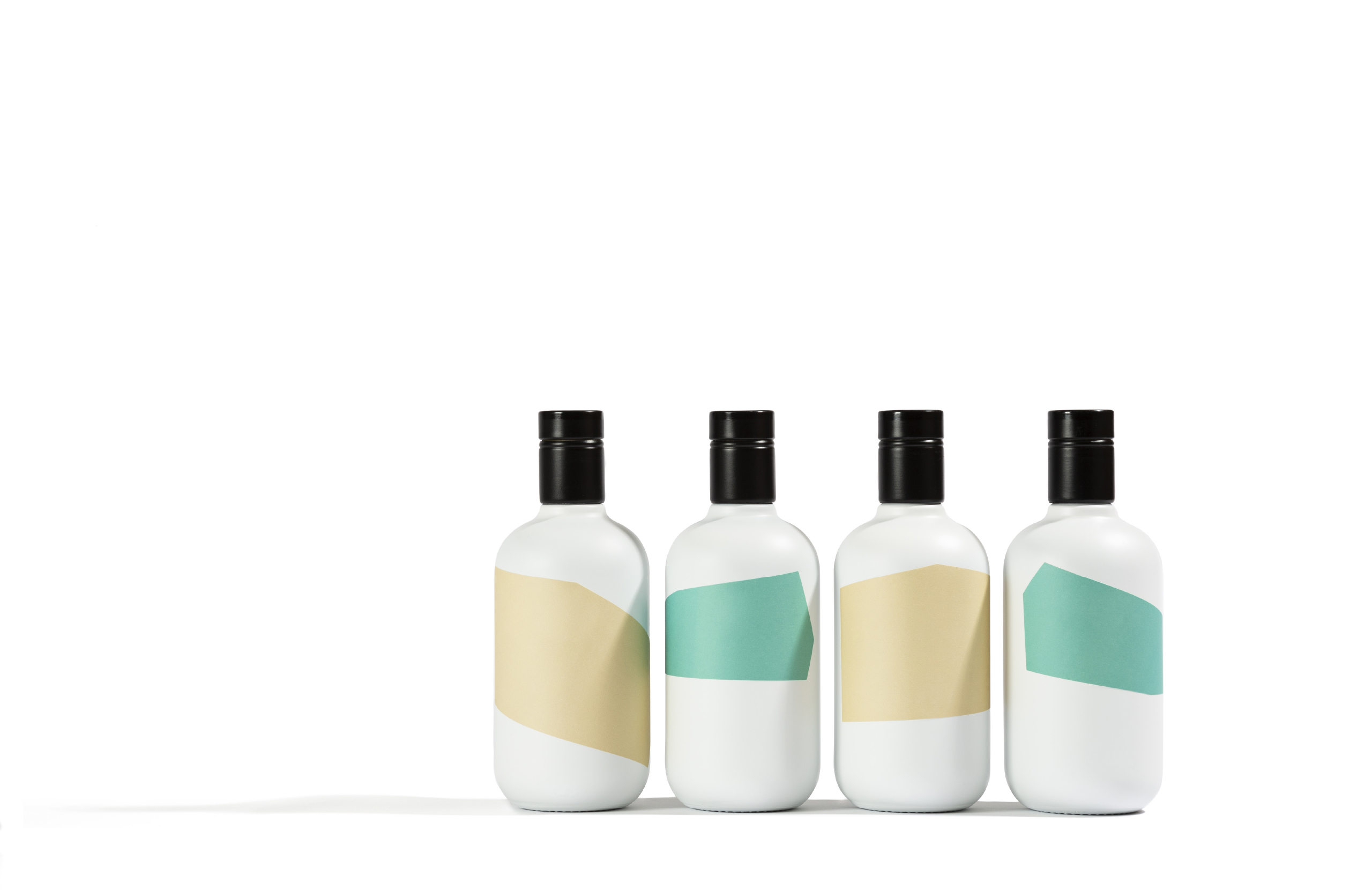
We wanted to visually translate the meticulous process of selecting the best terrains for each variety in every harvest.
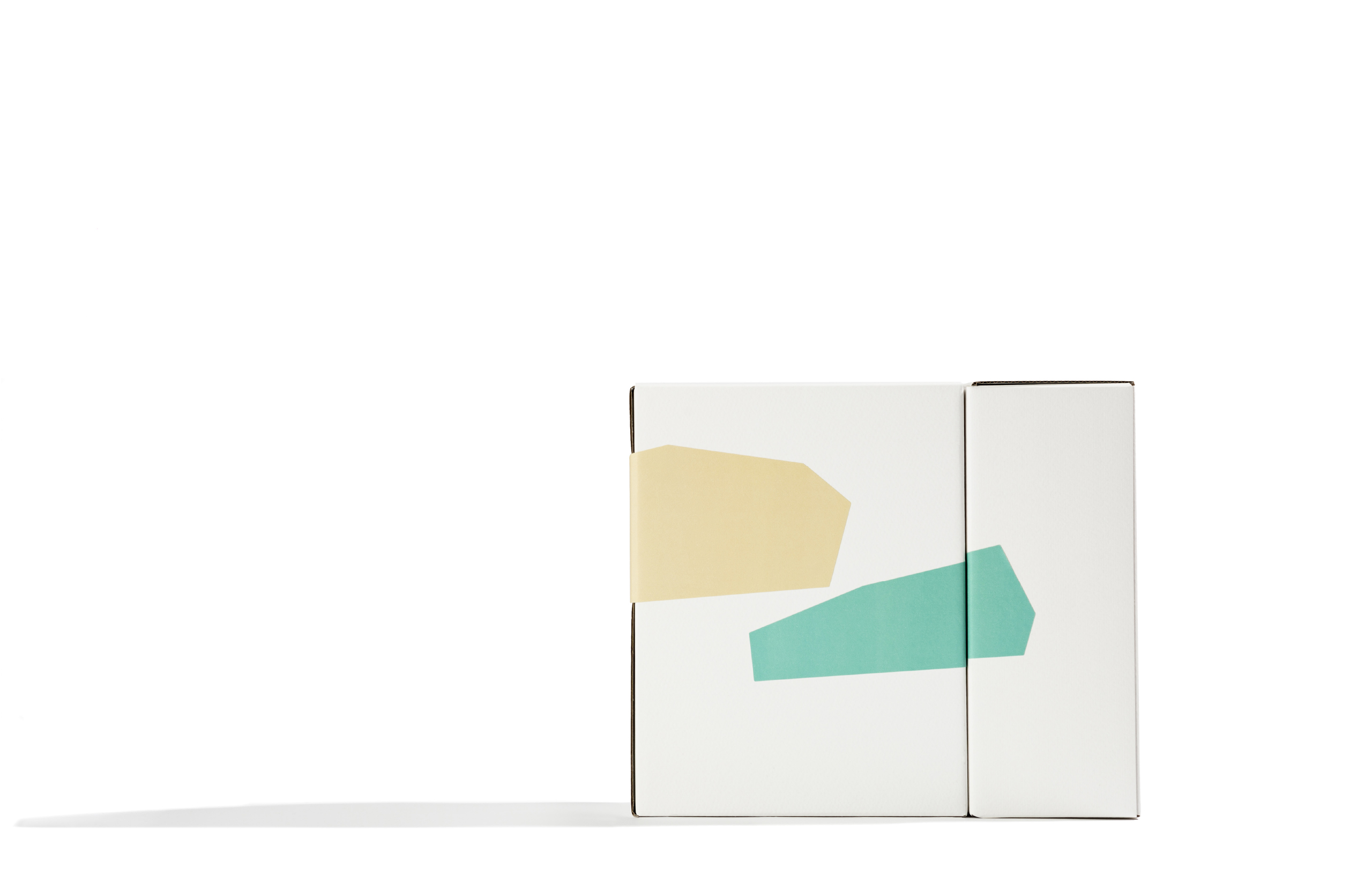
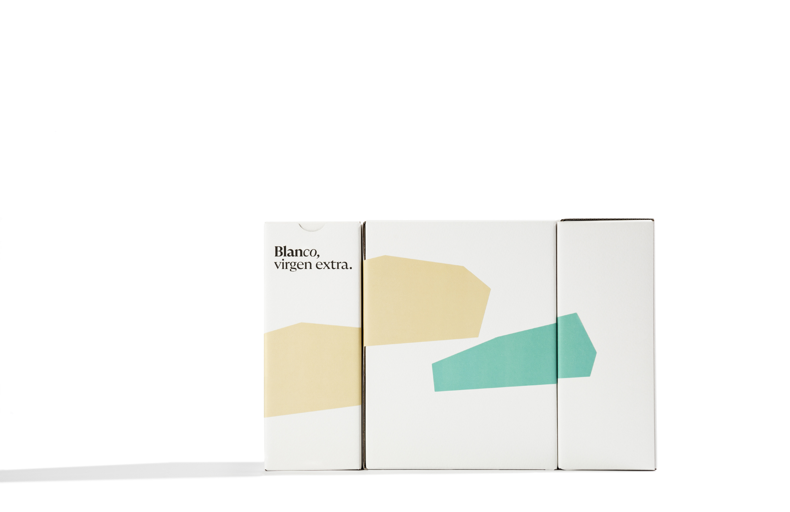
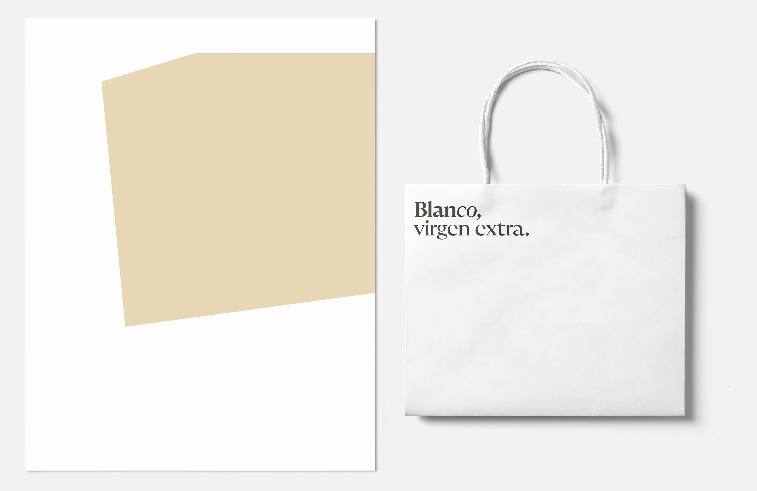
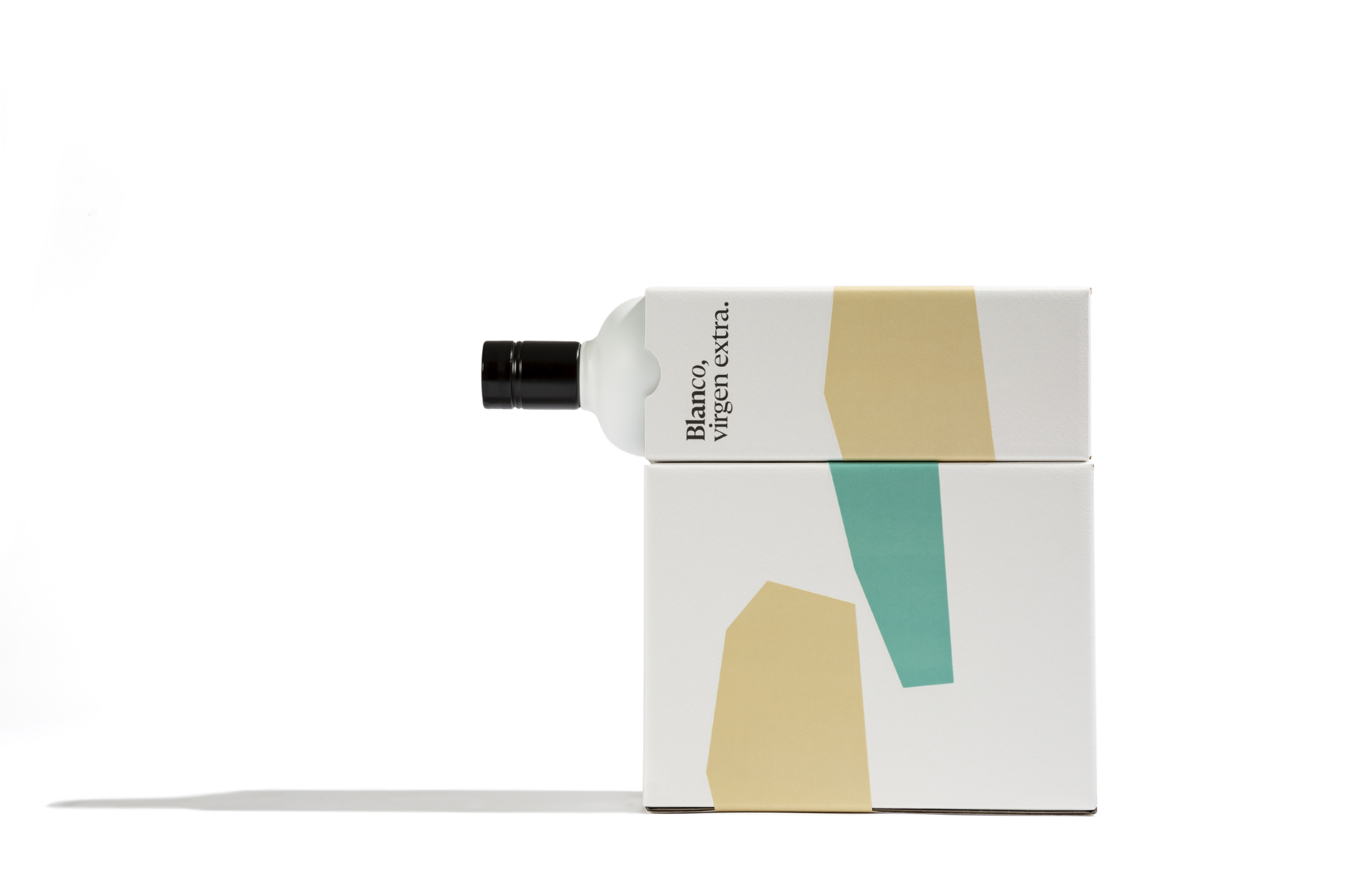
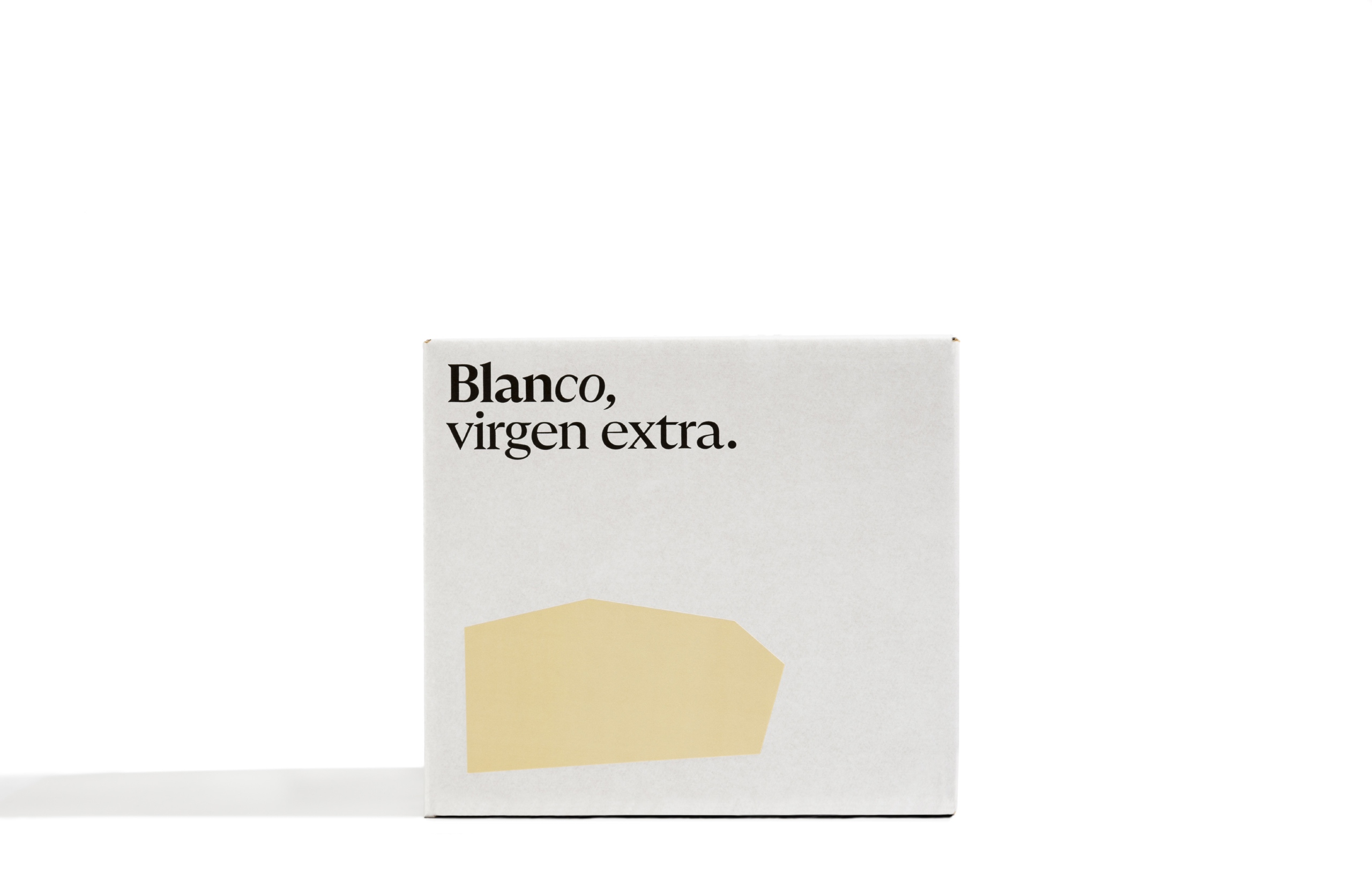
To achieve this, we drew inspiration from Matisse and his cut-out papers. Starting from a plan of the Fuente Alcaide estate, we cut out the selected terrains for the 2022-2023 campaign.
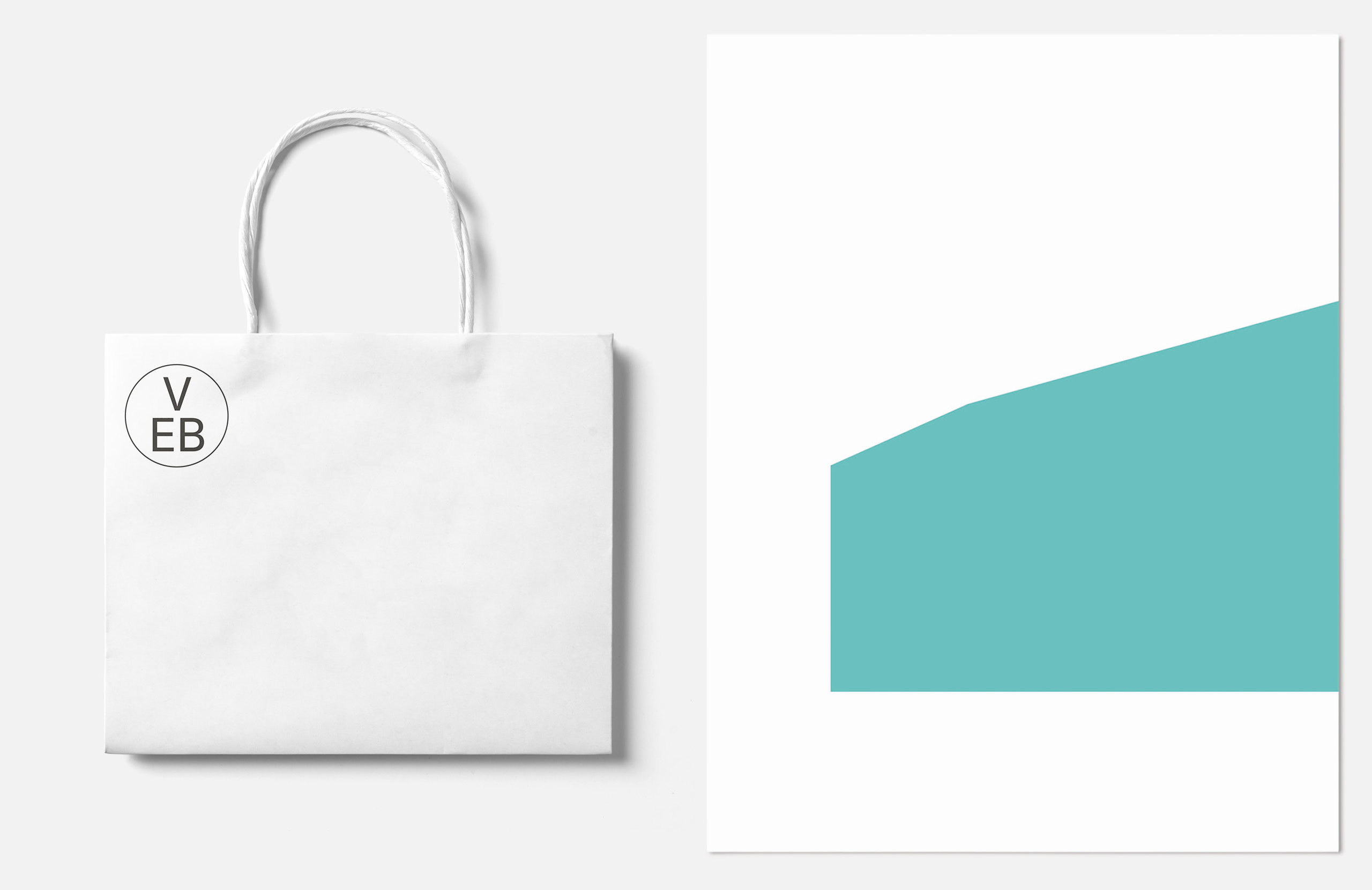
We created a visual system that turns the brand into a blank canvas where the estate expresses itself each season. The color palette is an adaptation of Land Rover’s 1980s paint catalog, a true icon of work in the Andalusian countryside. This palette changes with each new harvest.
In this way, Blanco achieved a distinctive visual code that highlights their exclusive method of producing extra virgin olive oil.

CREDIT
- Agency/Creative: Buenaventura Estudio
- Article Title: Blanco Extra Virgin, Terroirs Inspired by Matisse
- Organisation/Entity: Agency
- Project Type: Packaging
- Project Status: Published
- Agency/Creative Country: Spain
- Agency/Creative City: Loja
- Market Region: Europe
- Project Deliverables: Advertising Photography, Art Direction, Brand Redesign
- Format: Bottle, Box
- Industry: Agriculture
- Keywords: Extra virgin
-
Credits:
Creative Direction: Ramón Soler
Production Direction: Rafa Mateos
Photo: Cristina Beltrán


