


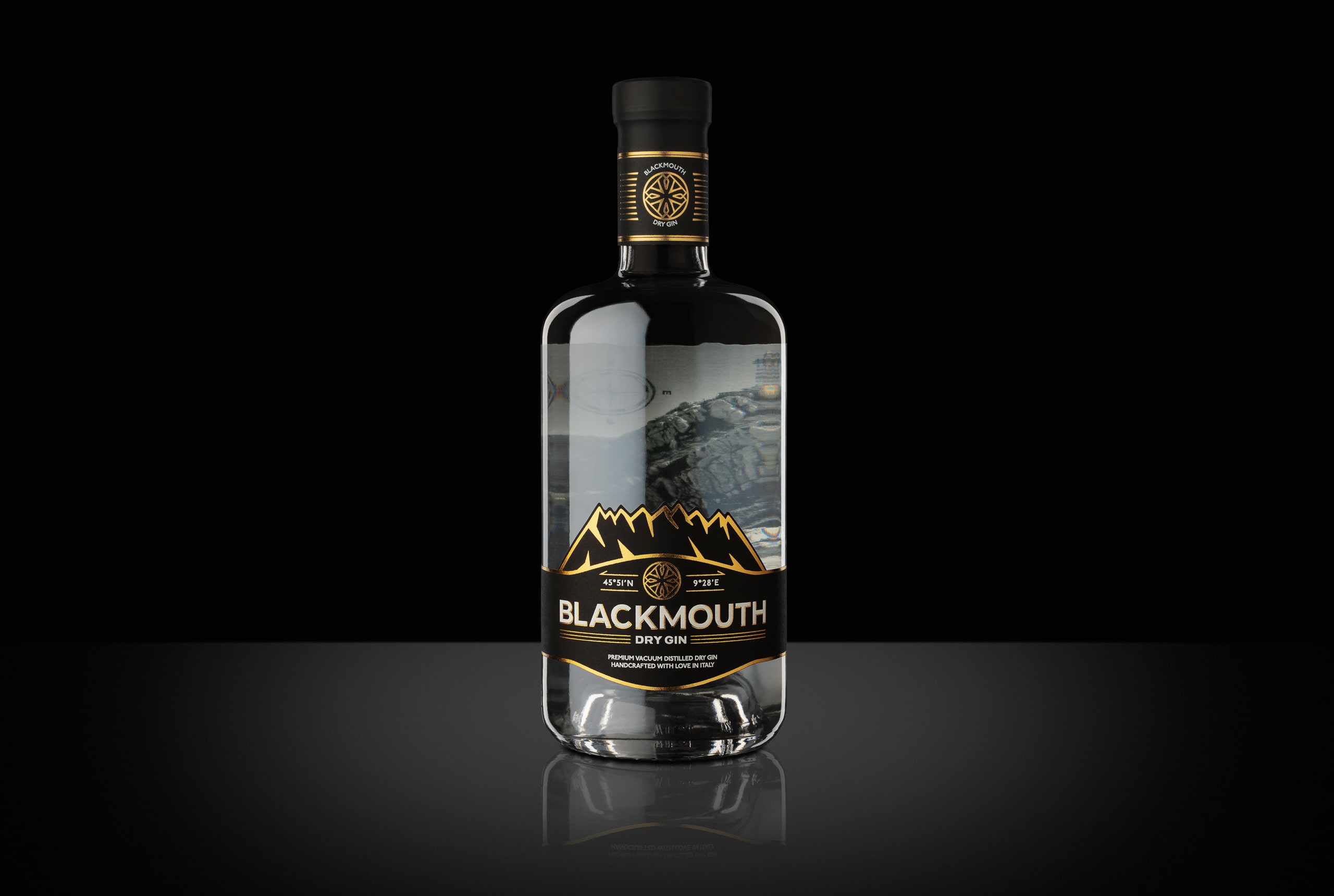
The story of the Gin, produced by Blackmouth Spirits, begins in a dark and narrow tunnel, just over half a kilometer long: it is the “Black Mouth” of Monte Resegone, a secret passage that leads to one of the most impressive views in Italy. Alessandro, the founder of the company and protagonist of this story, had discovered this tunnel during a phytological excursion, in search of herbs and plants that he would use for distilling. The breath-taking view led Alessandro to the most logical of conclusions: passion, discovery and research are the components needed to distil a high quality and extremely refined product.
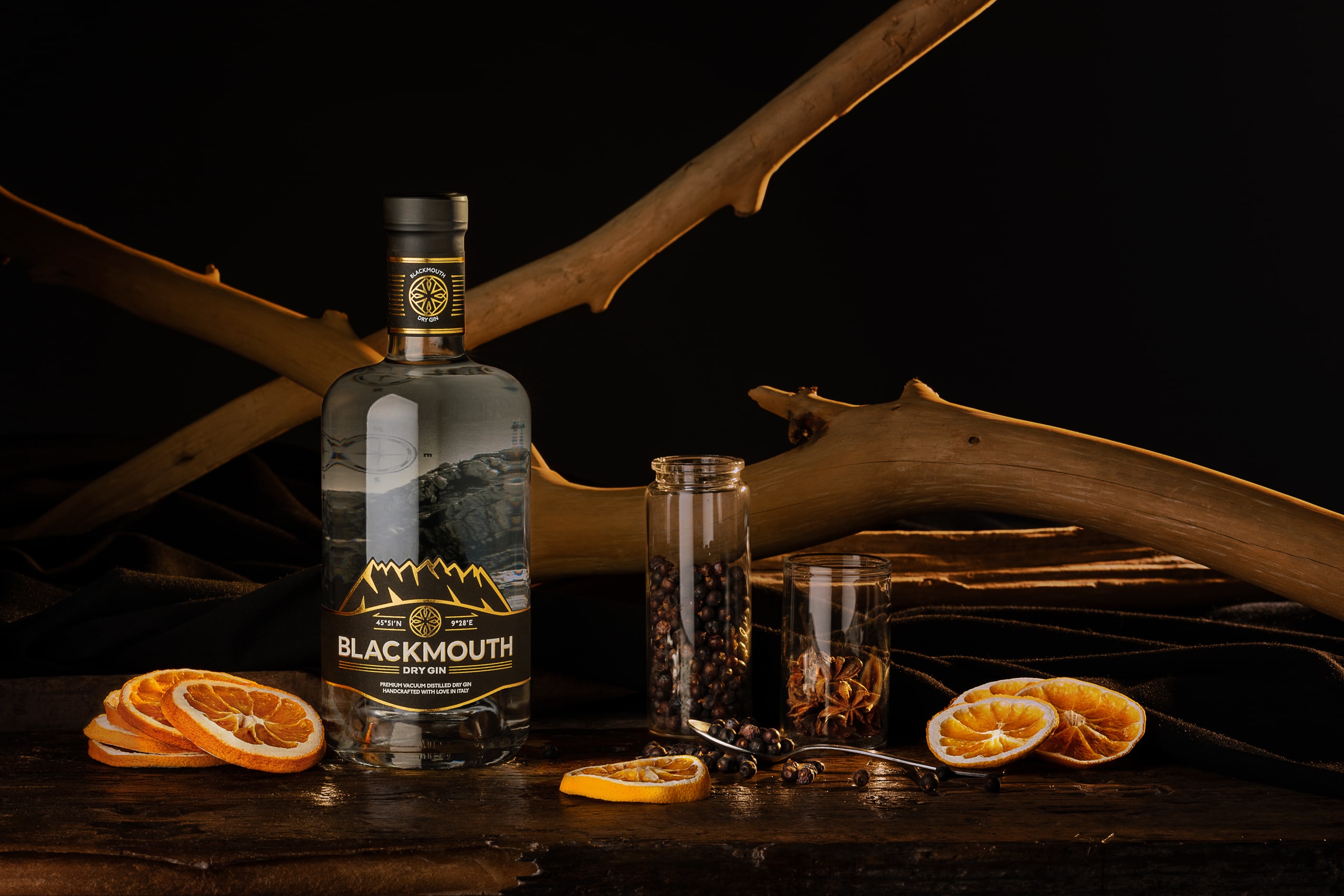
Despite being a new brand, Blackmouth Dry Gin has been able to establish itself, right from the start, among the most interesting and genuine “entry level spirits”, outlining a well-defined and constantly growing target of fans, testifying the quality of the product.
The label restyling stems from the Brand’s need to reposition itself towards a broader market, oriented to a local and sophisticated context, aimed at a target audience that includes Gin estimators and professionals from the world of Mixologists and Spirits.
In order to preserve the perception of the Brand by the audience, in the first restyling phase it was essential to understand which distinctive characteristics had to remain unchanged and which new forms had to be used for a communicative language aimed to the specific target.
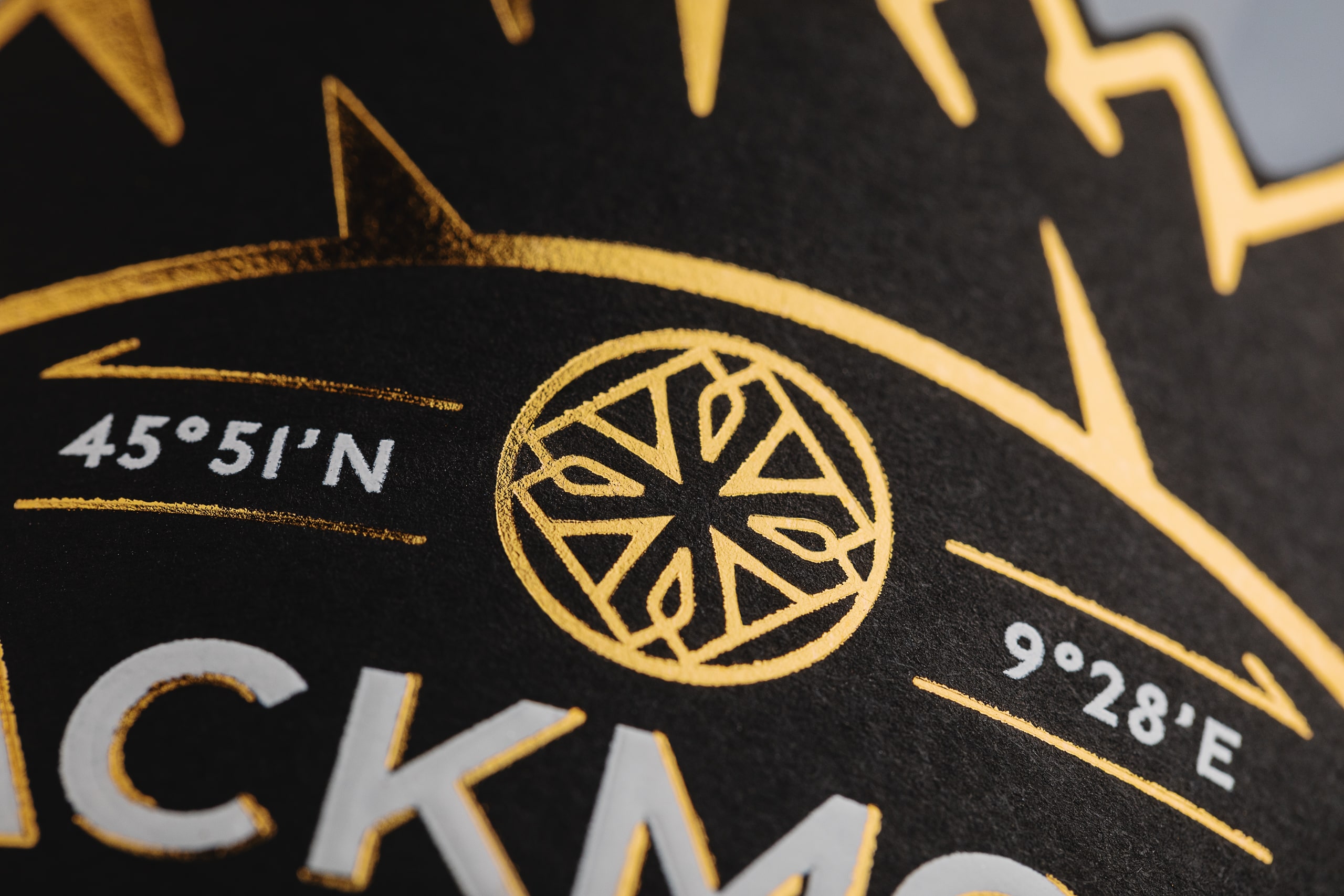
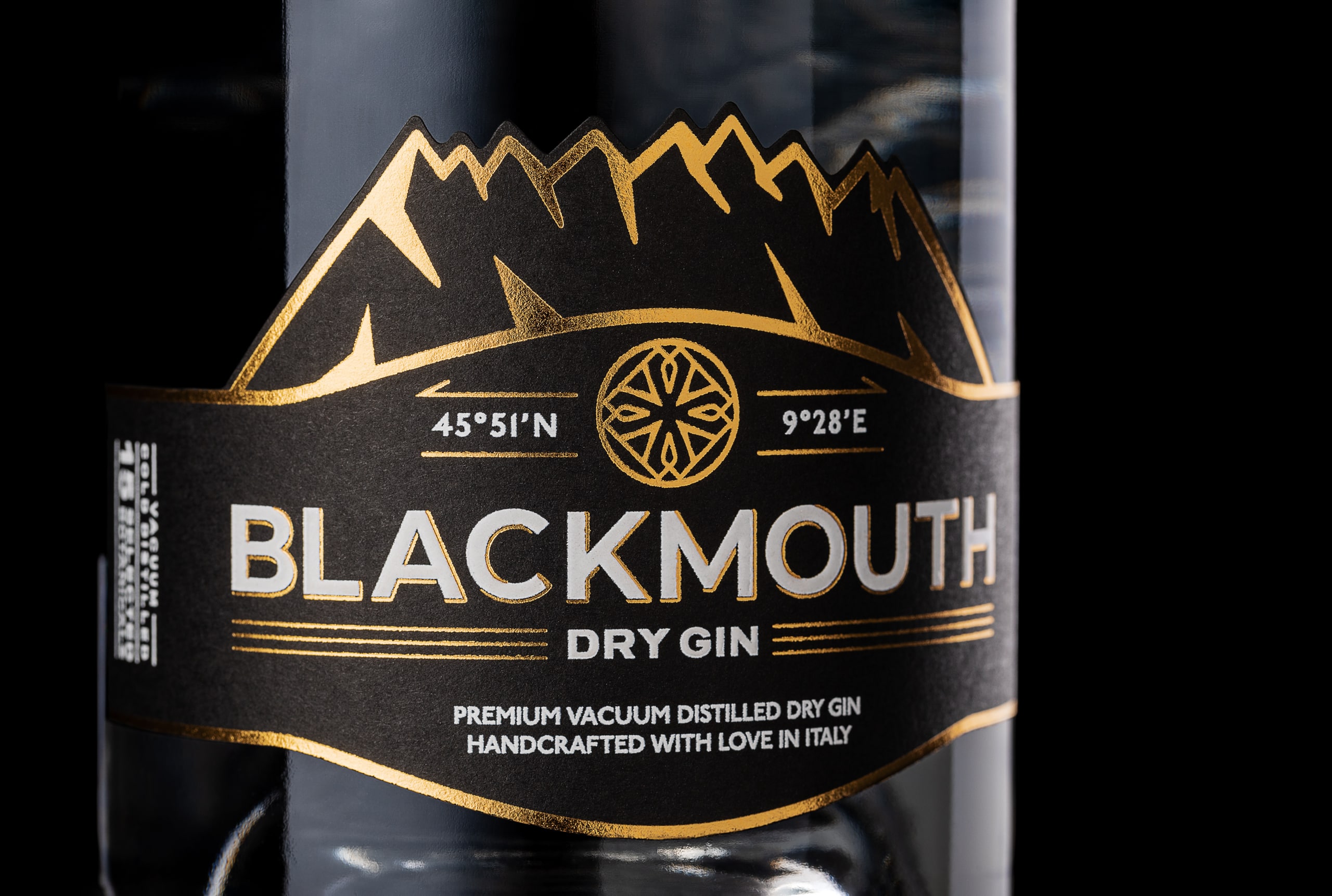
Thus, the design of a key symbol was born, an angular, geometric, and cryptic pictogram, which leaves room for different interpretations and contrasting emotions, representing the very essence of the product and the storytelling to which it is linked.
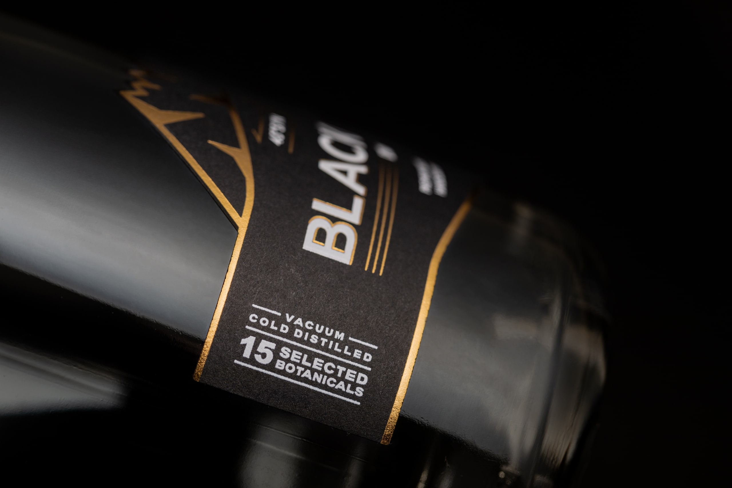
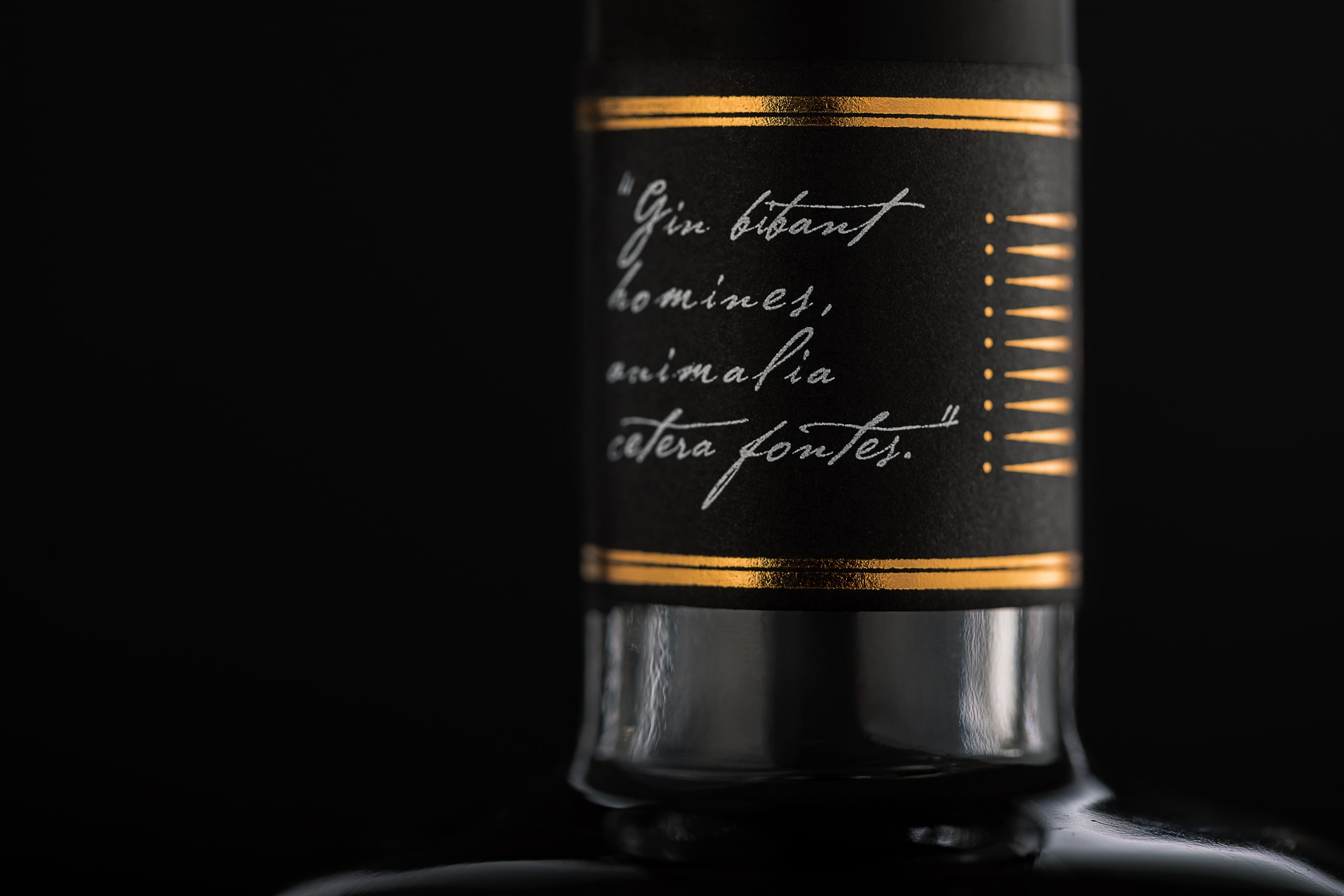
On the other hand, the choice of a limited set of fonts is a more pragmatic one, consisting mainly of sans-serif and monospace that allows the consumer to read the product information without too much difficulty, as well as the “Blackmouth Dry Gin” logo, which is placed on the front, it is compact and fully readable, unlike the previous version.
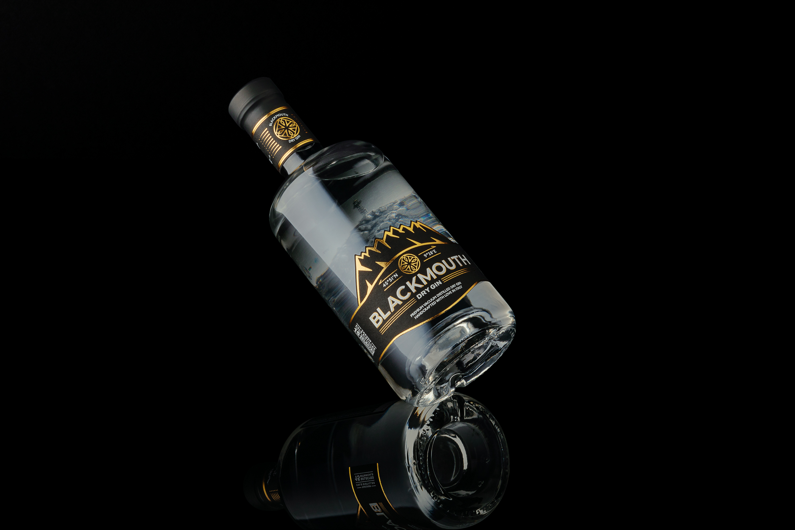
The result is a label closely linked to storytelling and to the area where it is produced.
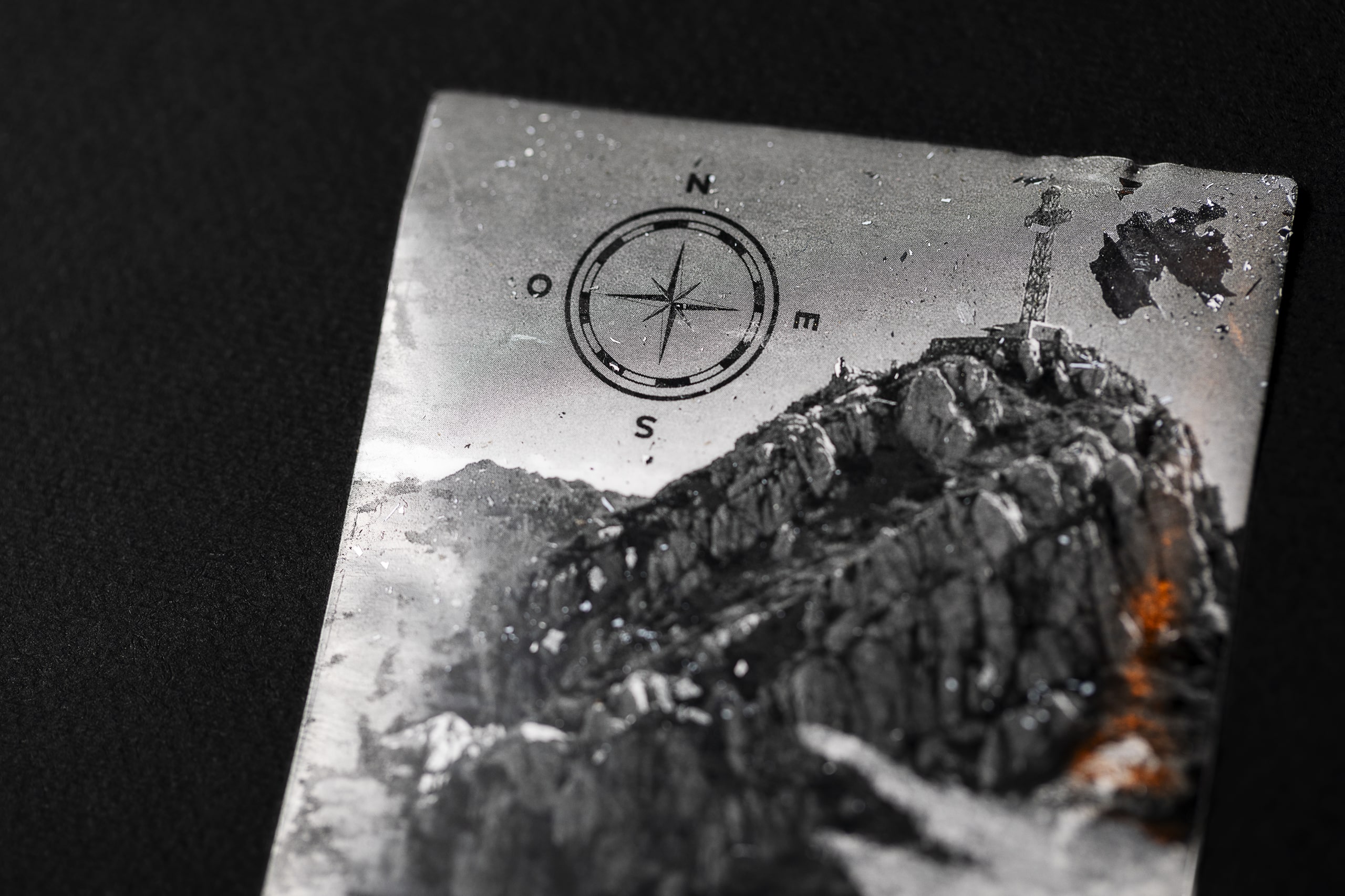
A strong appeal, amplified by the presence of geographic coordinates, to the stylized profile of Monte Resegone and the black and white photo of its highest peak.
CREDIT
- Agency/Creative: Antonio Golia - designinth
- Article Title: Blackmouth Dry Gin Label Re-Designed by Antonio Golia
- Organisation/Entity: Freelance
- Project Type: Packaging
- Project Status: Published
- Agency/Creative Country: Italy
- Agency/Creative City: Avellino
- Market Region: Europe
- Project Deliverables: Art Direction, Brand Identity, Brand Mark, Brand Redesign, Label Design, Product Photography
- Format: Bottle
- Substrate: Glass Bottle
- Industry: Retail
- Keywords: label, packaging, gin, spirits, italy
-
Credits:
Photographer: Floriano Formoso
Translation: Cristina Grasso


