


“Black/white” is a new project of a bakery and cafe in a small Russian town. Before “Black/White”, no one made bread and confectionery of such quality. The bakery offers artisan pastries based on traditional recipes. The composition of the products is as simple as possible, eliminating the use of yeast, accelerators, preservatives and other artificial components.
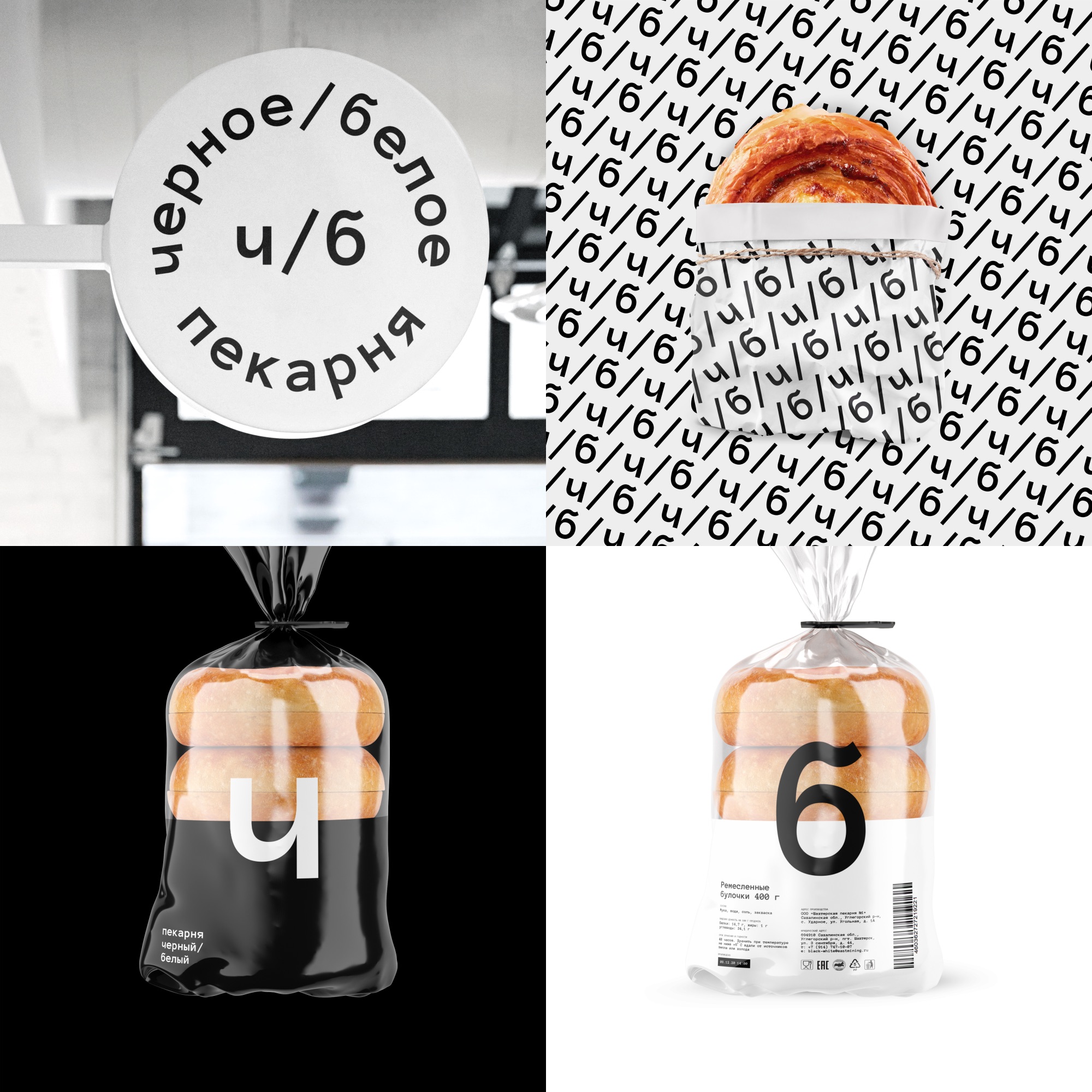
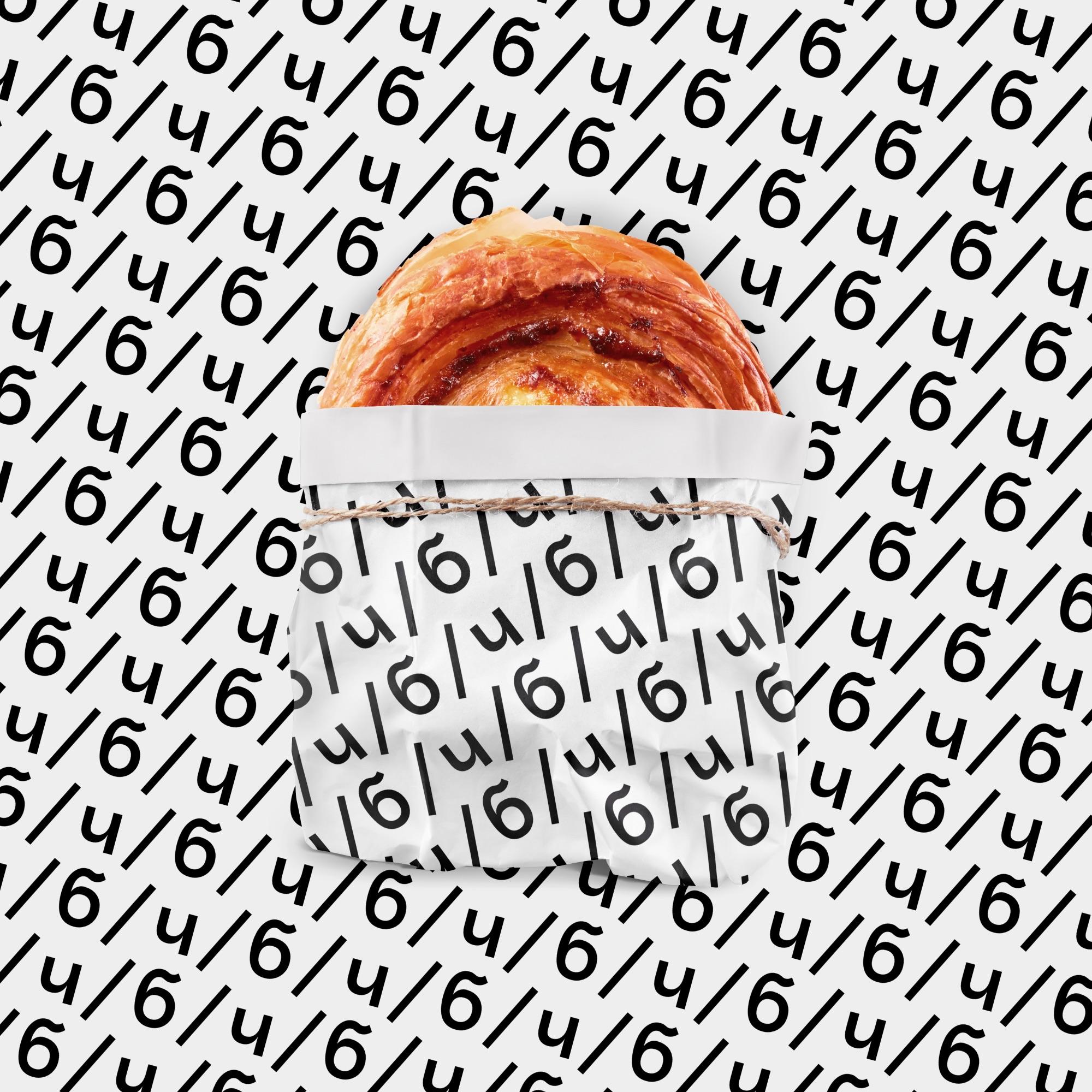
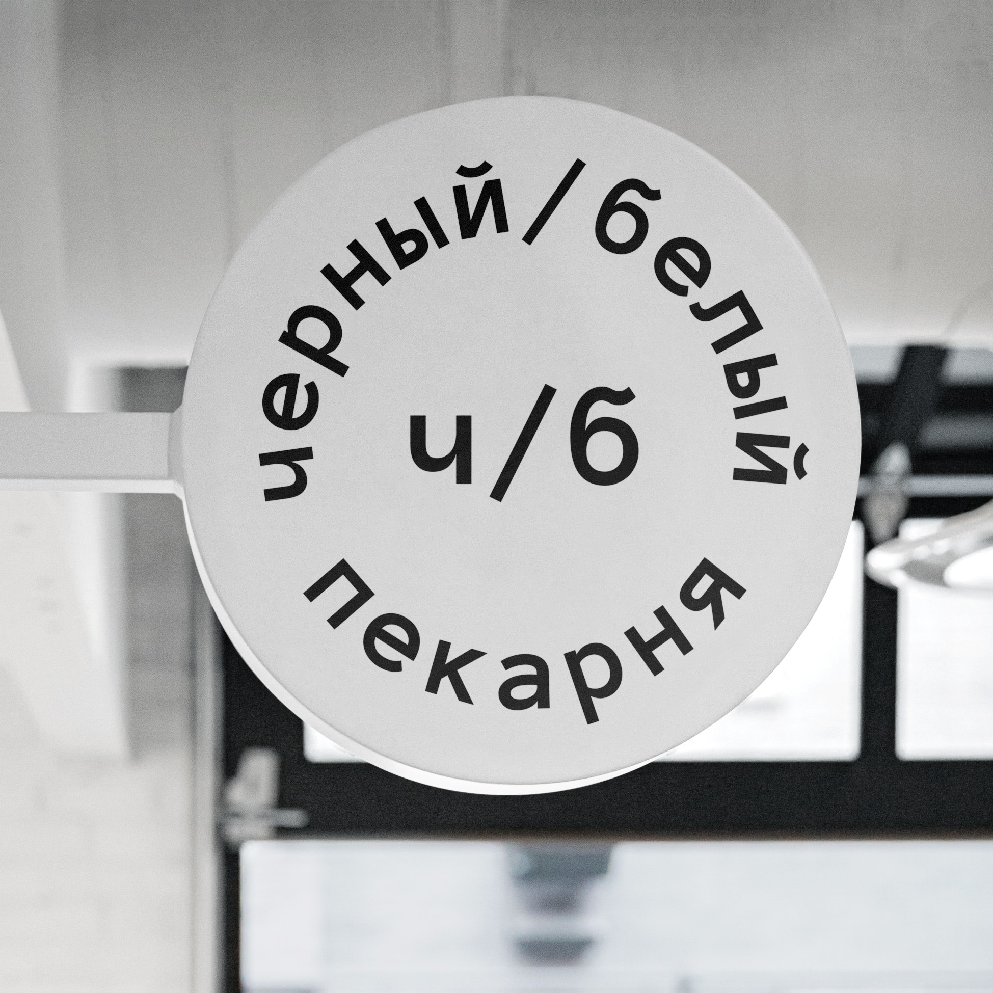
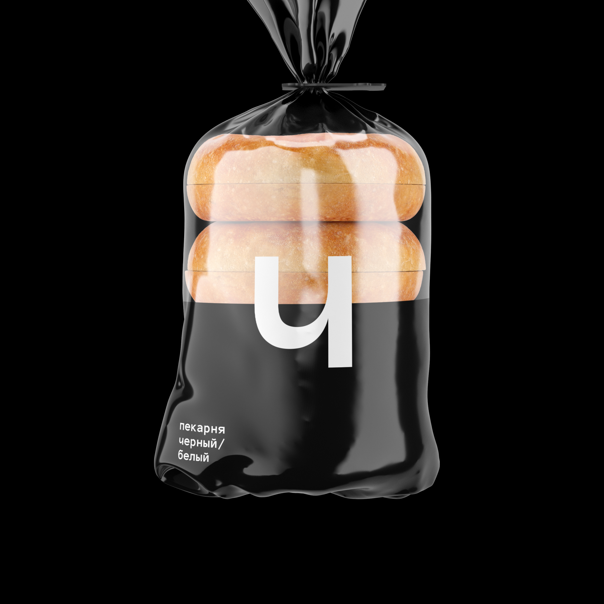
the simplicity and honesty of bread formed the basis of a simple and clear branding. The name “Black/white” is the traditional color of bread products in Russia. Like bread, bakery branding does not imply unnecessary “improvers” and decorations, only honest symbolism. “black/white” does not try to please everyone. the main thing is the composition and taste of bread. “black/white”. nothing superfluous.
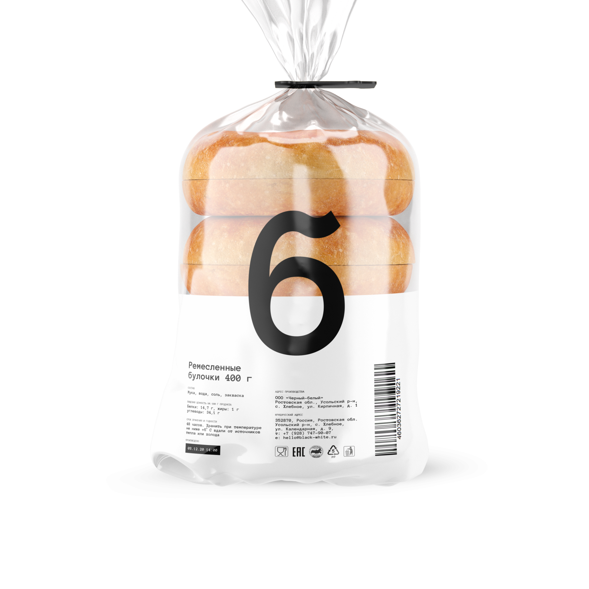
The bakery branding done in our agency continues the minimalistic values of the brand. There are only 2 colors in the color palette, black and white, which nevertheless serve as the perfect backdrop for rustic bread, scented rolls or fresh croissants. That is why the choice was made in favor of only text branding without the” add-on ” in the form of a sign.
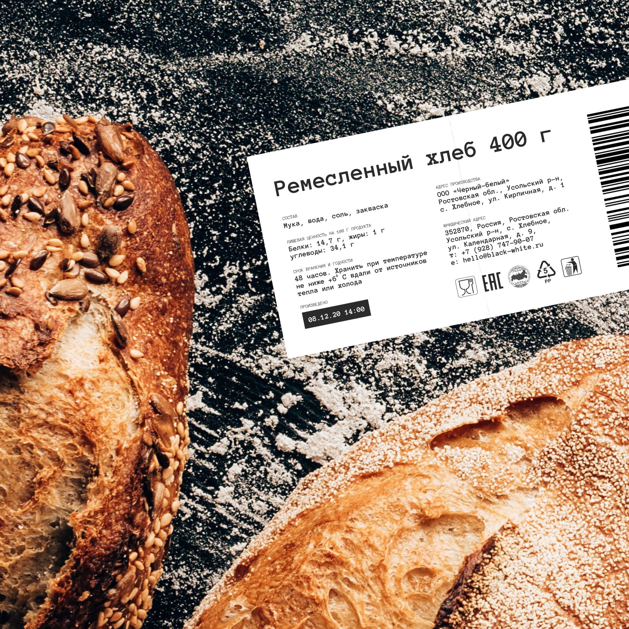
In total, there are 2 sets of packages: paper for selling bread in a bakery and plastic for retail stores. Originally we had planned to pack the brown bread in a dark box, and white in white. however, the vast majority of the types of bread that the bakery produces turned out to be white. So we decided to keep the front side black and make the back side white. The white side serves as a perfect background for the sticker, which is not so conspicuous. The packaging system with a sticker allows you to optimize the cost of packaging production, when changing the type of bread does not mean a new edition of the package. the bread packaging sticker is created in a format that allows you to edit it without involving professionals. the guys from the bakery themselves change all the information easily.
In addition to the packaging system, our agency has developed a concept for the appearance of the bakery. The bakery is 2 connected shipping containers. The white container houses a small cafe and shop. The black container is a production room with a full cycle of bread production. The containers are arranged so that the corner between them becomes a public transport stop where you can take shelter from the weather. Around the cafe is made of gravel, which absorbs water and allows the facades to remain clean. The floor of the bus stop and the floor of the bakery are a barrier-free environment, no steps. the cafe project has a social function and was created together with the city authorities.
CREDIT
- Agency/Creative: nOne
- Article Title: Black/White Bakery Branding by None Agency
- Organisation/Entity: Agency, Published Commercial Design
- Project Type: Identity
- Agency/Creative Country: Russia
- Market Region: Europe
- Project Deliverables: Brand Identity, Brand Naming, Brand Strategy, Branding, Packaging Design, Retail Brand Design
- Industry: Food/Beverage
- Keywords: bakery


