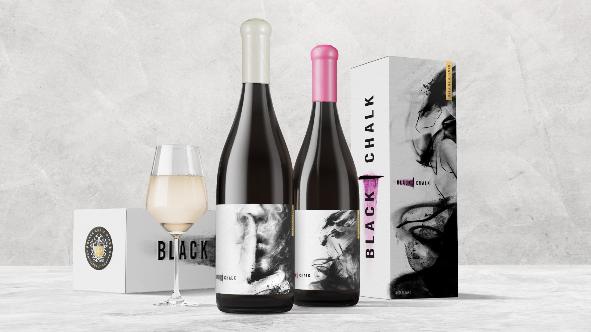
Black Chalk, a thriving, modern winery in Hampshire, is known for their range of sensorial sparkling wines, and their distinctive brand identity and packaging. This past year, the winery brought us a new challenge: to help expand the Black Chalk portfolio into two new still-wine varietals, a rosé and a white, showcasing their different properties while maintaining cohesion within the brand’s well-owned look/feel.
For the still rosé, Dancer in Pink, we were tasked with celebrating the dynamic, fruit-forward characteristics of the grapes. Whereas the still white, Rumour Has It, offered an unusual challenge: its grapes were purchased from a friend-of-the-winery in Kent, making it the first off-site sourcing for Black Chalk, as well as their first still chardonnay.
All in all, two very unique product stories, needing two very unique launch solutions. Which is why we dove into this assignment with great care and passion to ensure the maintenance of on-shelf appeal, overall brand recognition, and core differentiation between still and sparkling wines across the Black Chalk collection.
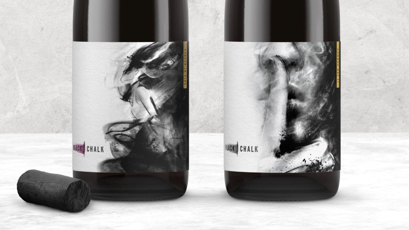
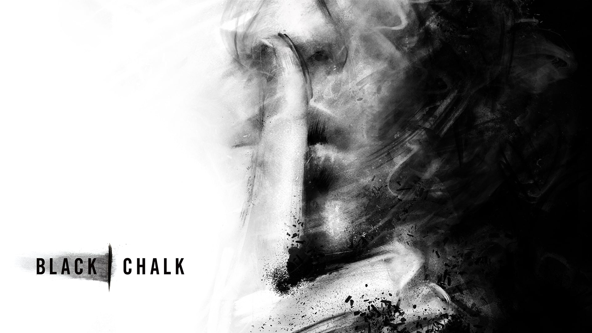
The Black Chalk visual style provides an excellent canvas for expression, so we first focused on hero imagery for the new still wines—what would best capture their essence at a glance? For the still rosé, we knew Dancer in Pink needed to be fully-realized, with the use of a dancer symbolizing the outgoing, elegant, and charming personality of the grape—a sort of alter-ego of the rosé. But for the still wine, Rumour Has It, the story felt more opaque and mysterious. Here, the sourcing of the grapes needed a bit of a charming unveiling, so a close-up, gentle, “shh” finger pose was chosen to symbolize the delightful intrigue behind the wine’s sourcing background.
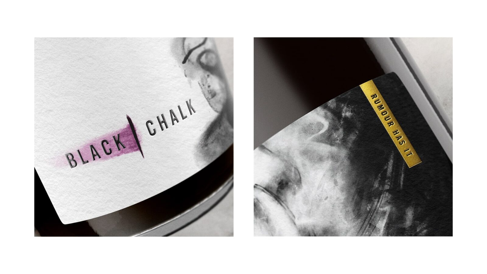
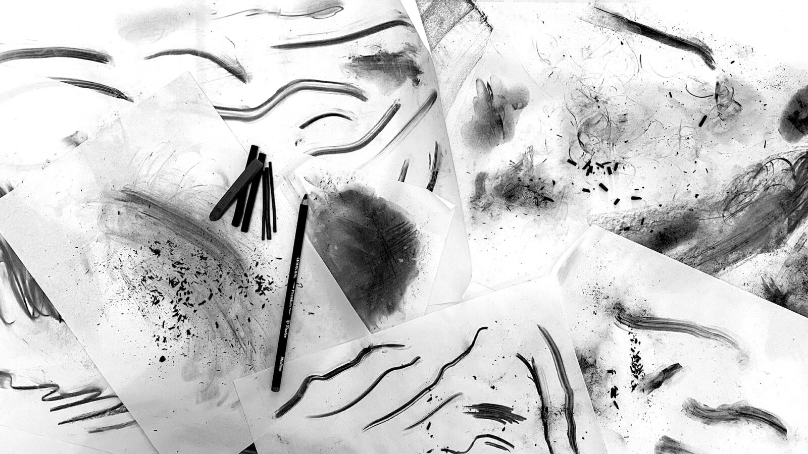
With our key visual elements chosen, and the client’s desire for bespoke illustration noted, we dove into developing a compelling, evocative, and cost-effective design approach that would fit into the overall branding while still standing out. We settled upon a charcoal-inspired line drawing style that perfectly conveys the storytelling needs of each varietal. Working to maximize budget, we used inspirational imagery to guide our artwork and created multiple custom charcoal textures, linework, and smudging by hand to showcase the exclusive and unconventional feel of Black Chalk. We then compiled all elements together digitally to produce beautifully unique artwork. The combination of striking charcoal markings, a dramatic black background, and a strong use of white space all gives the label a modern yet crafted feel, which enhances the history and narrative of the Black Chalk brand.
This fairly-straightforward launch assignment has opened up a new world for Black Chalk—focused around a powerful, flexible, new design style. They now have a broader, more ownable platform for brand storytelling, centered on inspiring old masters through new techniques, with the charcoal sketching representing the crafting behind each varietal in their portfolio. This approach has enabled influential content to be shared with new and existing clientele, strengthening Black Chalk’s reputation and encouraging new business, both on- and off-trade.
CREDIT
- Agency/Creative: Chase Design Group
- Article Title: Black Chalk Still Modern Hampshire Wine by the Chase Design Group
- Organisation/Entity: Agency
- Project Status: Published
- Agency/Creative Country: United States of America
- Agency/Creative City: South Pasadena
- Project Deliverables: Design, Label Design
- Industry: Food/Beverage
- Keywords: WBDS Agency Design Awards 2024/25
- Keywords: WBDS Agency Design Awards 2024/25
-
Credits:
Art Director: Peter Hawkins
Lead Designer: Saranna Drury
Design Team: Jordan Cox
Production: Simon Ward


