


Challenge:
The client sought a full rebranding of their sunflower seed product to better connect with consumers in Karakalpakstan. The previous brand name, Xit, lacked cultural relevance and distinctiveness. The goal was to create a locally inspired brand identity with a strong personality, recognizable visual style, and emotional resonance—turning the product into a cultural symbol as well as a snack.
Research & Insights:
Through on-the-ground consumer research, we discovered that sunflower seed consumption in the region is deeply social—linked to leisure time with friends, outdoor gatherings, fishing trips, family moments, and watching TV. It is a familiar, ritual-like experience, but no current brand captured this spirit visually.
Key findings:
The market was oversaturated with generic seed packaging dominated by repetitive sunflower imagery.
There was almost no representation of local culture or storytelling in packaging.
Consumers responded positively to relatable, character-driven designs.
Creative Solution:
Naming:
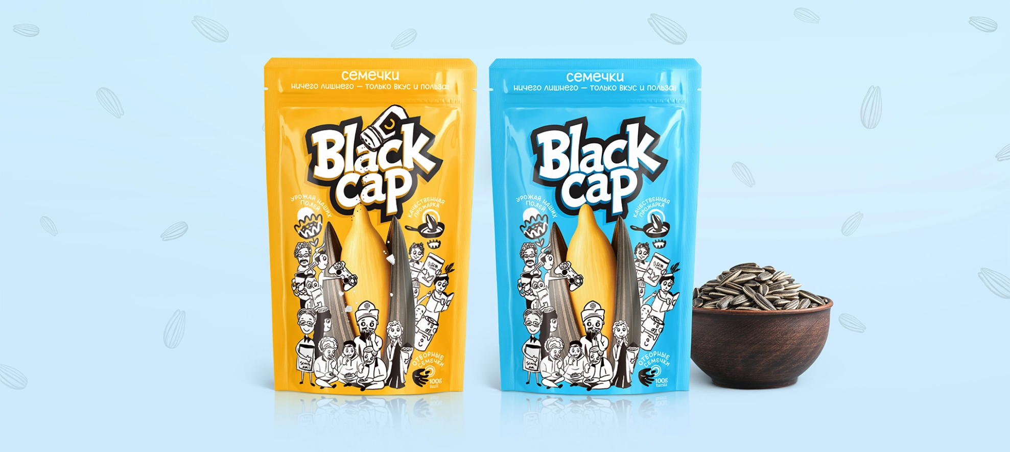
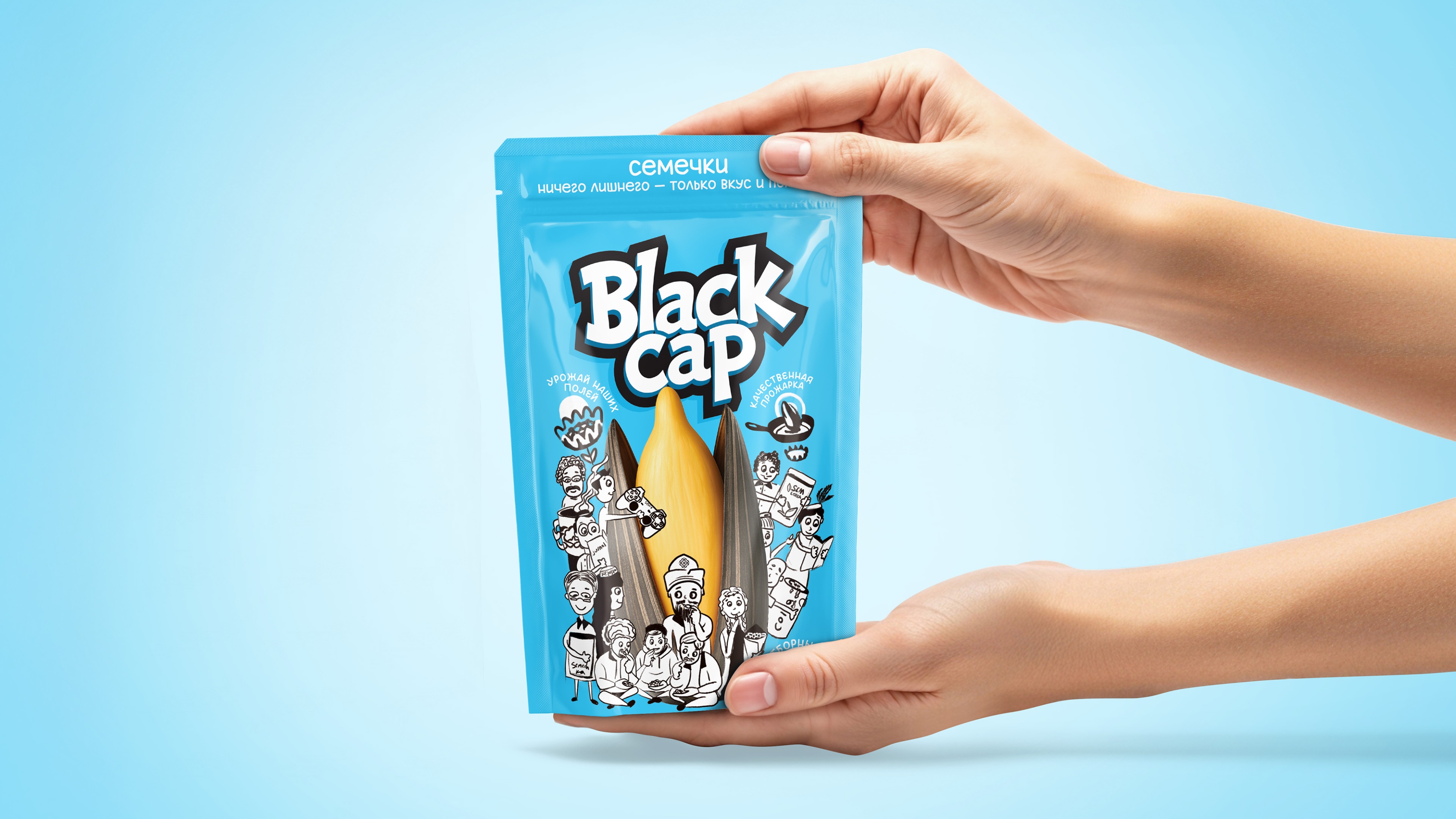
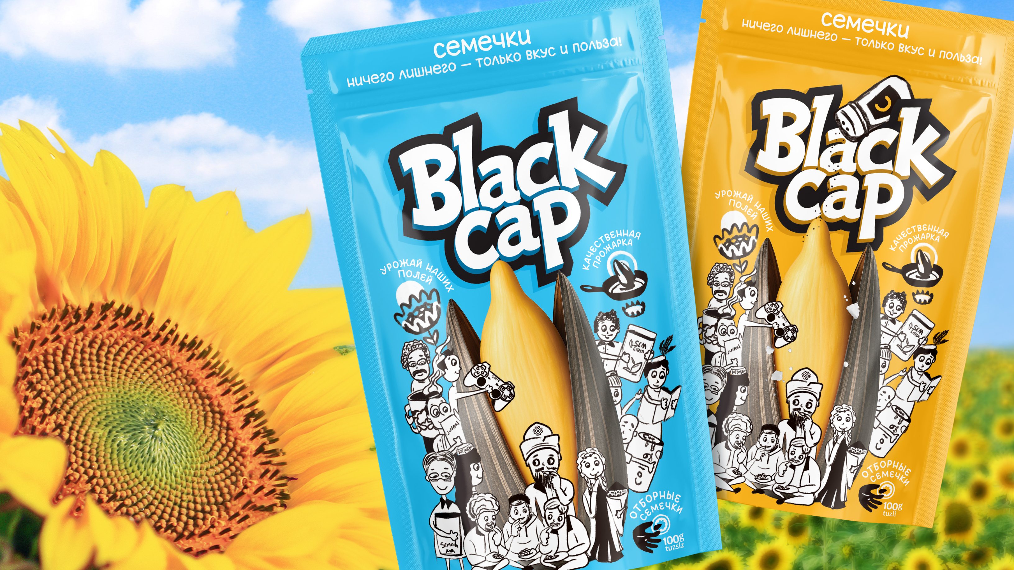
We created the name Black Cap—memorable, modern, and deeply rooted in Karakalpak identity. The black headwear (karakalpak) is a symbol of local tradition, instantly connecting the brand to the community.
Illustrations & Characters:
We developed hand-drawn illustrations depicting authentic, everyday scenes of sunflower seed enjoyment:
A man in traditional Karakalpak headwear.
A young woman holding a paper cone of seeds.
A group of friends in a teahouse.
A gamer, a fisherman, and a student.
These scenes make the packaging relatable, spark curiosity, and encourage customers to see themselves in the brand’s world.
Color & Differentiation:
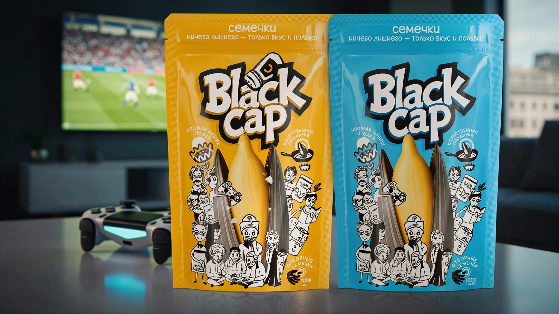
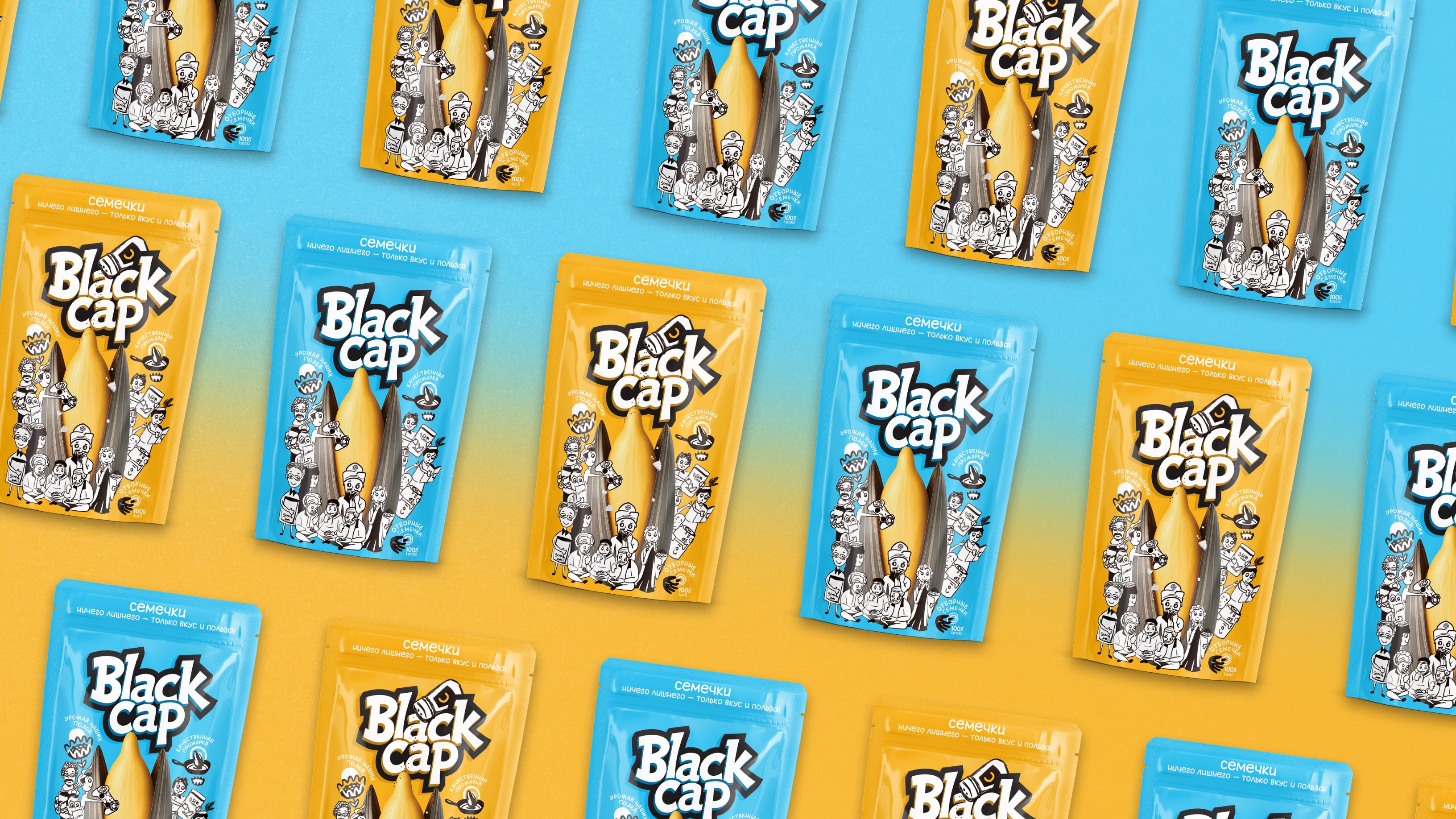
Blue packaging – salted sunflower seeds.
Yellow packaging – unsalted sunflower seeds.
The color-coding ensures quick flavor recognition and strong shelf visibility.
Icons & Communication:
Three custom icons clearly convey product benefits:
Ripe & Selected – high-quality raw materials.
Quality Roasting – premium production standards.
Premium Seeds – care and dedication to the consumer.
Results:
The redesign received enthusiastic feedback from focus groups and the client:
“Nothing like this exists on the market yet!”
“Looking at the characters is pure joy!”
“Finally, the brand has its own personality.”
With its launch in Karakalpakstan, Black Cap is set to stand out not only through its vibrant packaging but also through its authentic cultural storytelling—bridging tradition and modern FMCG design.

CREDIT
- Agency/Creative: Minim Design Agency
- Article Title: Black Cap Sunflower Seeds Packaging Redesign Inspired by Karakalpak Traditions by Minim Design
- Organisation/Entity: Agency
- Project Type: Packaging
- Project Status: Published
- Agency/Creative Country: Uzbekistan
- Agency/Creative City: Toshkent
- Market Region: Asia
- Project Deliverables: Brand Design, Brand Identity, Brand Naming, Logo Design
- Format: Flow-Pack
- Industry: Food/Beverage
- Keywords: Sunflower Seeds, Packaging Design, Cultural Branding, Local Identity, FMCG, Illustration, Naming, Logo Design, Karakalpakstan, Shelf Impact, Snack Packaging, Color Coding, Visual Storytelling
-
Credits:
Agency: Minim Design


