Squad Ink – Black Brewing Co.
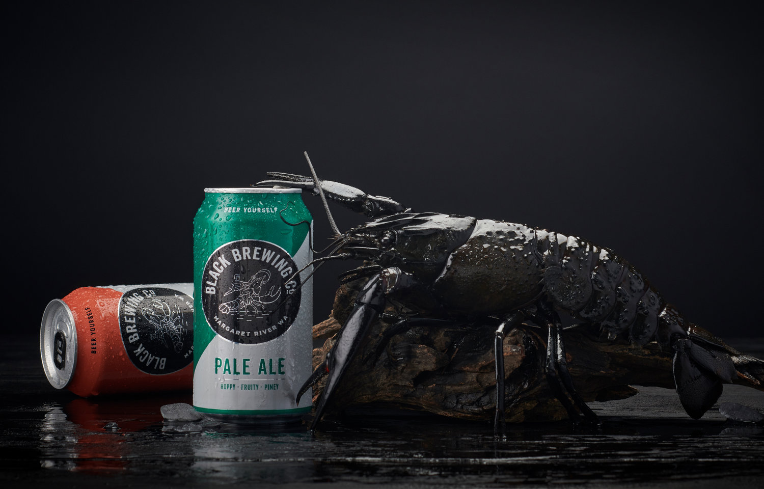
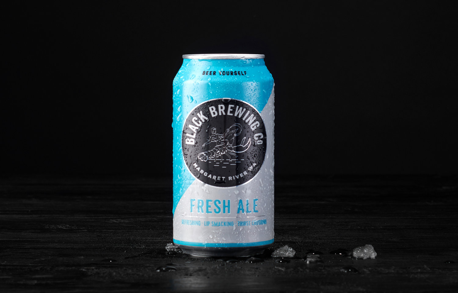
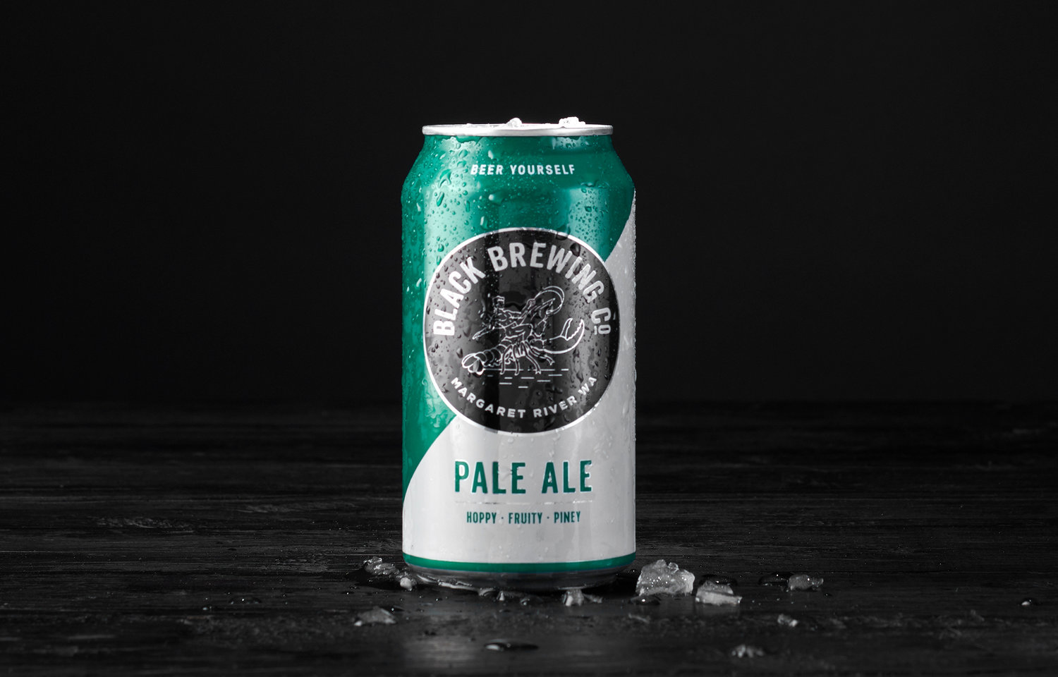
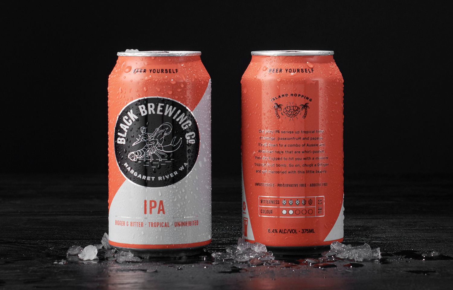
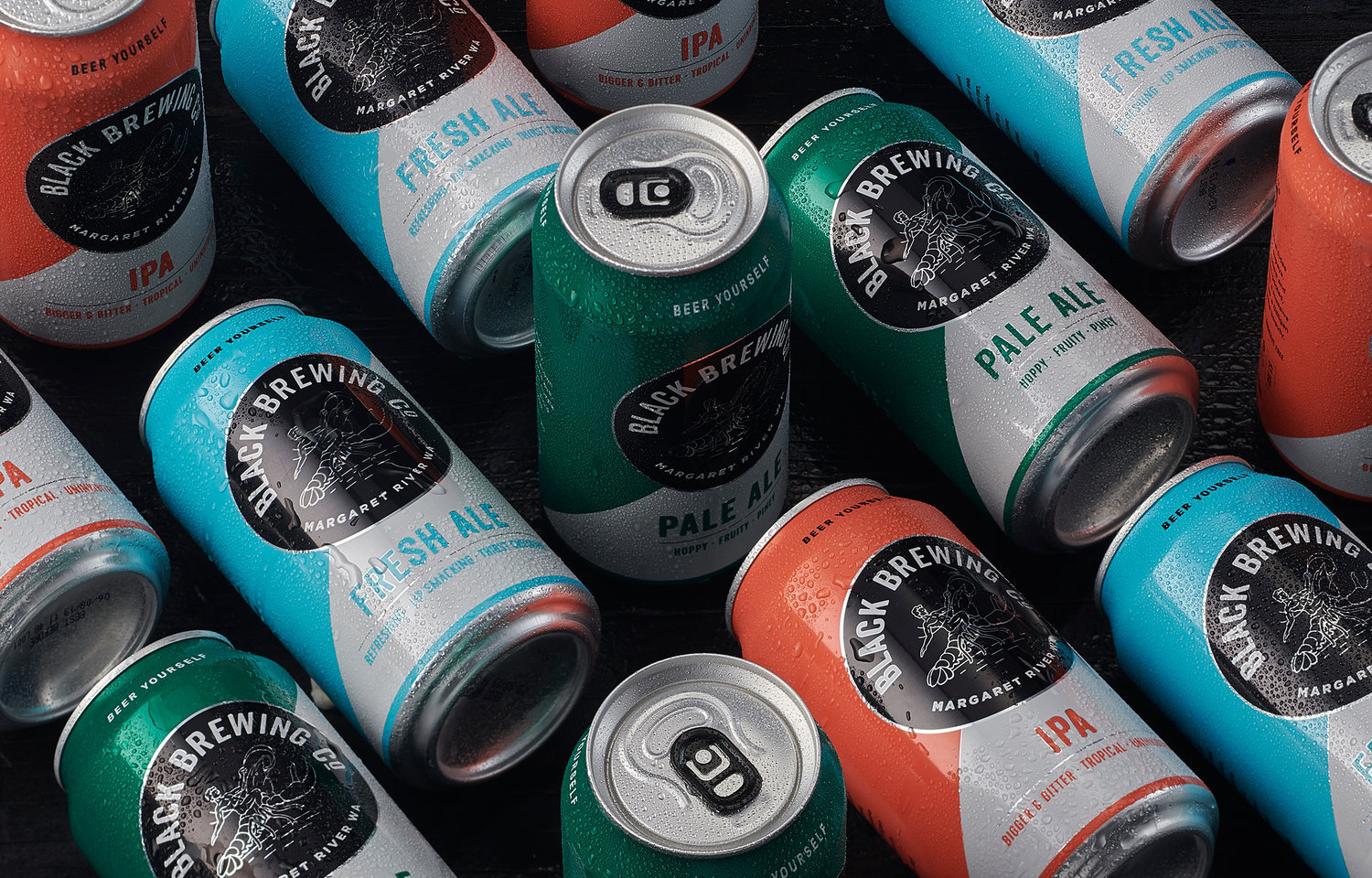
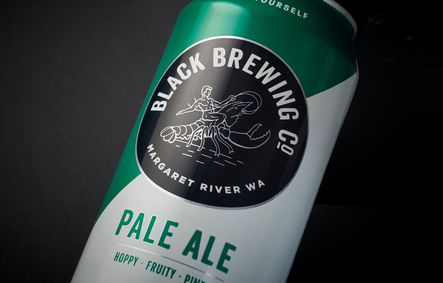
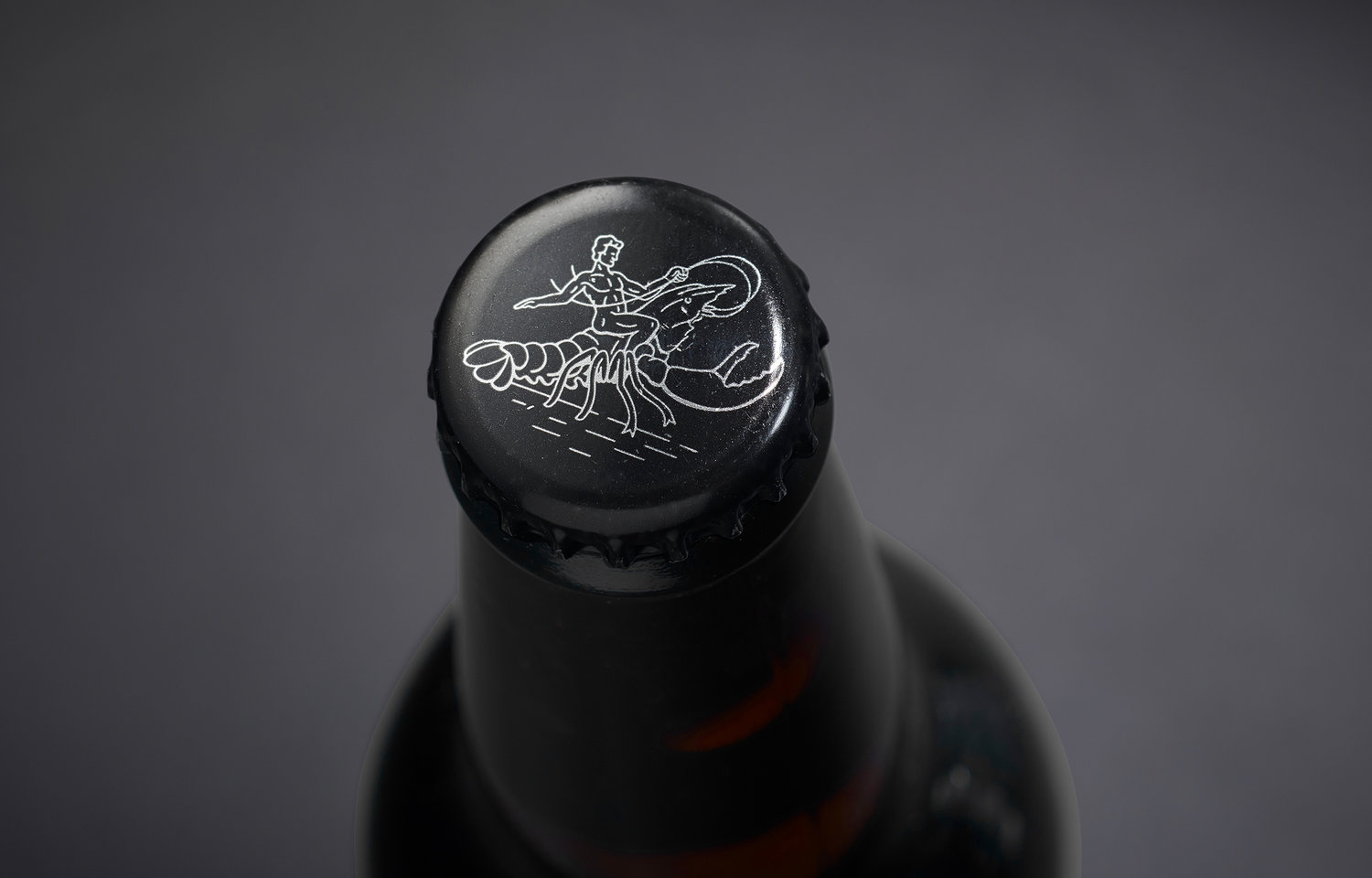
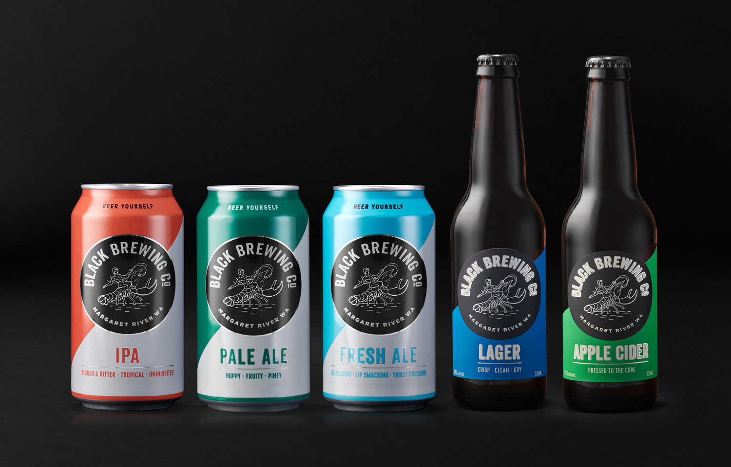
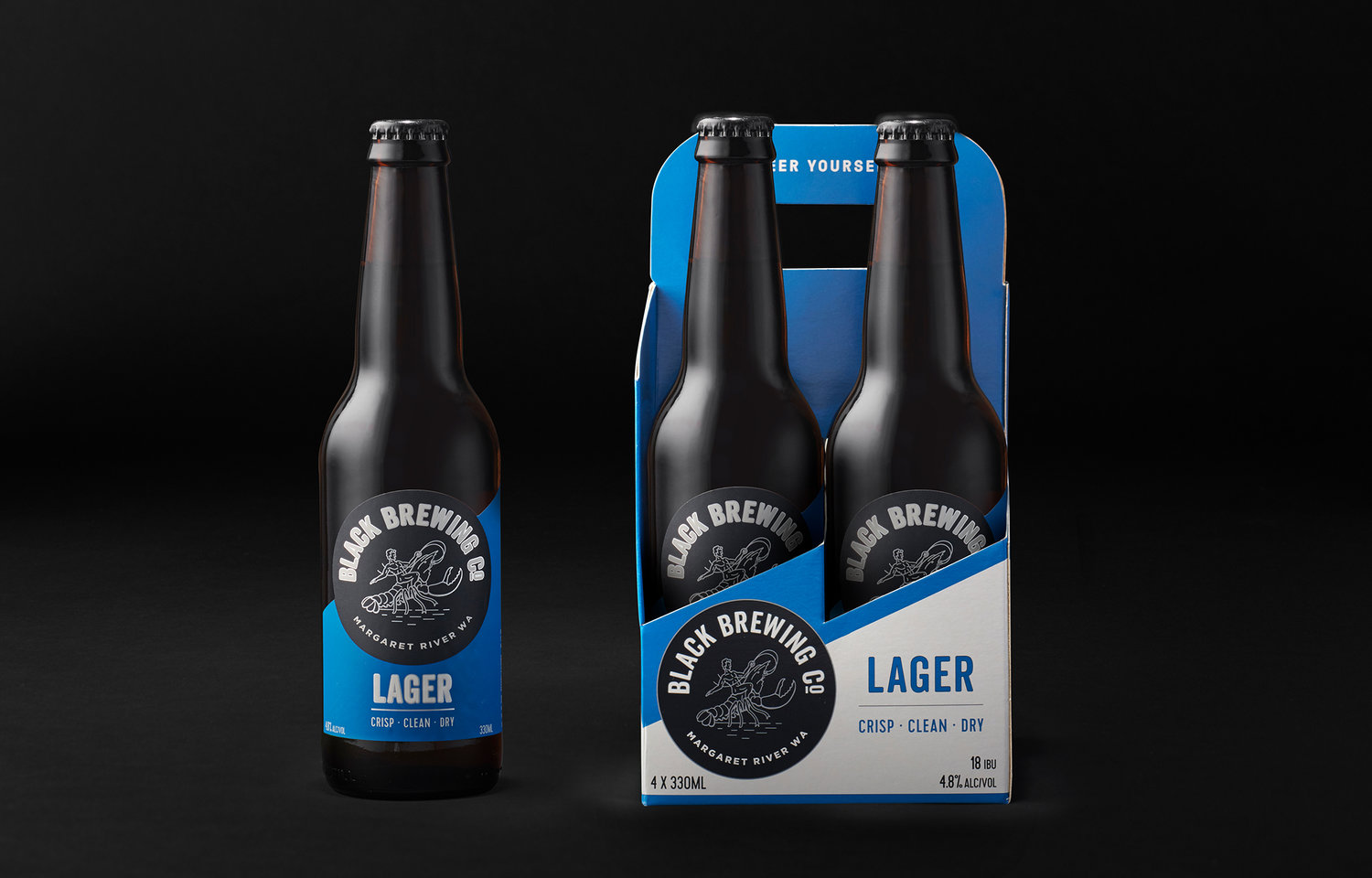
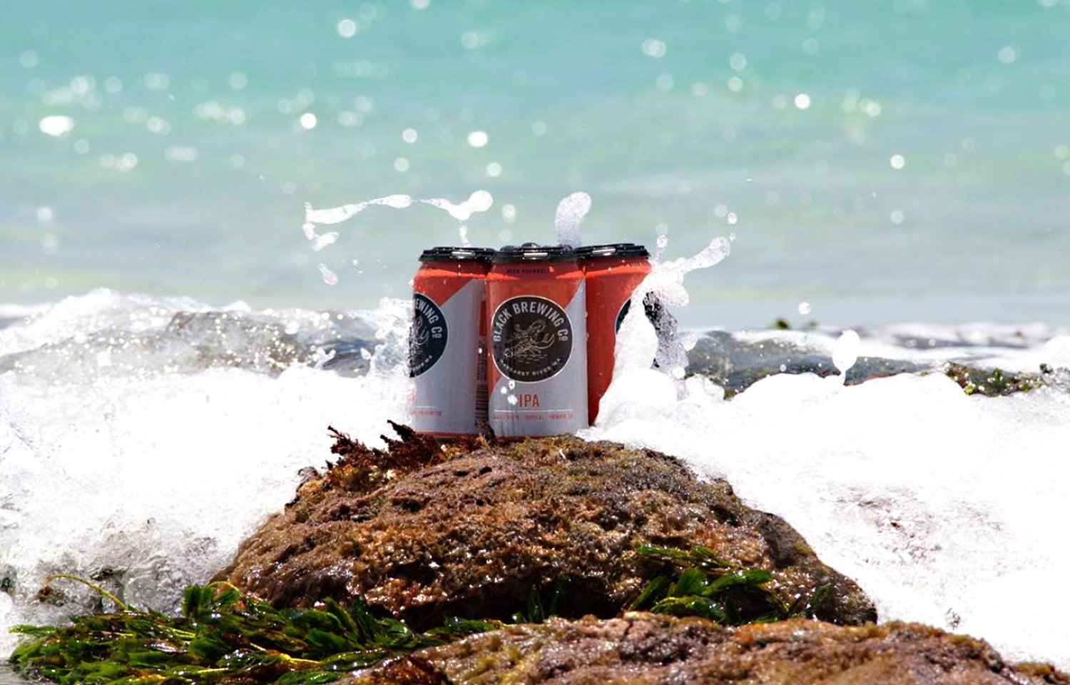
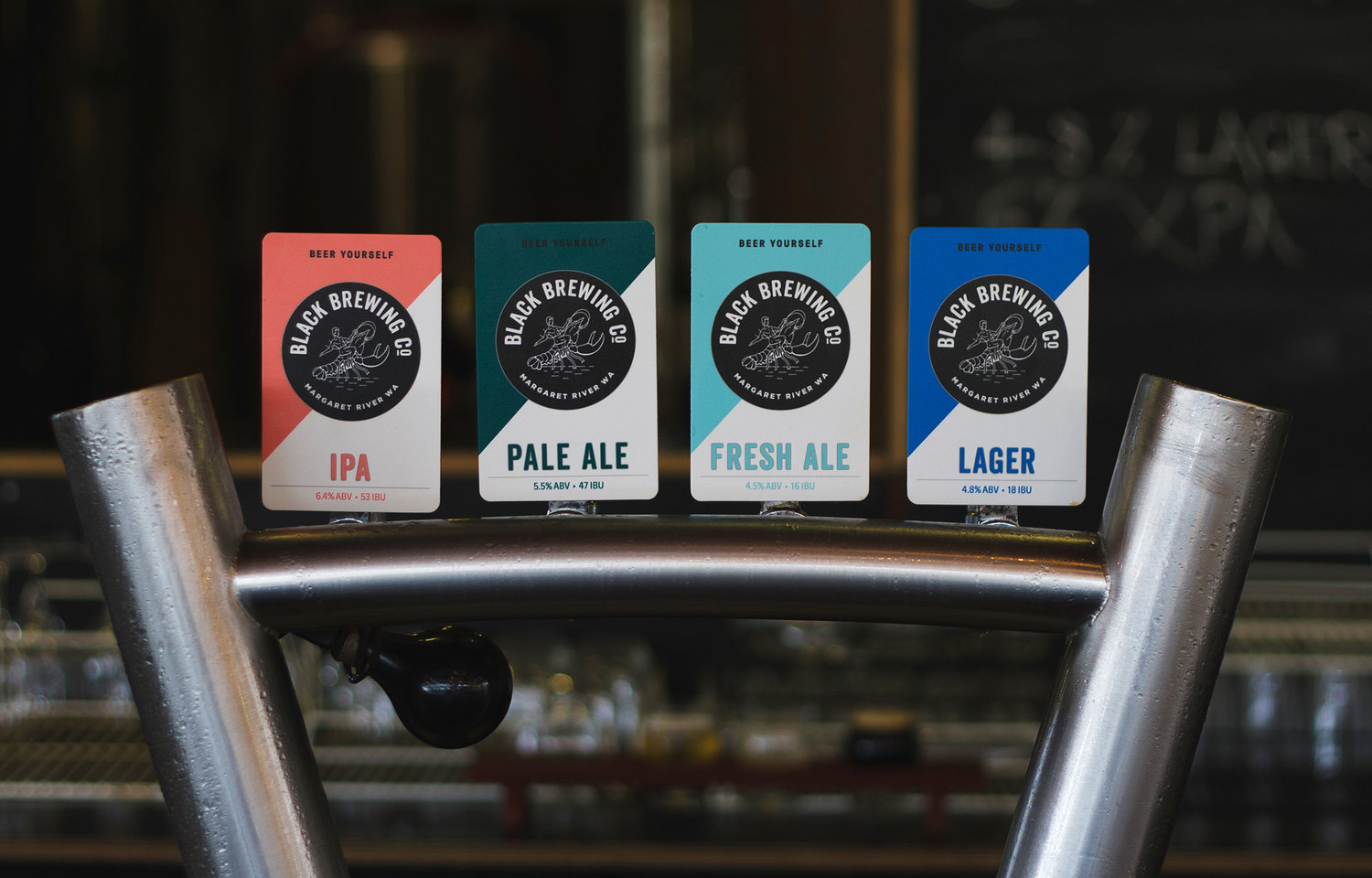
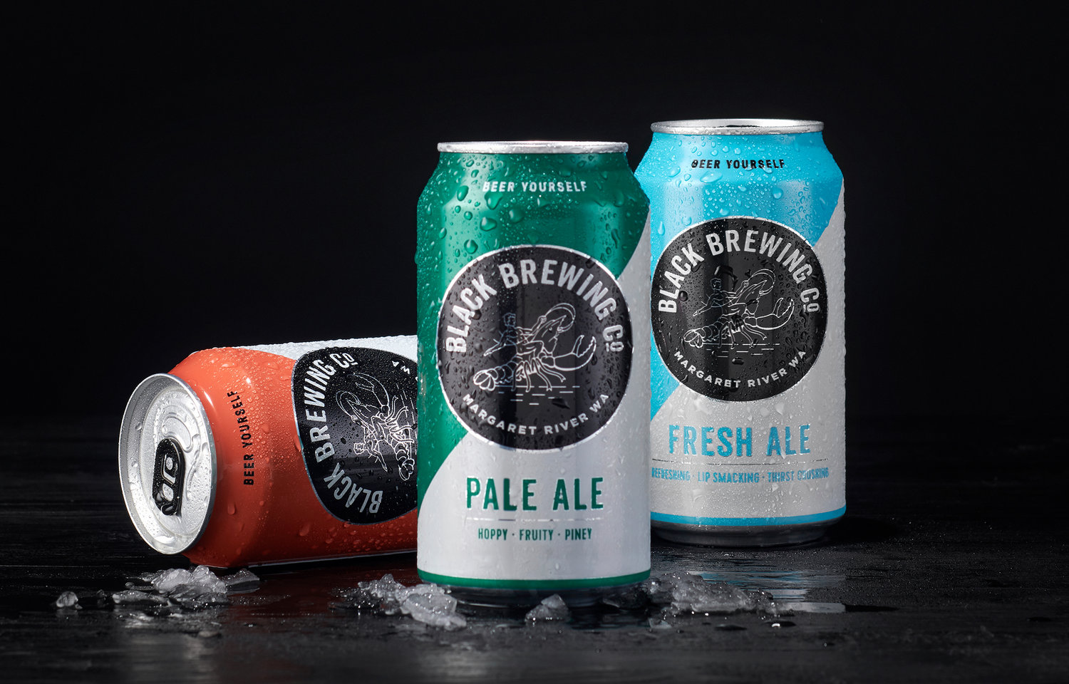
Our brief was to reposition the brand and repackage their range of five beers. Essentially, the brand faced a misalignment in place, product and personality. The brewery’s wild natural surroundings, which is a major draw card was underutilised. The range is light and refreshing, however the original packaging presented the beer to be heavy and un-sessionable. In addition to this, there was no authentic connection between the people behind the amazing brews and their brave brewing approach.From the outset, we looked to the rugged landscape for inspiration. An unforgiving sea wraps the coast, fuels a much-loved extreme sport culture and the vast and bountiful lands that flourish with native flora offer diversity in flavour and colour.Why a man straddling a Marron you might ask?The black marron, native to Margaret River is what locals call a “Black Chook”. The brewing team hunt these beauties as a past-time, so we adopted it as the brewery’s mascot and paired it with a rugged Adonis-like warrior – a symbol of Black’s thirst for adventure amongst the wild land and sea they call home.The idea of balance is symbolised through the diagonal two-tone graphic. The wild landscape is equally serene and beautiful, so too the adventurous spirit is balanced with meticulous brewing methods.We’ve adopted a diagonal two-tone graphic as a metaphor for balance. It also adds the dynamism and confidence required to cut through a cluttered craft beer shelf. Although strong shelf presence is achieved it was important to retain an equally strong sense of authenticity linking back to Black’s personality and sense of place.Messaging plays an important role in Black’s packaging to deliver an approachable personality necessary to maintain an accessible-premium position. We introduced clever product descriptors to capture the essence of each product at a glance. Looking at IPA – ‘Island Hopping’ alludes to tropical notes and a heavily hopped profile.This then leads into the product descriptions that strike a balance between big personality and juicy products notes for the discerning craft beer lover.“Our juicy IPA serves up tropical tides of mango, passionfruit and papaya. It’s all down to a combo of Aussie and American hops that are whirl-pooled, then dry hopped to hit you with a massive tropical fruit bomb. Go on, chuck a Gilligan and get marooned with this little beauty.”The black circular badge works as an eye catching device that offers clear brand recognition even in the most cluttered craft beer fridge. This was one of the key challenges we needed to solve and required numerous testing and tweaking to achieve the optimal result.The badge borrows from traditional beer semiotics but we’ve delivered it in a contemporary way to appeal to a younger demographic; 25-35yr old beer lovers (gender neutral) that don’t mind spending a little more for a premium craft beer with big personality. They’re tired of ‘hoppy’ craft brews that force you to throw the towel in after two cans. They’re looking for a full flavoured beer that is sessionable. Western Australia can get pretty warm so the perception that Black is ‘refreshing’ and ‘thirst quenching’ needs to shine through in the packaging design. We’ve delivered this through the use of vibrant colour and effective use of white.The packaging design successfully delivers an effective balance of striking retail cut-through with an authentic brand story that captures Black’s rich connection to the wild Western Australian coastline and their bold brewing approach.
