


Task: Due to the morally obsolete visual image of the Municipal Enterprise “Bishkekglavarchitectura”, which does not meet modern requirements and trends, we were asked to rebrand the enterprise’s identity.
Idea: Architecture is the cultural code of civilization. A good program starts with a clean code – good architecture starts with a clean city code. We projected these meanings in the corporate identity.
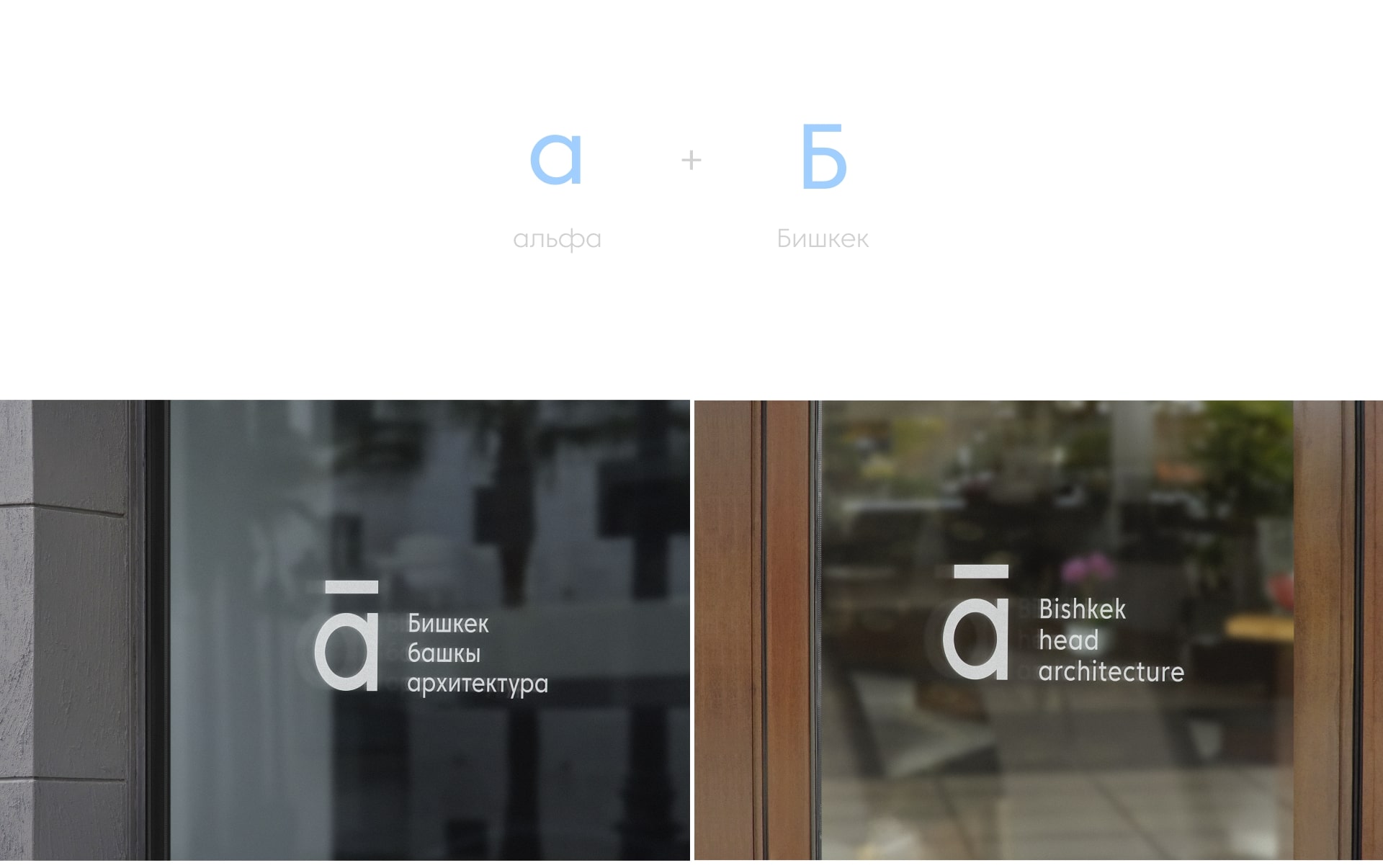
Solution: We determined that the logo should be iconic, which communicates the brand message in a simple way. The concept was based on a homoglyph: between the Greek “alpha” and “letter B”, represented by a mirror image.
Minimalist and modern aesthetics, as well as a strong and rigorous logo, create relevance for the company and visually distinguish it in the market.
Creating a new identity for the enterprise, we aimed to visually achieve the brand’s goals – to establish the prestige and inclusiveness of the municipality.
We also sought to develop a modern, visionary and established corporate identity that speaks of sustainability and innovation and visually communicates the unity and purpose of architecture in Bishkek.
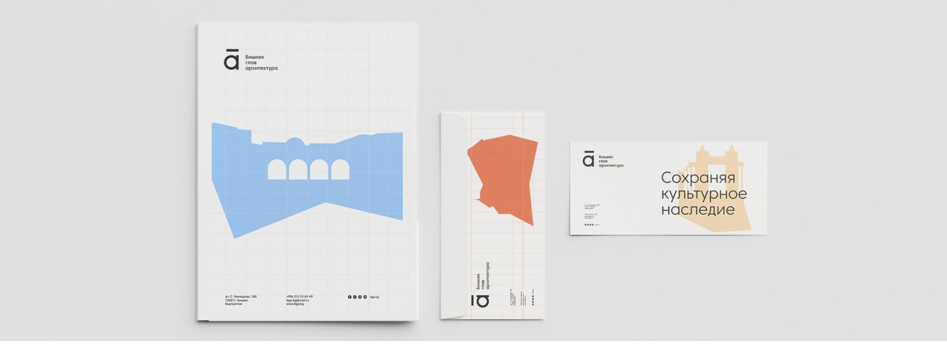
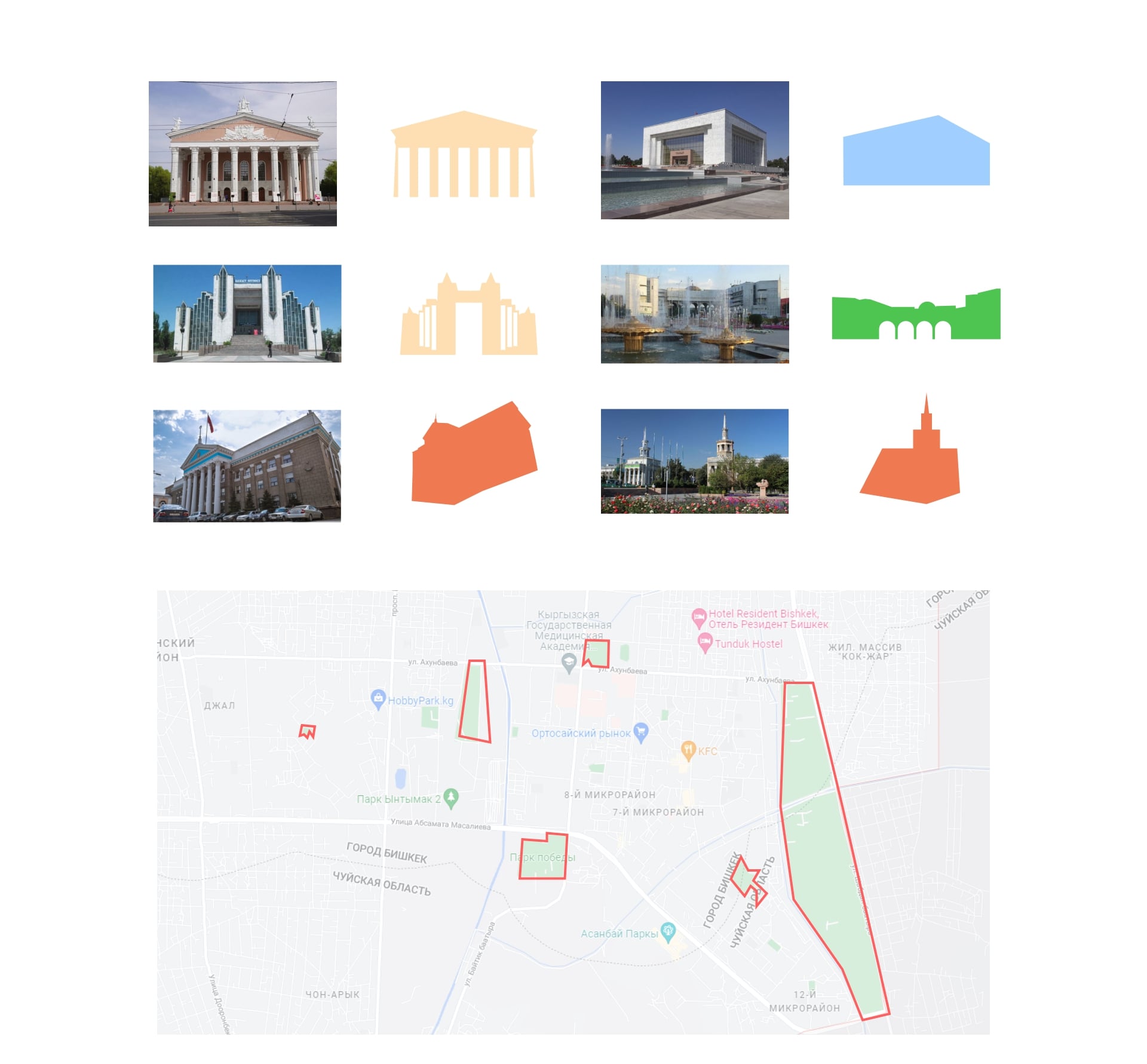
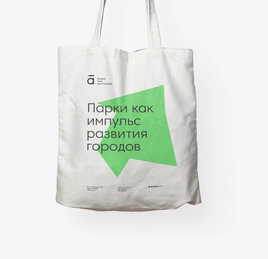
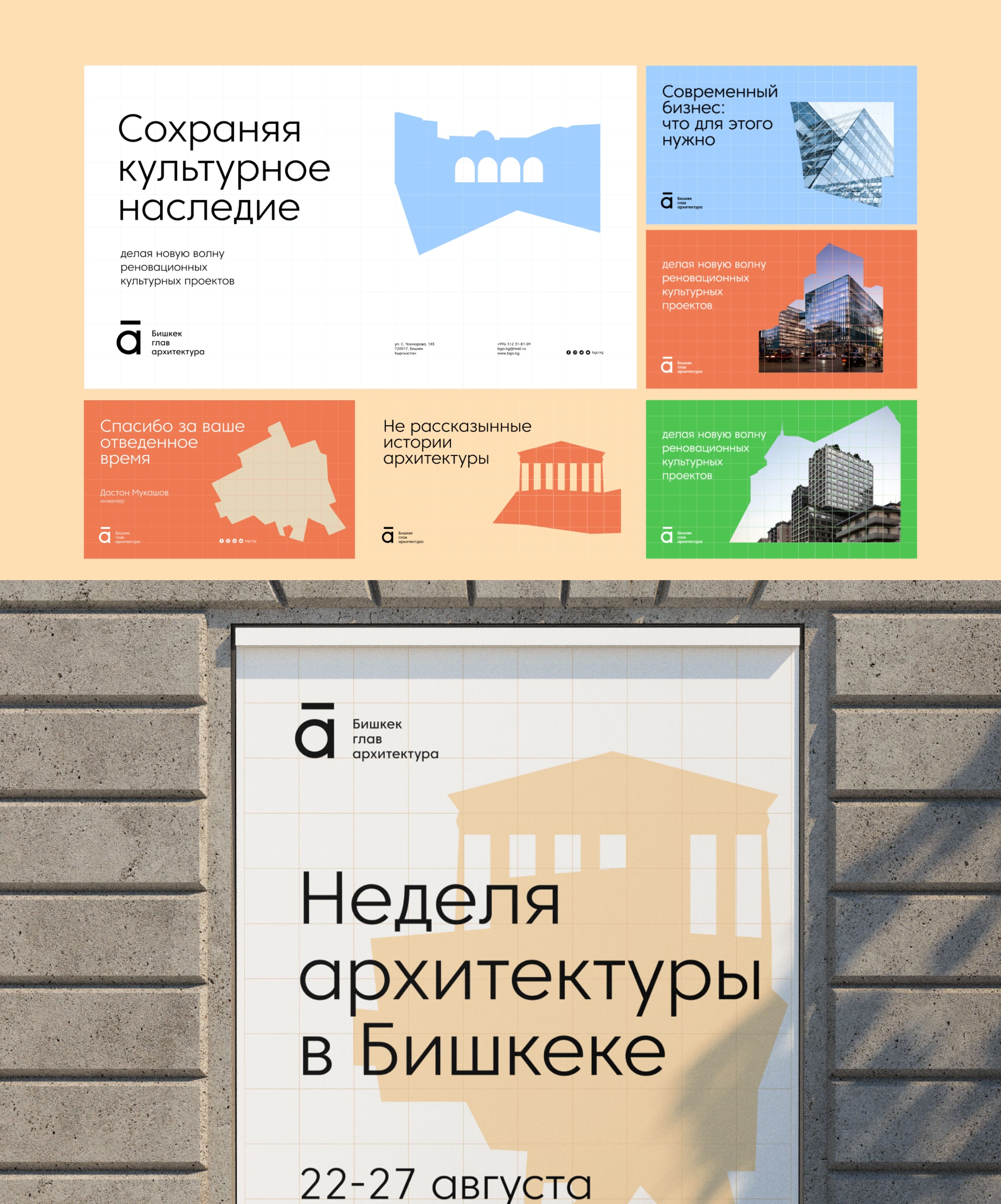
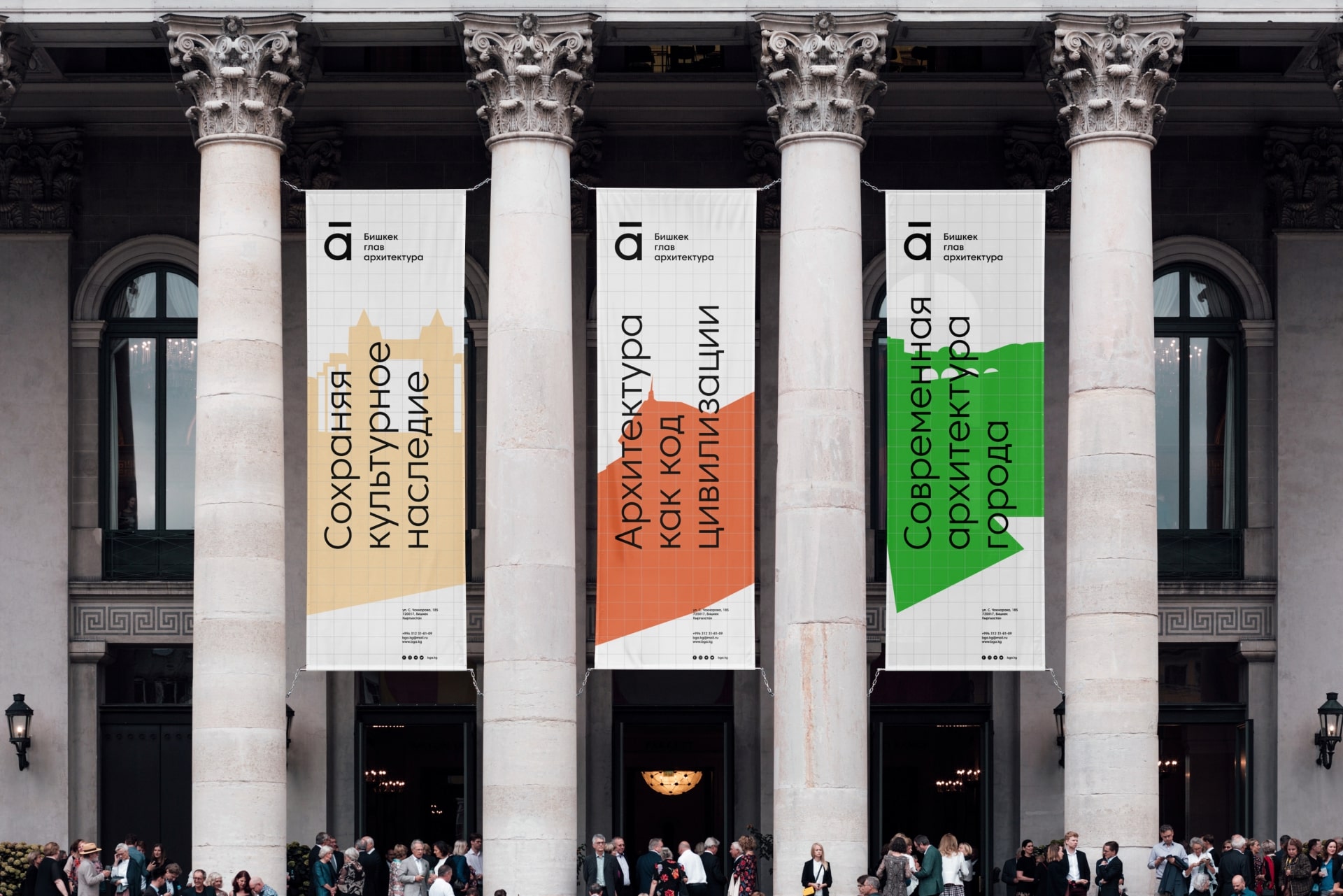
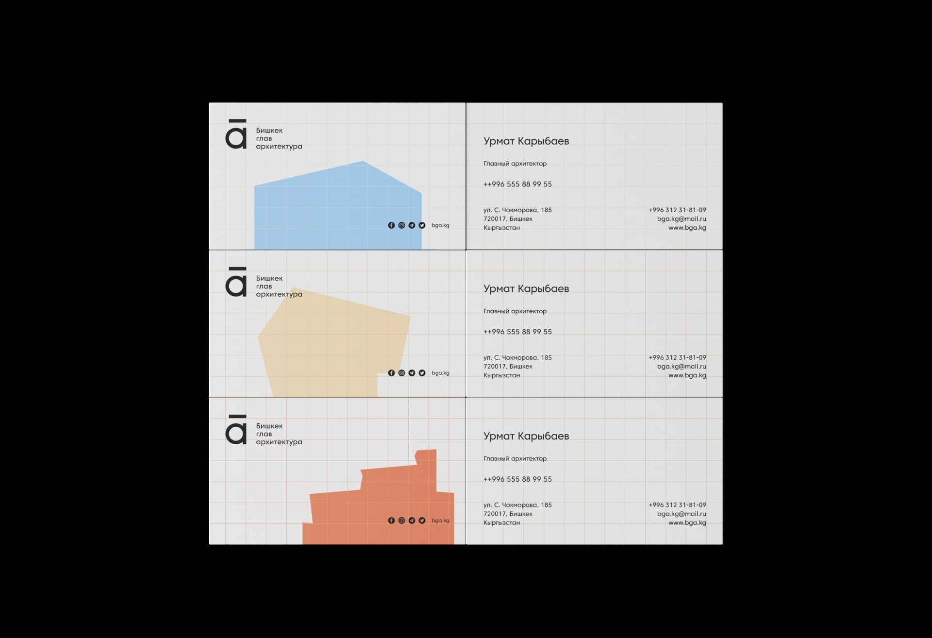
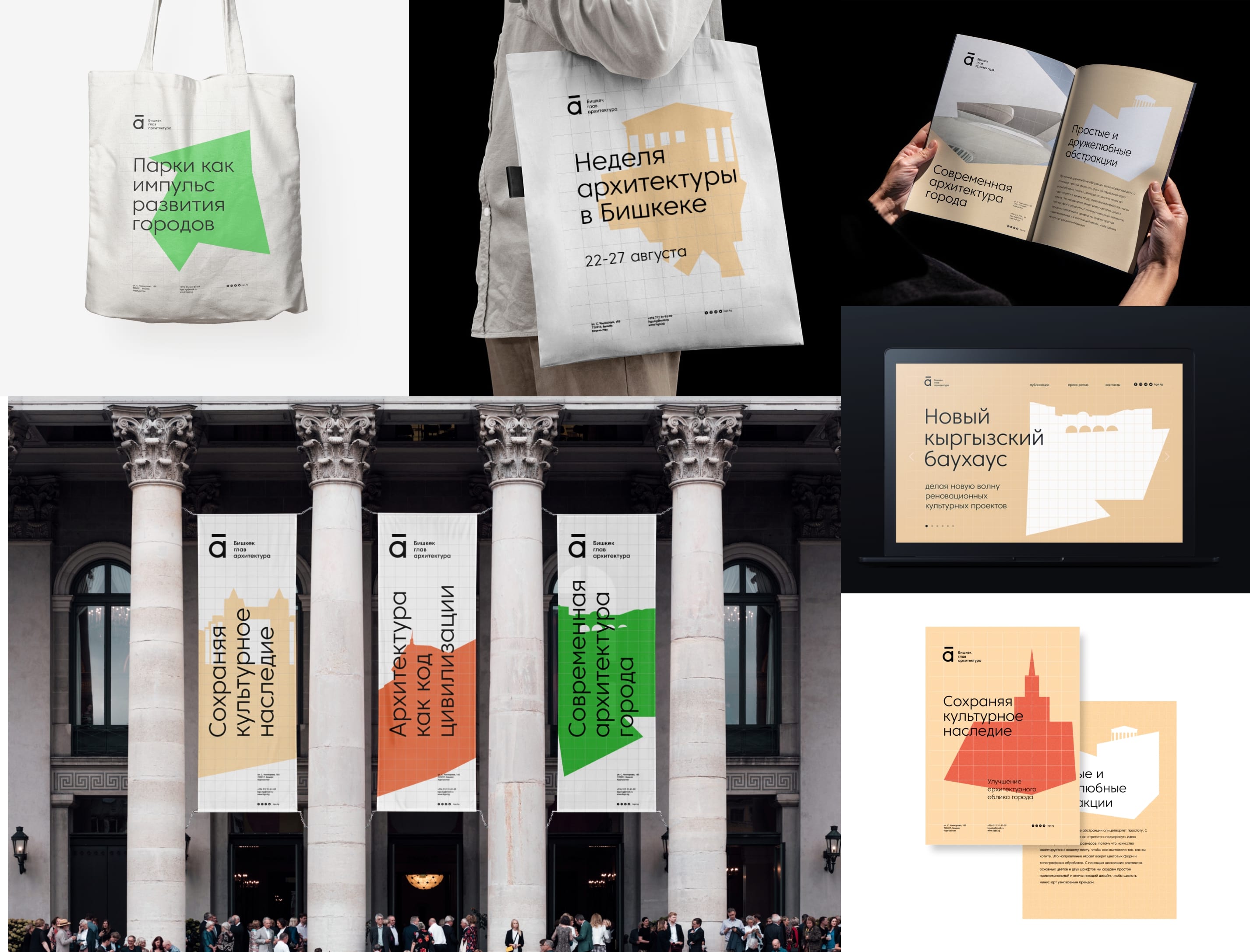
The identity speaks the language of architecture, showcasing buildings and territories in various abstract forms, as well as the unified voice of the architects.
The minimalist graphic elements that dominate the identity speak the language of architecture. Thus, we wanted the brand to achieve its goals – to connect the architectural and cultural past with real innovation.
Simple and friendly abstraction embodies simplicity. With light forms, the idea of diversity, frames and sizes is emphasized, because the architecture adapts to your place to make it look the way you want. This trend plays around color forms and typographic treatments.
Using a few elements, basic colors and fonts, we create a simple, attractive and impressive design to make the municipal enterprise a recognizable brand.

CREDIT
- Agency/Creative: Brandten
- Article Title: Bishkek Head Architecture Identity
- Organisation/Entity: Agency
- Project Type: Identity
- Project Status: Published
- Agency/Creative Country: Kyrgyzstan
- Agency/Creative City: Bishkek
- Market Region: Asia
- Project Deliverables: Brand Identity
- Industry: Construction
- Keywords: Bishkek, architecture, identity, Bishkekglavarchitecture, branding, city,
-
Credits:
Creative director: Azamat Tursunkulov
IG: azikovsky: twitter: azikosvky


