


Stubborn by Design: Casmurro Wine
For Bisarro Studio, the Casmurro project started with a word that carries unusual weight. Casmurro is more than a name – it is a character trait. It evokes someone stubborn, resistant to change, unwilling to compromise. Yet, when reframed, those same qualities become resilience, determination, and strength. This paradox became the foundation of the brand’s identity and guided every design decision.
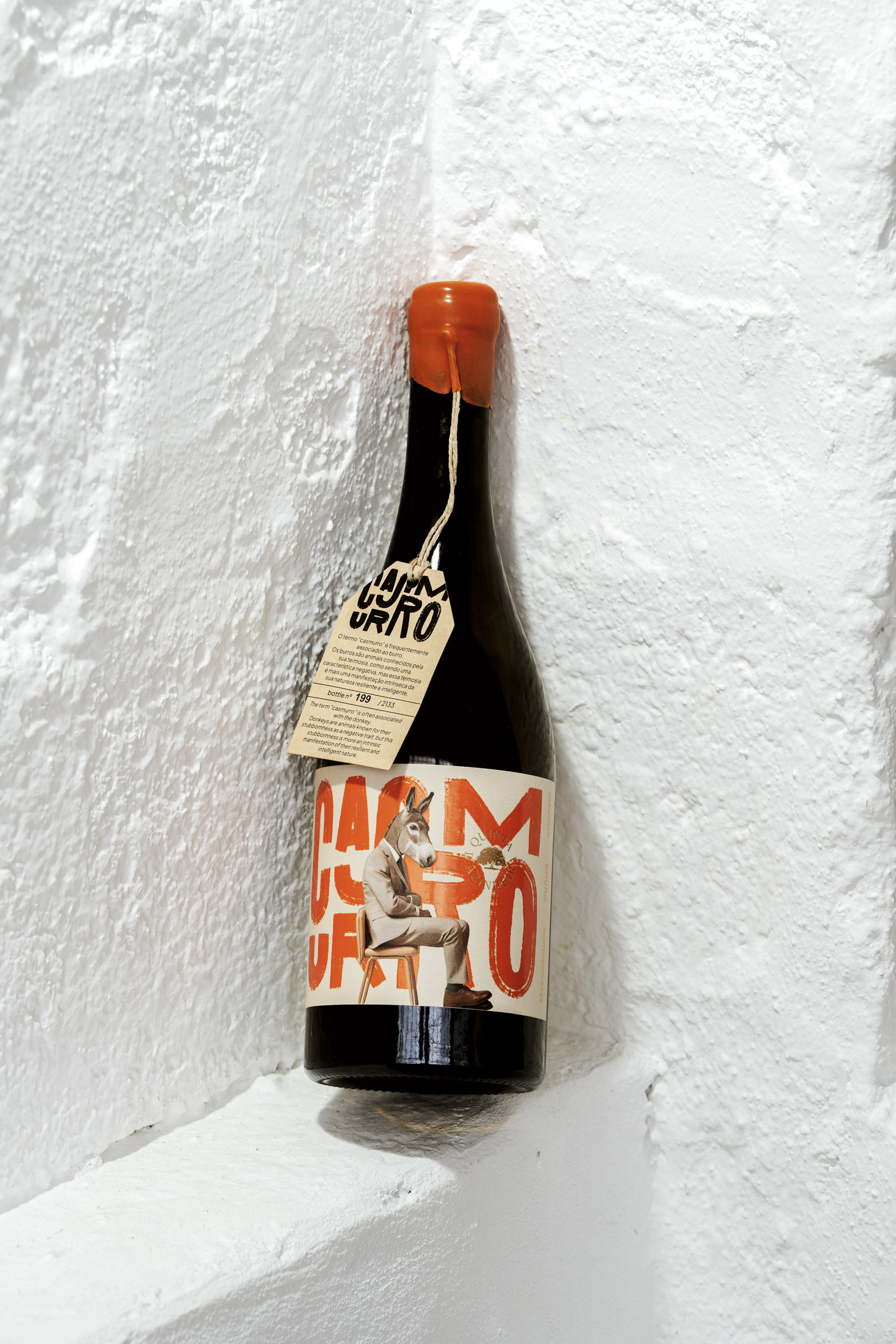
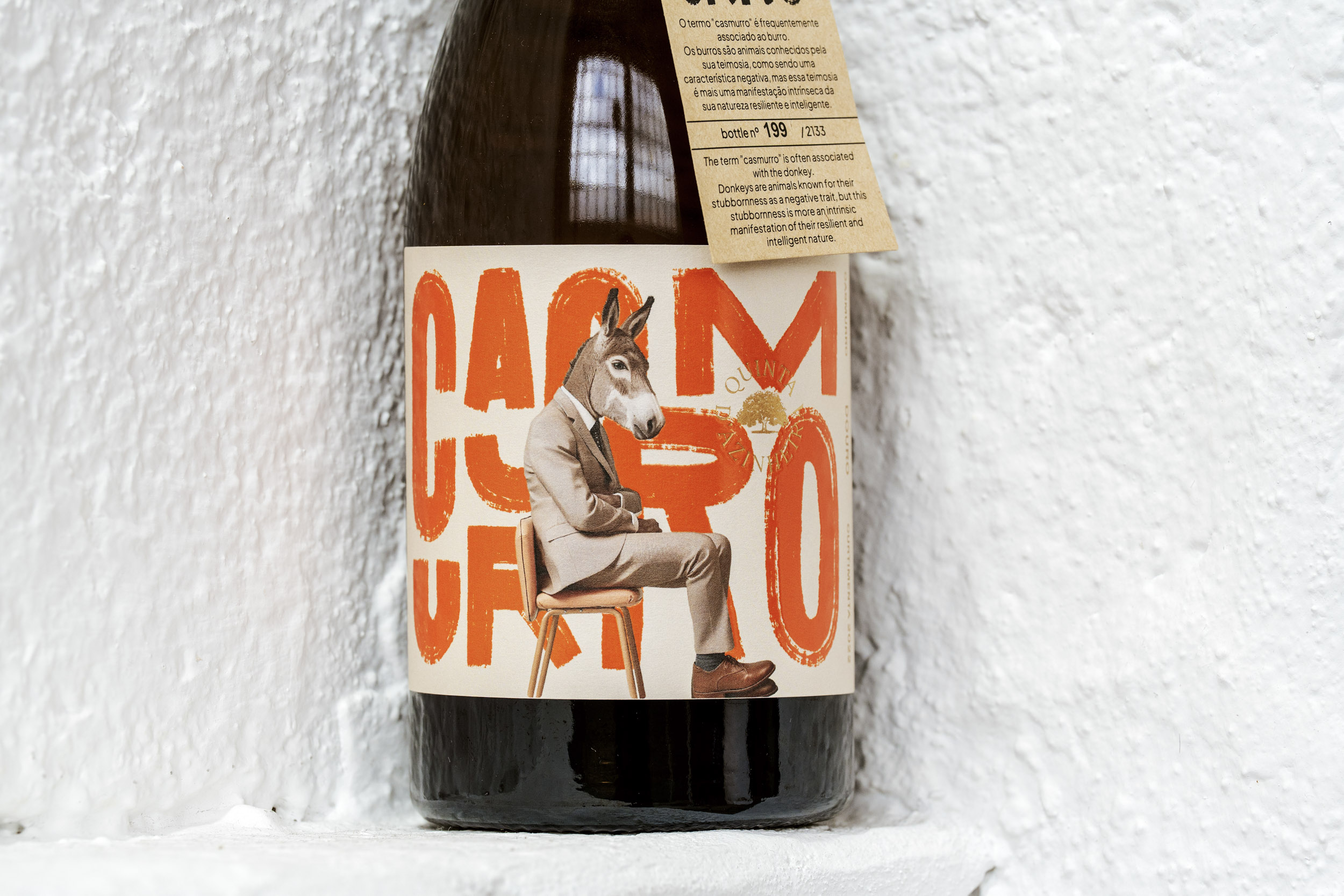
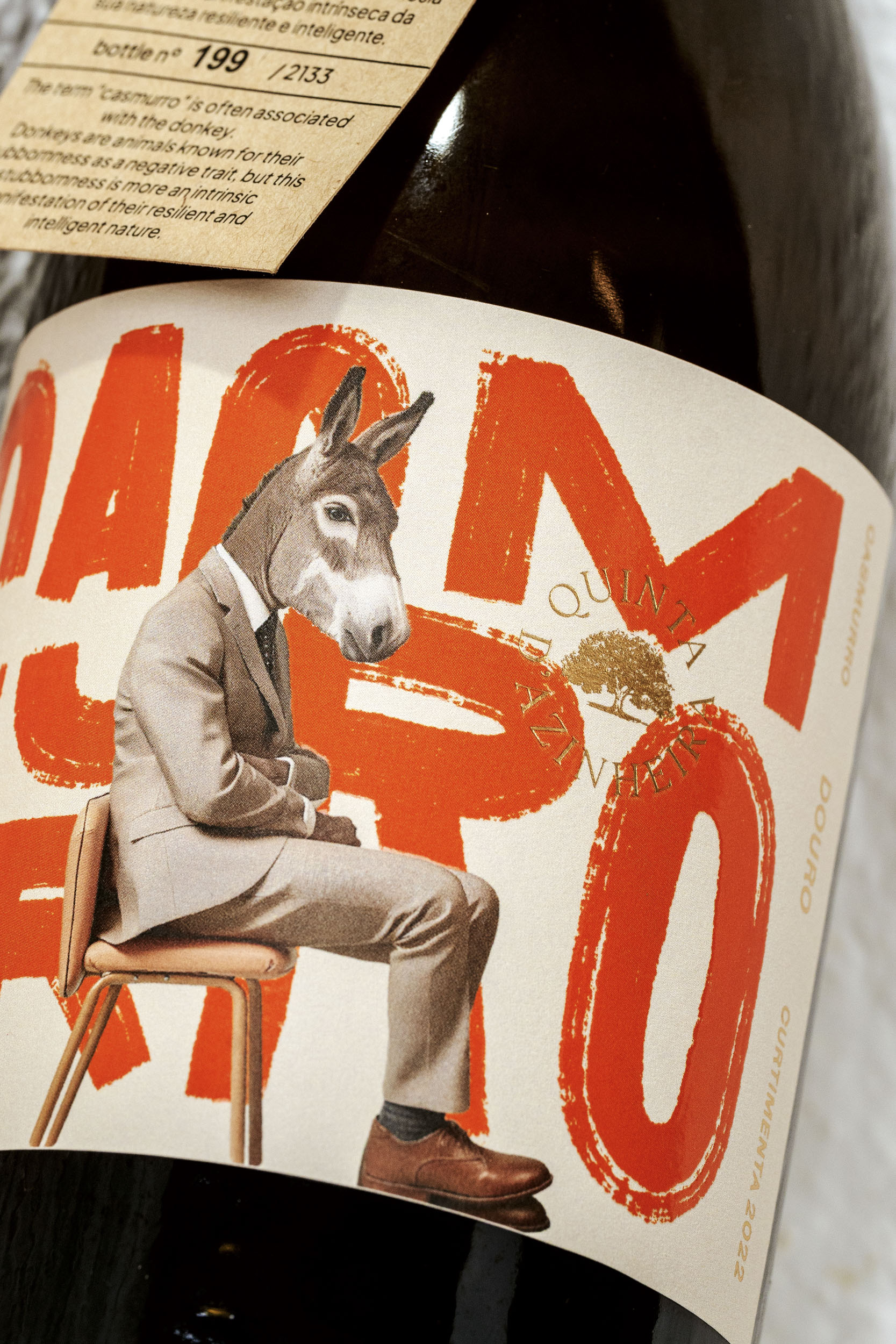
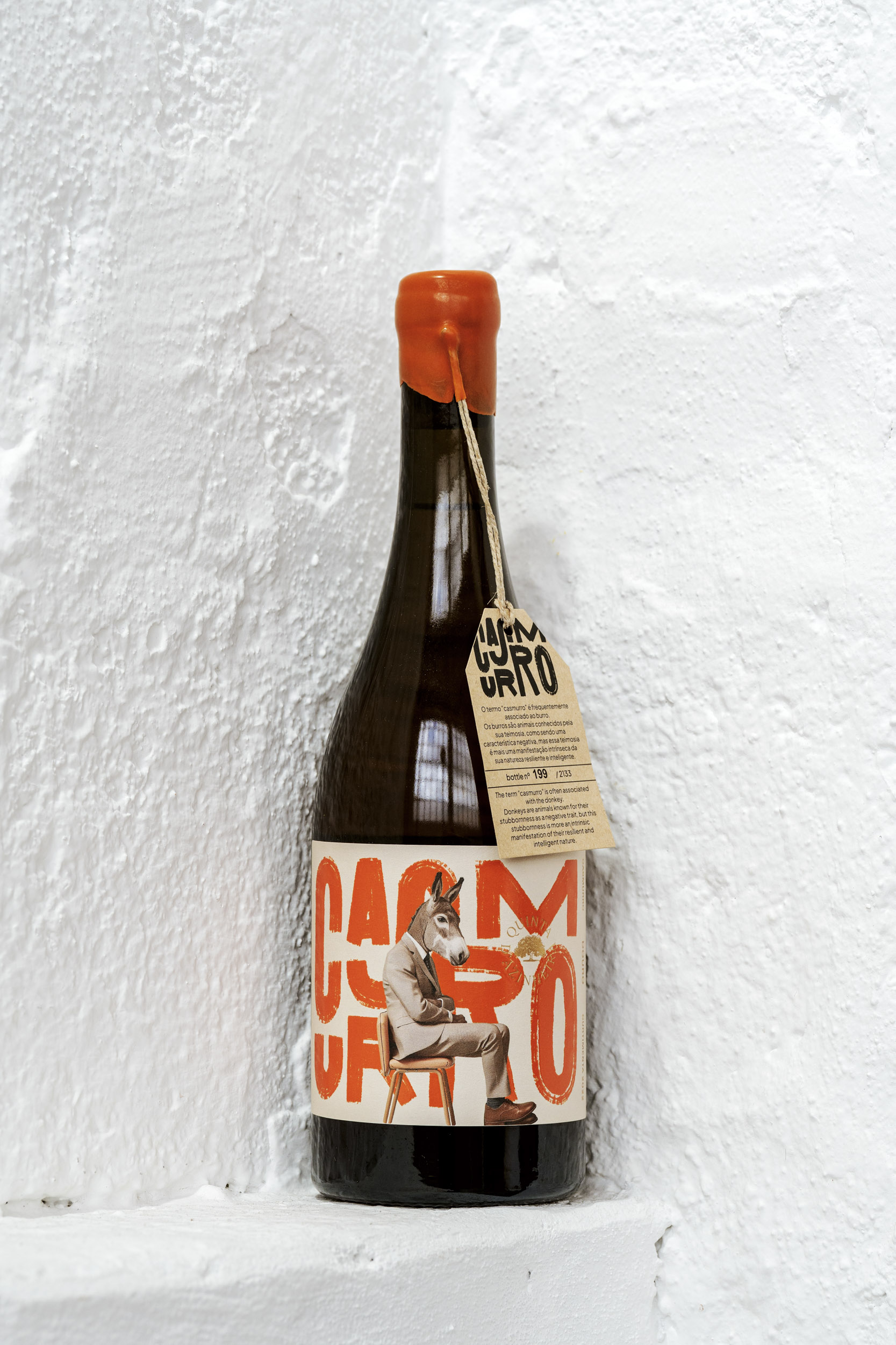
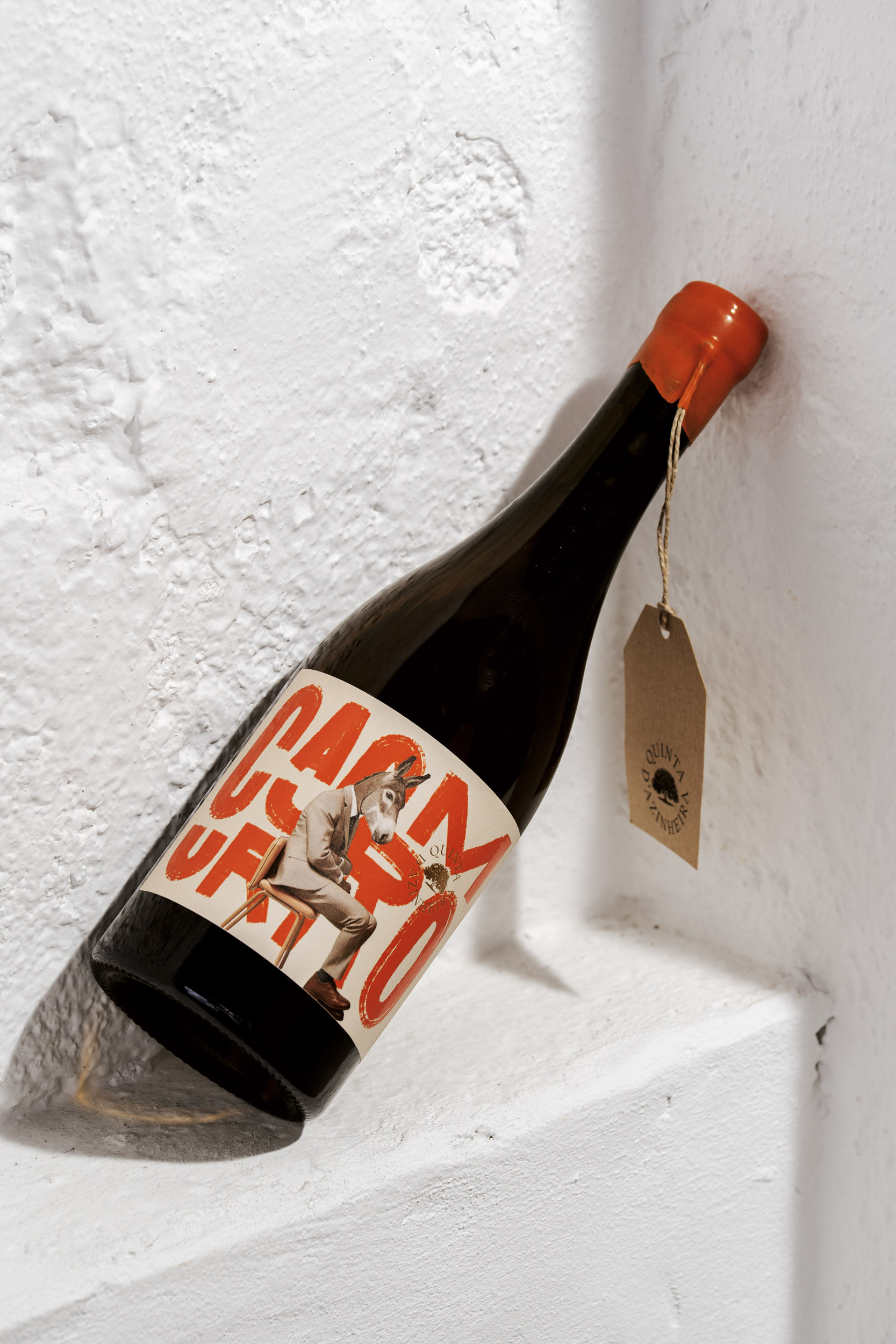
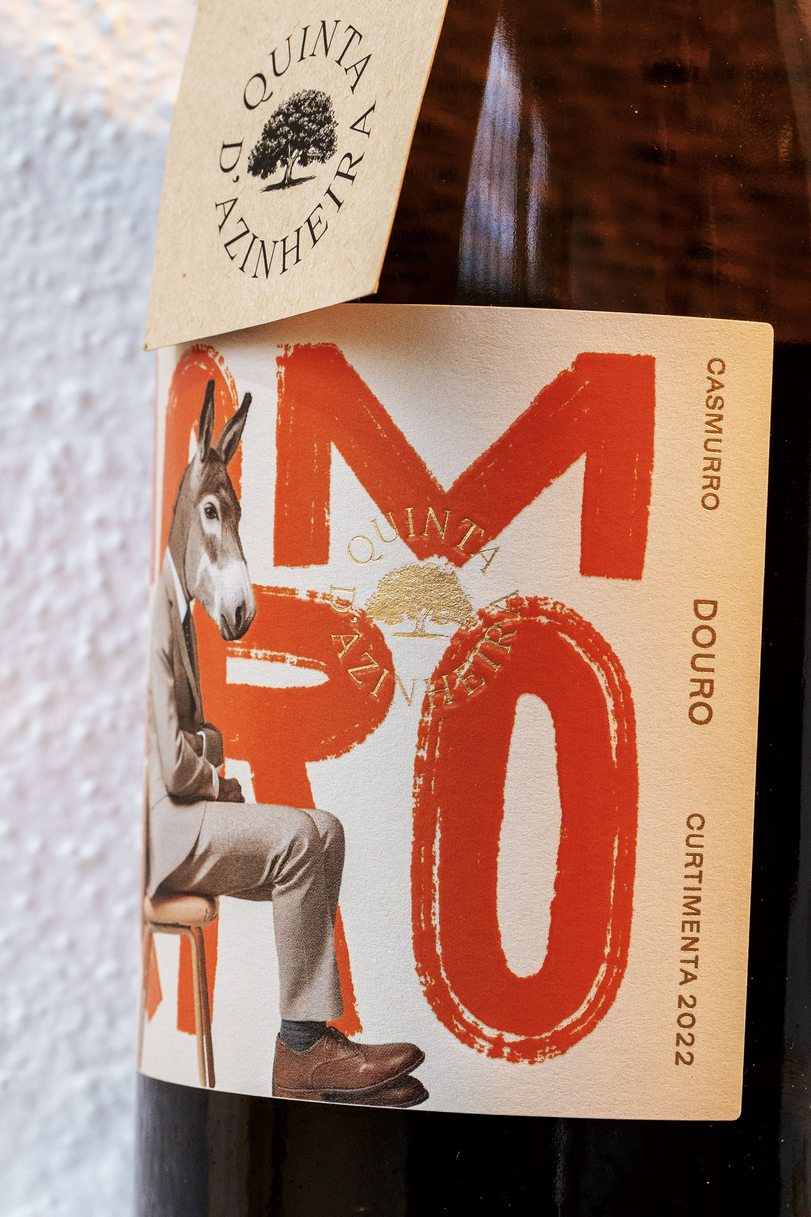
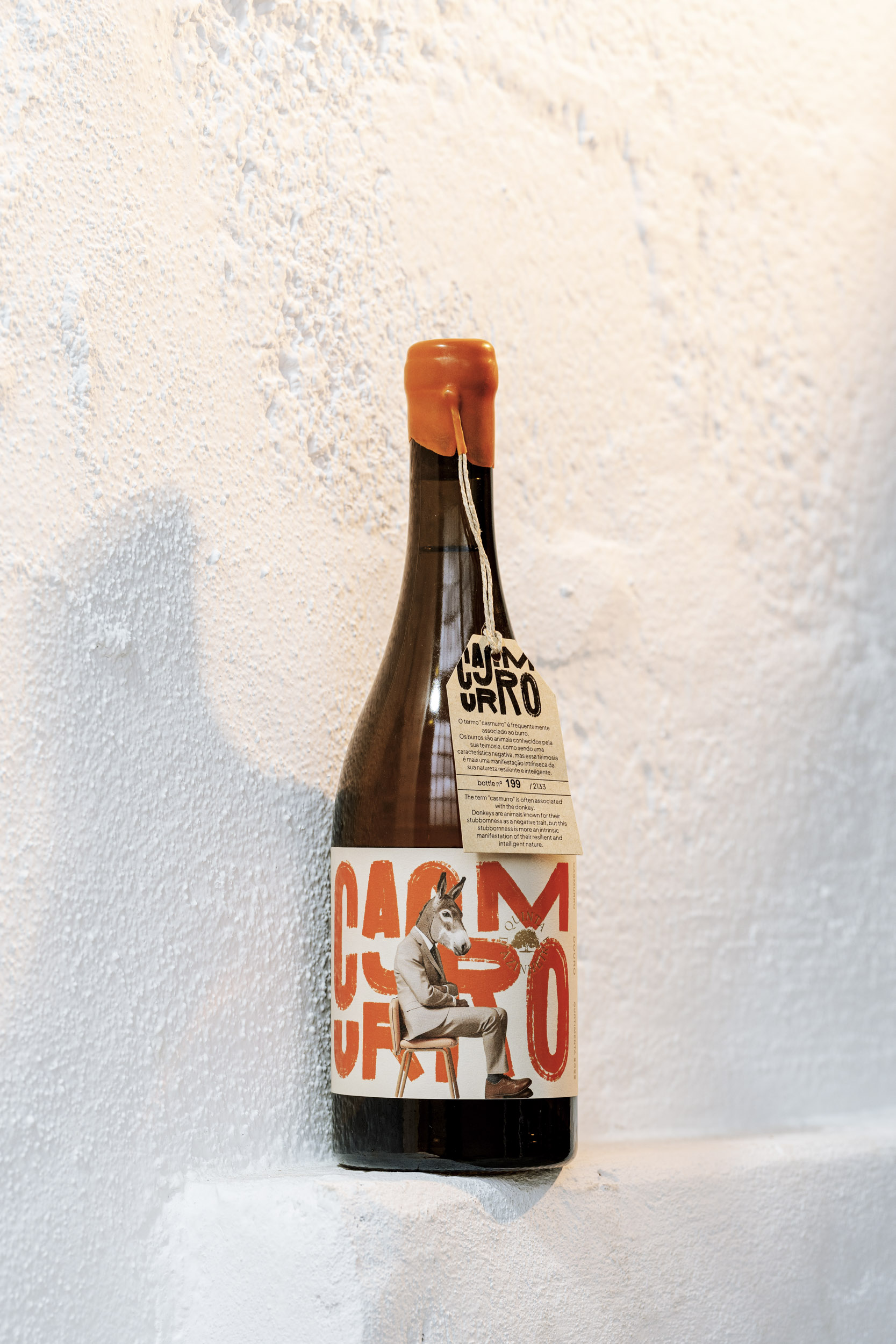
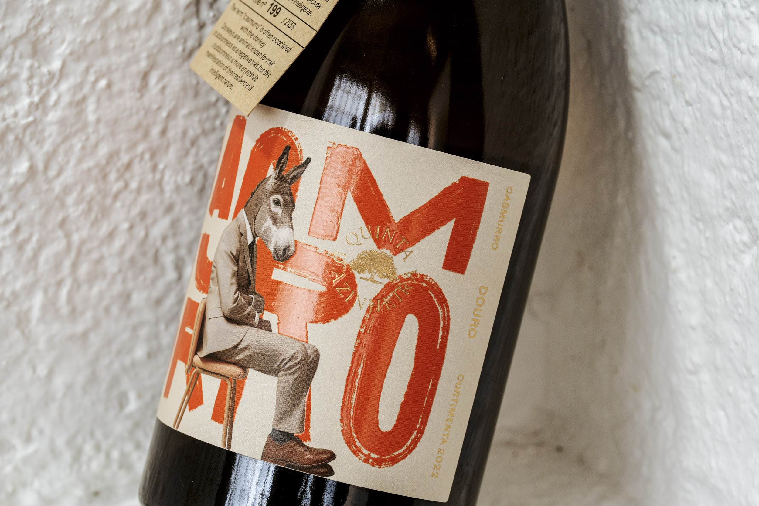
At the centre of the label stands a donkey in a suit – playful on the surface, but deliberate at its core. Traditionally associated with stubbornness, the donkey becomes, in this context, a symbol of resilience and persistence. By dressing it formally, the design mirrors the group of entrepreneurs and investors behind the project, known for their own “casmurro” spirit. The contrast between animal instinct and business attire highlights the
tension between tradition and ambition.
Typography was treated as a graphic force. Oversized, intense letters dominate the label, raw and unapologetic, echoing the strength of the word itself. Colour choice was equally intentional: orange is not a flourish but a direct reference to the wine – an orange wine
(curtimenta) – making identity inseparable from hue.
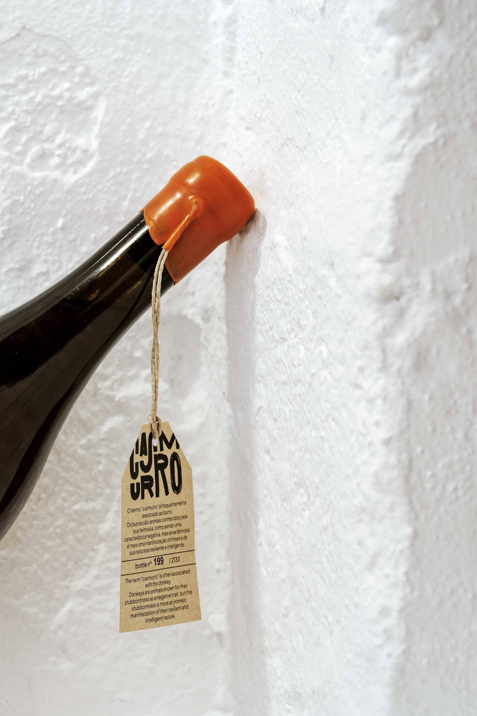
The materials underline this clarity. Matte paper reinforces the label’s tactile honesty, while
metallic stamping adds precision and a modern edge. Strong contrasts, minimal finishes, and deliberate restraint ensure the focus remains on concept and character.
Casmurro is not just a label – it is a statement of design and identity: stubborn, resilient, and impossible to ignore.
CREDIT
- Agency/Creative: Bisarro Studio
- Article Title: Bisarro Studio Designs Casmurro Wine With a Playful Yet Powerful Visual Story
- Organisation/Entity: Agency
- Project Type: Packaging
- Project Status: Published
- Agency/Creative Country: Portugal
- Agency/Creative City: Vila Real
- Market Region: Europe, North America
- Project Deliverables: Illustration, Label Design, Packaging Design, Photography
- Format: Bottle
- Industry: Food/Beverage
- Keywords: label design; Design; packaging; ilustration; bottle; Wine; red wine; Portuguese Wine
-
Credits:
photography: André Macedo


