


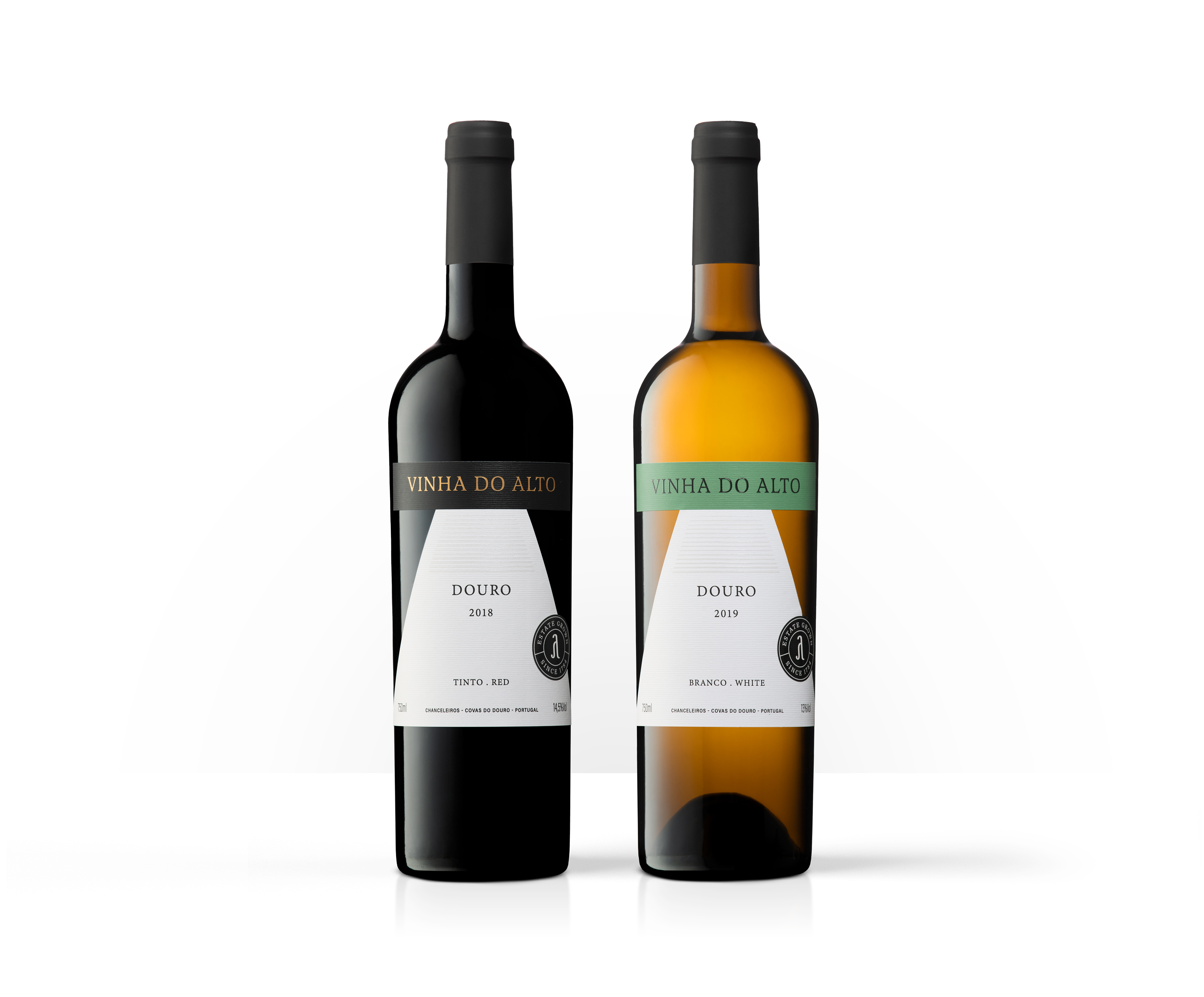
Quinta da Formigosa is located in Chanceleiros do Douro, on the right bank of the Douro River, and uniquely framed in the UNESCO classified landscape. Among its references is the Vinha do Alto red and the Vinho do Alto white. These wines were developed with the enological consulting of Duplo PR.
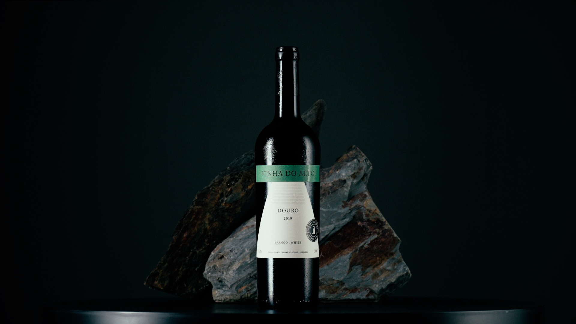
These wines are named after the vineyard from which they are born. It is a hillside vineyard, planted at altitude, which overlooks the right bank of the Douro River. From this terroir are born elegant and exuberant wines in the fruit and freshness that surrounds them.
One of the main elements of Quinta da Formigosa’s image is the “F” symbol that identifies the wines and serves as its logo. We felt that Vinha do Alto, as a brand in its own right, needed its own symbol; a reinterpretation of the element that identifies Quinta da Formigosa, but now that would identify Vinha do Alto. That it maintained a connection between this brand and the parent brand (Quinta da Formigosa); they belong to the same family, but are different brands.
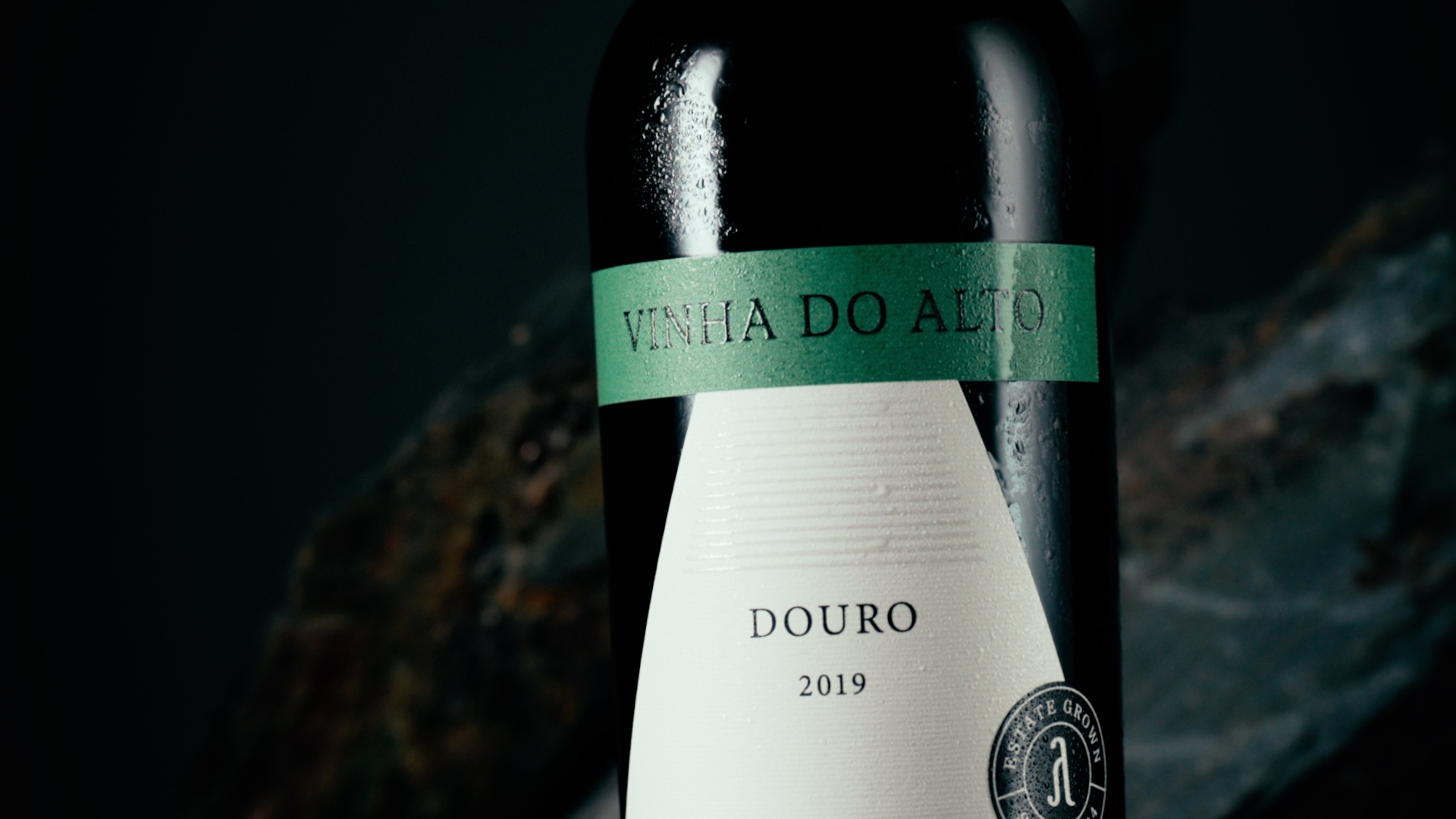
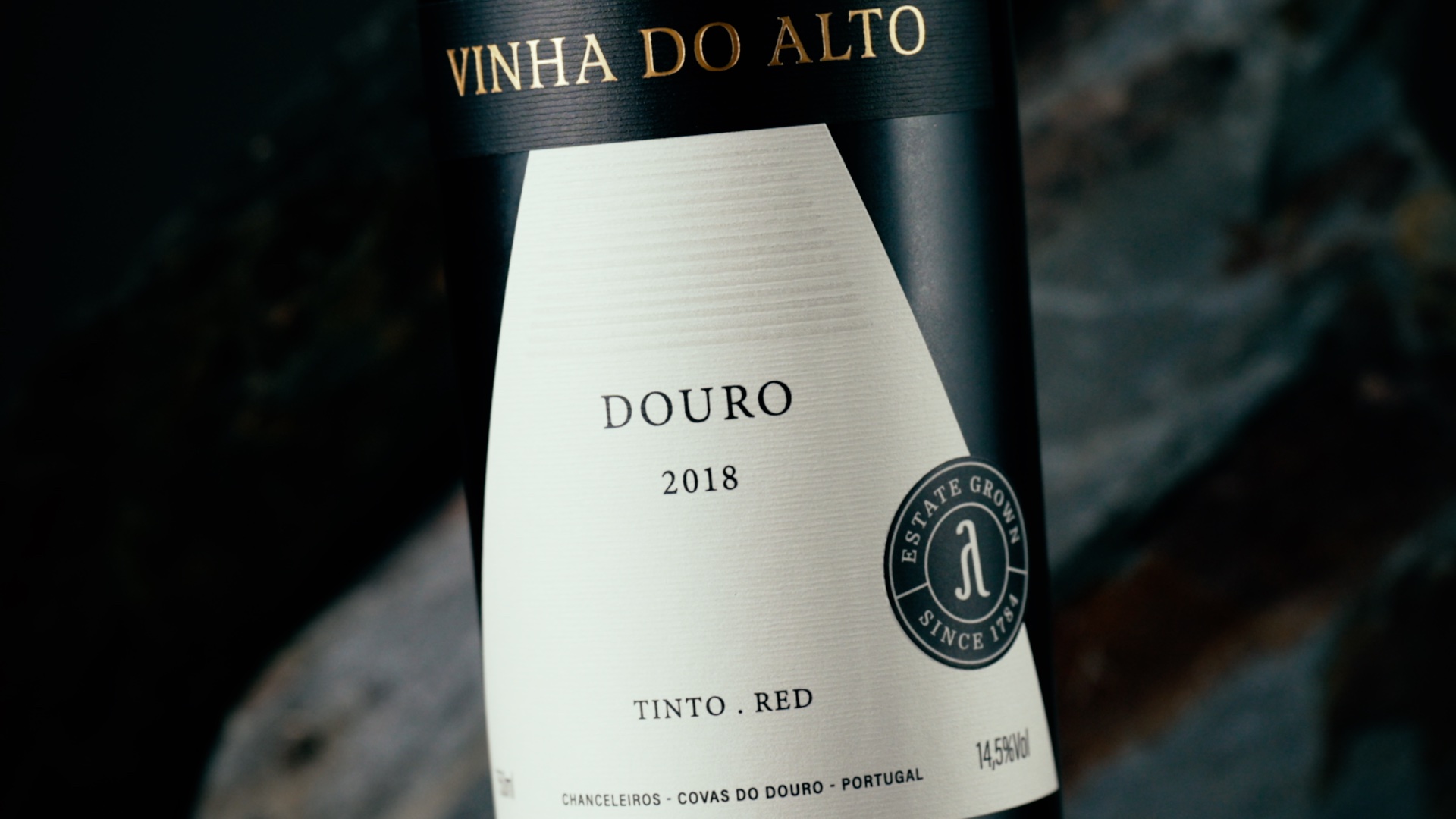
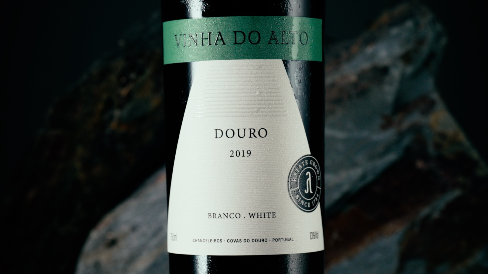
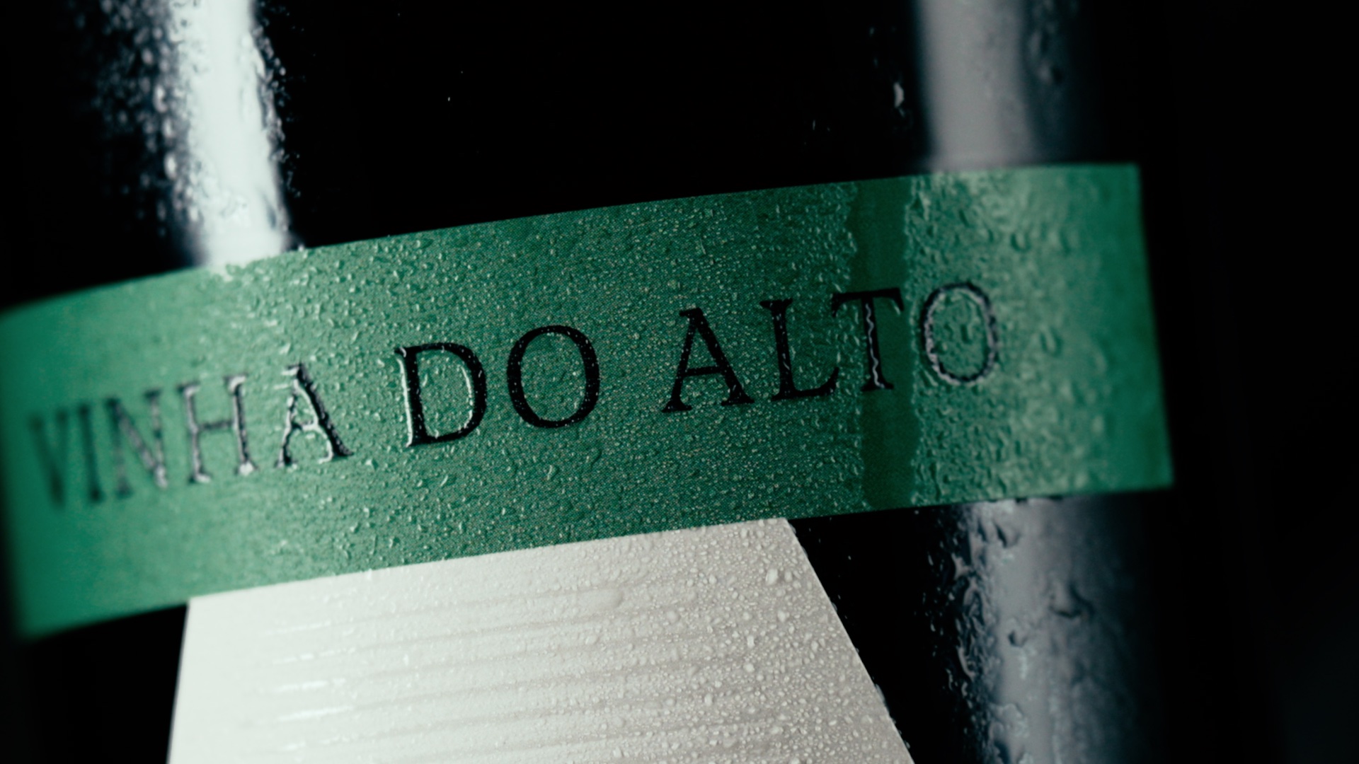
The main aspect of this label is its geometry. The triangle with Vinha do Alto at the top is a simple and almost literal interpretation of the characteristic of this vineyard: being on top of the hillside. This geometry takes advantage of the negative space between the rectangle and the triangle, allowing the bottle glass to be part of the label’s design. In the Vinha do Alto red wine, this is even more evident, as the black color camouflages the rectangle in the color of the bottle.
The paper used is Fasson® Alinea Blanc from Avery Dennison, which has a horizontal texture and therefore completes the label design. In the Douro wine-growing region, it is the hillsides flanked by lines of vines that make the landscape unique in the world; this label presents this, symbolically: on the one hand, the textured lines of the paper, the geometry of the triangle that represents the mountain, and the horizontal lines highlighted in uv varnish, on top.
Also, the name of the wine and the seal are highlighted with braille varnish. The highlight on the seal creates the illusion of being a separate element of the label, which gives it more depth.
The label was produced by VOX Artes Gráficas (Canelas, Porto).
The photos are by Lino Silva and the videos and stills are by André Macedo.
CREDIT
- Agency/Creative: Bisarro Design Studio
- Article Title: Bisarro Design Studio Creates Label Design for Vinha do Alto Wine
- Organisation/Entity: Agency
- Project Type: Packaging
- Project Status: Published
- Agency/Creative Country: Portugal
- Agency/Creative City: Vila Real
- Market Region: Europe
- Project Deliverables: Label Design
- Format: Bottle
- Substrate: Glass Bottle
- Industry: Food/Beverage
- Keywords: Wine label, Douro, Portugal, Embossing, Label design, Foil
-
Credits:
Videographer/Photographer: André Macedo
Photographer: Lino Silva
Printer: VOX Artes Gráficas
Paper supplier: Avery Dennison


