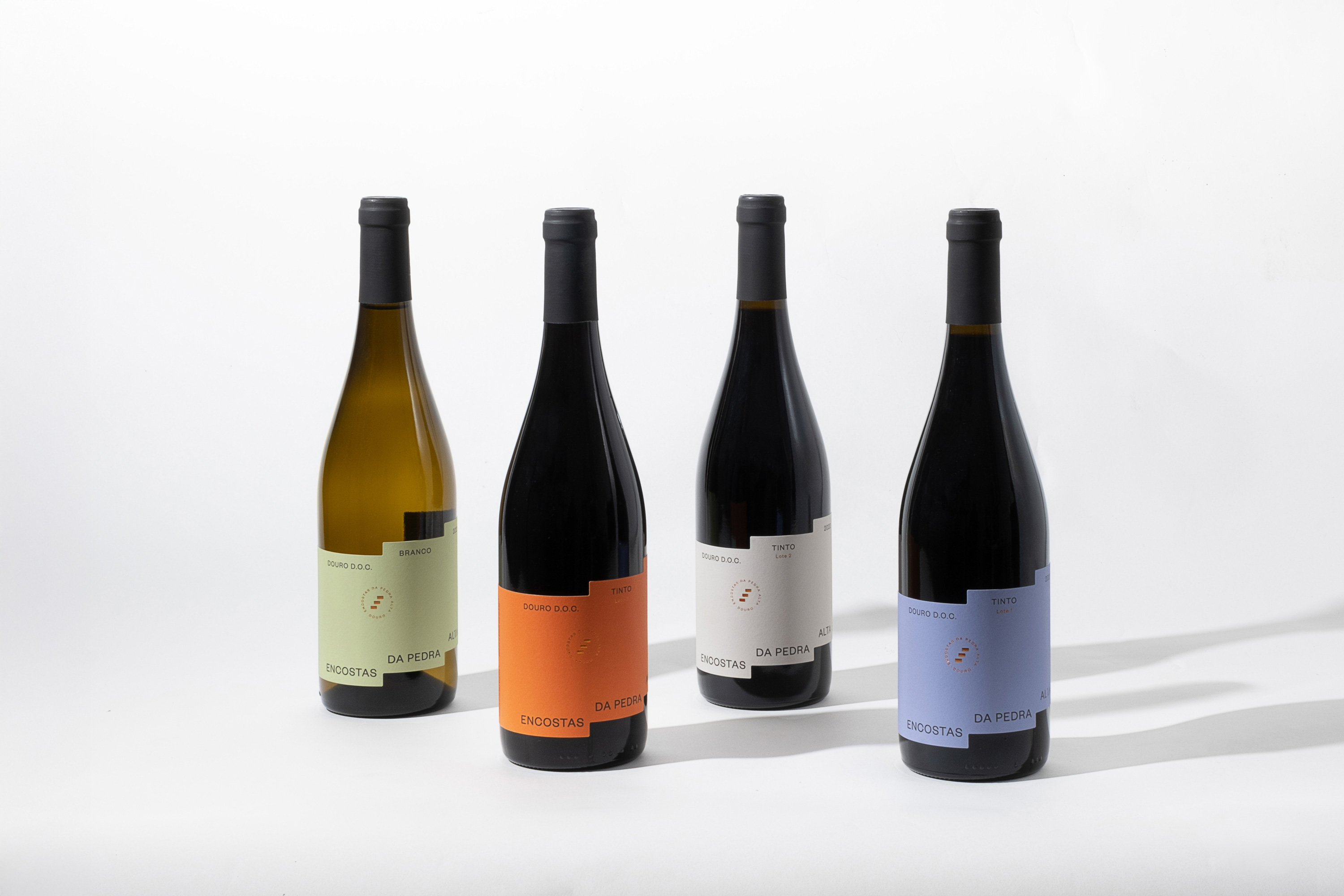
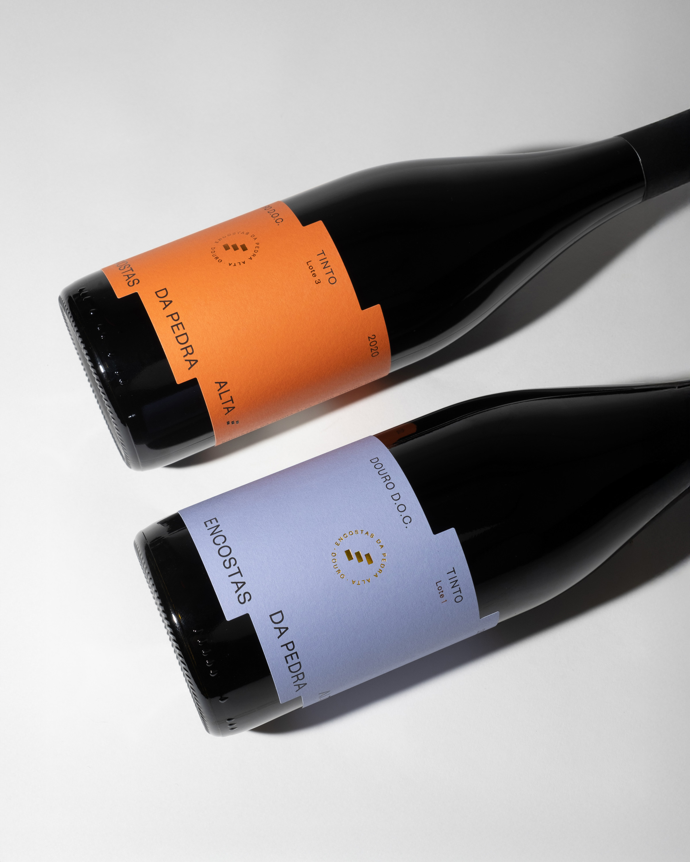
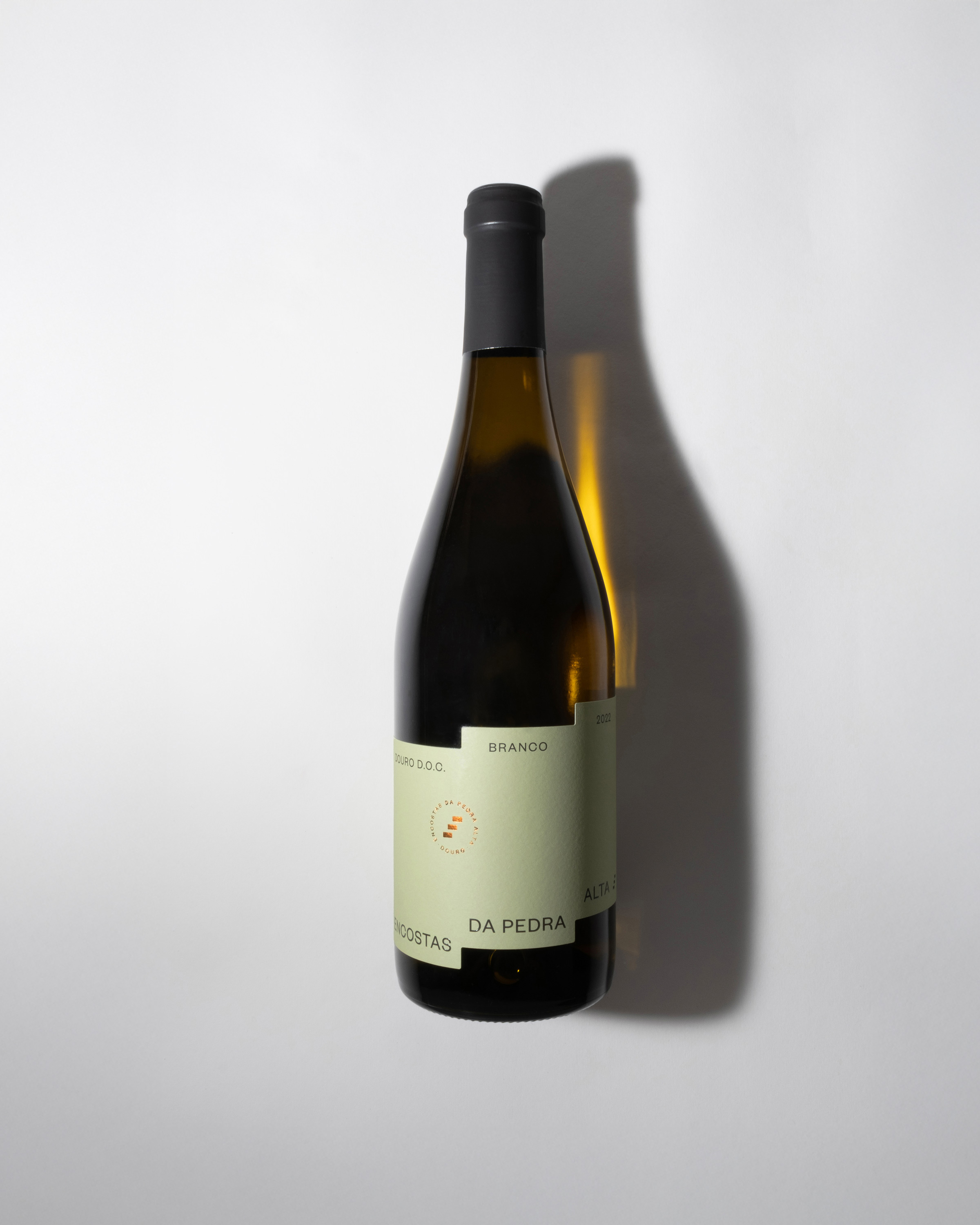
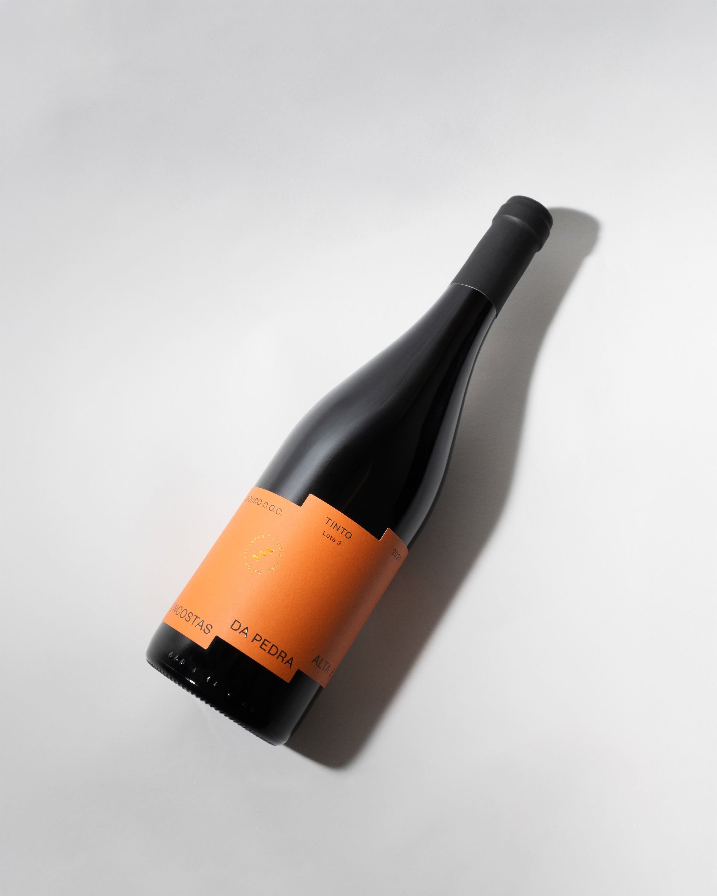
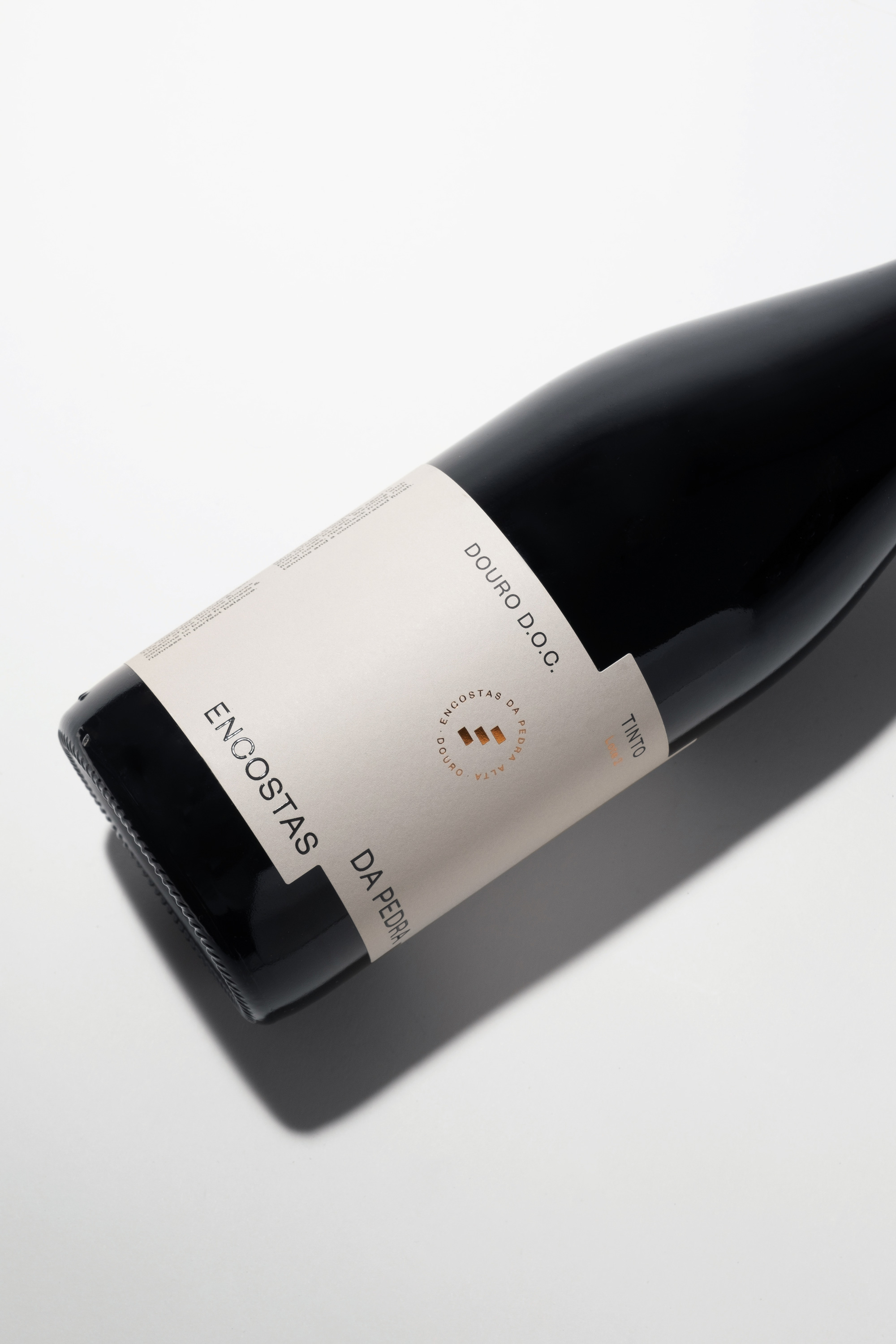
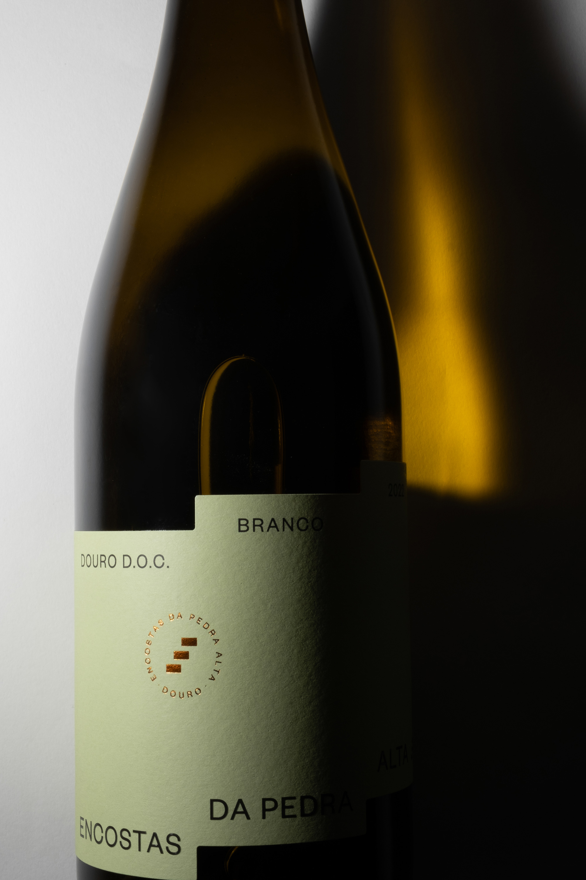
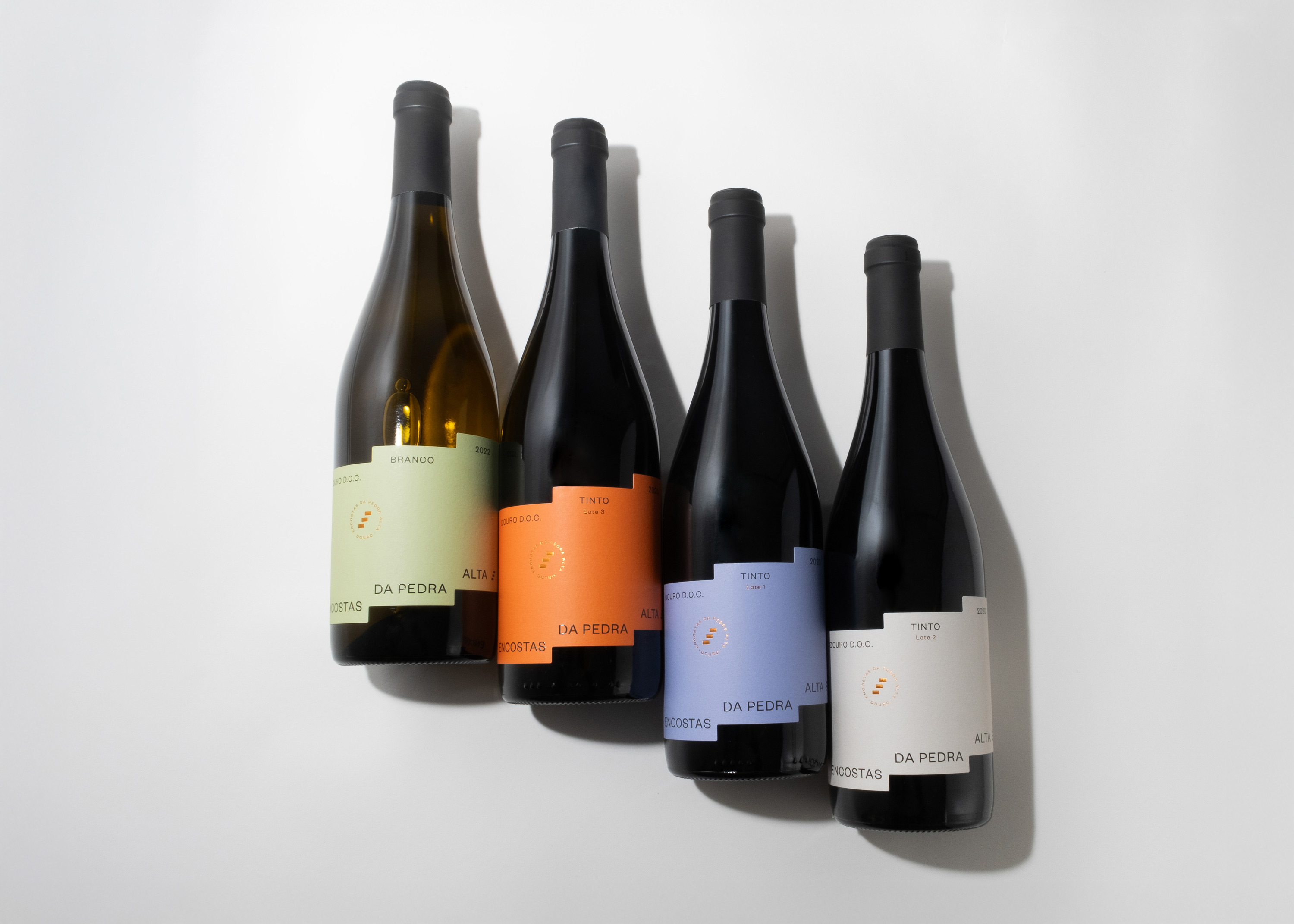
The Encostas da Pedra Alta wine line was created to preserve the characteristic tradition of the Douro while introducing a more contemporary approach. Bisarro Design Studio, responsible for the design, branding, and packaging, reinvented the iconic symbol of Quinta da Pedra Alta — the three rectangles — by transforming them into a die-cut label that directly evokes the terraced vineyards, one of the defining features of the Douro Demarcated Region’s landscape, characterized by mountain viticulture. This tripartite cut not only reinforces the brand’s visual identity but also reflects the distinctive nature of the estate, which is unique for having three marcos pombalinos.
The label’s color palette is carefully balanced, with each color reflecting specific aspects of the wine sector and the region itself. The combination of soft and vivid tones, along with earthy and neutral shades, symbolizes the connection between tradition and boldness, which are core values of Quinta da Pedra Alta. This chromatic diversity also facilitates the differentiation of the various references within the line, creating a cohesive yet distinct visual identity for each wine.
The minimalist typography chosen for the design exudes elegance and modernity, enhancing the wines’ sophistication. Together with a clean and organized layout, this typographic approach ensures that the main focus falls on the innovative label cut and its territorial inspirations. The intelligent use of negative space allows the label to “breathe,” while the informational elements are displayed clearly and accessibly.
Beyond its visual impact, this proposal conveys a commitment to the authenticity and tradition of the region. Through this contemporary approach, the labels not only capture the essence of Quinta da Pedra Alta but also tell the story of generations dedicated to producing exceptional wines. This balance between respect for cultural heritage and the adoption of a modern visual language positions the wines as a reflection of 21st-century Douro: innovative, yet deeply rooted in tradition.
CREDIT
- Agency/Creative: Bisarro Studio
- Article Title: Bisarro Design Brings a Contemporary Twist to Encostas da Pedra Alta Wine Branding
- Organisation/Entity: Agency
- Project Type: Packaging
- Project Status: Published
- Agency/Creative Country: Portugal
- Agency/Creative City: Vila Real
- Market Region: Europe
- Project Deliverables: Design, Graphic Design, Label Design, Packaging Design
- Format: Bottle
- Industry: Food/Beverage
- Keywords: Wine, Design, Label Design, portuguese wine, packaging, Douro,
-
Credits:
Art Director: Renato Rio Costa
Graphic Design: Raquel Relvas
Photographer: Marta Marques
Production: Etiquel


