


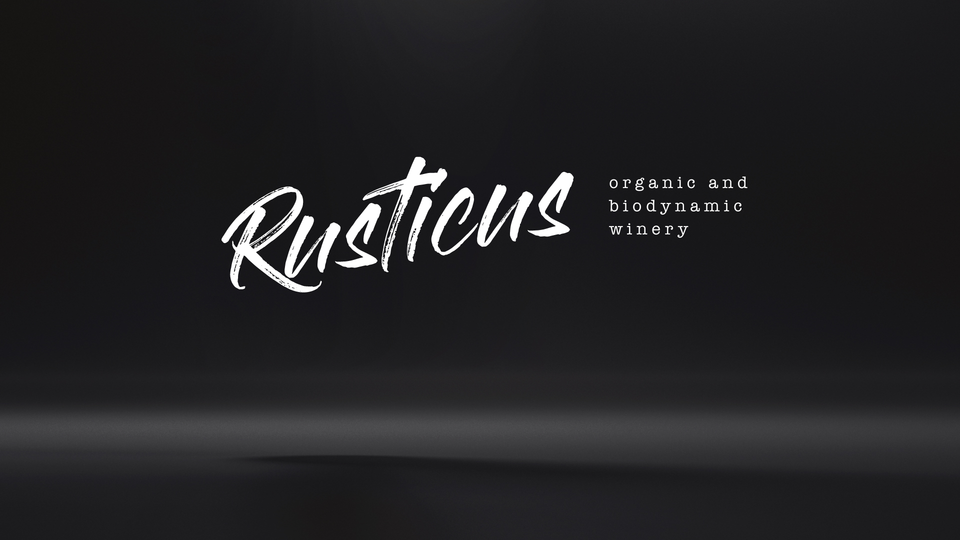
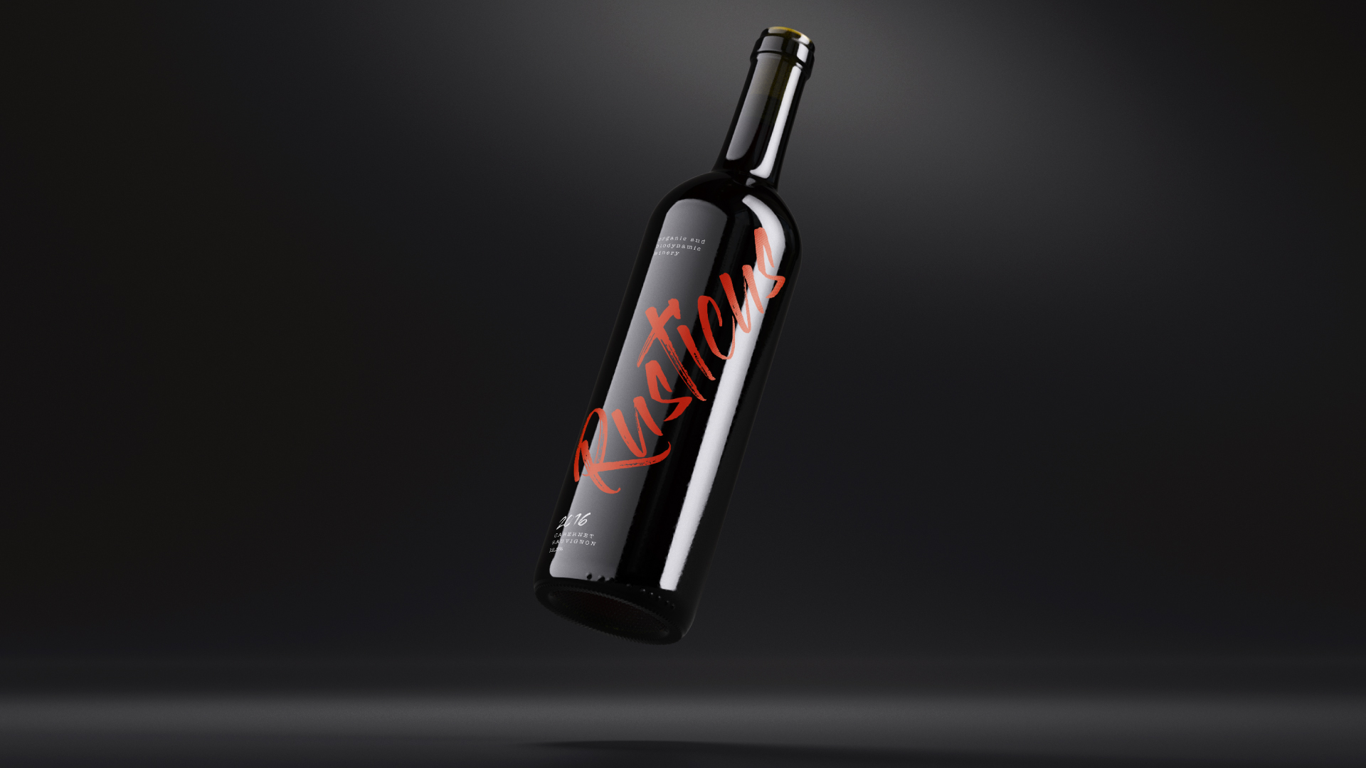
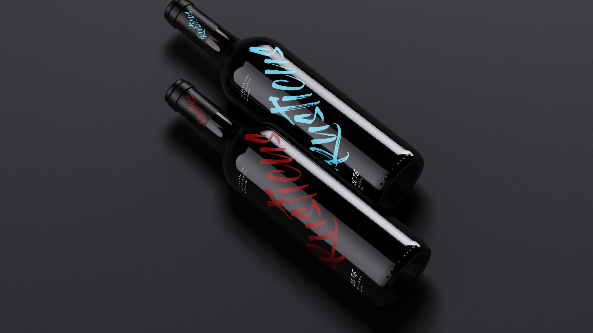
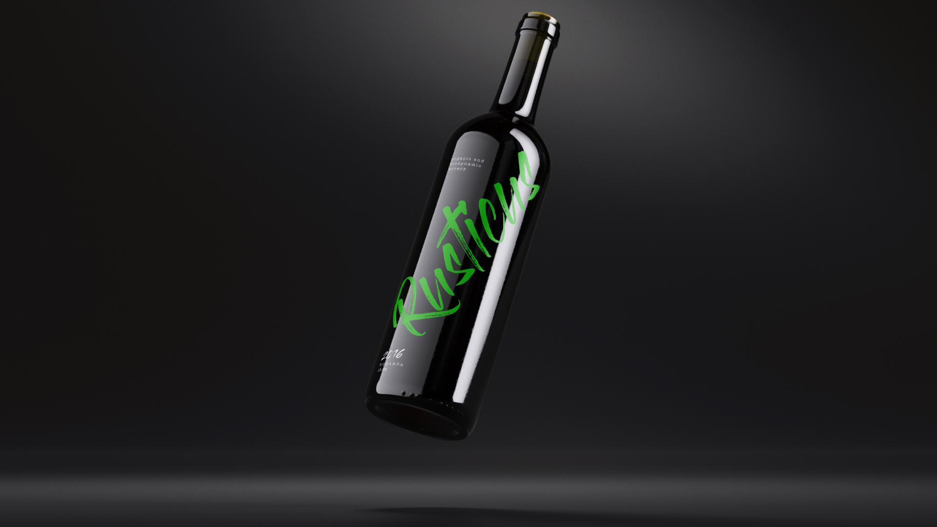
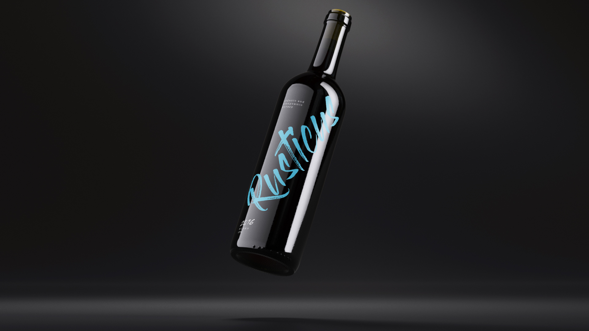
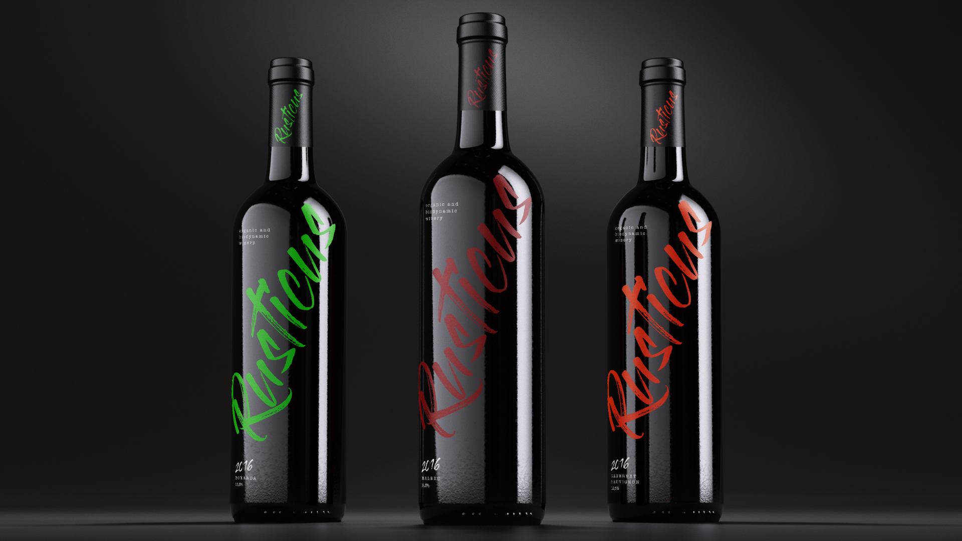
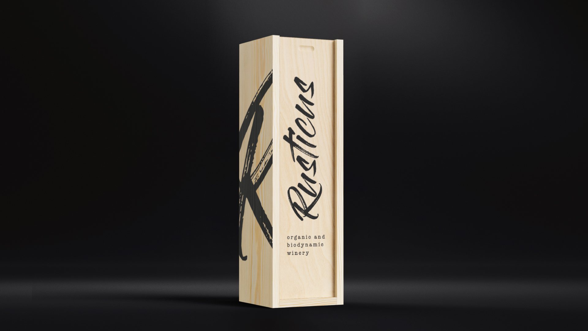
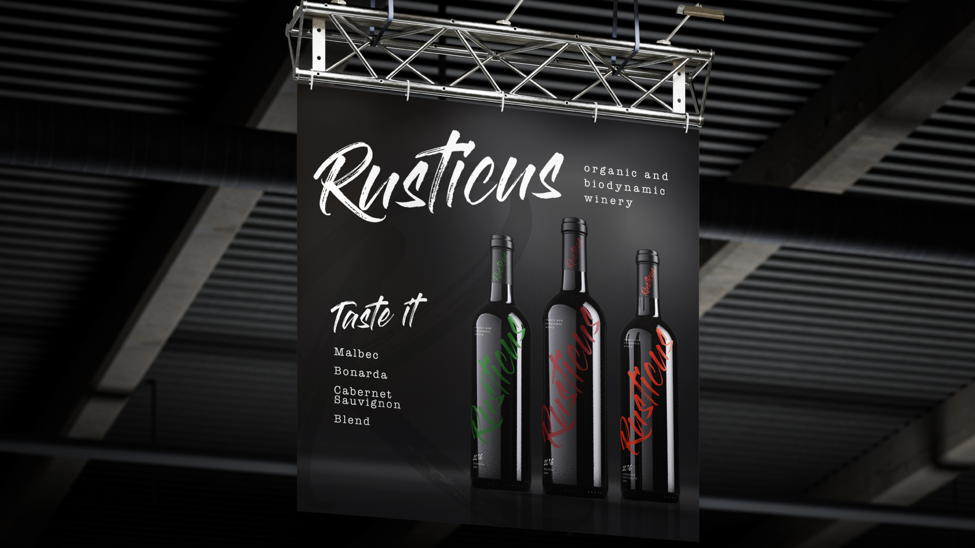
The identity of a biodynamic winery must convey the brand’s values and principles, such as harmony with nature and sustainability. For this, it is important to choose appropriate colors, typography and images that convey the brand’s personality and are attractive to the target audience. A well-developed visual identity is a powerful marketing tool, helping to highlight the brand in an increasingly competitive market. For Rusticus Vinícola Biodinama e Orgânica, we did exactly this process, we selected a typology that represented the entire universe, values and principles of the brand, making clear its sustainable and representative positioning, which include harmony with nature, sustainability, the health of the soil and concern for the environment. Alternation of colors to identify the types of grapes, variations of specimens, vintages and categories and expand the positioning before the consumer.
Colors:
Colors are one of the most important elements of the visual identity, and convey a lot about the brand’s personality and values, characterizing its influences and variations, being comprehensive in all segments of the Winery.
Typography:
The typography chosen has a more modern and sophisticated characteristic, combining with the personality and structure of the brand, the rustic side of nature, the simplicity for the application in the materials required by the winery and the characterization of the entire line of products involved.
CREDIT
- Agency/Creative: Agência BUD
- Article Title: Biodynamic and Organic Vineyard Rusticus
- Organisation/Entity: Agency
- Project Type: Packaging
- Project Status: Non Published
- Agency/Creative Country: Brazil
- Agency/Creative City: São Paulo
- Market Region: South America
- Project Deliverables: Brand Design, Brand Identity, Branding, Label Design, Packaging Design
- Format: Bottle
- Substrate: Glass
- Industry: Food/Beverage
- Keywords: #branding #packaging #packagingdesign #labeldesign #wine #clean
-
Credits:
Creative Director: Franklin Zampani
Creative Assistent: Nathalia Namie
Copy: Thais Cavalcante


