Cowan, London – Billson’s Beer
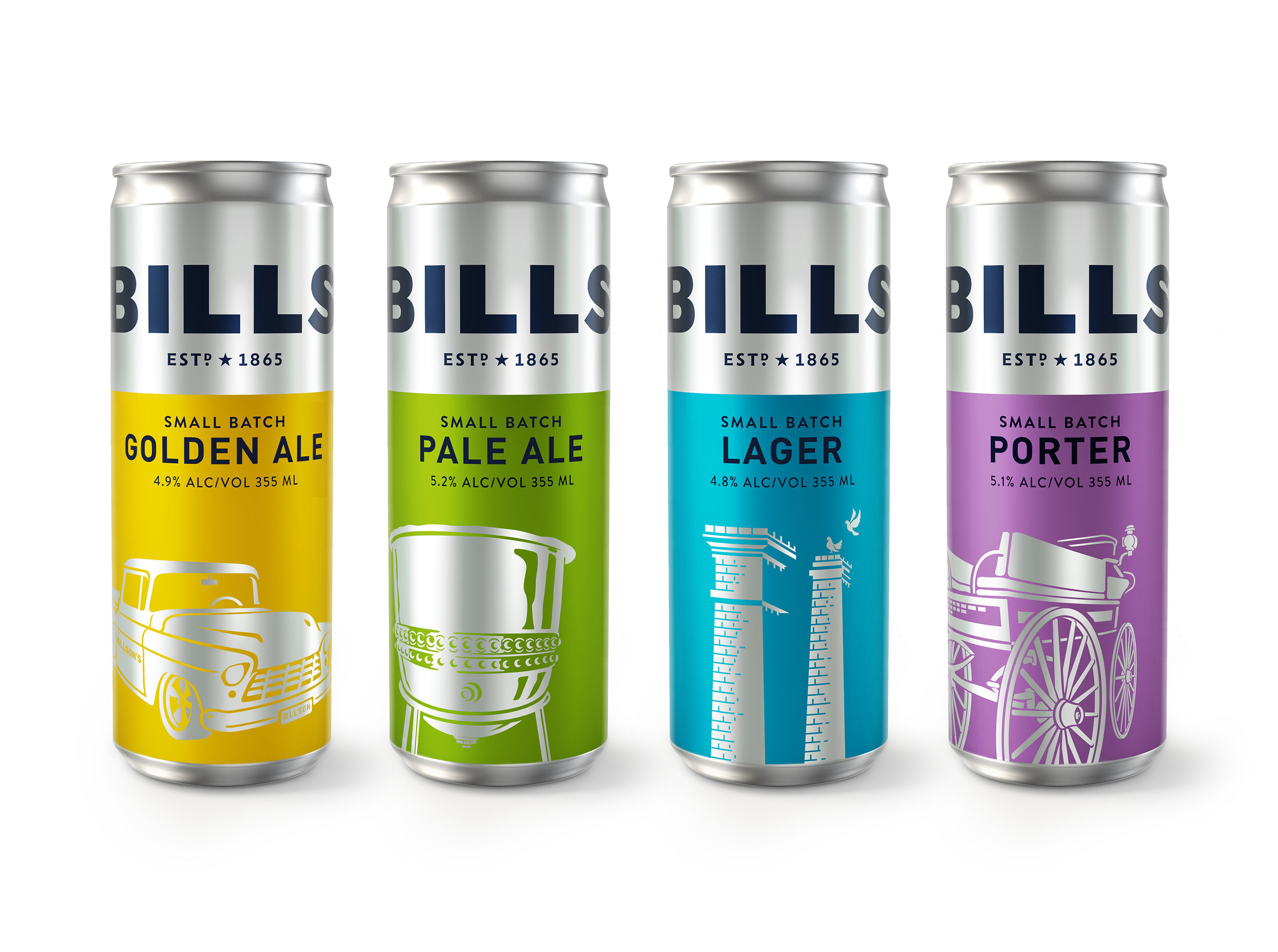
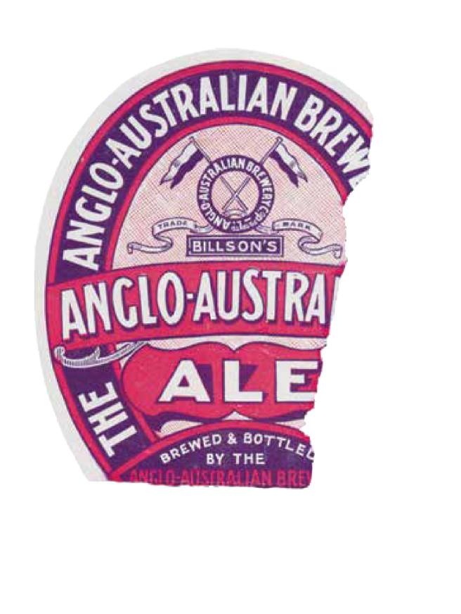
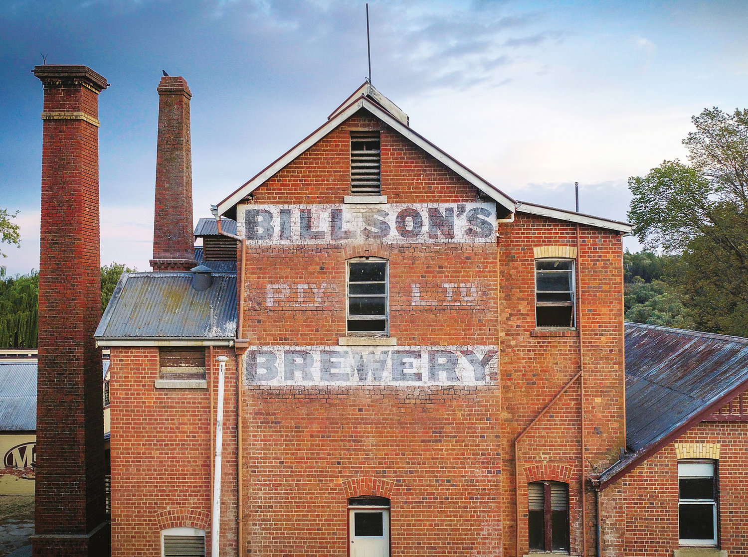
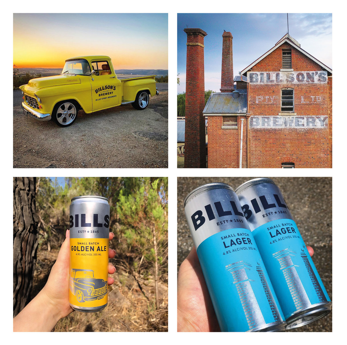
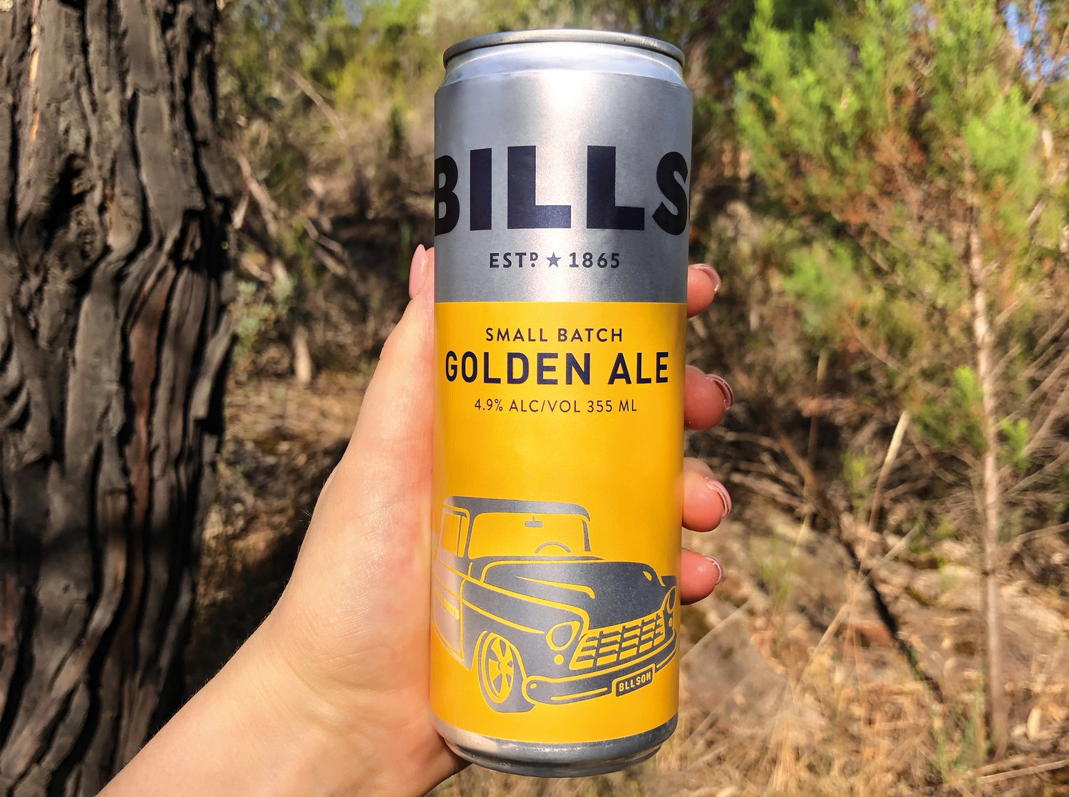
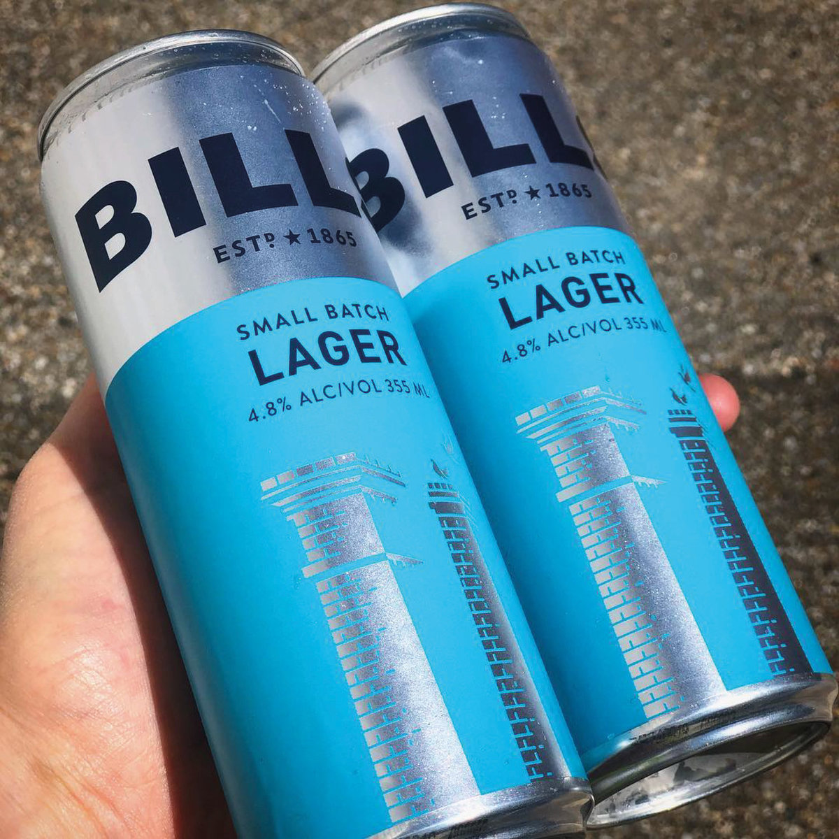
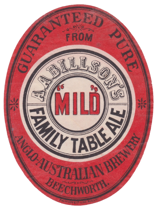
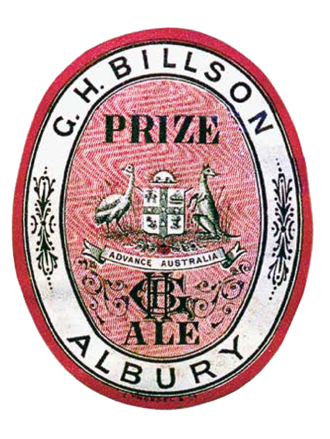
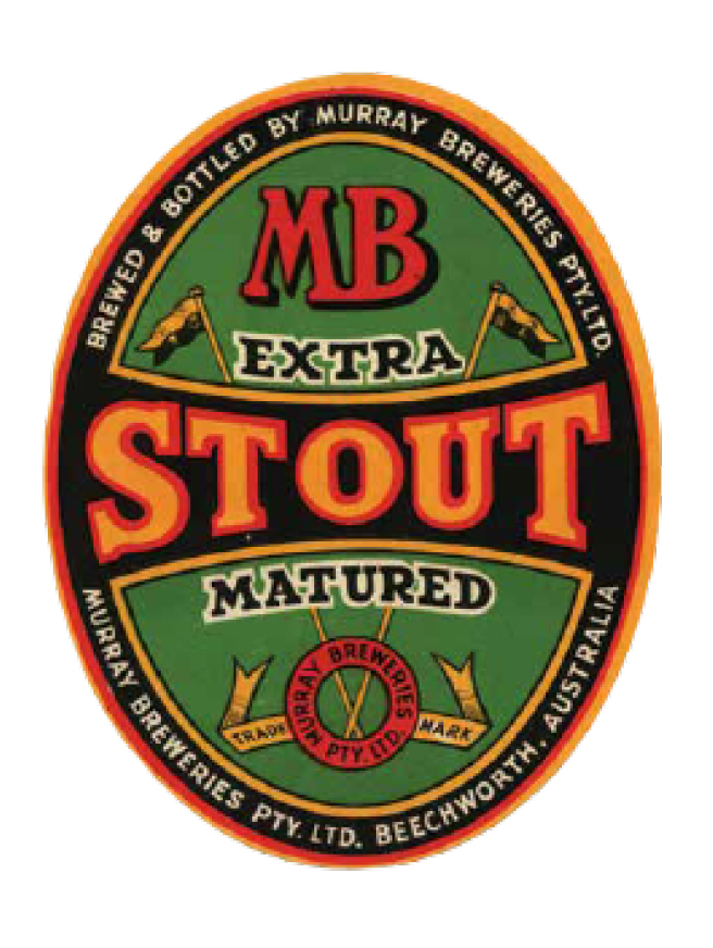
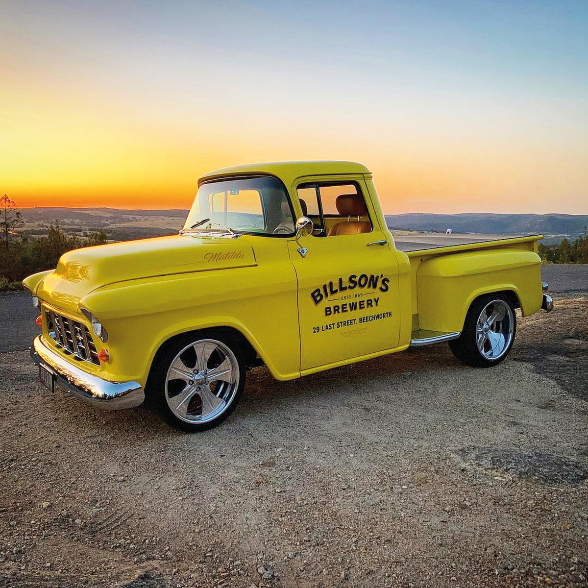
Billson’s brewery reveals its first alcoholic drinks for 70 years, with brand and packaging design by independent, international design agency Cowan London.This launch is not only a new chapter in the story of one of Australia’s oldest drinks manufacturers, it is also an example of how a brand can stand out in the increasingly crowded craft beer market. A brewery rebornSince 2017, when they acquired the brewery in Beechworth, north-east Victoria, the new owners of Billson’s have been breathing new life into the site and its product range. This launch of small batch craft beers, heritage beers, two new ciders and an alcoholic ginger beer, follows the 2018 launches of still and sparkling Alpine spring waters, traditional and contemporary cordials, as well as ten contemporary and classic sodas.“Packaging design is critical in beers and ciders,” says Billson’s Marketing Manager, Julia Vesval. “We needed to find a way to convey the rich heritage of Billson’s but in a way that will connect with a contemporary audience. We needed a design team imbued with a sense of both Australian culture and cutting-edge craft beer design cues. As a global agency spanning Australia, Asia and the UK, Cowan was the obvious choice for this project.”Kangaroos and ostrichesThe design of the four traditional beers is a subtle reimagining of the original labels from 70 years ago. The most distinctive elements of those designs have been brought to the fore: the iconic ostrich and kangaroo appear on the Prize Ale, flags flutter proudly on the Stout label.“We took away the unnecessary elements, keeping only the parts that resonate today, and reworking them for a modern eye”, explains Samantha Dumont, Creative Director at Cowan London. “We also retained a sense of imperfection with a nod to the original handcrafted label designs. It’s the contrast of this traditional Australian imagery against the silver cans, with the Billson’s logo written in confident, bold typography that makes these designs pop.”Billson’s in boldOn the four craft beers, the design layout is the same, but the look is very different. These draw inspiration from the brewery itself: a copper kettle for the Pale Ale can, the two chimneys for Lager, a 1950s Chevrolet truck for Golden Ale, and one of the brewery’s collection of horse-drawn carts on the Porter can. The story behind each item is told on the back of the cans, using no-nonsense, straight-talking words presented in a clean and simple sans serif font. The range is unified by the use of a vivid colour palette set against a tactile, matt finish silver. For both ranges, the brand mark ‘Billson’s’ is faithfully replicated on the cans, in all its subtle quirks and nuances, taken from the hand-painted branding that appears on the brewery building. The design mimics the huge confident type from that historic original, applying it as large as possible so the branding wraps around the cans, giving them a super-confident feel.Clever twistsFor the new ciders, Cowan London used the same strong Billson’s lettering and the same boldly coloured labels as the craft beers. But instead of traditional label shapes, the ciders feature the form of the fruits they’re made from, with the apple and pear stalks subtly altered to resemble the famous Billson’s tall chimneys. The alcoholic ginger beer design has a traditional feel, but with a twist. The label takes the oval shape and striking brand lettering of Billson’s traditional beers but gives it a quirky Victorian twist. Flames burst from the ears of a moustachioed man, reflecting the bold strapline: ‘refreshingly fiery’.Brand creation at paceThese new Billson’s drinks take the total number of products launched and relaunched since the new owners took over the brewery to a remarkable 39. “It’s inspiring to be part of a project that’s moving at such a pace,” says Dumont. “It requires a very entrepreneurial approach, with us adapting, developing and building the brand through each design. It’s also incredibly refreshing to be working with a brewery that can credibly play into the world of both heritage and modern craft.”Vesval, agrees. She says: “Things move fast at Billson’s and we’re excited to see how quickly and effectively the team at Cowan London is creating ranges of products that bring the rich heritage of the place to life for a new audience. It’s been 70 years since people could enjoy Billson’s beers, and we can’t wait to share them again.”


CREDIT
- Agency/Creative: Cowan, London
- Article Title: Billson’s Launches First Beers for 70 Years, with Designs by Cowan London
- Organisation/Entity: Agency, Published Commercial Design
- Project Type: Packaging
- Agency/Creative Country: United Kingdom
- Market Region: Oceania
- Format: Can
- Substrate: Metal


