


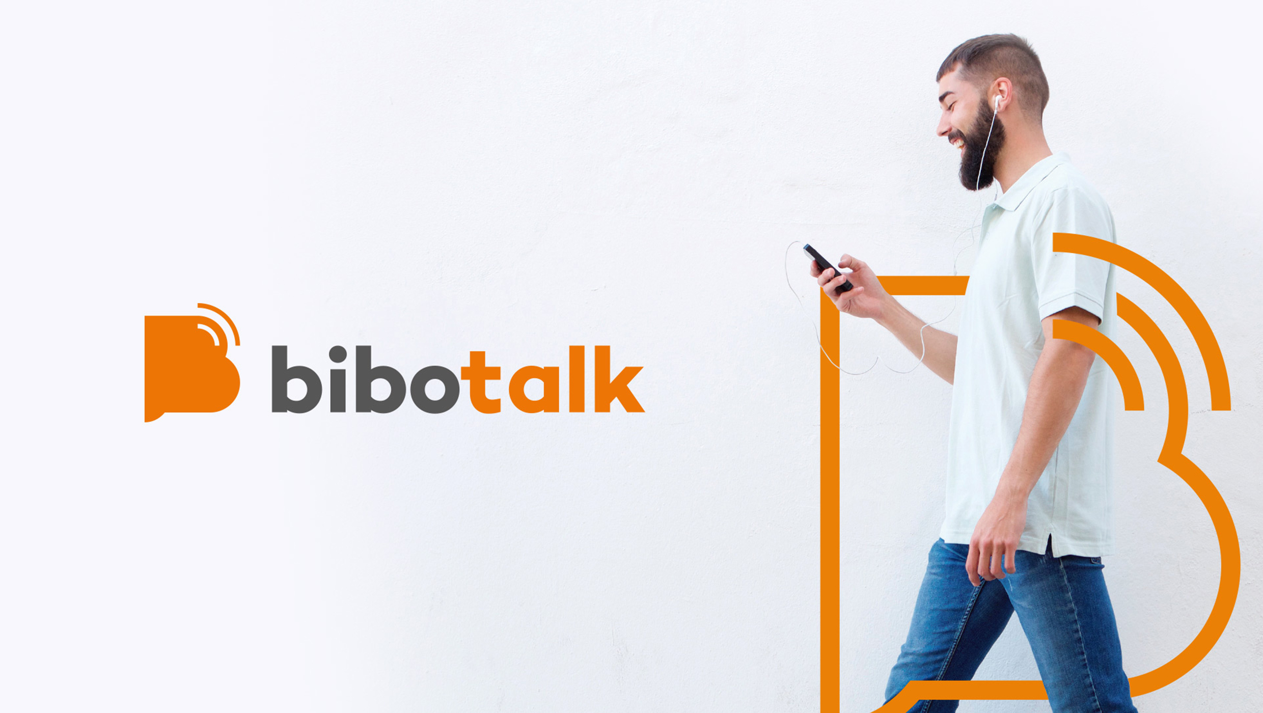
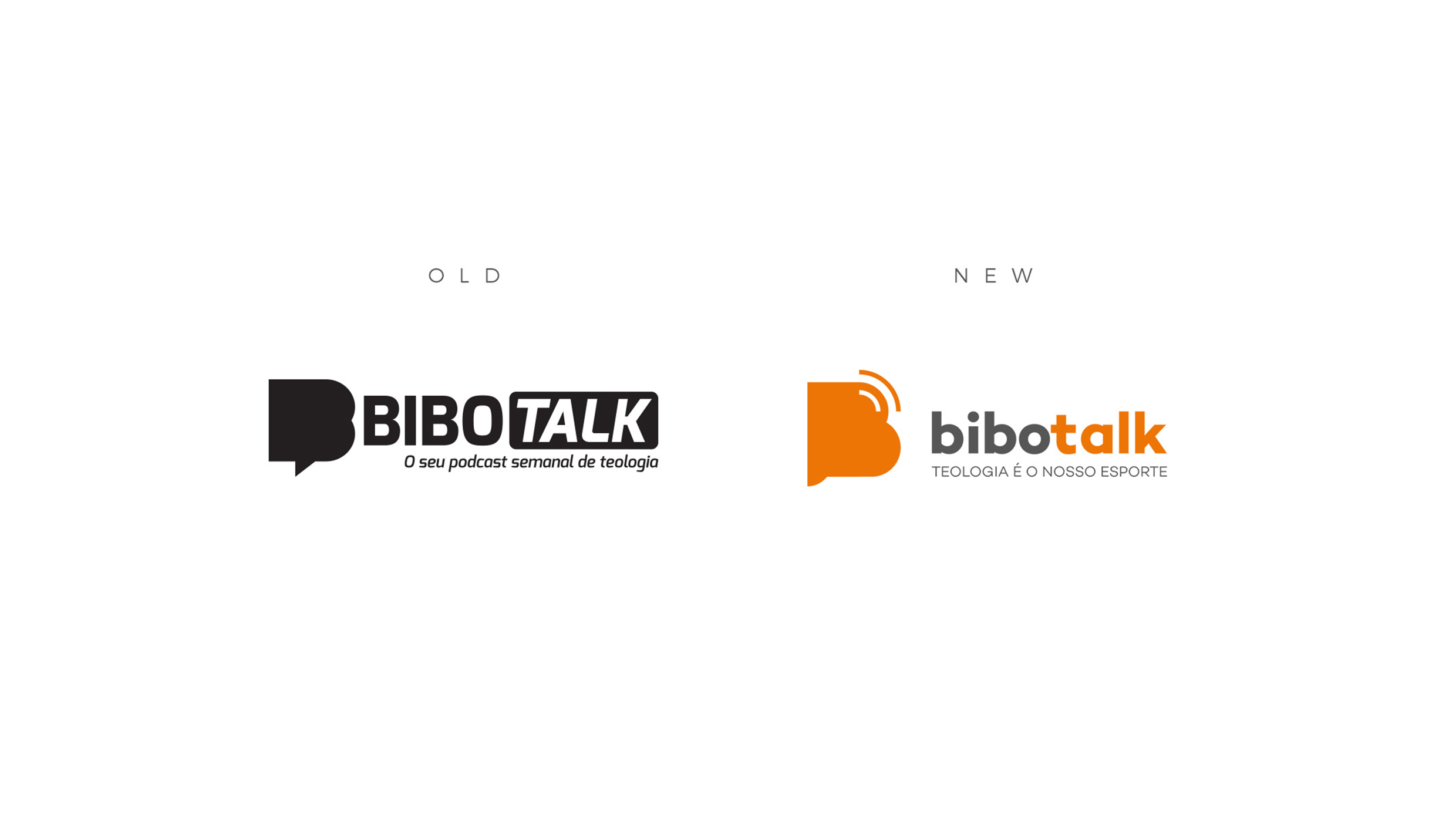
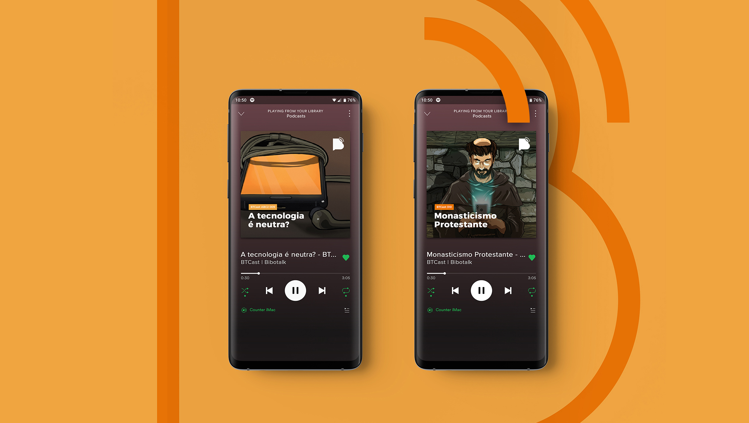
Bibotalk is the biggest Brazilian theology website and podcast. Active for more than 9 years, bringing weekly Christian content through podcasts and videos. This brand redesign project was made to mark the website’s 2020 new phase, giving a more modern touch, and yet keeping the same identity that people are used too.
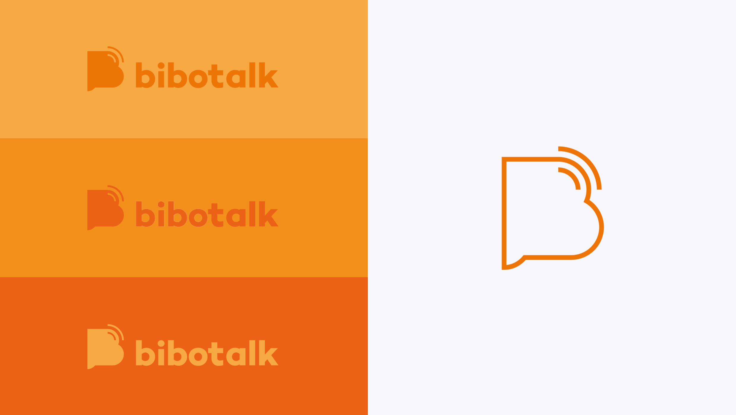
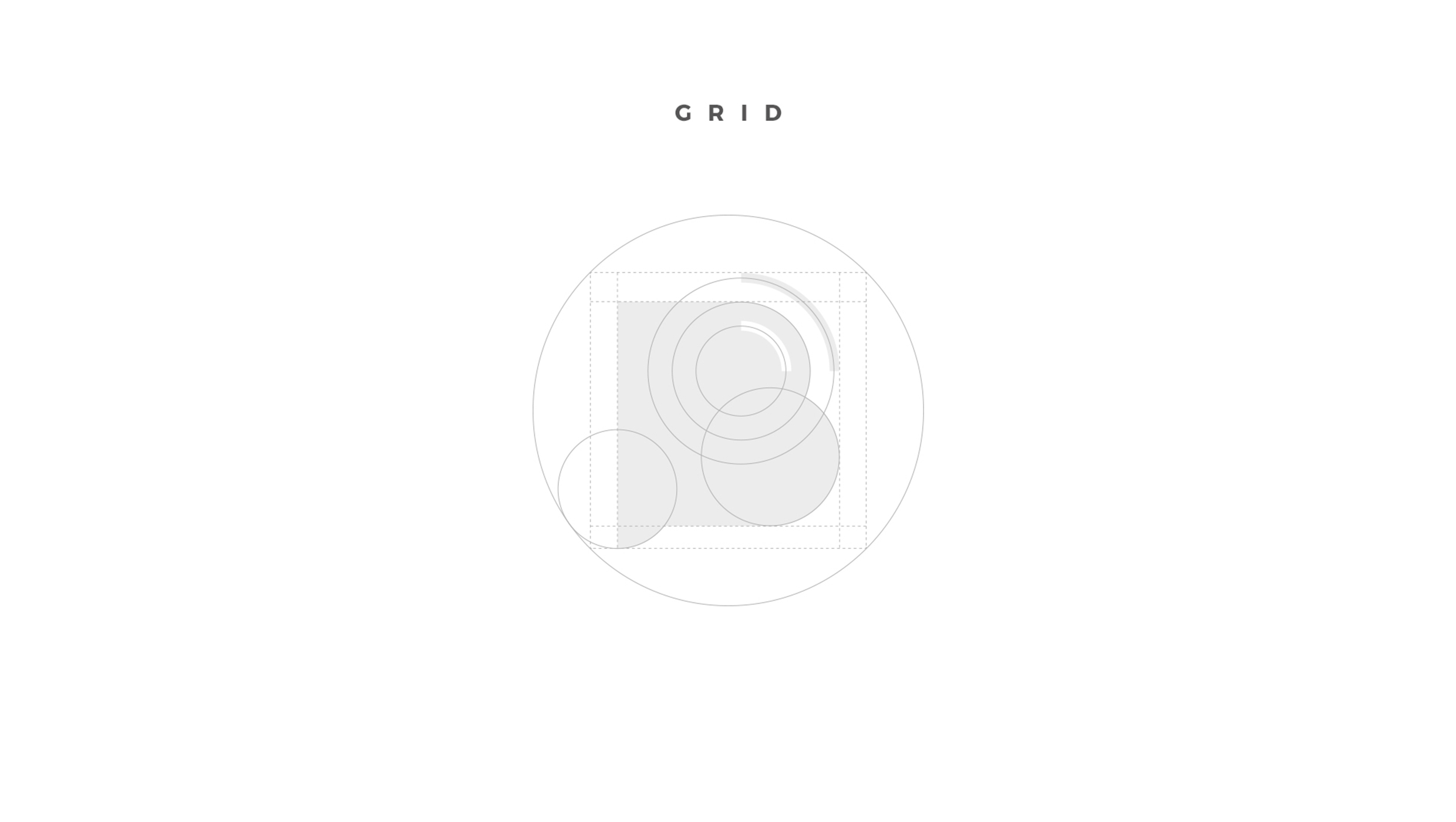
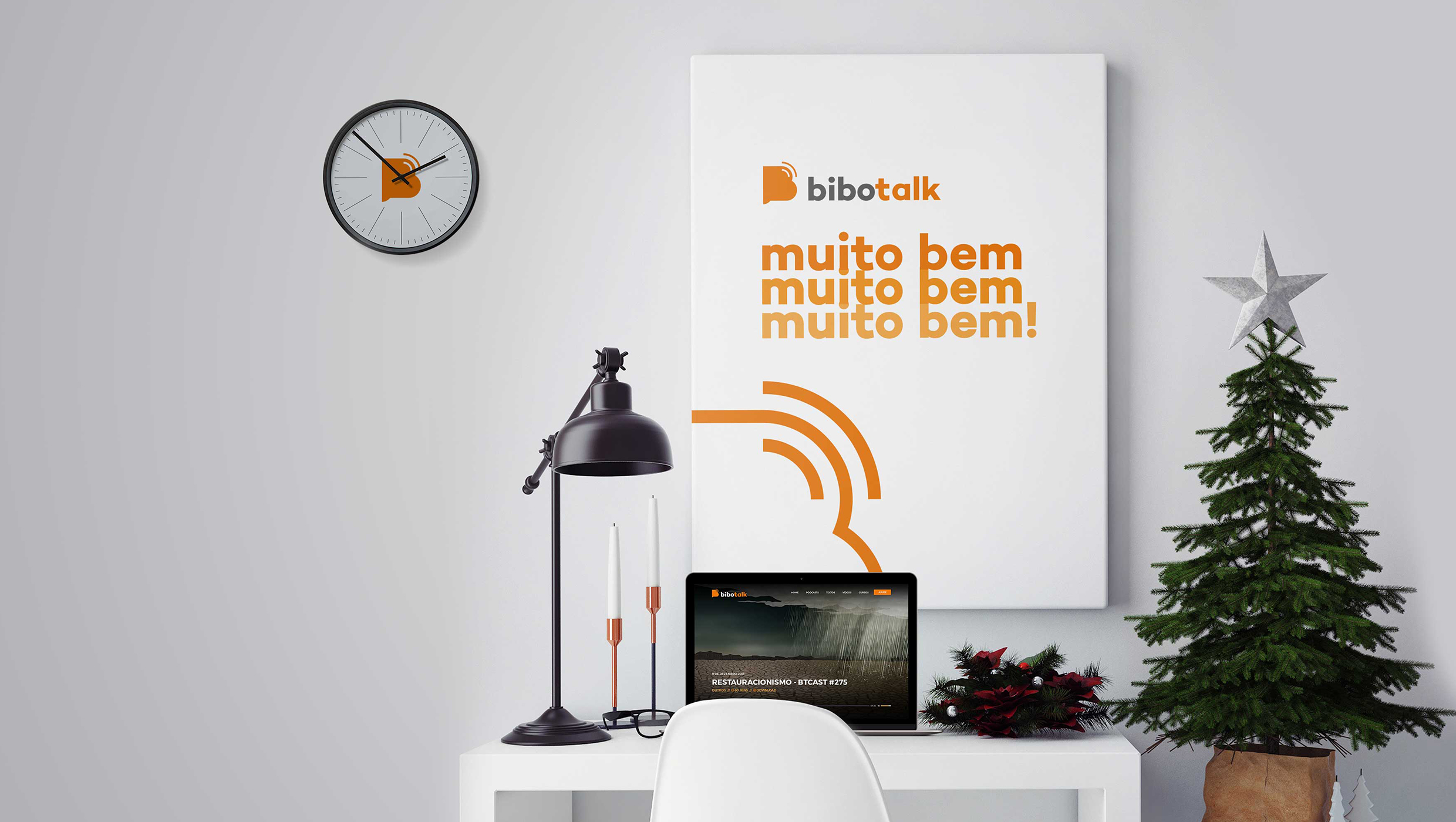
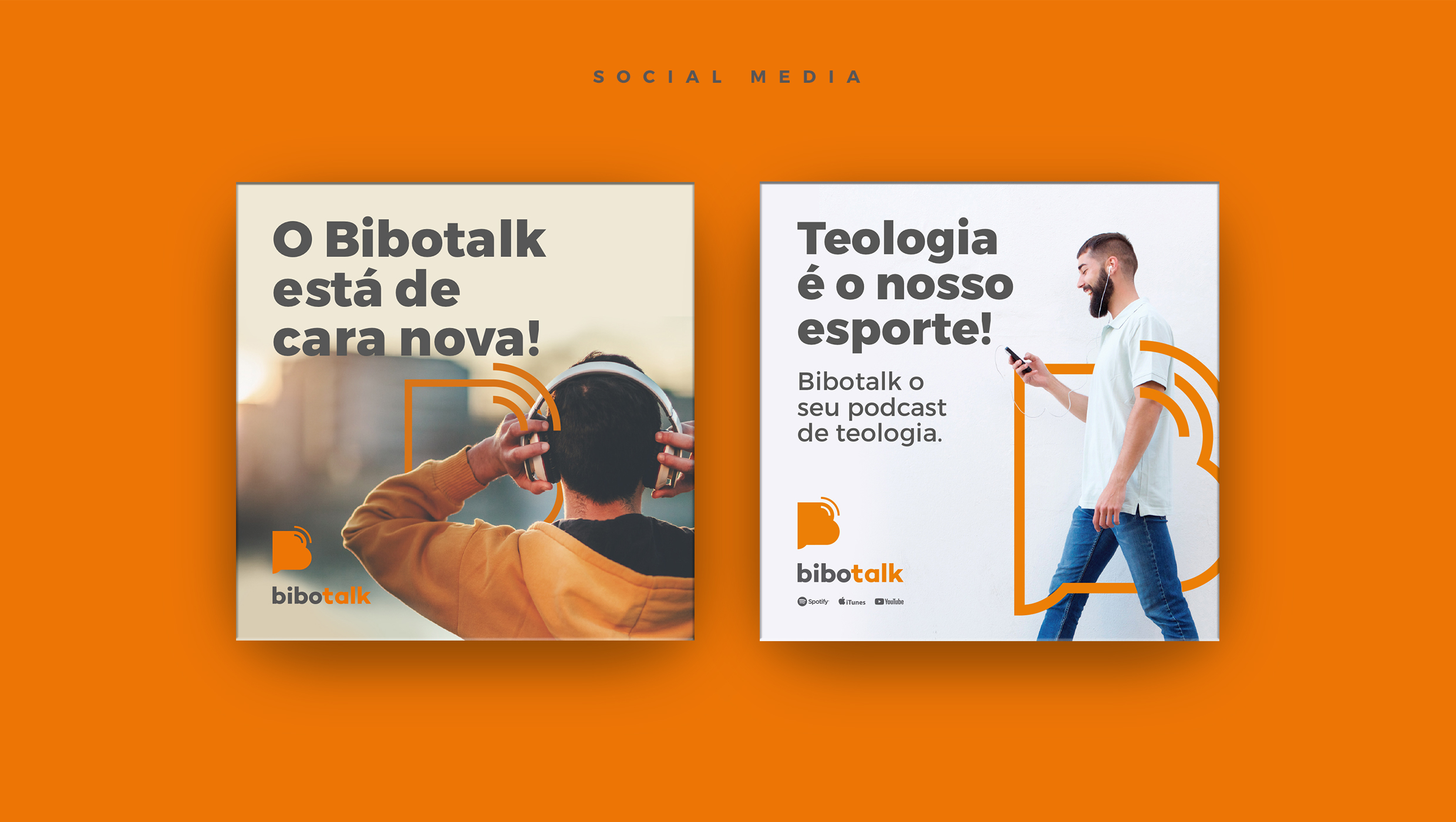
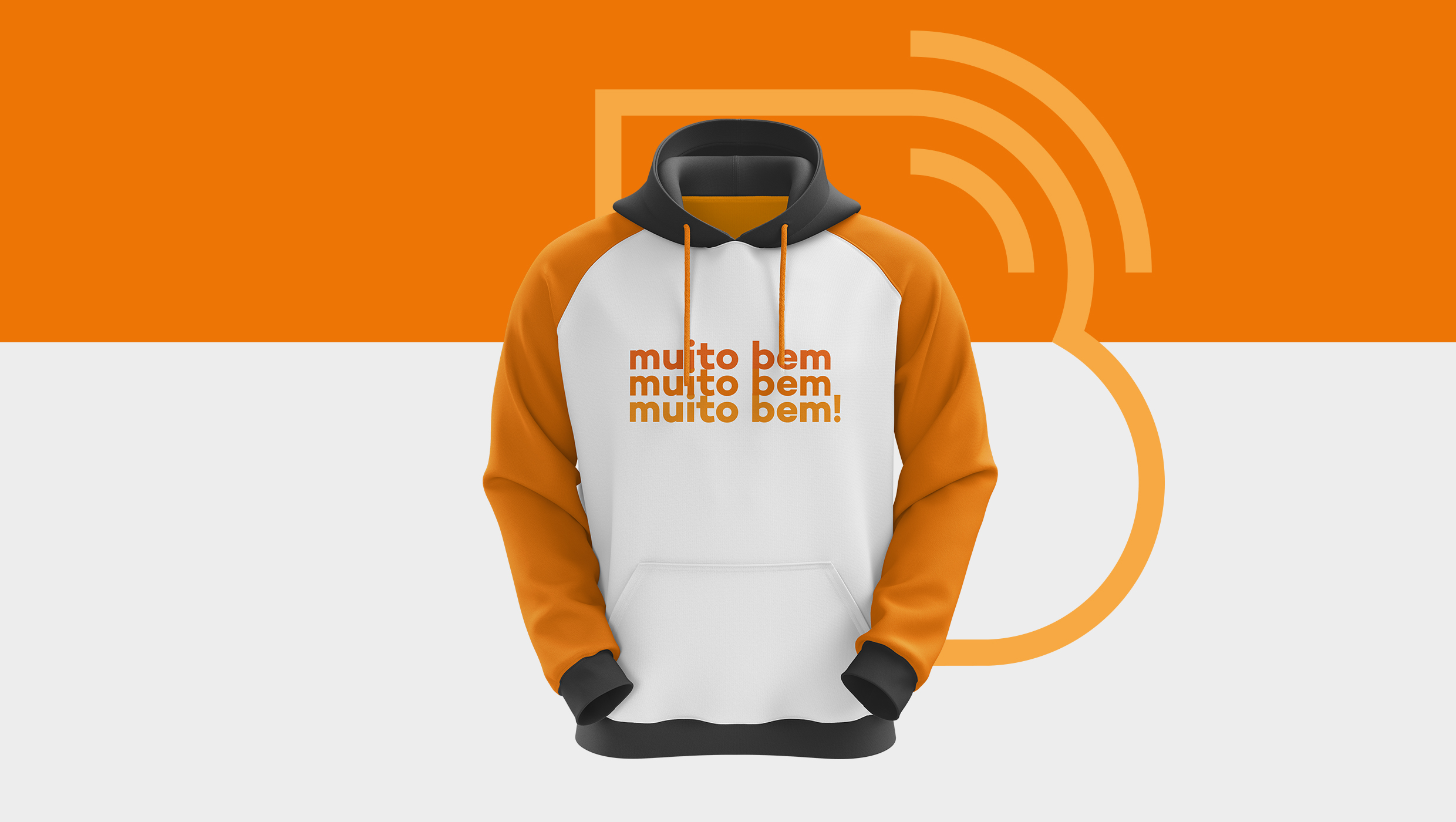
The new logo takes the old shape as a base but implementing the RSS feed icon, referring to the content transmission through a podcast. Its structure is built using circles to form a pleasant and friendly look and feel. The orange color, used only on the website in the past, now is featured in the brand and marketing materials, bringing way more identity and personality to the brand.

CREDIT
- Agency/Creative: Caio D'art Design
- Article Title: Biggest Brazilian Theology Podcast Rebranding
- Organisation/Entity: Freelance, Published Commercial Design
- Project Type: Identity
- Agency/Creative Country: Brazil
- Market Region: Global
- Project Deliverables: Brand Identity, Brand Redesign, Brand Strategy, Graphic Design, Identity System, Research, Tone of Voice
- Industry: Information
- Keywords: Podcast, B shape, theology, talk, orange logo
FEEDBACK
Relevance: Solution/idea in relation to brand, product or service
Implementation: Attention, detailing and finishing of final solution
Presentation: Text, visualisation and quality of the presentation


