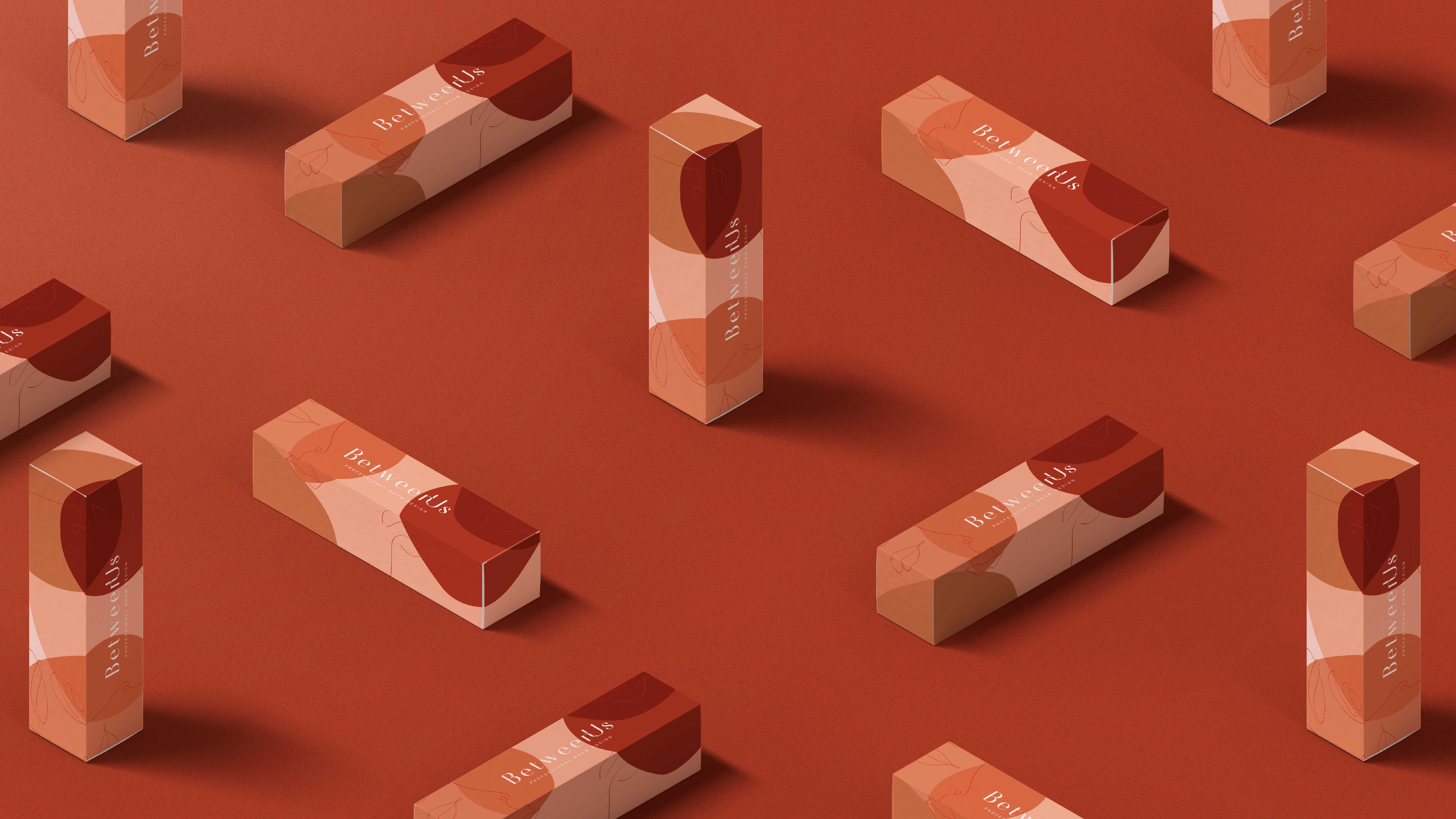
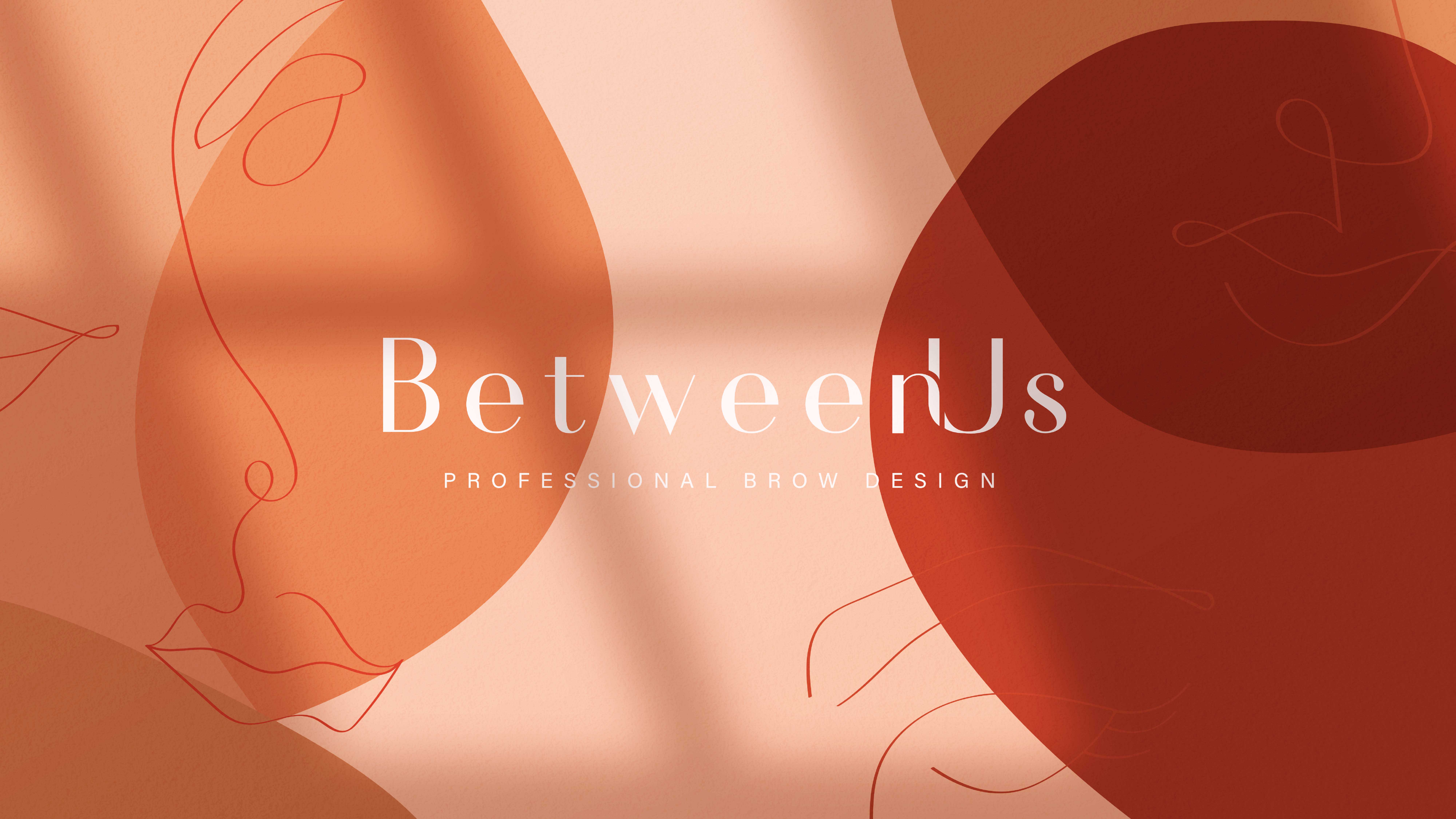
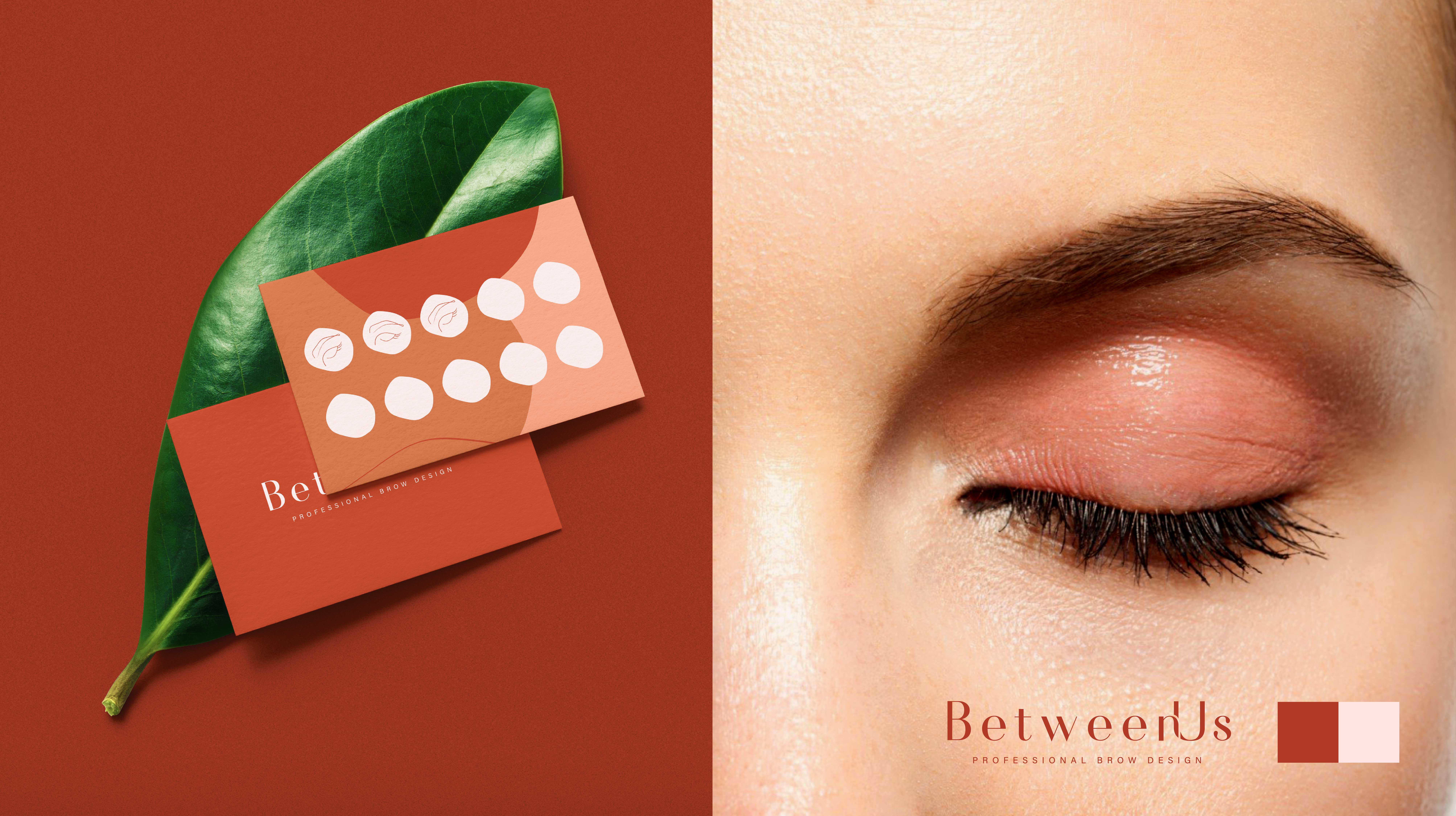
As the name implies, BetweenUs promotes the intimate relationship between the brand and the consumer, in the personalized design of eyebrows. The brand intends to value what really exists “between us”, (brand and customer), be it a story, a gesture or an action and, mainly, the excellence of the service.
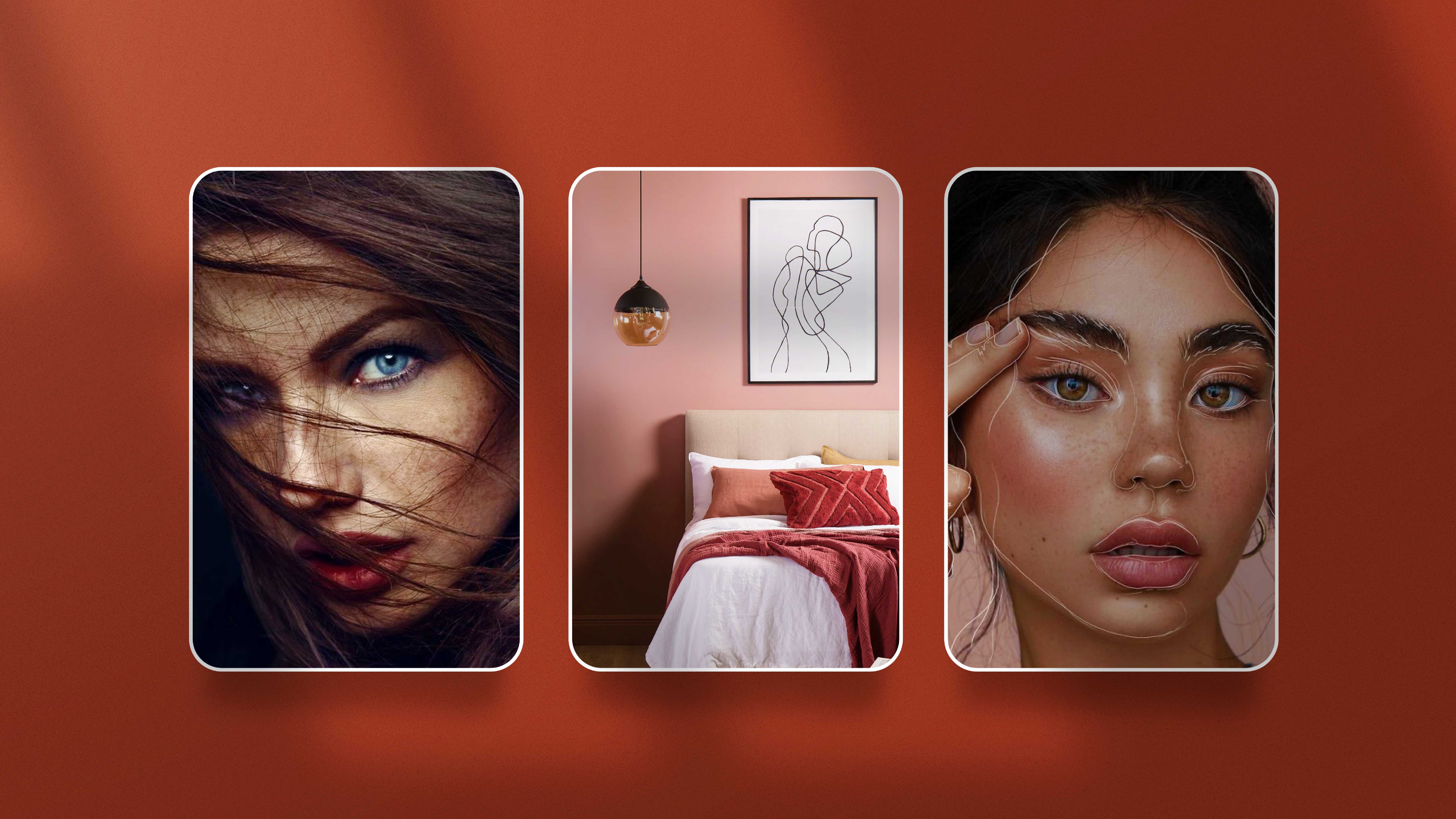
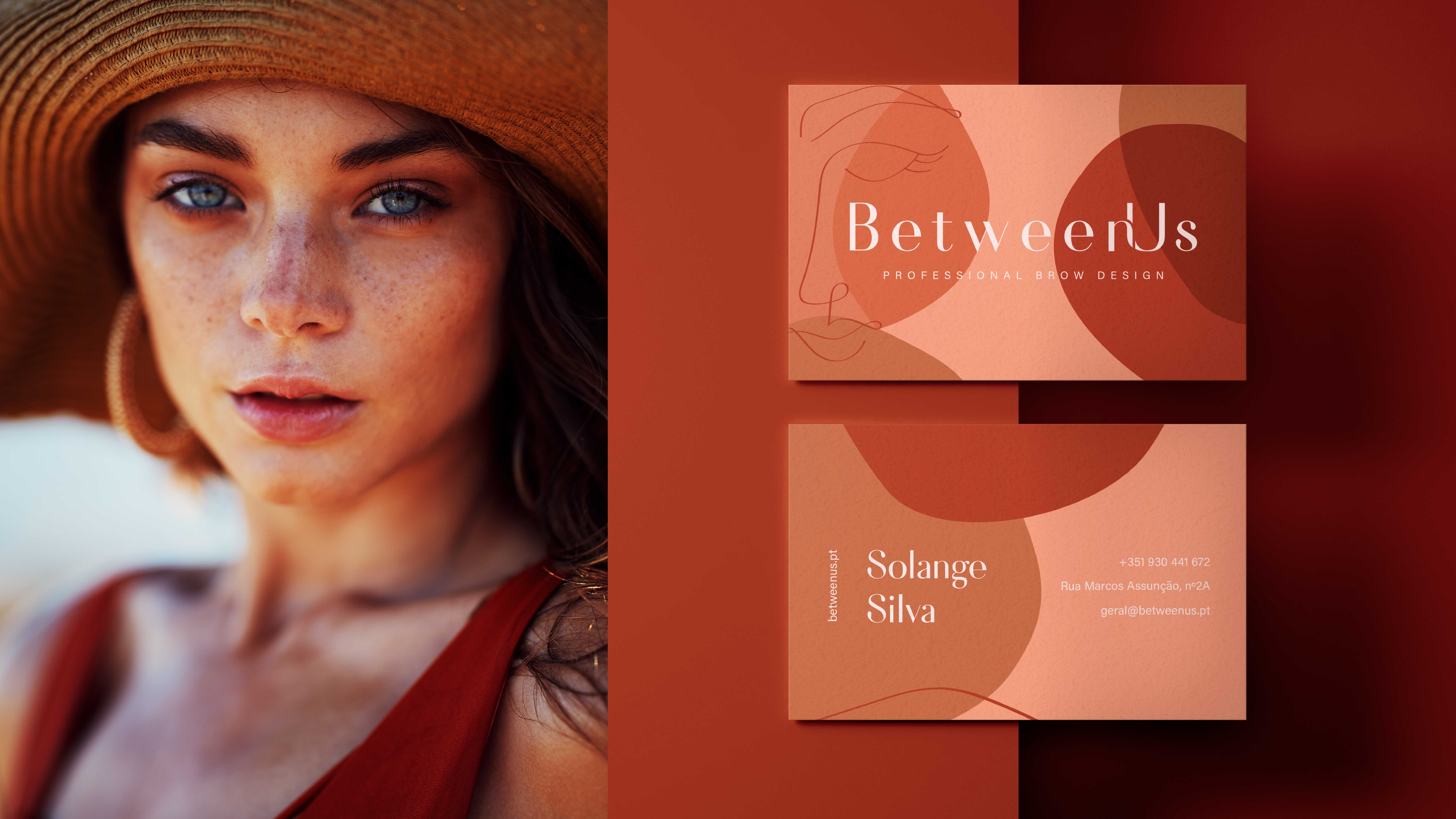
The individuality of the eyebrow and the way it becomes the main element in the expression of each one, are celebrated through a brand that invested in every detail. Influenced in the Nordic style, the visual identity was inspired by the art of Henri Matisse for its simplification of shapes and the typical rhythmic movement of its lines, translating the beauty of feminine traits and the importance of taking care of ourselves. Based on the different skin tones, we created the color palette, which invites you to a warm and intimate environment, in the brand’s physical space.
CREDIT
- Agency/Creative: d'front - Branding & Design Agency
- Article Title: BetweenUs Identity
- Organisation/Entity: Agency, Published Commercial Design
- Project Type: Identity
- Agency/Creative Country: Portugal
- Market Region: Europe
- Project Deliverables: Brand Identity, Brand Strategy, Branding, Graphic Design, Illustration, Packaging Design, Tone of Voice
- Industry: Fashion
- Keywords: Brow Design, Beauty, Graphic Design, Packaging, Stationary.


