


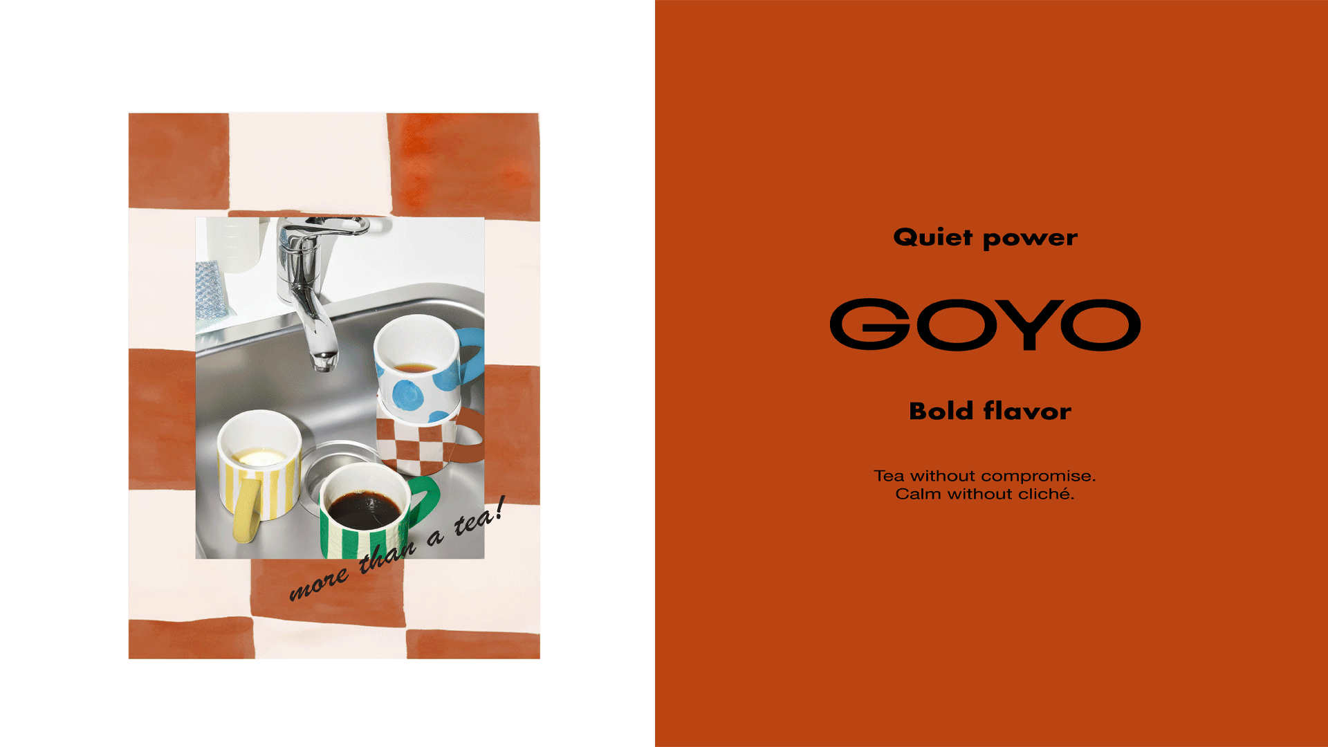
GOYO is an artisanal tea brand inspired by the Korean word 고요, which means calm and quiet. Tea as a category is often trapped in clichés: delicate florals, heritage illustrations, muted pastels, and the assumption that it only belongs to slow, sleepy rituals. GOYO moves beyond those expectations. It redefines tea as a modern ritual that can bring clarity in the morning, balance through the day, energy when focus is needed, or comfort in the evening. Calm here is not passive but active — a state of presence that adapts to every mood and every moment.
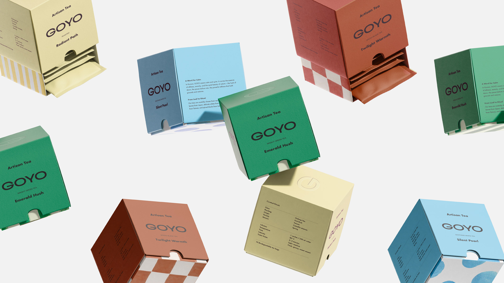
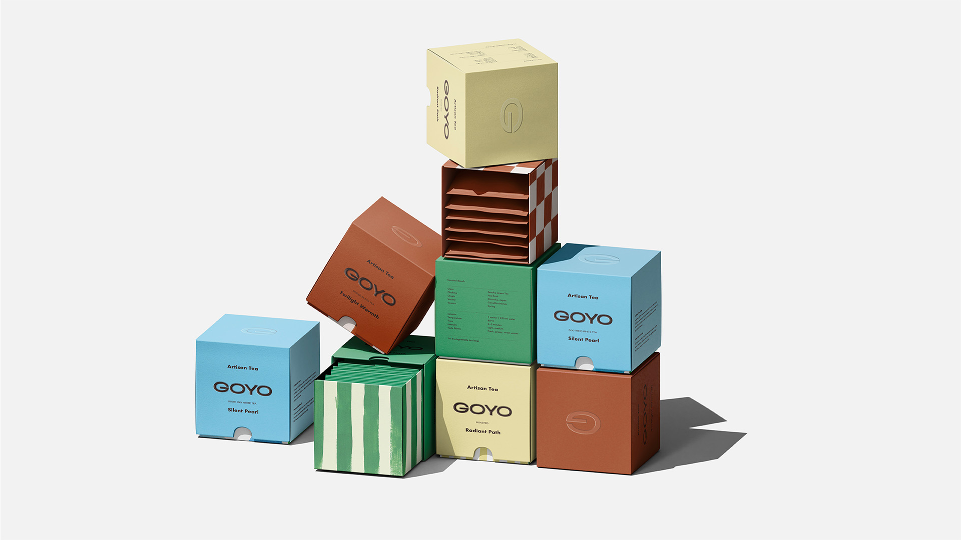
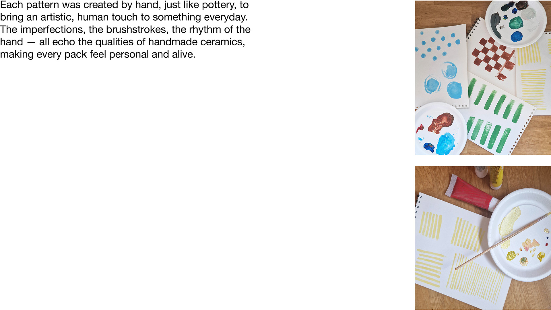
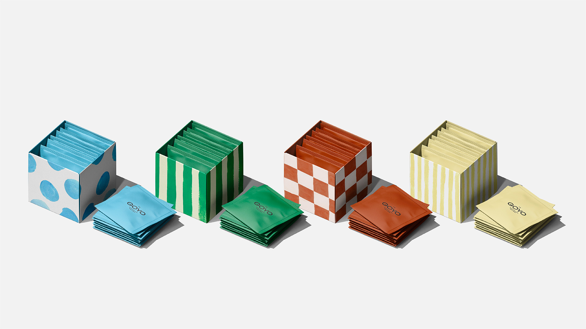
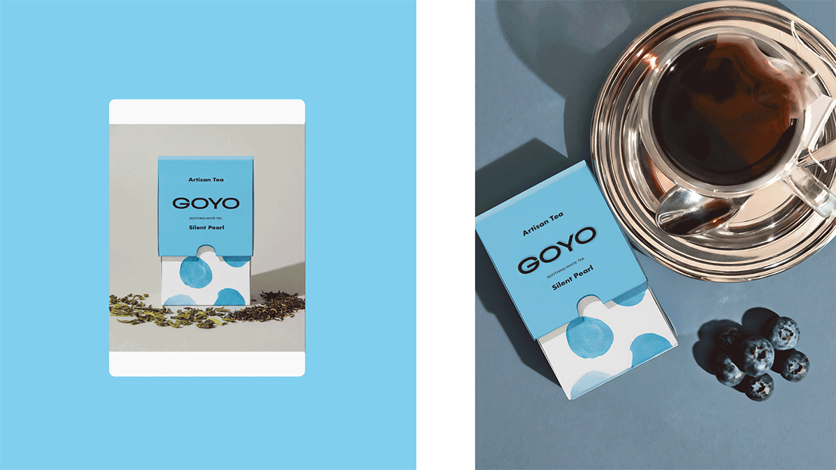
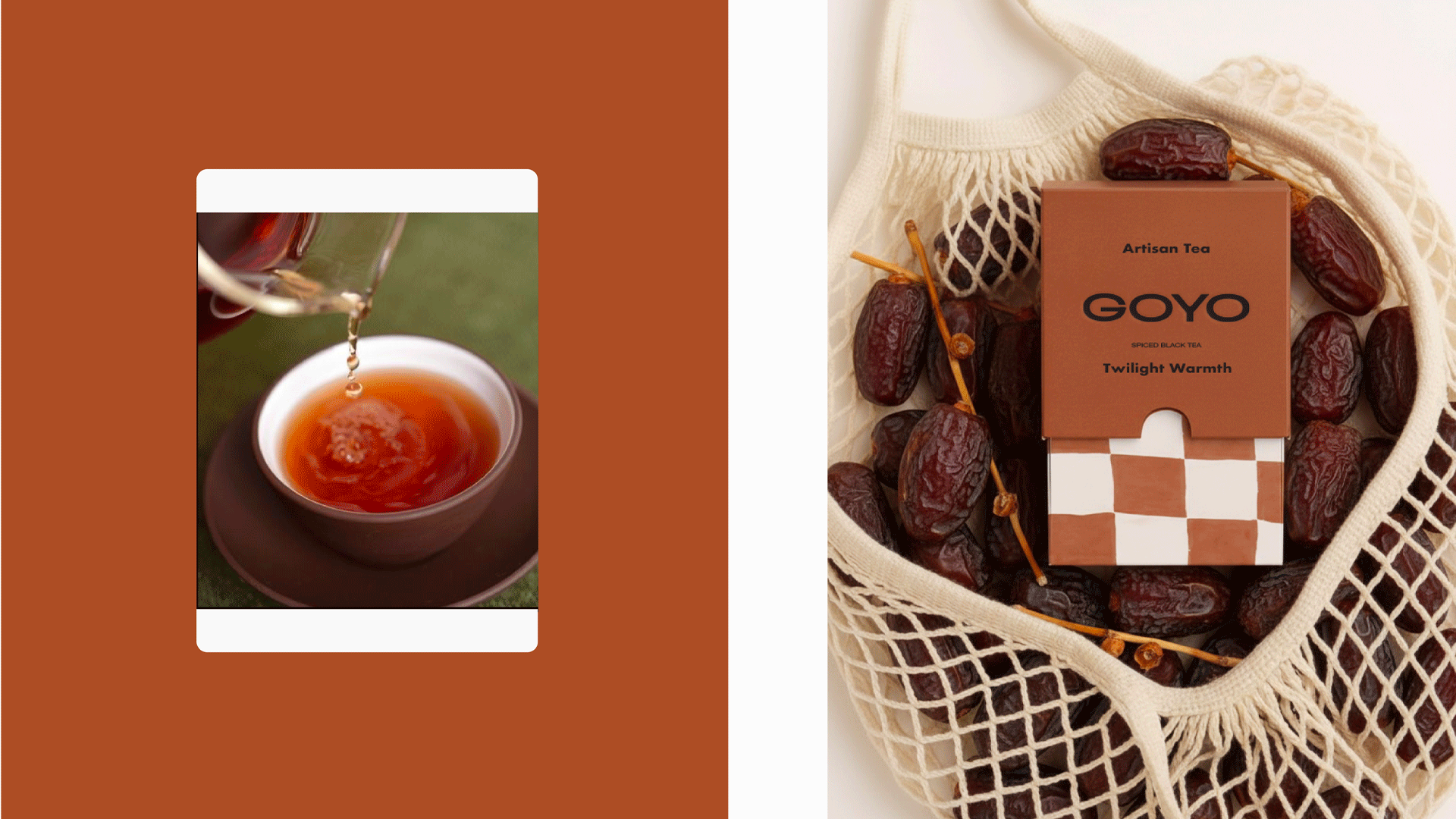
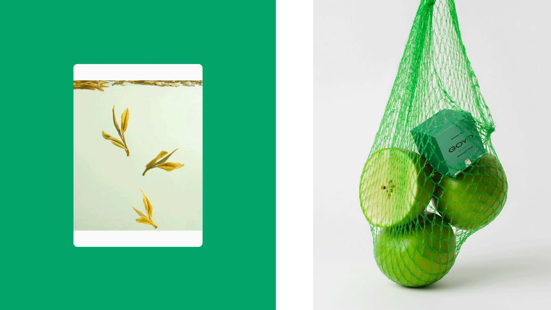
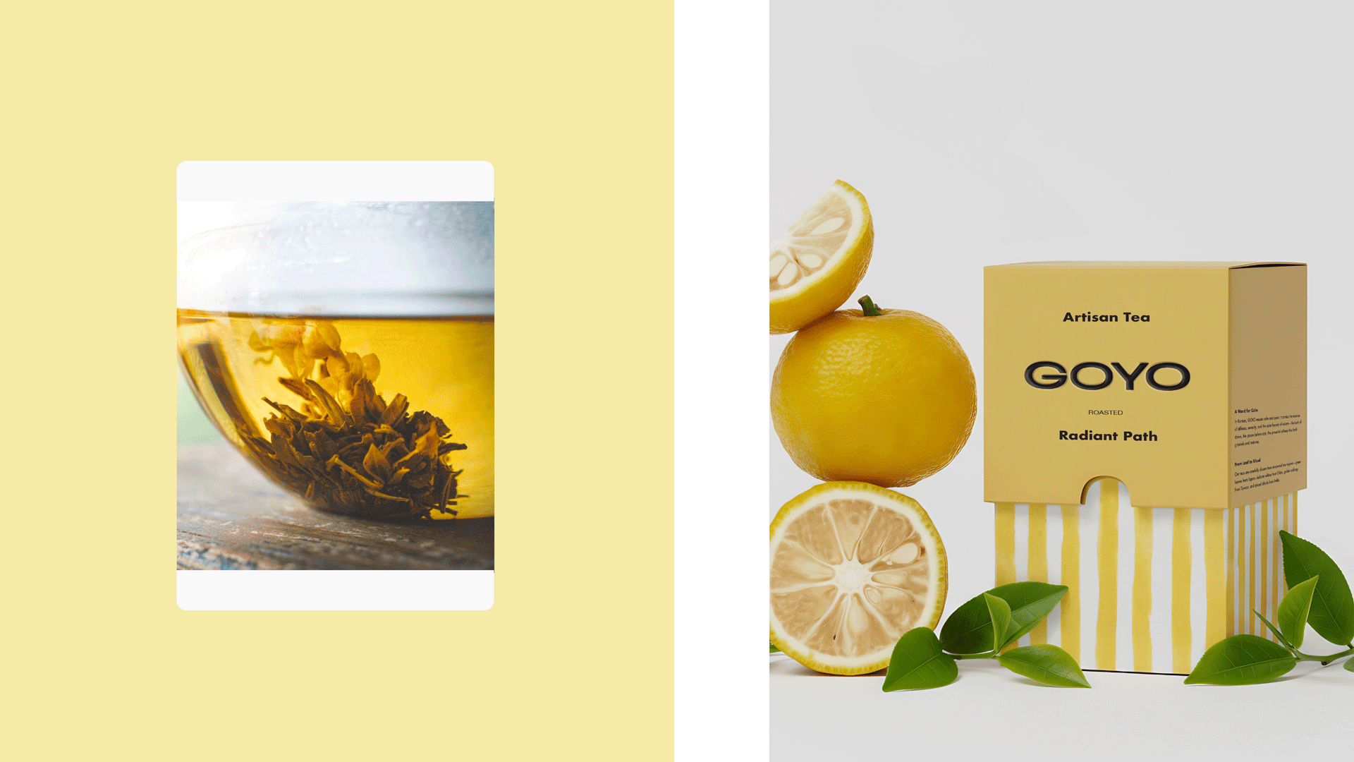
The design concept began with a simple question: what if a tea pack could feel like a handmade ceramic mug? While clay was not a practical option, the spirit of craft was translated into bold, hand-painted patterns. Each pack pairs a confident block of solid color on top with expressive brushstrokes on the bottom, creating a dialogue between stability and expression, modernity and human touch. The effect echoes the beauty of ceramics — everyday objects elevated through art.
The palette also breaks conventions in the tea world. Instead of soft pastels or moody tones, GOYO embraces zesty yellow, crisp blue, vivid green, and earthy terracotta. Together, these colors feel modern, bold, and optimistic — balancing energy with calm, freshness with warmth, clarity with grounding. A customized logotype completes the identity: minimal for readability but refined with crafted details to carry both precision and personality.
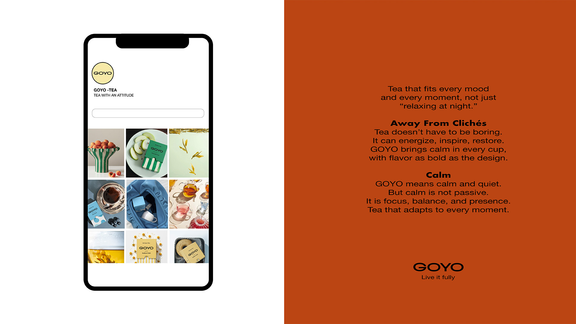
Photography extends the same philosophy, presenting the packs in editorial still-life scenes with fruit, pastries, and ceramics. The idea of wellness here is not about restriction or rigid superfoods, but about freedom — enjoying simple or indulgent moments with balance. GOYO places tea outside the clichés and into the world of design, culture, and modern living. It is calm but alive, artistic yet approachable — packaging that doesn’t just contain tea, but becomes an object in its own right, carrying the spirit of art into everyday rituals.
CREDIT
- Agency/Creative: Better than Sunday
- Article Title: Better than Sunday Redefines Goyo Tea Identity as a Modern Ritual of Presence
- Organisation/Entity: Freelance
- Project Type: Packaging
- Project Status: Published
- Agency/Creative Country: Sweden
- Agency/Creative City: STOCKHOLM
- Market Region: Europe, Global
- Project Deliverables: Advertising Photography, Art Direction, Brand Creation, Brand Identity, Food Photography, Graphic Design, Packaging Design
- Format: Box, Sachet
- Industry: Food/Beverage
- Keywords: tea, teas, artisanal, drinks, drink, collection, patterns, pattern, minimal
-
Credits:
Art & Creative Direction: Better Than Sunday


