


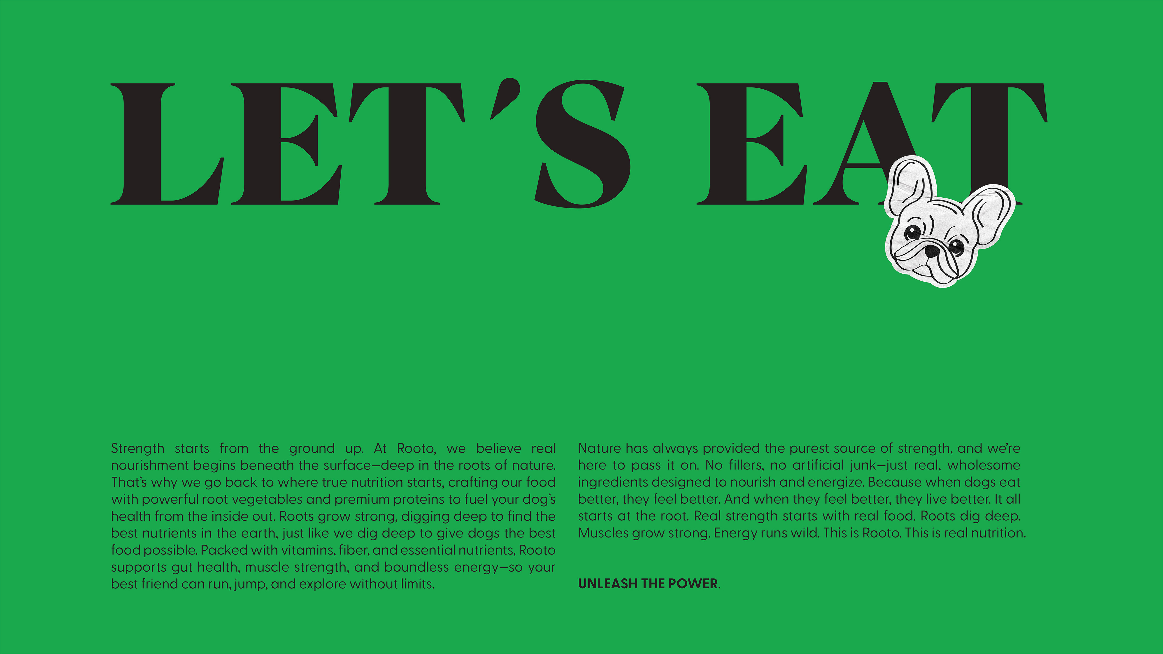
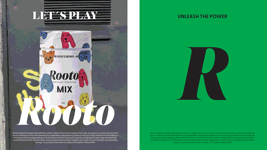
Rooto breaks away from the predictable aesthetics of pet food branding. While most dog food packaging looks conventional, Rooto dares to be bold, vibrant, and full of personality.
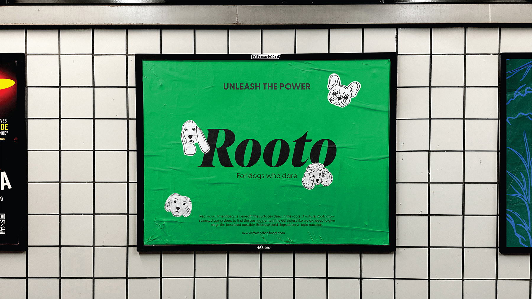
The design captures the joy, energy, and individuality of dogs without relying on childish clichés. The name “Rooto” comes from “root,” highlighting the power of vegetables in a dog’s diet—while also sounding like a pet’s name, friendly, familiar, and full of character.
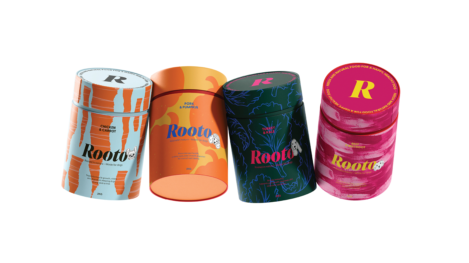
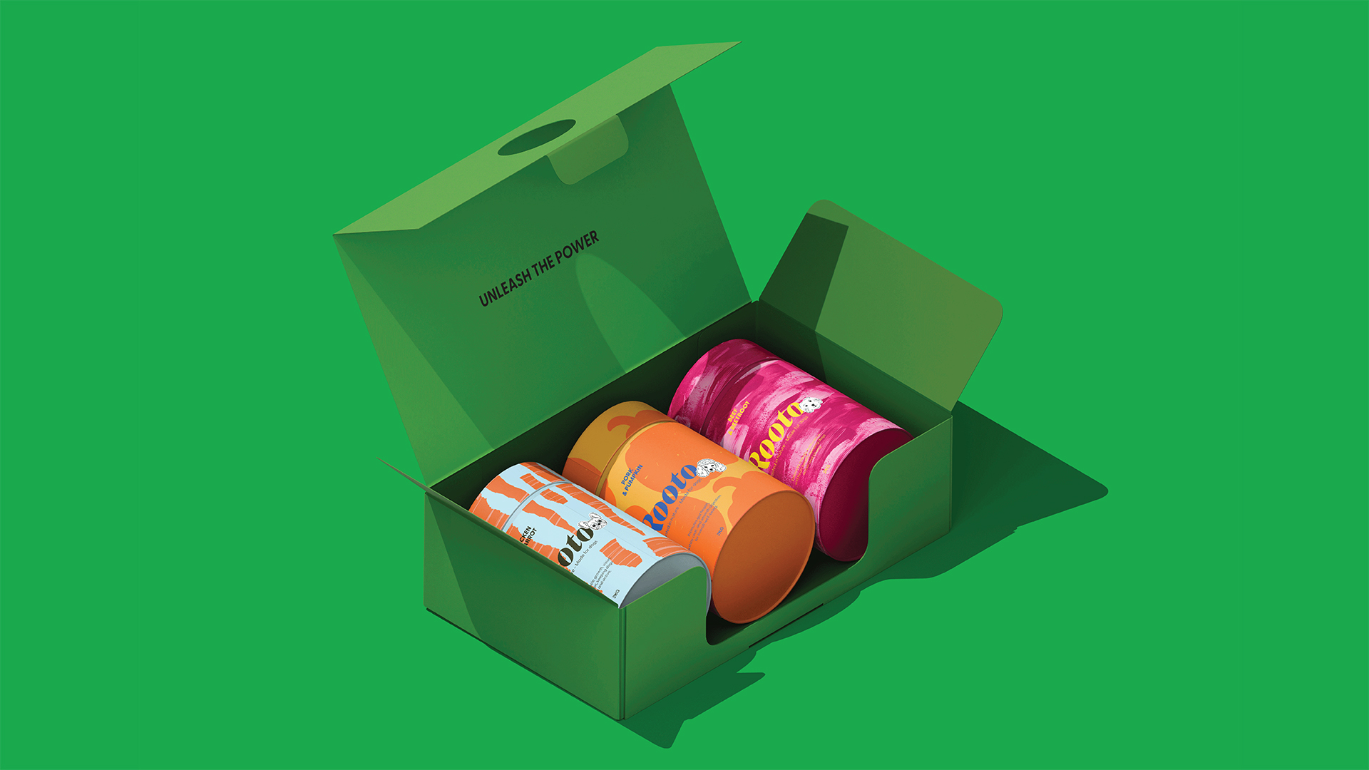
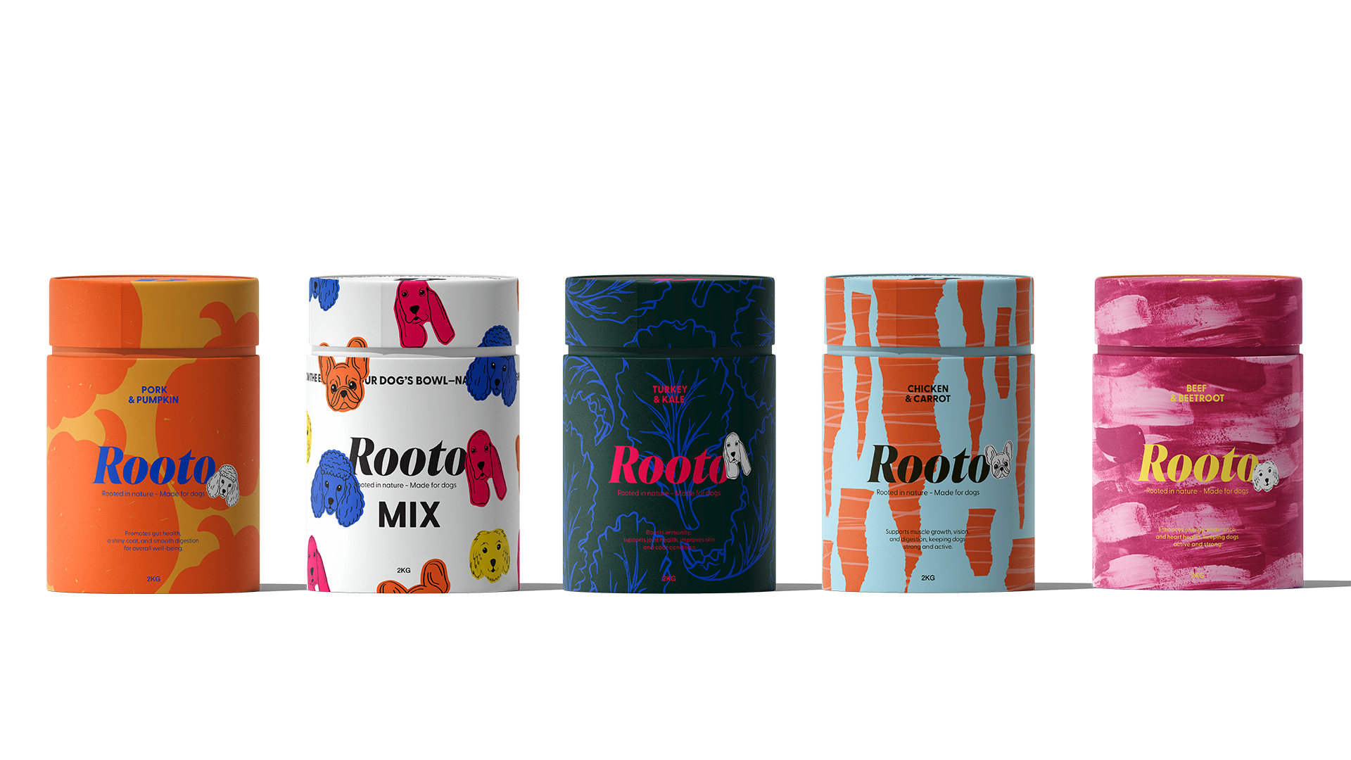
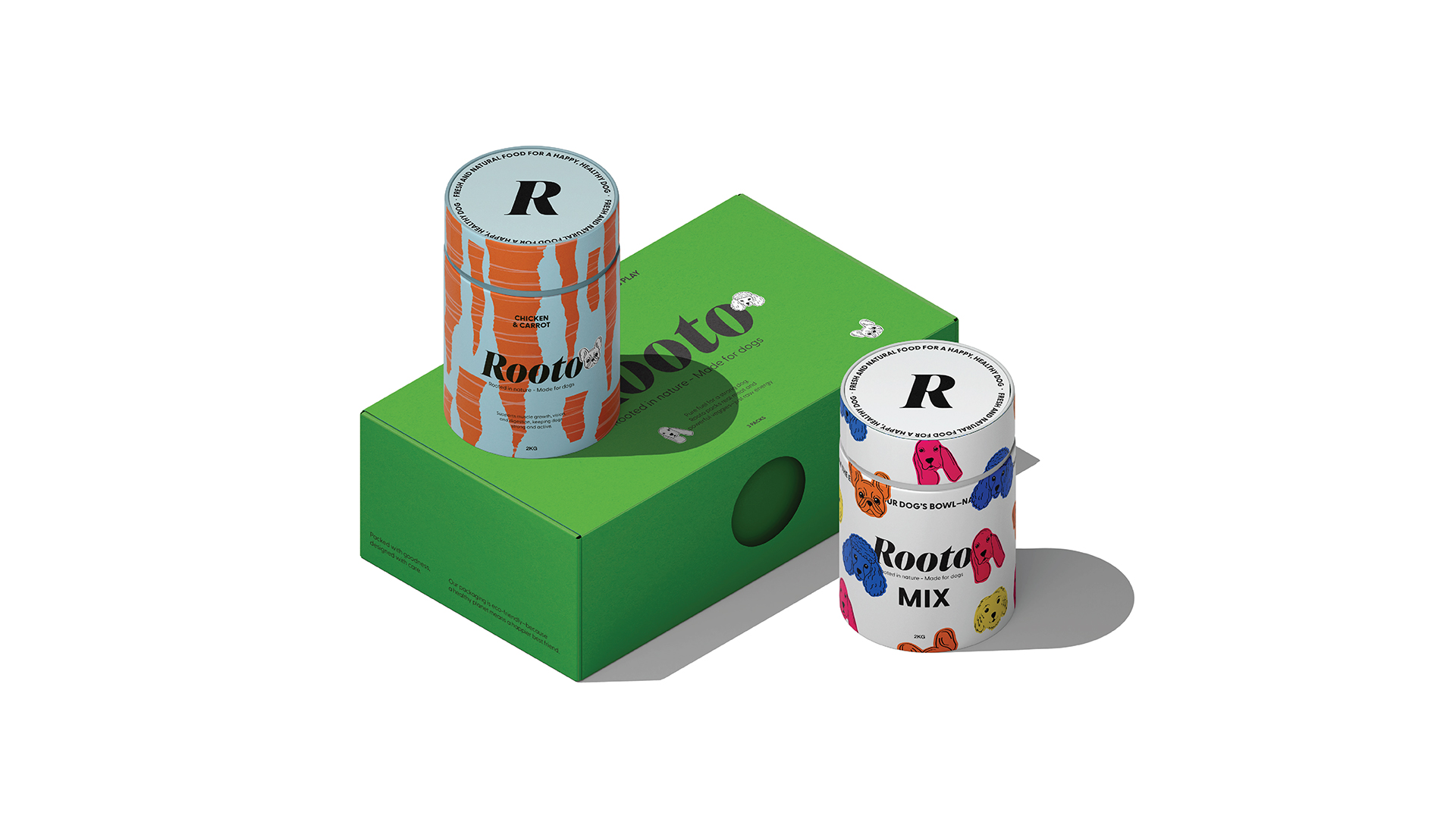
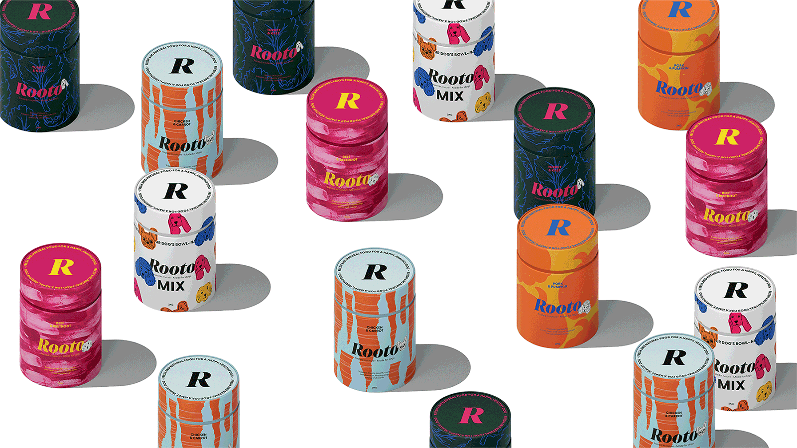
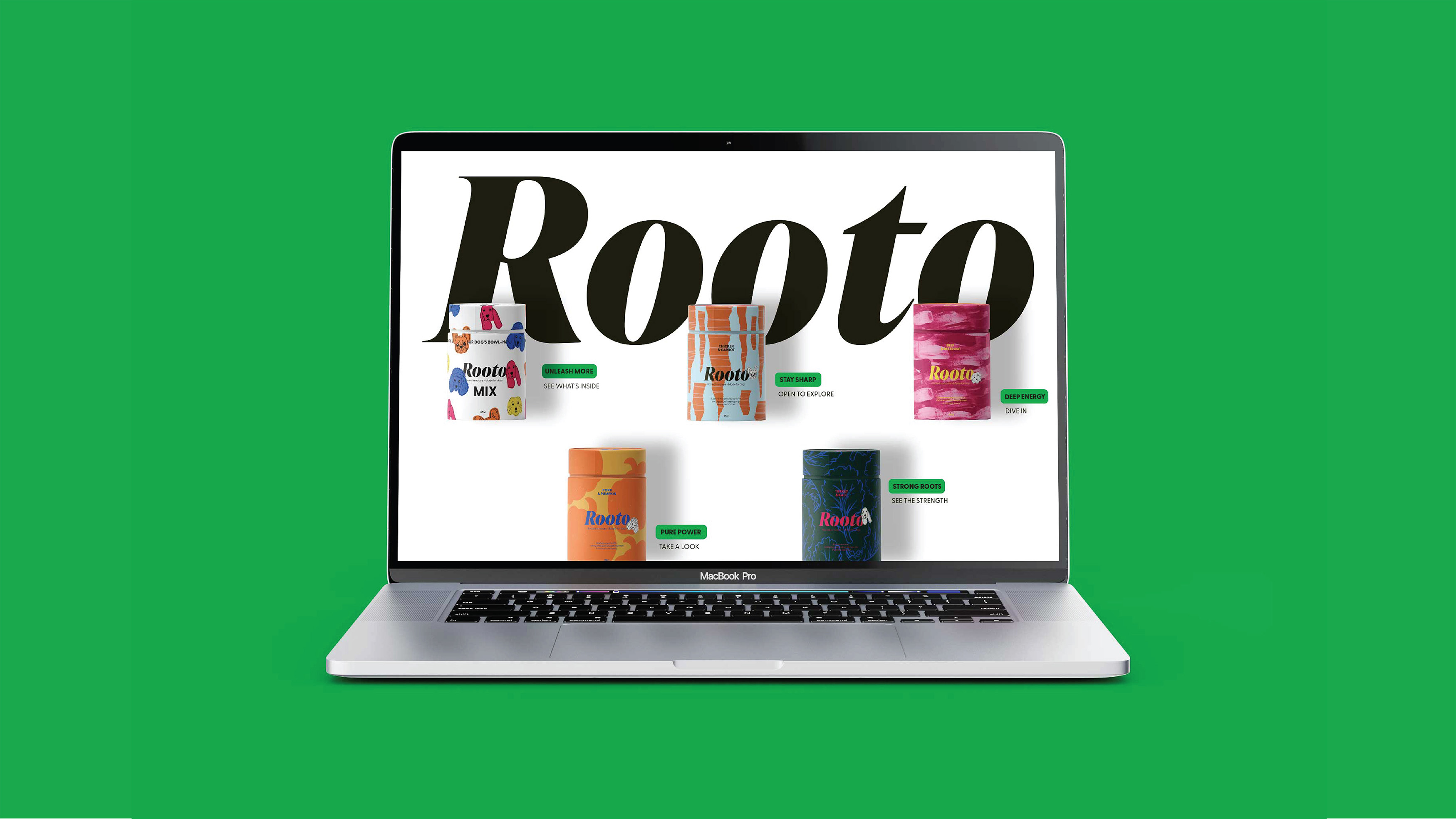
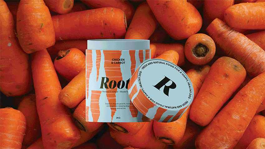
Each product features a hero vegetable, visually reflecting its essence—sharp and dynamic for carrots, rich and textured for beetroot, solid for pumpkin to emphasize its volume, and outlined for kale to convey its delicate yet bold presence. The lineup includes four core products, plus a Mix Edition that blends all flavors into one, offering variety and excitement.
Hand-drawn dog face sketches in a sticker-style design subtly connect the brand to the dog world, adding personality while ensuring Rooto remains sophisticated, modern, and design-driven. The color palette is bold yet refined, balancing expressive graphics with a clean, structured layout. Every design element is intentional, reinforcing a sense of movement, dynamism, and playful rebellion.
Beyond aesthetics, Rooto’s packaging is designed to be collectible—something you’d want to keep, display, or repurpose. The bold, italicized logotype strengthens the brand’s unique identity, mirroring the adventurous spirit of dogs and their owners.
Playful, rebellious, and full of personality, Rooto is made for dogs and owners who embrace fun, adventure, and individuality.
CREDIT
- Agency/Creative: Better than Sunday
- Article Title: Better than Sunday Challenges Pet Food Design Conventions with Rooto’s Fresh Look
- Organisation/Entity: Freelance
- Project Type: Packaging
- Project Status: Non Published
- Agency/Creative Country: Sweden
- Agency/Creative City: STOCKHOLM
- Market Region: Europe, Global
- Project Deliverables: Brand Creation, Brand Design, Branding, Creative Direction, Graphic Design, Logo Design, Packaging Design
- Format: Can
- Industry: Food/Beverage
- Keywords: dog food, pet, dog, packaging, vegetable, carrot, beetroot, pumpkin, kale, branding, identiny, expressive ,
-
Credits:
Art Direction: Better than Sunday


