


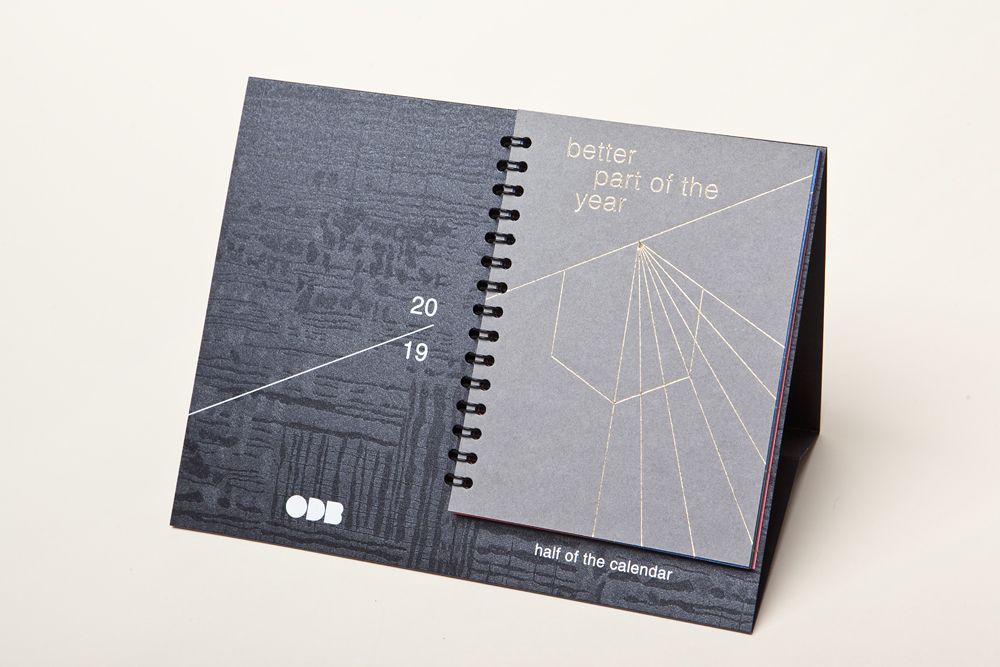
The goal was to create original calendar for the second half of the year as souvenir for key clients and partners, which represent our vision, creative approach and print experience.
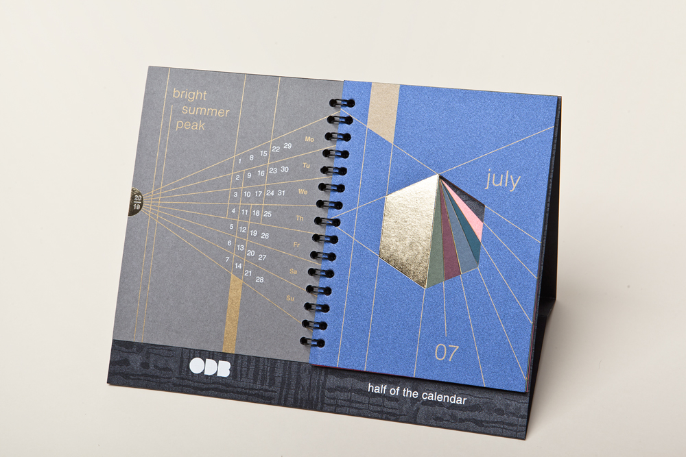
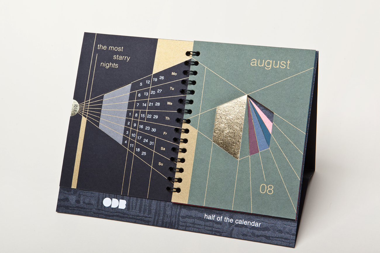
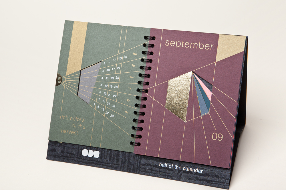
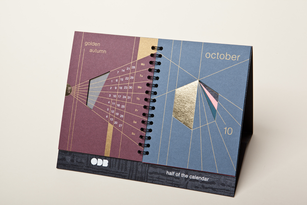
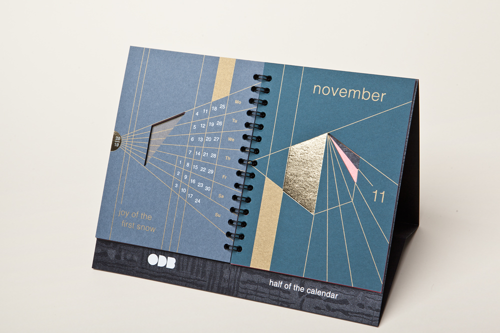
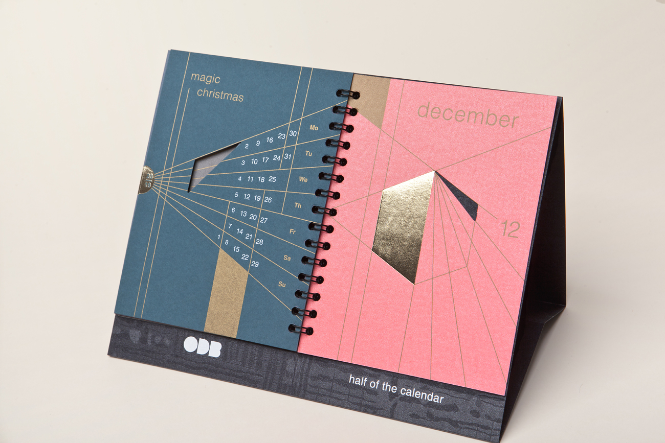
We presented the second half of the year as better part of the year and express all the wonderful moments of each month. July is the bright summer peak, August is the most starry nights, September is rich colors of the harvest, October is golden autumn, November is joy of the first snow, December is magic Christmas.
In the production for each month used special paper from Gmund collection – Gmund Tatjana, Gmund Colors Matt, Gmund Action. Two pantone silk screen printing, gold foil stamping, cutting.
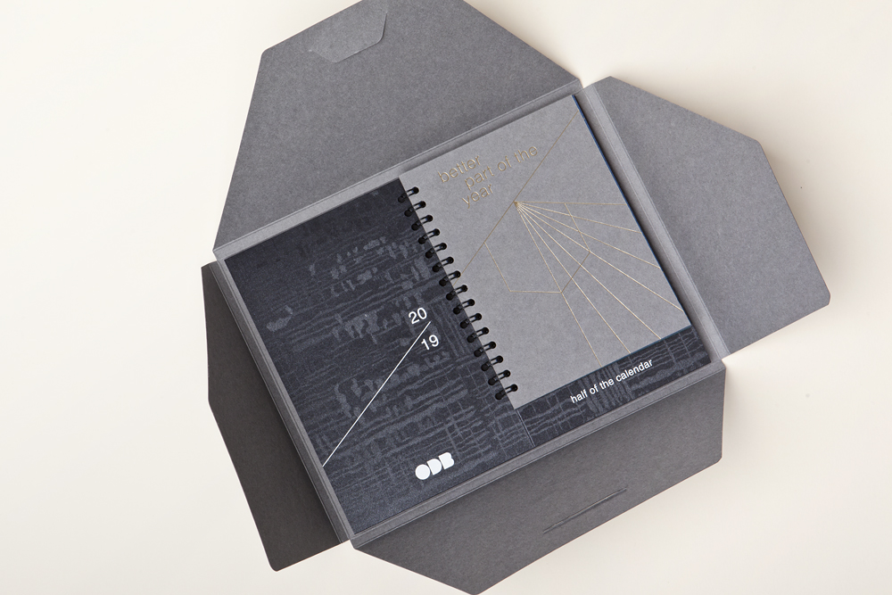
Original calendar construction special for C5 envelopes. Envelope for private hand over also made from Gmund Colors Matt 93 using foil stamping.
It’s the first calendar for better part of the year. In calendar production combined different types and colors of paper from Gmund collections which highlight special moments of each month.
CREDIT
- Agency/Creative: ODB
- Article Title: Better Part of the Year Calendar
- Organisation/Entity: Agency, Published Self Promotional Design
- Project Type: Packaging
- Agency/Creative Country: Russia
- Market Region: Europe
- Project Deliverables: Brand Identity, Brand Strategy, Graphic Design, Illustration, Research, Structural Design, Tone of Voice
- Format: Case
- Substrate: Pulp Carton, Pulp Paper


