Problem statement: Cat food shelves lack products that emotionally connect with the consumer at first glance. Most brands opt for a correct layout with a good photograph of a cat, but they don’t go beyond that. There is no storytelling or emotional connection beyond the photograph of a cute or friendly cat, and in concept, the brands are quite similar to each other (except for some exceptions).
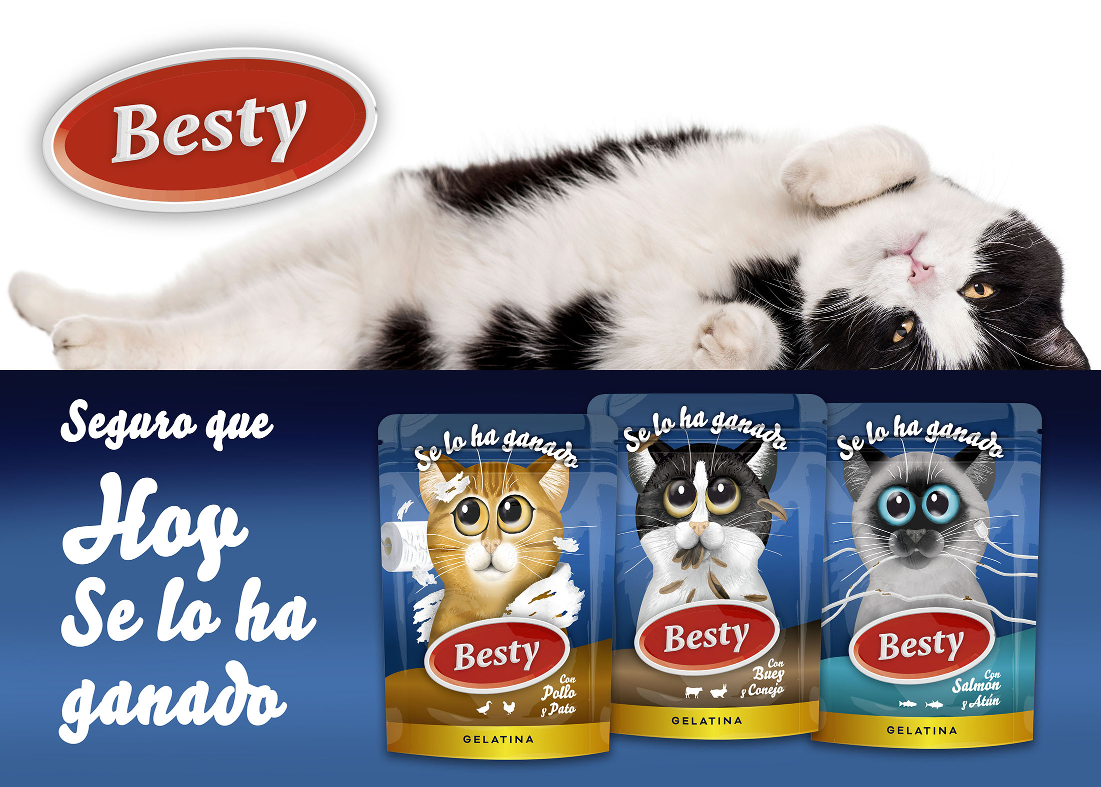
Solution statement: We appeal to that emotional connection with the consumer based on the knowledge of people who have common cats (it is not a premium product, it is a commodity) and their relationship with their felines. Our buyer persona would be young or middle-aged, who has one or more cats, or is a first-time cat owner, and is familiar with their playful nature.
The brand: Besty means “best friend or colleague”. We are looking for a visible, simple, and readable aesthetic. Easy to integrate into the packaging.
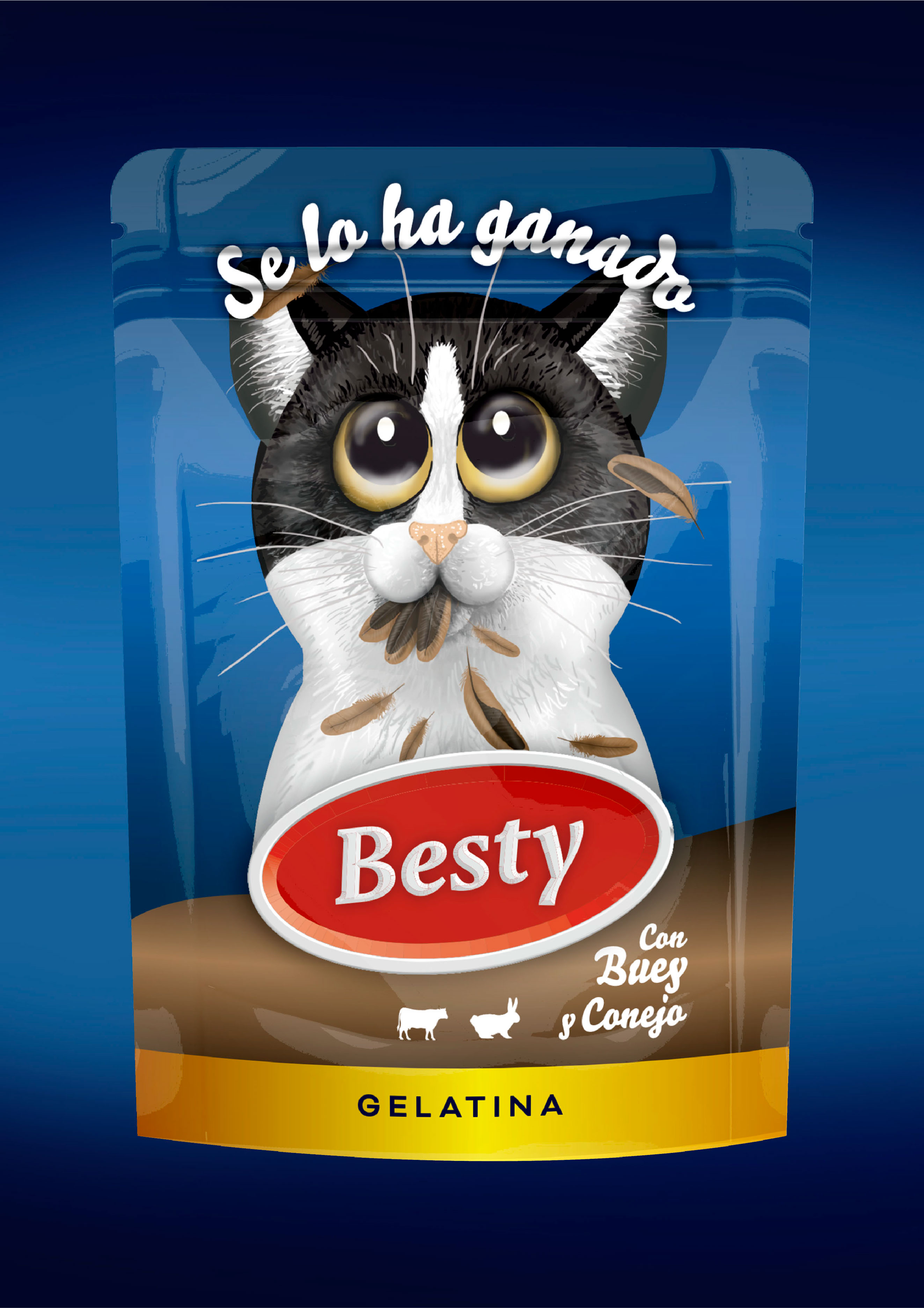
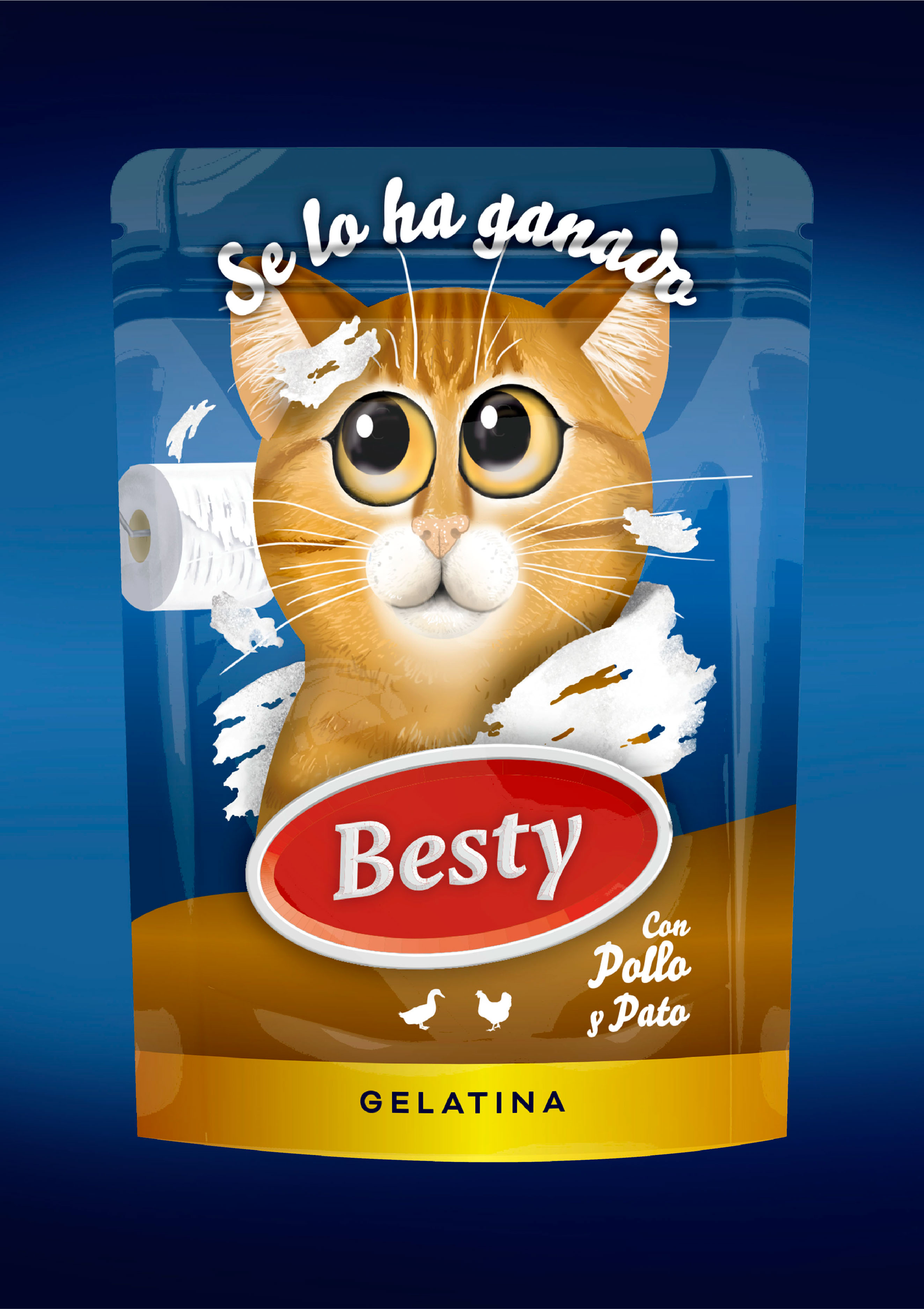
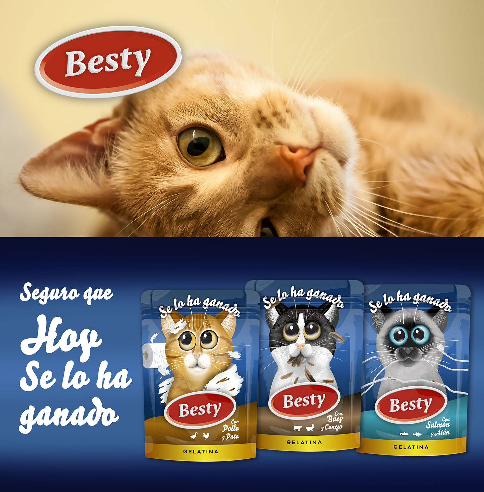
The range: “They have earned it” appeals to the moment of the day when you reward your pet. Typically at the end of the day or when the person comes home after a day of work. It is a special moment that the animal eagerly anticipates, and the person-pet relationship is close. The pet is not rewarded for doing anything special, but rather for being who they are and for being there, keeping us company. It is a universal and understandable concept; any cat that lives with humans “has earned it.”
The storytelling and design: The consumer is aware of the mischievous side of their pet. They know that sometimes they do “naughty things” or bring “gifts,” but they still have an affectionate relationship with the animal. We are looking for an illustration that shows us those anecdotes with which the consumer can identify immediately and a model of a common cat that can be usual. Each flavor is identified with a different cat color and a different “mischief,” so that we can have a range in which the consumer can identify with their cat in one way or another. The style should be approachable, friendly, and attractive to our buyer persona. Moving away from classic styles and images in which the cat is simply there. We want to evoke an emotion in the consumer, if we can make them smile, we will have won.
 1
1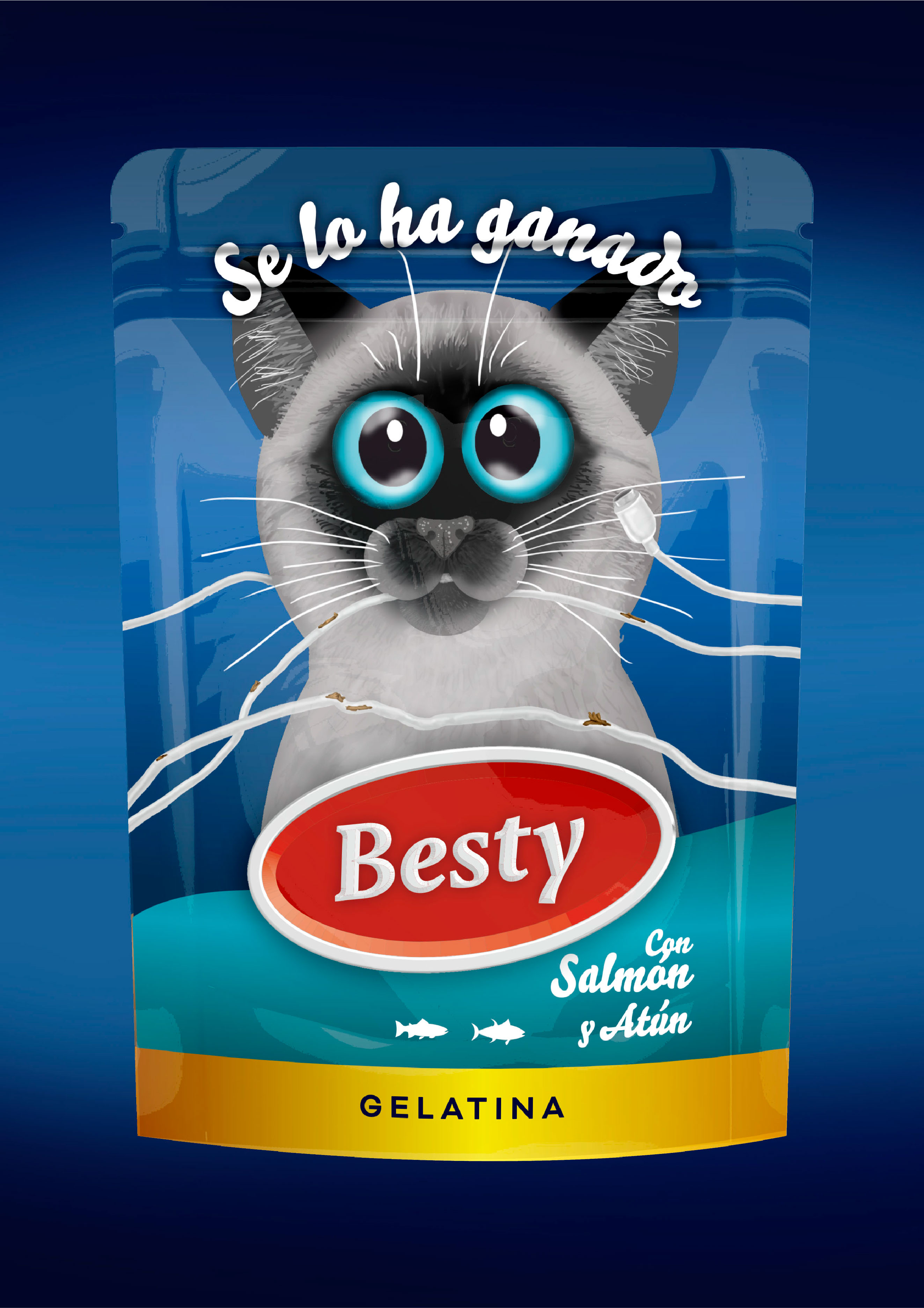
CREDIT
- Agency/Creative: Magic Mirror Design
- Article Title: Besty Wet Cat’s Food Packaging Design
- Organisation/Entity: Freelance
- Project Type: Product
- Project Status: Non Published
- Agency/Creative Country: Spain
- Agency/Creative City: Castellón de la Plana
- Market Region: Europe
- Project Deliverables: Packaging Design
- Industry: Retail
- Keywords: #marketing #product #packaging #branding #ilustración #comidablandagatos #besty #selohaganado
-
Credits:
General Director: Esther Rodríguez


