


Kindling is a yakitori restaurant whose branding celebrates the timeless ritual of gathering over good food. The project began with a simple observation: yakitori dining is fundamentally about connection—passing plates, sharing stories, and building memories around the table. This insight became the foundation for creating a visual identity that honors these shared experiences.
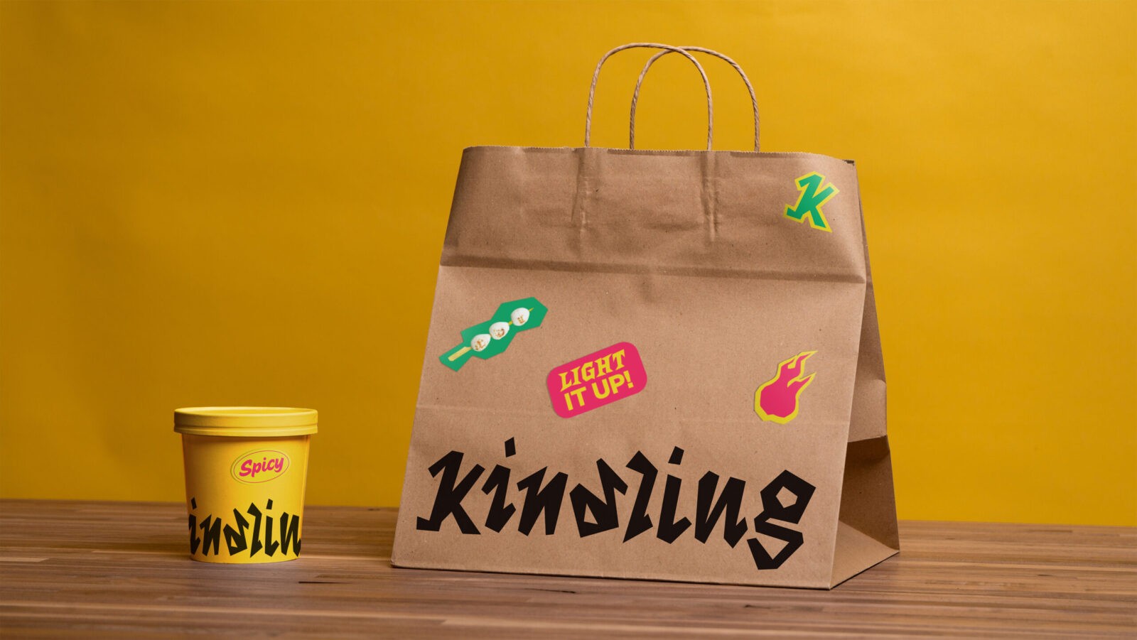
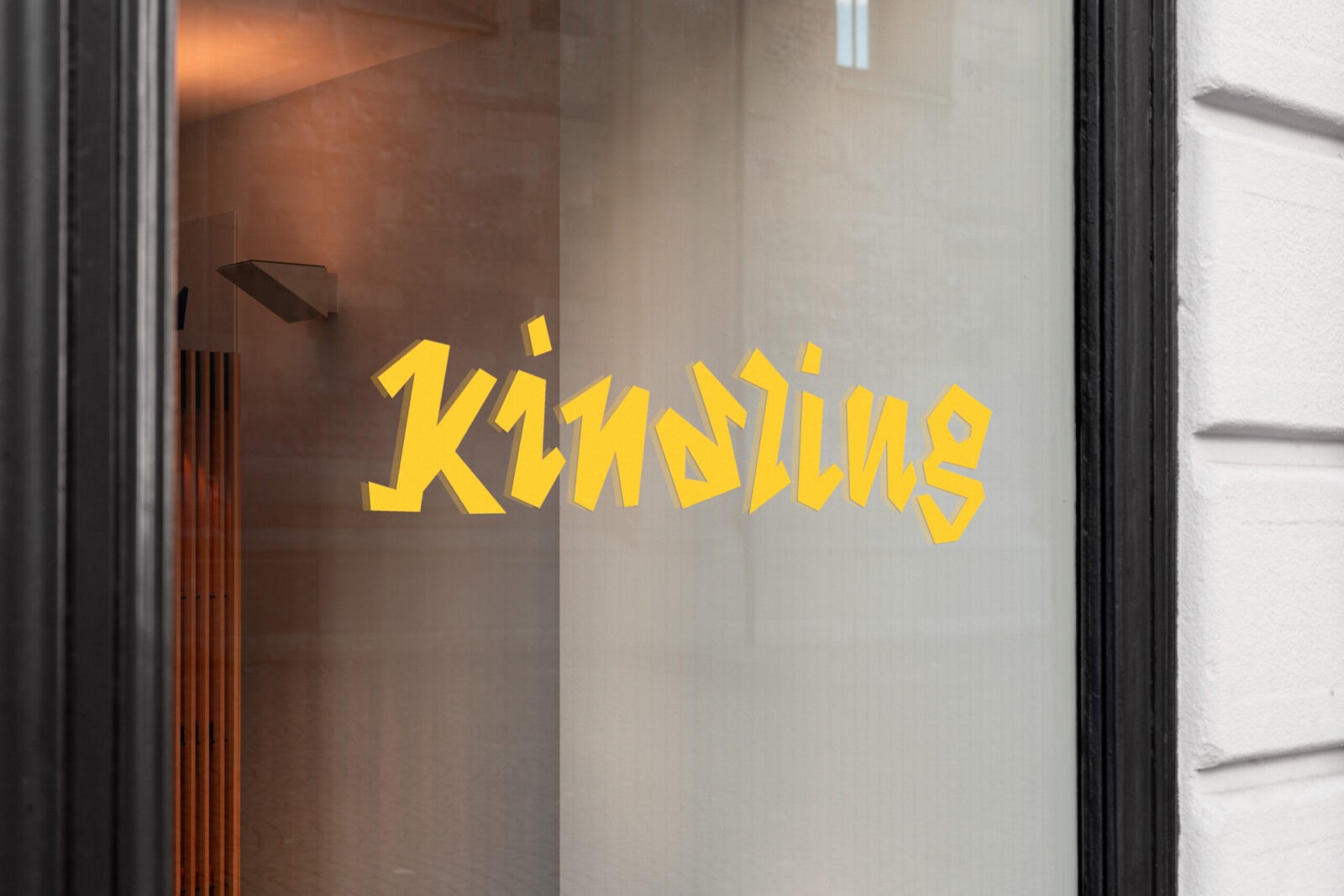
The name “Kindling” emerged after extensive exploration, chosen for its layered meaning. Beyond representing the warmth of fire used to grill skewers, kindling serves as a metaphor for sparking conversation and igniting connections between people. It captures the essence of yakitori culture without relying on traditional Japanese nomenclature, offering something both familiar and fresh.
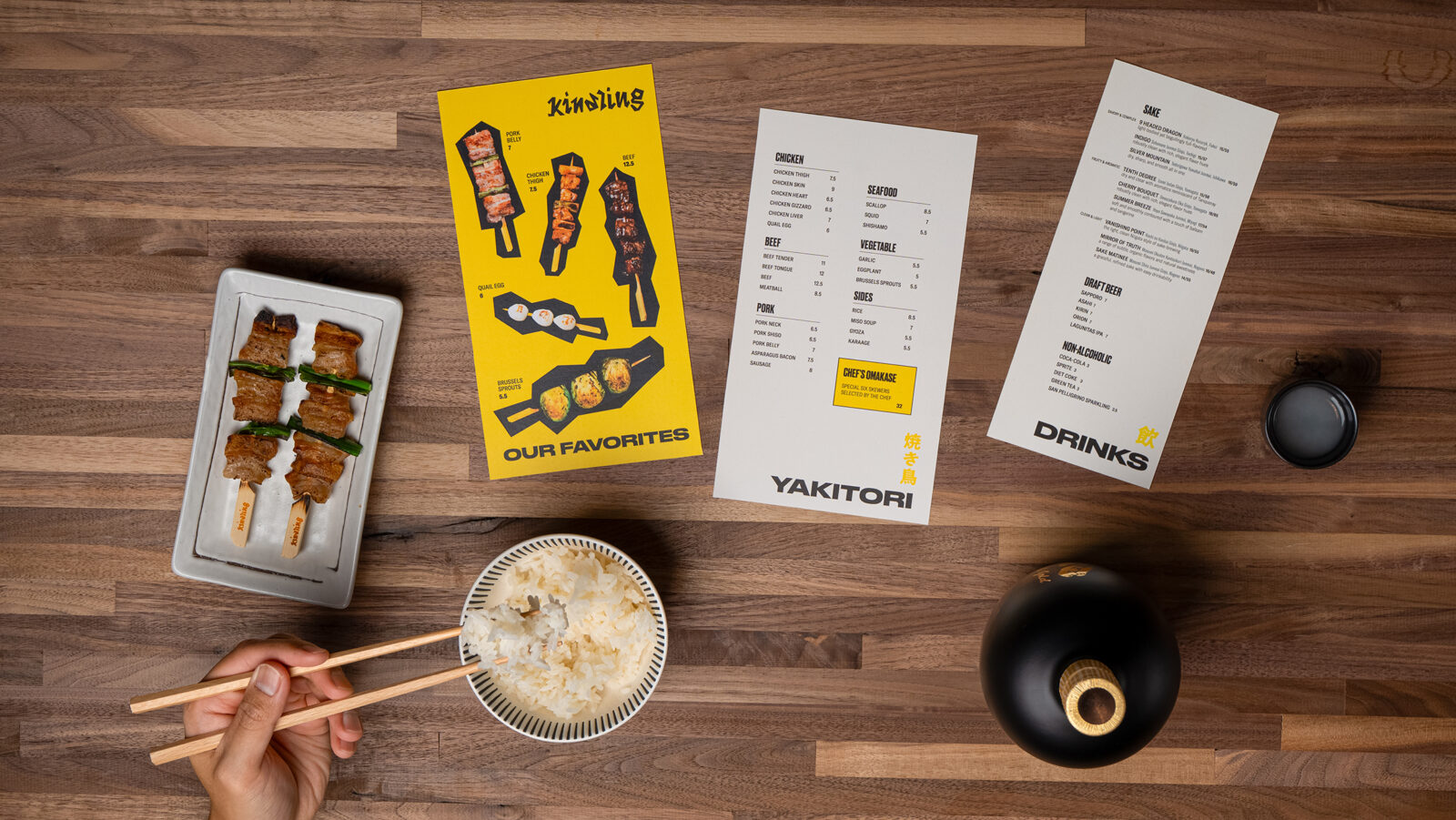
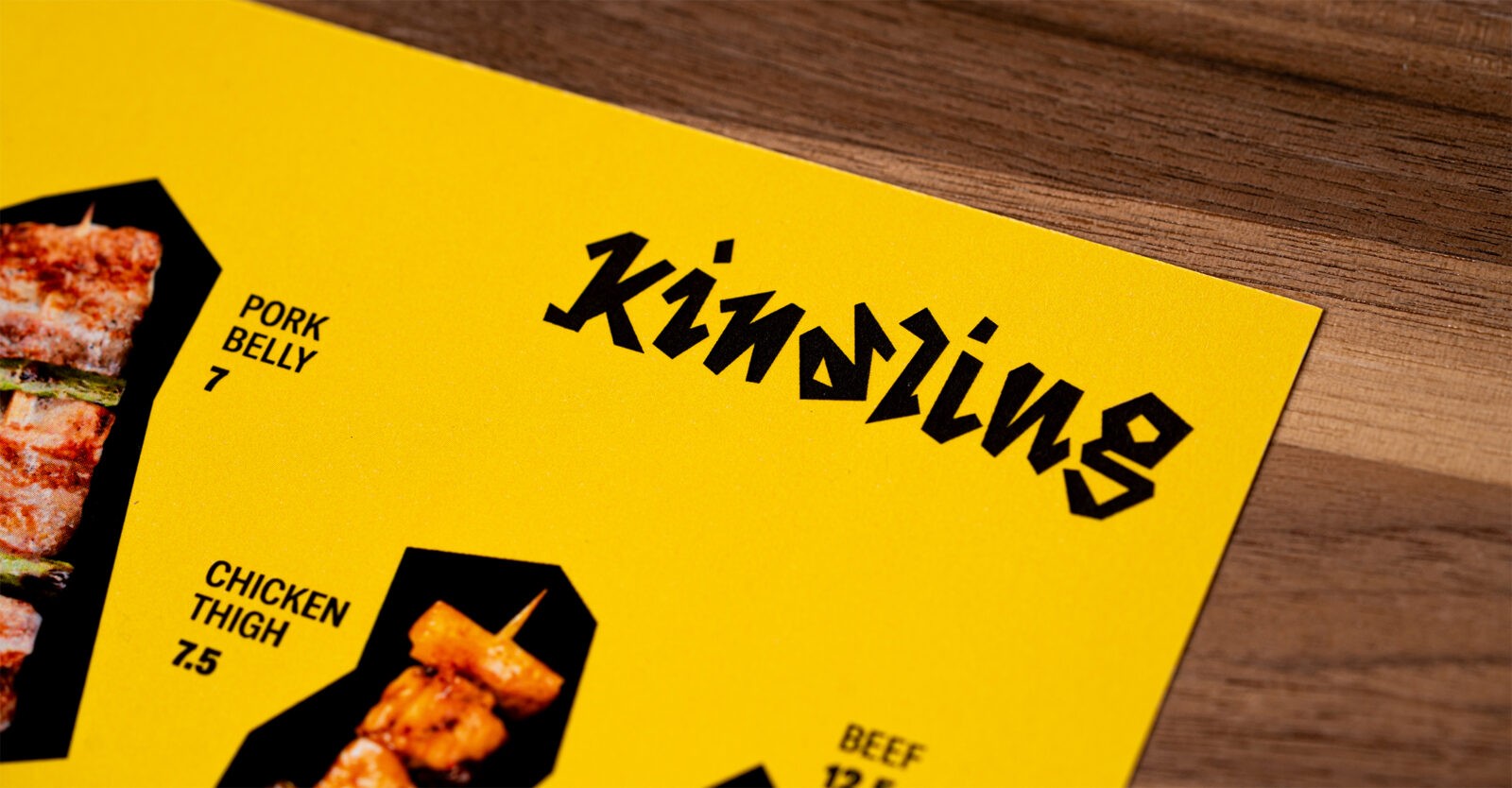
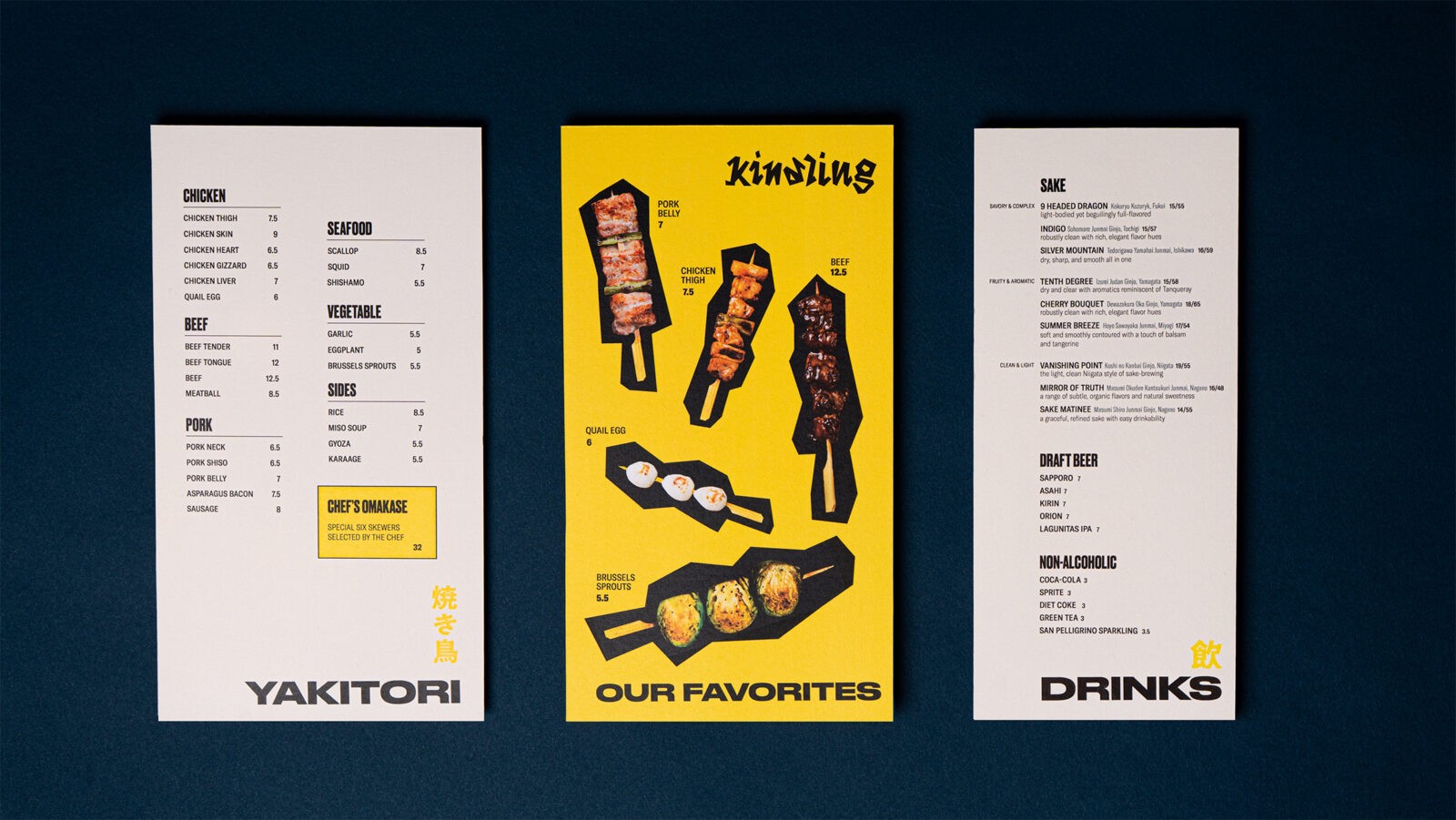
The visual language draws inspiration from Saul Bass’s geometric poster work, translating his bold, angular approach into distinctive skewer shapes that became the brand’s signature element. These geometric forms ripple throughout the identity—from the dynamic logotype with its sharp, energetic letterforms to coasters and packaging details. The result is a visual system that feels both modern and purposeful, balancing boldness with warmth.
Typography and layout decisions prioritize clarity and functionality. Recognizing that yakitori dining involves continuous ordering throughout the meal, the menu adopts a compact format to preserve valuable table space. A clean two-column system guides diners through options without overwhelming, while bold headings and bright yellow accents create visual energy and approachability.
The personality achieved is sincere without being saccharine, bold without aggression. By pairing matter-of-fact typography with vibrant color and playful geometric elements, the branding communicates warmth and invitation while maintaining sophistication. Strategic copywriting on coasters and takeaway bags reinforces the brand’s core message, gently reminding patrons to savor the moment and company.
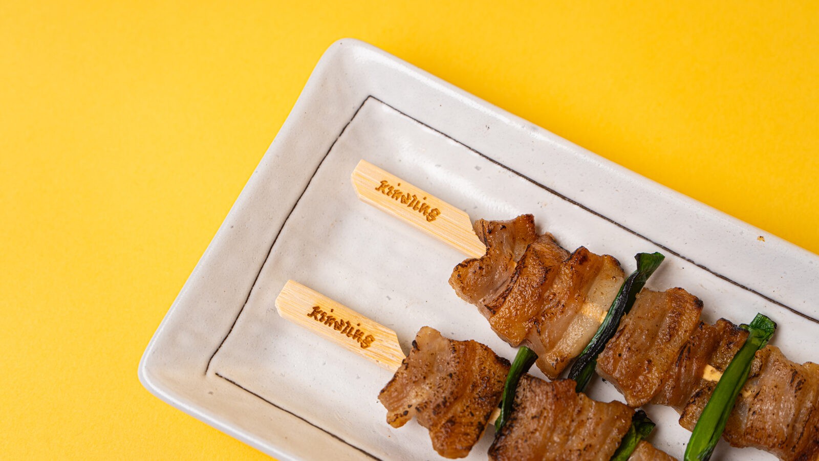
From laser-engraved skewers to thoughtfully designed menus, every touchpoint reinforces Kindling’s mission: to create an environment where the focus remains on what matters most—the people around the table and the meal that brings them together. The brand identity doesn’t just represent a restaurant; it celebrates a philosophy of dining centered on human connection.


CREDIT
- Agency/Creative: Benedict Allen
- Article Title: Benedict Allen Creates Kindling to Celebrate Shared Dining Through a Distinctive Yakitori Identity
- Organisation/Entity: Student
- Project Status: Non Published
- Agency/Creative Country: United States of America
- Agency/Creative City: Los Angeles
- Project Deliverables: 2D Design, Art Direction, Brand Creation, Brand Design, Brand Identity, Brand Mark, Brand Naming, Branding, Design, Graphic Design, Lettering, Logo Design, Packaging Design
- Industry: Hospitality
- Keywords: WBDS Student Design Awards 2025/26 , branding, identity, restaurant, hospitality, logo, logotype, typography, menus, signage, packaging, collateral, concept, strategy, storytelling, visual, guidelines, artdirection, illustration, print, digital, warmth, organic, rustic, modern, minimal, cozy, ember, hearth, neighborhood, seasonal


