


Iconic San Diego attraction Belmont Park, known for its historic wooden Giant Dipper rollercoaster, has unveiled a new brand positioning and identity that pays homage to its heritage and the vibrant culture of San Diego. Radiating the warmth of the sunshine state and its free-spirited sense of adventure, the new identity inspires an infectious playfulness that highlights Belmont Park as a place that everyone can come to enjoy.
Ahead of its 100-year anniversary in 2025, Belmont Park appointed belief-led brand innovation company BLVR to help provide a clear and consistent direction for its future, differentiating it from other amusement parks on the West Coast and nationally. The new solution leverages the attraction’s rich history but for today’s audiences, zoning in on its local charm to celebrate everything that’s unique and extraordinary about San Diego.
Defining a Core conviction
“We felt the essence of Belmont Park had been missing from our brand identity for a number of years. There’s so much here that enables us to be a pillar of the community in San Diego for tourists and locals alike – from the entertainment of the rides to the tasty food to the beachfront location. Yet we felt we were being overlooked,” says Steve Thomas, General Manager of Belmont Park. “We wanted our new identity to help us create that connection with people so that everyone feels welcome.”
To ensure this felt as authentic as possible, BLVR worked with Belmont Park’s internal stakeholders to uncover the brand’s core conviction – a firm belief that San Diego’s culture is unique, extraordinary, and deserves to be shared. That conviction is at the heart of the strategic approach to the brief.
“What really shone through is how Belmont Park is ideally positioned to embody San Diego through memorable, exciting, and quintessential California experiences. Nowhere else can compete with that”, says Alex Blair, Group Strategy Director at BLVR. “Using this lens, we wanted to create a fresh and modern brand that leaned into the emotional connection between the park and its visitors.”
Creating cohesion
Another part of the challenge was the lack of consistency across the park. “There was no strong brand presence,” says Blair. “The best thing about Belmont Park is that there’s something for everyone, but each vendor had its own look and feel, there was no sense of unity between them. We knew that to elevate the customer experience, we had to bring everything together so that it felt cohesive while still leaving enough room for each ride and vendor to have its own personality.”
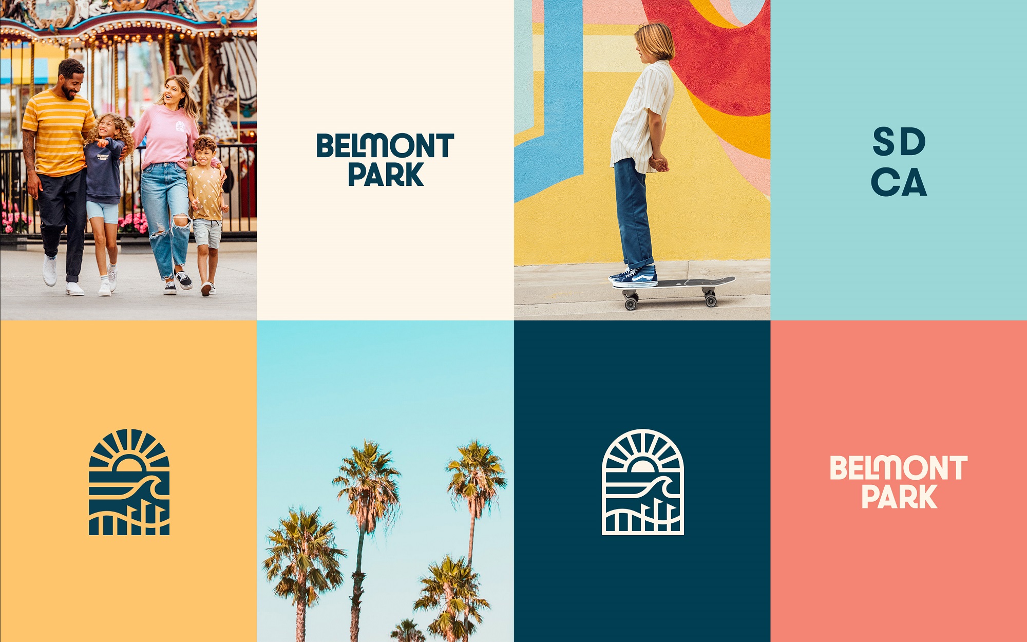
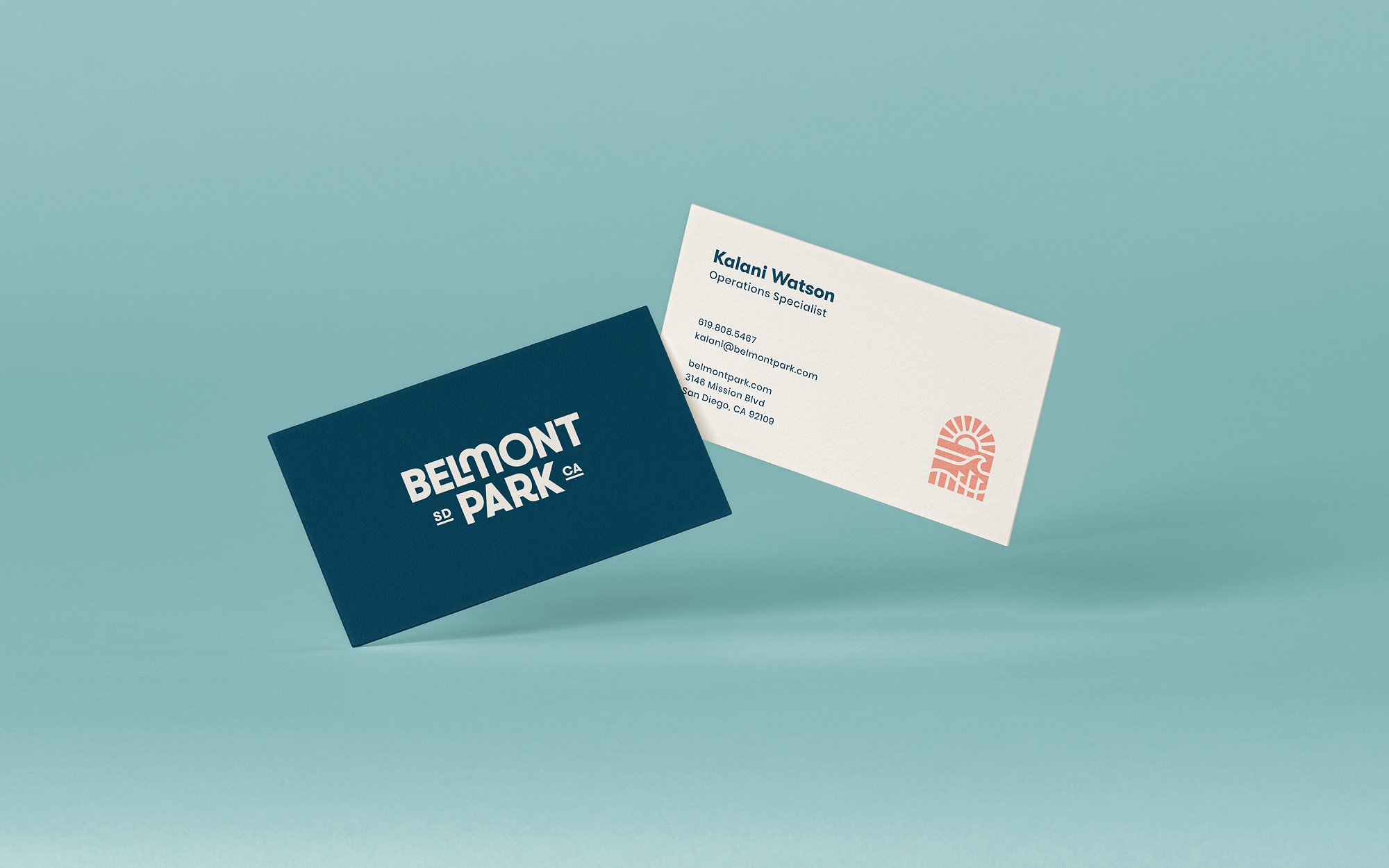
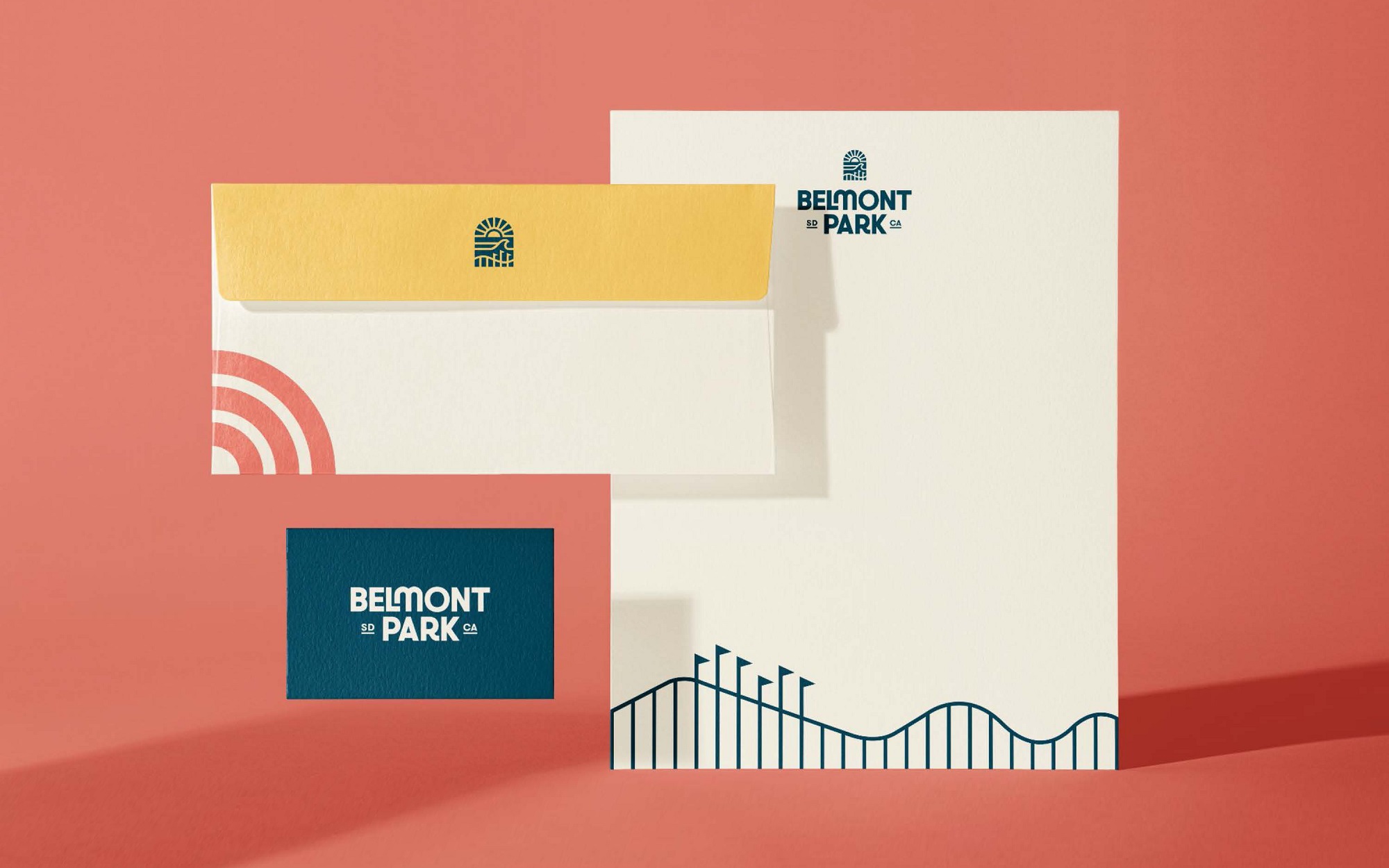
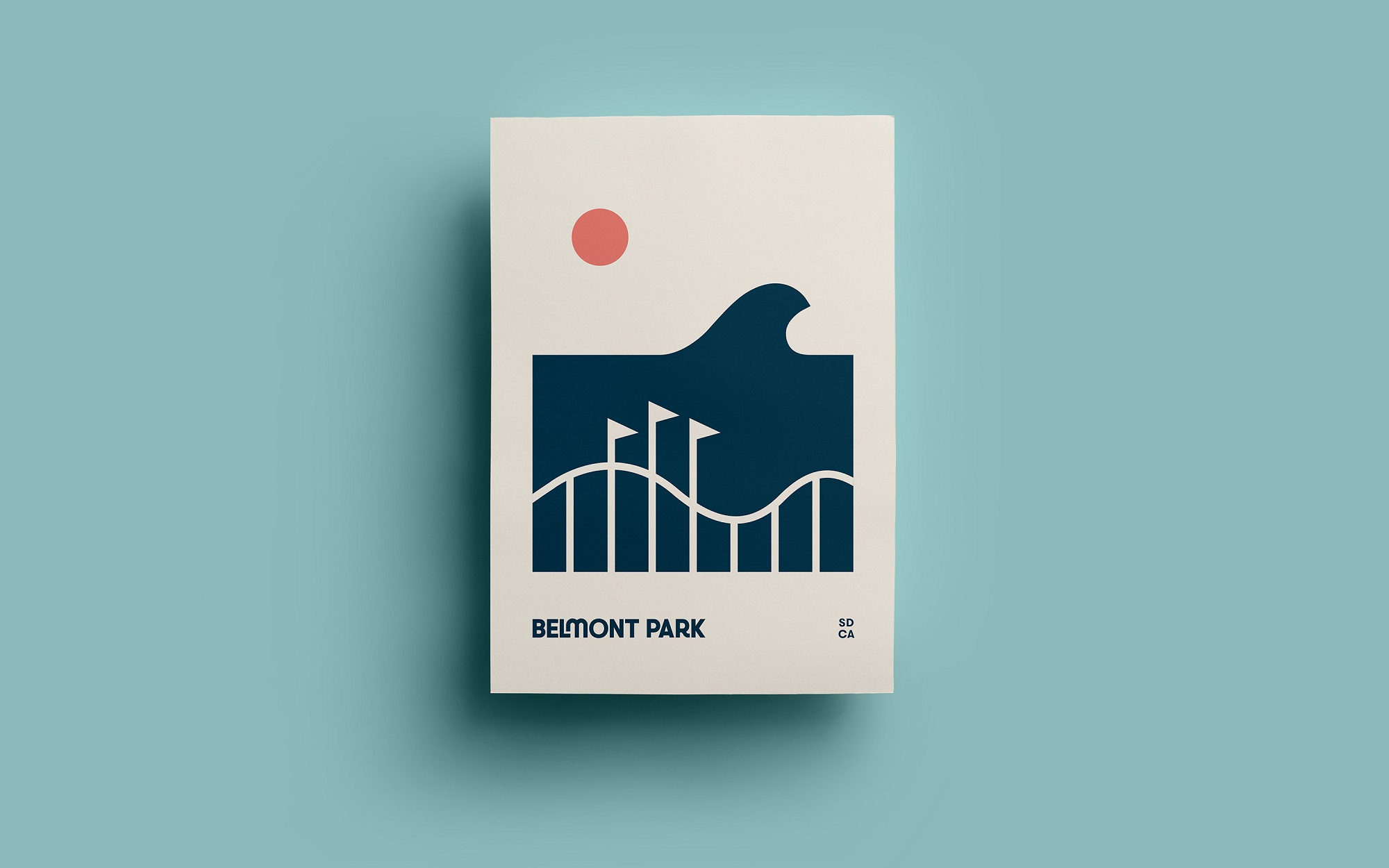
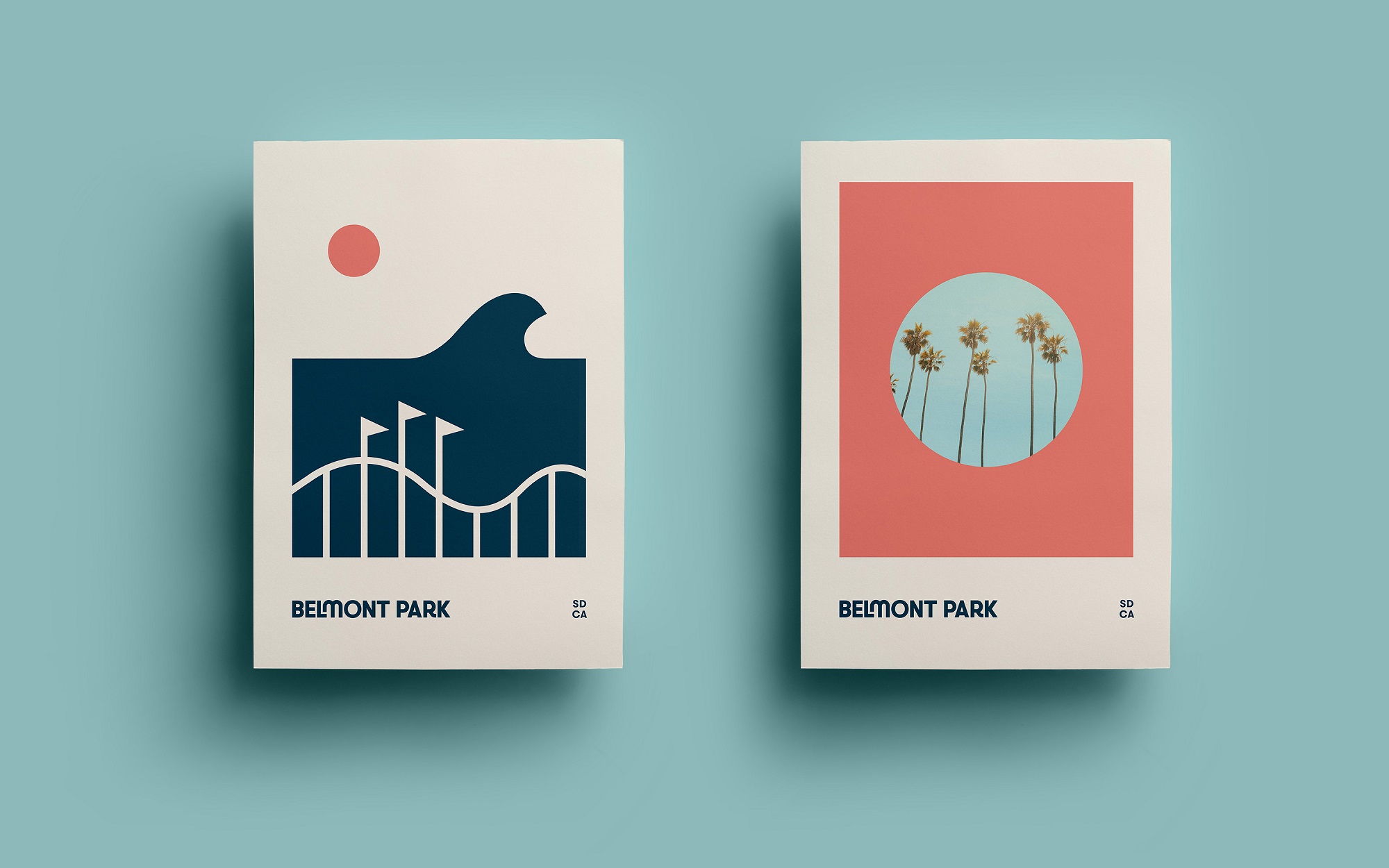
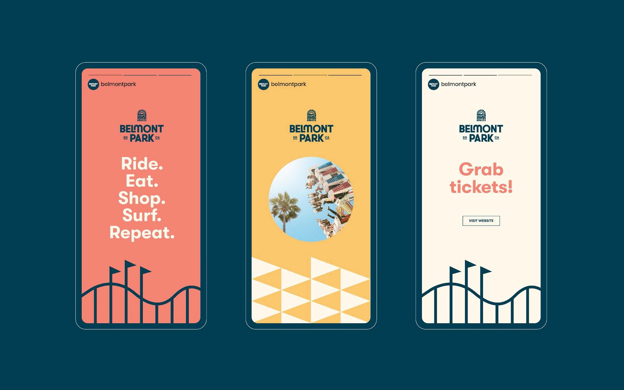
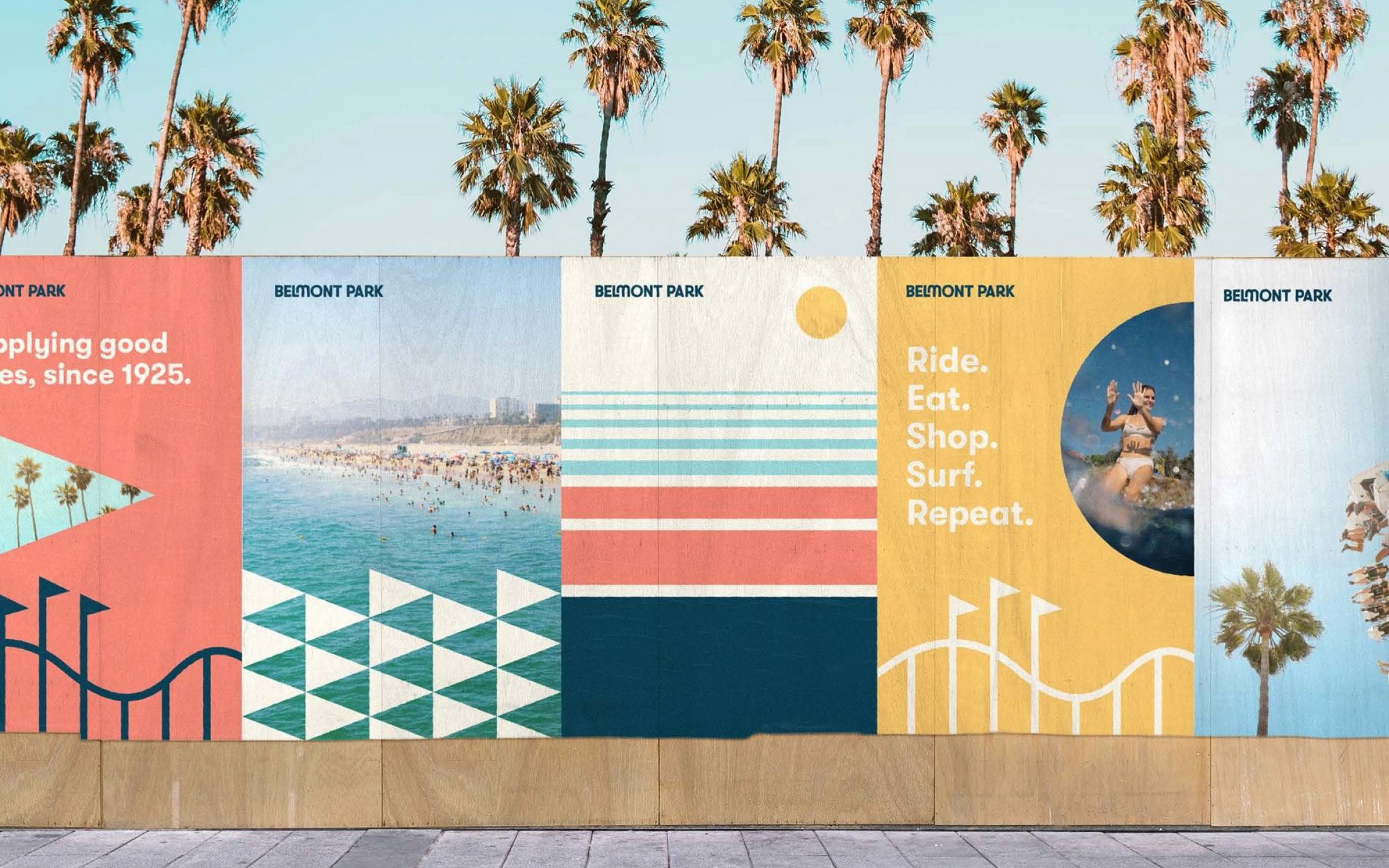
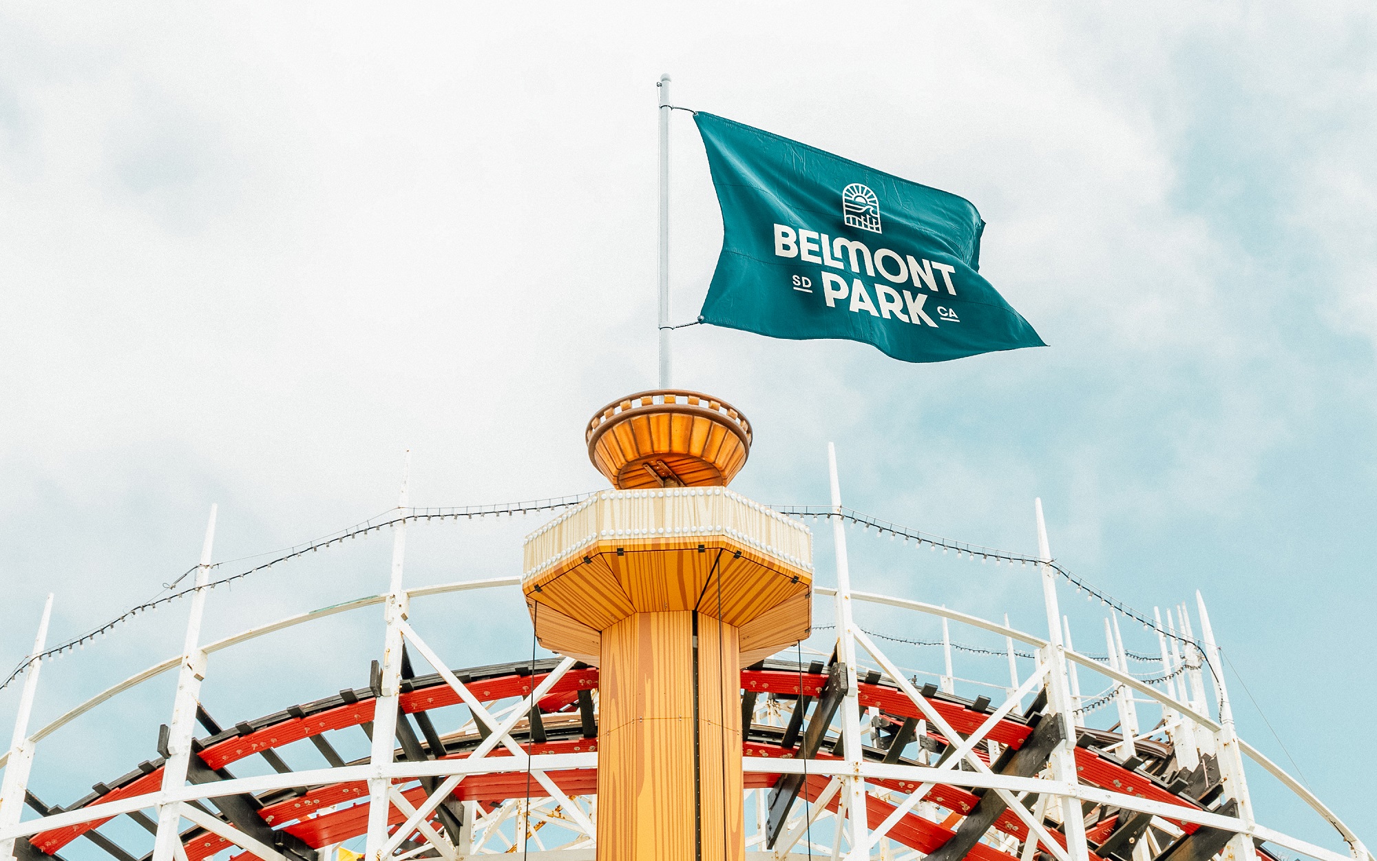
Articulating Belmont Park’s core conviction provided that unity and informed every part of the visual identity. At the heart of it sits the new logo. Combining all the key elements of the park – the Giant Dipper, the beachfront, and the San Diego sun – in a rounded arch, it’s an effective shorthand for everything that the park has to offer. Its artful simplicity allows for consistency, essential for an identity that has to live in so many places, from large-scale posters to signage, to a tiny t-shirt badge.
The identity’s wider visual language derives from the logo. Key elements include a suite of shapes to crop photography and to form decorative patterns, as well as a Giant Dipper graphic that can be used to frame various styles of content. Each enables the identity to flex depending on need and application while building a distinctive and recognizable brand.
Nostalgic but modern
The visual execution was inspired by the graphic language of the seventies, striking a balance between nostalgia and modernization. For example, the bespoke wordmark features chunky curves reminiscent of that era.
Austin Lane, Executive Creative Director at BLVR, says: “This, alongside the logo, laid the foundations for the rebrand’s nostalgic visuals. However, rather than fully replicating the style in what could quickly become pastiche, it borrows just the right amount. For example, we have injected small moments of playfulness – in the connection between the ‘L’ and the ‘M’ and on the kick of the ‘R’. This keeps it clean, making it a fresher take on the past.”
The color palette further adds to the sense of cohesion, signaling the warmth and optimism of the San Diego culture and enhancing the notion of Belmont Park as a cultural gateway to the city. Inspired by the vibrant colors of the park and the surrounding natural landscape, it features shades drawn from the sand, sun, sky, and water (navy, cream, aqua, yellow and coral).
A familiar voice
Alongside the visual identity, BLVR worked with Belmont Park to develop an ownable tone of voice. Like the rest of the rebrand, it sought to highlight the energy of San Diego; laid back, leisurely, yet adventurous. It provides a point of difference from the larger, more corporate style of Belmont Park’s competitors. Playful messages include ‘Ride. Eat. Shop. Surf. Repeat’ and ‘supplying good vibes since 1925’.
A personal touch
Situated just twenty minutes from the BLVR offices, the project felt particularly personal to the BLVR team. “The opportunity to define Belmont Park’s future was exciting for us. It holds a lot of personal memories for everyone, whether it’s where you spent your summer holidays as a child, experienced your first taste of independence, or had your first kiss,” says Blair.
“That sense of connection and nostalgia was exactly what we wanted to tap into. People often yearn for the simple times before we were so locked into our phones and the digital world. We wanted to use this rebrand as an opportunity to say, ‘You can have these times back.’”
The rebrand is launching this week and being rolled out over the summer across the park and new merchandise, messaging, uniforms, and wider initiatives, with a new website coming soon.


CREDIT
- Agency/Creative: BLVR
- Article Title: Belmont Park Celebrates Quintessential San Diego Culture In Joyous New Identity by BLVR
- Organisation/Entity: Agency
- Project Type: Identity
- Project Status: Published
- Agency/Creative Country: North America
- Agency/Creative City: San Diego
- Market Region: North America
- Project Deliverables: Brand Identity
- Industry: Entertainment
- Keywords: San Diego, brand identity
-
Credits:
BLVR: BLVR


