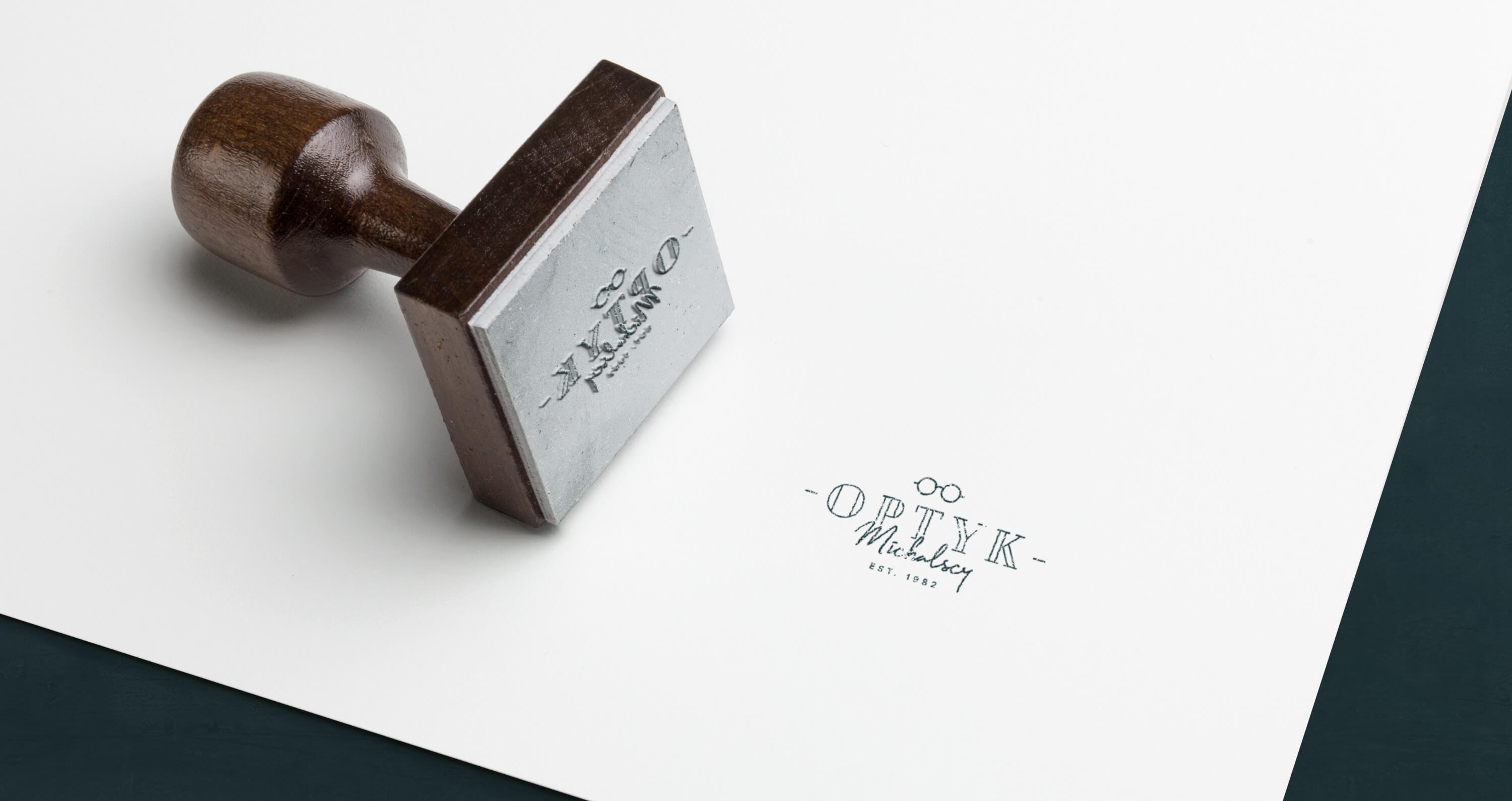
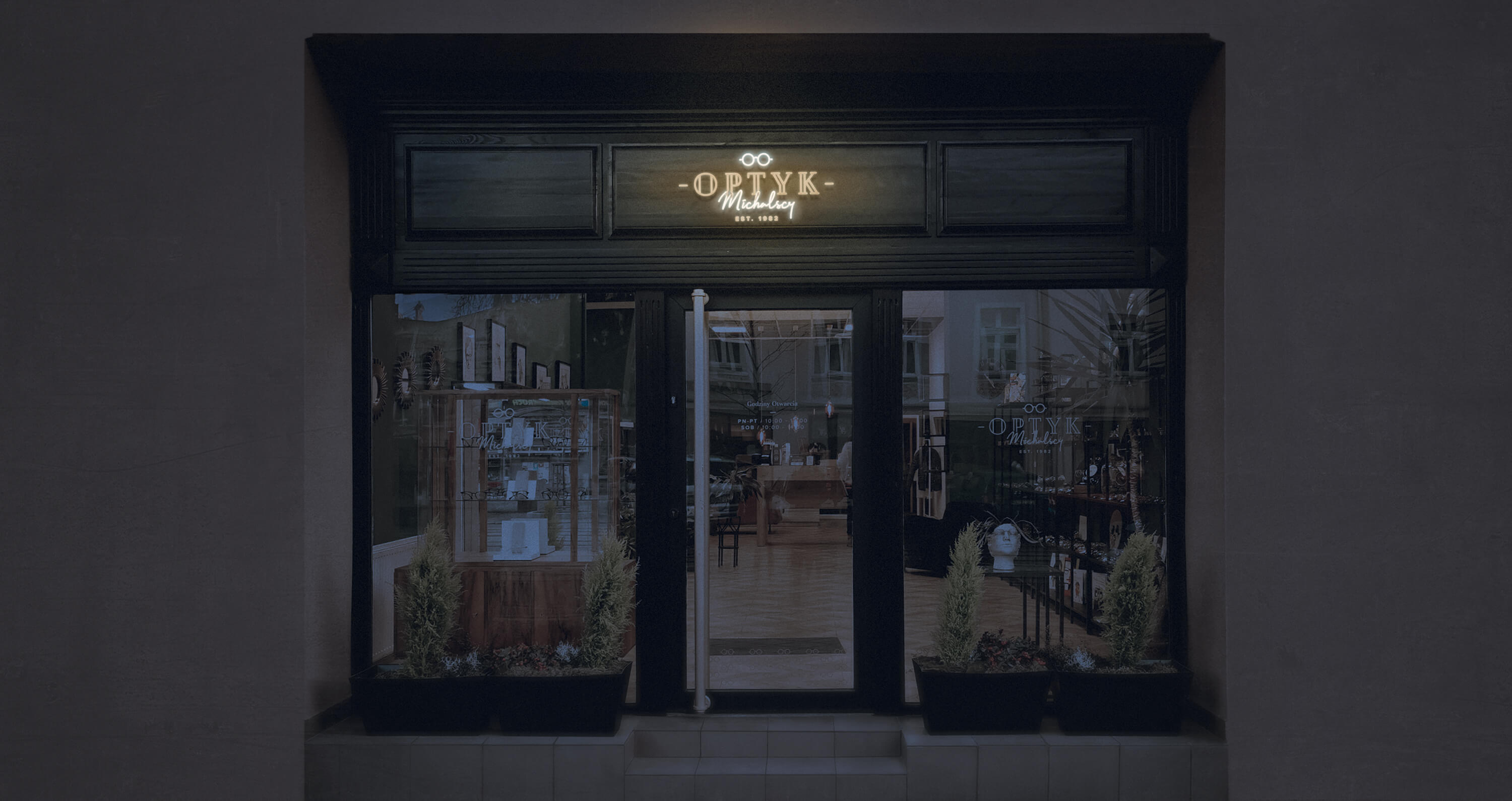
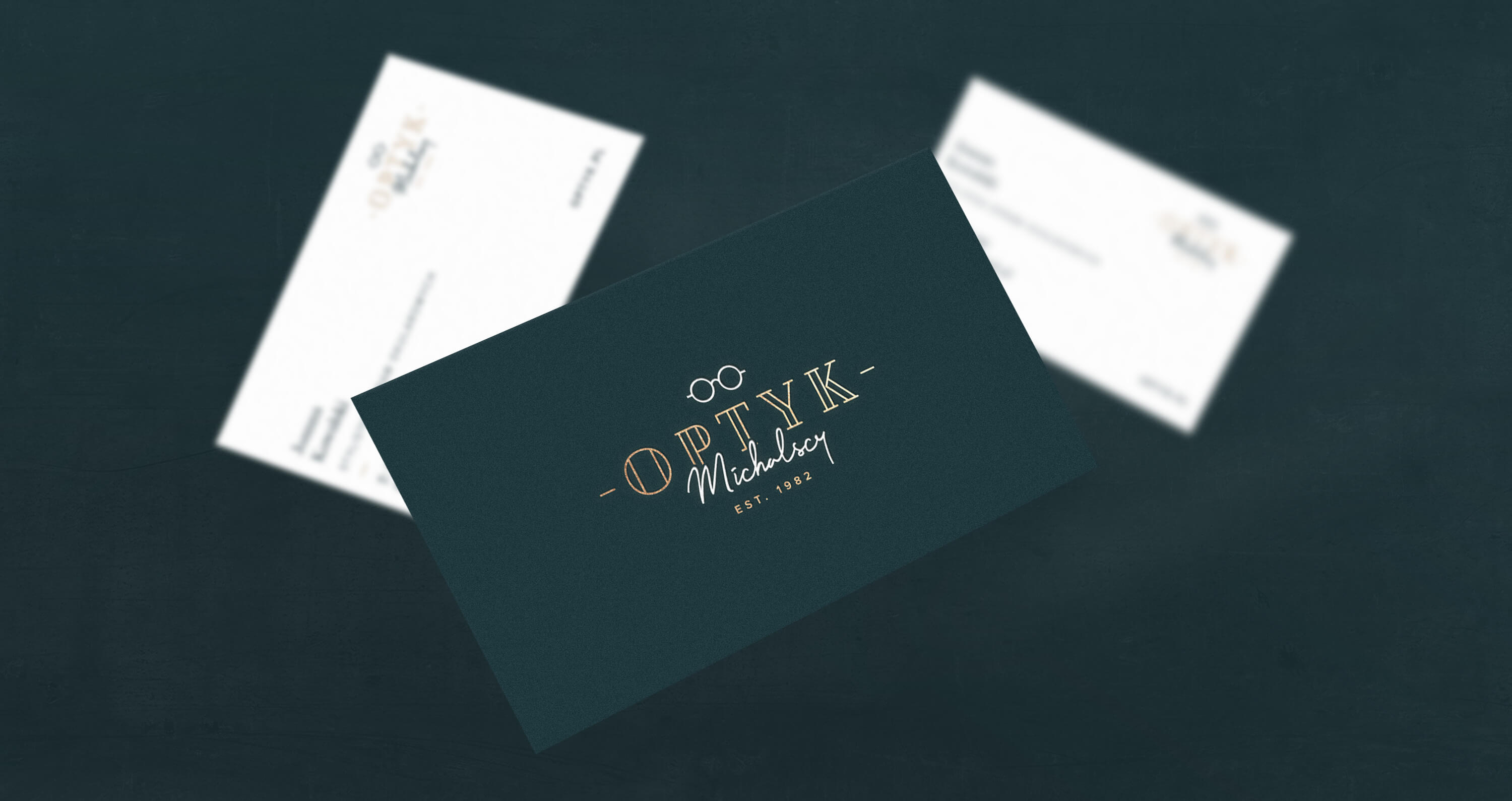
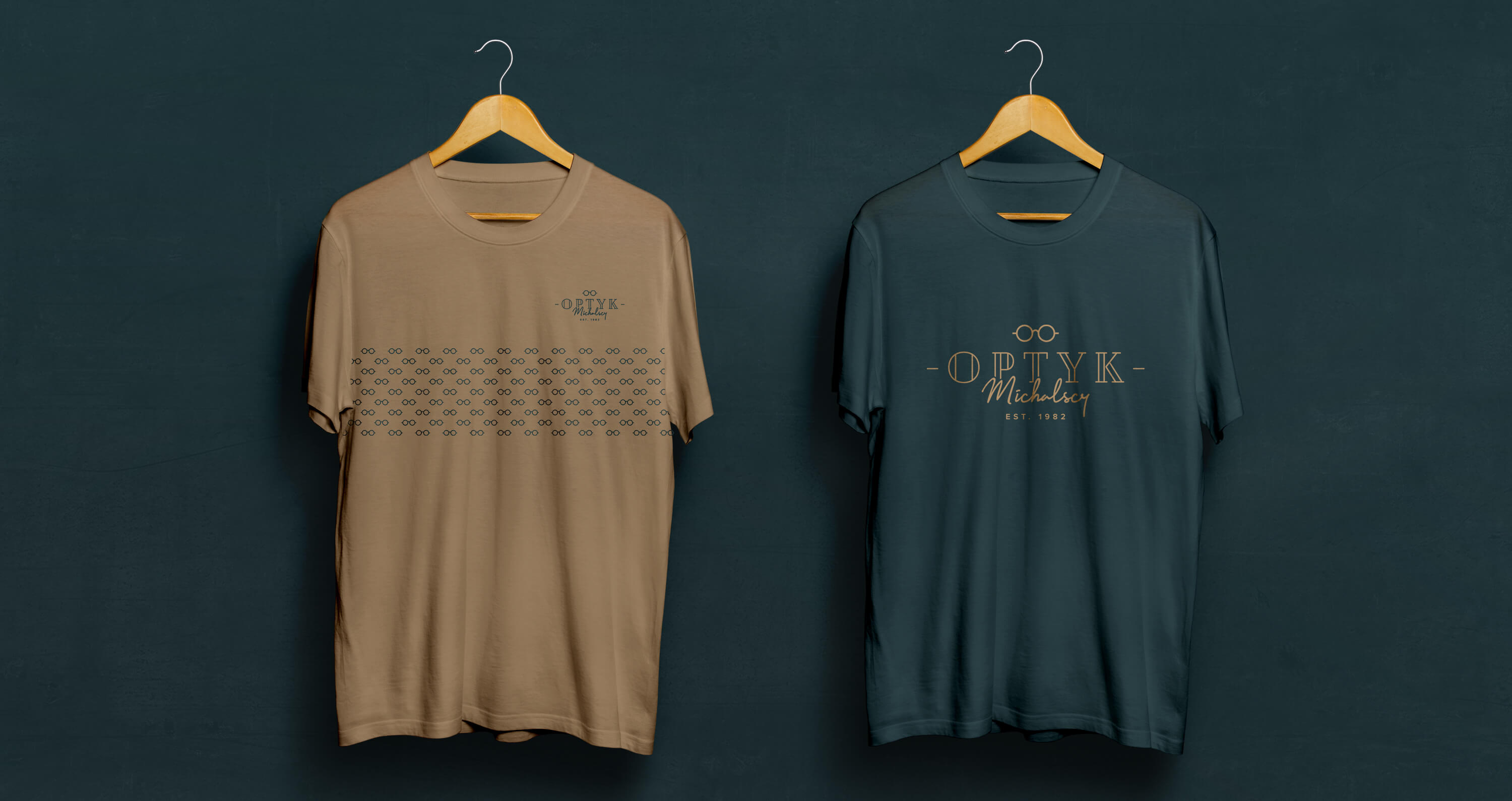
The Michalscy visited us with a question about refreshing the image of an optical company in Bydgoszcz. Thanks to great communication with the client, we quickly found a common language and established an action plan. The idea was to create a classic and elegant visual identity that will fit into the atmosphere of Gdańska Street. We started with the preparation of the basic element of corporate identity, i.e. the Logo, which will be diversified by the unique optical salon website. Meeting customer needs and to achieve a clear message, the word “Optician” is the main element of the logo. To enhance the reception effect, a minimalist eyeglass icon is added. To give it a more personal touch, the name of the founders is added in the style of handwriting. The concept also assumed that the logotype could be used as a neon to refer to the history of the most famous shopping street in Bydgoszcz, which in the 80s’ shimmered with a palette of glowing colors.




CREDIT
- Agency/Creative: Belgrav Studio
- Article Title: Belgrav Studio Refresh the Brand of Optyk Michalscy Optician
- Organisation/Entity: Agency, Published Commercial Design
- Project Type: Packaging
- Agency/Creative Country: Poland
- Market Region: Europe
- Project Deliverables: Brand Advertising, Brand Design, Brand Identity, Brand Redesign, Brand Refinement, Brand World, Branding, Packaging Design, Rebranding
- Format: Bag
- Substrate: Pulp Paper


