


A Wine Label Redesign for Bien Nacido’s Estate Tier Wines
Bien Nacido Estate is a name synonymous with premium quality wines. Established in 1973, the estate spans over 2,800 acres in the Santa Maria Valley of California, with 800 acres of vineyards that produce some of the best grapes in the region.
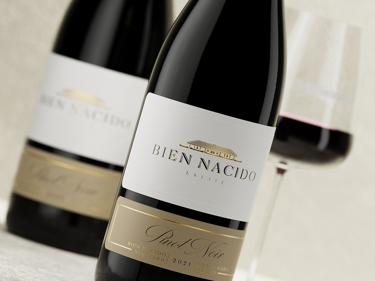
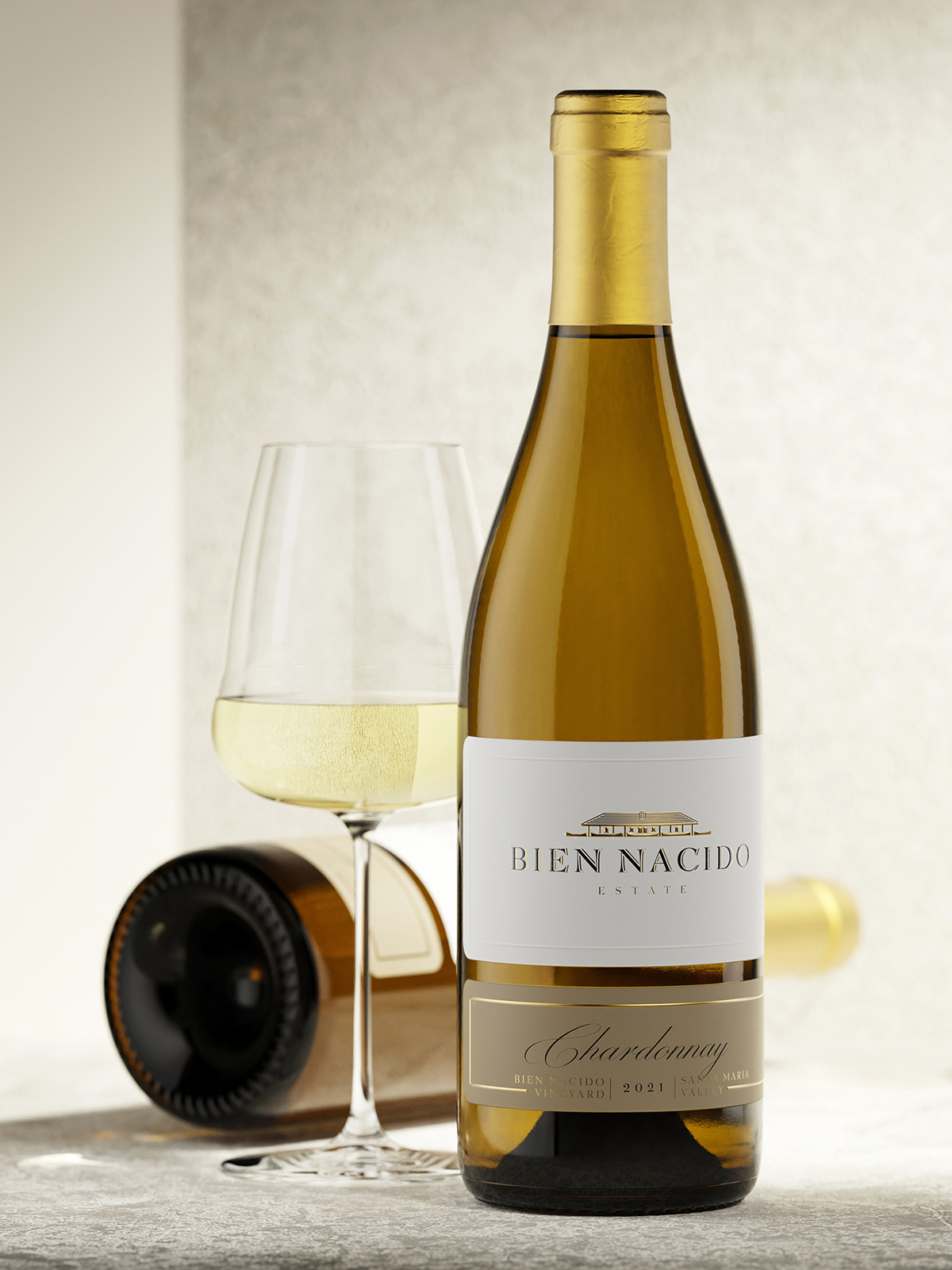
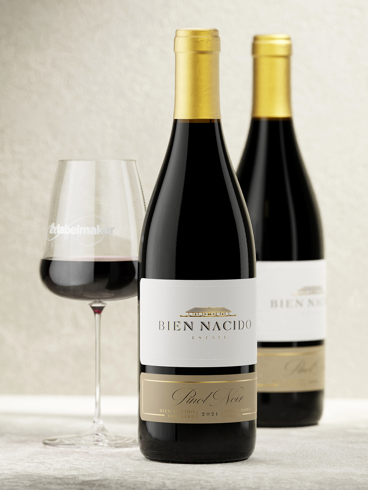
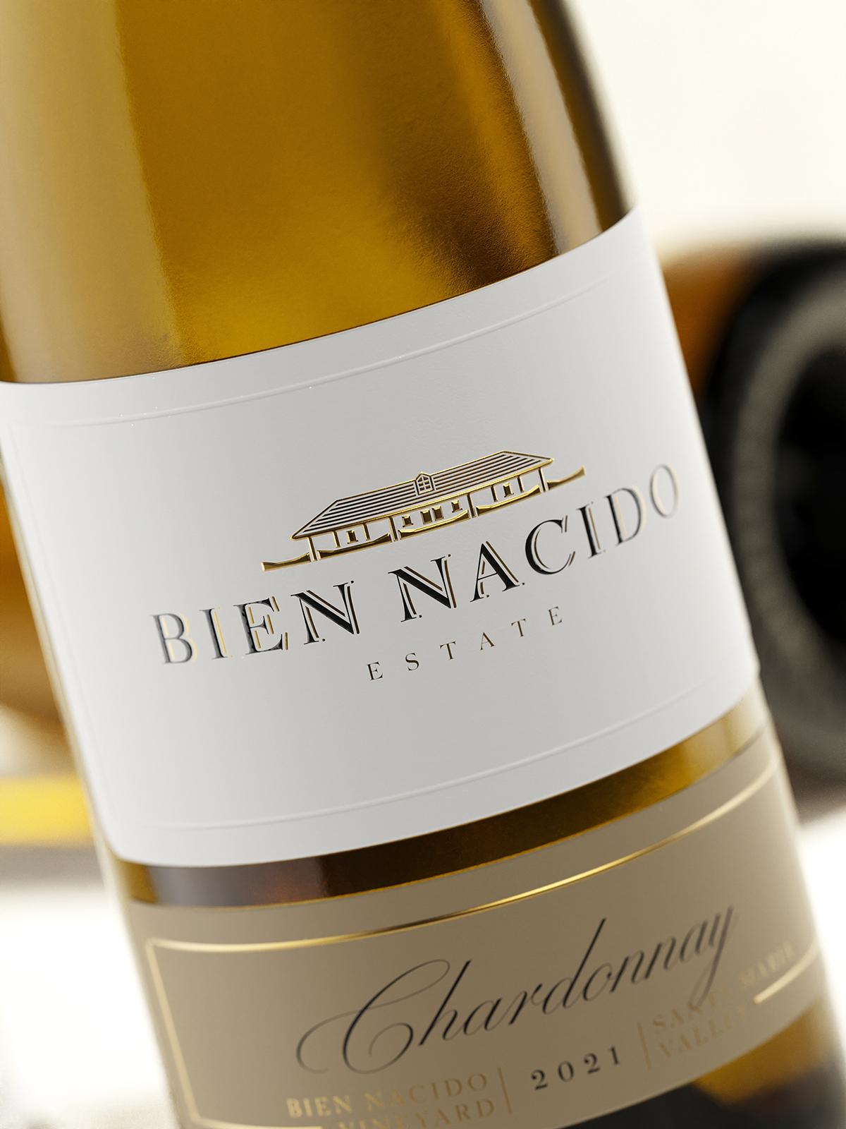
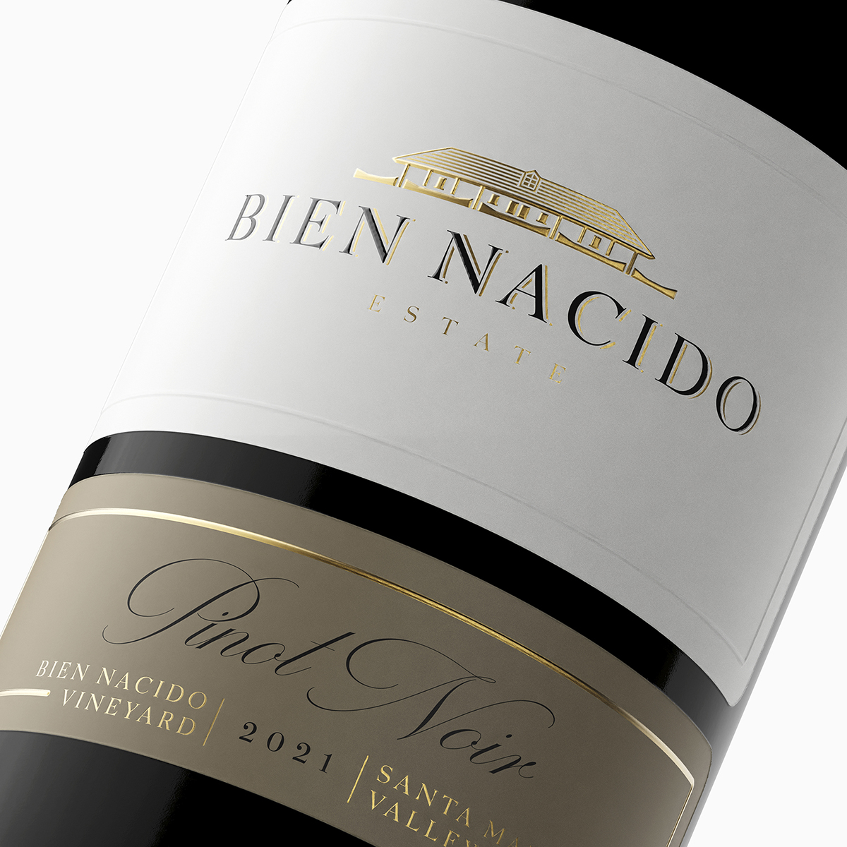
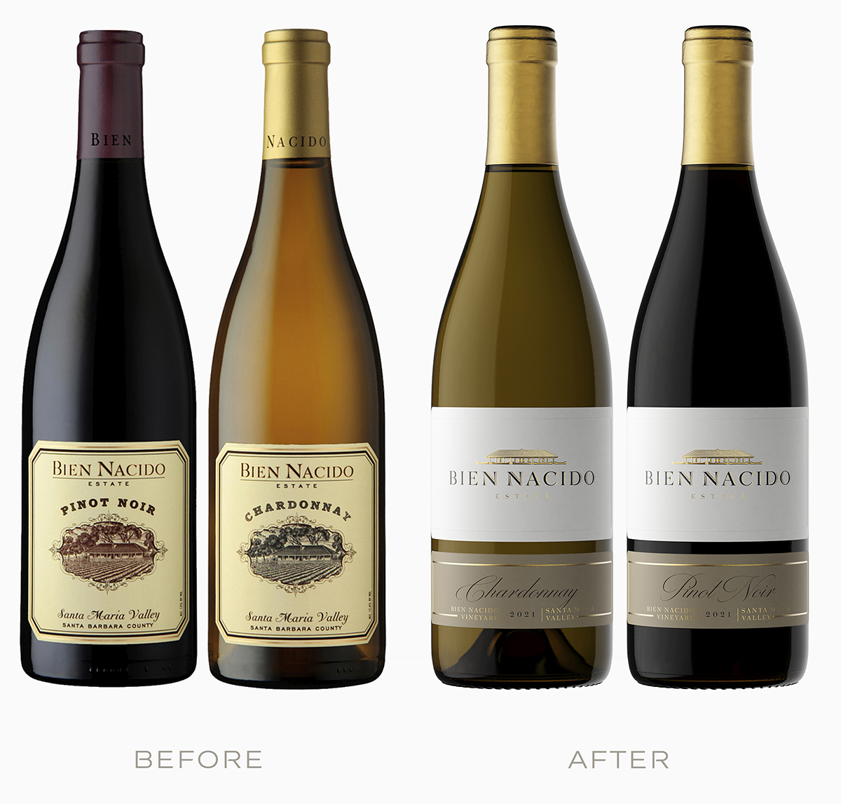
Recently, I had the honor of working on the redesign of the existing wine labels for Bien Nacido’s Estate Tier wines. The old labels had a certain charm, but they were outdated and didn’t accurately reflect the premium quality of the wine inside. My goal was to create a new design that was sophisticated, elegant, and timeless, while paying homage to the vineyard’s iconic adobe house.
It all started with a excellent brief that I received from Tommy Gaeta, the marketing director of the Miller Family Wine Co. The brief was detailed, comprehensive, and provided me with all the information I needed to understand the request and work successfully on it. In fact, I could use Tommy’s brief as an example of how to create such briefs for other clients.
Working closely with Tommy and his team, I designed a new label that features the adobe house of Bien Nacido in a gold-foiled embossing on premium paper. The label is a two-part design that elegantly complements the classic burgundy bottle with its gold capsule. The new label exudes a timeless elegance that creates a premium and high-class look, positioning the Estate Tier wines on the top shelf where they belong.
To ensure that the new label lived up to our vision, we turned to Dagaprint.com, a world-renowned printer that specializes in high-quality printing. Their attention to detail and precision were second to none, resulting in a perfect print job that captured every detail of my design.
The collaboration between myself, the Bien Nacido team, and Dagaprint.com resulted in a very classy new label design that elevates the Estate Tier wines to new heights. It’s a perfect example of how the right design can capture the essence of a wine and create a visual representation of its superb quality.
This project was a testament to the power of collaboration, and I’m grateful to have been a part of it. And stay tuned for more, as a second wine label redesign project will soon be unveiled!
CREDIT
- Agency/Creative: the Labelmaker
- Article Title: Before and After Elevating the Elegance
- Organisation/Entity: Freelance
- Project Type: Packaging
- Project Status: Published
- Agency/Creative Country: Bulgaria
- Agency/Creative City: Sofia
- Market Region: North America
- Project Deliverables: CGI, Graphic Design, Label Design, Packaging Design
- Format: Bottle
- Substrate: Glass Bottle, Pulp Paper
- Industry: Food/Beverage
- Keywords: the labelmaker, wine label art, wine label designer, wine label design, wine design, wine branding, wine label print, hot foil stamping, microembossing, gold hot foil, label printing, wine label print, embossed wine label, jordan jelev, bien nacido estate, bien nacido vineyard, california, napa valey, santa maria valley, santa barbara county, miller family wine company
-
Credits:
Client: Bien Nacido Estate
Wine Design & CGI: the Labelmaker


