


In today’s wellness and energy market, brands compete in a sea of similarity. Clean ingredients. Functional benefits. Promises of better, faster, modern energy. While packs may look different, the narratives often mean the same thing.
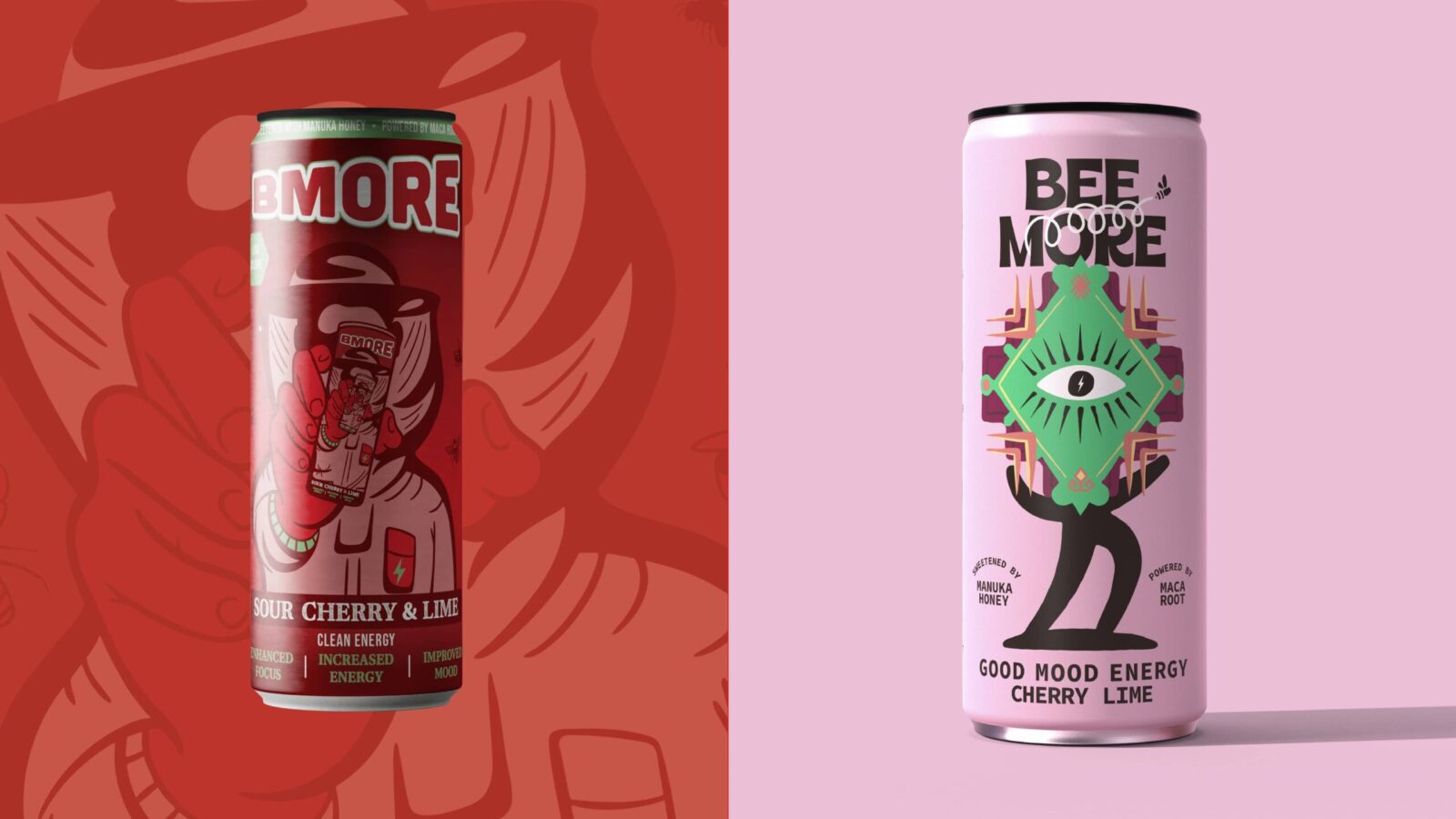
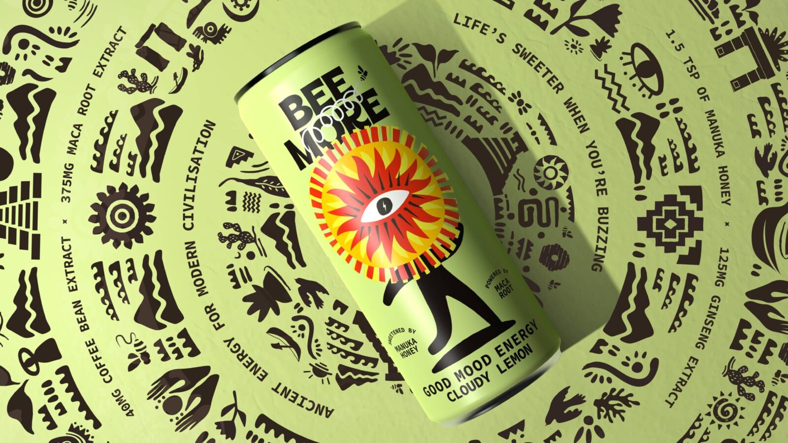
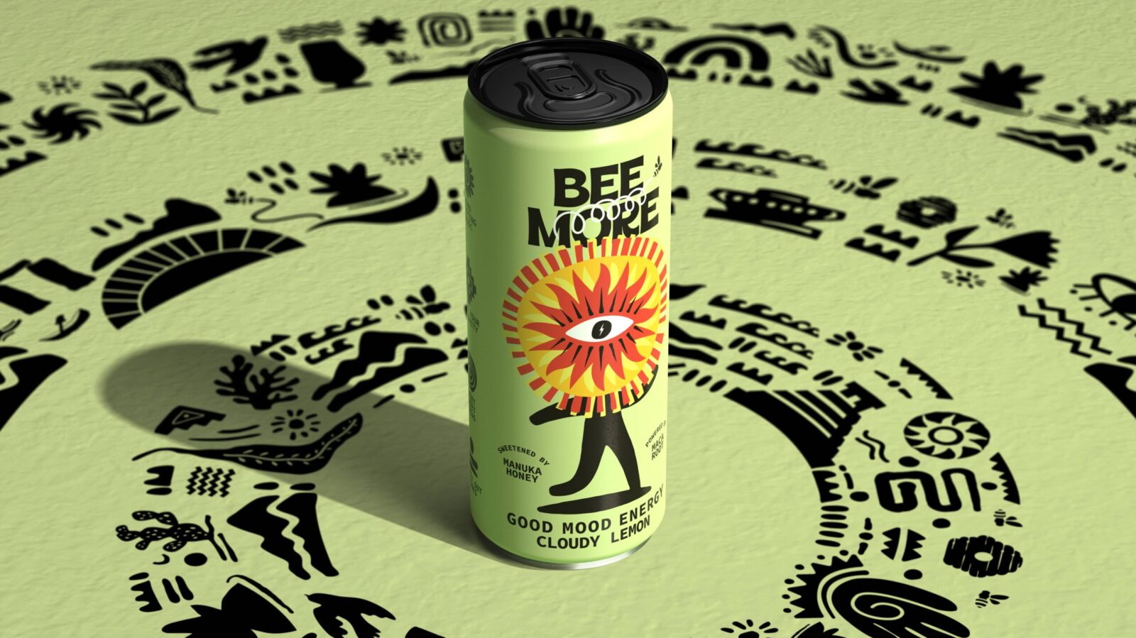
When BEEMORE approached Boundless Brand Design, the product itself was not the problem. Powered by manuka honey and maca root, it delivered genuine efficacy. But the brand lacked the depth and belief system required to stand apart. It existed as a product on shelf – not as a world consumers could step into.
The challenge was clear: build a brand powerful enough to compete, scale and endure.
To do this, first we needed to define what energy should mean.
Rather than amplifying claims or adding more functional language, Boundless identified the need for a central organising belief – something strong enough to align product, design and storytelling.
Then, we anchored BEEMORE in a clear worldview: Ancient Energy for Modern Civilization.
Inspired by lost civilizations and time-tested sources of strength, this idea reframes energy as proven rather than invented, sustained rather than explosive, and balanced rather than extreme. It moves the conversation away from synthetic stimulation toward enduring vitality rooted in nature and history.
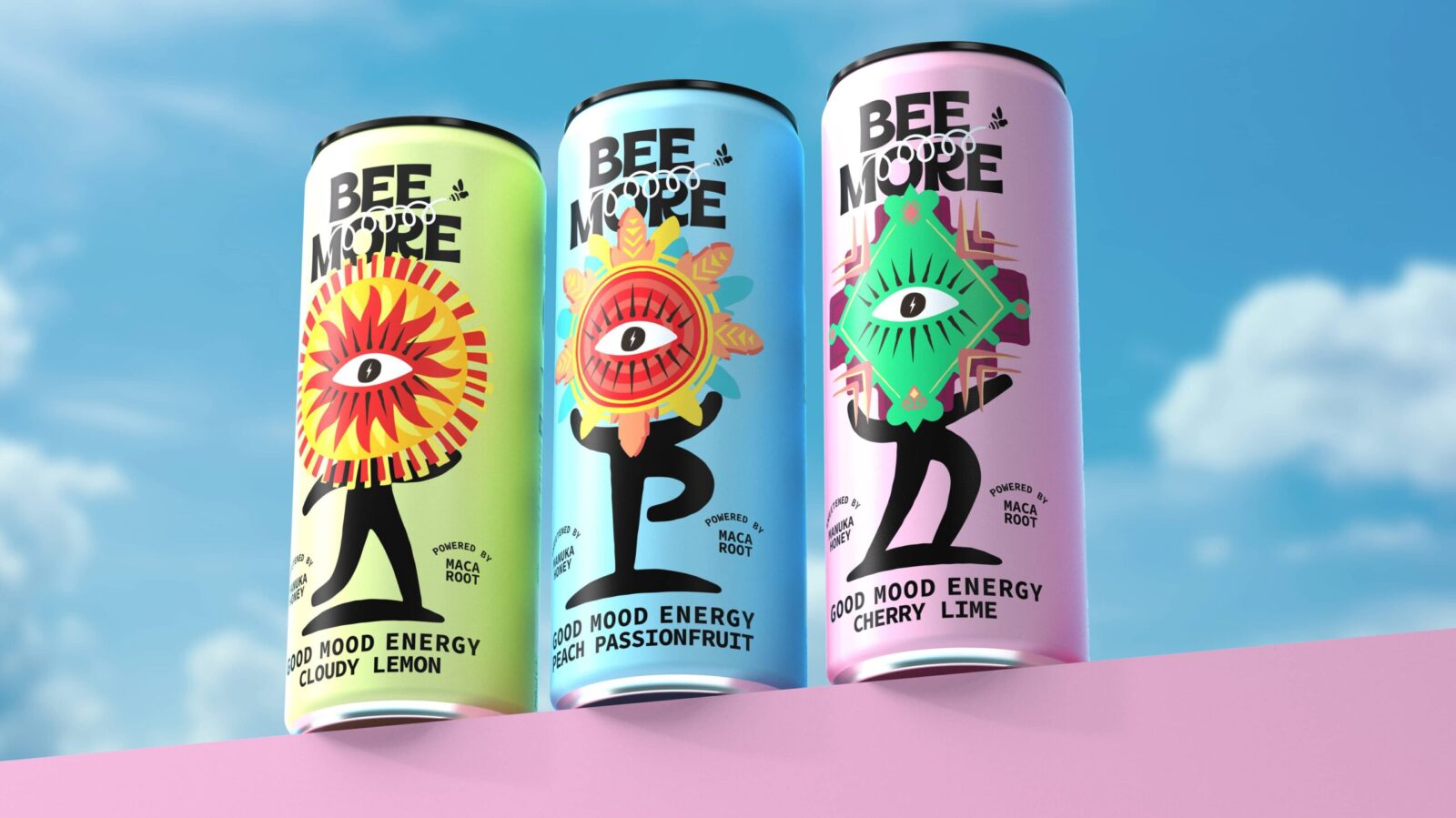
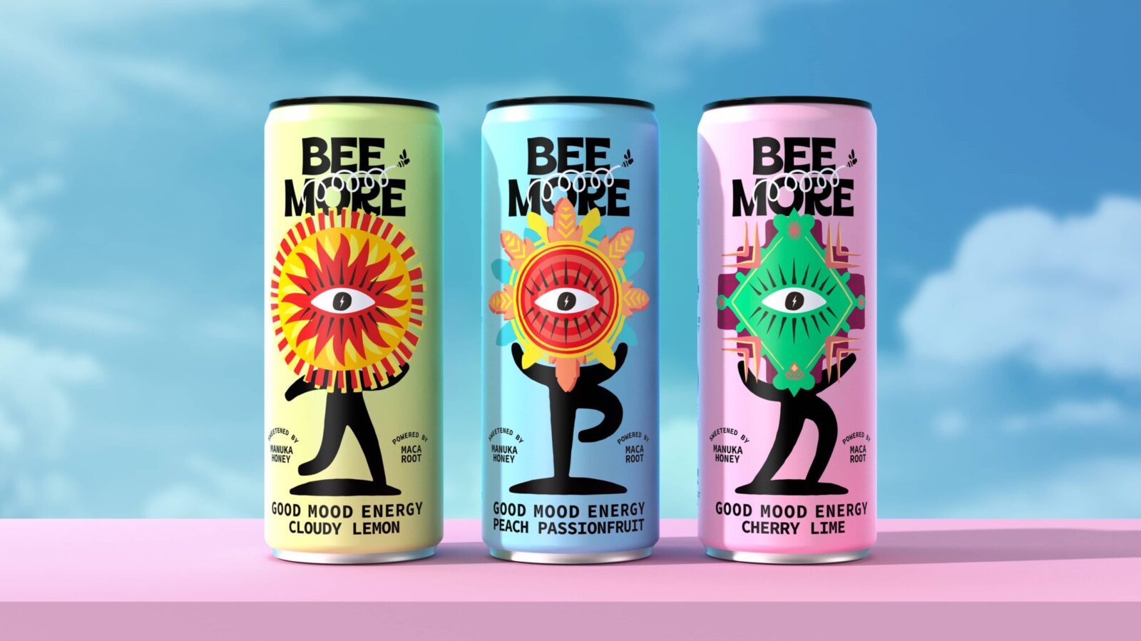
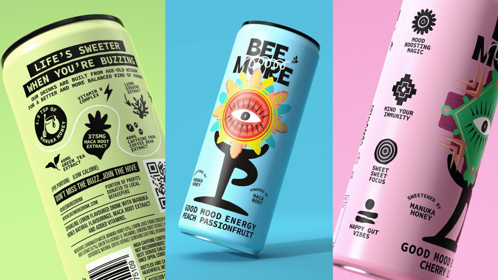
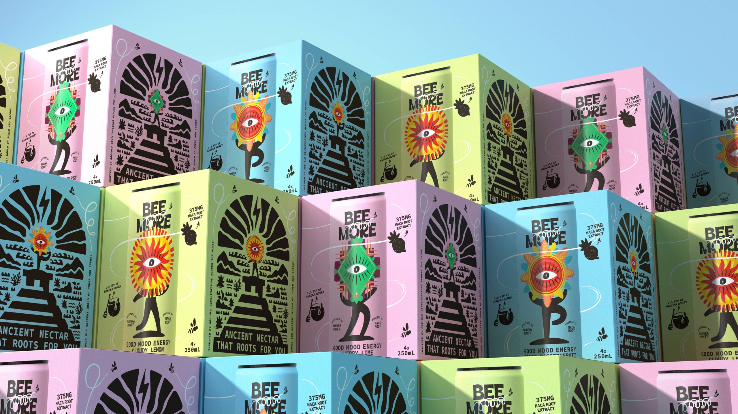
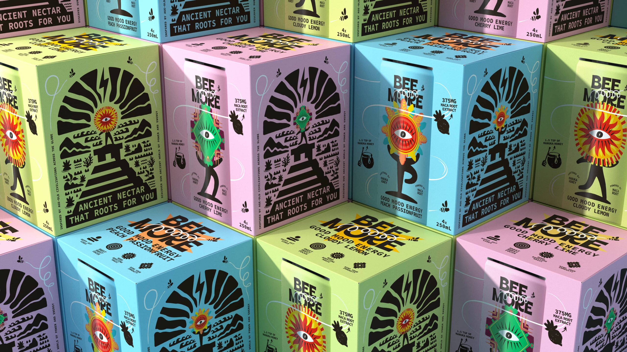
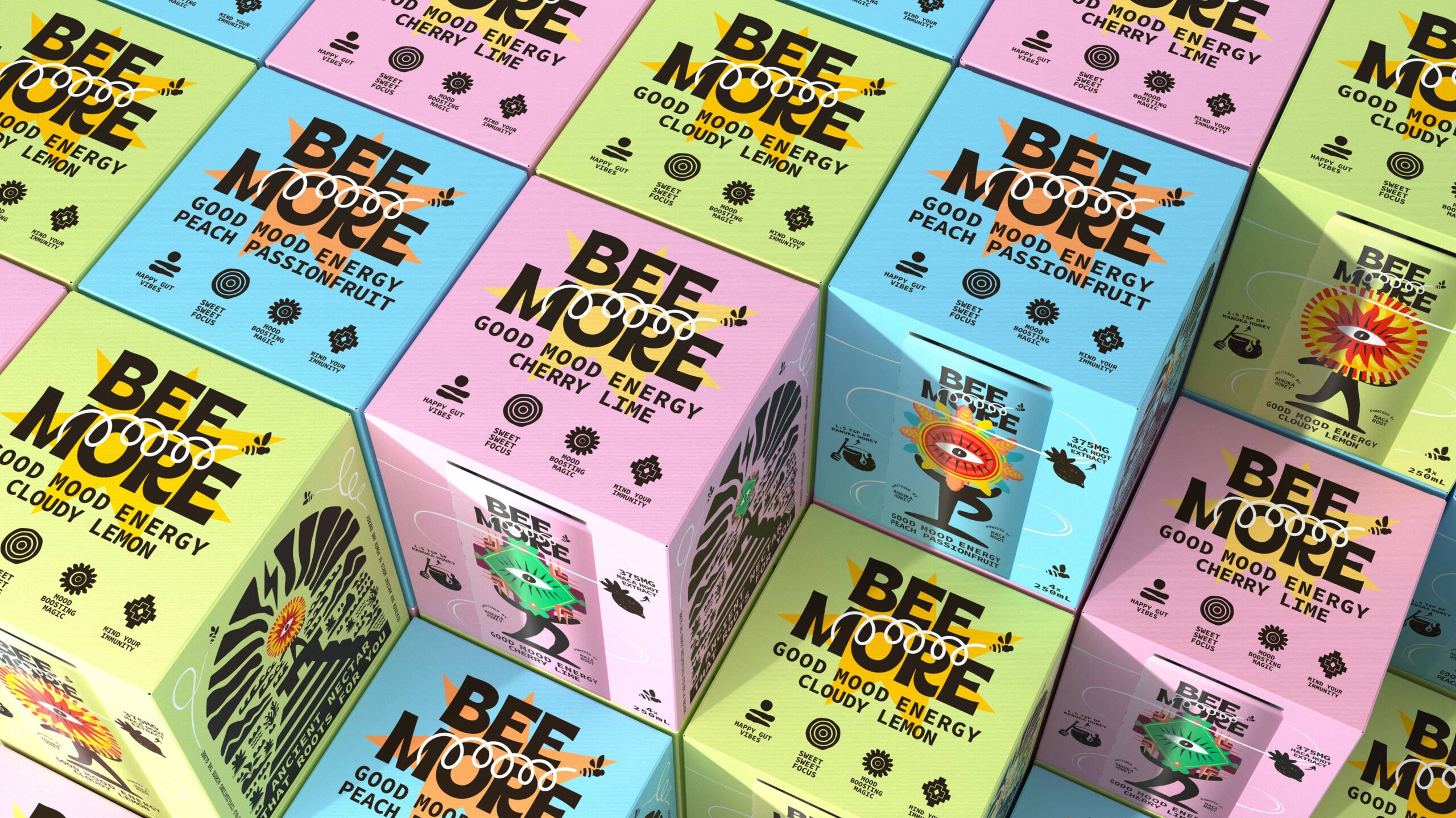
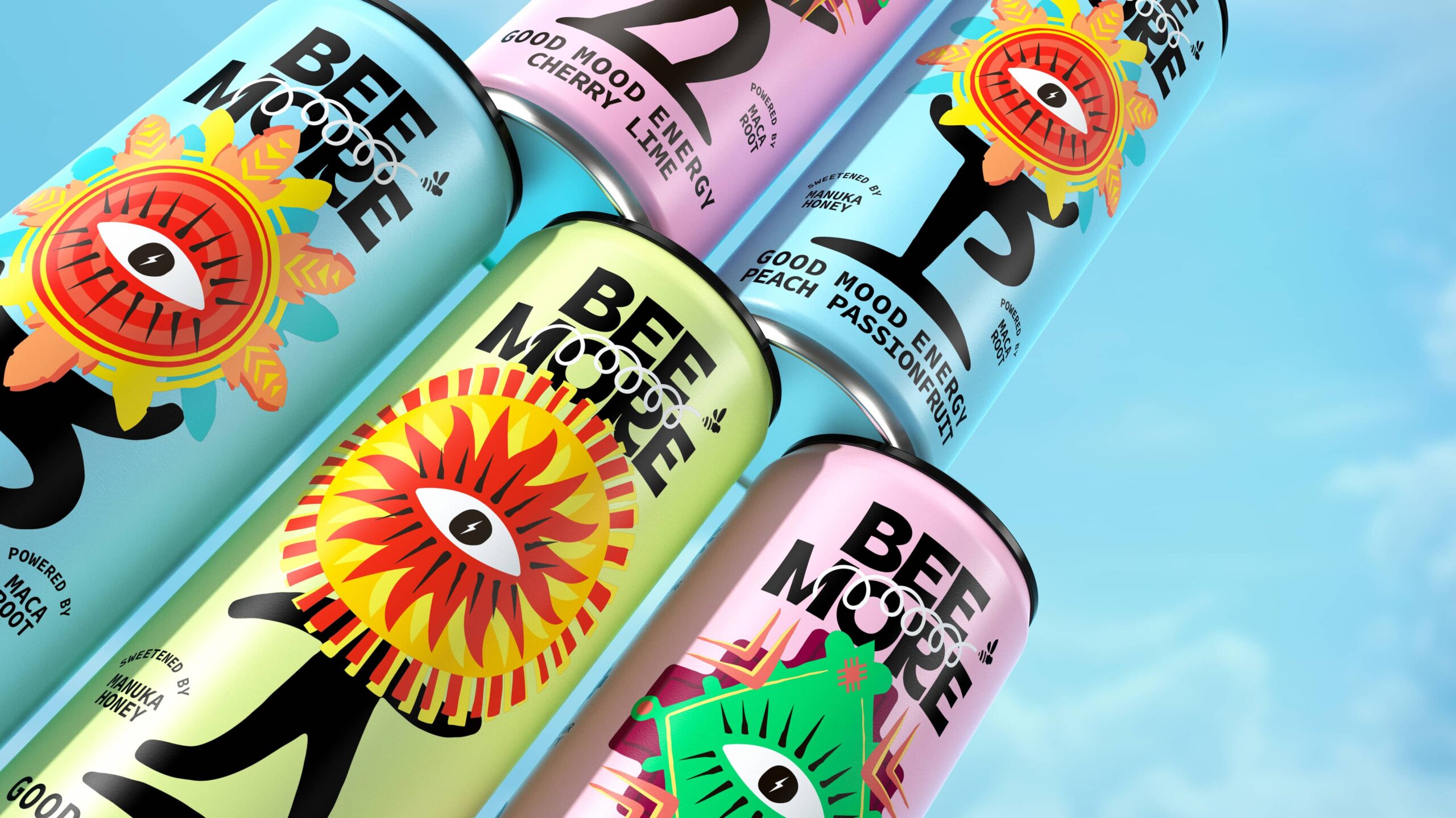
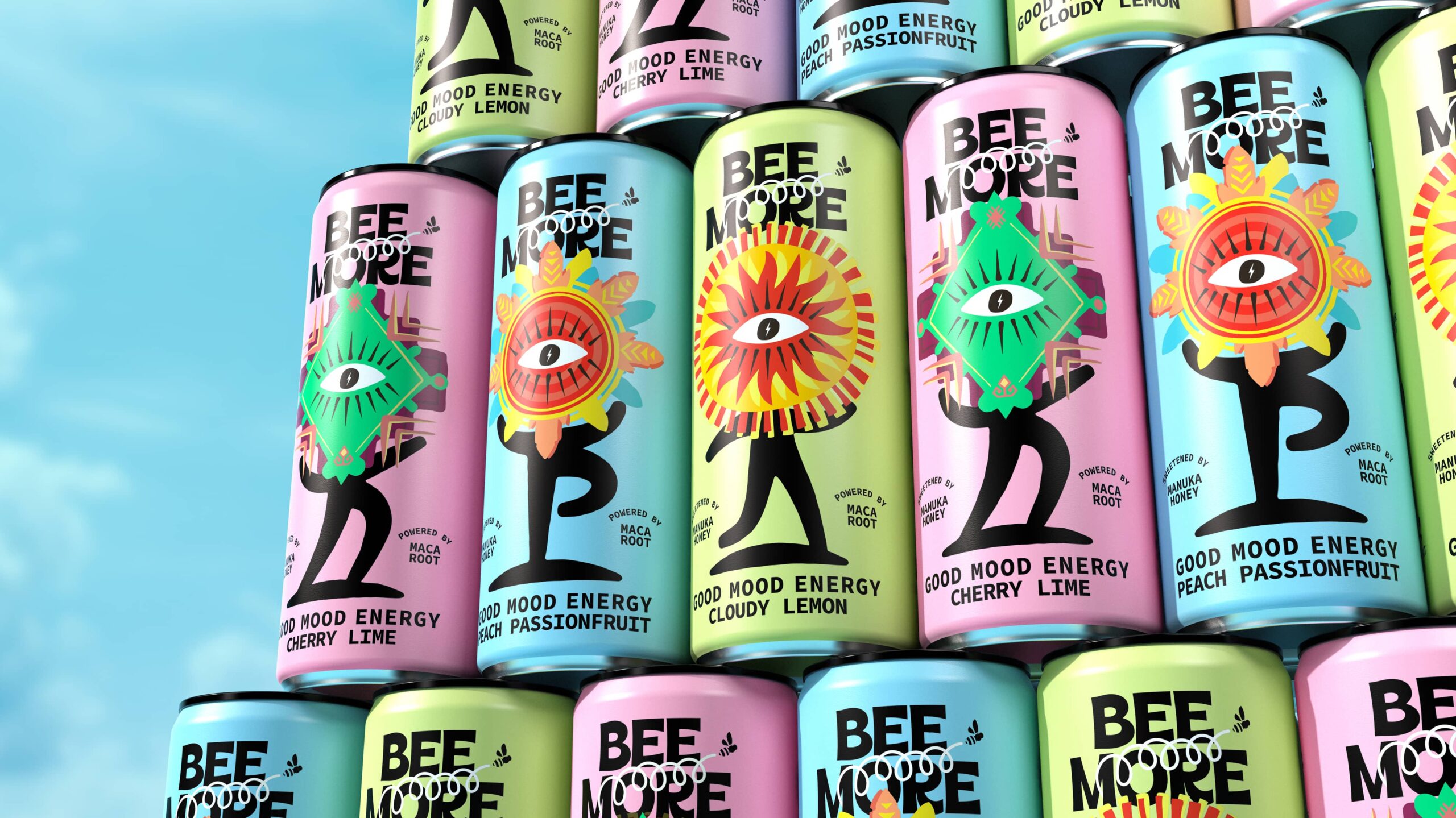
Totemic characters were developed as symbolic representations of key benefits, giving the product range a distinctive and expandable architecture. Graphic forms and iconography drew inspiration from ancient inscriptions and monumental architecture, creating a visual grammar grounded in ritual, hierarchy and meaning.
This was not decorative storytelling. It was a world with rules – a coherent system that could scale across SKUs, formats and future innovation.
Typography and colour were crafted to balance human imperfection with modern clarity, ensuring the brand felt expressive and contemporary rather than nostalgic. Every design decision followed the same internal logic, enabling cohesion without rigidity.
The result is a brand that doesn’t borrow attention through louder claims or fleeting trends. It creates its own territory.
In one of the most crowded categories in FMCG, BEEMORE demonstrates the power of choosing a belief – and giving it a world to live in.
Hamish Shand, Founder & Executive Creative Director, Boundless Brand Design says “Most energy brands compete at the level of claims – louder benefits, faster results, cleaner formulas. But the real challenge isn’t volume, it’s meaning. With BEEMORE, the product already had integrity. Our role was to elevate it from a functional proposition into a belief system people could buy into.
By anchoring the brand in Ancient Energy for Modern Civilisation, we shifted the conversation from short-term stimulation to sustained, time-tested vitality. Once that belief was clear, everything else – the symbols, the structure, the visual language – flowed with purpose. We didn’t just design a pack. We built a world with rules, one that gives BEEMORE the authority and flexibility to grow without losing its soul.”

CREDIT
- Agency/Creative: Boundless Brand Design
- Article Title: Beemore Energy Drink by Boundless Brand Design Redefines Natural Energy on Shelf
- Organisation/Entity: Agency
- Project Status: Published
- Agency/Creative Country: United Kingdom
- Agency/Creative City: London
- Market Region: London
- Project Deliverables: Brand Guidelines, Brand Redesign, Brand Strategy, Brand World, Illustration, Packaging Design
- Industry: Food/Beverage
- Keywords: WBDS Agency Design Awards 2025/26 , Energy Drink, Brand Redesign


