Information Resources Inc. (IRI) and The NPD Group (NPD) announced their merger on April 12, 2022, and its completion on August 1, 2022. IRI was a leading innovator in providing data, analytics, and consulting services to the CPG industry, while NPD provided market information and advisory services for general merchandise, including technology and retail, as well as food service and food consumption. Despite the 45 years of brand equity built by IRI and over 50 years for NPD, management felt strongly that retaining one or both of the existing brands was not an option. They embarked on the bold strategy of creating an entirely new, innovative brand with a completely fresh identity that focused on the future rather than reviving the past.
Any brand change is a big commitment. It involves trademarking, physically implementing the change in offices, and committing to telling and building a story. Coming up with a new name was a complex challenge in itself when there are 100,875,478 active trademarks globally. The new name and tagline also needed to resonate appropriately in all countries where the company operates, which added another level of difficulty.
Circana looked at a wide range of brand types, such as those that describe an attribute or accolade, such as Progressive; names that are “clarifying combos,” such as YouTube; and others that were “signifying objects,” such as Target. A brand equity study was conducted in 30 countries across North America, EMEA, and APAC to understand the perception of its legacy companies among clients and the broad market. That study was followed by extensive research, including a comprehensive survey of over 750 IRI and NPD clients and prospects, more than 40 in-depth, one-on-one interviews with clients, industry, and media analysts, and live online listening sessions involving over 570 employees from both organizations across the globe.
This research resulted in the generation of 2,700 potential new brand names, 200 logo concepts, and 1,100 taglines. Additionally, the company conducted two linguistic studies spanning 22 languages and markets, which served as a critical step in making the final decision.
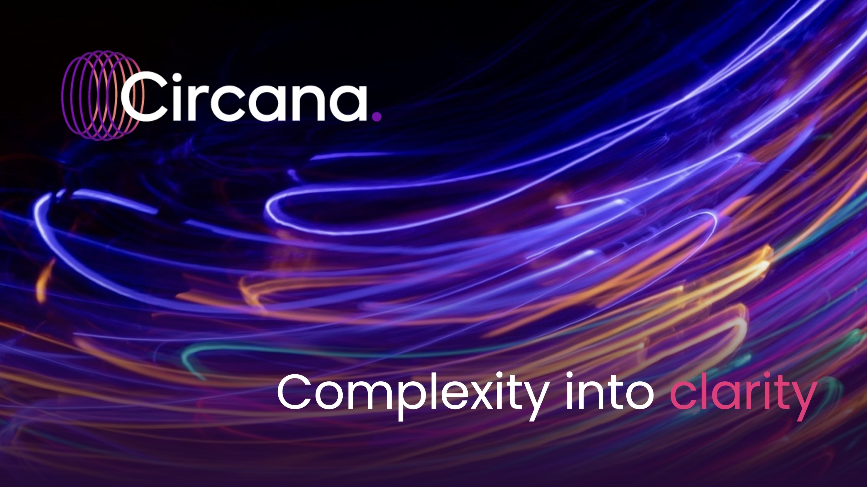
Circana, with the accompanying “Complexity into Clarity” tagline, was the best option to communicate a new direction. Since the root name of “Circana” is a circle, it reflects Circana’s value proposition of bringing a complete 360-degree view of the consumer to the industries it serves. The two “Cs” in Circana tie directly to the tagline “Complexity into Clarity” and its differentiator of enabling clients to “see the complete consumer.”
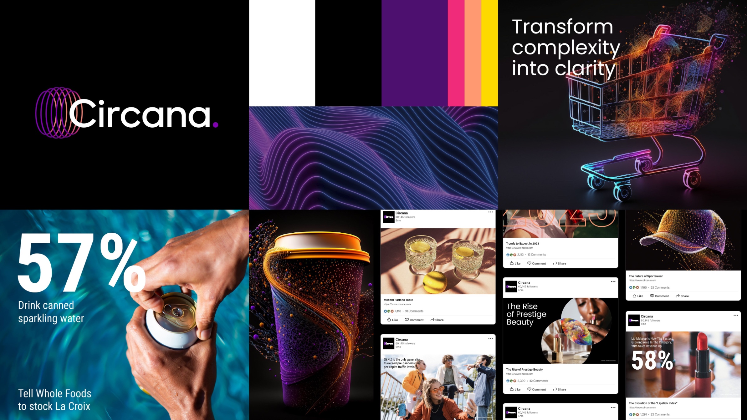
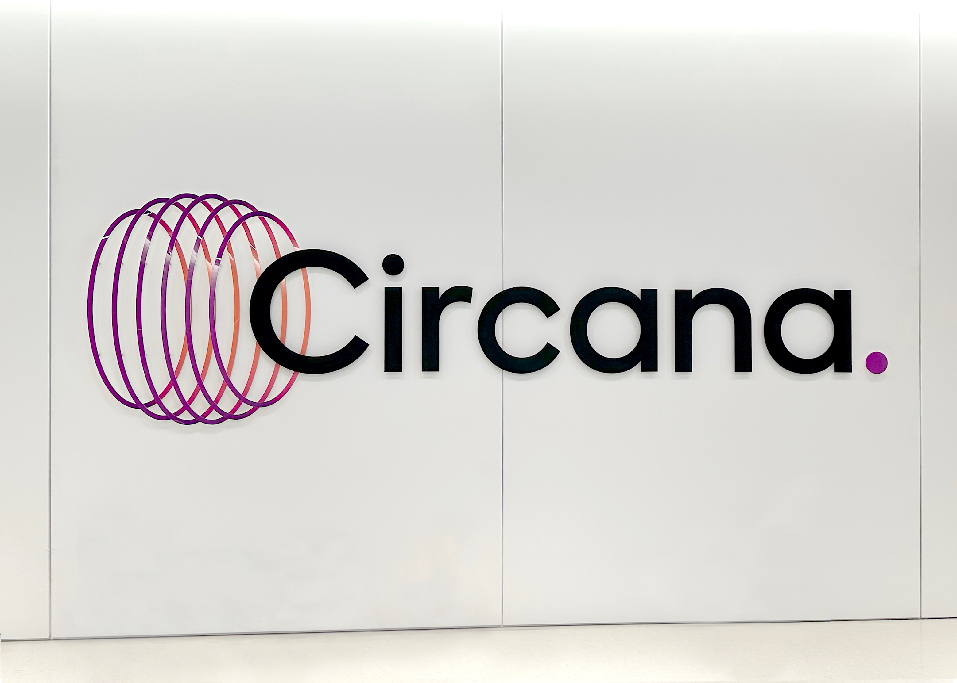
The logomark is six concentric circles representing the complexity of consumer data and the complexity of clients’ markets. The bold, modern wordmark appears to emerge from the symbol, reflecting how Circana is reinventing its business category and differentiating itself from competitors. Completing the logo is the clarity dot, a symbol of the ultimate clarity that Circana achieves as a result of embracing complexity.
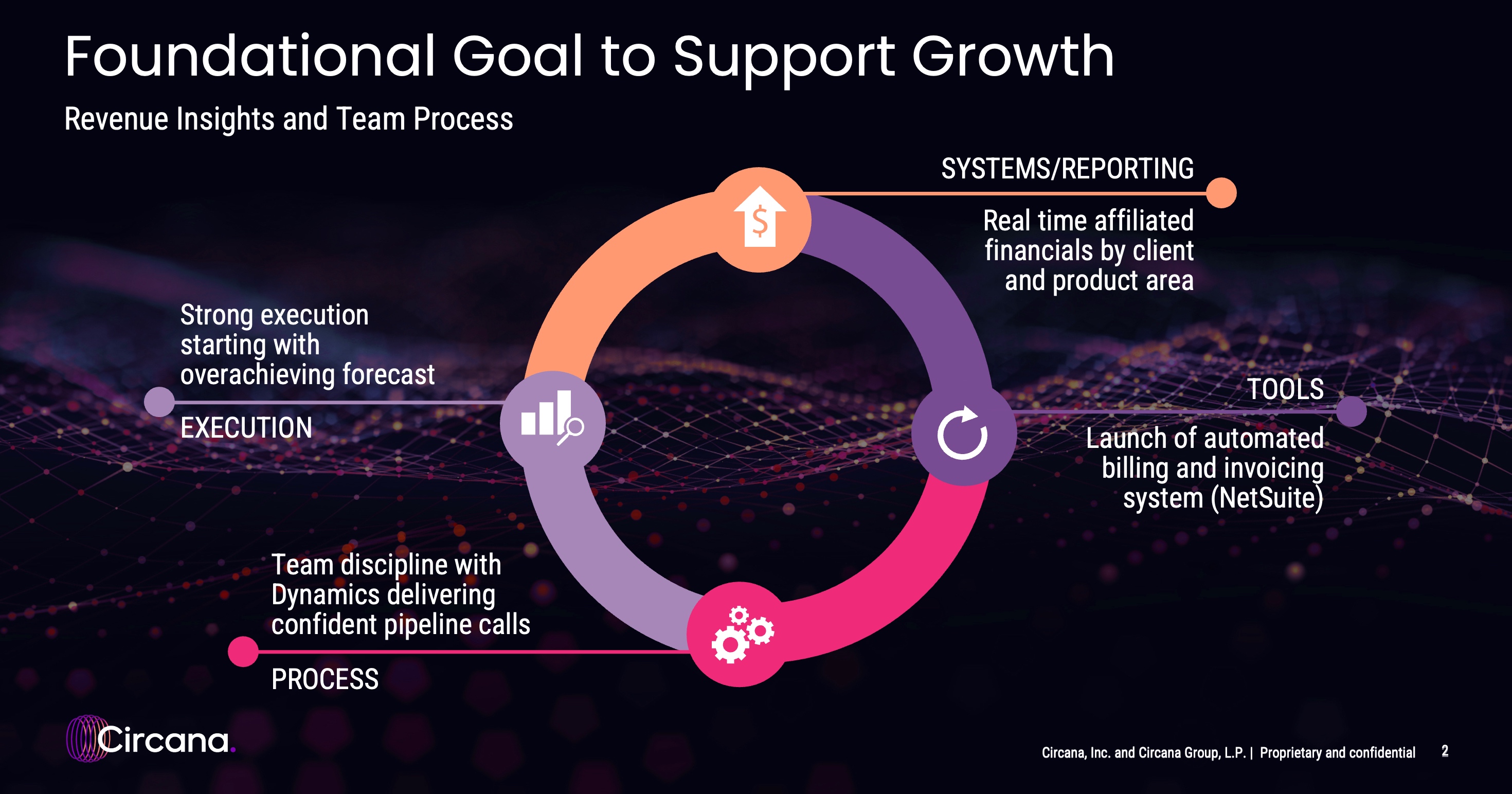
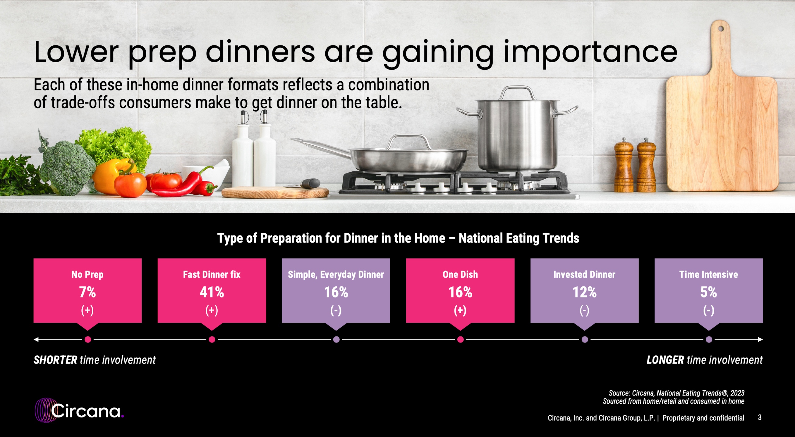
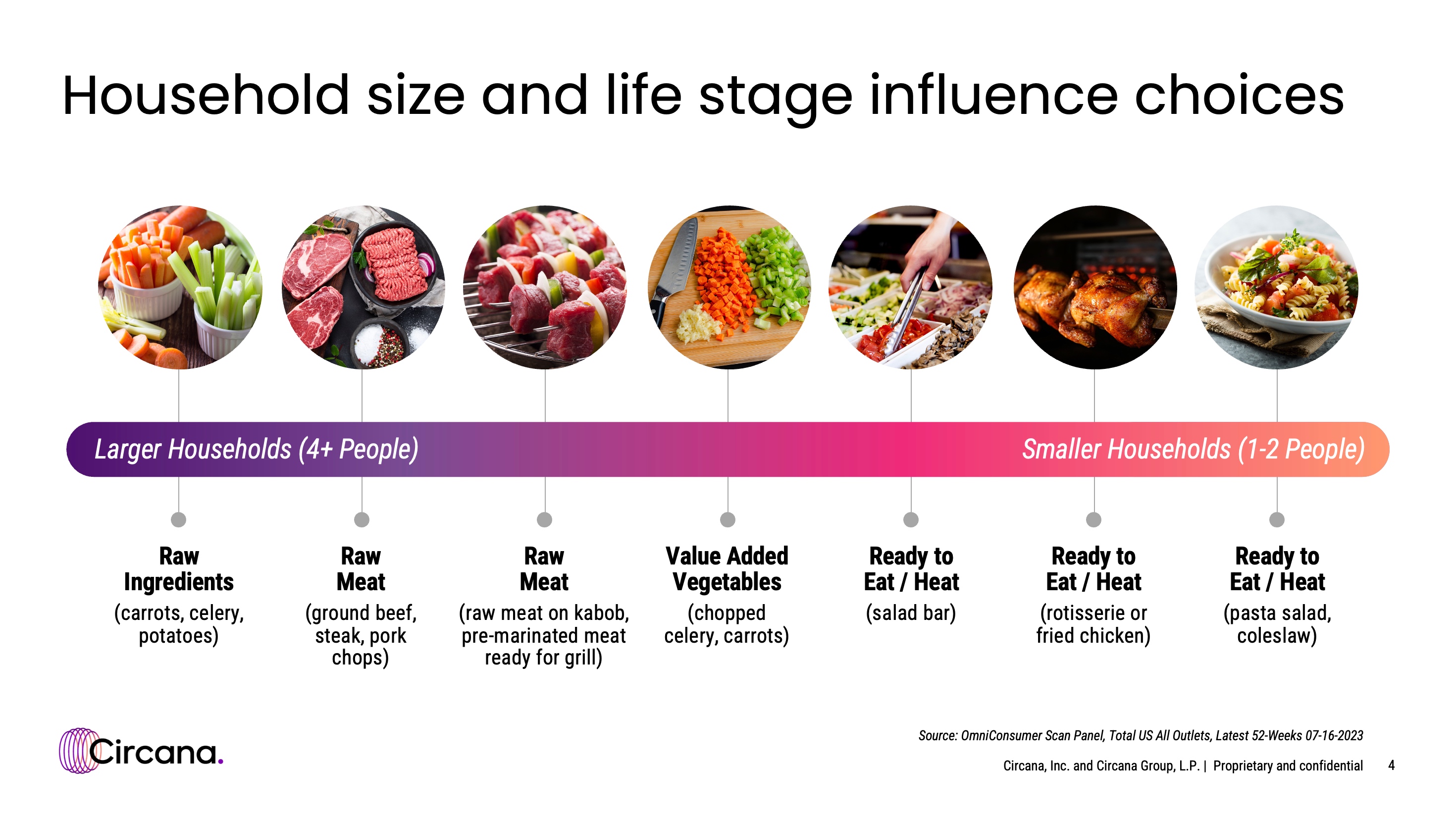
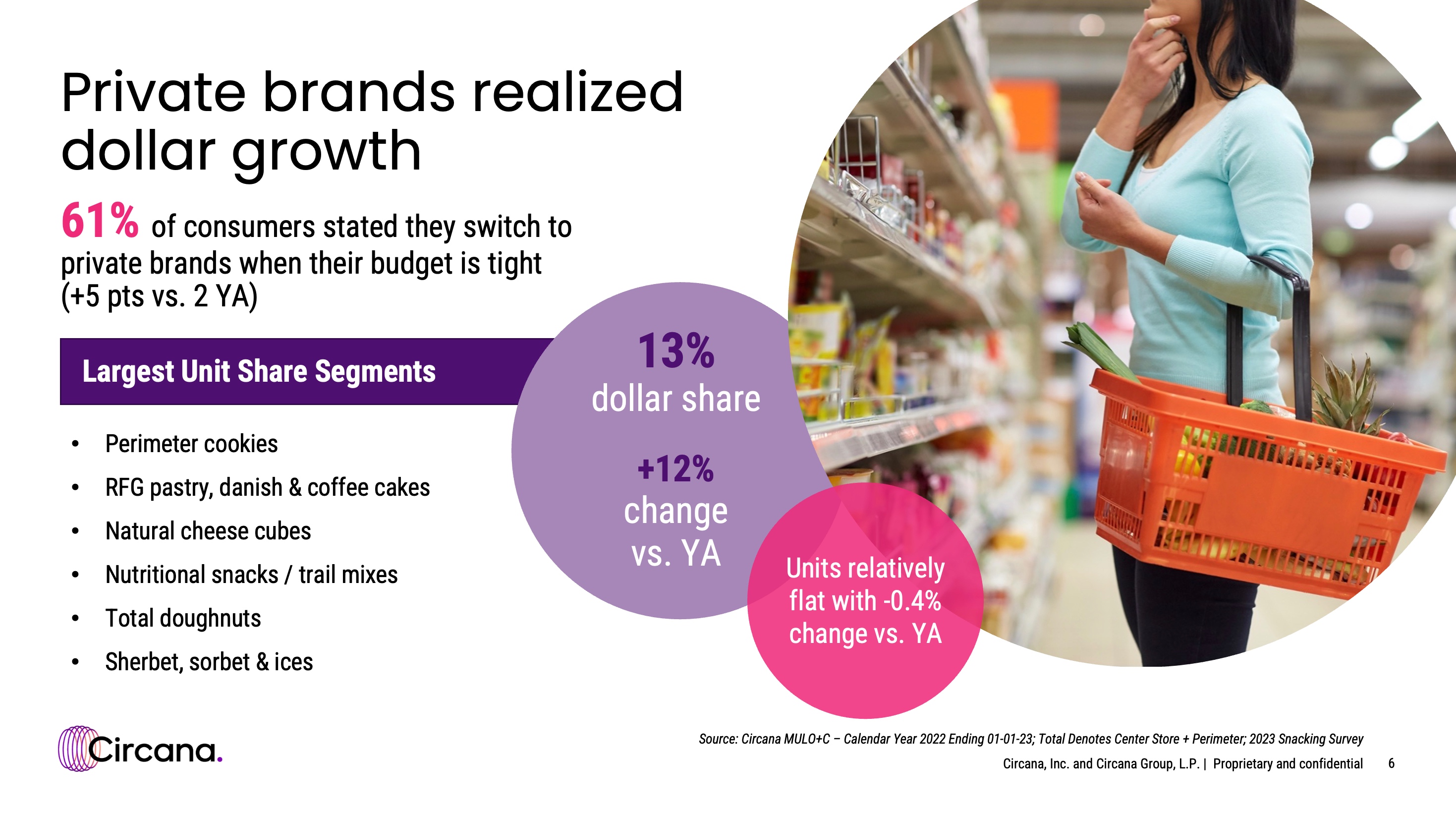
There’s an abundance of greens and blues among competitors in the industry, so Circana uses bold colors like black and purple with warm accent hues like magenta to set its visual identity apart. This color palette communicates a tech-forward vision while still feeling grounded and human. The font choices, Poppins and Roboto Condensed, were selected for a sleek, technological, and circular look while still compliant with accessibility needs. The visual approach carried through to photography and design elements. Circana’s photography features bold, vibrant moments in time to use in contrast with colorful abstract images to show the journey of complex, abstract data to a real-life, clear moment. Reports, presentations, and social media graphics use bold, warm colors paired with vibrant images and circles to create dynamic layouts.
The new brand identity was implemented across touchpoints internally and externally, including vibrant building signage, business cards, and all other marketing collateral. Circana shared an exciting brand launch video to its website and social channels on launch day. The video, which has garnered over 650,000 views on YouTube alone, honed in on Circana’s unique offering of the “Complete Consumer” view — bringing clarity to a world that is complex for its clients to navigate.
The press release announcing Circana earned 57 feature articles and 8.7 million unique views in two weeks, unheard of for a rebranding announcement of a private company. Circana also advertised its new brand by taking over Ad Age’s homepage for a day. Since Circana is headquartered in Chicago, two ad placements were featured on Chicago Tribune’s leaderboard and sidebar web pages for four days.
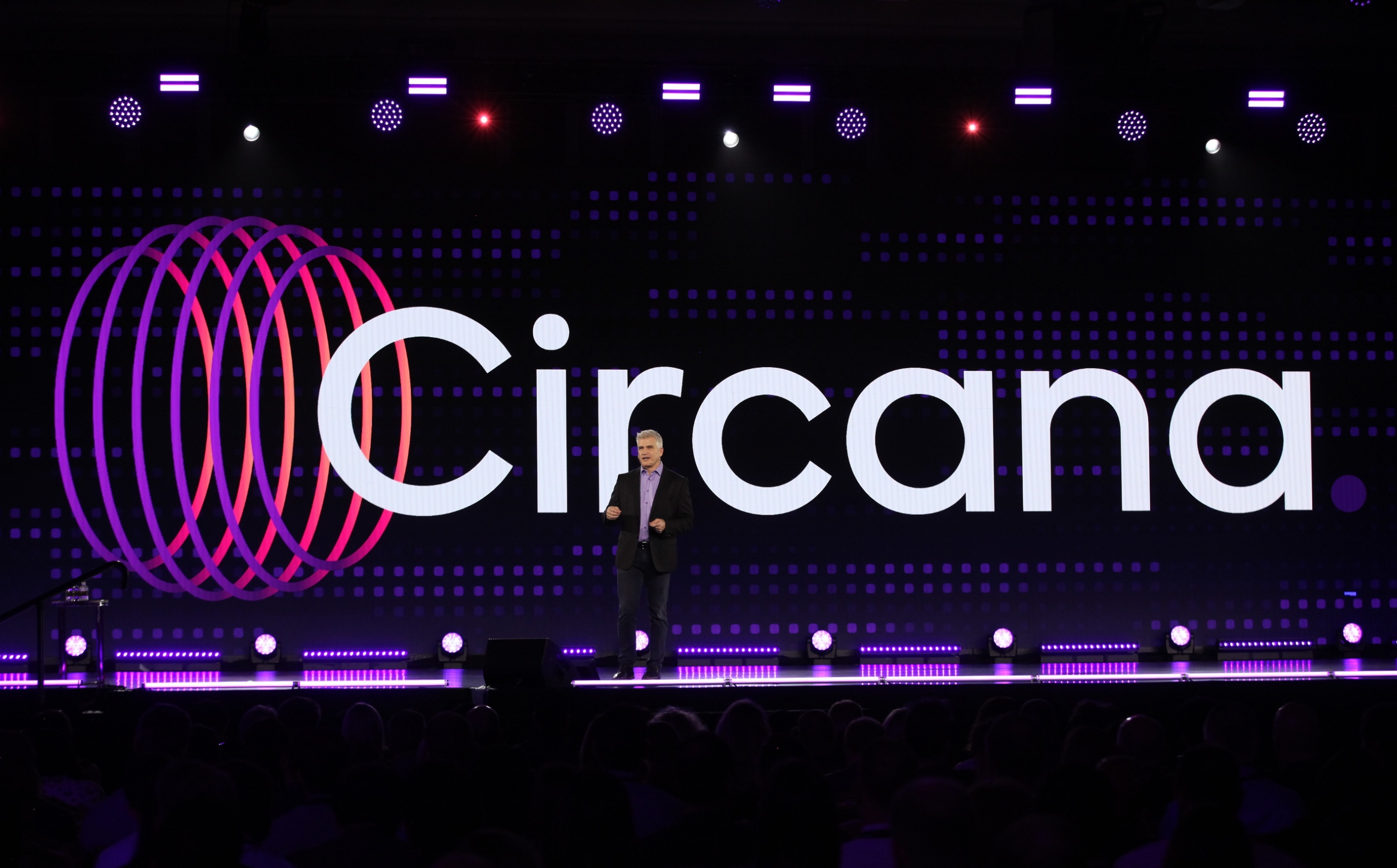
Taking place a mere two weeks after the rebrand announcement, the company held its flagship multi-million dollar annual event, Growth Summit, gathering 1,200 clients and partners for three days of insightful presentations and a showcase of Circana’s newest technology advancements.
Despite the challenges planning Growth Summit, including its first occurrence since 2019 due to the pandemic, a new planning team, vendors, and event production company, it emerged as an overwhelming achievement. Prior to the event, 44% of attendees had an extremely positive opinion of the brand and a post-event survey revealed an astounding 81% of attendees held an extremely positive opinion. This accomplishment serves as a testament to Circana’s rebrand success.


CREDIT
- Agency/Creative: Circana
- Article Title: Becoming Circana: IRI and NPD’s Exciting Rebrand
- Organisation/Entity: In-House
- Project Type: Identity
- Project Status: Published
- Agency/Creative Country: United States
- Agency/Creative City: Chicago
- Market Region: North America
- Project Deliverables: Brand Identity
- Industry: Technology
- Keywords: WBDS In-House Design Awards 2023/24
- Keywords: Identity, Brand Redesign
-
Credits:
Design Agency: Circana


