


About
From the latest GenZ movement and behavior, Beck’s Ice gathers their expression to announce the new rebranding movement with authenticity, unexpectation and thought-provoking. By unlocking new elements and breaking the previous appearance, Beck’s Ice becomes more relevant and true to its bold attitude ready for the new booming digital mediums, their Beck’Stage platform for underground culture & younger generations.
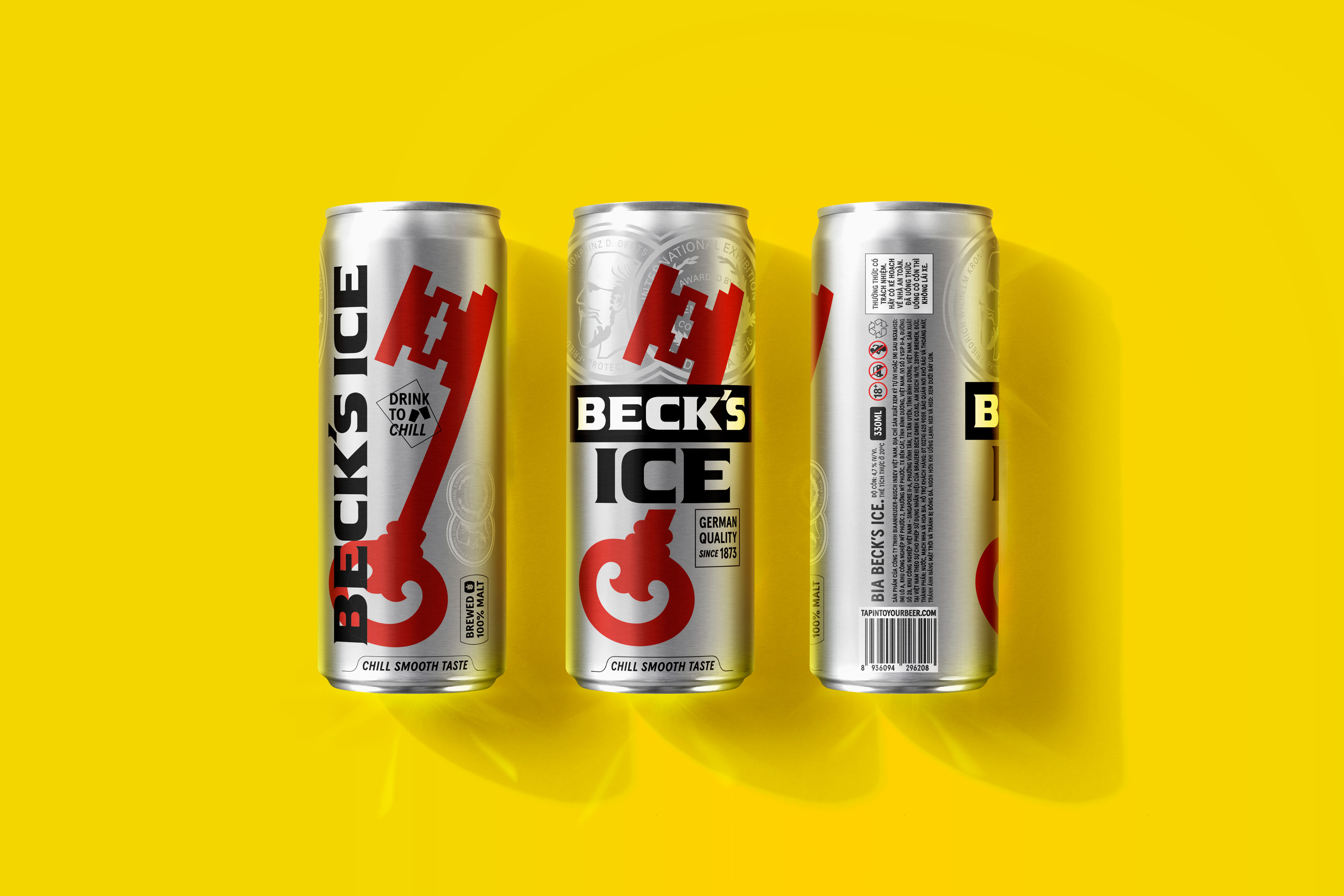
Logo
Aiming for better presentation on shelves and various types of usages on print and digital mediums, the new logo unlocks new possibilities for deconstructing multiple elements into new formats of logos such as the new Beckey as a supergraphic icon and many new forms of logotypes.
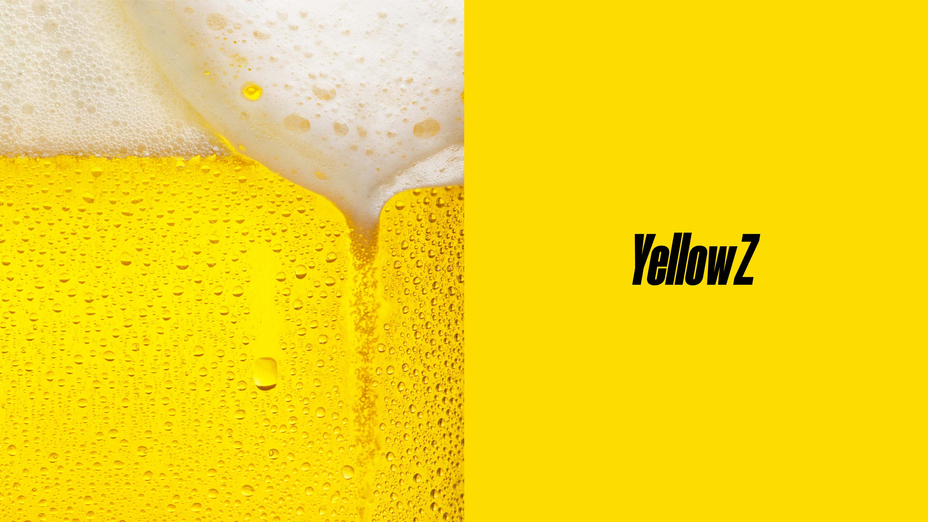
Color Palette
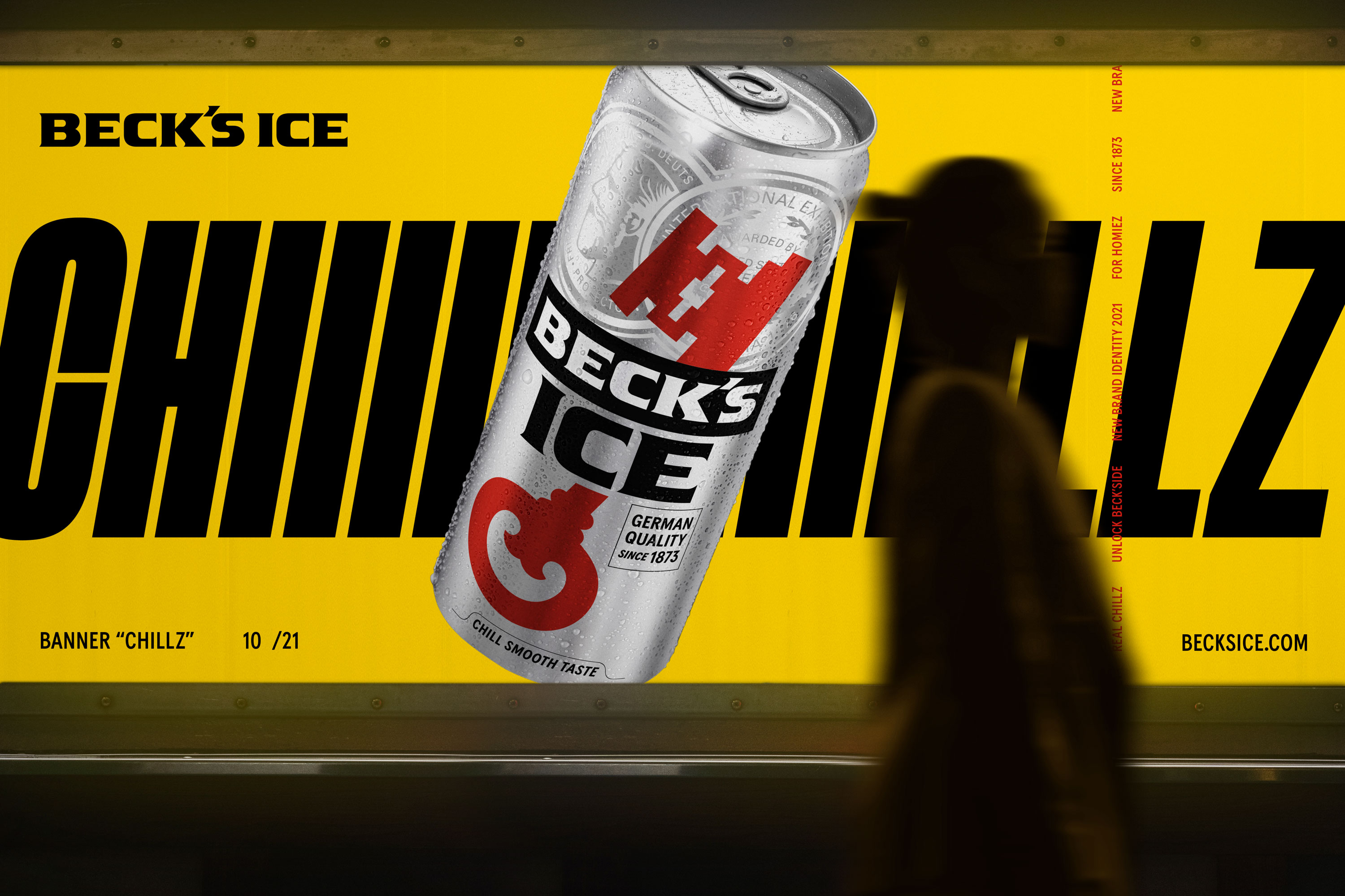
Inspired by the 100% malt German beer formula, the new color palette is called “German Palette” with the striking new YellowZ as te new main brand color and black, red and white as supportive colors.
Typography
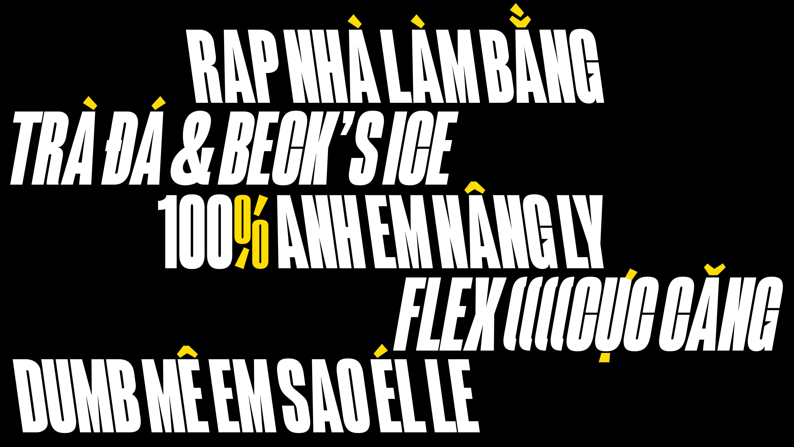
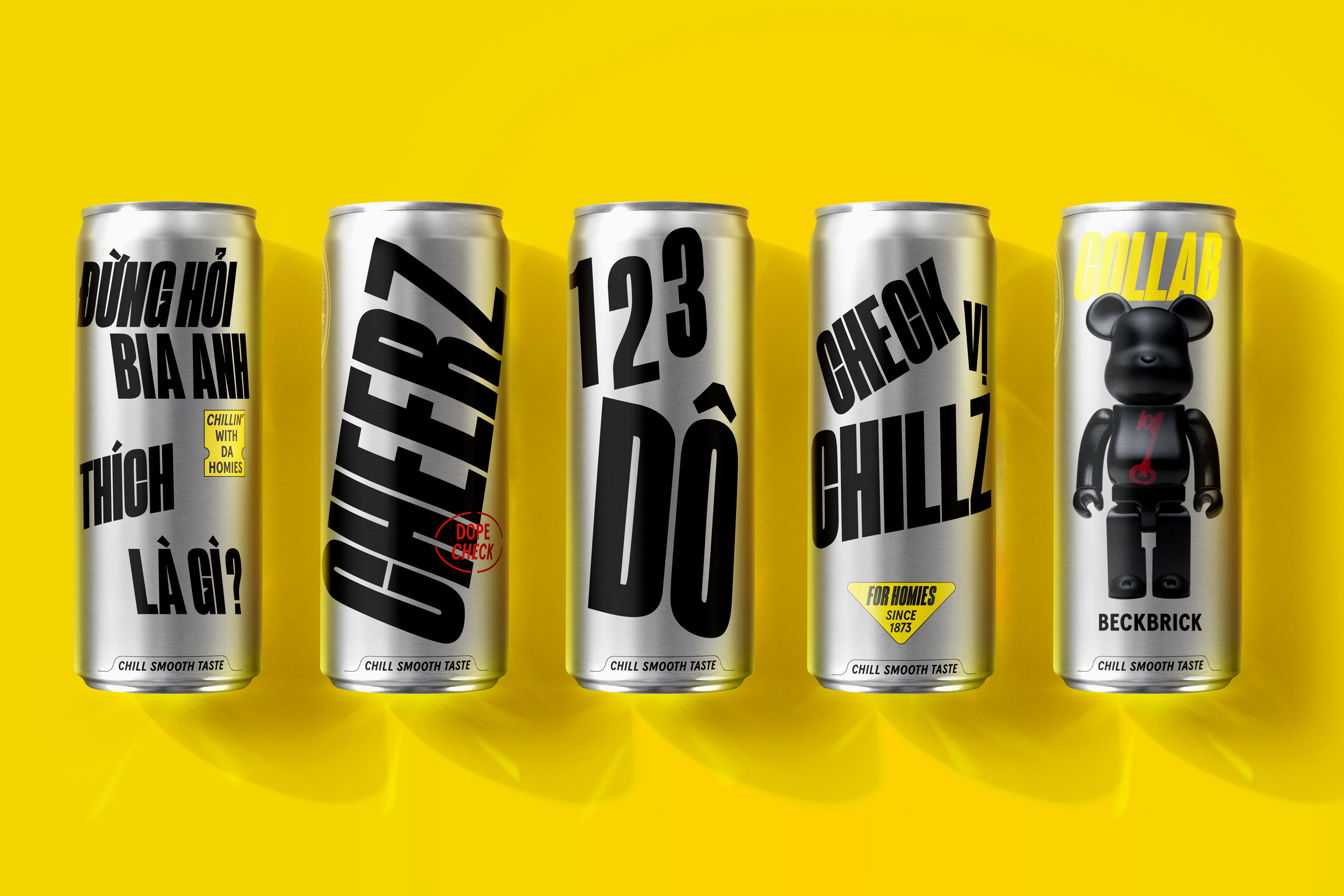
Through its Beck’Stage festival, the brand focuses deeply on verbal communication such as rap, musical lyrics and trending verbal ayings. Therefore, typography naturally becomes brand key elements to visualize and design their messages. Together with Blaze Type & Colophon Foundry, our Type Associates developed a breakthrough Vietnamese version of Arges Black and Apercu, called Chillz Family for Beck’s Ice. The new branded font family has Chillz Display with “cheering diacritics” inspired by pouring and clinking moments when drinking and a new Beckslant (backslant) style supports the typographical expression and also, Chillz Apercu with multiple weights and styles as supportive ‘hypebeast’ body fonts.
Initial Marks
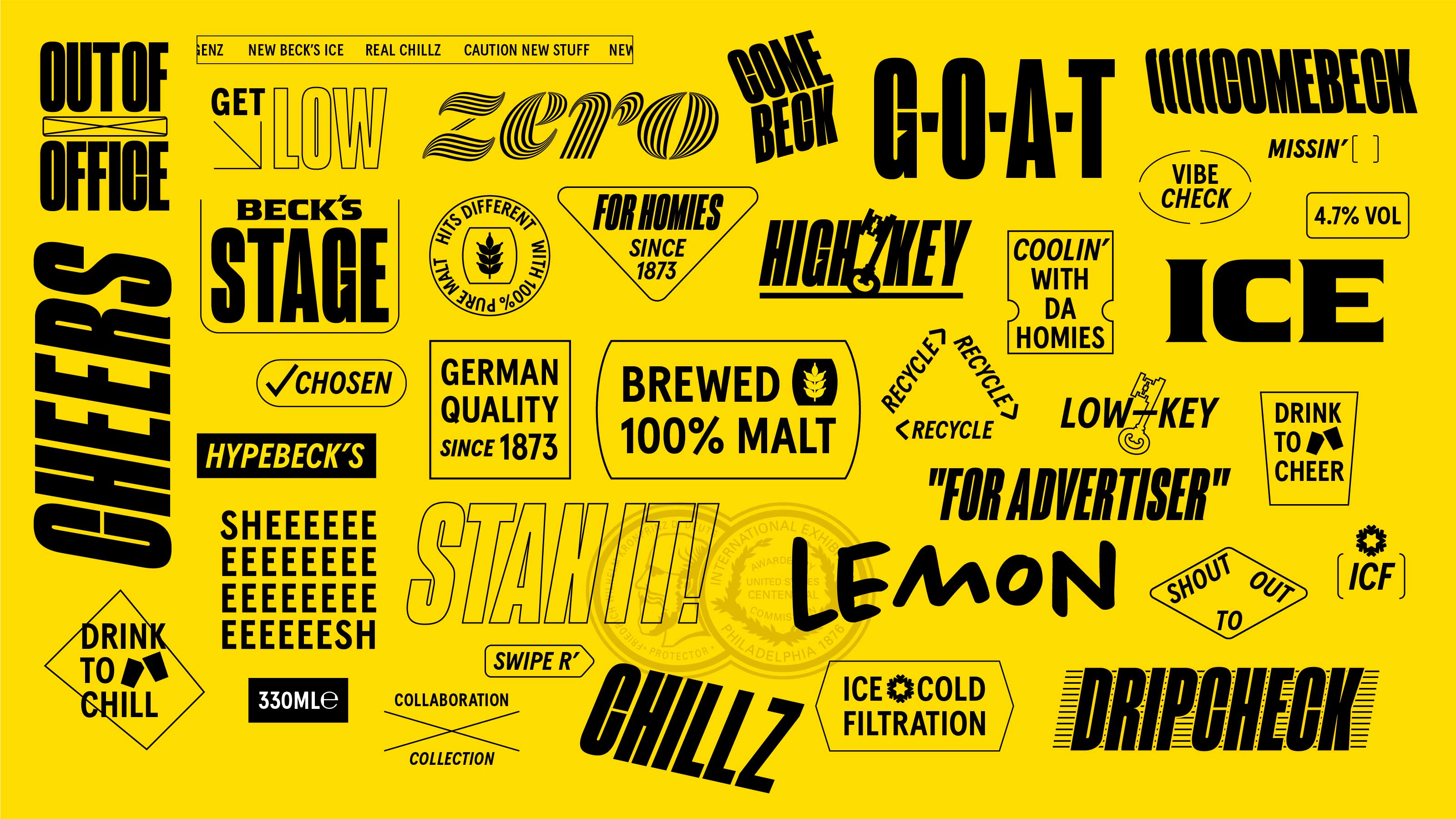
To expand the new Beck’s Ice culture, a series of “initial marks” was created with meaningful typography, driving the brand forward about the content and how the content is displayed.
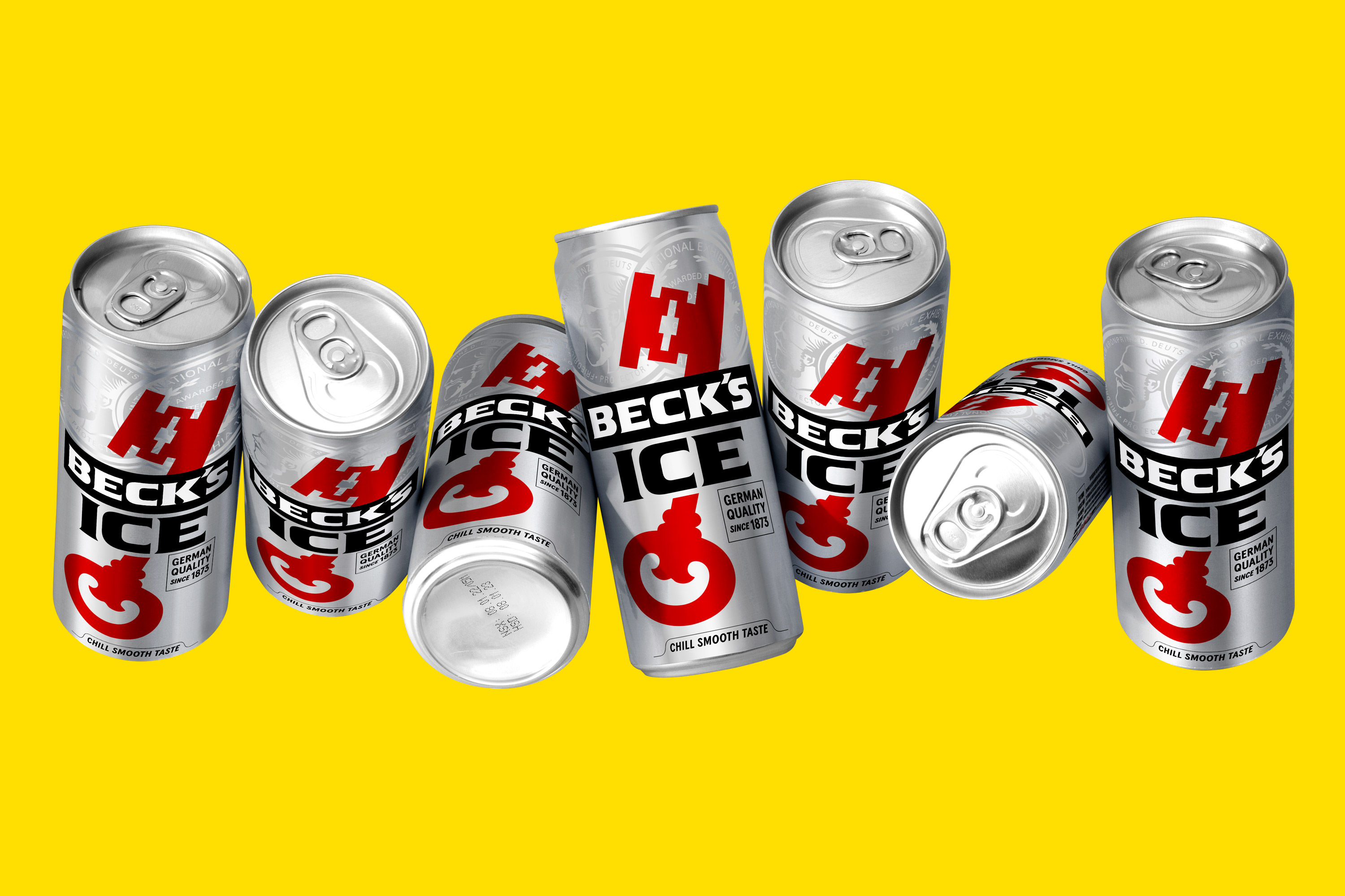
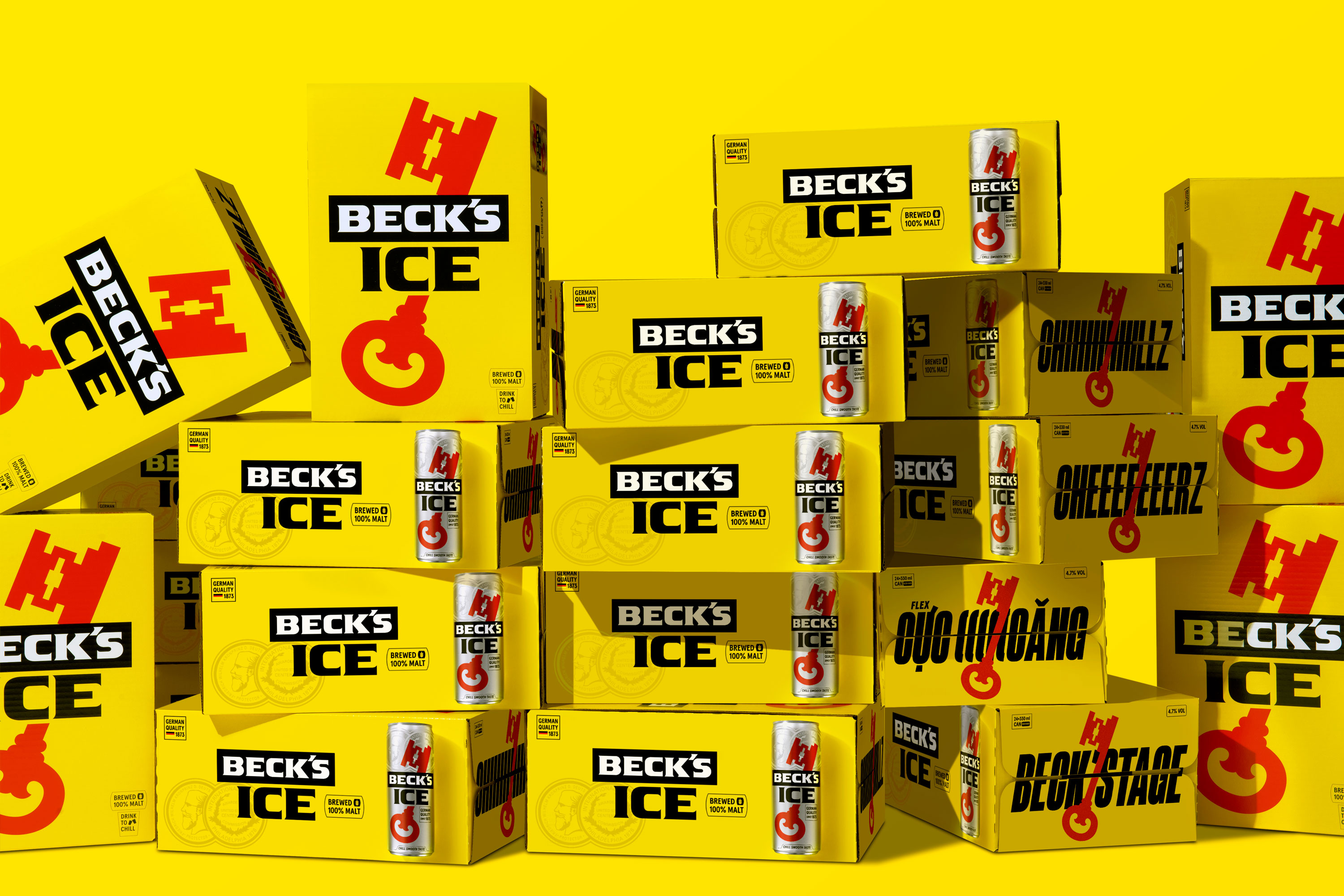
Packaging
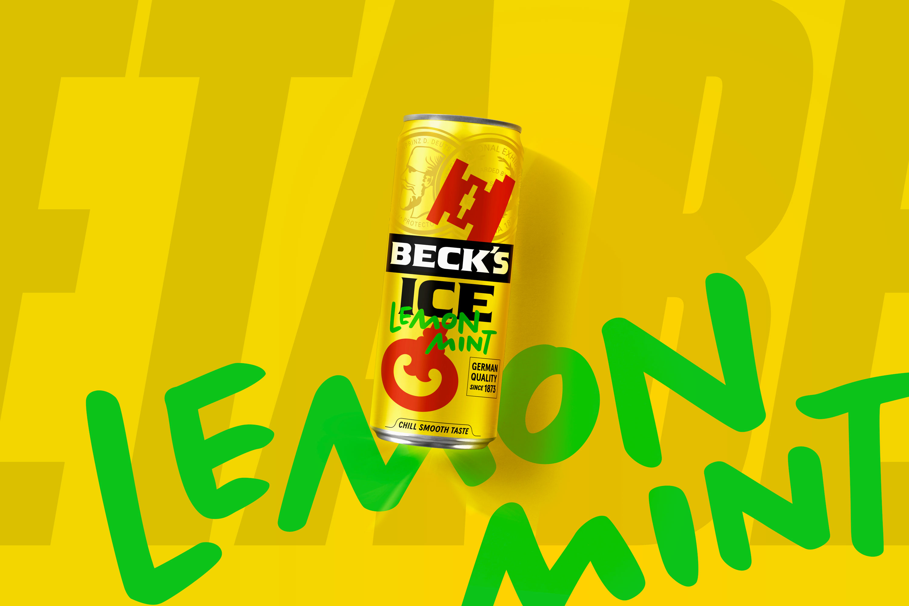
We recreated the packaging layout again by opening a completely new side called “Beck’Side” for playful typography design and special collaboration. The design gives brands and marketers a new chance to express messages and campaigns on this canvas.
HypeBeck Merchandise
Following “staying close to your crew”, the new merchandise system will stay close to streetwear culture with tag accessories for sneakers, streetwear clothing and hypebeast toys.
CREDIT
- Agency/Creative: M — N Associates
- Article Title: Beck’s Ice Rebranding by M — N Associates
- Organisation/Entity: Agency
- Project Type: Identity
- Project Status: Published
- Agency/Creative Country: Vietnam
- Agency/Creative City: Ho Chi Minh City
- Market Region: Asia
- Project Deliverables: Brand Architecture, Brand Creation, Brand Design, Brand Experience, Brand Guidelines, Brand Identity, Brand Mark, Brand Redesign, Brand Strategy, Brand Tone of Voice, Branding, Packaging Design, Packaging Guidelines, Toy Design, Type Design, Typography
- Industry: Food/Beverage
- Keywords: beer, packaging, branding, beck's ice, vietnam, typography
-
Credits:
Design Firm: M — N Associates
Typography: Chillz Display by Blaze Type
Typography: Chillz Apercu by Colophon
Photography: Wing Chan


