


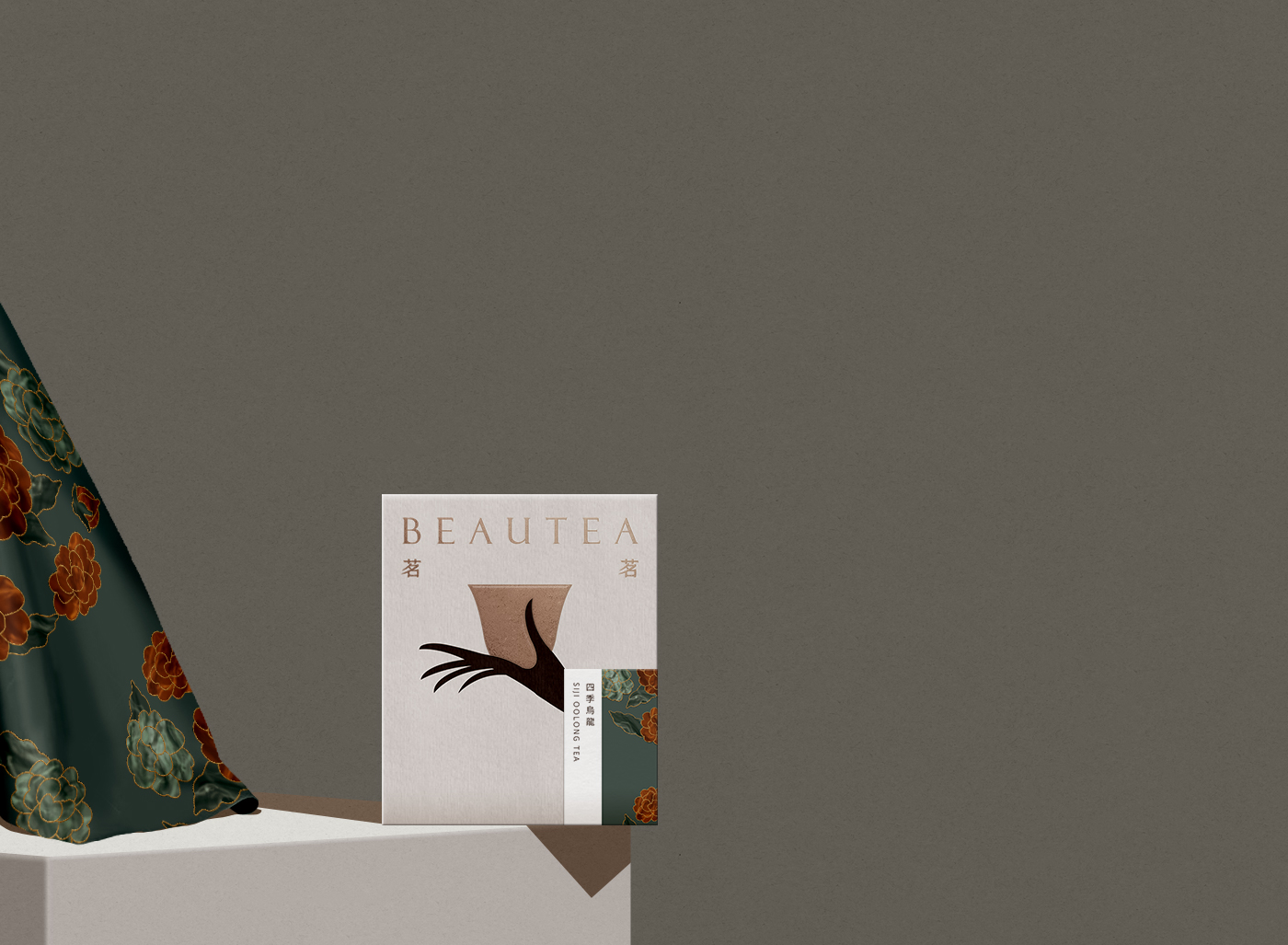
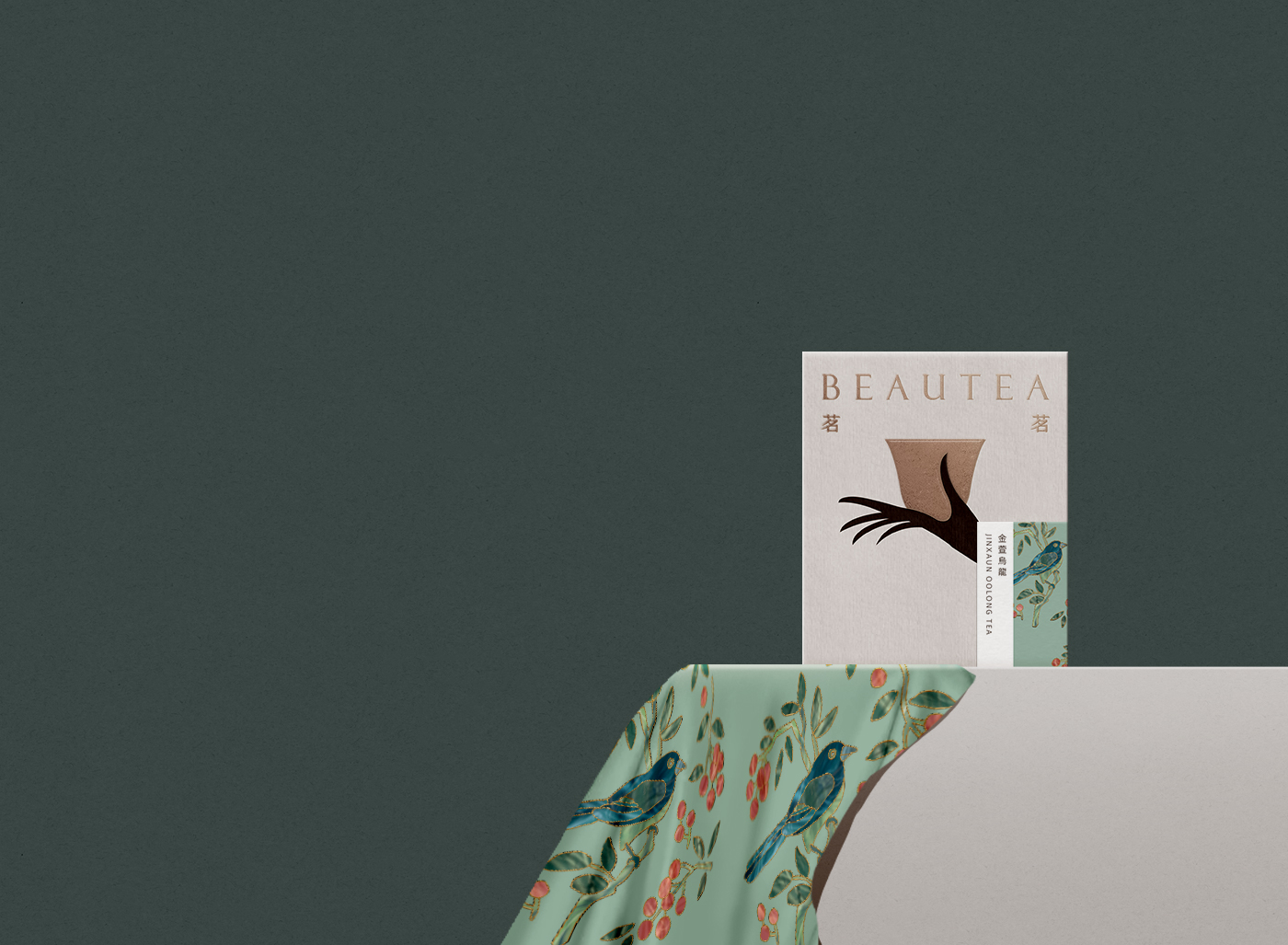
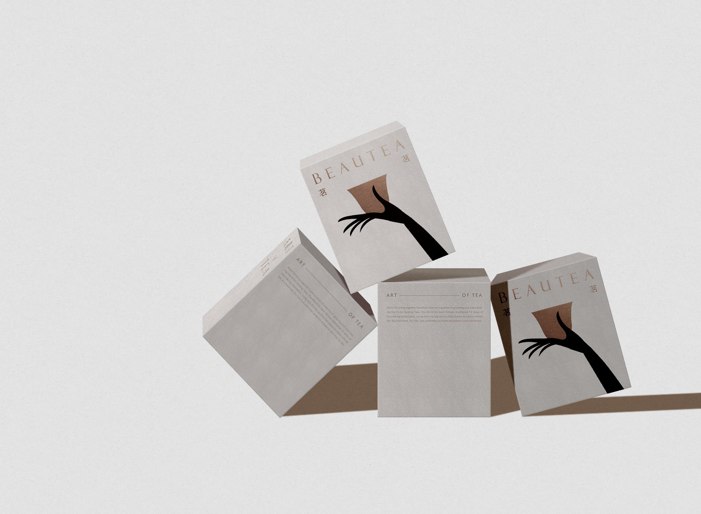
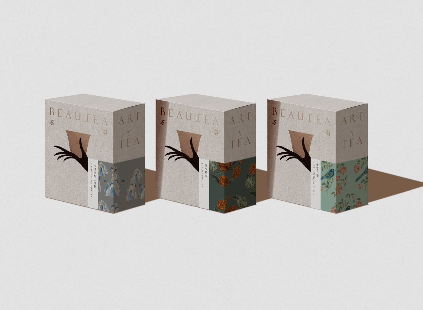
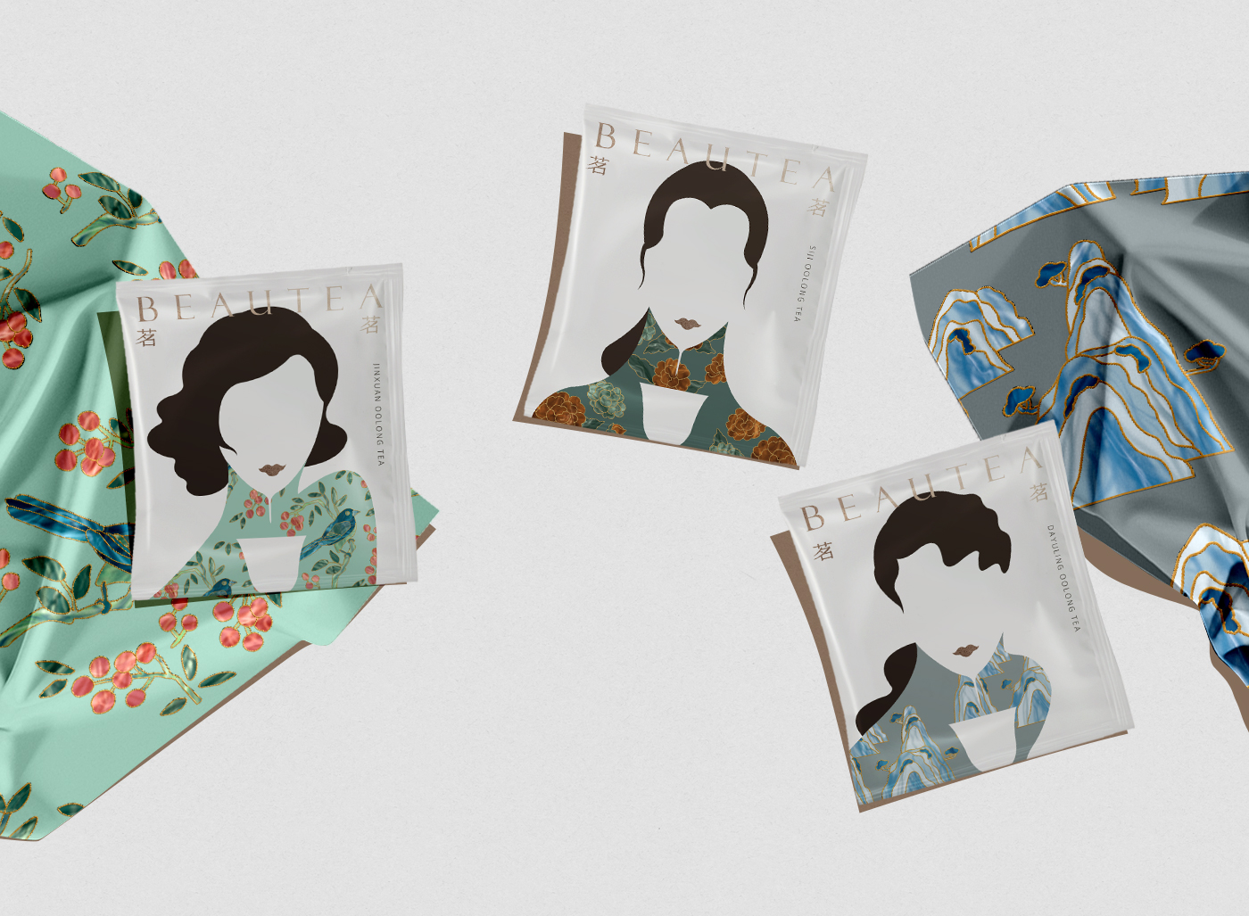
Since ancient times, chinese poets have often associated female images with tea, tea gentle, elegant flavor metaphor into a woman.
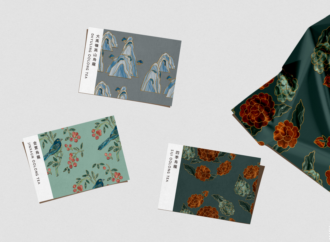
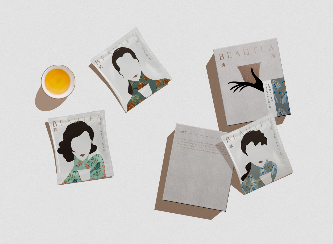
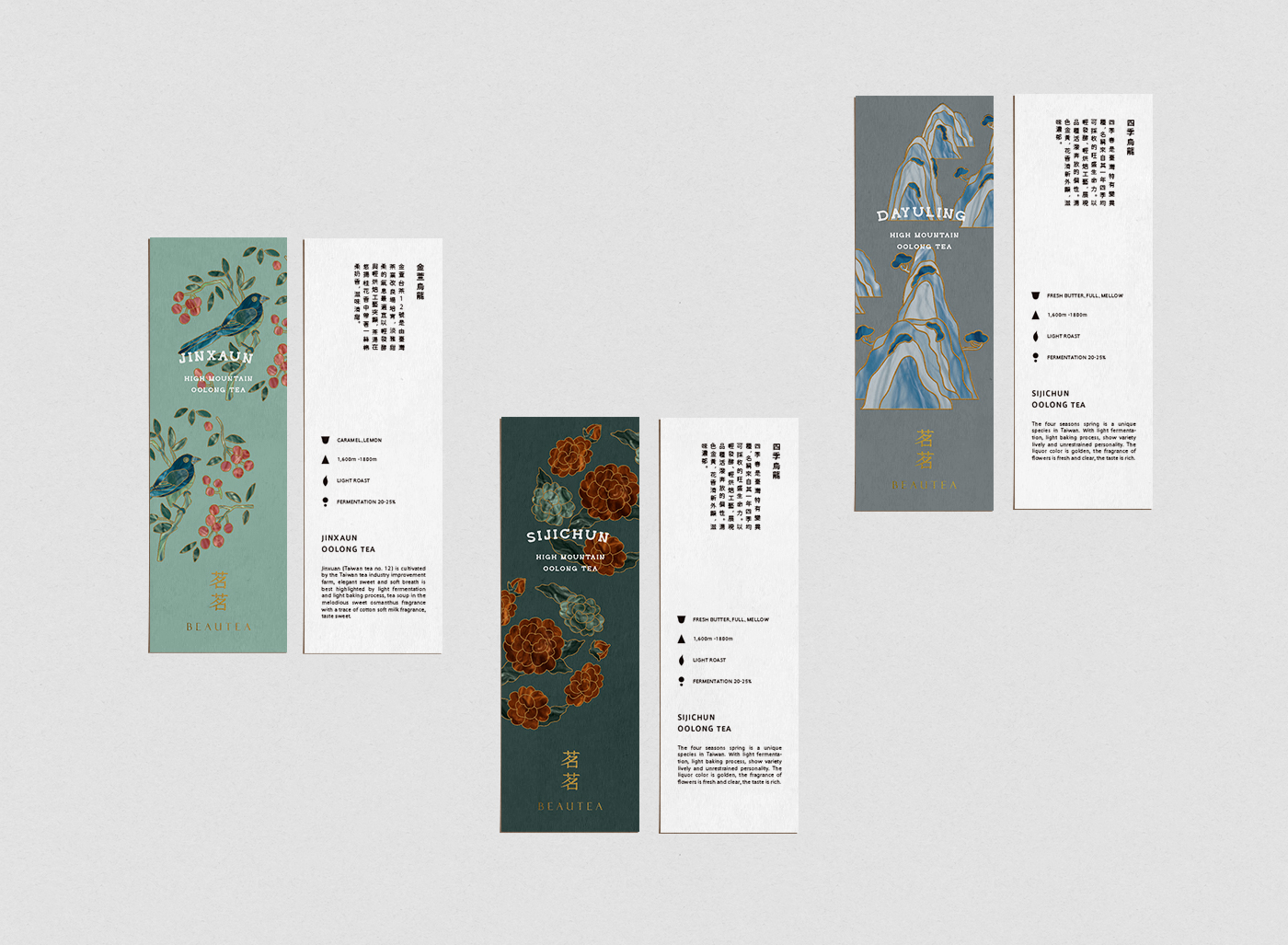
Combining the packaging with the image of women and the flavor of tea with the patterns in traditional chinese clothing, each tea has its own personality, its own flavor, each mouthful is raised from the heaven and earth forest, unique flavor.
A good cup of tea is accomplished by the accumulation of many details, just the right monsoon, sunshine and morning dew in the tea garden, through the nourishment of nature’s miniature climate and the strict selection of tea farmers, in the green hills and in the valleys, with the aroma, taste the art of tea.

CREDIT
- Agency/Creative: Lung-Hao Chiang
- Article Title: Beautea Tea Visual Identity Design
- Organisation/Entity: In-house, Non Published Concept Design
- Project Type: Packaging
- Agency/Creative Country: Taiwan
- Market Region: Asia
- Project Deliverables: Brand Advertising, Brand Architecture, Brand Creation, Brand Guidelines, Brand Identity, Brand Naming, Brand Strategy, Branding, Graphic Design, Identity System, Illustration, Packaging Design, Product Architecture, Product Naming, Research, Tone of Voice
- Format: Box, Flow-Pack, Tag
- Substrate: Plastic, Pulp Carton, Pulp Paper
FEEDBACK
Relevance: Solution/idea in relation to brand, product or service
Implementation: Attention, detailing and finishing of final solution
Presentation: Text, visualisation and quality of the presentation


