Branston® is one of the UK’s most iconic food brands and Branston Beans have become a firm favourite with households since they were launched in 2005. The Branston Beans brand proposition has always been focused on product taste, with consumers being encouraged to take the Branston Bean Challenge!
Princes Food Group came to us looking to re-design the visual identity of their licensed Branston brand. They were seeking to refresh and contemporise the current design to create stronger taste credentials and to reflect the proven taste preference that their beans enjoy over the competition (in a recent benchmarking test, consumers preferred the taste of Branston beans against the ‘other’ major competitor in this category).
Baked beans have almost universal appeal and usage – the target audience is therefore very wide and very mainstream! This is a brand and product that needs to appeal to everyone from parents buying staple food for their kids’ tea, through to pensioners, and to students. Baked beans are an easy, safe standby that can be stored for ages and will always get eaten up.
We needed to give this iconic brand a reason to be picked up against the likes of other branded competitors and own label.
The objectives for the project were well defined from the onset of the project: to contemporise the Branston range and communicate stronger taste credentials to build awareness and engagement; to attract new, younger consumers (25-44 BC1) without alienating existing consumers; to make Branston more distinctive and deliver stand out on shelf from the competition.
The proposition we developed was all around the core thought of ‘The Tastier Choice’. Branston has been shown to be preferred over other brands in blind taste-testing. This preference is driven by the Branston sauce which is richer, thicker and more tomatoey!
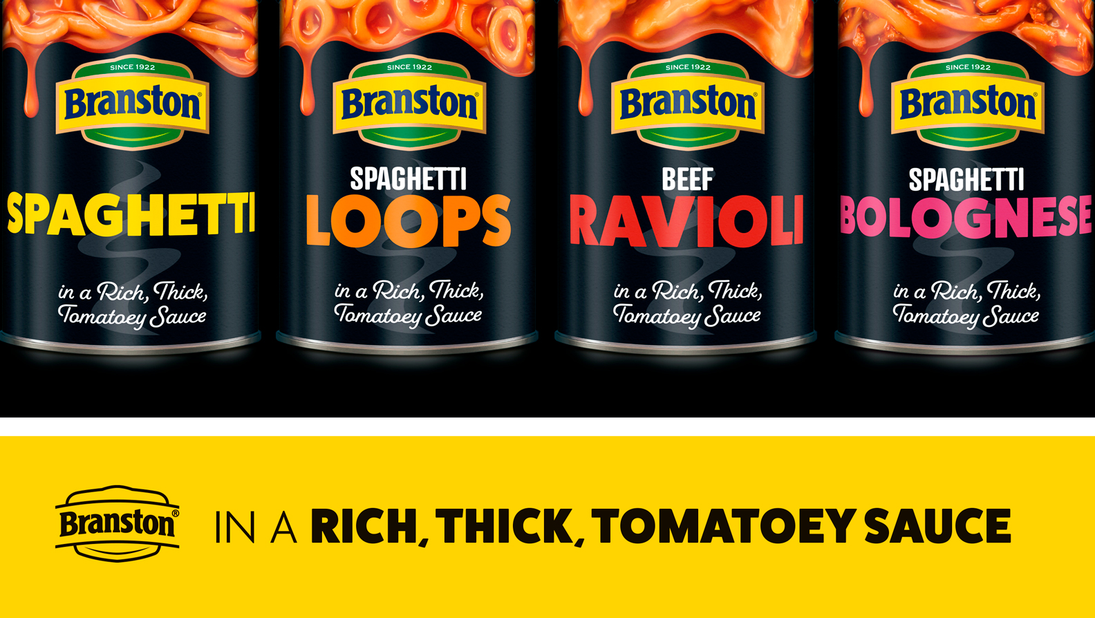
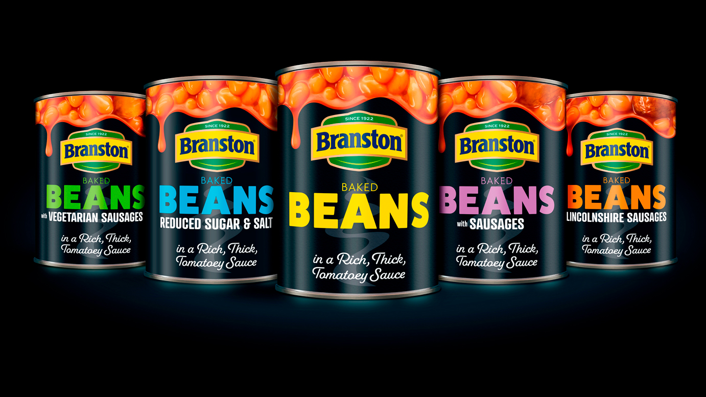
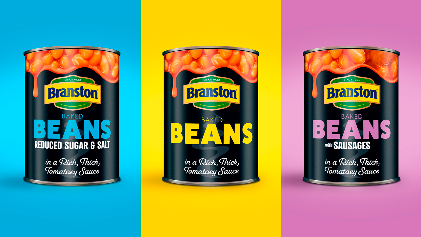
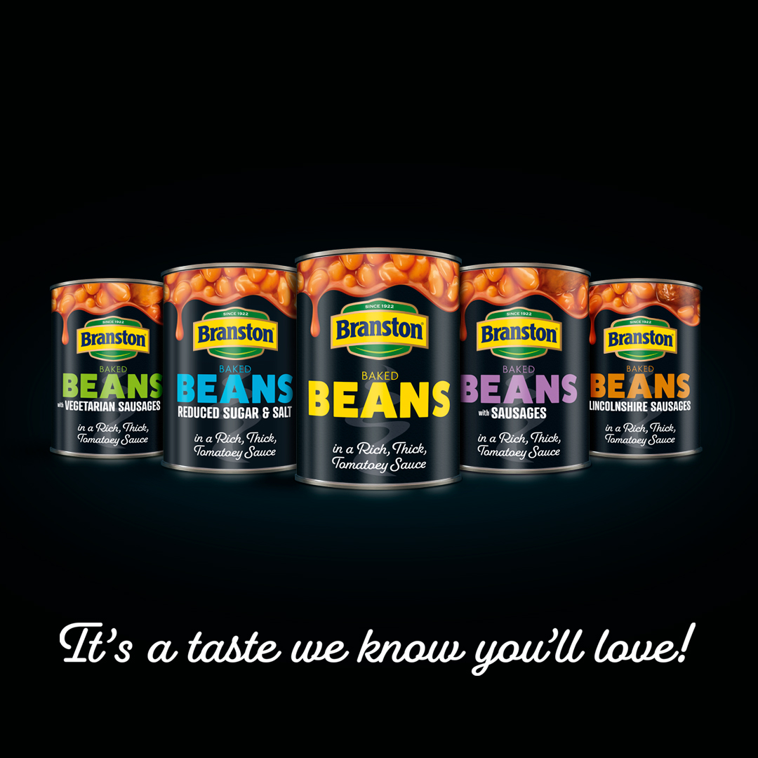
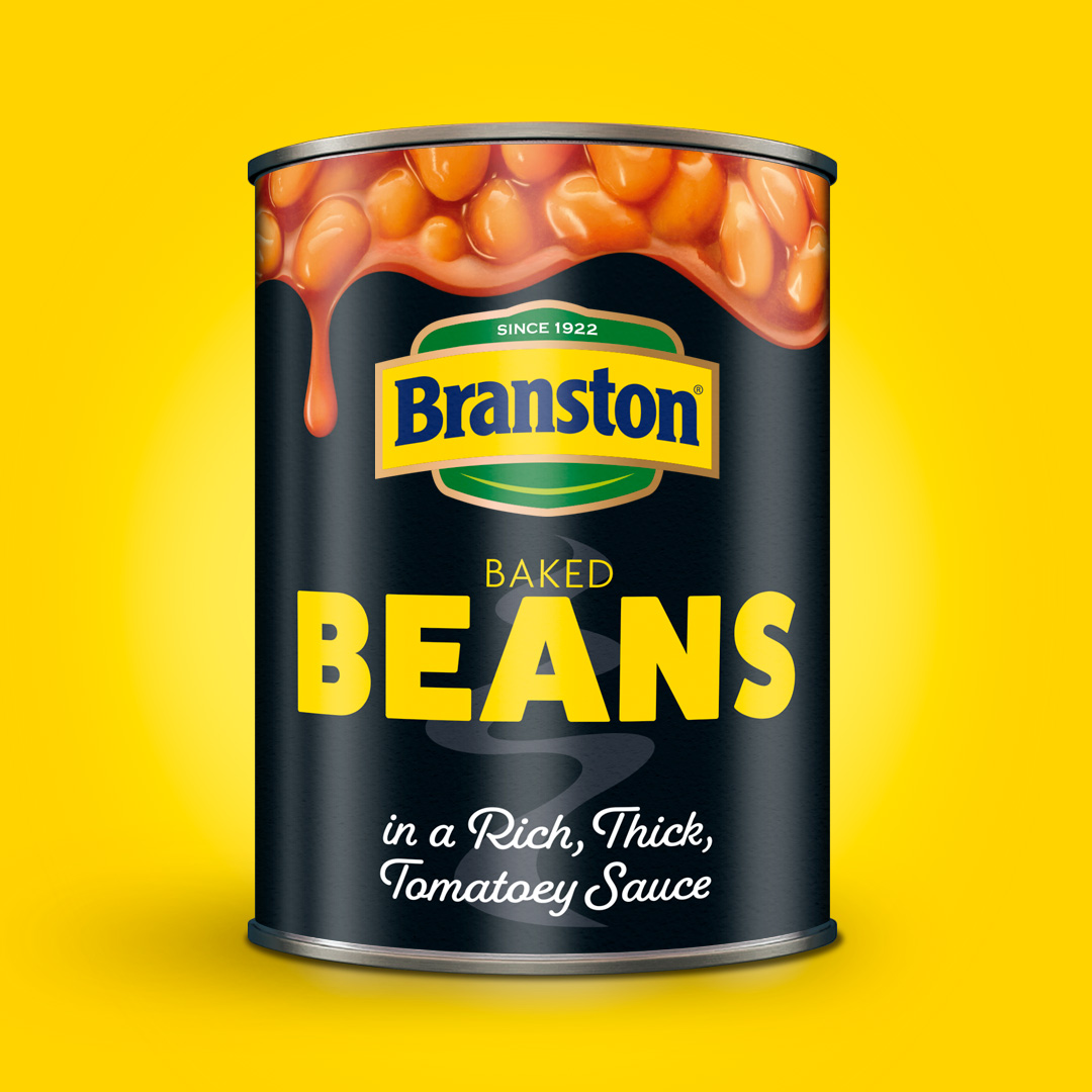
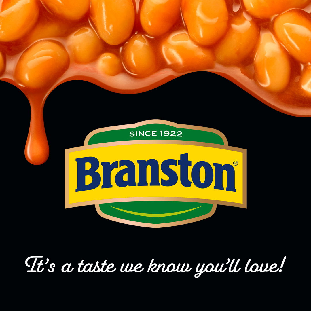
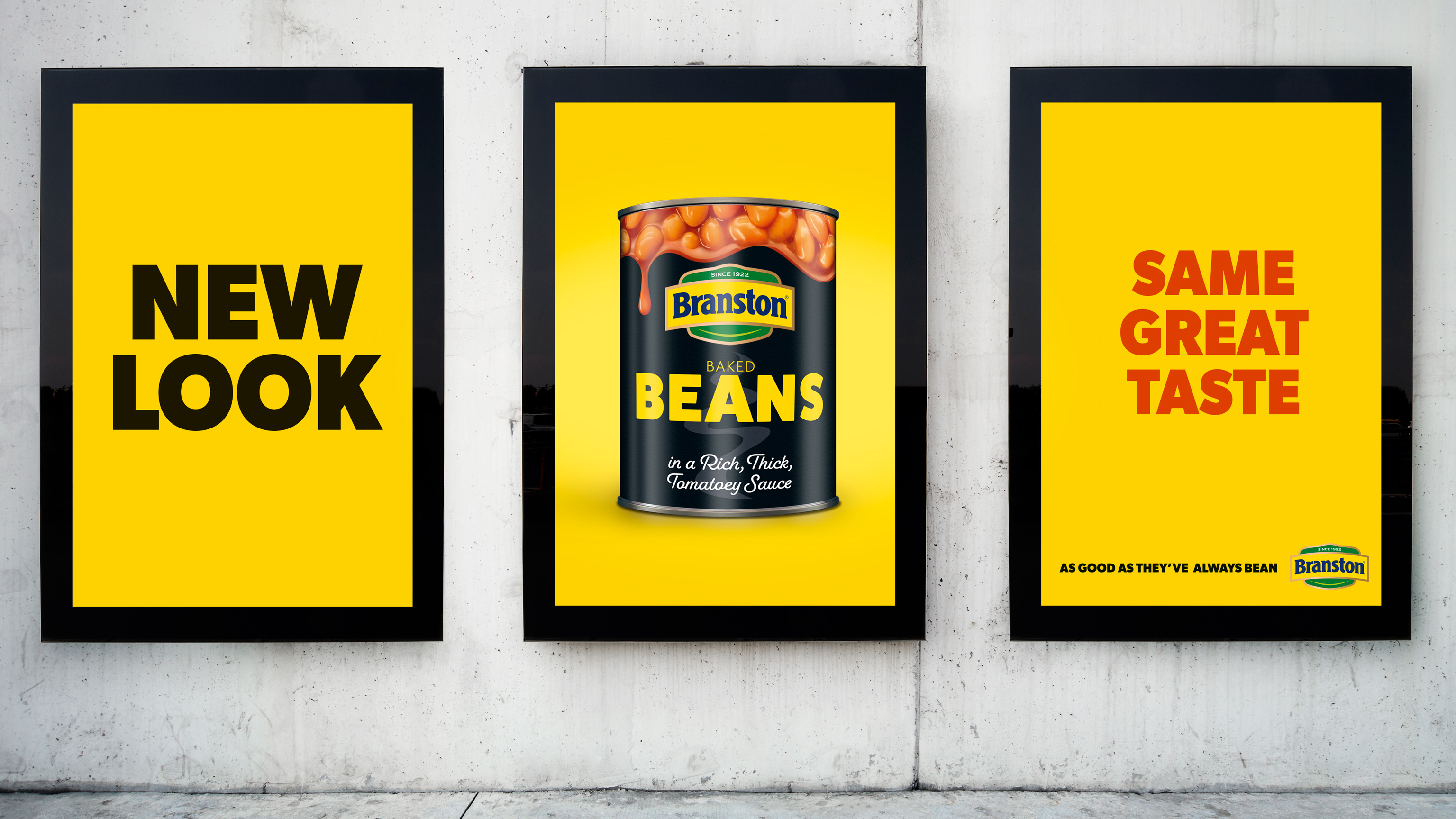
Our solution was what we nicknamed ‘dribbly beans’. The bold new design uses a dark palette to highlight the premiumness of the products and every Branston product contrasts brilliantly against the background. Working with a brilliant team at Lux Studios in London we laser cut templates and shot every Branston product in the same position so that the ‘dribble’ was consistent over the 20+ skus.
The client was delighted with the outcome and August 2022 sees the launch of the core products in multiple supermarkets across the UK.
CREDIT
- Agency/Creative: The Brand Nursery
- Article Title: Beans Means Branston – Visual Identity Re-Design by The Brand Nursery
- Organisation/Entity: Agency
- Project Type: Packaging
- Project Status: Published
- Agency/Creative Country: United Kingdom
- Agency/Creative City: Leeds
- Market Region: Europe
- Project Deliverables: Brand Redesign
- Format: Can
- Substrate: Pulp Paper
- Industry: Food/Beverage
- Keywords: Brand redesign
-
Credits:
Senior Designer: Geoff Crumack


