


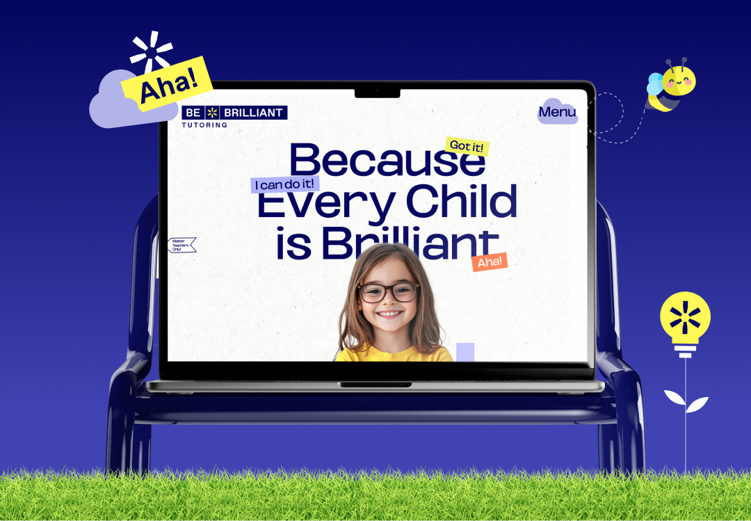
Be Brilliant Tutoring, based in New York, empowers children ages 4-14 to unlock their unique potential through the Gattegno method, which centers on the idea that every child has a natural brilliance waiting to be discovered. This approach helps children overcome learning challenges with confidence. When Be Brilliant approached us, their website wasn’t attracting enough new clients. Our initial UI/UX audit revealed key issues: underdeveloped branding, unclear messaging, and a confusing website structure that impacted their credibility. These insights led us to develop a complete brand and website redesign.
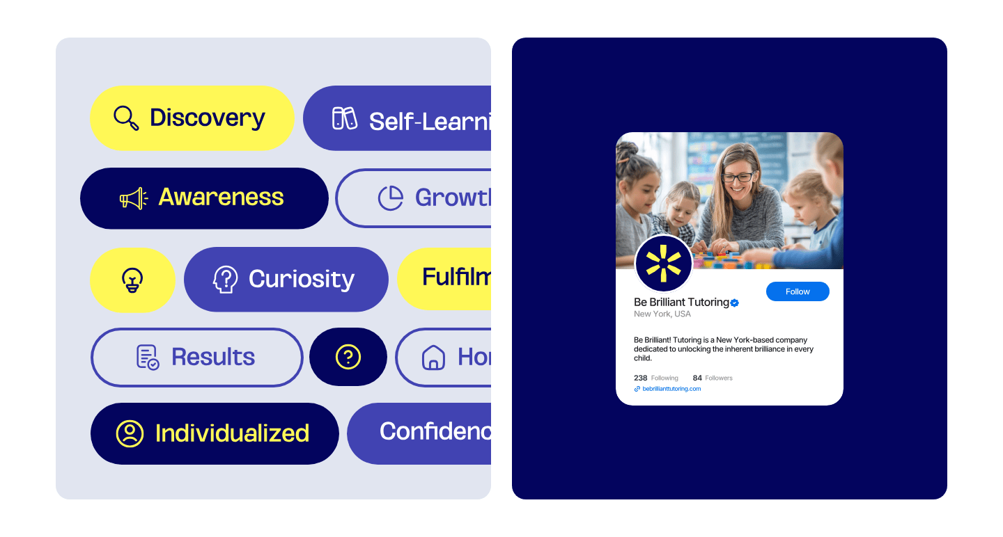
The biggest challenge was capturing the essence of Be Brilliant’s distinctive teaching approach. While Gattegno’s method is a strong foundation, many other centers also promote specialized methods. To stand out, we needed to dive deep into Be Brilliant’s philosophy and clearly communicate what makes their approach transformative. Leveraging our background in developmental psychology, we developed messaging and tools that showcases Be Brilliant’s unique ability to inspire lifelong learning.
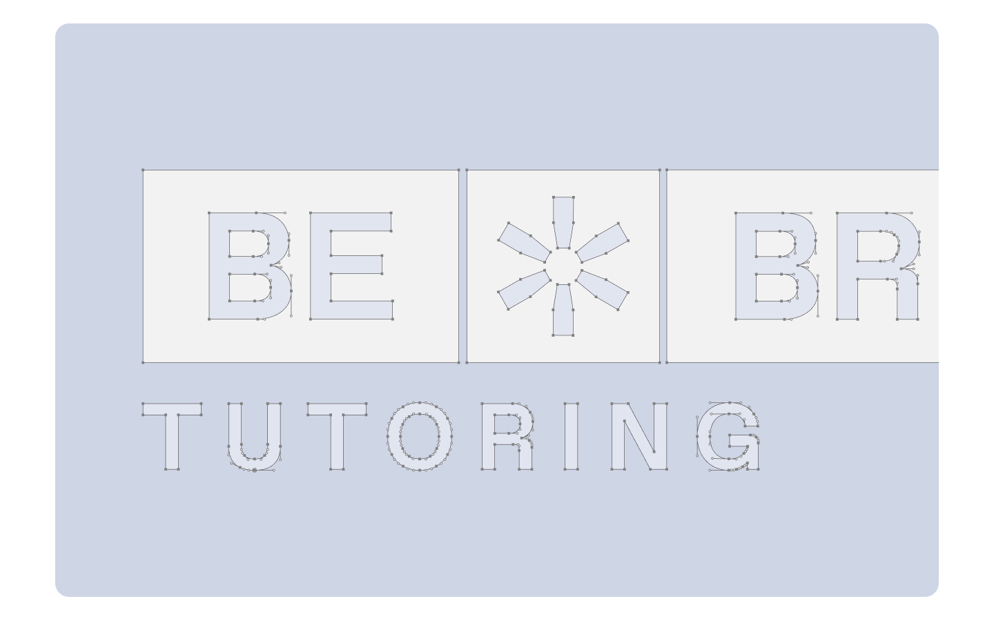
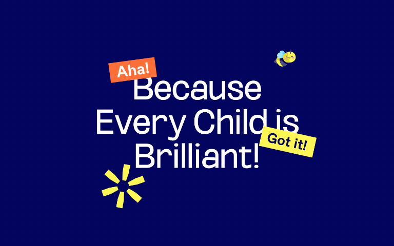
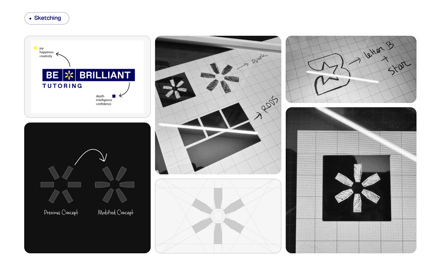
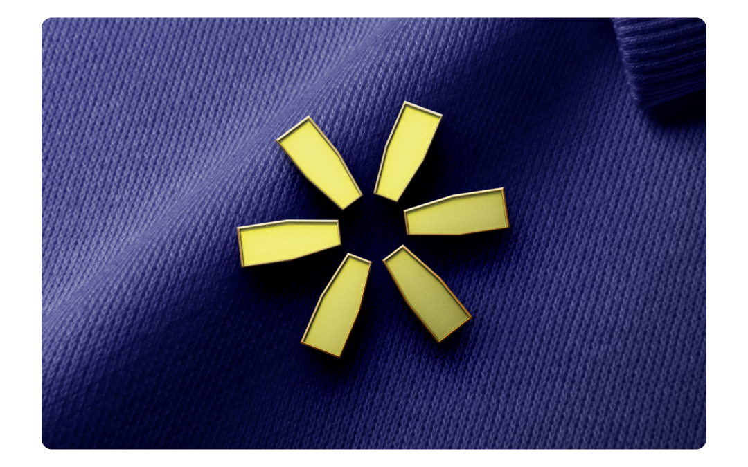
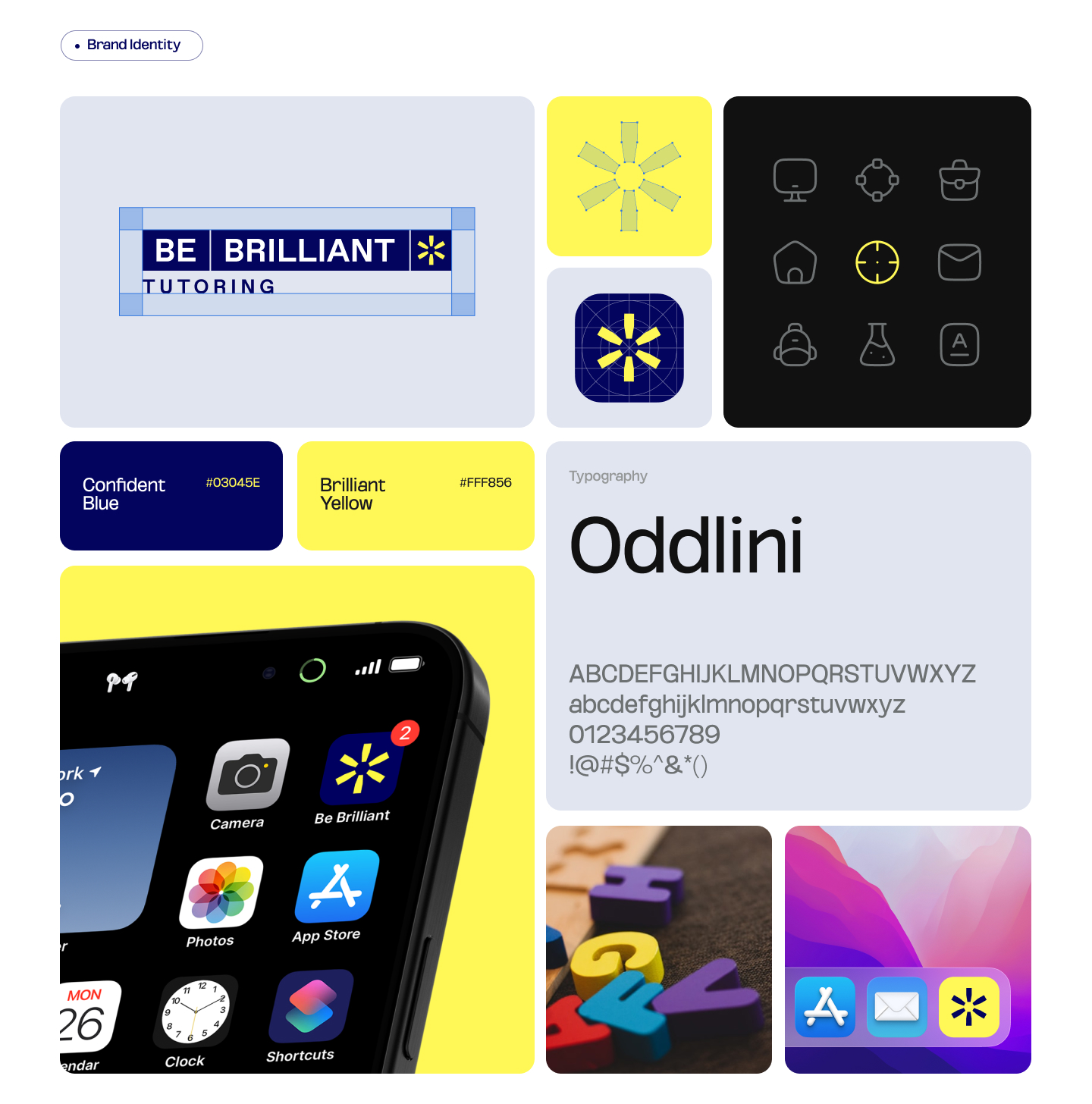
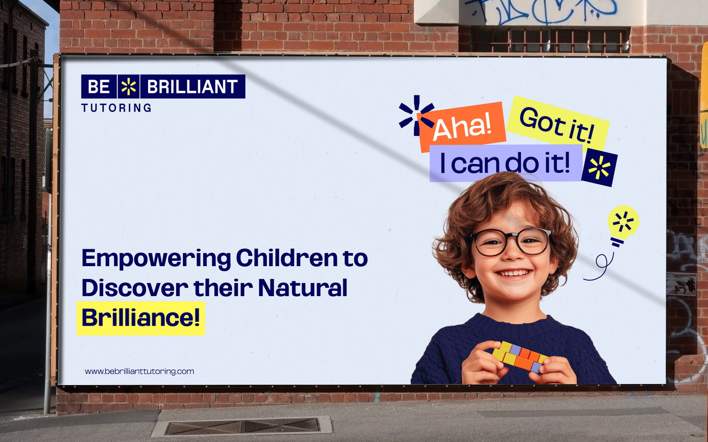
The final logo is a multifunctional design directly inspired by the Gattegno rods, central to Be Brilliant’s teaching approach. The logo reflects how children combine rods to grasp new concepts, symbolizing learning as a dynamic, hands-on process. It includes a spark element—a blend of a star and exclamation mark—that represents both the child’s brilliance and the discovery aspect of the “Aha!” moment.
We chose a deep blue for trustworthiness and a bright yellow for excitement and energy, perfectly aligning with Be Brilliant’s mission of fostering joyful, impactful learning.
Building on the core themes of “Aha!”, “I Can Do It!”, and “I Got It!”, we designed visual elements inspired by the Gattegno rods. These graphics visually reinforce the learning journey and can be used seamlessly across both digital and physical spaces, creating a consistent and recognizable brand presence. In addition to these core visuals, we developed other graphic elements derived from the logo’s spark symbol, further expanding the BBT visual ecosystem. This cohesive system allows for a branded environment where each element, from classroom decor to digital assets, reflects Be Brilliant’s philosophy and unique identity.
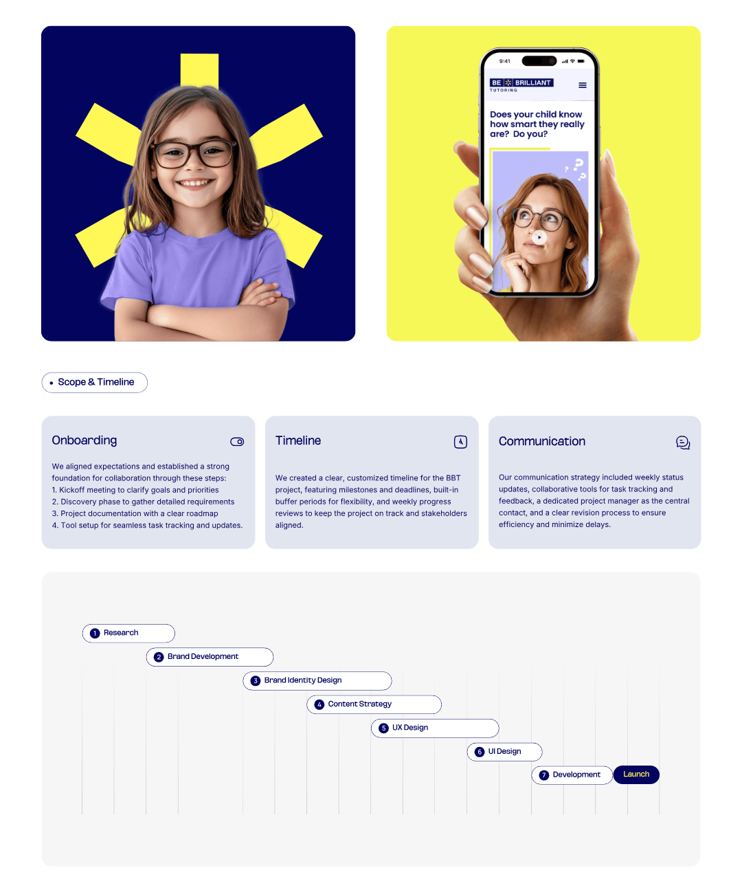
We also developed a structured content strategy, organizing the website’s information flow to highlight Be Brilliant’s values and approach. Specific recommendations ensured each section communicates their core mission and differentiators.
CREDIT
- Agency/Creative: Mk Way
- Article Title: Be Brilliant Tutoring: A Confident New Identity for a Forward-Thinking Tutoring Brand
- Organisation/Entity: Agency
- Project Type: Identity
- Project Status: Published
- Agency/Creative Country: Canada
- Agency/Creative City: Toronto
- Market Region: North America, Global
- Project Deliverables: Animation, Brand Design, Brand Guidelines, Brand Identity, Brand Mark, Brand Redesign, Brand Strategy, Branding, Creative Direction, GIF Animation, Graphic Design, Logo Design, Poster Design, Rebranding, User Experience, User Interaction, Web Design
- Industry: Education
- Keywords: branding, education, ui/ux, web design, children, brand identity, visual identity, ui design, school, kids, teens, digital, creativity, WBDS Agency Design Awards 2024/25, tutoring, learning
-
Credits:
Creative Director: Anastasia Tsoupa
Brand Designer: Mehedi Islam


