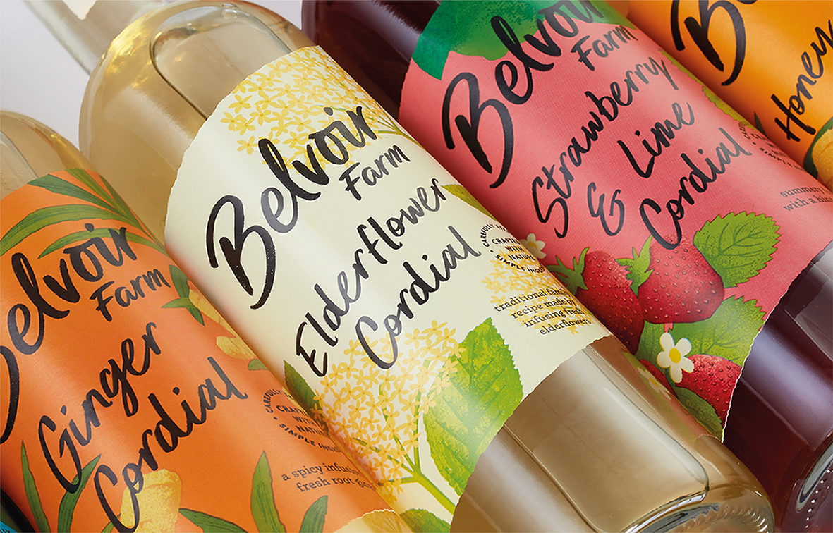
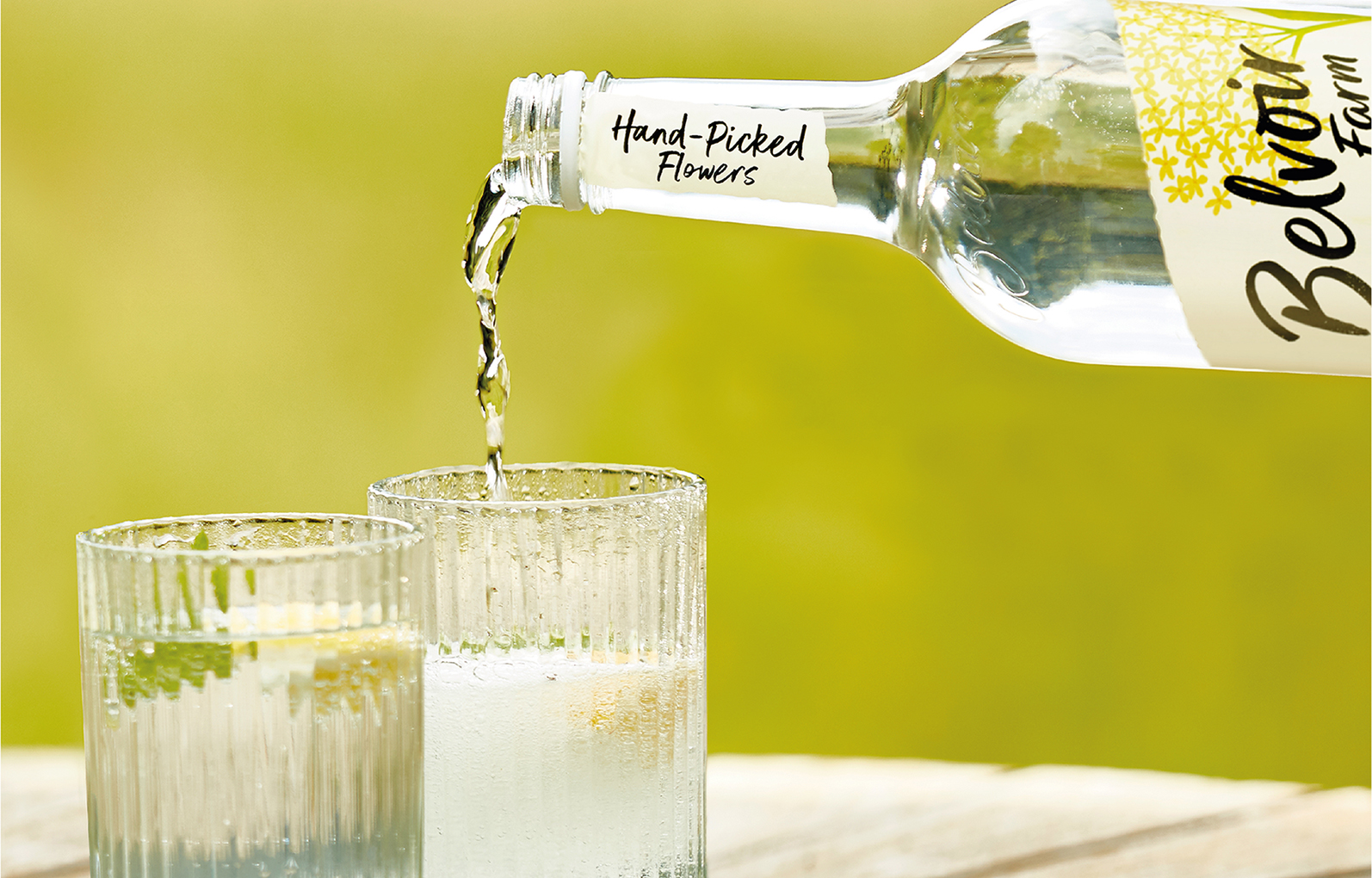
Award-winning premium soft drinks brand, Belvoir Farm, has partnered with B&B studio on a strategic repositioning and redesign as it seeks to drive growth, deepen consumer engagement and attract a younger audience. The rebrand builds on the brand’s authentic farming roots, the first bottles of its signature elderflower cordial being handmade on the family farm in the idyllic Vale of Belvoir over 40 years ago. Today, elderflowers from the farm, where the brand is still based, are harvested by the local community each year and used in the production of its cordials and sparkling drinks.
Crafted with Nature
B&B’s strategy was inspired by the philosophy and approach of the working farm where Belvoir is based. Dedicated to working hand-in-hand with nature, the farm is responsible for protecting the local wild eco-system and encouraging its flora and fauna. This closeness to nature is reflected in Belvoir’s products that use only carefully selected natural ingredients and contain nothing artificial. The new design introduces this sense of wild nature, while the increased emphasis on Belvoir’s authentic connection with the British countryside adds richness and depth to the brand’s broader brand communications.
Wild by Nature
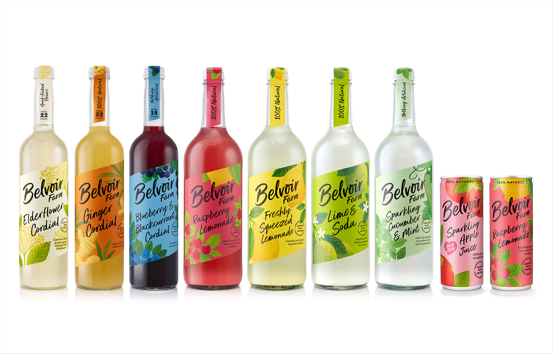
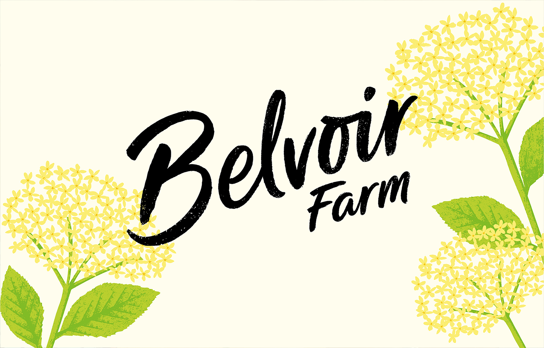
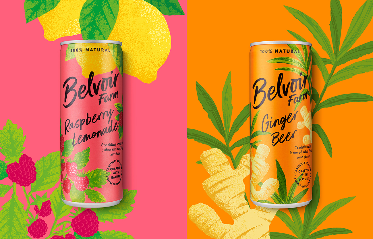
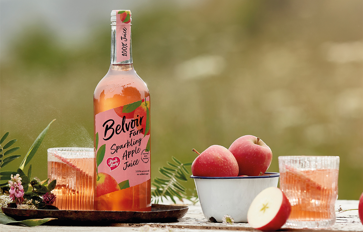
Belvoir’s new graphic identity and packaging design seeks to sensitively evolve the key assets from the existing and hugely recognisable design – including its handwritten type, angled label and ingredient illustrations – in a new, more wild, direction. The type, including the brand logotype crafted by Rachel Joy Price, becomes less ornate and calligraphic for a more natural and contemporary feel, while the illustrations are not so carefully placed in the layout but are instead allowed to grow into the design from the side as they would in nature. The illustration style, produced in-house at B&B studio, has a rawer and more bountiful feel. Even the brand name has evolved – from Belvoir Fruit Farms to Belvoir Farm – in order to tell a truer, more authentic story.
On pack, the design retains its handcrafted codes, but loses the ‘country fair’ feel for a bolder, more refreshing look. Range and variant signalling has been subtly improved and clarified, without feeling either corporate or systematic.
As Belvoir’s strategic and creative brand partner, B&B will continue to work with the brand across broader communications, including social media and advertising.
Shaun Bowen, Creative Partner at B&B studio, says: “It’s a privilege to be able to update and improve a much-loved British brand like Belvoir, and to have the opportunity to tell their unique story in a more contemporary and compelling way. We were really inspired by the farm, its commitment to sustainability and its connection to the British countryside, and we wanted to share that with consumers who might not know the story. In a premium soft drinks category that gets bigger and more complex by the day, it’s important to support the brands that care about the bigger picture.”
Pev Manners, owner of Belvoir Farm, adds: “The re-brand brings our packaging and communications up-to-date with modern consumers while also taking things back to our roots – the rural wild, where we’re truly at home. We’re the only company in the world where the local community helps with the elderflower harvest, picking flowers from our own orchards and from hedgerows in the surrounding countryside. B&B has captured that love of nature and we’re incredibly proud to see it all come to life.”
CREDIT
- Agency/Creative: B&B studio
- Article Title: B&B Studio Reinvigorates Premium Soft Drinks Brand Belvoir Farm
- Organisation/Entity: Agency, Published Commercial Design
- Project Type: Packaging
- Agency/Creative Country: United Kingdom
- Market Region: Europe
- Project Deliverables: Brand Identity, Brand Redesign, Brand Rejuvenation, Brand Strategy, Brand World, Branding, Graphic Design, Illustration, Packaging Design, Rebranding
- Format: Bottle, Can
- Substrate: Glass Bottle, Metal


