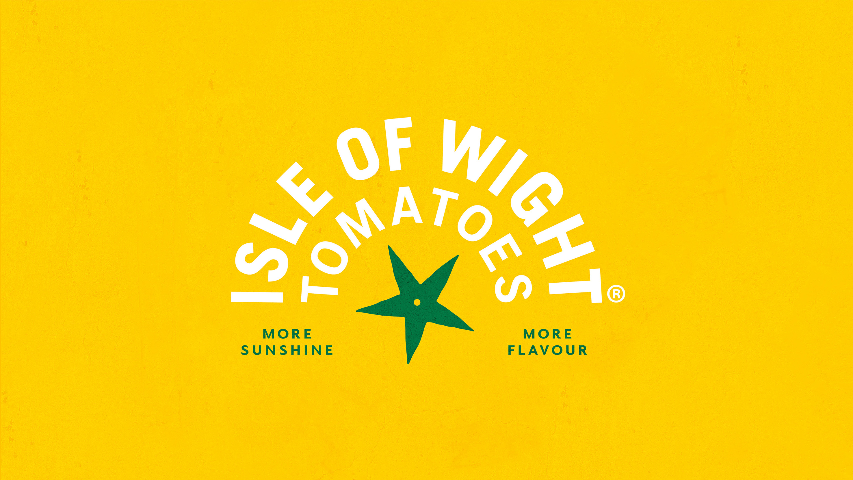
B&B has collaborated with expert tomato growers and gourmet producers, previously known as The Tomato Stall, to emphasise the brand’s secret ingredient – the exceptional climate and terroir of the Isle of Wight. Now named Isle of Wight Tomatoes, the new brand is built around a key product promise – More Sunshine, More Flavour.
Soaked in sunshine
With more sunshine hours than anywhere else in the UK and a uniquely rich soil, the Isle of Wight is the perfect place to grow tomatoes, and the ‘Grown in the Isle of Wight’ claim had become a key signifier of quality across The Tomato Stall’s retail offer. The decision to upweight this claim to a brand name seeks to cement this difference from competitor products, further elevating the brand within the produce category.
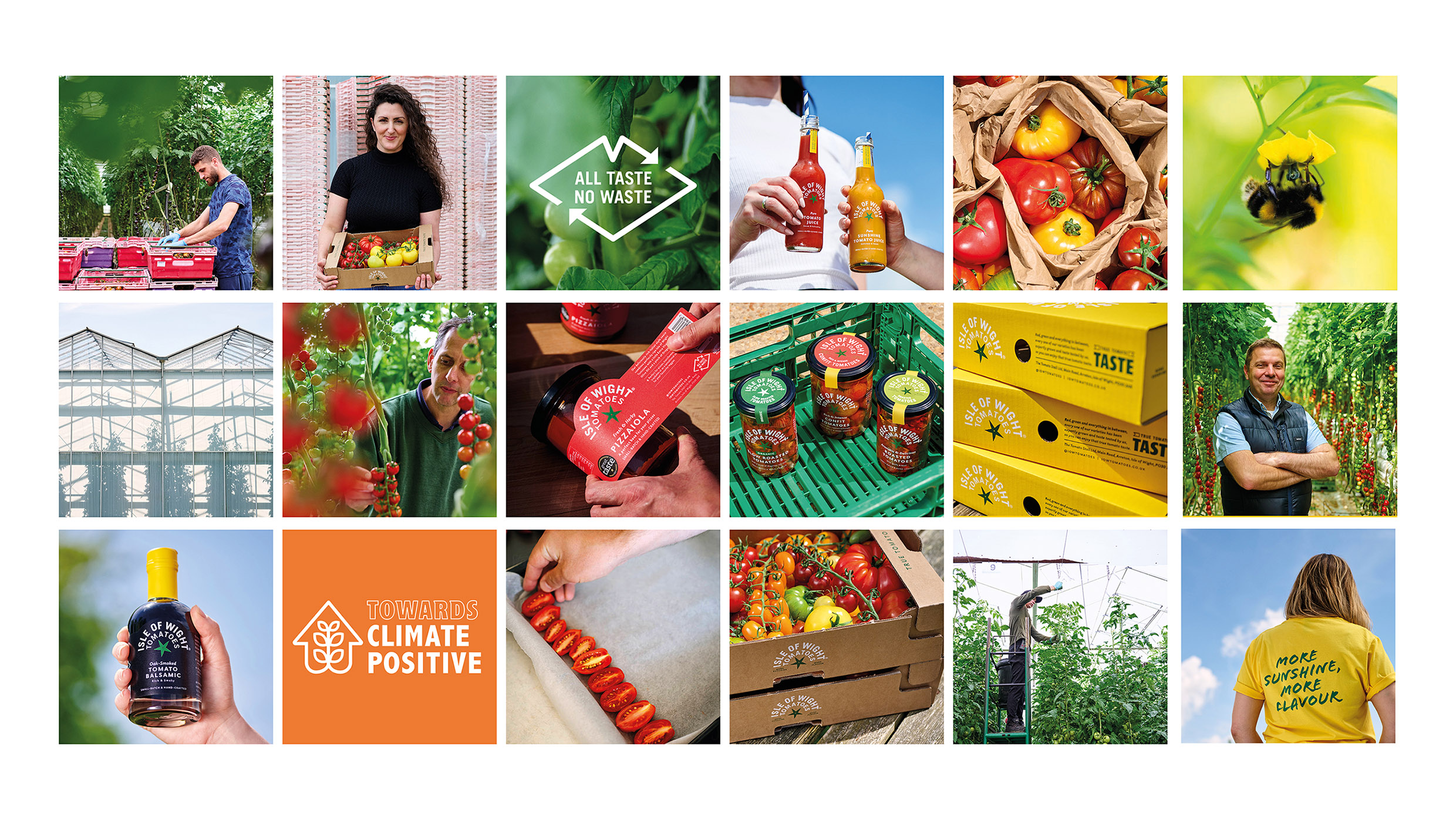
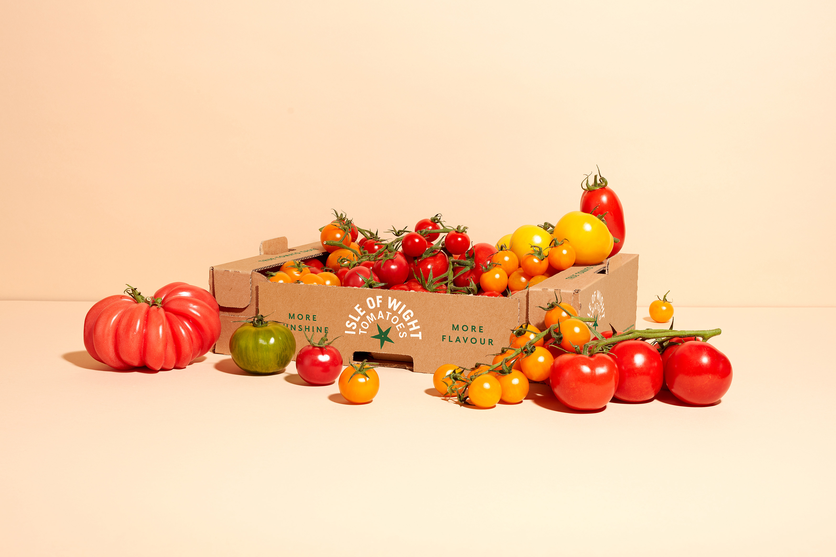
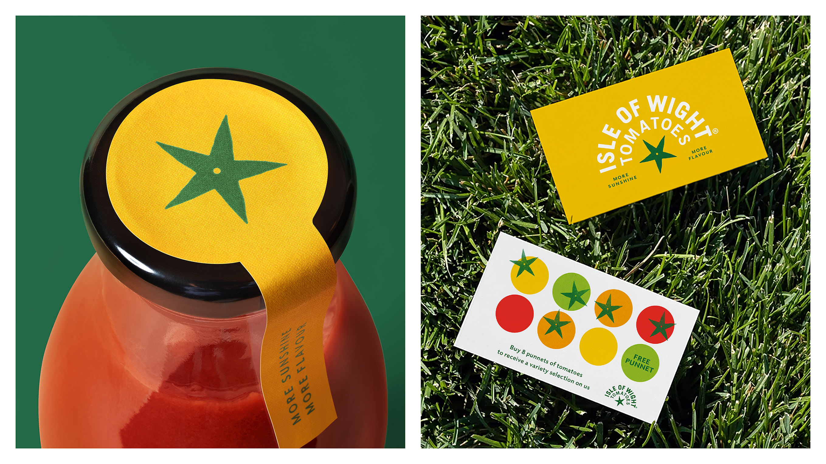
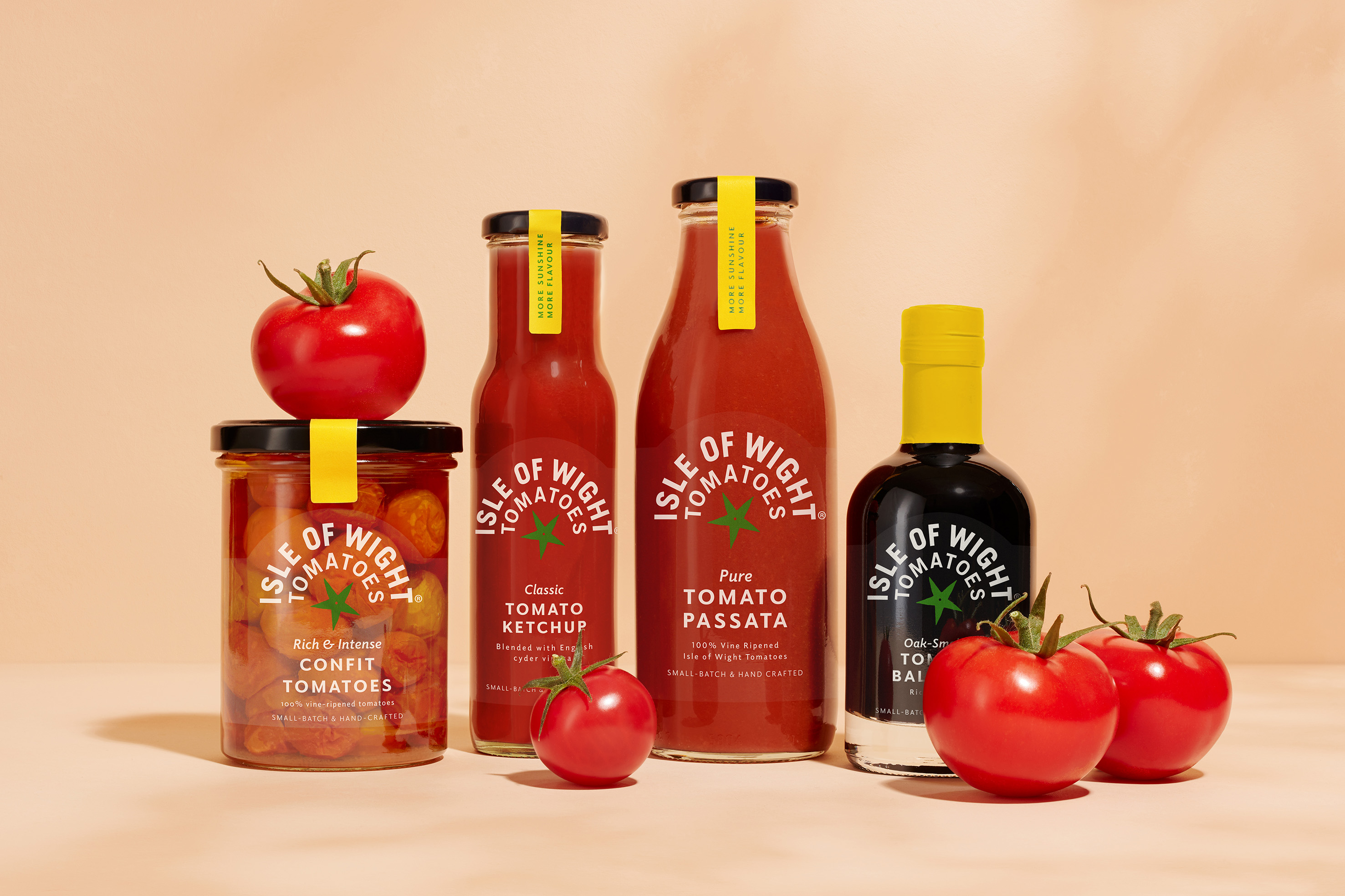
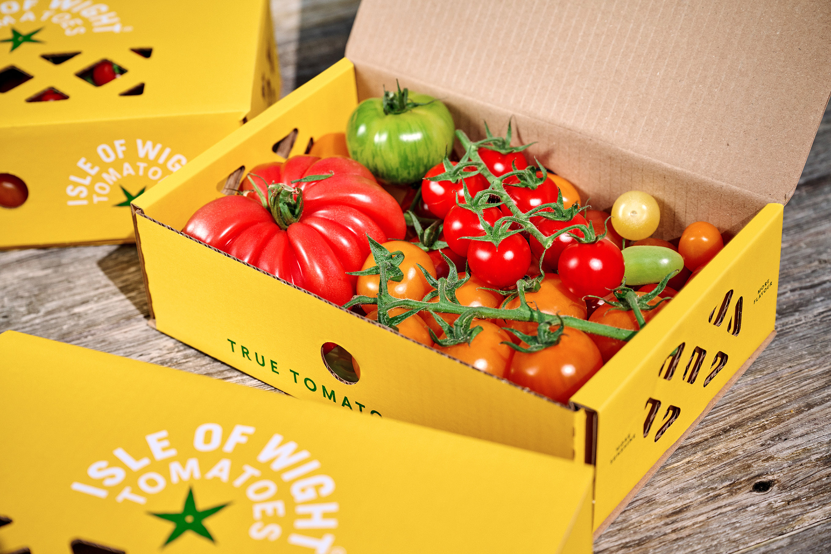
The new brand identity leads on the sunshine theme, pushing the branding on from an expected red and green world to a vibrant and unexpected yellow. Coupled with a new star icon that suggests a tomato calyx, the yellow also signifies the breadth of tomato varieties available from the brand. The yellow acts as a core brand colour across the brand world, while a new flavour-led palette of colours has been introduced on packaging for the brand’s broad range of tomato-based condiments and sauces, with the green calyx tying the identity together.
Beyond product, new brand messaging focuses on sustainable growing expertise, capturing the many stories from the farm, from its no waste philosophy to its use of natural predators. A playful tone of voice is accompanied by naturally lit photography to further emphasise the brand’s sunny disposition across social and digital channels.
“Working with the amazing team at Isle of Wight Tomatoes has been a real eye-opener,” says B&B Associate Creative Director Jennie Potts, “and I hope that the new identity helps capture the genuine passion, purpose and perfectionism that goes into growing this exceptional product. We’re really proud of the new visual identity and the bold approach it takes within the produce category.”
Managing Director of Isle of Wight Tomatoes, Paul Thomas, adds: “Elevating our brand from the fresh tomato offer available in any supermarket was key to this brief, and B&B has enabled us to communicate our difference directly to consumers. We love how joyful the new brand feels after what has been a tough few years in farming. It has really helped us focus with positivity on the future.”
Isle of Wight Tomatoes can be found across the UK in supermarkets, delis, farm shops and restaurants, and are also available direct to consumer at www.iowtomatoes.co.uk.


CREDIT
- Agency/Creative: B&B studio
- Article Title: B&B Studio Reimagines The Tomato Stall As Isle Of Wight Tomatoes, Putting The Focus On Provenance With A New Brand Positioning, Identity And Packaging Design
- Organisation/Entity: Agency
- Project Type: Identity
- Project Status: Published
- Agency/Creative Country: United Kingdom
- Agency/Creative City: London
- Market Region: Europe
- Project Deliverables: Brand Identity, Brand Mark, Brand Naming, Brand Redesign, Brand Strategy, Brand Tone of Voice, Brand World, Branding, Packaging Design
- Industry: Food/Beverage
- Keywords: Brand redesign, Provenance, Isle of Wight Tomatoes,
-
Credits:
B&B studio: B&B studio


