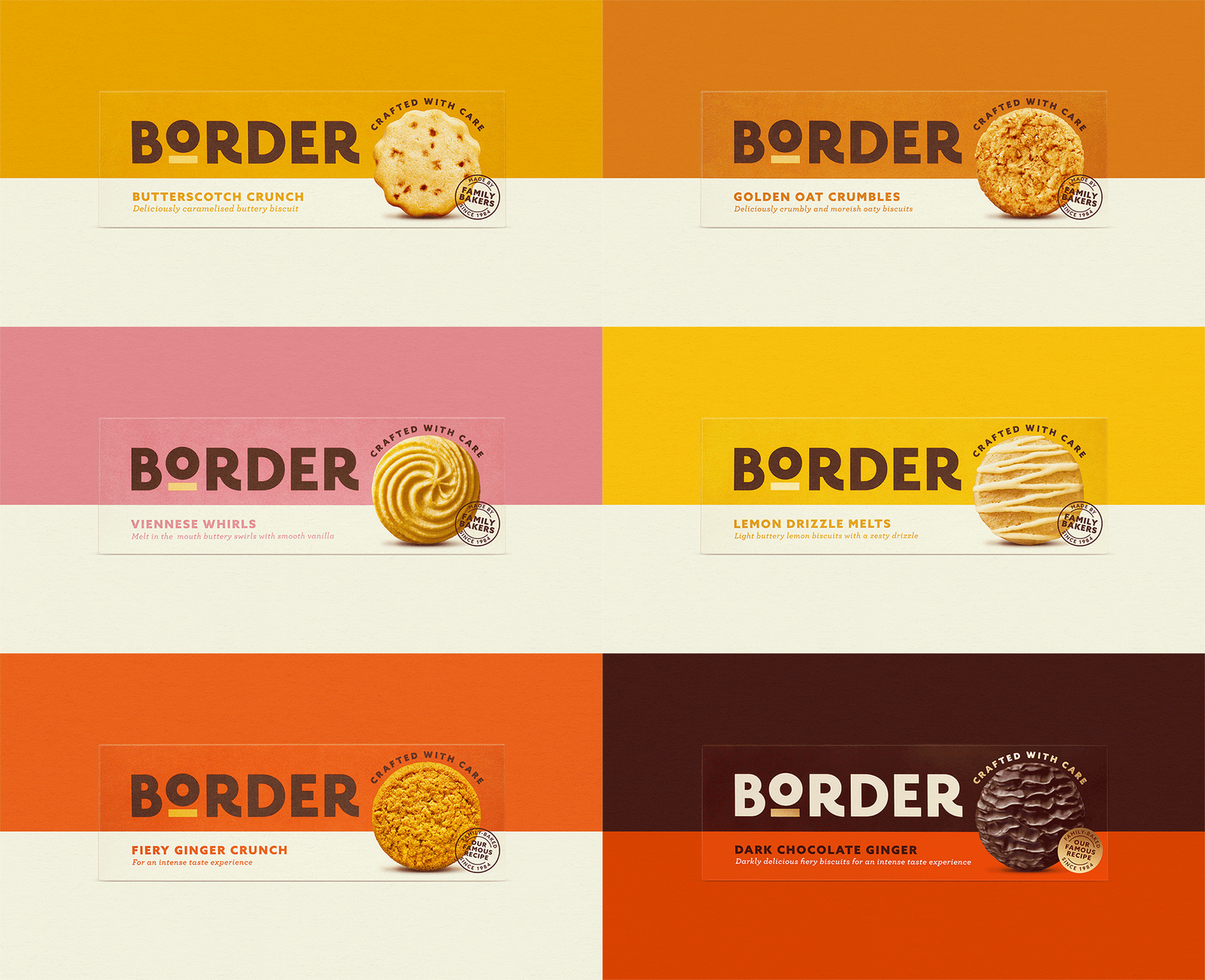
B&B studio has partnered with Border Biscuits on a major rebrand of its identity and packaging design following a significant repositioning exercise. Created to help the brand become the UK’s number one accessible premium biscuit, the rebrand was announced by Border as the ‘biggest move in its 38-year history, and coincides with new product launches in its chocolate covered range.
Elevated identity
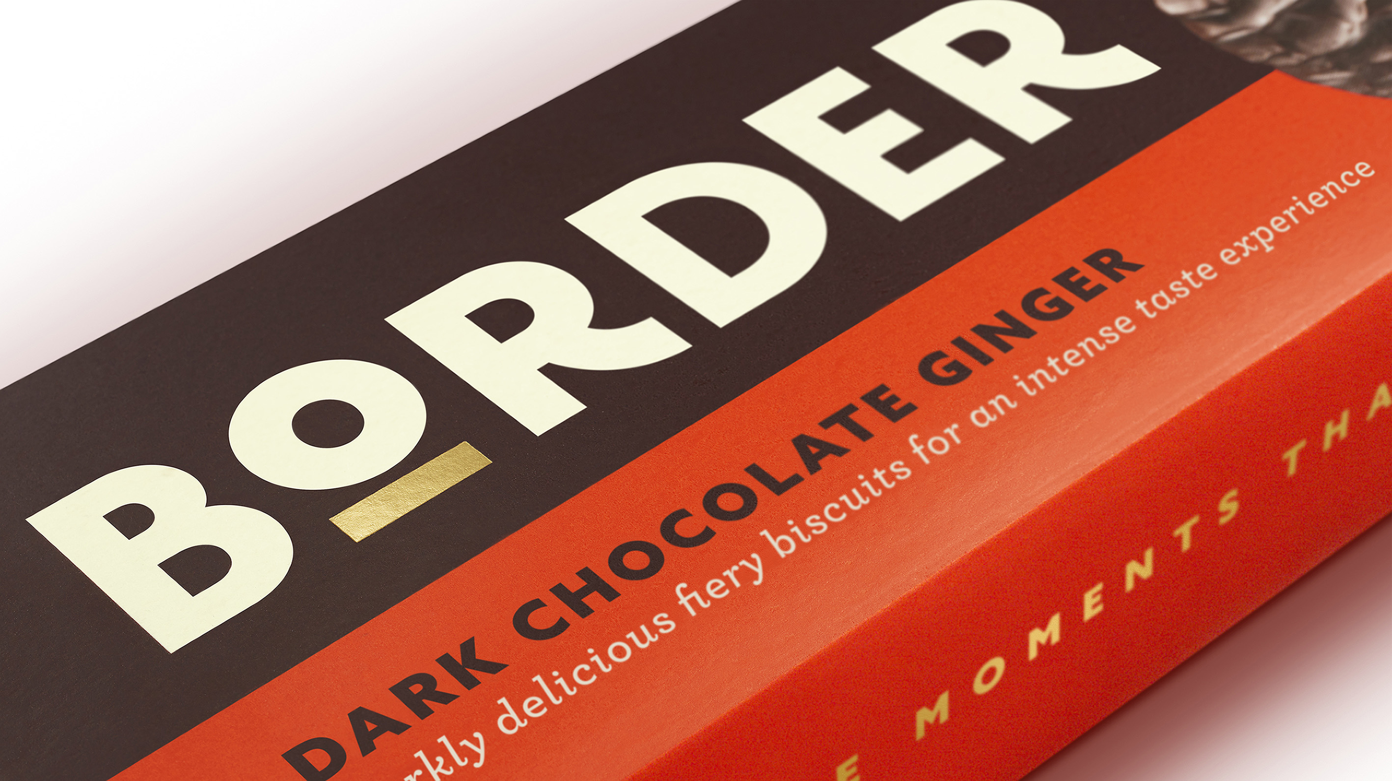
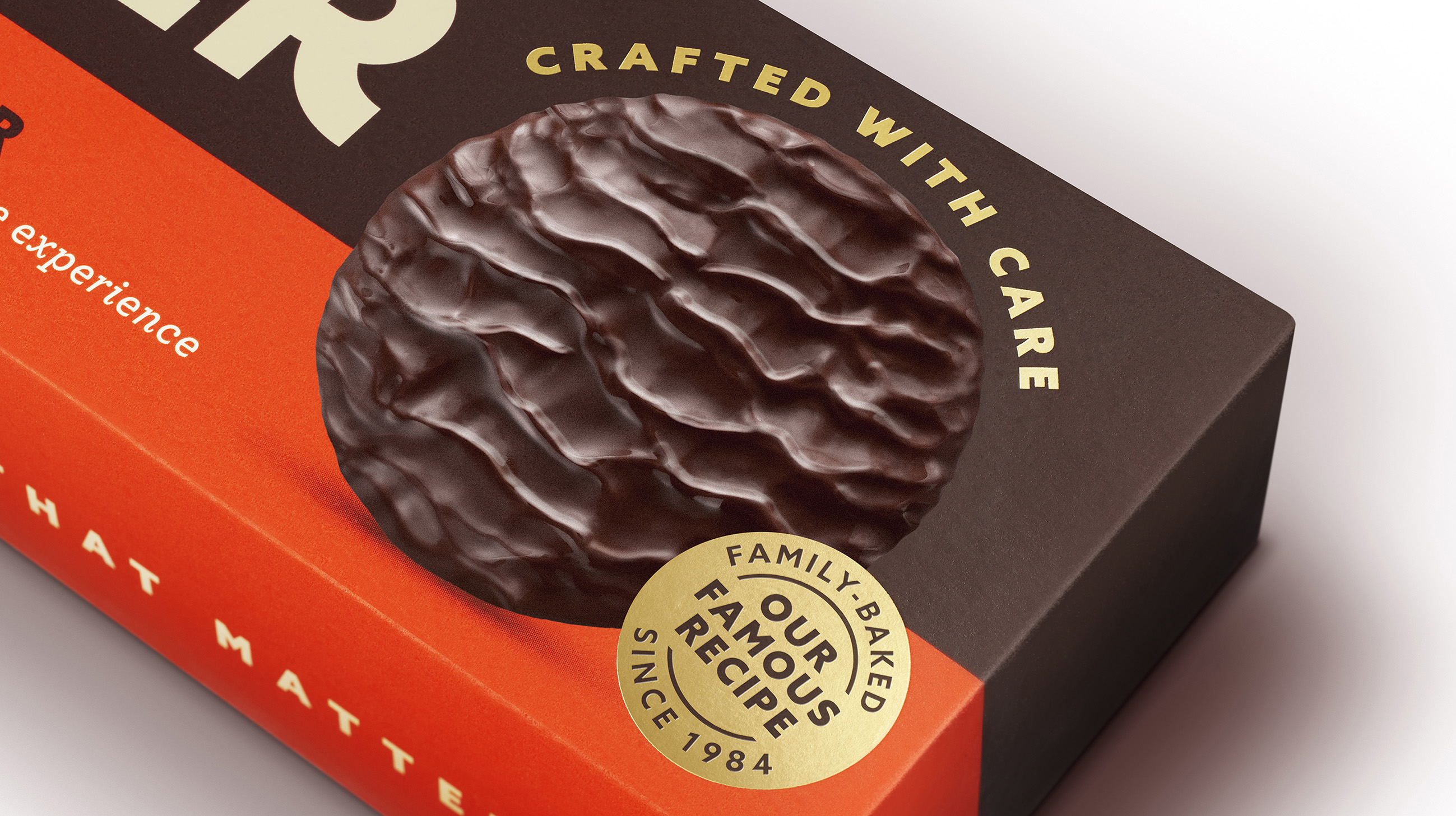
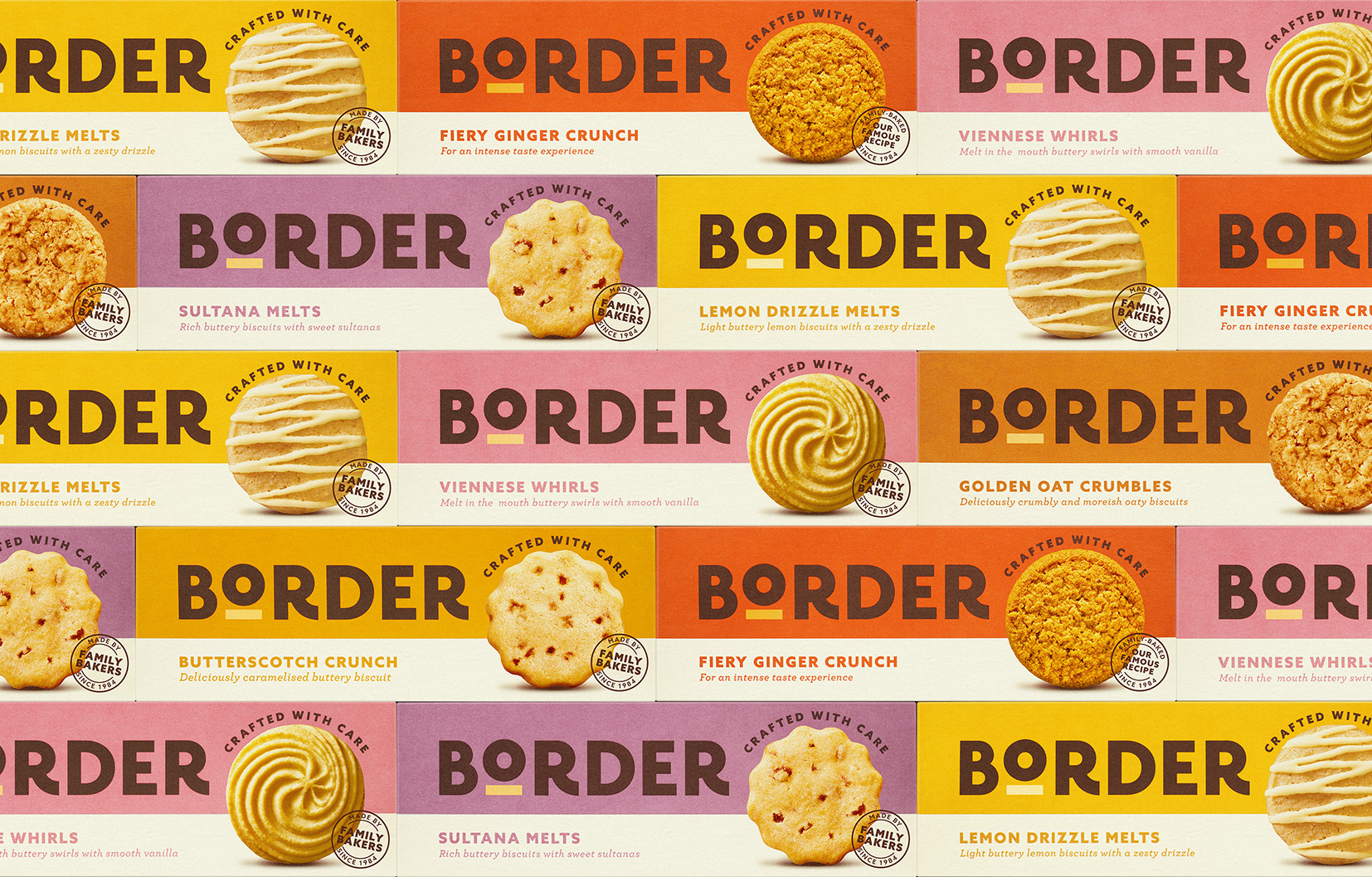
The new visual identity marks a significant step-change and brings instant clarity to Border – a brand that is inextricably linked to the quality of its products. A bolder logotype contains a characterful elevated O with an underline, designed to represent the product, and the brand’s commitment to quality. An updated on-pack message – Crafted with Care – reinforces this feel, speaking to Border’s heritage as a family-owned business of expert biscuit-makers.
Effortless Navigation
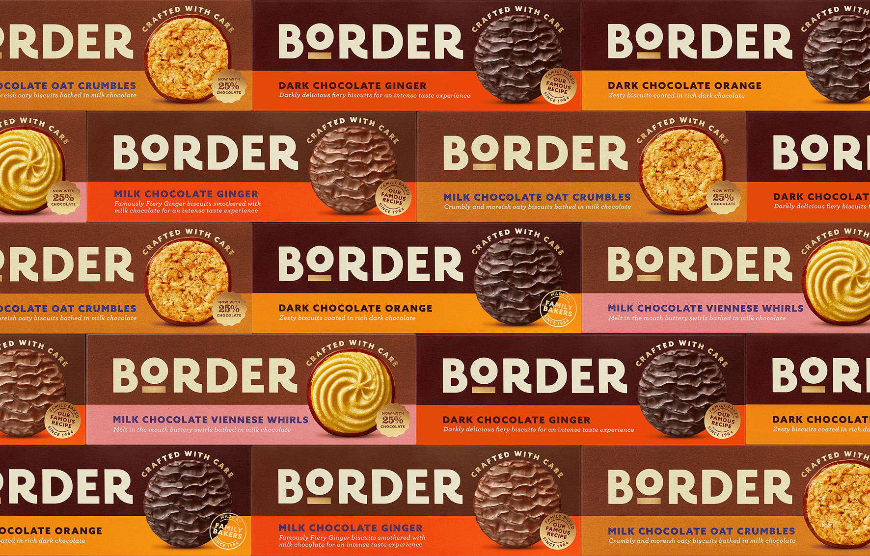
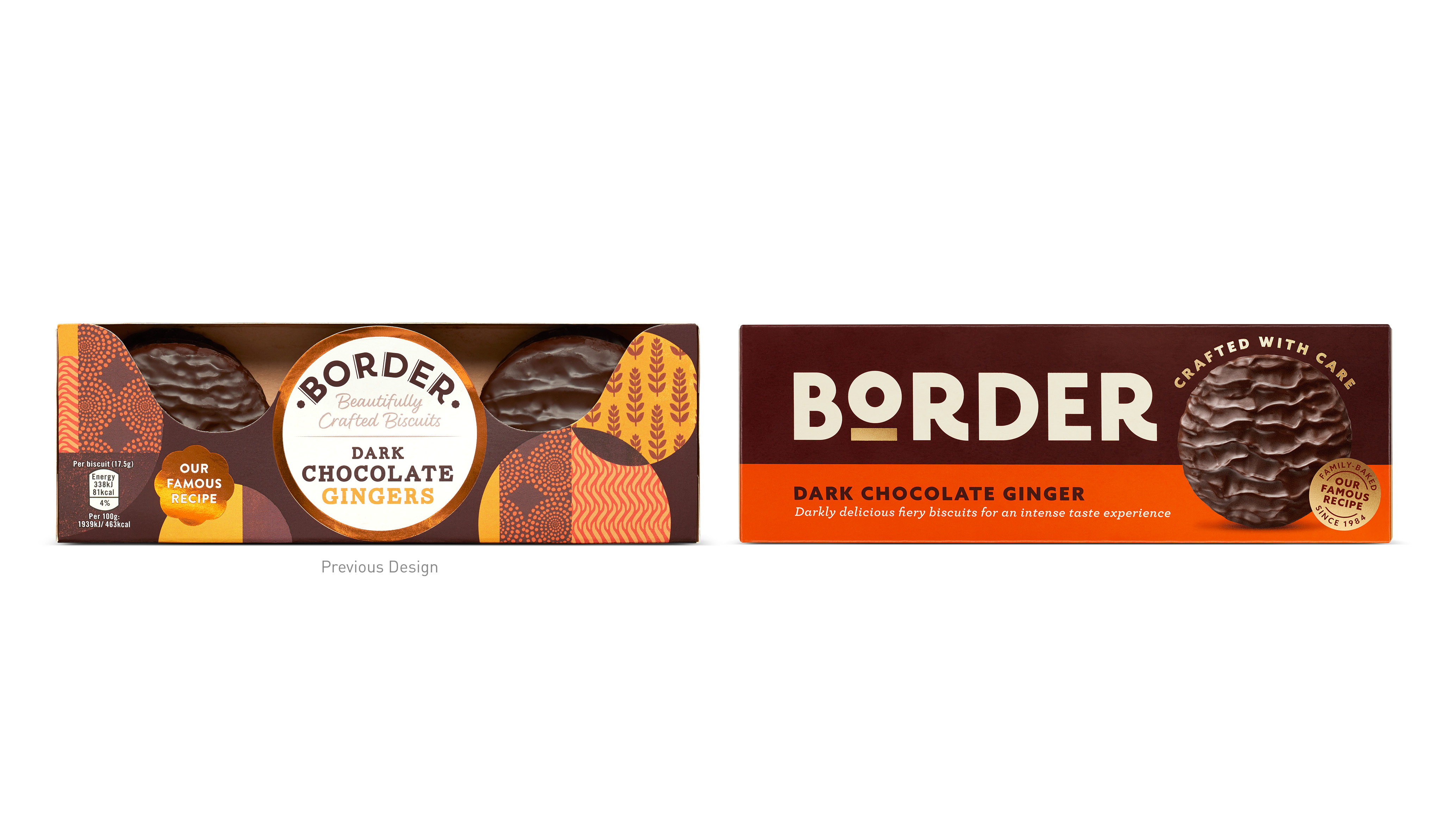
Evolving the brand from its existing world of beige was key to the redesign. The new system comprises a fresh and tasty colour palette, celebrating each biscuit variant with its own shade, and introducing greater range differentiation and effortless navigation to create range harmony. While literal product visibility has been lost in the removal of windows – part of Border’s journey towards reduced packaging – bold product photography is able to display the biscuits in their most perfect state for far greater taste communication. The resulting design offers exceptional shelf standout and works beautifully as a range.
Shaun Bowen, Creative Partner at B&B comments: “The trusted quality of Border Biscuits really sets the brand apart. Our confident rebrand proudly reinforces this status, championing Border as the biscuit of choice for moments that matter and elevating it among the competitive set.
“The design was specifically crafted to set strong foundations for new product development,” adds Shaun. “Border has big ambitions, and its existing design simply didn’t have the stretch or impact to deliver on innovation.”
Jack Gibbons, Design Director at B&B, continues: “Having the confidence to be bold, simple and impactful is crucial for premium accessible brands within a fast-moving retail space. Maintaining that simplicity while enabling much greater range navigation was perhaps the biggest challenge, but the new design system successfully helps shoppers shop today, while setting the brand up for tomorrow.”
Suzie Carlaw, Head of Brand, at Border adds: “B&B’s expertise in premium accessible design has been instrumental in helping us target an untapped segment within the biscuits category where consumers are looking to trade up from everyday products to more premium options.”
Border’s new products – Dark Chocolate Orange Biscuits and Bars are now available in Sainsbury’s with wider distribution to follow, while its Dark Chocolate Raspberry products will be launched soon.
CREDIT
- Agency/Creative: B&B studio
- Article Title: B&B Studio Rebrands Border, Bringing Accessible Premium Design to the Biscuit Category
- Organisation/Entity: Agency
- Project Type: Packaging
- Project Status: Published
- Agency/Creative Country: United Kingdom
- Agency/Creative City: London
- Market Region: Europe
- Project Deliverables: Brand Design, Brand Guidelines, Brand Identity, Brand Redesign, Packaging Design
- Format: Box
- Substrate: Pulp Carton
- Industry: Food/Beverage
- Keywords: redesign, rebrand, Border Biscuits, accessible, premium, packaging design,
-
Credits:
B&B studio: B&B studio


