


B&B studio has partnered with Edgewell-owned Wilkinson Sword to rebrand and revamp its shaving and grooming portfolio, introducing contemporary design confidence while re-emphasising the brand’s unique heritage. The rebrand cements Wilkinson Sword’s role as the ultimate challenger to brand leader Gillette in the face of new market entrants and direct-to-consumer offerings.
The Blade Masters since 1772
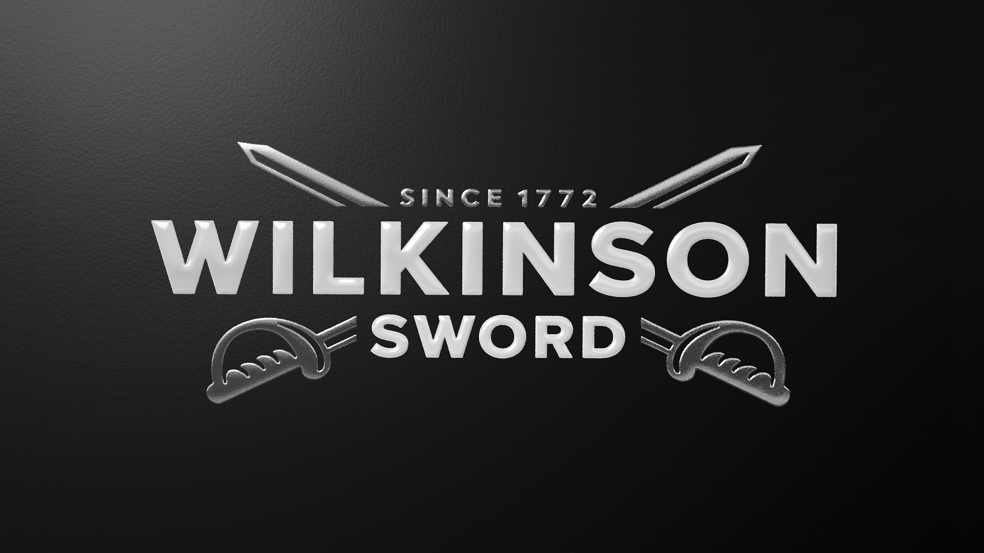
Working to a new brand positioning – The Blade Masters since 1772 – inspired by the brand’s 250+ year history and sword-making origins, B&B studio began the project by recrafting Wilkinson Sword’s iconic double sword logo. The new design moves away from the existing flat and one-dimensional graphic, introducing greater depth and character to the swords, and modernising the logo’s typography – including reworking the Ws with sharp and purposeful cuts. A new “Since 1772” tagline stresses the brand’s longevity and expertise, adding quiet confidence to the execution.
A Complex Portfolio
Bringing meaning and purpose to the brand’s portfolio was the project’s core strategic challenge. A new consumer-led architecture, inspired by The Blade Masters – focuses on expertise and introduces four distinct ranges across the brand’s shaving and grooming products. This simplified system was created to help people find the right tools to achieve a more masterful shave.
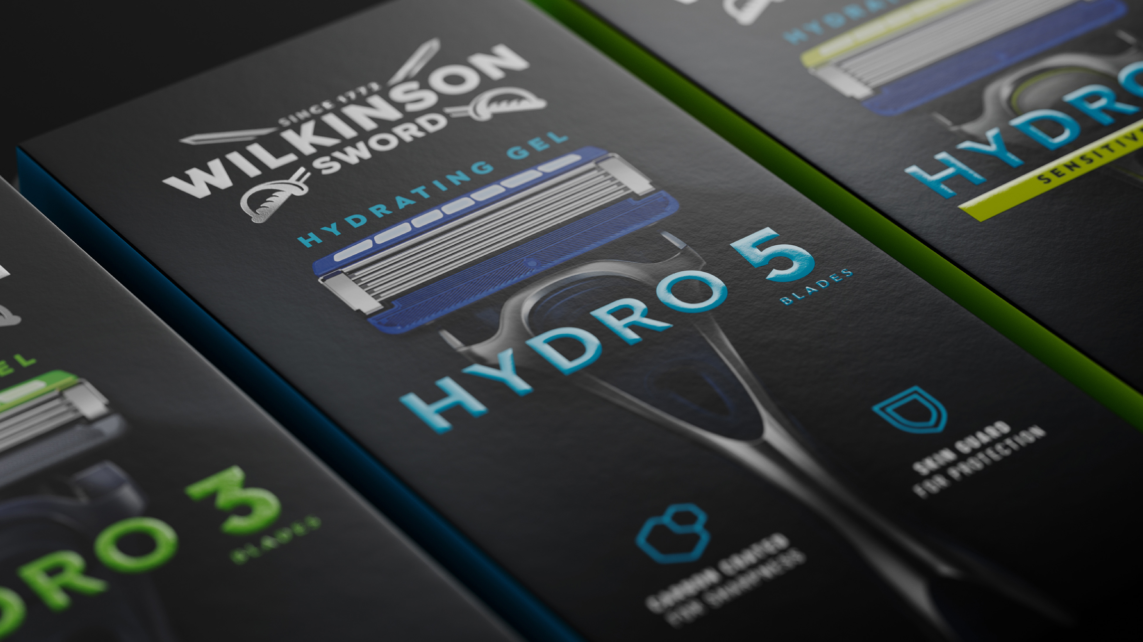
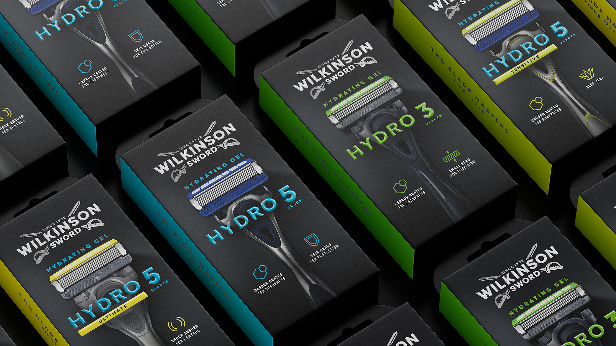
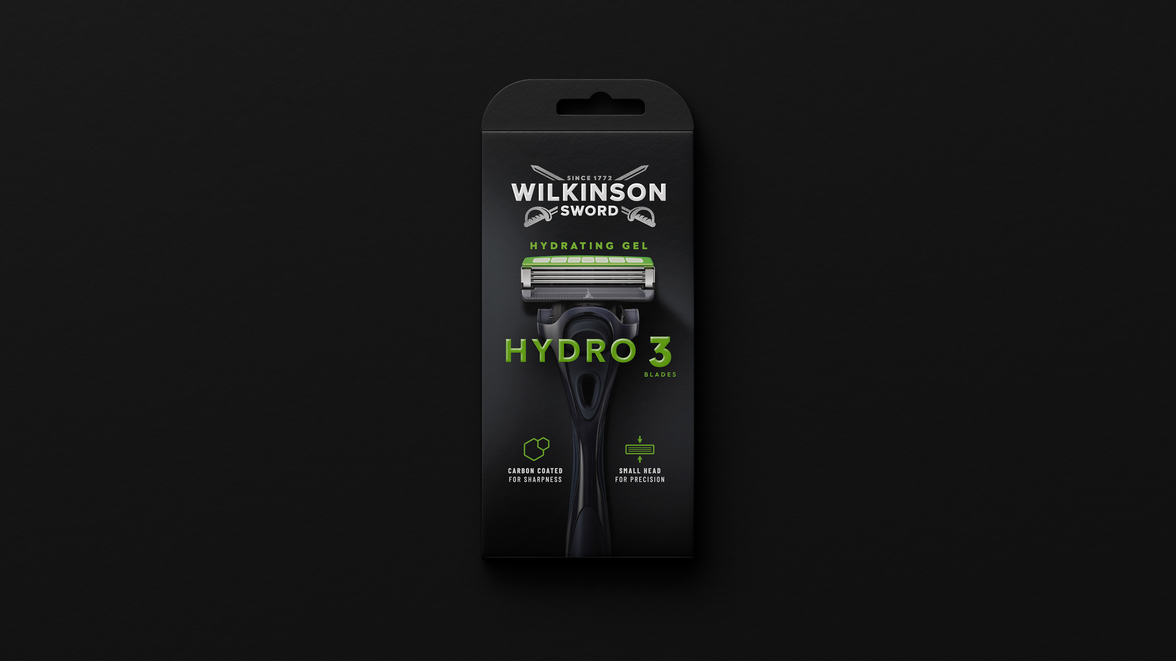
With different SKUs available in different markets, it was essential to create an overarching family feel from a design point of view, so that any of the products could sit together. This has been achieved by introducing black as a core brand colour across all ranges, and using colour blocking, layout and typography to differentiate ranges, and variants within each range. Across all SKUs, product is put on a pedestal through hero imagery that clarifies what’s inside.
A simplified communications system has also been introduced, with a clearer product naming, universal benefit-led iconography, and a consistent hierarchy, aiding navigation and making the brand’s expertise instantly accessible.
Wilkinson Sword’s Hydro range – the core razor offer – is the first of the new designs to launch onto the market, with further ranges to follow.
Contemporary Confidence
“Tackling the Wilkinson Sword portfolio has been an incredibly rewarding challenge,” comments B&B Design Director Jack Gibbons. “It is a privilege to partner with a brand so rich in heritage, and the new look emphasises the brand’s genuine quality and expertise in a cluttered marketplace.”
“B&B has successfully translated our new Blade Master positioning into a design that oozes contemporary confidence,” says Sophie Rock, Head of Wilkinson Sword Europe. “We can’t wait to see the complete portfolio on display in stores.”
CREDIT
- Agency/Creative: B&B studio
- Article Title: B&B Studio Partners with Wilkinson Sword to Rebrand and Restructure its Shaving Portfolio
- Organisation/Entity: Agency
- Project Type: Identity
- Project Status: Published
- Agency/Creative Country: United Kingdom
- Agency/Creative City: London
- Market Region: Europe
- Project Deliverables: Brand Architecture, Brand Identity, Packaging Design
- Industry: Beauty/Cosmetics
- Keywords: brand redesign, packaging redesign, Wilkinson Sword,
-
Credits:
B&B studio: B&B studio


