B&B studio – Peppersmith Rebrand
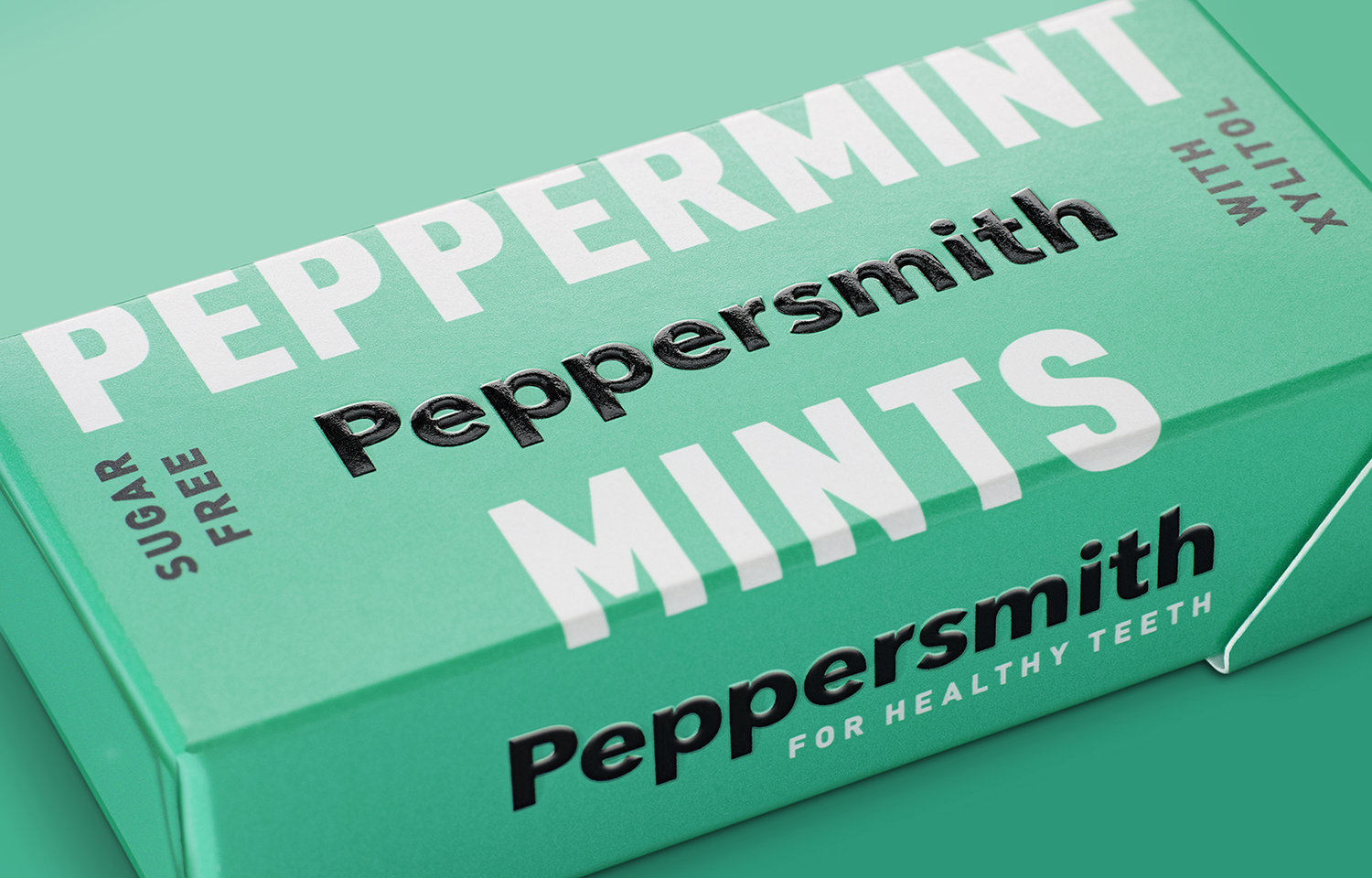
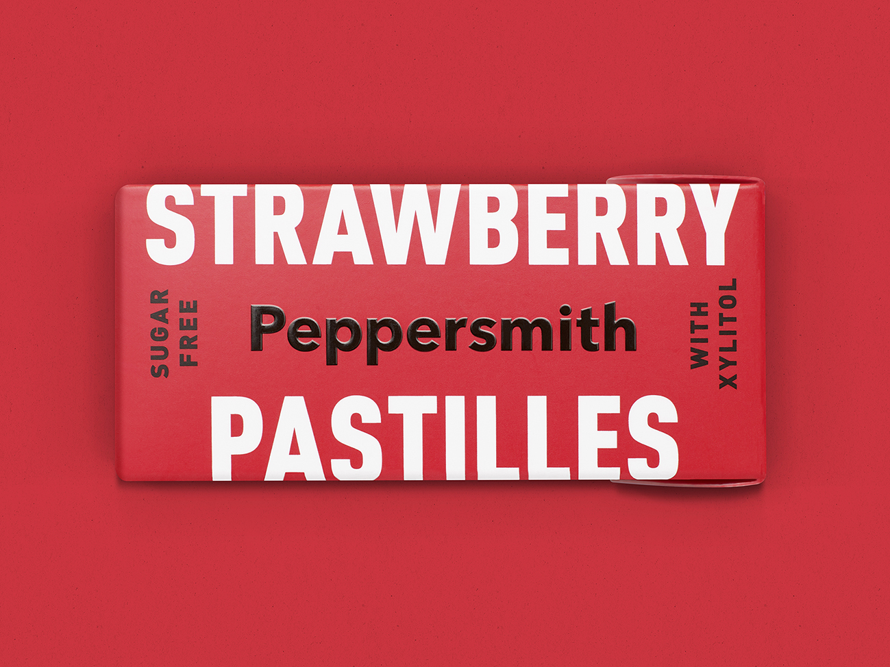
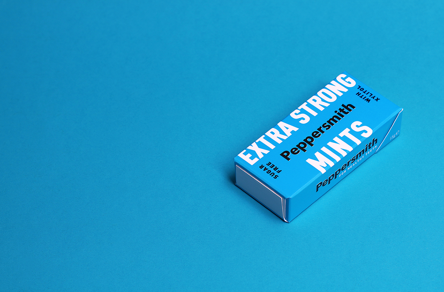
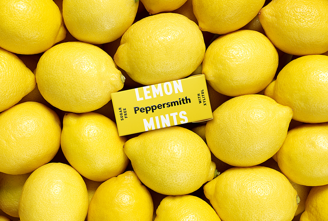
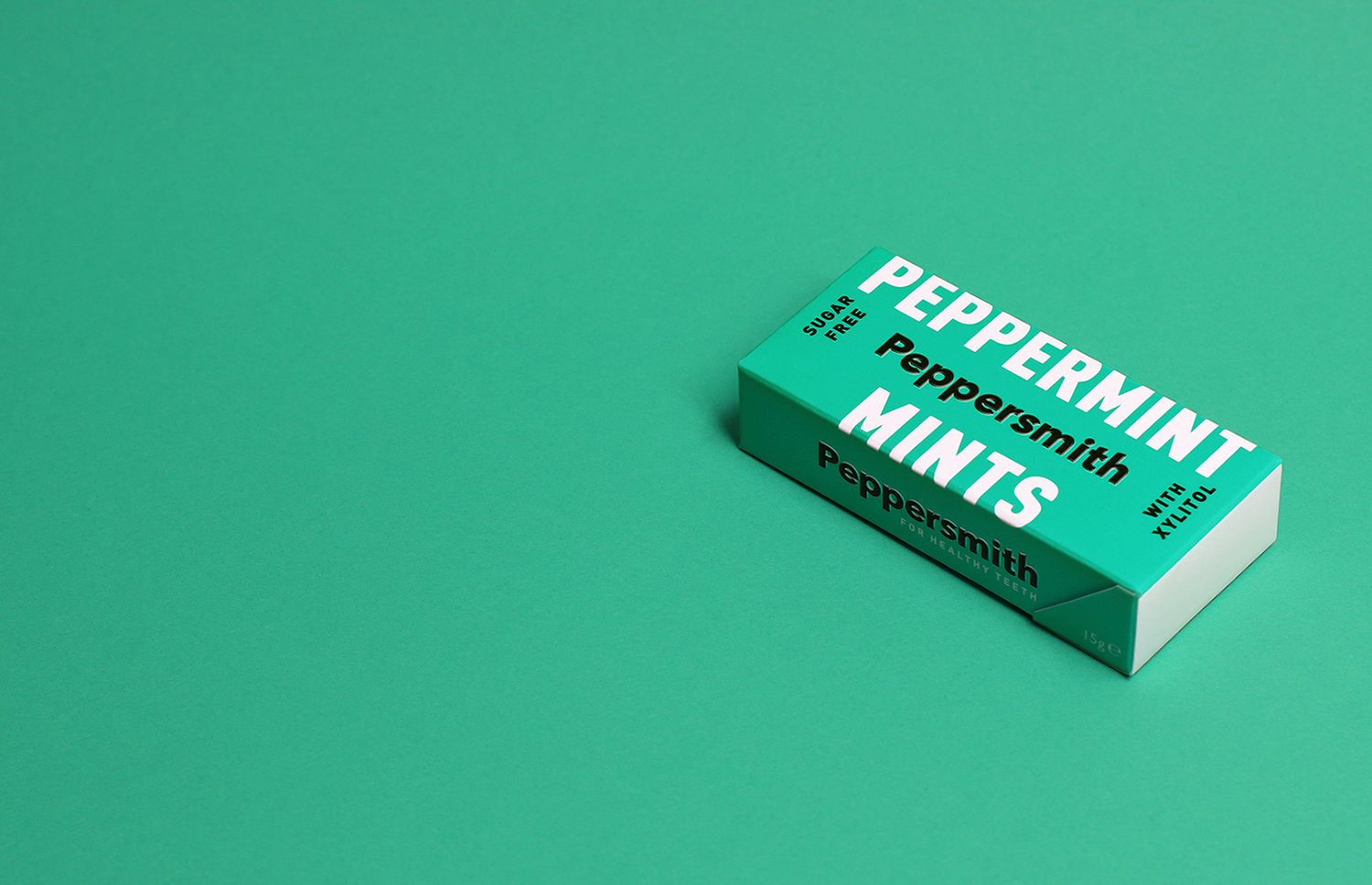
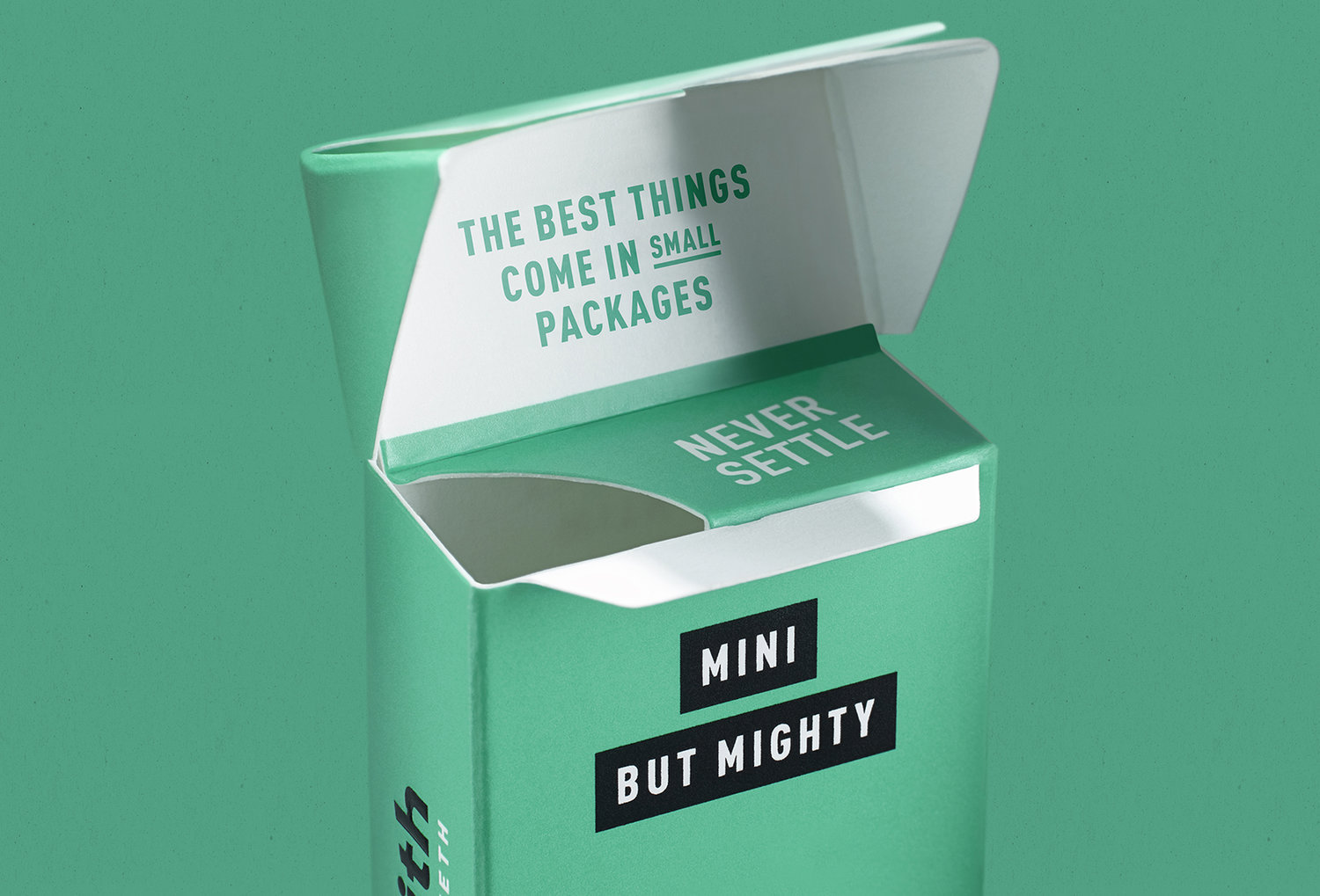
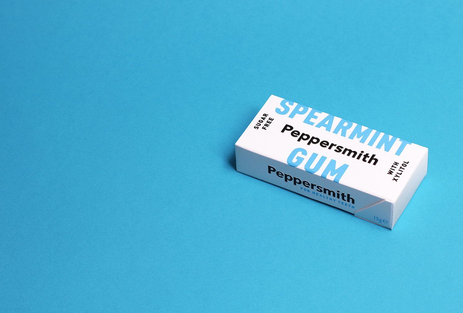
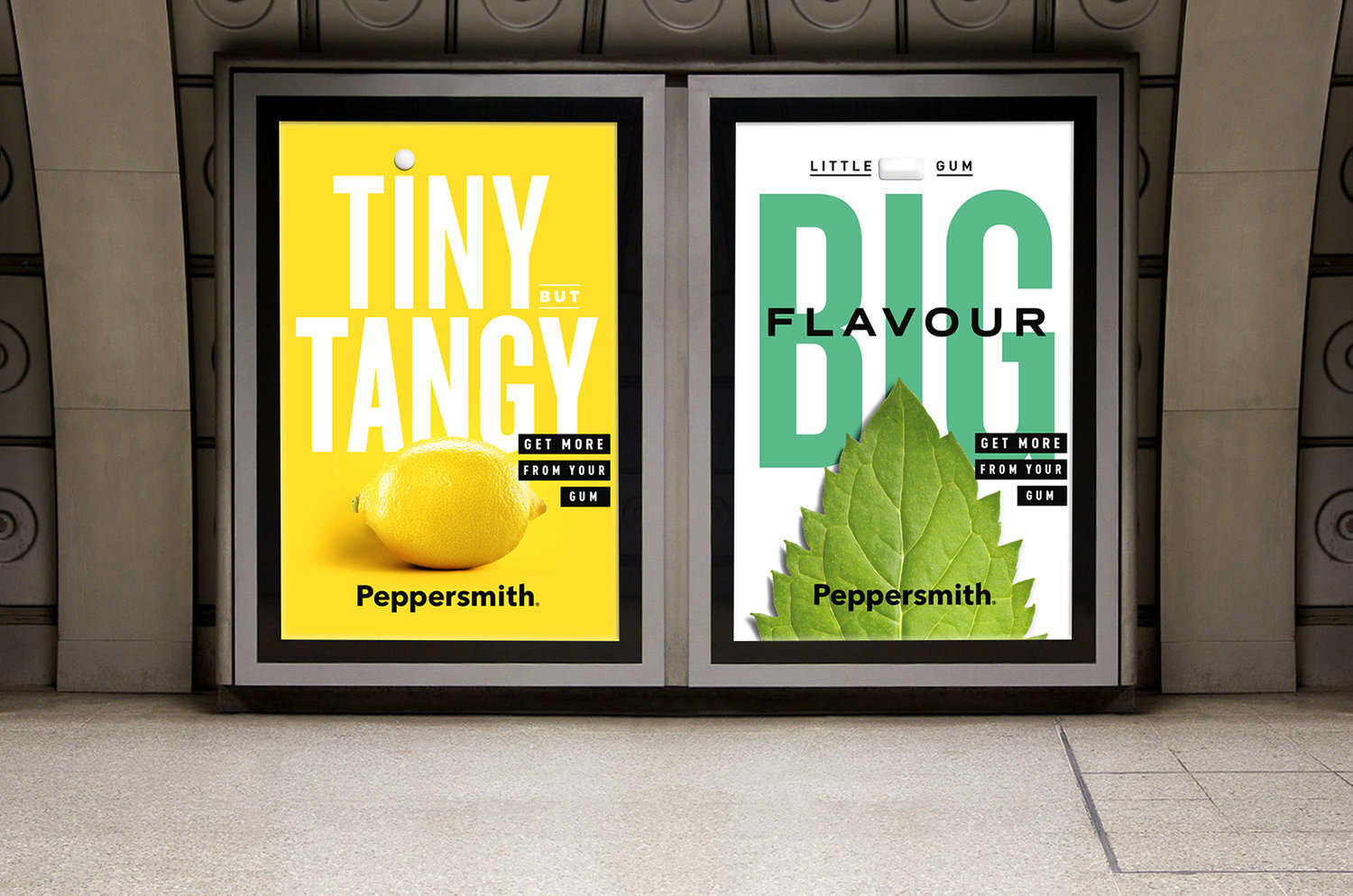
Building on a long-standing agency-brand relationship, B&B has created a fresh look and feel for Peppersmith, celebrating the natural ingredients and strong flavours of each product in the brand’s range of gum and mints. Category and market shift Since B&B created the original Peppersmith brand as a challenger to the mainstream gum category back in 2010, category and market shifts had caused the brand to adopt a more functional benefit-driven approach. The packaging refresh project was a great opportunity for the agency to reappraise what the brand truly stands for, what it should be communicating and how. B&B was keen to build on Peppersmith’s internal mantra of Never Settle, and carve out a more emotionally engaging platform that celebrates the brand’s commitment to being better made and better for you. Small packs, big personality Working with the new positioning, B&B was able to reinvent the overall brand and visual identity and introduce new brand messaging that celebrates high quality, natural ingredients. Incorporating spearmint or peppermint leaves, lemons or strawberries, each element of the Peppersmith identity from the individual packs to printed and digital materials is brought to life with bold, large scale imagery and powerful colours. The copy on each pack has been stripped back with wrap-around lettering and playful phrasing such as ‘mini but mighty’ and ‘tiny but tangy’, reinforcing the punchy flavours in each mint or gum. In addition, Peppersmith has introduced plastic-free packaging which no longer incorporates a plastic wrapper. #neversettleShaun Bowen, Creative Partner at B&B studio, says: “When we first partnered with Peppersmith, we positioned them as a premium gum with a handcrafted feel. But this is a brand that never settles. Over the years, Peppersmith has evolved to meet consumer demand for everyday-premium brands that are health-conscious and pack a flavour punch. It’s a brand without compromise. “In this rebrand, we’ve defined the brand’s functionality and repositioned them with a desirable lifestyle aesthetic, enabling them to confidently communicate the product benefits through the appropriate channels, from high quality ingredients to health credentials.” Mike Stevens, Founder of Peppersmith, says: “The new designs give us a much more contemporary look, make our messaging clearer and give us better stand out in an increasingly competitive category. With a more streamlined aesthetic and bolder tone of voice, B&B has reinforced our position as a leading challenger brand with a strong personality that sets us on a path for future growth.”
CREDIT
- Agency/Creative: B&B Studio
- Article Title: B&b Studio Delivers New Brand Identity for Peppersmith – Small Packs With Big Personality
- Organisation/Entity: Agency, Published Commercial Design
- Project Type: Packaging
- Agency/Creative Country: United Kingdom
- Market Region: Europe
- Format: Box
- Substrate: Pulp Board


