


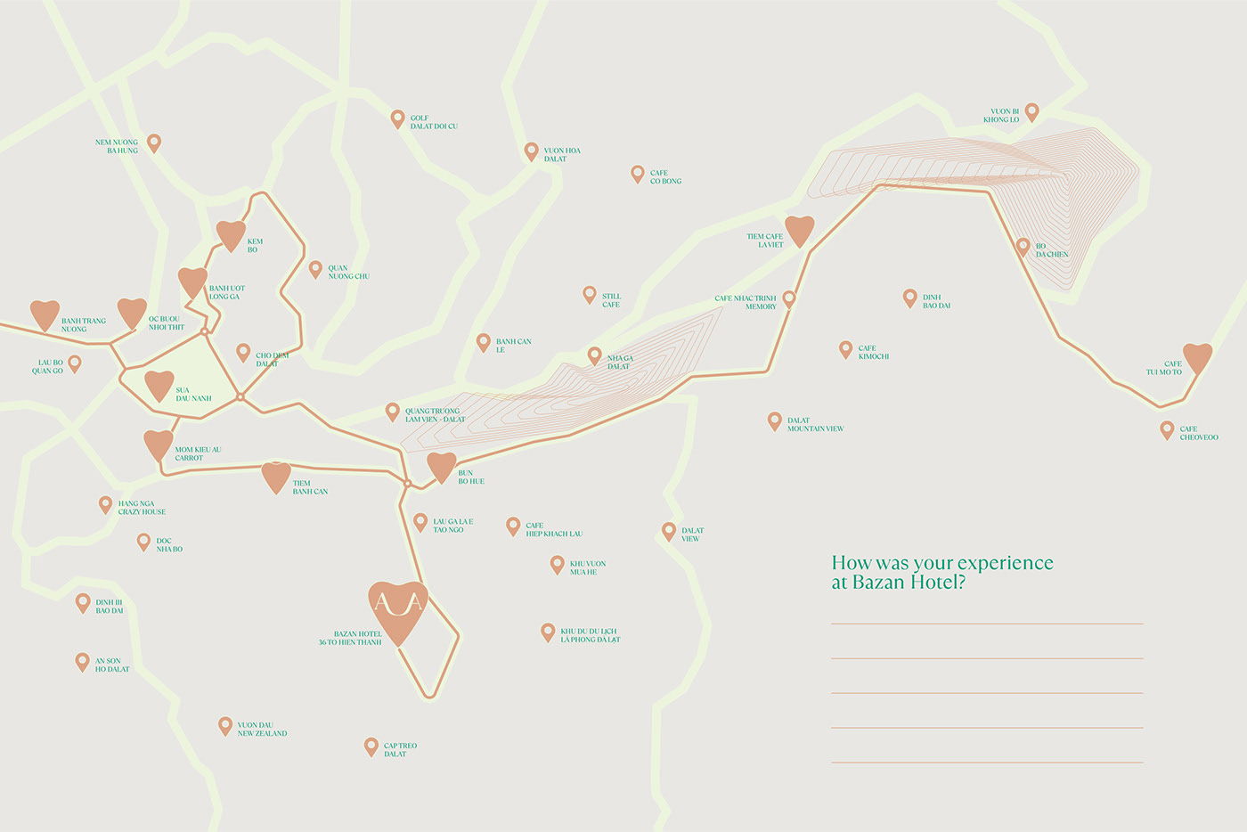
Bazan and Local Beauty: Da Lat is always an interesting destination for people who love to travel and experience. Not only possessing a mild and cool climate all year round, but Da Lat also attracts tourists with its precious architectural heritage along with a history of more than a century. It is the advantages of climate, nature, topography, and architecture that have made Da Lat an ideal destination for experience tourism and relaxation.
Bazan is one of many hotels located in Da Lat city. With a friendly, approachable personality, focusing on service quality, and meticulousness in decorative items that cleverly integrate Da Lat elements, Bazan wants to bring visitors a memorable experience with Da Lat’s geographical features and people.
Mission: Create an identity associated with local elements as well as showing the thoughtfulness and care for the service quality at the hotel in order to bring a memorable experience to visitors. The identity personifies the essence and spirit of Bazan Hotel. Building an identity to increase the competitive advantage for Bazan Hotel compared to its neighbouring hotels in the aspect of enhancing the stay experience.
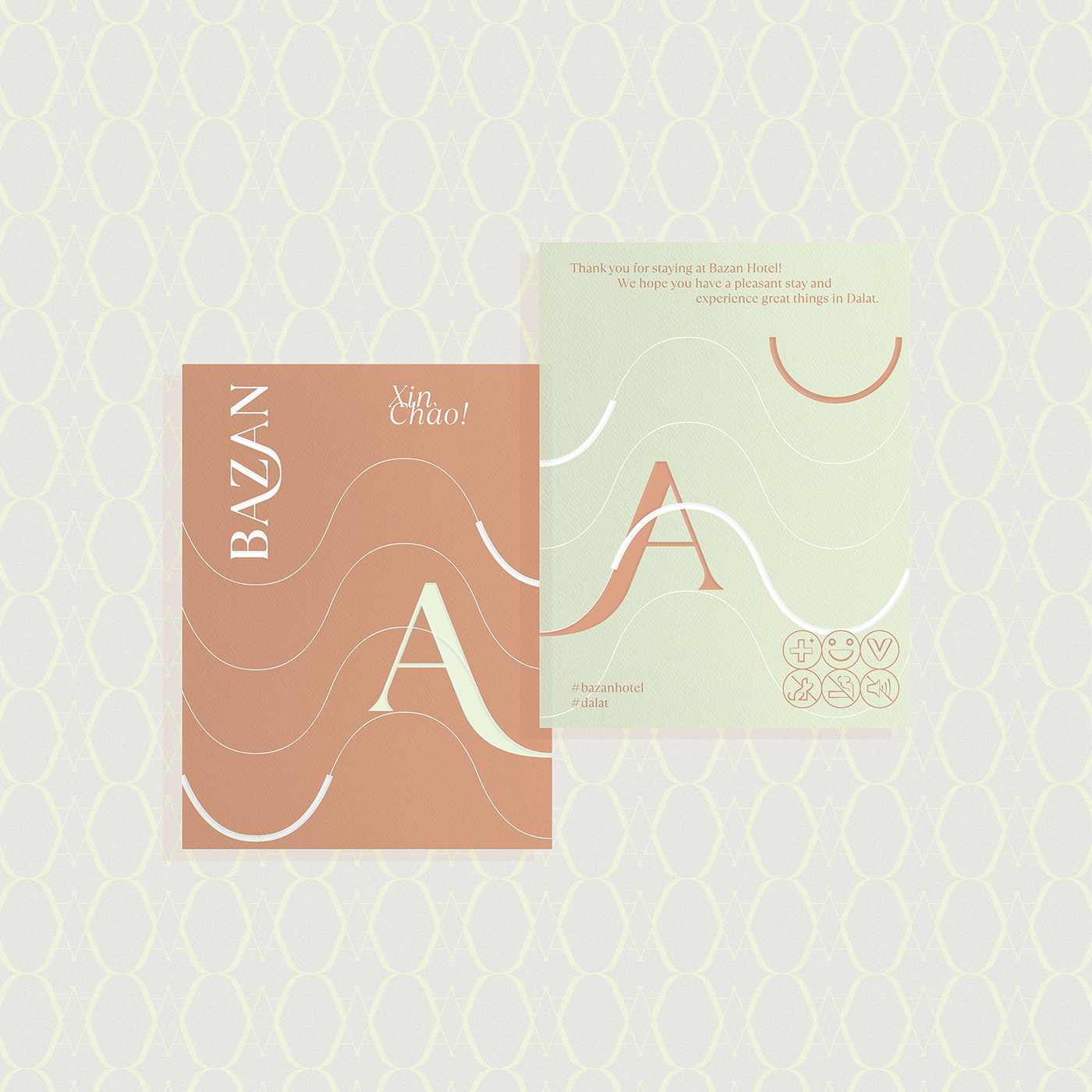
Solution: Visiting Da Lat, you will easily encounter the up and down roads along with the diversity of green native flora all year round. All these create a very unique rhythm of Da Lat.
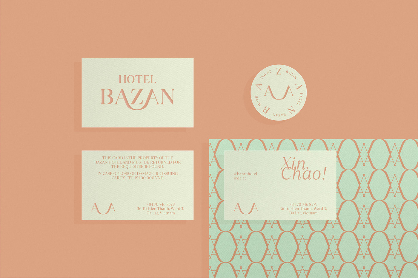
Even the name Bazan (in Vietnamese) is also named after a typical red-brown soil of the Central Highlands of Vietnam – basalt red soil.
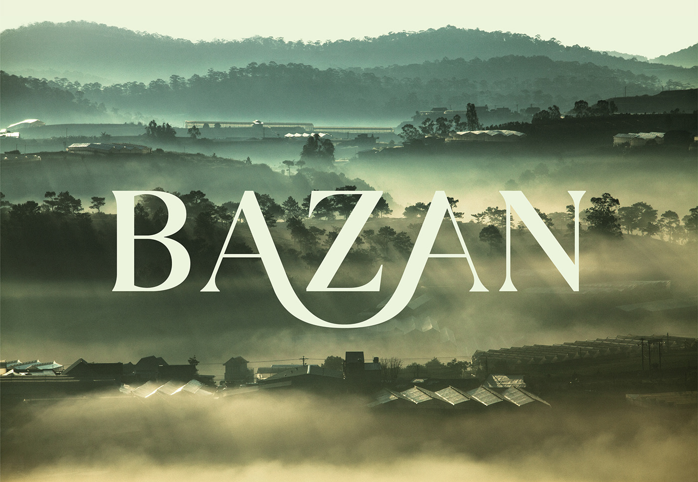
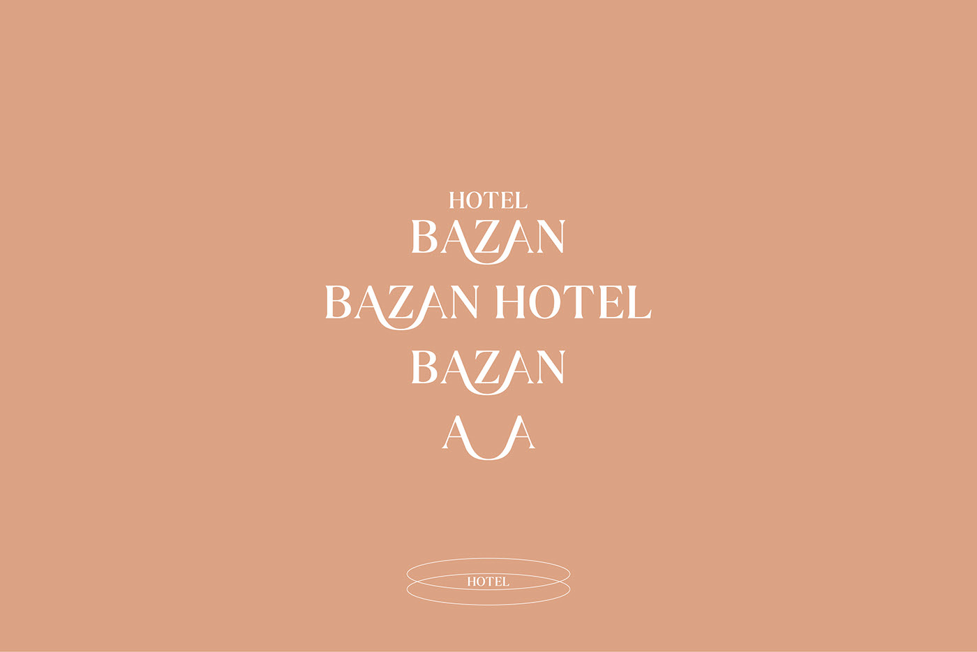
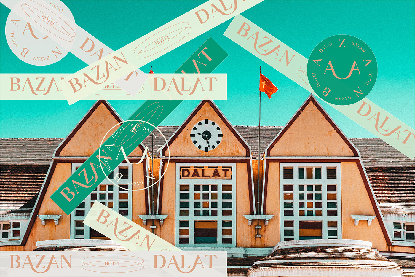
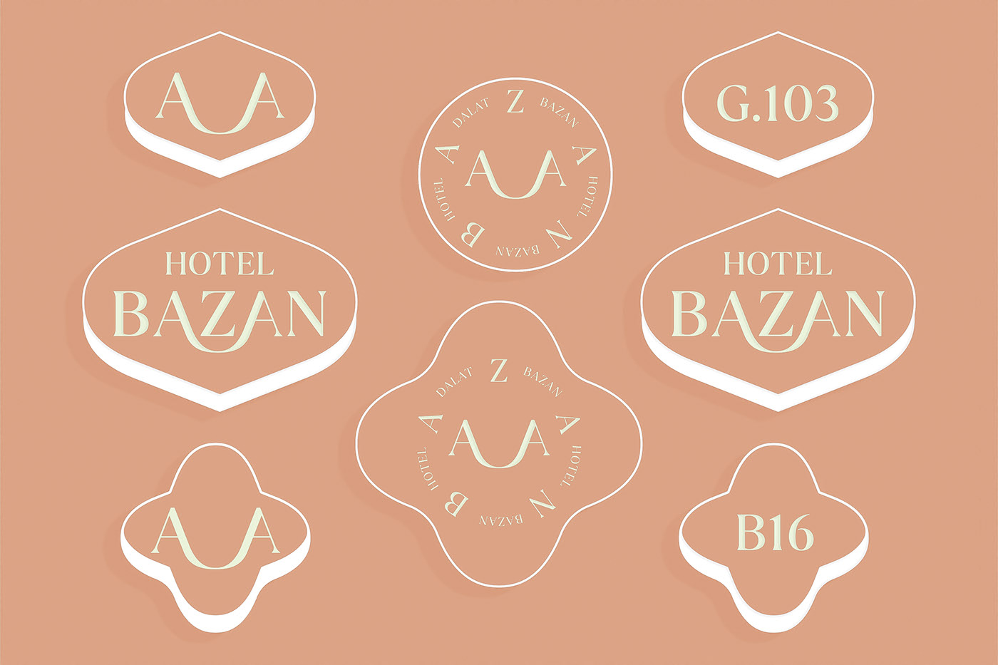
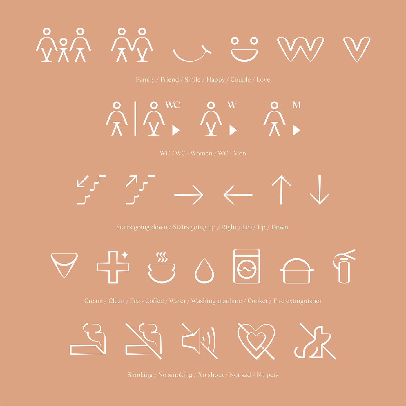
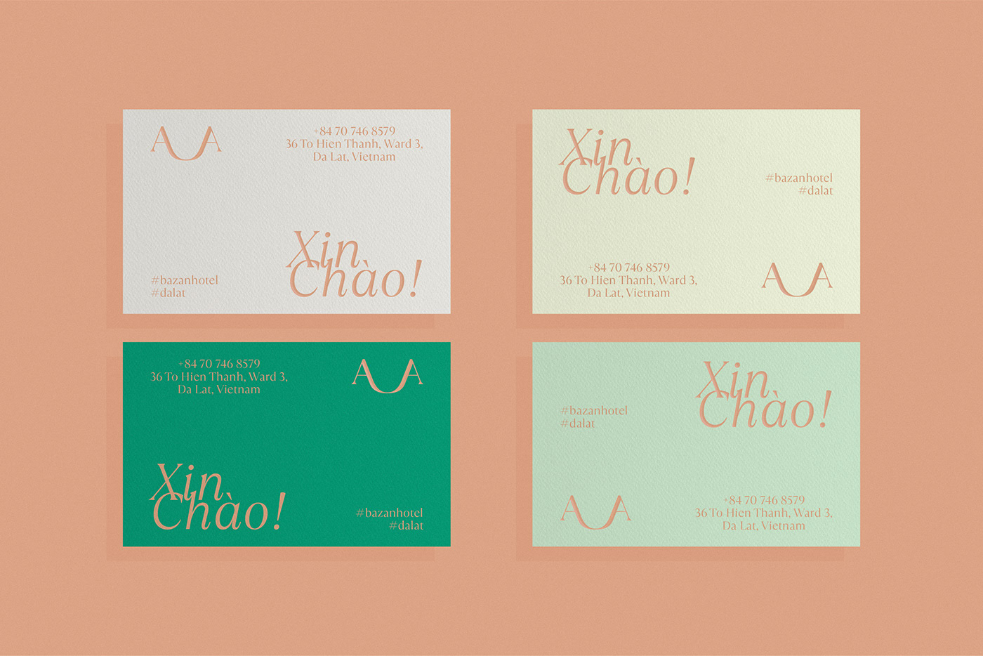
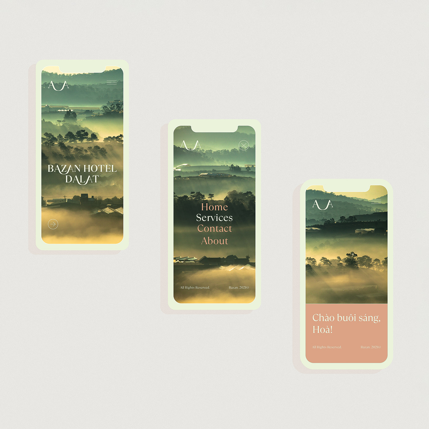
With the idea of taking connection and local elements as the root for all creativity, Bazan Hotel’s logo is built from a simple serif typeface and an extended line connecting the two letters A – A to help convey the idea: connecting the harmony between Da Lat and tourists, between friends, between Bazan and friends.
Bazan’s Wordmark is a simple combination of the key experiences at hotels: smile and sleep. The font is chosen to highlight the link of the same letters, you can easily recognize the connection between A – A in the brand name like a rhythm.
Starting from the hotel’s decor colors with two primary ones: brown of basalt red soil and light yellow, we developed secondary colors that complement the primary colors to emphasize the spirit of joy, comfort, and falling in line with nature.
CREDIT
- Agency/Creative: The Fubo
- Article Title: Bazan Hotel Brand and Visual Identity by The Fubo
- Organisation/Entity: Agency
- Project Type: Identity
- Project Status: Published
- Agency/Creative Country: Vietnam
- Agency/Creative City: Ho Chi Minh
- Market Region: Asia
- Project Deliverables: Brand Design, Brand Identity, Brand Naming, Branding, Illustration
- Industry: Hospitality
- Keywords: The Fubo, Bazan Hotel, brand, visual identity, Vietnam
-
Credits:
Art Director: Hoa Pham
Designer: Phuong Thao Pham
Project Assistant: Hong Cam Ngo


