


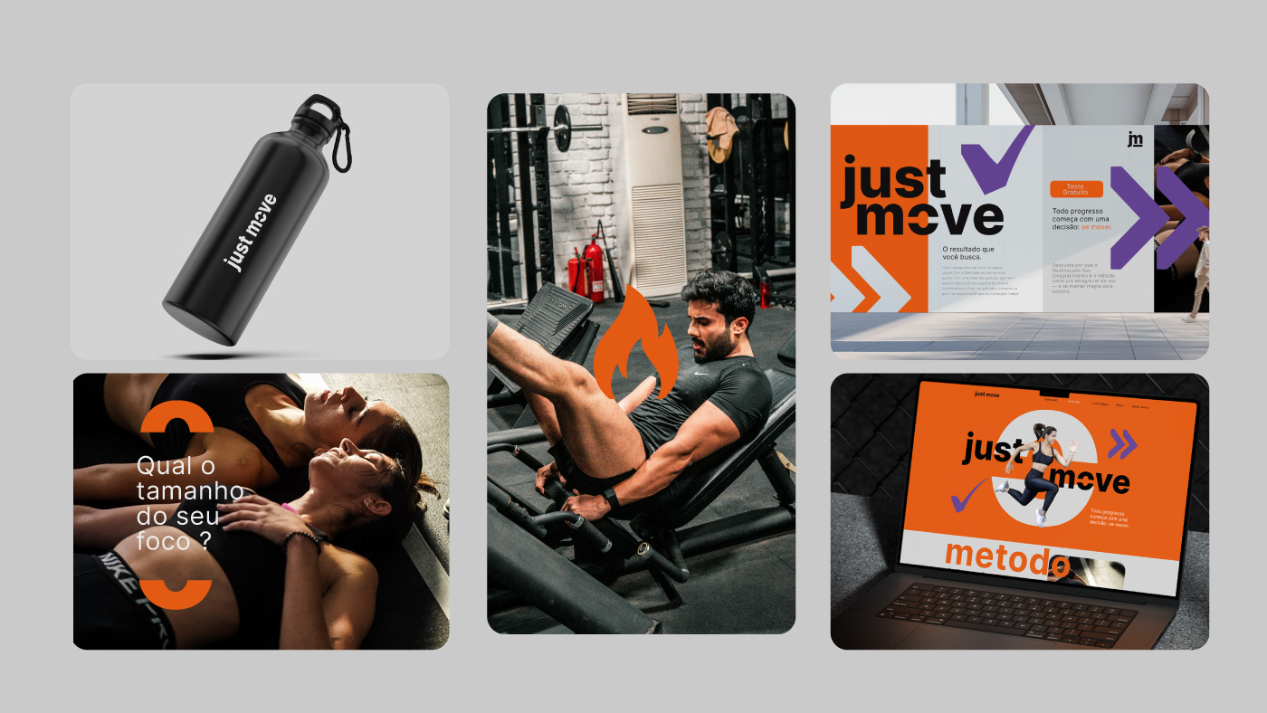
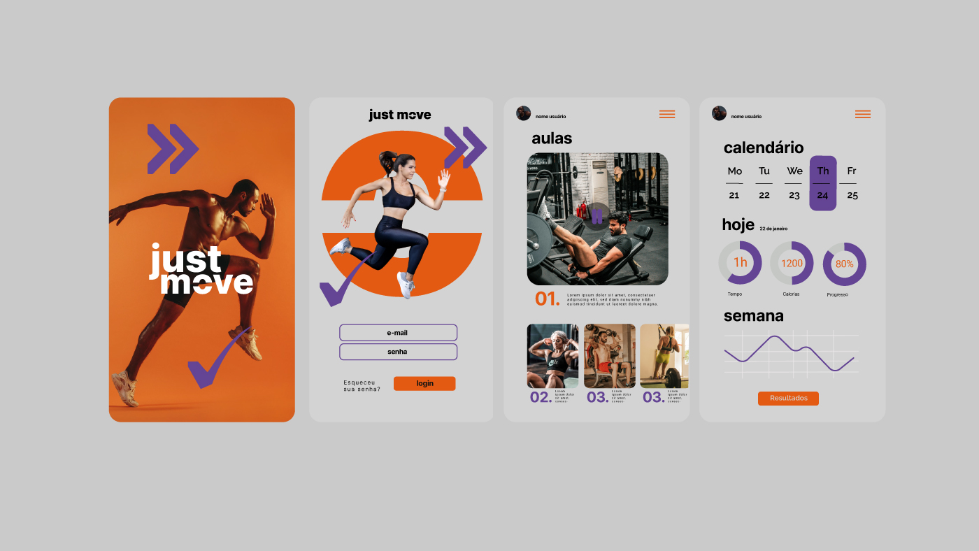
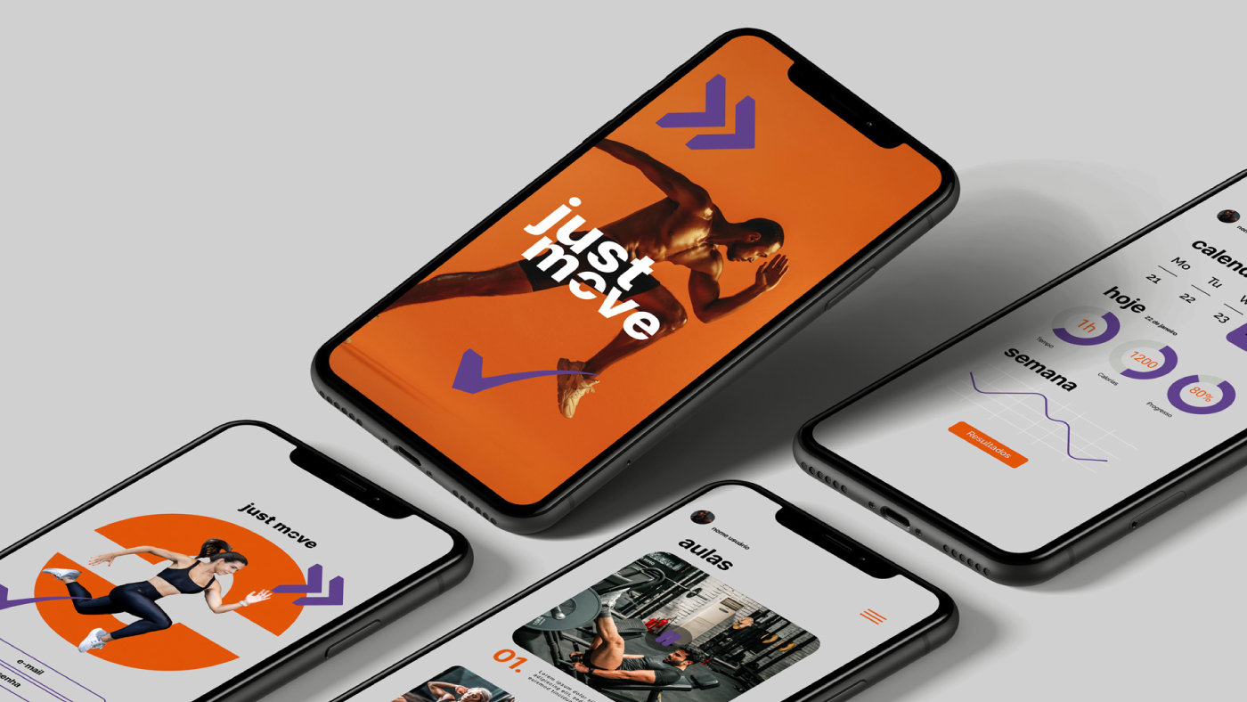
The Just Move rebranding project was built on a clear strategic foundation: to transform a fitness brand into a system of clarity, movement, and personal progress. Every visual and verbal decision was made to reinforce strength, direction, and sophistication while maintaining accessibility and humanity.
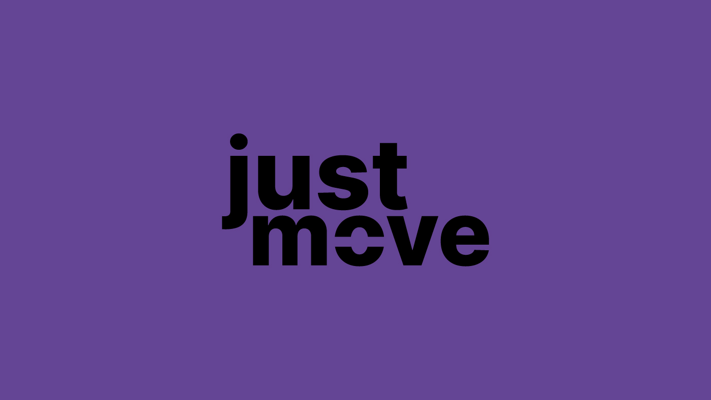
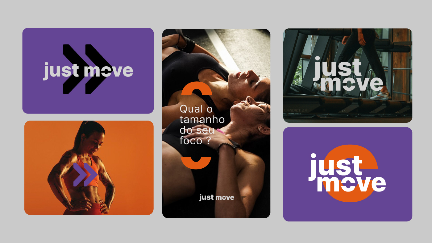
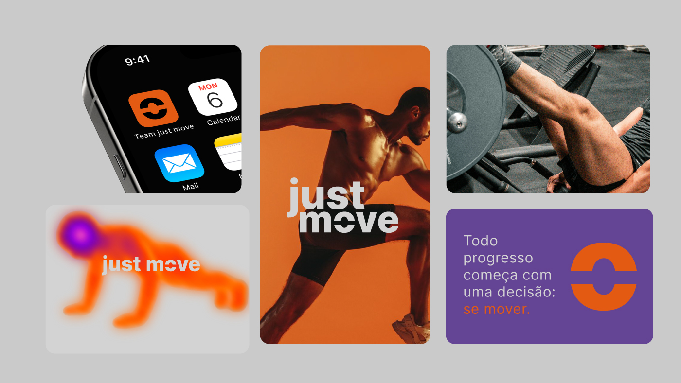
The color palette follows a deliberate logic of balance between power, energy, and refinement. Black serves as the structural base of the brand, sustaining authority, focus, and presence. It ensures clarity and visual impact across all applications. Orange acts as kinetic energy in motion, creating contrast, visual rhythm, and guiding the eye toward key highlights. Violet introduces a layer of innovation and technology, adding vision, personality, and differentiation within a highly competitive market. Off-white functions as breathing space, organizing composition, bringing lightness and balance, and naturally elevating the brand’s perception without excess.
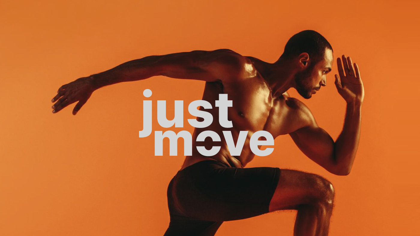
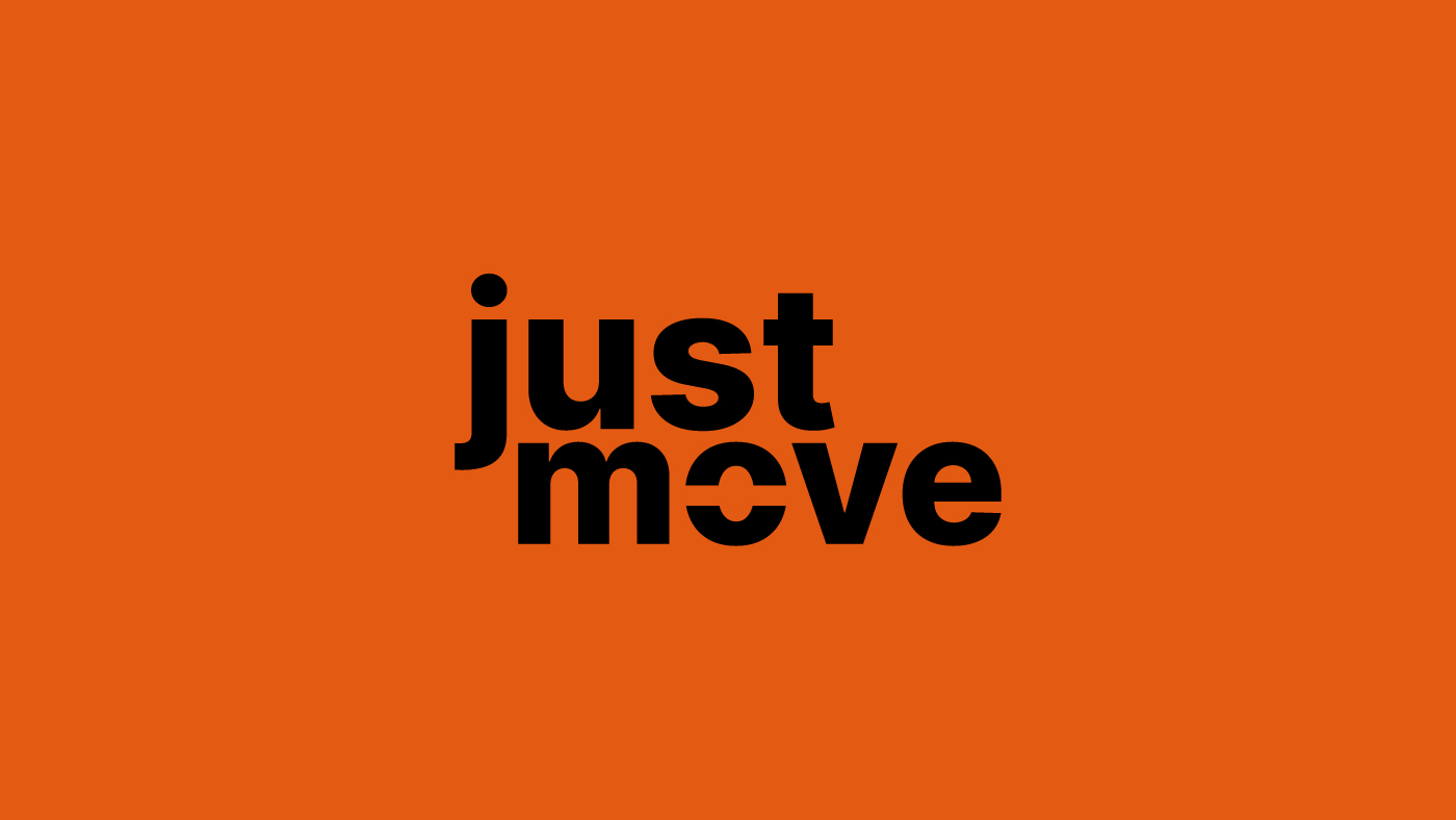
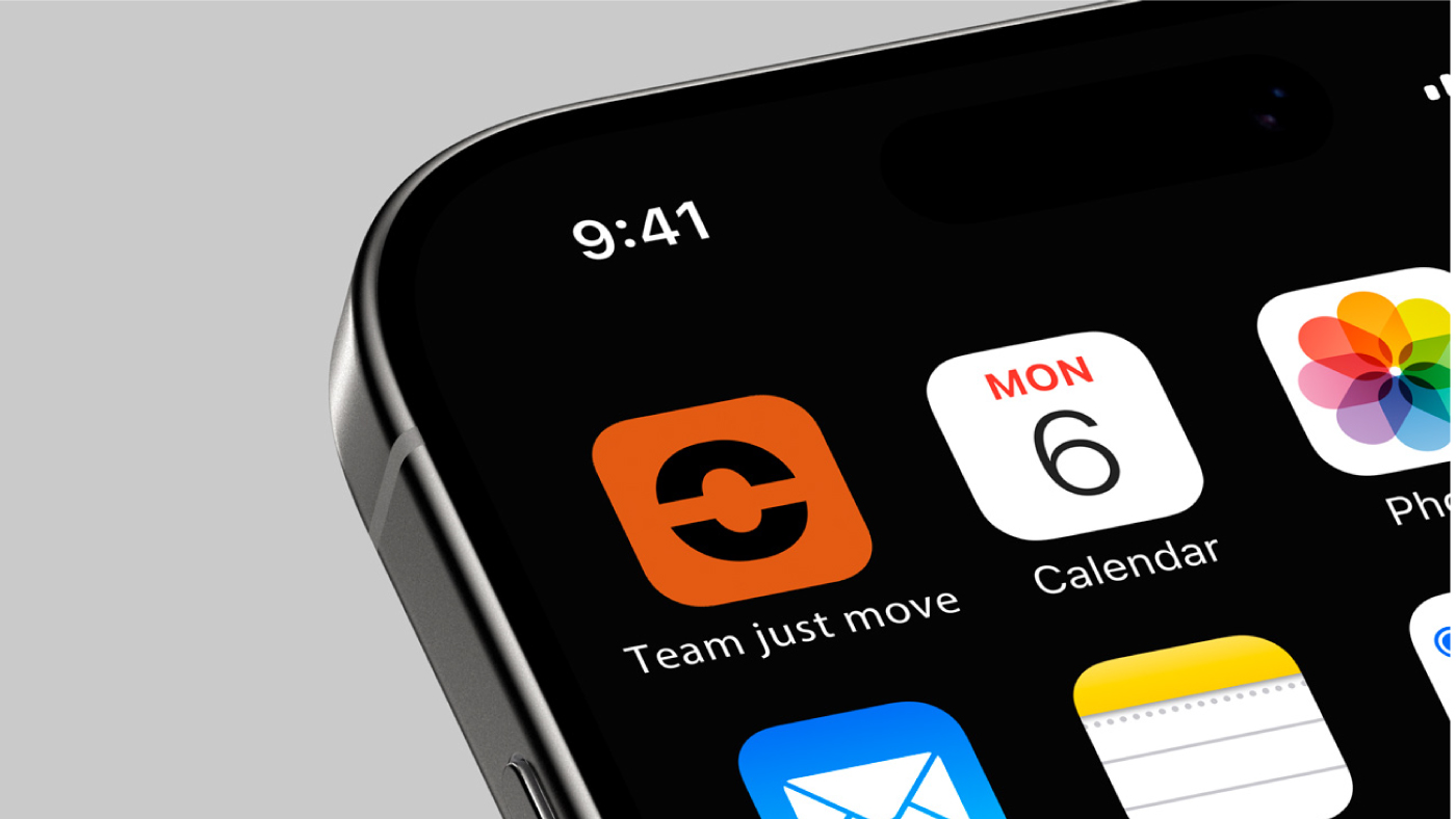
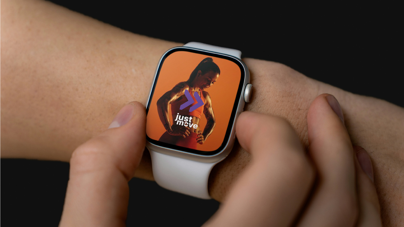
The logo translates movement with focus. The cut within the letterforms is not merely an aesthetic device; it symbolizes direction, precision, and intentionality. It reflects the idea of eliminating distractions to concentrate energy on what truly matters: moving forward. The bold typography conveys strength, impulse, and intensity, reinforcing an active and dynamic presence. At the same time, the use of lowercase letters creates proximity and approachability, communicating youthfulness, modernity, and alignment with contemporary digital product language.
Beyond aesthetics, the brand is rooted in belief. We believe progress is individual. No two bodies are the same. Real results happen when you understand your own rhythm. Just Move does not sell shortcuts. It sells clarity. It sells movement.
Our purpose is to transform doubt into action, inertia into consistency, and plans into measurable results. Through science, technology, and human presence, we simplify the journey. Training and nutrition become part of daily life, not a burden.
Because the body changes when the mind understands the process. And the mind changes when the body begins to respond.
Every day counts.
Every choice moves.
Every achievement is yours.
Just Move.
The movement that transforms.
CREDIT
- Agency/Creative: Bass. Estúdio Gráfico
- Article Title: Bass. Estúdio Gráfico Designs Gives Just Move a Clearer Direction in Fitness Branding
- Organisation/Entity: Agency
- Project Type: Identity
- Project Status: Published
- Agency/Creative Country: Brazil
- Agency/Creative City: Piracicaba
- Market Region: South America
- Project Deliverables: App Design, Brand Design, Brand Identity
- Industry: Health Care
- Keywords: Design, branding, health, gym
-
Credits:
bass.: Marcos Basseto


