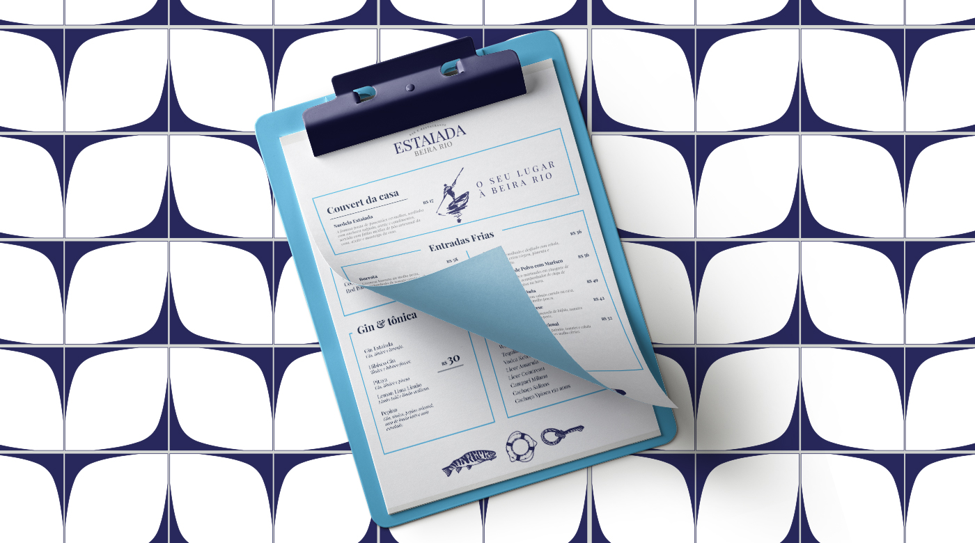
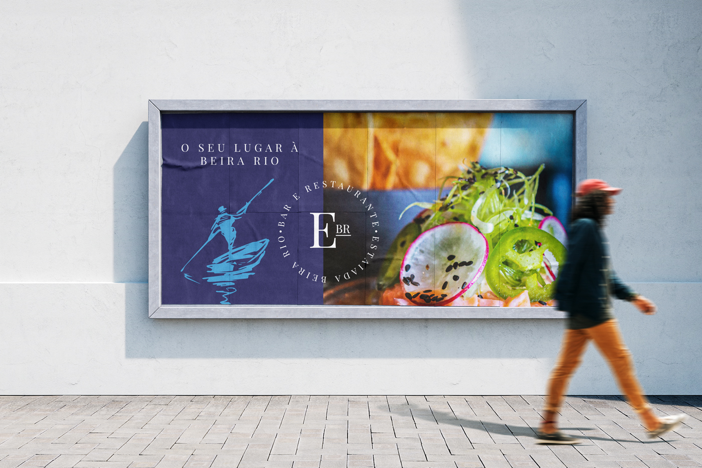
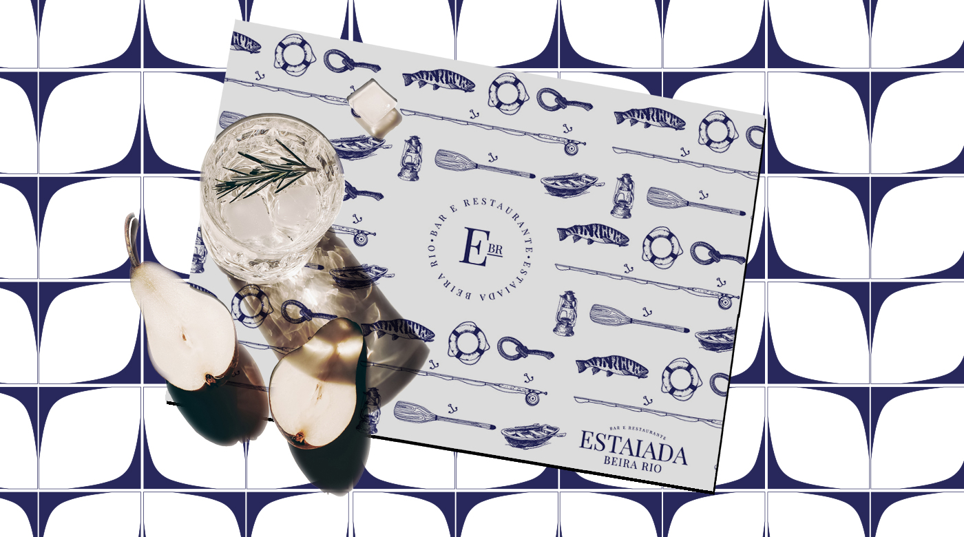
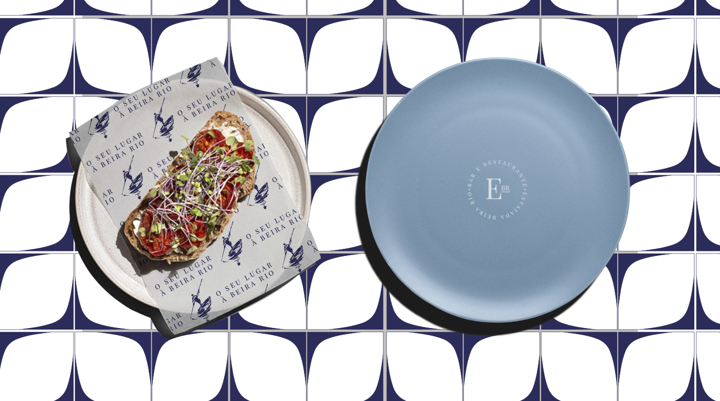
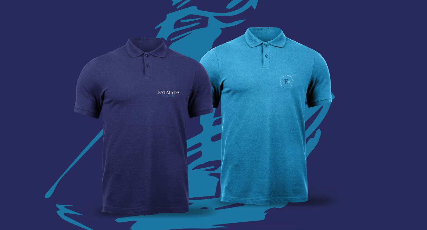
Brand project and visual identity we created for Estaiada Beira Rio: Simple, classic, and calm. We opted for a typographic brand to convey a clear and direct message to customers, aligned with our pursuit of simplicity, timelessness, and sophistication. The choice of blue tones was carefully made to evoke serenity, calmness, and confidence. We integrated elements such as the rower, lantern, rope, and oar into the visual identity, creating a distinctive pattern that further enriches the brand. This pattern not only reinforces the authenticity of Estaiada Beira Rio but also adds a layer of meaning and unique visual identity.
Estaiada Beira Rio believes in creating special moments by the river. Our goal is to offer a welcoming environment where everyone feels at home and can enjoy moments of pleasure and relaxation. We value the beauty of nature and strive to provide a memorable gastronomic experience with delicious dishes made from natural ingredients. We want to be your favorite refuge, where you can disconnect from the hustle and bustle of everyday life and reconnect with yourself and your loved ones. Come visit us and let yourself be carried away by the tranquility and beauty of our riverside space. Your place by the river!
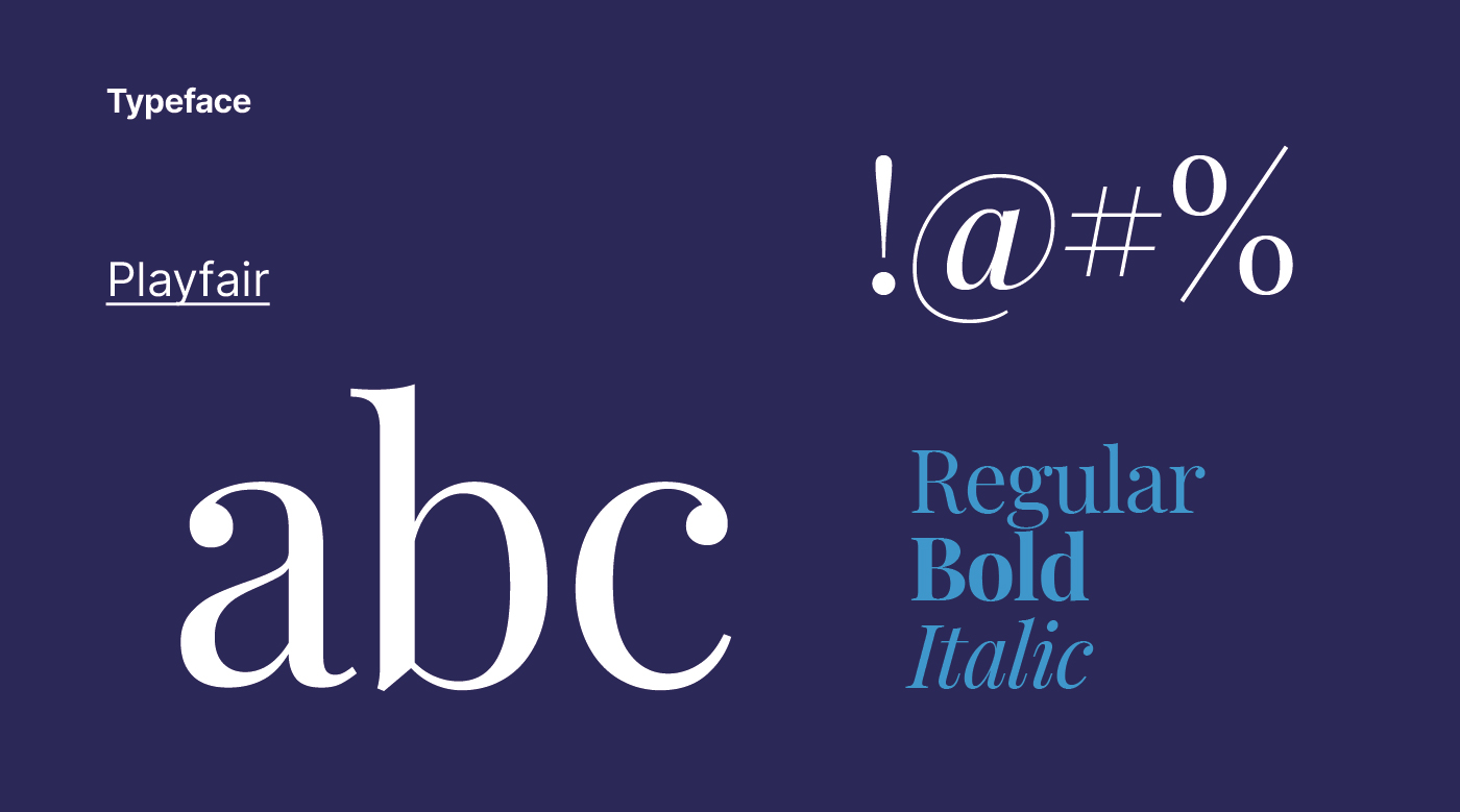
The Playfair font was chosen for the Estaiada Beira Rio logo due to its simple yet classic form, conveying an image of prestige and quality. Its exceptional legibility and versatility ensure that the logo is easily recognized and applicable in various contexts, reinforcing the restaurant’s distinct identity.
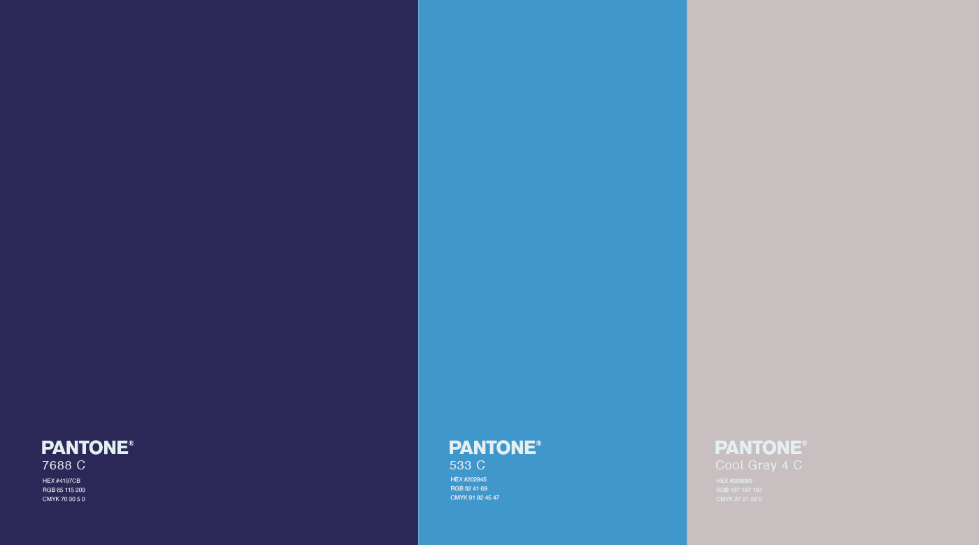
Blue is often associated with serenity, calmness, and confidence, transmitting a sense of tranquility that perfectly aligns with the relaxing and welcoming atmosphere of the riverside restaurant. This color creates an emotional connection with customers, inducing a sense of comfort and well-being during their experience at Estaiada Beira Rio.
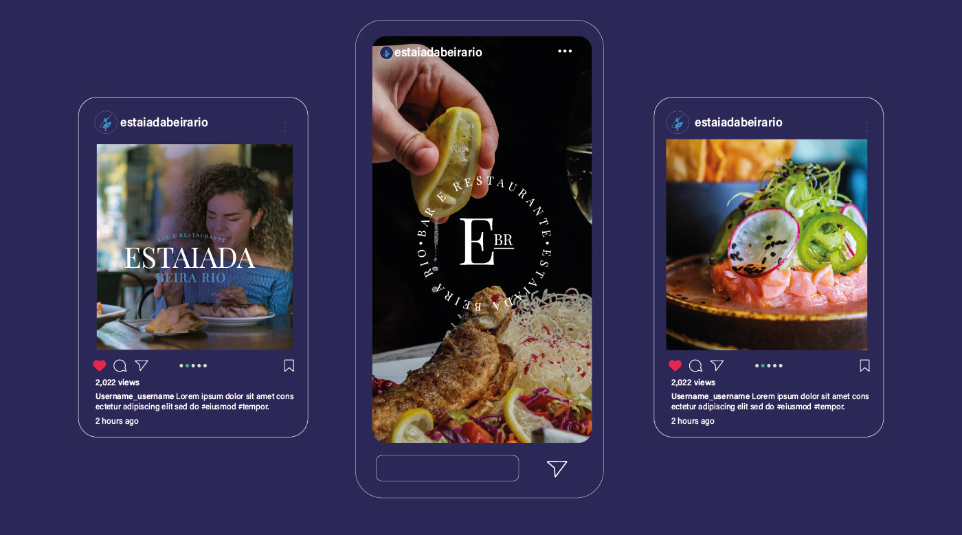
We opted for a typographic brand for Estaiada Beira Rio to convey a clear and direct message to customers, in line with our pursuit of simplicity, timelessness, and sophistication. This minimalist approach allows the restaurant’s name to stand out as the central element of the visual identity, providing flexibility and versatility in its application. Thus, we ensure a consistent visual identity that aligns with the brand’s visual guidelines, which prioritize simplicity, clarity, and calmness.
Combining these elements, we create a unique and cohesive brand identity that not only stands out but also evokes the desired emotional responses from our customers. The integration of natural elements and serene colors further enhances the overall experience, making Estaiada Beira Rio a preferred destination for those seeking relaxation and high-quality gastronomic experiences by the river.
Let’s finalize this by emphasizing the essence of Estaiada Beira Rio – a place where nature meets sophistication, providing a serene escape from the everyday hustle. Whether you are here to enjoy a meal or simply to relax, Estaiada Beira Rio offers an experience that blends natural beauty with exceptional service, making it the perfect spot for special moments by the river.
CREDIT
- Agency/Creative: Bass. Estúdio Gráfico
- Article Title: Bass. Estúdio Gráfico Branding and Visual Identity for Estaiada Beira Rio
- Organisation/Entity: Agency
- Project Type: Graphic
- Project Status: Published
- Agency/Creative Country: Brazil
- Agency/Creative City: Piracicaba
- Market Region: South America
- Project Deliverables: Brand Design, Graphic Design, Logo Design
- Industry: Food/Beverage
- Keywords: food, branding, design, visual identity, restaurant
-
Credits:
Bass.: Marcos Basseto


