


Partenope Gin
La leggenda si fa design
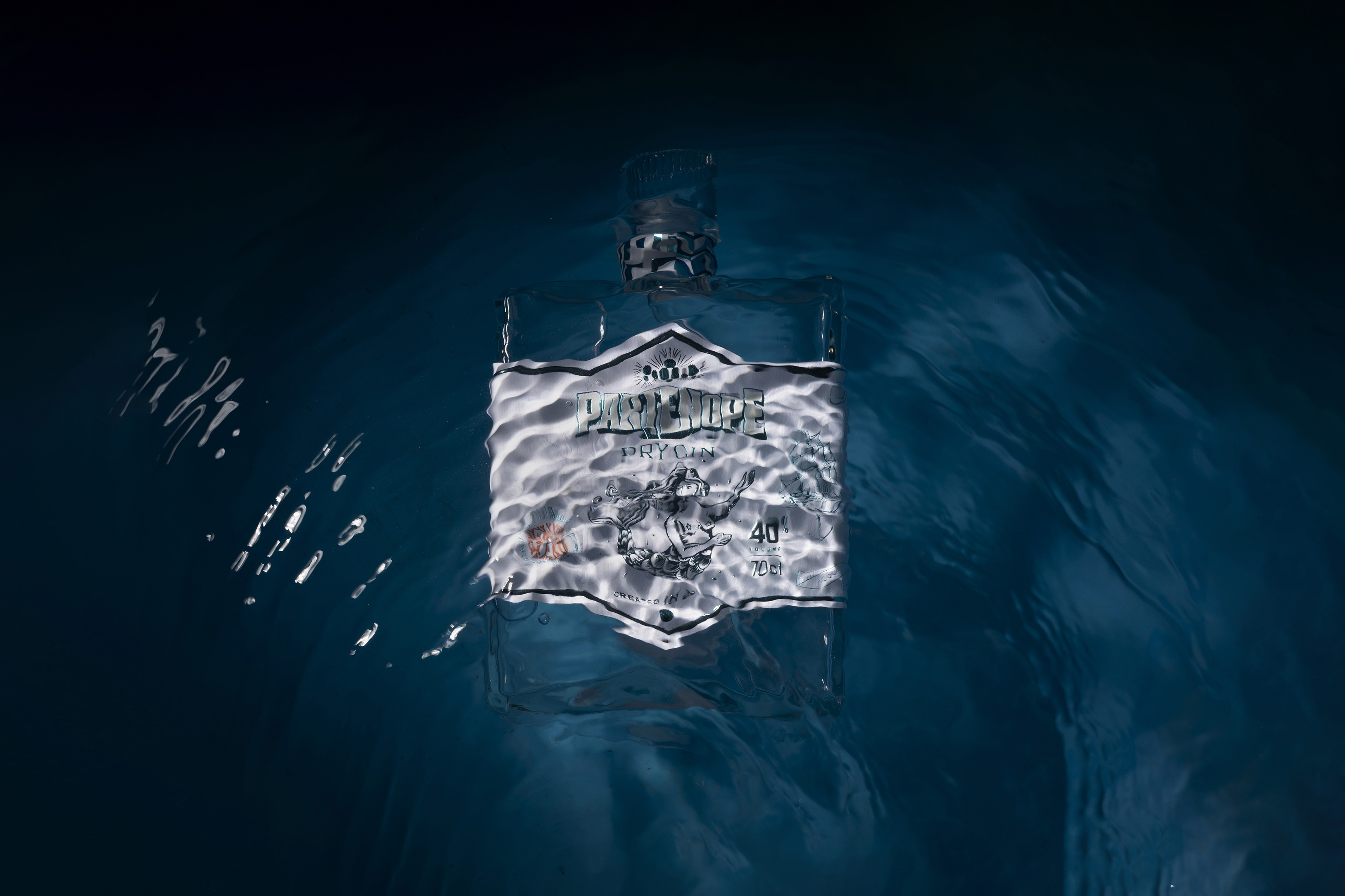
In the heart of the Mediterranean, where myth and sea meet, Parthenope Gin is born: a gin that doesn’t simply tell a story but expresses it through material, light, and identity.
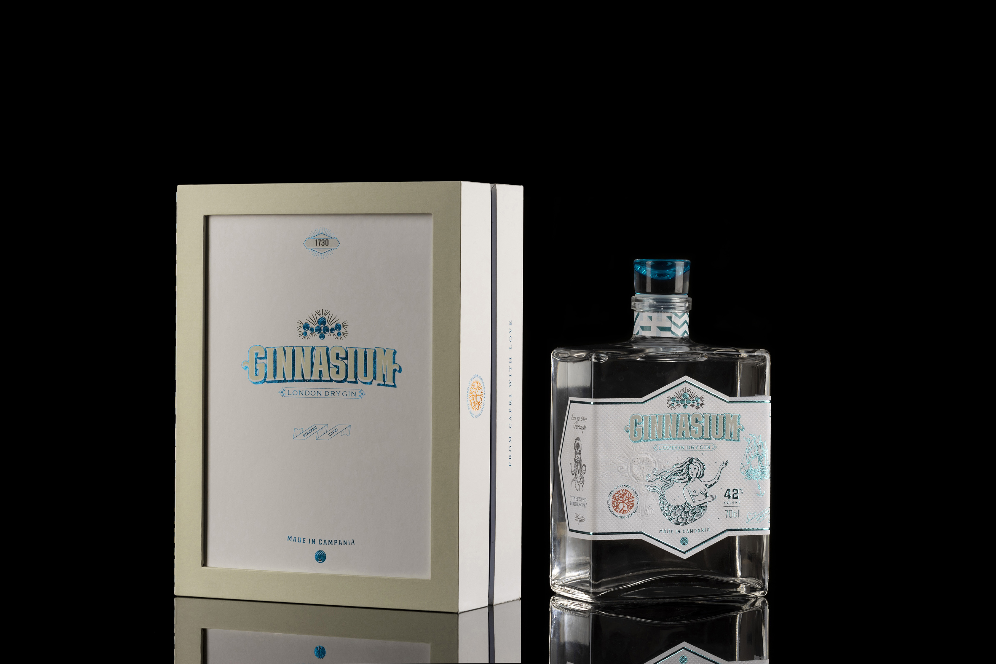
The project originates within Ginnasium Lab, a creative laboratory where neuromarketing and experimental design coexist. From this research came the first conceptual version of the bottle, later evolved and refined into its final commercial form.
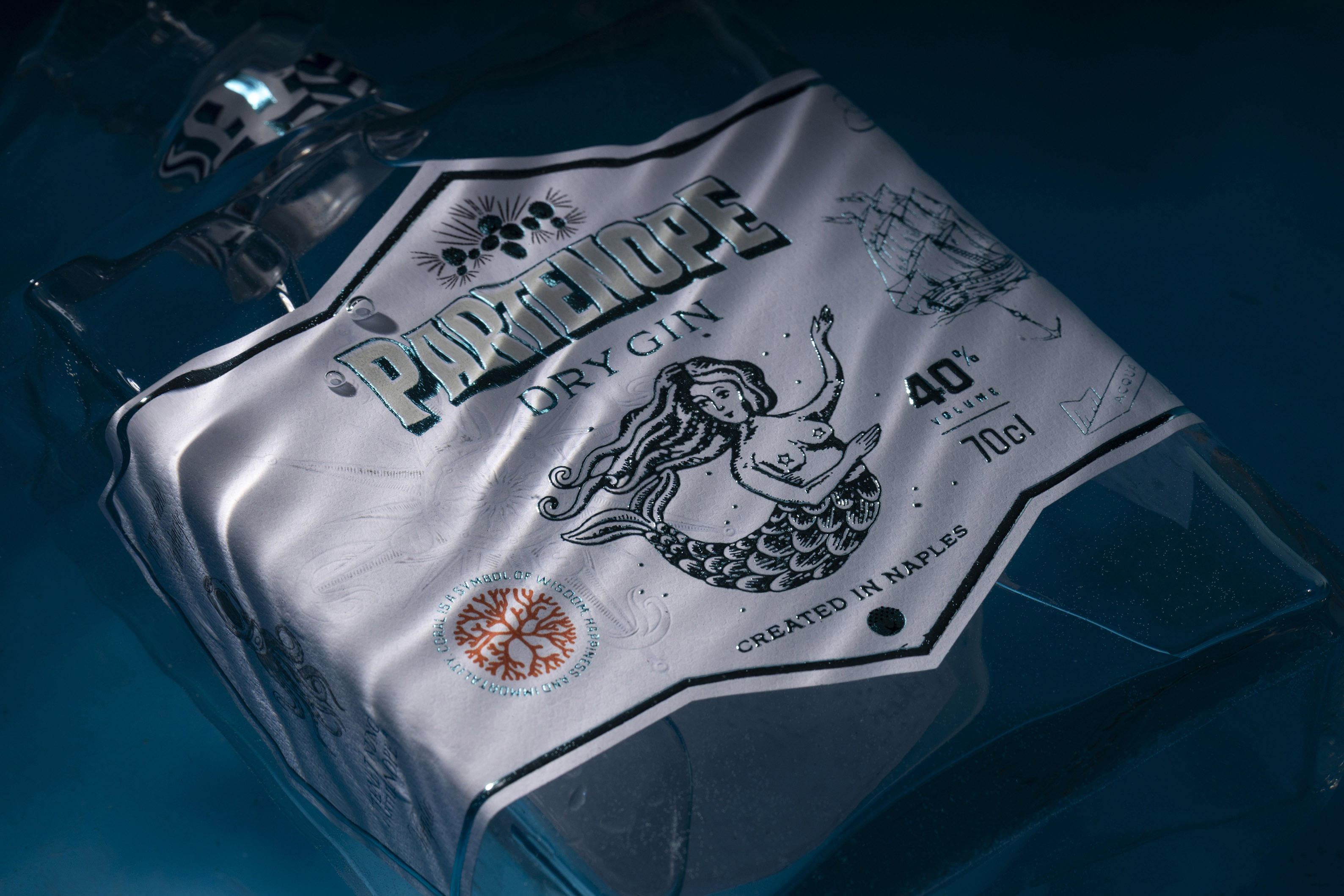
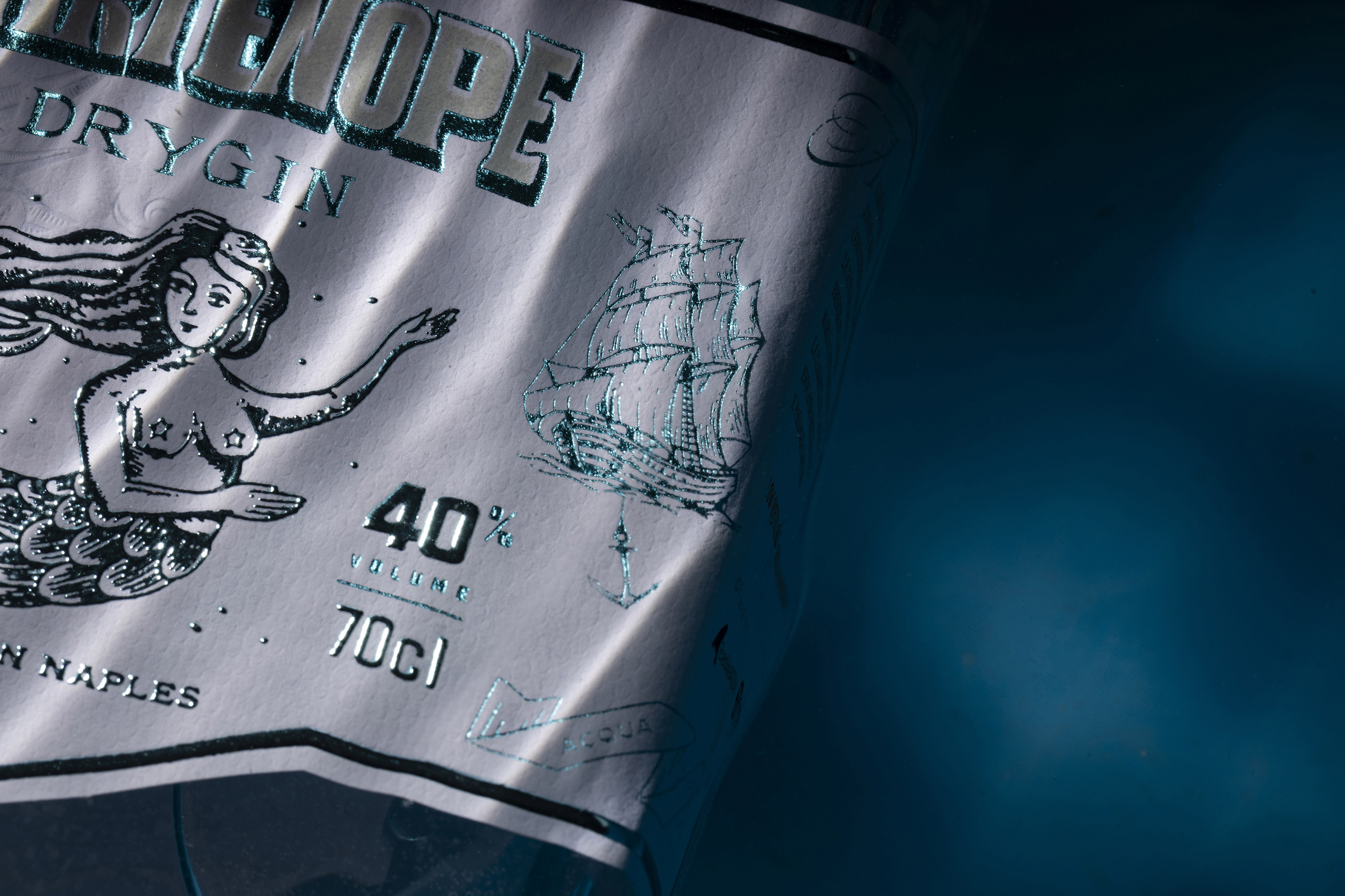
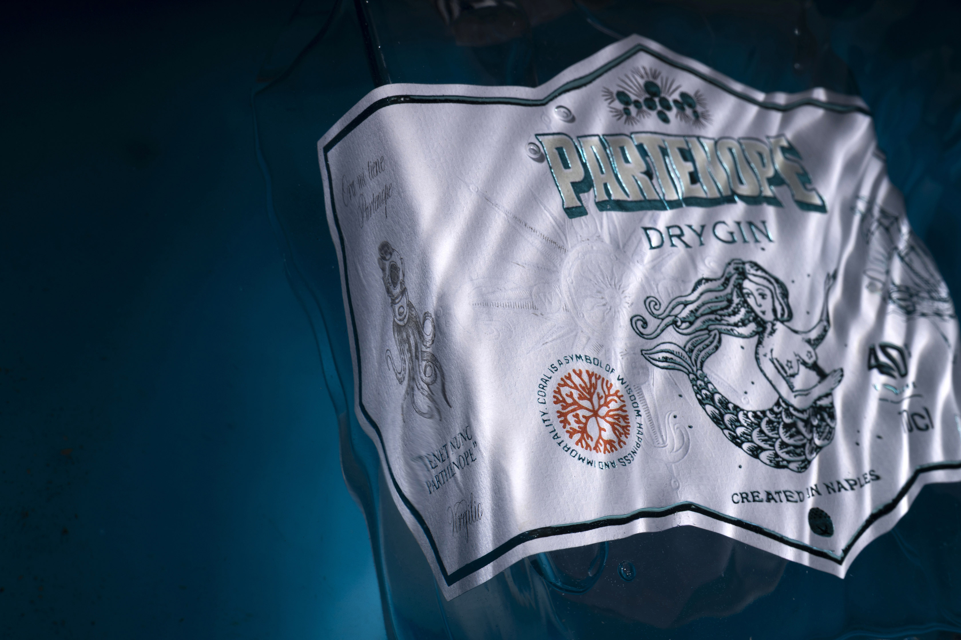
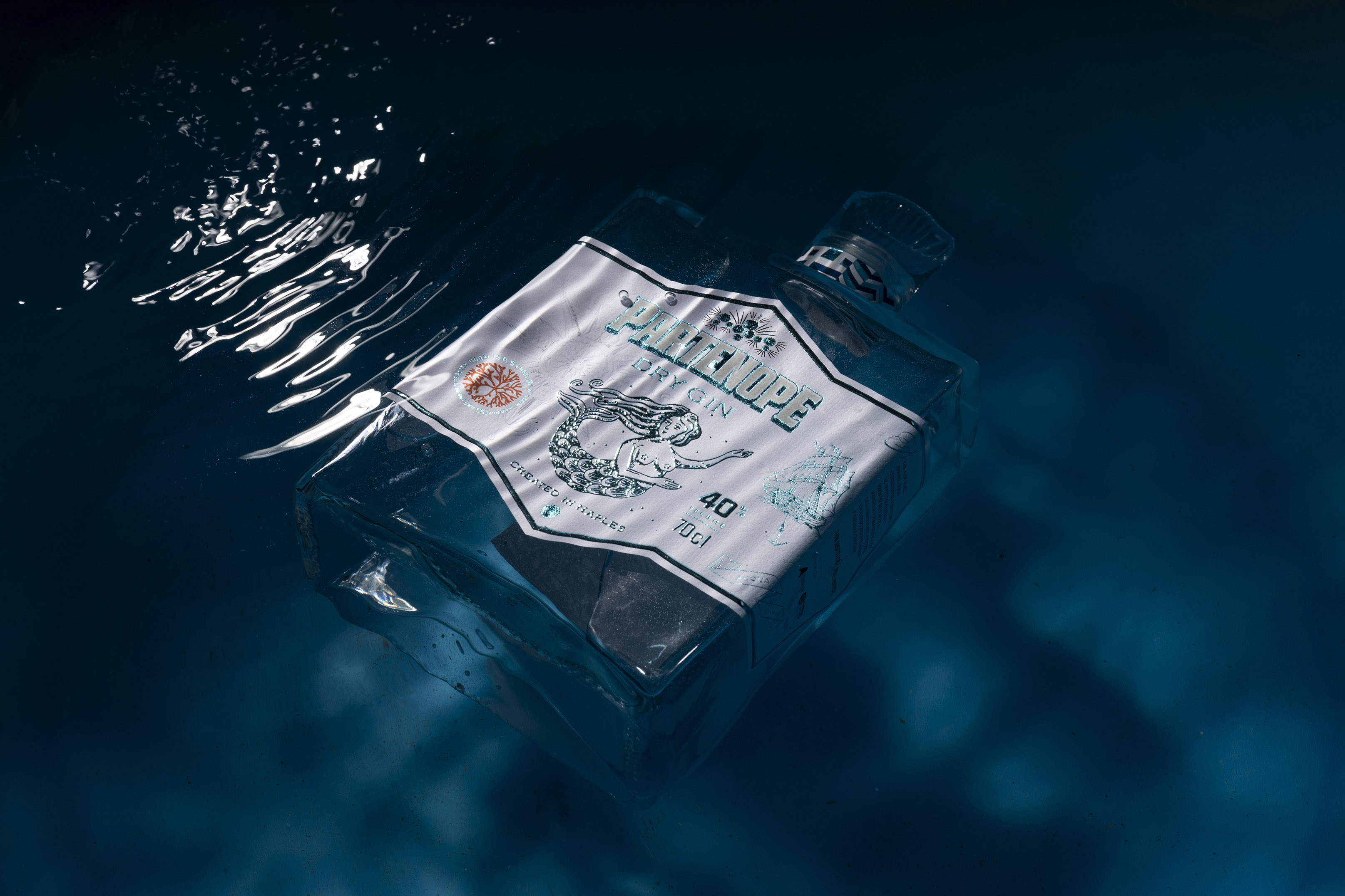
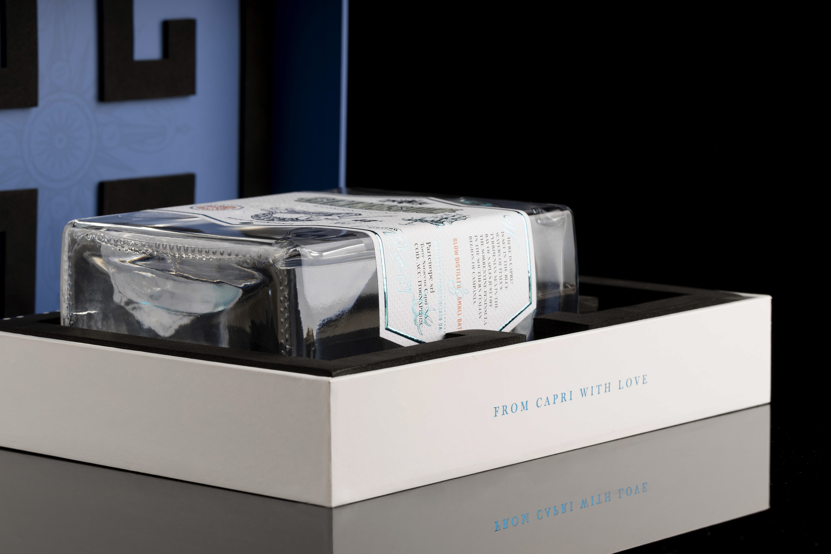
Its protagonist is Parthenope, the siren founder of Naples: an elegant, magnetic, timeless figure. Her sinuous body inhabits the label of the Capri bottle by Vetroelite, transforming it into a visual narrative woven from sea, myth, and contemporary design.
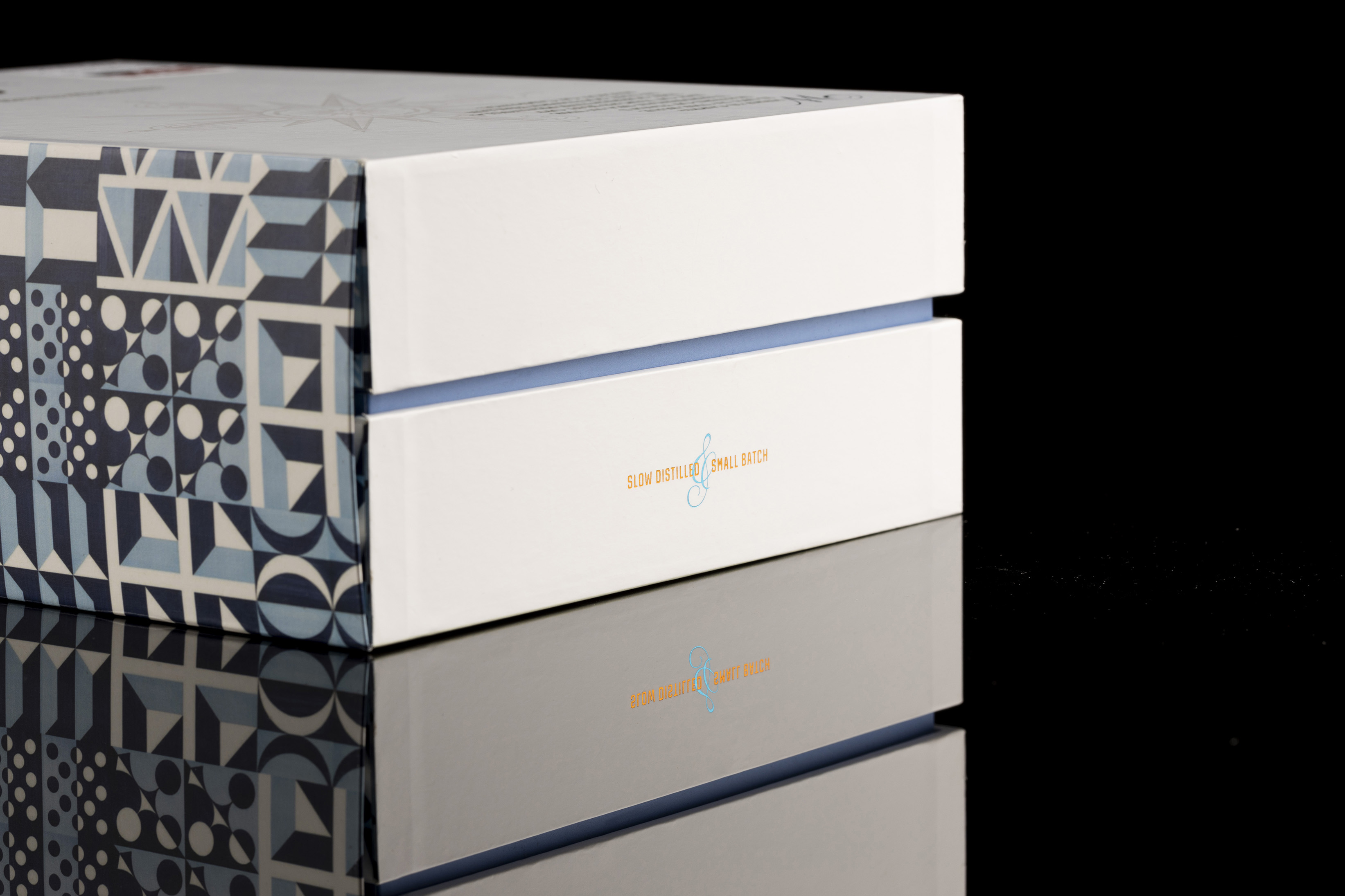
The label is printed on Jazz Ice Premium FSC by UPM Raflatac, a tactile and luminous paper enriched with metallic blue foils, UV screen-printing, and a debossing that recalls the movement of water. Each impression creates plays of light and shadow reminiscent of the sea and its depths.
The dominant color is Blu Ponti, a direct tribute to the ceramics and Mediterranean vision of Gio Ponti, the architect and designer who left an indelible mark on Naples and its coastline. That blue vibrant and weightless becomes a bridge between tradition and modernity.
The custom typeface designed with Resistenza Type Foundry accompanies the project with rigorous, modern typographic elegance: crafted letters, structured forms, and shadows that emphasize volume and physicality, like sculptural characters.
The Vinolok Edge glass closure with an inner turquoise coating echoes the sea-inspired palette and adds a precious, sculptural detail to the bottle. The result is a complete sensory experience visual, tactile, and material.
Parthenope Gin is an aesthetic and identity-driven journey.
It is Naples reflected in its sea.
It is myth transformed into design.
It is light meeting depth.
CREDIT
- Agency/Creative: BasileADV
- Article Title: BasileADV Translates Neapolitan Myth Into the Identity of Partenope Gin
- Organisation/Entity: Agency
- Project Type: Packaging
- Project Status: Published
- Agency/Creative Country: Italy
- Agency/Creative City: BasileADV/Italy
- Market Region: Europe
- Project Deliverables: Calligraphy, Label Design, Packaging Design, Photography
- Format: Bottle, Box
- Industry: Food/Beverage
- Keywords: label, label design, type, type design, packaging, design, photography
-
Credits:
Creative director: Andrea Basile
Type designer: Giuseppe Salerno
Digital design: David Ardito
Photographer: Diego De Dominicis


