


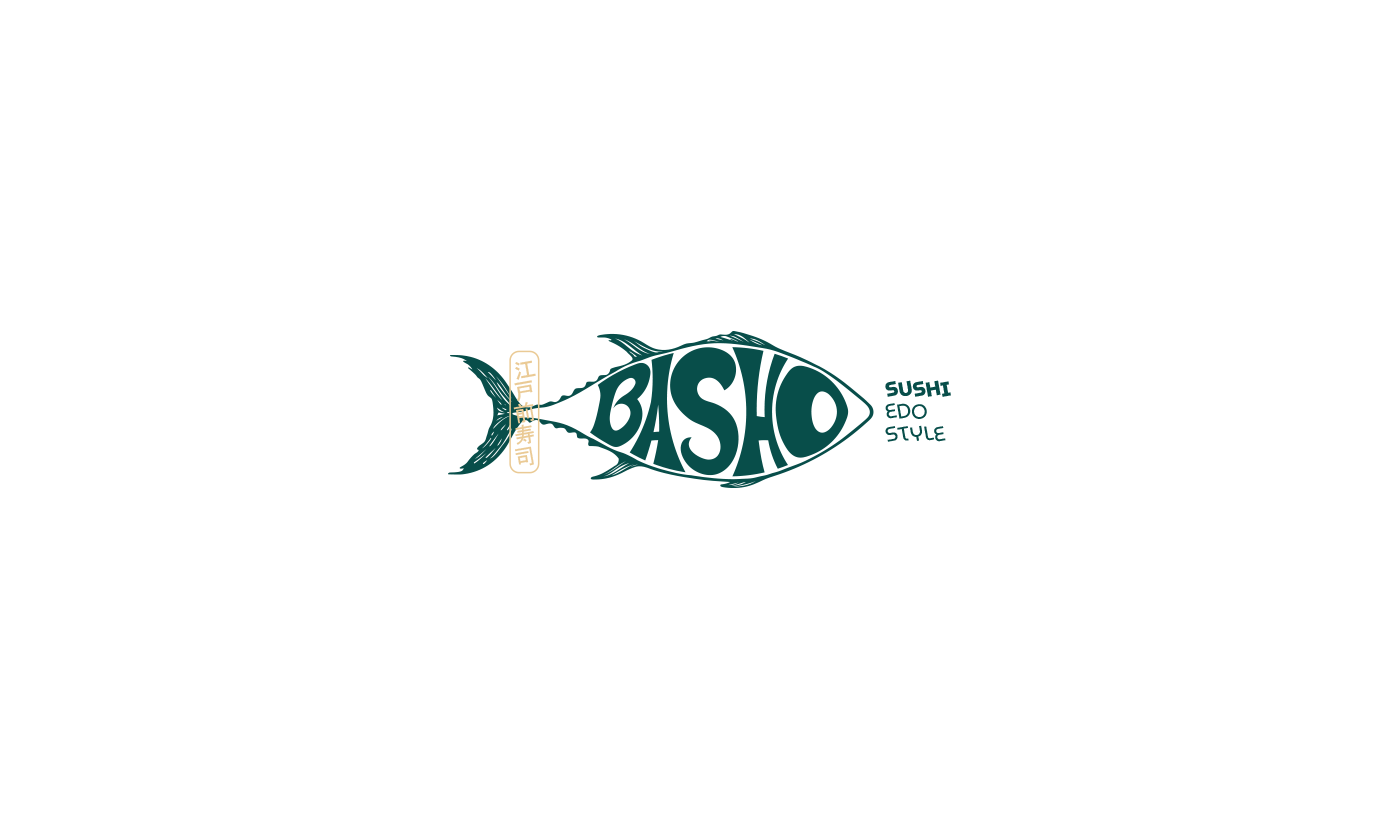
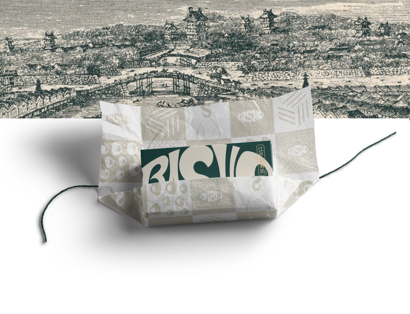
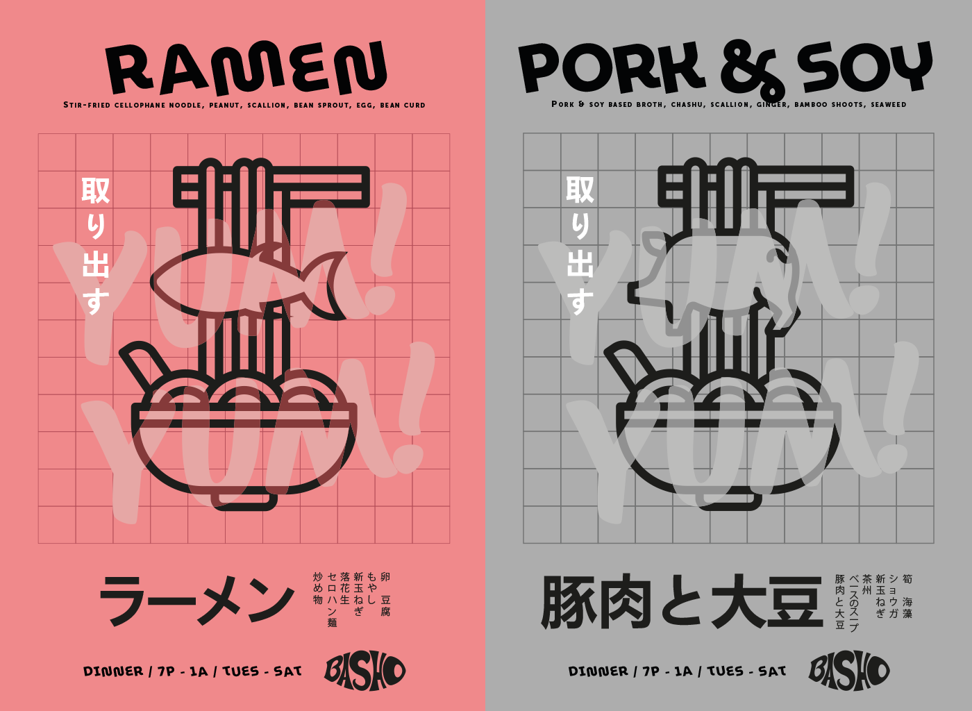
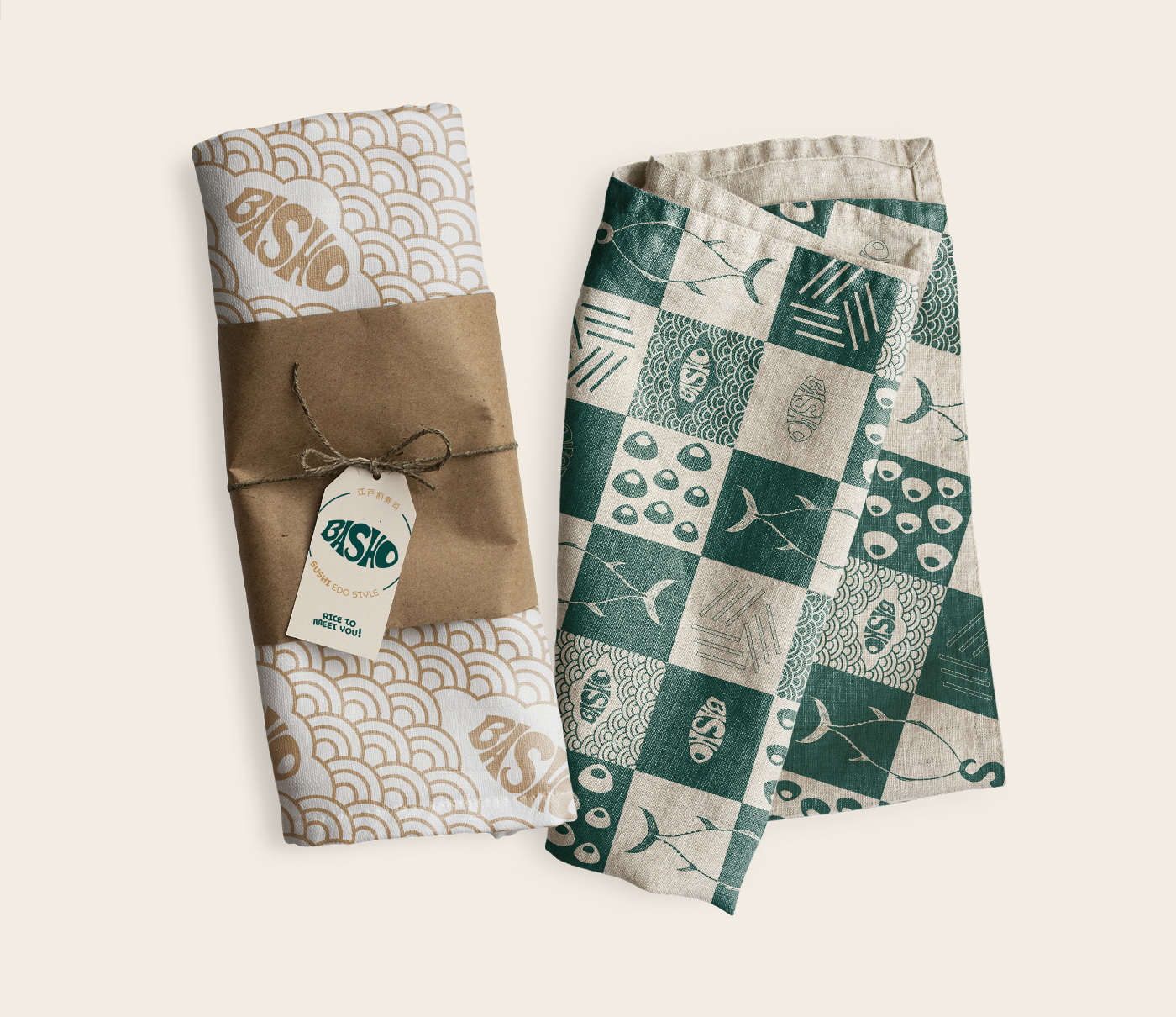
The people of ancient Edo (Tokyo today) were known to be people with no time, with busy and hectic lives. They wanted food to be fast so it wouldn’t take too much of their time. Then, in the mid-1820s, sushi was created. The edo style sushi tries to preserve and appreciate the flavors of each fish and ingredients.
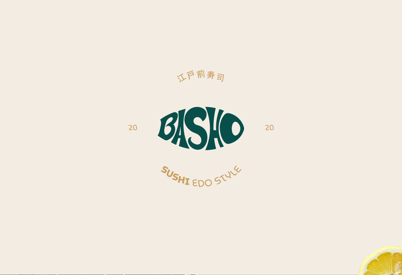
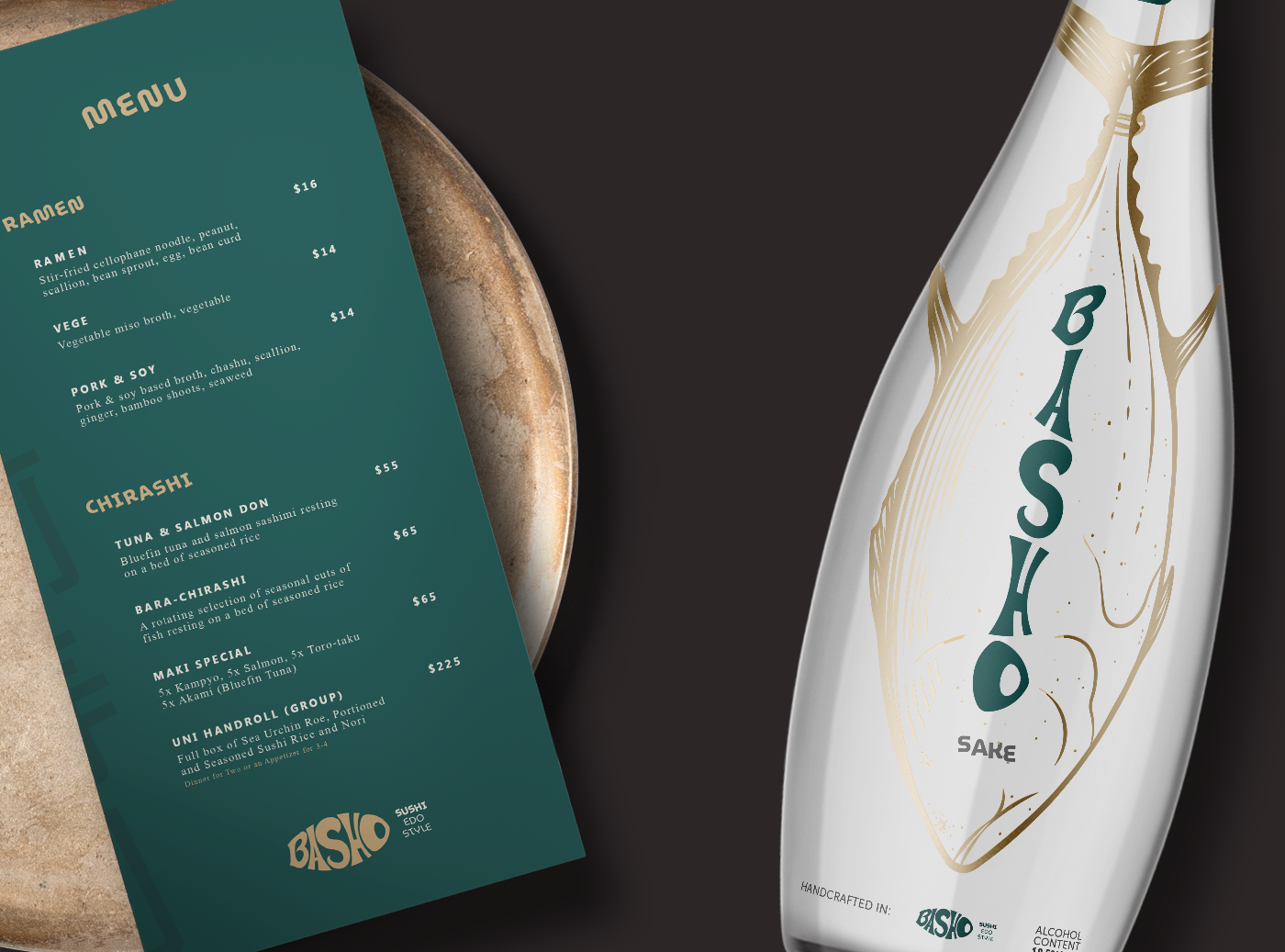
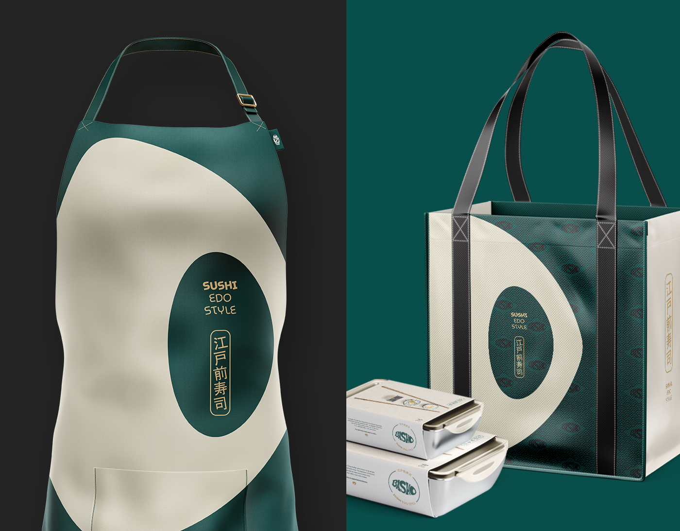
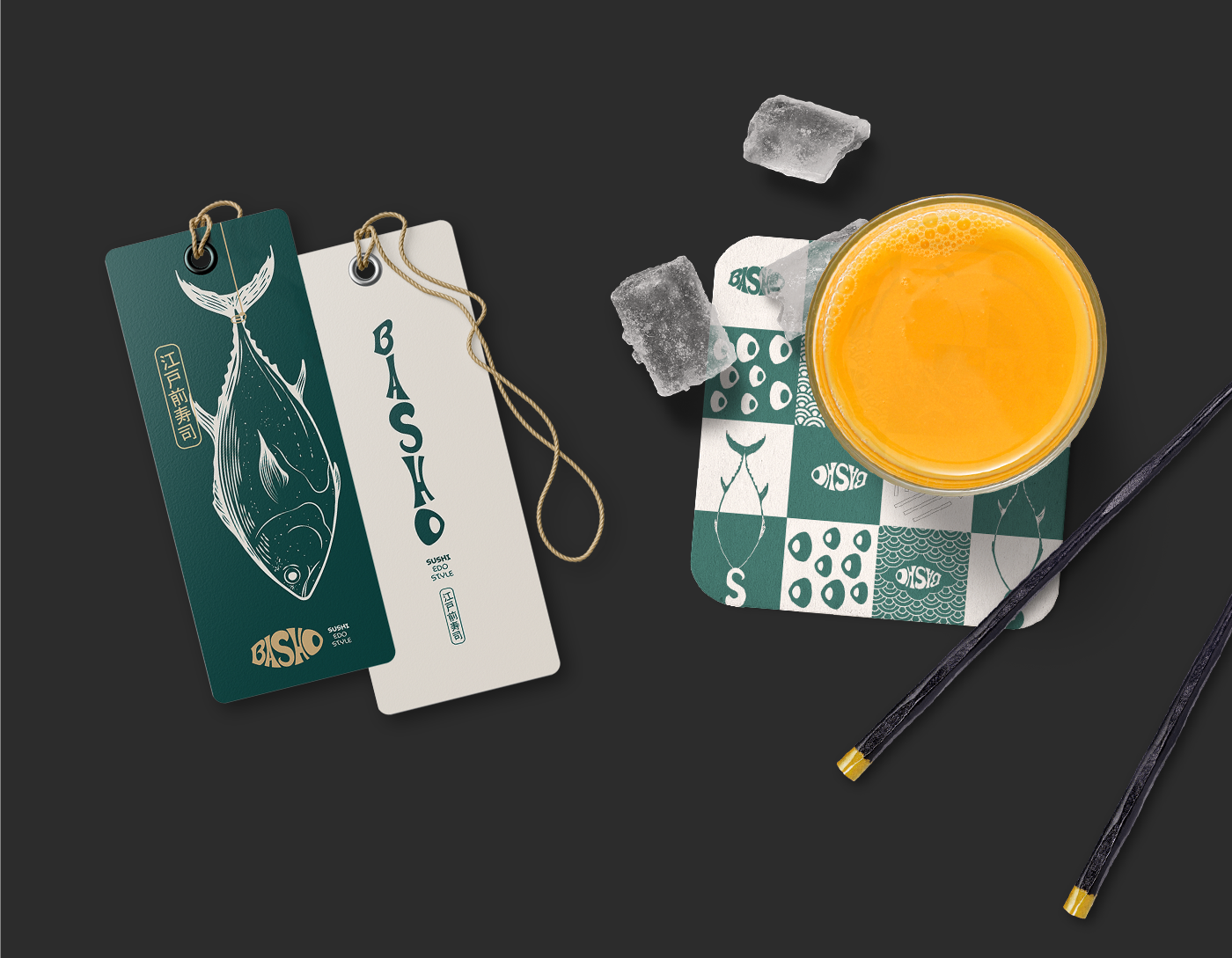
About the Elements: The name Basho (場所) is a Japanese word that is often used to show the exact location. Using the letters of this incredible name to simulate the tuna spine was a fantastic challenge. Bluefin Tuna, which is part of the identity, is the most expensive fish in the world, has a pointed snout, two dorsal fins, and a rounded belly, where the most noble meat is.


CREDIT
- Agency/Creative: José Alcânttara
- Article Title: Basho Sushi Branding Identity Designed by José Alcânttara
- Organisation/Entity: Freelance, Published Self Promotional Design
- Project Type: Identity
- Agency/Creative Country: Brazil
- Market Region: South America
- Project Deliverables: Brand Advertising, Brand Architecture, Brand Creation, Brand Identity, Brand Naming, Branding, Graphic Design, Identity System, Illustration, Packaging Design, Research
- Industry: Food/Beverage
- Keywords: branding, Corporate Identity, sushi, logo, josé alcânttara, stationary, visual identity, brand
FEEDBACK
Relevance: Solution/idea in relation to brand, product or service
Implementation: Attention, detailing and finishing of final solution
Presentation: Text, visualisation and quality of the presentation


