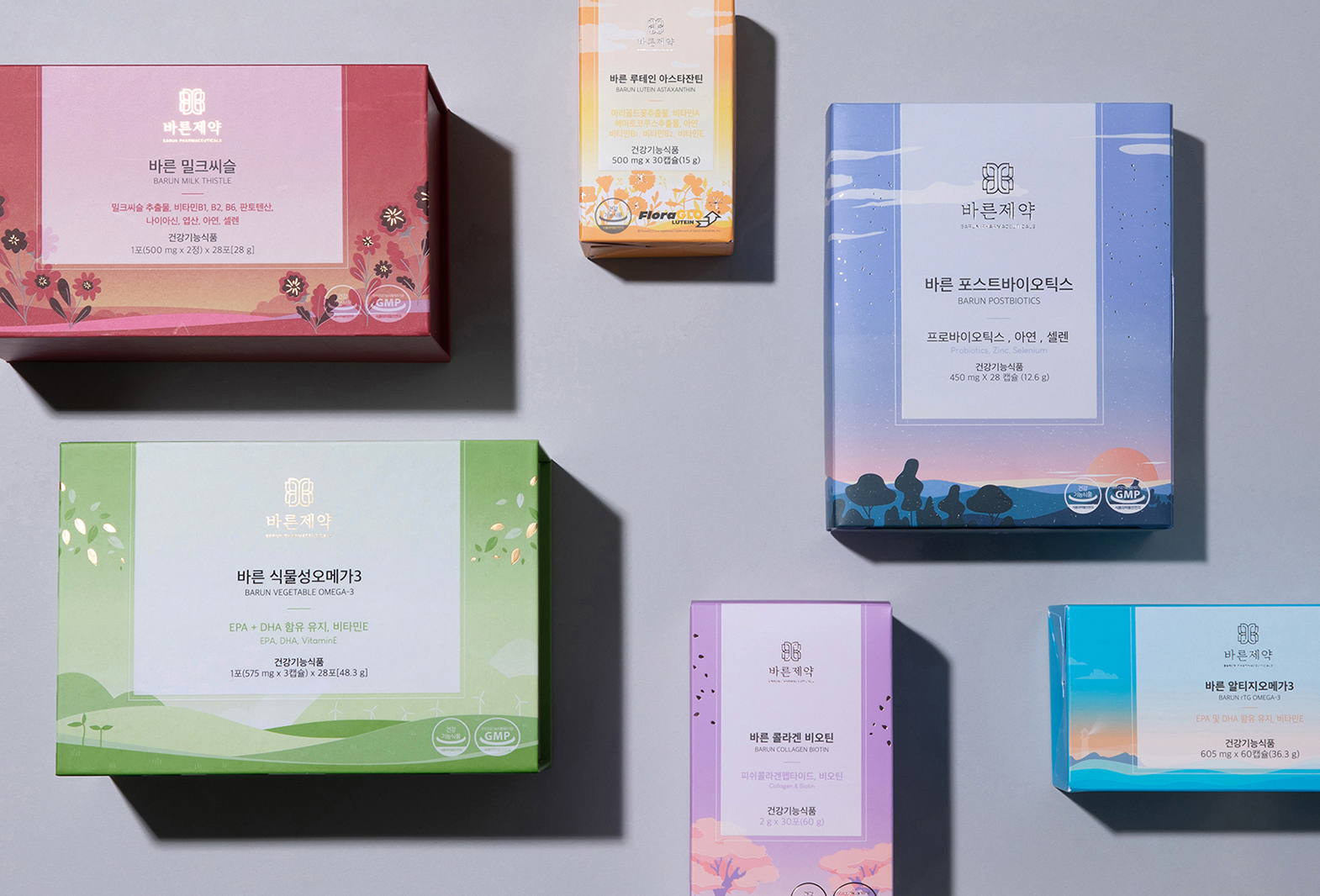
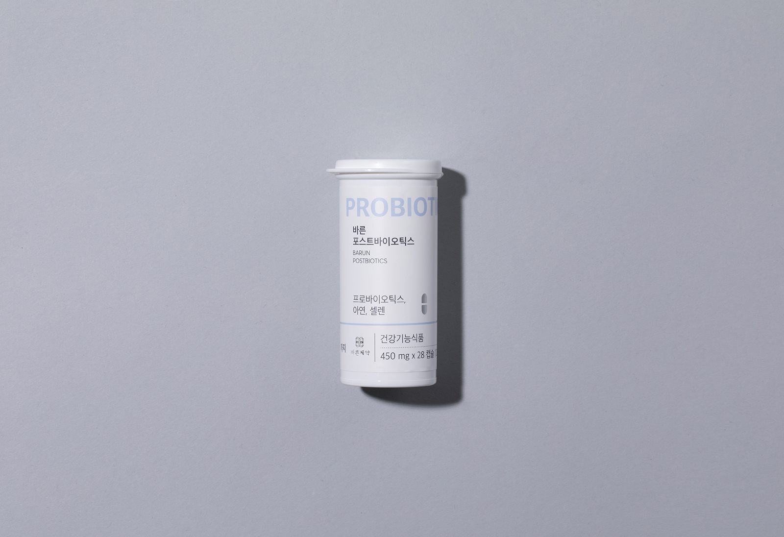
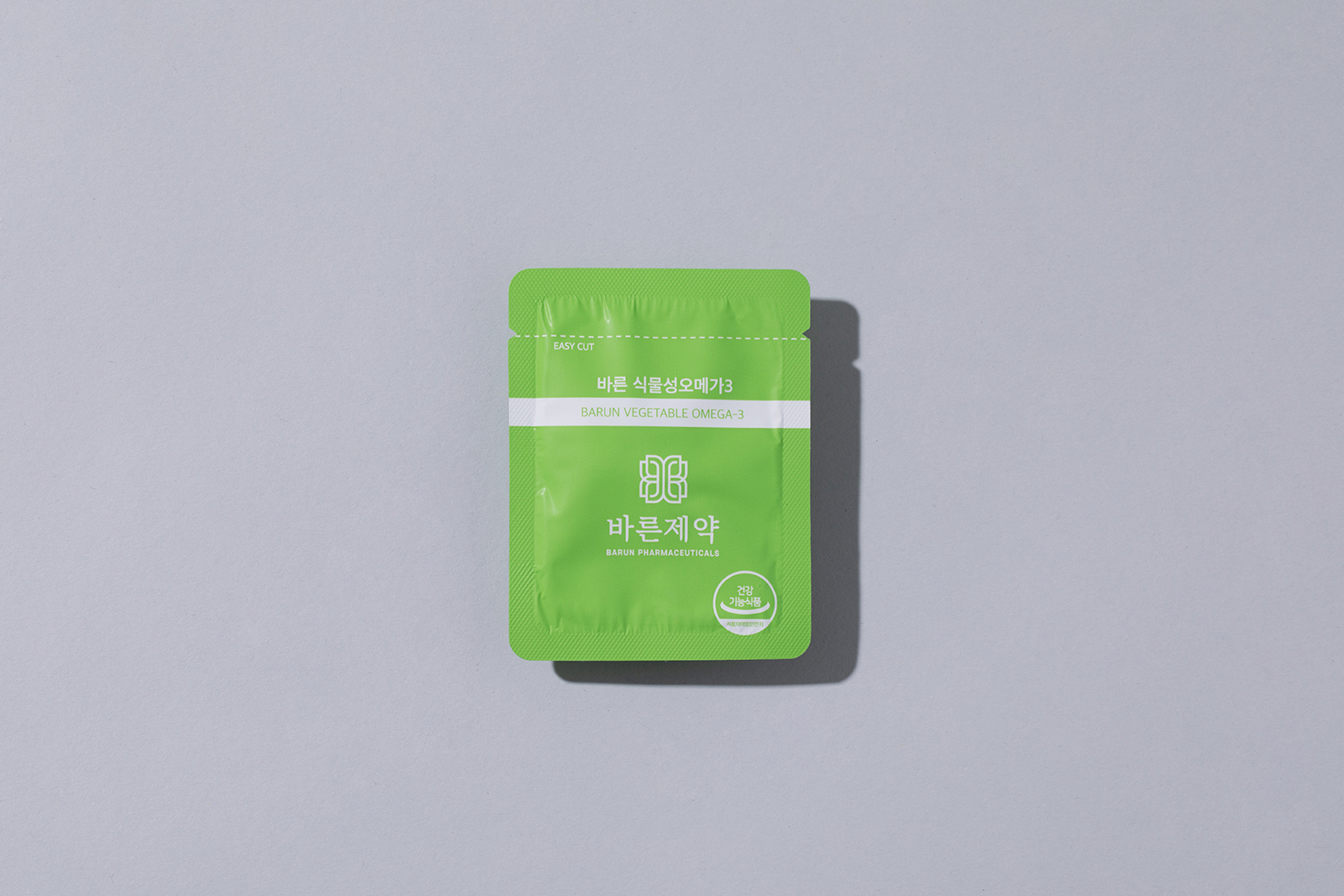
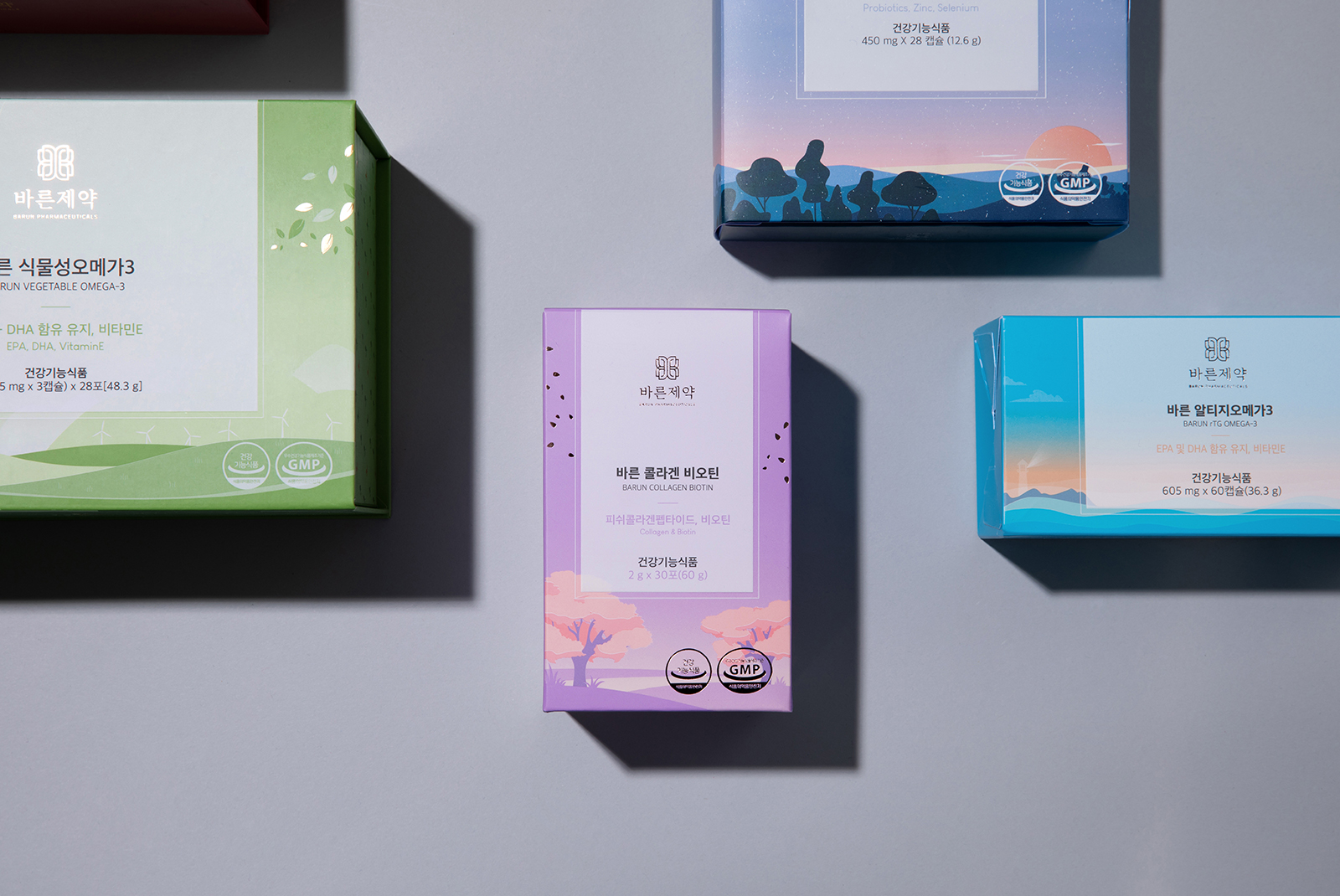
Barun Pharmaceutical is a premium health food brand produced with natural ingredients derived from nature and eco-friendly. Rather than the feeling of consumers taking pills, they tried to create an image of a brand that naturally absorbs nutrition itself. Therefore, the existing scientific efficacy base deviates from the brand image and is familiar but luxurious. So, although it is popular overall, it was able to represent a new brand in the nutritional category. In addition, the graphic elements that health functional foods should have had to be met in the design of the internal package. Images of the efficacy and effectiveness of the product were given in designs other than boxes.
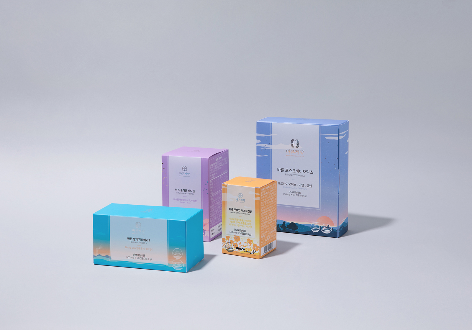
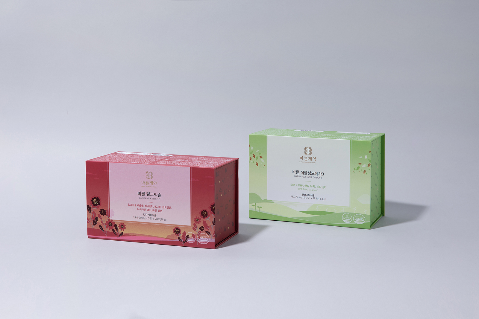
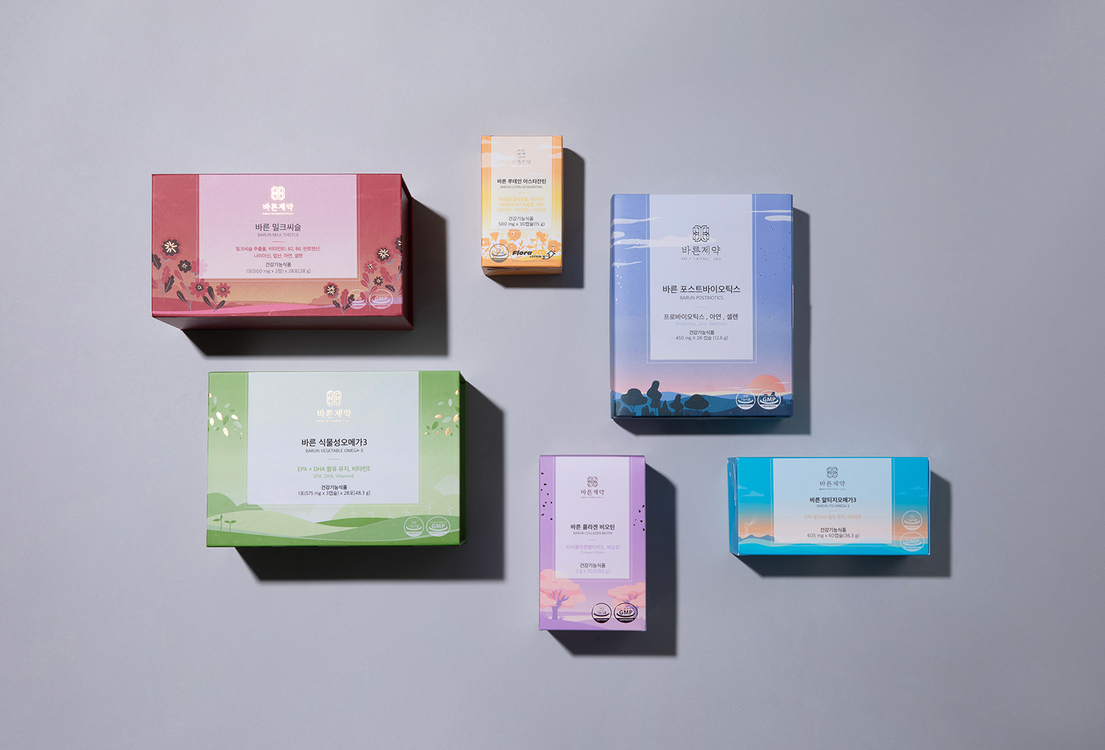
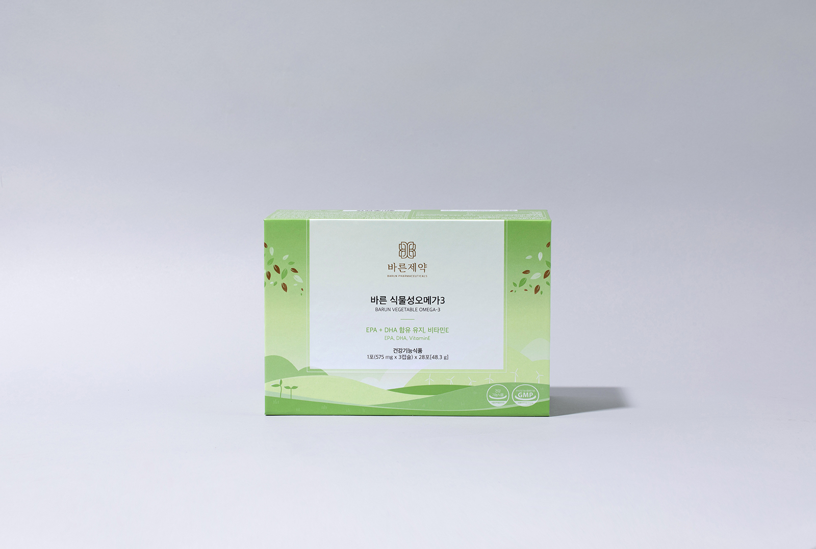
The six products were expressed in the package design with illustrations of colors
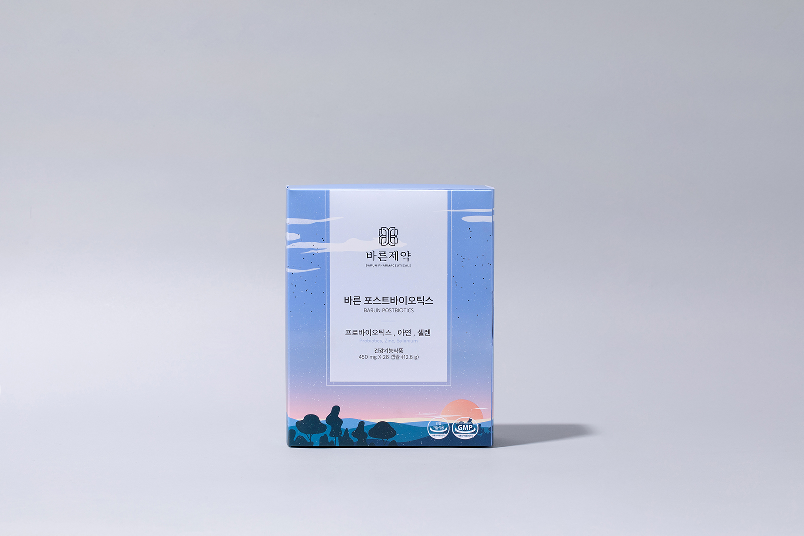
and landscapes that could be metaphorical in each product. Although motifs inspired by nature, we tried to look more modern in geometric expressions. The image drawn in this way was friendly and new in each form. And the color contains the parts inspired by the East and Korea in the palette. In this project, in order to maximize the brand image given by colors, printing of all designated colors, not CMYK color printing, was carried out. In addition, the post-processing elements are also small detailed elements.
Overall, the package design of Barun Pharmaceutical is meaningful in that it crosses the boundaries of existing healthcare categories. It is also seen as the power of illustration. It shows the brand’s thoughts beyond the package.
CREDIT
- Agency/Creative: Long&Short
- Article Title: Barun Pharmaceutical Package Design
- Organisation/Entity: Agency
- Project Type: Packaging
- Project Status: Published
- Agency/Creative Country: South Korea
- Agency/Creative City: Seoul
- Market Region: Asia
- Project Deliverables: Graphic Design, Illustration, Packaging Design
- Format: Blister-Pack, Box, Sachet
- Substrate: Plastic, Pulp Board
- Industry: Health Care
- Keywords: illustration packaging, calm
-
Credits:
Creative Director: Joohyung Yun
Designer: Sohyeon Kim


